Ever heard the saying, “He has another thing coming”? The correct version of this is actually, “. . .another THINK coming”. Really. I’m not making this up.
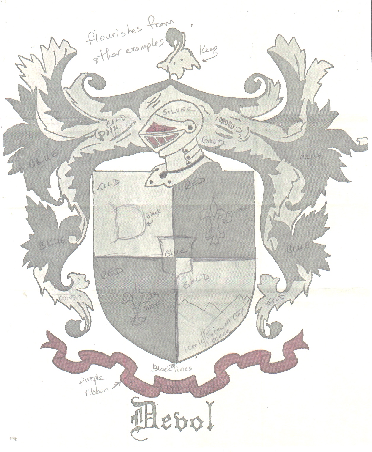
As I was working with my Friend/Customer on her coat of arms, we designed it together. I took the approach of “The Customer is Always Right”, and didn’t look at it critically through my own lens of opinion.
There’s nothing wrong with that in commission work.
Or is there?
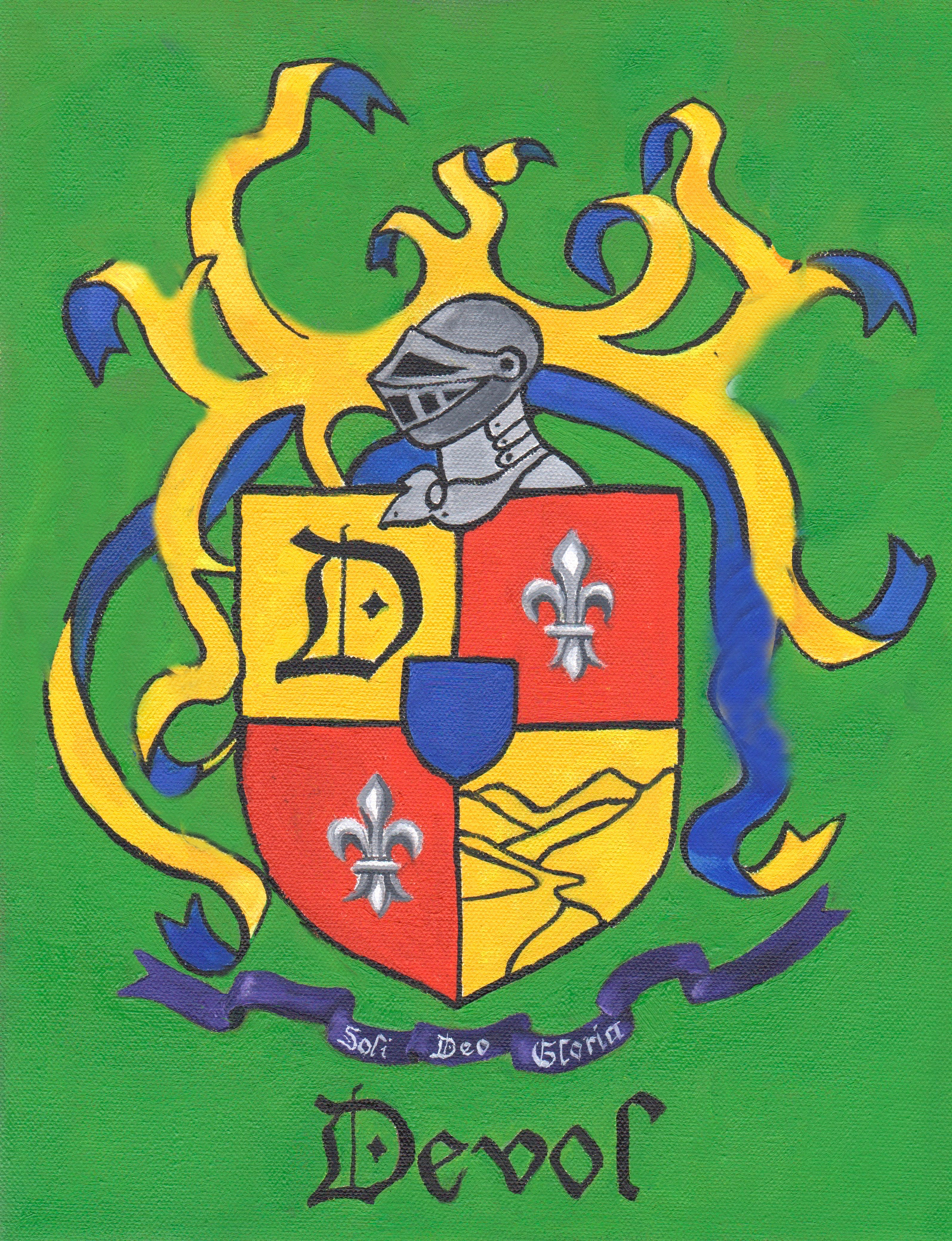
My Friend/Customer wasn’t as happy with the results as we had hoped. I showed her every step of the process, both the designing and the painting. We discussed shapes and colors and placements and sizes, but something didn’t mesh for her after she received the painting.
This troubles me, not in the sense of being annoyed with her, but in wondering where I went astray in the process. My job is to help the customer know and get what she wants, and I failed.
My conclusion is that if a customer thinks she knows her mind, don’t leave her out there in Design Land alone. Be critical (as in helpful and discerning), make suggestions, and help her see the best possibilities instead of letting her drive the process alone.
We are now rethinking the design. Here are the original, the painted version, and a sloppy photoshop revision.


The shield is ever so slightly larger, some ribbons are narrower, and some ribbons are now gone.
She is a good friend, we communicate often, and together we will solve this!
2 Comments
I guess your client knows what the lower right yellow panel is supposed to be. To me they look like faces overlapping each other (see the lower right one? A high forehead, nose and down-turned mouth is there, and the one across from it looks like a bird face!). I also think the leaves on the original look better than the ribbons. The suit-of-armor head looks kind of odd to me too. Of course, this is not my commission, but I wonder if she has thought about how it will look to others when it is hanging on her wall at home. I think you are right, Jana, as the professional artist your input should be essential.
Marjie, I will study on your thoughts while looking at the design and see if I can incorporate anything. I appreciate your thoughtfulness! So you know, the lower right panel is a simplified version of Farewell Gap and the Mineral King valley, since the name Devol means “of the valley”.
Comments are closed for this article!