Odd Job, Chapter 3

If you subscribe to the blog and read the email on your phone, the photos might not show up. (Some people get them, some do not; it isn’t a problem I know how to solve.) You can see them by going to the blog on the internet. It is called cabinart.net/blog, and the latest post is always on top.

Yesterday’s post about refreshing 2 signs left you hanging. I hope the anticipation of today’s continuation didn’t disrupt your sleep last night.

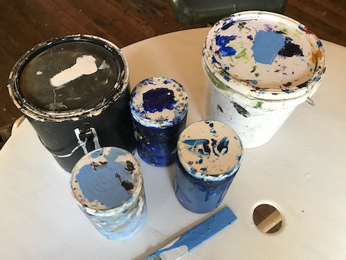
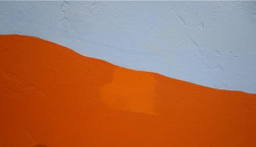
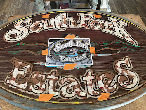
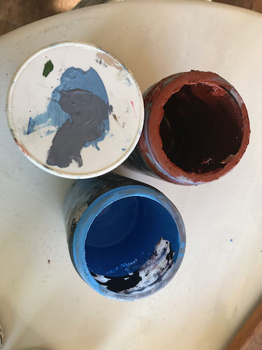
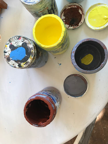
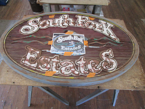
After applying 2 coats of the rim color, some confidence began developing. Time to tackle the narrow yellow line. You can see the old color in the middle; I put a bit of white on the left, and some brighter lightfast yellow on the right.

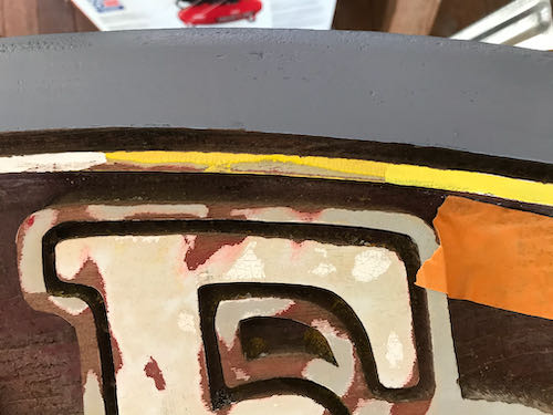
The yellow needed some red, along with a touch of white.

You might be able to tell that the upper yellow is now better, but since the lightfast yellow is transparent, it needed a primer coat beneath. No need to color fuss here because the goal is to make it look good.

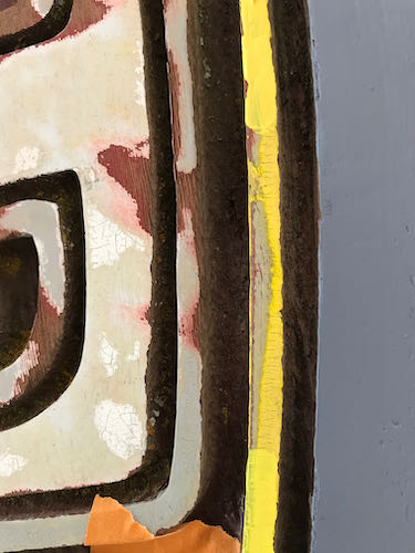
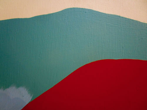
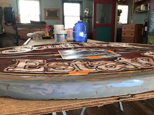
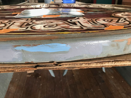
As I painted the narrow line with white, I realized that the wood is quite splintery. This means that getting a smooth edge isn’t going to happen the entire distance on any of the sign. But, it is a sign, not a piece of fine art to be viewed closely.

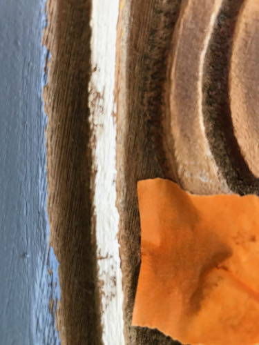
With the warm weather, swamp cooler blowing, and big doors open, the paint dried quickly. I could paint one sign, turn and do the other, go back to sign #1 for the second coat, and then turn and second coat sign #2.

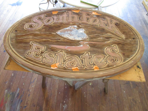
The white letters seemed like a good next step. These also soaked up the paint and required 2 coats. The rough edges bothered me at first. Then I remembered that this will be viewed from inside people’s cars, until they stop noticing at all. 
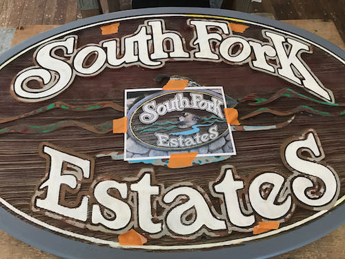
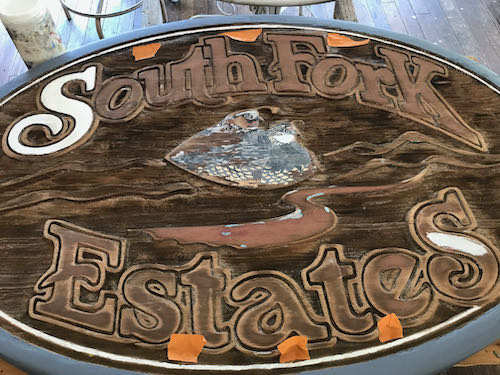
After 5 hours, I felt an unavoidable slide into Idiotland, where Sloppy, Stupid, and Careless all reside. Besides, my cheater-readers kept falling off when I leaned over the sign, and then I painted a blue streak on my face by accident.

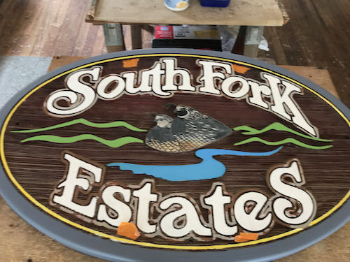
So, that’s all on this Three Rivers custom art project for today. The quail and the narrow gray line surrounding the letters will require a strong focus (and a better fitting pair of cheater-reader glasses).

Odd Job, Chapter 2

If you subscribe to the blog and read the email on your phone, the photos might not show up. (Some people get them, some do not; it isn’t a problem I know how to solve.) You can see them by going to the blog on the internet. It is called cabinart.net/blog, and the latest post is always on top.

Because I am an artist in a small town, I get asked to do a variety of things.

This keeps me growing, learning, and becoming more capable of doing more odd jobs. Still, I start out a little unsure of where to begin and unsure of my abilities to git ‘er dun well.

The outer rim of each sign is a grayish blue, or perhaps a bluish gray. It looked pretty straightforward, both in the mixing and the application. I put these 2 colors together and made the gray on the top of the lid.

You can see that I tried a few versions.

Because my gray had a purplish cast, I put in a smidgeon of yellow, which is opposite purple on the color wheel. (The ArtSpeak word for that is “complementary color”, as in “complete” because its presence completes the 3 primary colors which can be blended to make every color in the world. Not white. White is the absence of color.)

A touch more white, and then it was close enough. 

Clearly I had to be very very careful because Pippin was underfoot.

Let’s continue tomorrow, shall we?

You’re an Artist, So Could You. . .? (Odd Job)

I recently bid on an odd job, one of those that comes to me like this: “You’re an artist, so could you. . .?”

This was a request to repaint 2 large redwood signs, originally sandblasted and painted in 1990.

The neighborhood’s budget didn’t match my bid, so I suggested that they do the scraping and sanding. They did, and then brought me the signs (there are 2 and this one gets the most sun so looks the worst).

Ready to work

Trail Guy set up 2 work tables using sawhorses in our painting workshop. (He doesn’t paint, but the workshop is also his place, so I can’t say “my painting workshop”.)

I set aside the unfinished Mineral King oil paintings that have no deadline in order to get this job done quickly for this Three Rivers neighborhood.

The subdivision asked me to seal the sign for sun damage protection. I know nothing about this. Mixing colors, refreshing tired paint, that’s what I know.

When you don’t know something, ask someone who does. Preferring someone with experience over someone with an opinion, I began thinking of people who might have knowledge to share.

My first contact was an old friend in Massachusetts with a sign business who referred me to someone in Mendocino who was kind enough to email me. I also found a sign company online in Charleston, South Carolina, filled out their contact form, expected and got nothing back. I called the man who sanded the signs to see if he knew who originally made them; he gave me the name and number of someone I worked for briefly back in 1986 (and have encountered several times since because that is the nature of Tulare County). That man gave me the name of a sign company that he thought might have made the signs, but they are going out of business. Their answering machine says to text with any questions, and so far, silence.

Next, I will show you my painting progress and process while I wait to see if Mendosign replies to my specific question about a sealant.


Listening, Learning, Thinking, and Applying

This photo is apropos of nothing; I just put it here because I like it. 

Recently I had the privilege of an honest discussion about some blog posts with three wise friends. It made me realize a few things:

  1. Sometimes my posts need an editor. Blog posts are meant to be spontaneous and heartfelt, and a little bit of fun is always welcome. “Blog” comes from “web log”, which is essentially an online journal. And what is journaling if not spontaneous? But when work is public, editing is a good idea. A person can only self-edit so much, so sometimes things don’t sound as intended.
  2. These are the three posts we discussed: 1. Quick Quick can you help us? 2. Did Mineral King Need a Paint Job? and 3. Messing with Other People’s Art. I reworked them a little bit, so if you are curious, reread them, and if inclined, tell me what you think (because I love an honest discussion where I can learn).
  3. Sensitive people will find things to be upset about; blunt people will tell it like they (Ahem, “we”) see it. Neither type is right or wrong; we are simply different.
  4. Listening, learning, thinking, and applying will help prevent us from mowing over, blowing past, or dismissing one another (although that is an easier method in the short run).
  5. Not everything has to be talked about, but when someone you care about is bugged, it is good for the relationship to pay attention.

Phew. I need a cigarette.

JUST KIDDING! NEVER SMOKED, NEVER WILL.

How about a nice picture to wrap this up?

(Heh-heh-heh)

Trail Guy Hikes For Us

Who is “us”? 

You, me, anyone who reads the blog but isn’t retired or on vacation in Mineral King. While I was painting walls inside Three Rivers buildings, Trail Guy went hiking in Mineral King.

He went up toward Timber Gap, and then to Empire, but not to the top, just a loop that gives good views.

While he was there looking at the mountains, I was painting the very same peaks in the Mineral King Room at the Three Rivers Historical Museum.

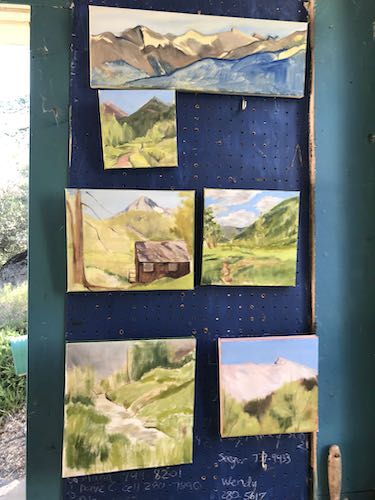
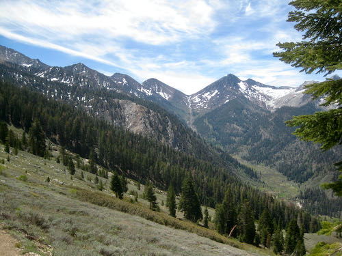
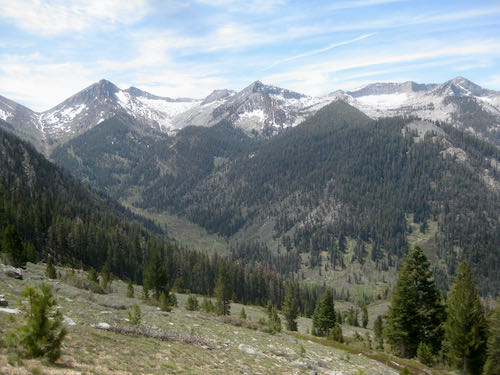
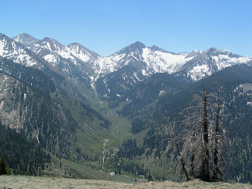
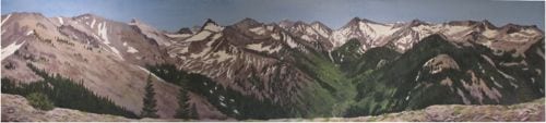
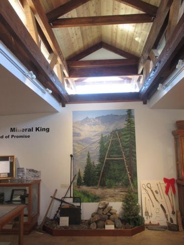
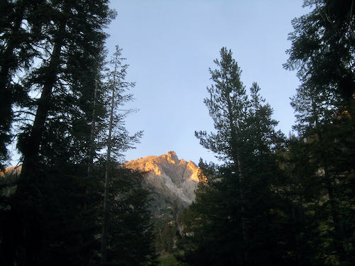
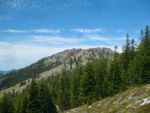
This is Ranger’s Roost, AKA Mather Point, looking through the timber of Timber Gap. When you are looking at Timber Gap, it is the bump to the left/west. The Mather Party came over Timber and saw Mineral King. I drew the cover in pencil and colored pencil for a book about it, but I haven’t read it. I just look at the pictures. (This was a second edition—the original drawing on the first edition went missing so the publisher commissioned me.)

There were a few flowers: shooting star, Western wallflower, phlox.

This is the rock outcropping on Empire that gives the false impression of being the actual peak. It is a favorite for enjoying alpenglow in the evening light.

Still More Painting in Church

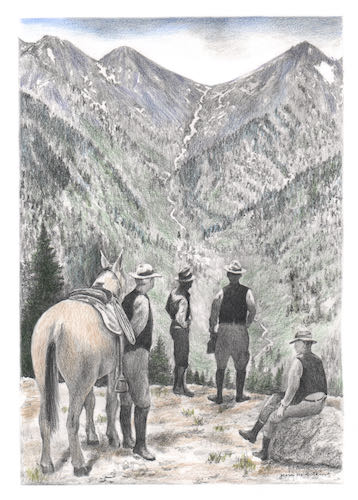
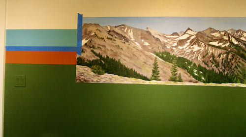
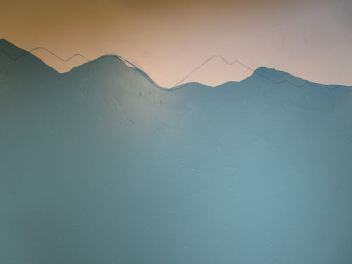
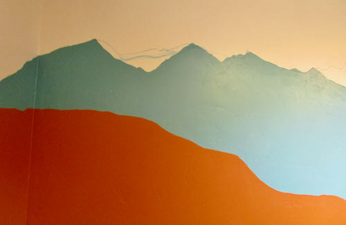
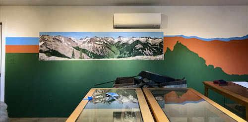
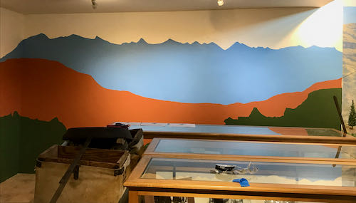
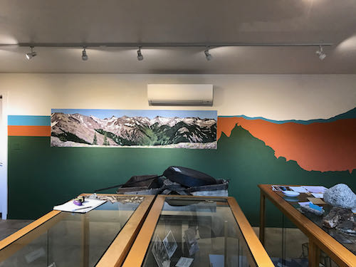
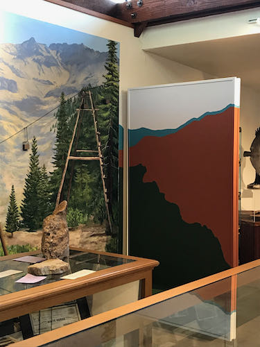
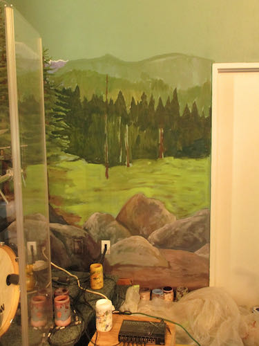
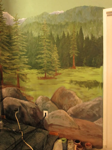
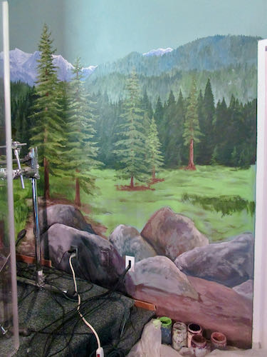
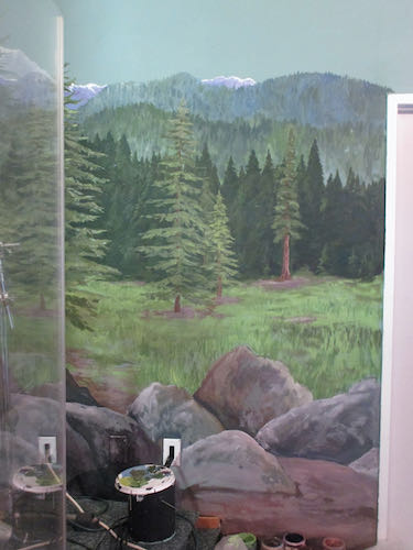
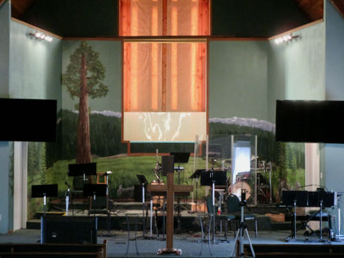
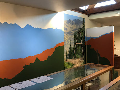
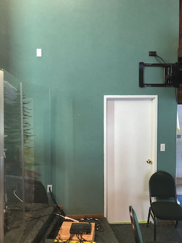
After having the audacity to mess with someone else’s art, I returned to the endless mural at my church. (It would be a real blessing if someone else messed with this one for me.) This blank right side needed to be finished. 

Weird color because the big stage spotlights are on.

I started by defining and filling in the different segments from farthest away to closer (called “planes”, which is a word you might recall from geometry.) 
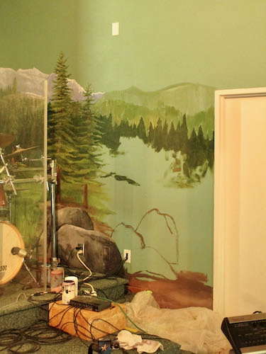
Boulders seemed like a good solution. It is better if the two “wings” aren’t symmetrical, which means that they don’t mimic one another. That wouldn’t look natural, as if it is natural to have a giant mural of a fake Sequoia meadow on the stage of a church. (I love Three Rivers, with all our original authentic uniqueness. Sometimes it seems as if we use our location as permission to be mavericks.)

I found a different setting on my camera to show the colors more true. 
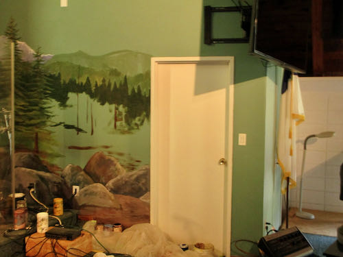
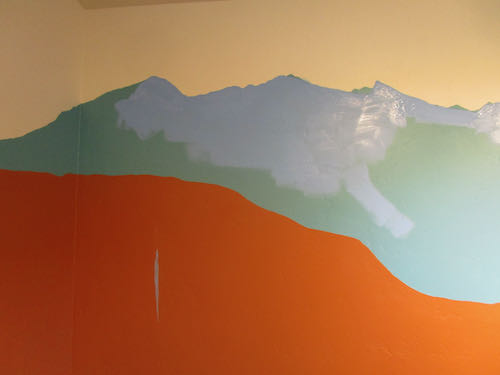
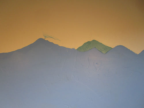
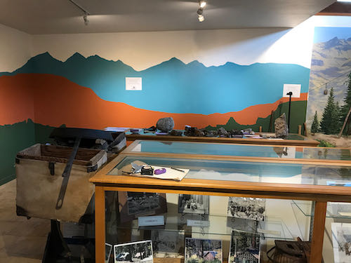
After 5 hours, I dropped off into Idiotland, where I began to get sloppy and stupid. It isn’t good to get sloppy in a place with carpet and painted areas that have no touch-up paint available.

Am I finished?

Maybe, maybe not.

It will probably take a month or two of Sundays before I decide. 

Maybe I just won’t sit where I can see this, and then I won’t pick it apart. It looks fine from this angle.

So there.

I mean “Amen”.

P.S. The drummer gave me a wonderful compliment about the mural extensions. He said they looked so right, so perfectly continued from the rest of the mural that he didn’t notice that they were there.


Messing With Other People’s Art

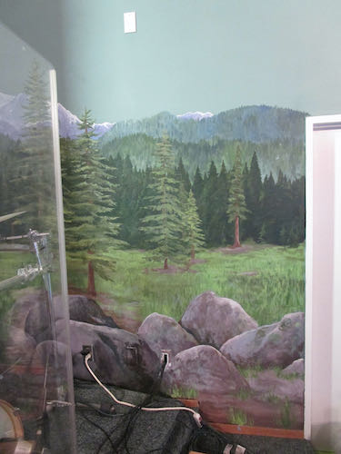
There have been several times in my career when I have been asked to change someone else’s art. I have repaired a torn canvas, changed a boulder in a painting that looked like a skull, fixed a child that looked like a little hunchback, and brightened colors in a dull painting. All these were done without knowing the original artist, and with assurance that the original artist would never know.

The Mineral King Room makeover was a different story. The original designer is highly educated, experienced and respected in The Art World. I am somewhat known in the local Art World, but I try to keep a low profile when it comes to any formal types of situation where I might be outed as a total DBO, mostly self-taught, Tulare County native. (You know how I feel about ArtSpeak. . . ugh.) 

I respect the original artist of the Mineral King Room and understand that she put a lot of thought into the design. The folks who approved the design were awed by her work, and didn’t think that there would be a strong reaction to the teal color and the stylized mountains, which were all effective from a designer’s point of view.

The approvers were mistaken about the reaction, which was strongly against the color and the mountain shapes. This necessitated a call to your Central California artist, who also is the local Mineral King artist.

The designer wasn’t pleased when she learned that I would be giving her design a makeover. (What artist would be??) I don’t blame her, because she chose all the shapes and colors based on her design expertise, to provide the best interpretive background for historic displays. She was professional and polite, while sounding as if she was defending a dissertation, not in a defensive way, but protective and offering the rationale for her design decisions.

My approach, on the other hand, also based on training and experience, is to simply please the customer. (My very wise dad taught me the all important business principle of “You kiss their fanny and take their money”.) We have to think about who the visitors and supporters of the Mineral King Preservation Society are, and what they will understand. The answer to that is that they love Mineral King, not a stylized version of it. (“Nosirree, I’ve climbed Sawtooth, and that ain’t it!”)

This is how the mountains surrounding the Mineral King valley really look.

So, with respect to the designer, who is very good at what she does, I just dove in and “corrected” her work. I don’t mean that it wasn’t good; it just wasn’t right for the audience.

Did Mineral King Need a Paint Job?

Did Mineral King need a paint job?

No, but the Mineral King Room at the Three Rivers Historical Museum did. The blue didn’t match the murals in the room, and the mountaintops weren’t recognizable. (You can see the murals here.)

First, I was determined to mix the right shade of blue using whatever paints I had on hand. Lightfastness isn’t a problem on indoor murals, so I was able to use a can of indoor white paint that came from who knows where, along with my 2 mural paint blues. Mural paints are highly pigmented and that makes them very useful for making my own interior colors.

Second, we taped all the parts that needed protection. (This was not the royal we—I had great help from MKPS Sandi).

Next, I traced the tops of the mountains on the mural showing the peaks surrounding the MIneral King valley. This provided a guide to redraw the peaks to match reality. (This was based on the assumption that I painted the mountains accurately in the mural.)

I drew the mountains on with chalk. (It wasn’t a Mineral King blue either but it matched my painter’s tape.)

Then, I started painting and almost immediately, dripped onto the rust color.

Good thing there is touch-up paint for all the colors involved. 

Here is an example of something weird that I have learned about acrylic paints, as opposed to oil paints: they are LIGHTER when they are wet. Doesn’t make sense, but it is true.

That teal color was great with the rust, but just not right for the subject matter. I told the Mineral King Preservation Society that if they are just going to waste the paint, I’ll be happy to take it off their hands. I’m sure I can find a use for it. (Weird how the rust looks like red here, and the white looks like light tan).

Now look at the room so you can see the corrected peaks and the color that matches the murals. (I’ll show a before and after on the 2nd shot for you.)

Before:

After:

The mountains in the Before photo are more dramatic and more proportionally pleasing. However, the mountains in the After photo are realistic rather than stylized, match the murals and give more display space for whatever will be going on the wall.

Tomorrow I will tell you a few thoughts about this job.

Quick Quick, Can You Help Us?

The Mineral King Preservation Society has 2/3 of a room at the Three Rivers Historical Museum. We call it The Mineral King Room, in spite of sharing it with another exhibit. 

A few years ago I painted some murals in that room.

Recently, the room started getting a facelift, or perhaps “makeover” is a better word. I was at the museum for something, went in the Mineral King Room, and saw the beginnings. My first thought was that it was colorful and spiffy looking; my second thought was that the blue didn’t match the sky in the murals, and my third thought was that the supposed Mineral King peaks did not look like Mineral King.

Several weeks later, another Mineral King person stopped by and said, “That color of blue is doesn’t look like a Mineral King color, and I don’t recognize those peaks.”

Thus, I got a phone call, asking if I could change the color of blue and fix the line of mountains.

Aren’t you just dying to see what I am talking about?

An incidental thought about that blue: it is a great color, kind of a turquoise or teal, something I have quite a bit of in my wardrobe. It just doesn’t happen to match a sky in Mineral King. It might look better with the rust than the sky blue, but reality has to take precedence.

Mineral King Is Now Open

Memorial Day weekend is the traditional cabin opening weekend. It is when Sequoia National Park unlocks the gate, and people begin backpacking and camping. Some years it feels like summer; some years it does not. This year was snow-free, but it did not feel like summer.

The classic view

This section was stripped of willows and other shrubs in the fire prevention efforts last fall. (I spent a ridiculous amount of time going through my photos to find one of how it looked before it got pruned to no avail.)

Monarch Falls and Creek are flowing well.

This is “Iron Falls” along the Nature Trail.

This is Iron Falls as recently painted.

The dandelions were prolific, bright, and charming (because they are not in my lawn).

This is the view of the stream that I painted 7 times over the winter in the Sawtooth oil paintings, and I took this photo in hopes that it will assist me as I paint #8.

This is painting #6 of Sawtooth Near Sunnypoint.

As now seems to be the norm, there were dogs coming both up and down the Nature Trail with impunity. No one reads the signs, and no one cares. (There is a dog in this photo, although it is sort of a “where’s Waldo” type of view.)

We had a super clear day to walk up to Crystal Creek and the wind was quite icy.

This is the section that I think of as the Yellow Tunnel in the fall. The cottonwoods were just beginning to leaf out.

Crystal Creek was doing its normal spread into about 4 shallow branches.

Thus we conclude my first visit to Mineral King for 2022. May there be many more!