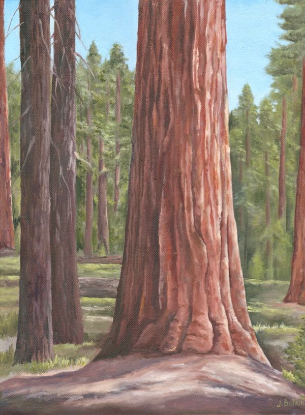
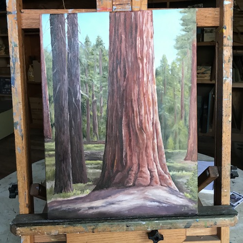
After adding the birch branches to the Hard House oil painting commission, I happened to look at an oil painting of a Sequoia in my studio. For some reason, I haven’t really liked this painting very well.

Since it hasn’t sold, maybe no one else likes it either. After working on the sequoia mural and the giant snowy sequoia oil painting, I had an idea of how to improve it.
It always feels weird to put a completed painting back on the easel. It is a blend of feeling good about knowing I can improve it, and feeling a little embarrassed that I didn’t figure it out sooner.
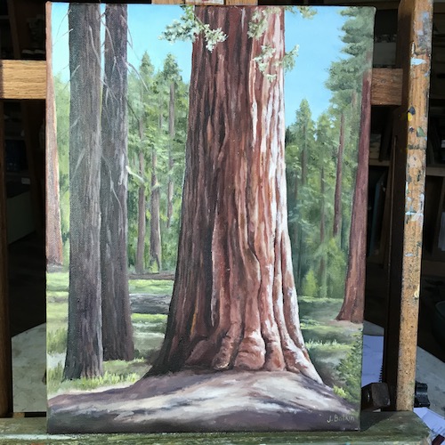
Okay, now look:
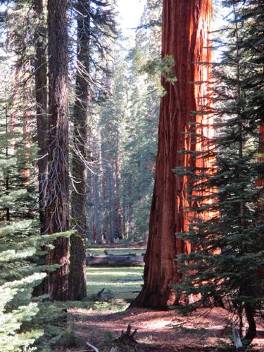
Maybe I can do better. It took awhile to recognize the photo I used for this painting because I have definitely used it as reference only rather than an exact recipe.

Maybe I’ll keep messing with it. The contrast could be heightened on the main tree, and maybe a foggy looking distant sequoia would look believable behind it to the left, as in the photo. All the distant trees could be made grayer or lighter or something that shoves them farther back.
Who am I to think I can improve on nature? The answer is this: I am someone who understands that real life is messy and artists get to clean it up. For example, look at the large amount of dead branches on the 2 trees to the left of the main tree in the photo. What purpose would they serve in this painting? Likewise with the young tree in front on the right side – it obstructs the view of the big tree.
So many decisions for just one painting – it is a wonder I can even decide what to wear in the morning. Aha! That explains why I often don whatever I left on The Chair the night before.
4 Comments
Yes, add some of the green branches from the tree on the right. As it is, the sequoia looks too lonely, not enough interest. The tree on the right adds depth and more color and texture.
Thank you, Nikki. It is an ongoing puzzle. Sometimes it feels as if a painting just starts out weak and changing it is like trying to change the direction of a cruise ship.
The first thing I noticed that looks “odd” to me is at the bottom of the tree. There’s this gray mass that looks like the tree is growing out of a slab of granite. On the original photo, it’s actually brown “droppings” and slash. Maybe tweaking that part since it’s so foregroundy front-and-center might help? The rest of the painting looks lovely to me.
Thank you, Sharon. Someone else suggested the same thing. I am not seeing it that way but will study the photo a little more. This painting might just need to head to the dumpster and stop wasting everyone’s time.
Comments are closed for this article!