Final Weekend of the 2024 Mineral King Season

Business first

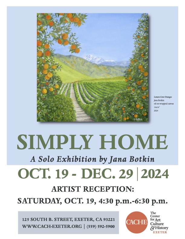
First, an ad. I hope to see you all (my tens of readers) on Saturday!

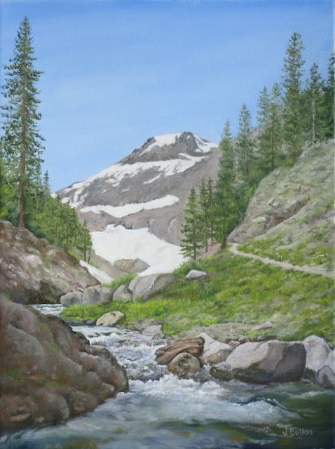
Mineral King

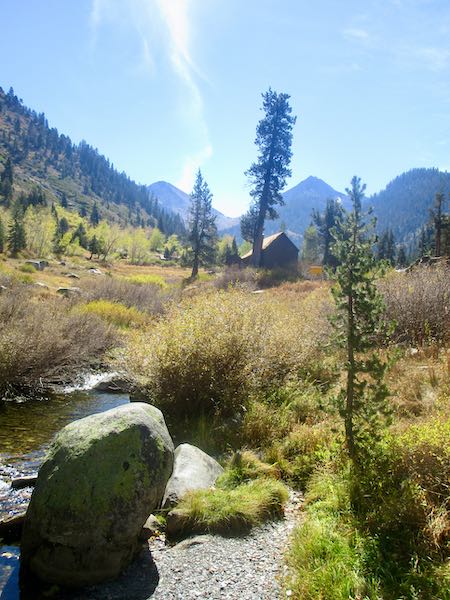
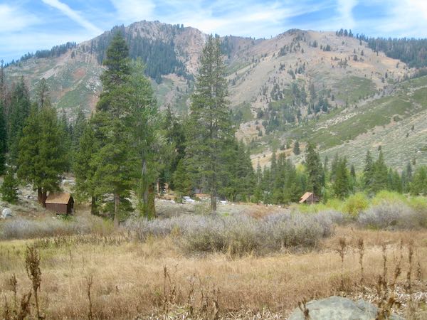
Many people enjoy Mineral King in summer; fewer make it there in the fall, and a very few make it up in the winter (for many good reasons, beginning with the locked gates). I think of it as a summer place, and with this year’s extended heat, the season seemed lengthy. The added time was a gift, because we thought it was toast with that stupid Coffeepot fire.

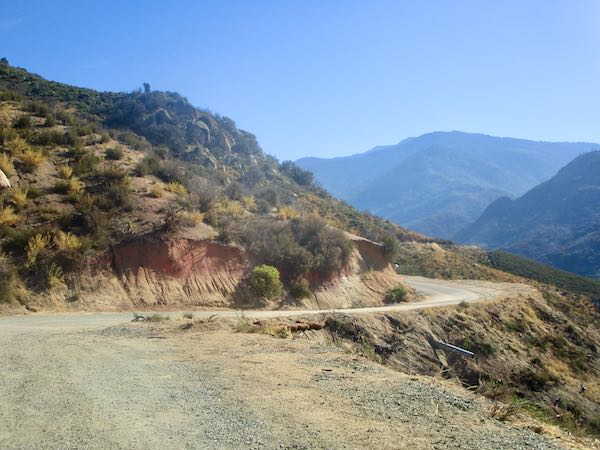
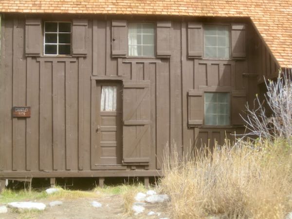
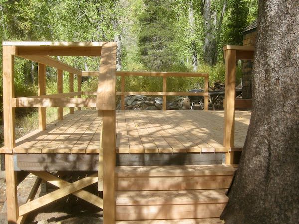
Lots of photos for you to enjoy today. . .

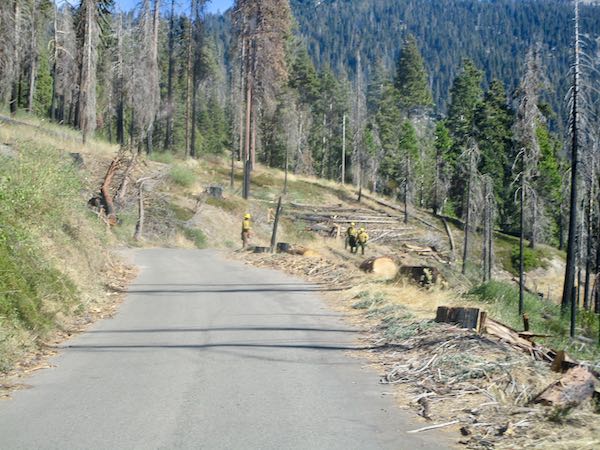
Pink stuff from the fire, severe pruning, and a few smokes.
Crews are still working, and there are many many dropped trees.
We got mail! (Thank you T & L P)
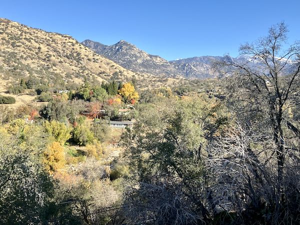
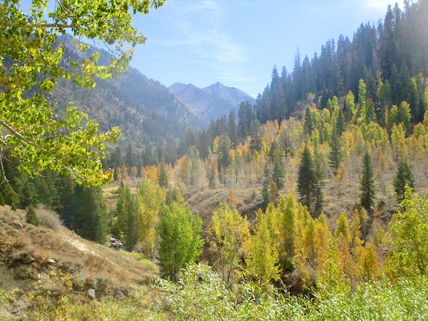
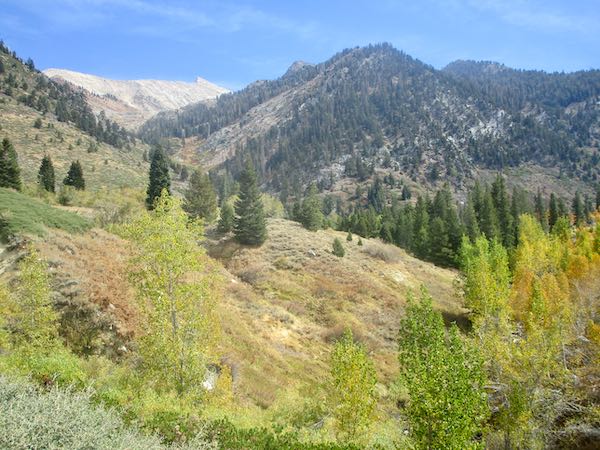
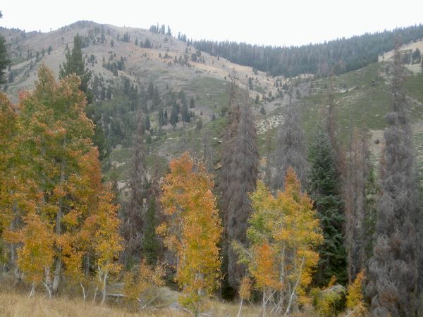
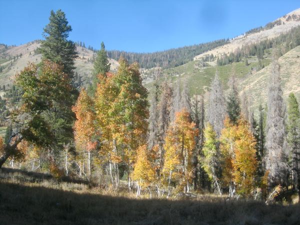
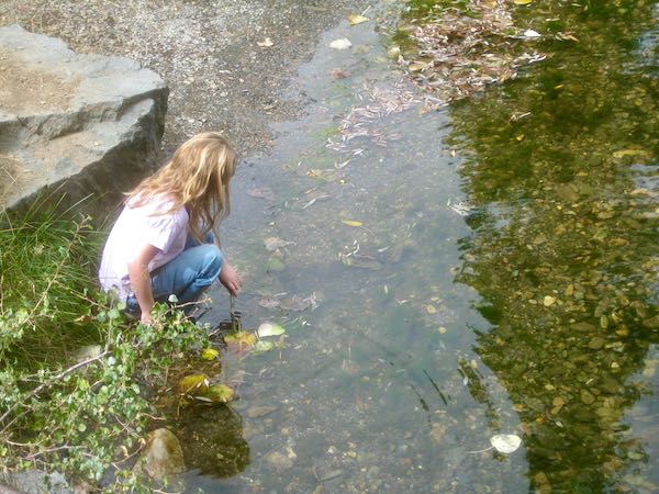
The water is low; the colors are fading.

I went out with my dying camera battery to capture a few photos in the sunshine.

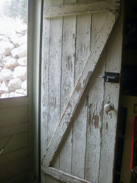
It was good to see that work has gotten done on several cabins in spite of the rude interruption of the stupid Coffeepot fire.

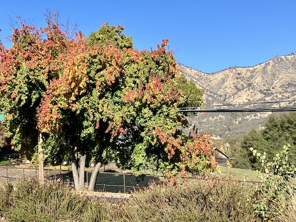
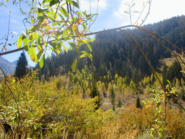
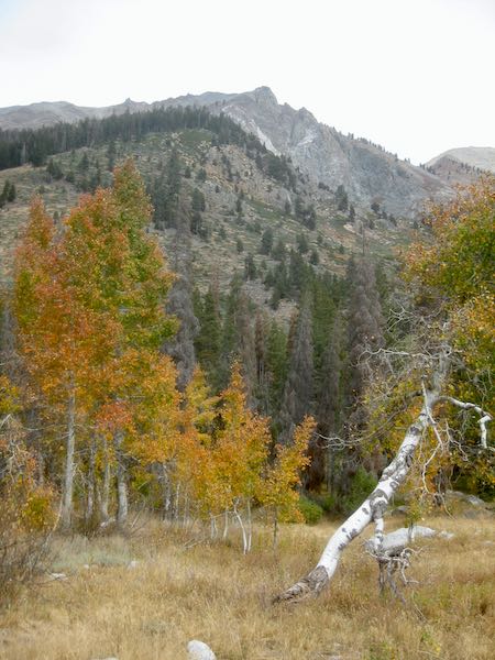
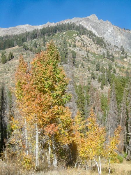
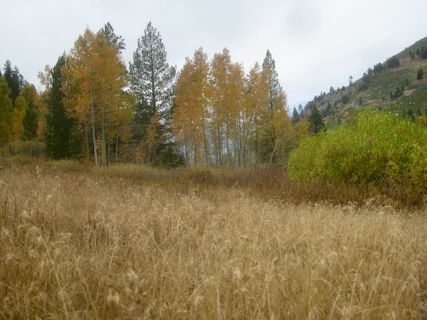
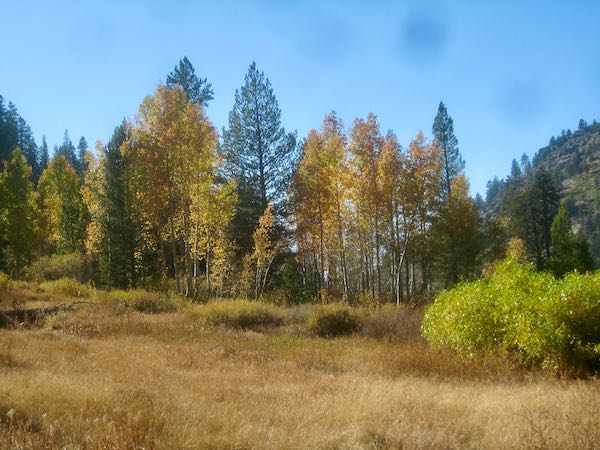
The next day began overcast. We went for a walk past Crystal Creek to see if we could discover any fall color. Nothing to see. Hiking Buddy and I went out a bit later, thinking it might be our only chance. However, the sun came out later, so we went back out. Look at the difference the sun makes! (And please excuses the dark spots from Trail Guy’s camera, which I borrowed due to forgetfulness on my part to bring the backup battery.)

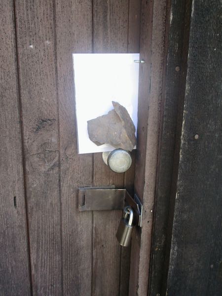
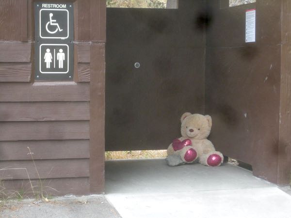
While hanging out with my little friend, I showed her something peculiar.

That was there all weekend and no one knows why. So, we added a pair of found sunglasses. We are easily amused at our cabins, always finding something fun to do.

There is such a nostalgic feeling to the season’s final stay at our cabins. Although we see our neighbors throughout the year because we are real life friends, closing is a bit melancholy.

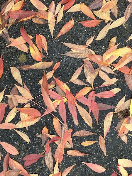
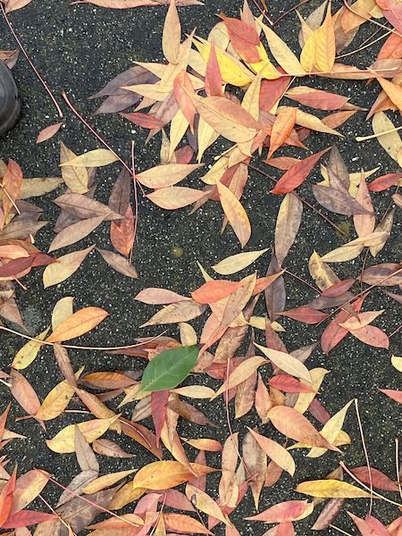
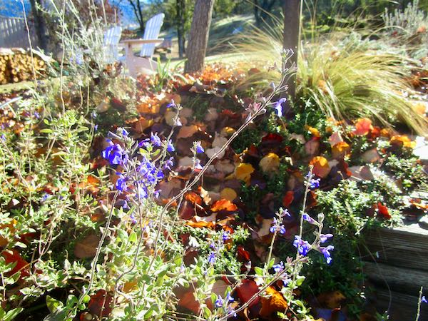
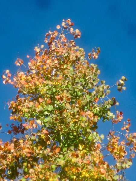
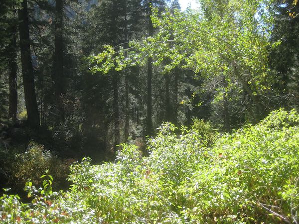
While we made one final stop at the community dumpster (managed by Trail Guy, the all-purpose mayor), I took the borrowed camera for one final look at some fall color. Turned out to be more fall light than actual autumn-type colors.

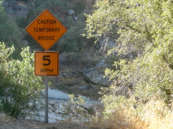
And finally, it is a huge relief that the temporary bridge allowed us to come and go all season.

I never did figure out the necessity of this sign. The word “temporary” made me want to drive much faster than 5 mph.

And Another Still Life

Fridays are usually for Mineral King. We haven’t been able to get there due to the road closure. There are limited times that people can pass through, but it isn’t helpful to only be able to go up at the end of the day and be required to head down early in the morning. (Maybe that will change soon. . . ever hopeful here.) For fire information, you can go here: watch duty or here: inciweb. I can’t seem to find the maps on watchduty using an old iPad, but maybe you can. The Coffeepot fire is called “CAKNP” on inciweb.

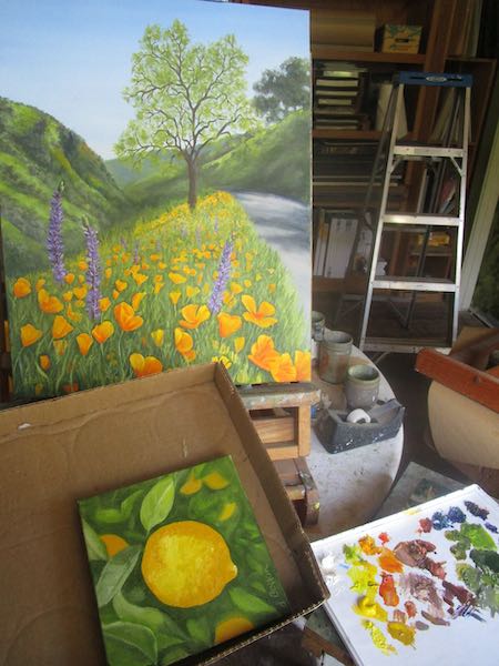
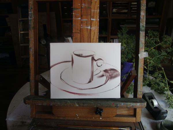
Are you curious as to what subject I chose for my third still life? I guess you must be if you are reading this.

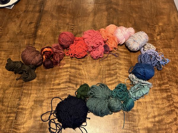
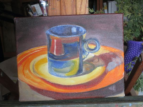
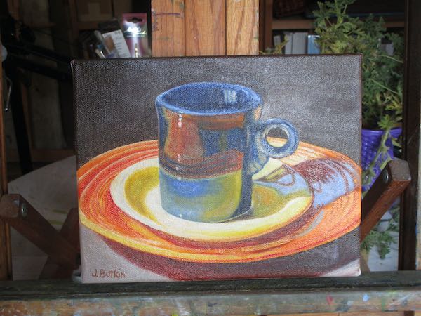
COLOR won!!

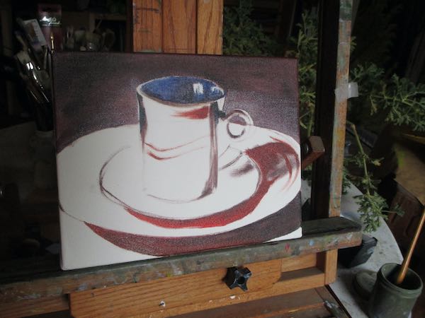
I know, this doesn’t look like color. Just you wait. . .

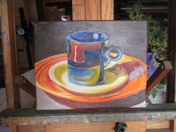
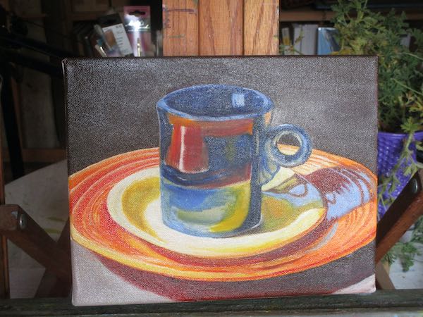
This is probably too small to see the progression. It was fiddly, exacting, and really fun to mix a bunch of colors that were not landscape greens, browns, and grays.

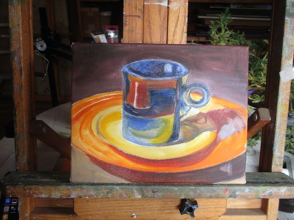
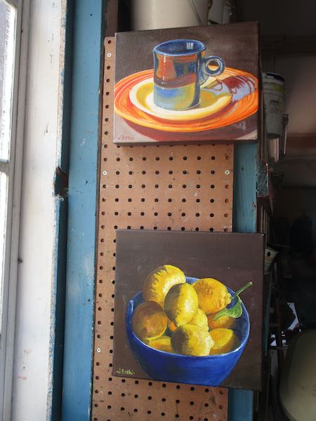
These are my two final pieces for the upcoming show. “Simply Home” will open on Saturday, October 19 and run through December 29, at CACHE, 125 So. B Street, Exeter, CA 93221.

P.S. Want to know the titles? Blue Bowl, Yellow Lemons, and Cabin Dishes. (I bet you can figure out which title goes with which painting.)

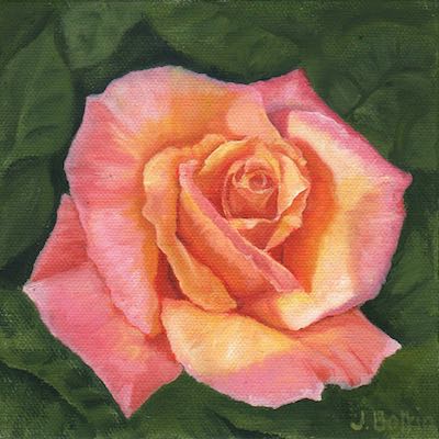
Six Reasons I Loved Painting This Rose

The rose painting went to Kaweah Arts for the final hurrah before they close (reopening in March). This meant that I didn’t give it a clever name, just slapped it with “Rose”.

I loved painting this because:

  1. There were specific things to paint rather than vague landscape textures.
  2. It didn’t matter if I matched the color or the shapes precisely.
  3. It was small enough to finish quickly.
  4. The colors were different than in a landscape, my normal subject.
  5. It restored a bit of confidence in my ability to paint when I had so many incomplete pieces without answers as to how to make them look right.
  6. It is just pretty, really truly pretty.

Victory Tomatoes

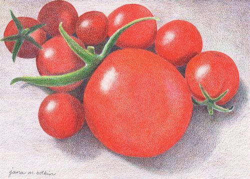
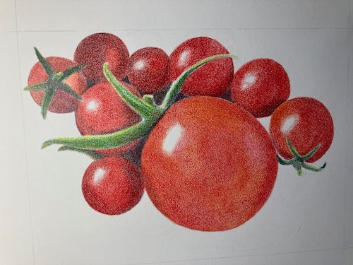
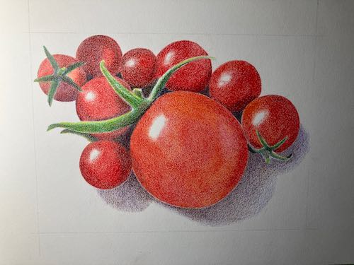
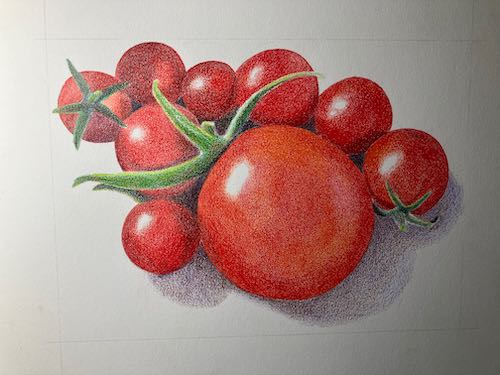
My drawing of tomatoes is completed. Carrie Lewis asked for a paragraph of 100 words or less to accompany the drawing. Here is what I submitted.

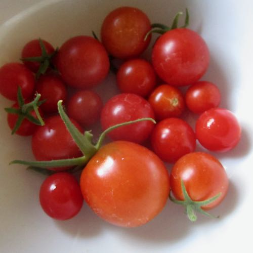
Gardening feels like a war. We planted many tomatoes in an enclosed area, protected underneath from gophers, on all sides from deer, and over the top from birds*. We faithfully watered and fertilized all summer. Finally, in mid-October, we began getting tiny cherry tomatoes, many no more than 1/2” in diameter. Every tomato felt like a victory, so I took photos of them as proof that we had actually grown some food.

This was not for a competition. It is just a submission to Carrie’s magazine (digital rather than print) called CP Magic, which is all about colored pencil. Colored pencil is not my main medium, as you know, but Carrie is a friend, and I wanted to participate simply because sometimes it is fun to try different things.

*After I wrote this, I realized that we had left the tomatoes exposed to the birds. I meant to put mesh on top but just never got to it.

Happy Birthday, Trail Guy! (all those years are also a victory)

Suddenly Felt Like Drawing

If you receive this in your email and want to see the photos, click on the title.

My friend Carrie Lewis is fully immersed in colored pencil. At the end of December, she put out a call to artists for their best colored pencil work from 2023. I realized that I had done none all year, but suddenly, I had an overwhelming desire to work in colored pencil. It might have been related to working on multiple paintings that felt too hard for me, wanting to do something easier.

After looking through my photos for something that I could easily complete in the one week remaining in 2023, I chose this photo of our little tomatoes. (Small garden, small crop, even smaller fruit).

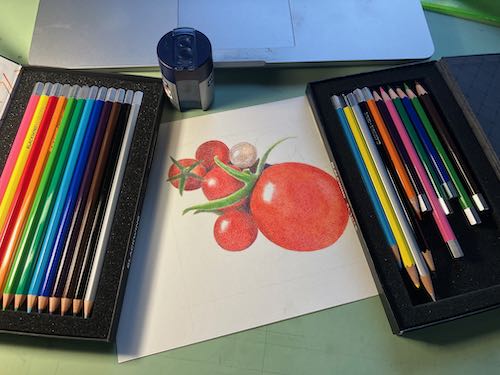
I chose Strathmore 500 series Bristol vellum paper. (Won’t mean a thing to most of my readers, but it helps me remember in case Carrie wants to know). In looking at my extensive collection of colored pencils, I decided to keep things simple, so I chose Blackwing Colors, a set of 12. Yeppers, only 12 colors. (For a short time, they offered a set of 24, but as a never-early-adopter of anything, I missed it.)

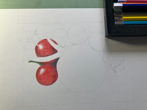
First I drew the tomatoes. In keeping with the desire for simplicity, I didn’t draw all of the tomatoes in the photo, so it was ready for color very quickly.

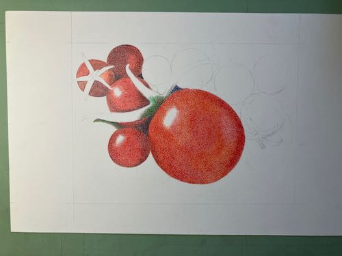
To make the darker and shaded reds, I used purple and brown beneath the red. To brighten the red in some places, I used orange and pink beneath the red. I used many layers of red in both instances, keeping a very sharp point (on all the pencils).

It didn’t take long to for the red pencil to get used up. Of course, if the last 3 inches hadn’t been broken inside, I could have kept using it. I don’t remember dropping it, but I could have. New pencils are always a bit of a thrill. (Don’t tell me to get a life—this is my life and it’s a fine one!)

Better add the shadows so the ‘maters aren’t just floating. I used purple and brown, but I may try that silver pencil (or is it gray?) over the top to smooth it out. Later.

That was decent start. The daylight was running out and my feet were cold, but I did one more little thing before calling it a day: I smoothed and sharpened all the edges of the tomatoes.

What’s left: finish the background, correct the color on the stems, fill in tomato color more to get rid of the white specks, sign, and scan.
Painting Fruit Instead of the Golden Gate Bridge

I had a few unexpected hours available to paint and decided to not waste that time doing something useless like weeding or vacuuming or painting the Golden Gate Bridge (just your basic endless repetitive chore).

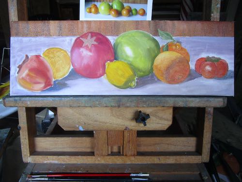
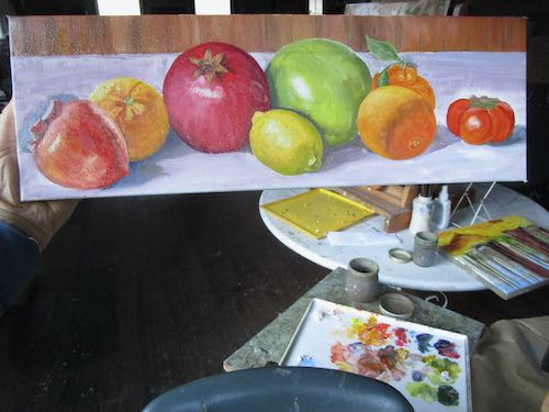
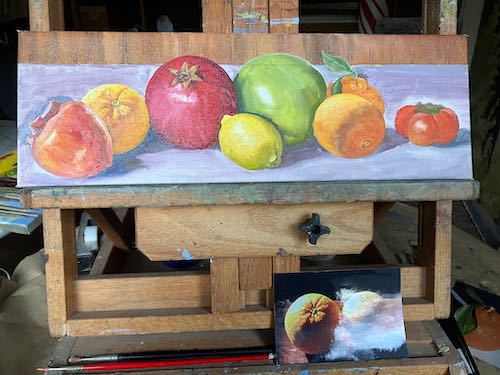
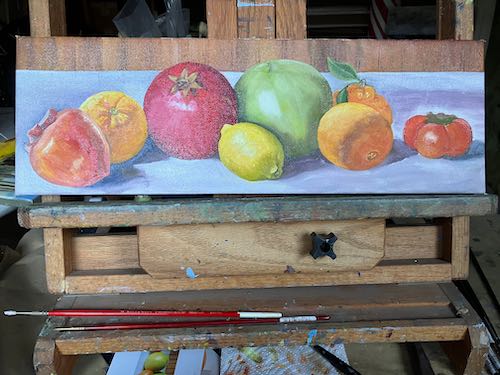
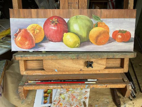
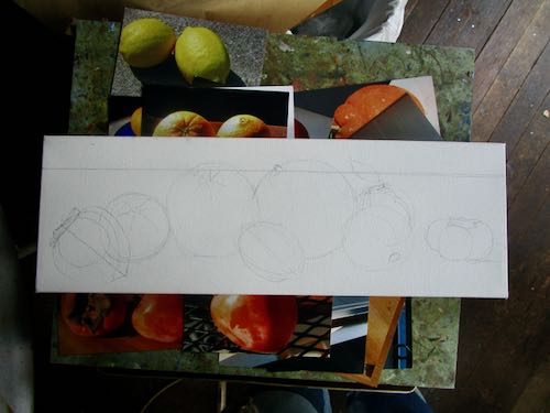
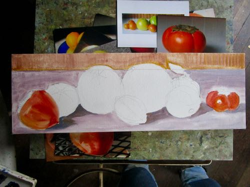
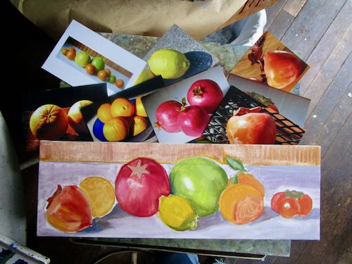
I worked on the commissioned oil painting, 6×18″ for my friend/customer to fit between 2 other fruit paintings in her kitchen. She saw the painting Citrus Row and requested the addition of pomegranates and persimmons but gave me the freedom to arrange and fill with whatever else I chose. Instead of adding those P fruits, I started a new painting.
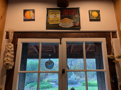
She sent me this photo to show me where she wanted to put the painting.
Back wall first
The fruit on the far right is a fuyu persimmon, not a tomato. I don’t know why I started on the right side instead of the left, which is normal when I draw so that my hand doesn’t drag over the completed area.
This picture looks worse than the previous one because the paint was quite wet and the late afternoon light made it very reflective.
Incomplete: the table, stem on the pomelo, and the cap on the fuyu. and the edges and signature.

It is quite a thrill to be able to mix and use all these bright colors. Of course, having painted this at the end of the day’s light, it could look rather wrong when I see it in normal daylight.

Yeppers, the table needs work. The leaf on the tangerine is blending into the table. The shadowed part on the orange on the right isn’t right. The fuyu persimmon might need some color correction. The shade from the lemon on the pomelo looks like an outline. On and on and on it goes.

It’s a wonder that any paintings ever get finished.

Feeling Fruity Around Here

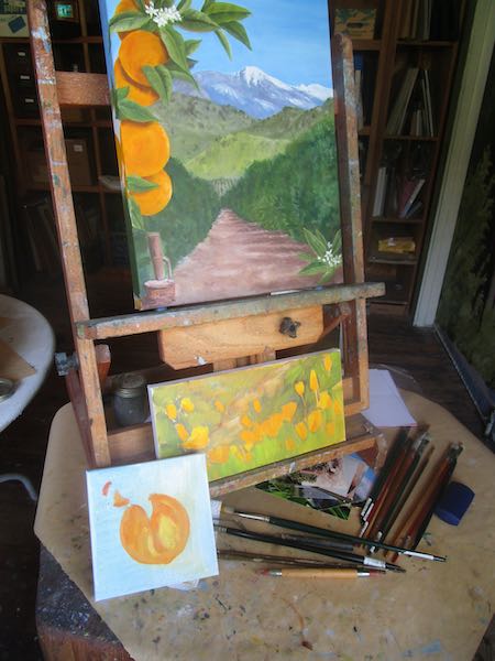
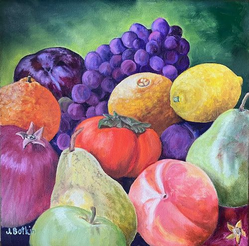
Feeling fruity around here lately. A month or 2 ago, I painted this to decorate a banquet for a citrus marketing outfit.

A friend who has bought more of my paintings than anyone else saw this. She said, “If it doesn’t sell at the event, I want it!”

I took the painting to her, and she said, “I’ve been thinking. . . could you change one of these to a pomegranate? And include both kinds of persimmons?”

I said, “Sure, I can do that!”

Then I brought it home, thought it over, and decided to do a new piece for her. I dug through my fruit photos, looking carefully at the lighting and angles. Then, unlike my normal approach, I drew it out.

This is going to be good—colorful and well planned.

The other fruit painting I recently painted as a gift, I did without any real planning. I just pantsed it, trying this and that with paint, having fun with color.

I like it, and so does the recipient. Yeah, yeah, it probably would have been better to plan it. Sometimes I just rebel.

P.S. Good thing I painted a new one because the original, Citrus Row, sold at CACHE’s Holiday Fair!

Perfect Fall Day in Three Rivers

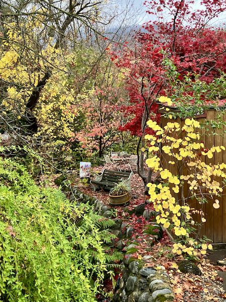
Thanksgiving was a perfect fall day in Three Rivers. We went for a walk to take in the clear air and last hurrah of autumn colors.

My flowering pear tree was a champion this year.

Finally, a reminder for you (and for me, since I don’t get to keep endlessly lollygagging around). Besides, you might like going to Exeter tonight, to their annual city-wide party! I won’t be there but other artists will be at CACHE and all the stores in town will be open and there will be eats and treats. I am a stay-at-home-after-dark-wet-blanket kind of non-party person. But I wasn’t always, and this is a very fun event.

P.S. The commenting part of the blog has been misbehaving but comments are coming through anyway. So to those of you who soldiered through, thank you!

Finishing a Plein Air Drawing

If you receive these posts in email and the pictures in the post don’t show for you, tap here janabotkin.net. It will take you to the blog on the internet.

Plein air means “on location”. Last summer I sat by the stream in Mineral King with a set of 12 colored pencils to see if I could complete a drawing on location.

Not a chance. 

My friend Carrie Lewis posted the project on her blog, and recently someone asked if I would complete the drawing.

Since nothing is pressing right now, I decided to finish the drawing in the studio, but this time using the entire set of 120 colored pencils (Polychromos by Faber Castell)

I’ll just show you the photo, then all seven progressive scans, minus any jibber jabber. (But you can ask me questions in the comments, if you want to know anything specific about the process.)

I am finished and the drawing is done. (Did you know that people aren’t supposed to be “done”?)

This is Vandever, the right half of Farewell Gap in Mineral King, as seen by the Honeymoon Cabin from the gnarly juniper.

Make me an offer! The highest bidder (if not too insulting) before March 31 will be considered. The unframed drawing is approximately 6×8″.


New Cards

If you subscribe to my newsletter, you learned that I have some new cards for sale, and this post will be a refresher for you.

What do you do when it rains day after day?

Besides being a looky-loo at all the flowing water around Three Rivers, apparently I sit around designing and ordering new cards. Then I fold and package them, in three different assortments.

Bigger than my normal little notecards, these glossy cards are 4-3/4 x 7-1/2″, a package of 4 cards with envelopes for $20.

Three assortments:

  1. Tulare County: Citrus Cove, Citrus & the Sierra, Farewell Gap at Dusk, Honeymoon Cabin (1 each of 4 pictures, with envelopes)
  2. Citrus Groves: Citrus Cove, Citrus & the Sierra (2 each of 2 pictures, with envelopes)
  3. Mineral King: Farewell Gap at Dusk, Honeymoon cabin (2 each of 2 pictures, with envelopes)

If you order, I will pay the postage.

BUT WAIT! THERE’S MORE!

I also put together packages that have four cards with envelopes, all the same design. This is NOT on the website, so if you have a particular favorite and would like a package of just that design, let me know via email or phone or old fashioned mail or catch me somewhere in Three Rivers. Same price.