A Conversation About Color

A friend is learning about art, practicing diligently at watercolor, taking workshops and painting with a group in her town. She also reads about art, and has been kind enough to spend time with me, discussing various art related topics.

She told me about a book called “Breakfast at Sotheby’s: An A-Z of the Art World” by Philip Hook. Not only did she read it, she took notes. AND, she shared them with me!

Two main points interested me in our conversation about color.

1. In Breakfast at Sotheby’s, her notes say this: “Red and blue are the most important colors in modernist art.” (I’ll have to look up the definition of “modernist”. . . always something to be learned around here. . .)

2. One of her instructors believes that all paintings should have some cerulean blue. This is a lighter blue, leaning toward turquoise that I use when I mix colors. (I only use the primaries plus white to make all my colors with a few exceptions.)

While my friend and I sat together in my studio discussing color, we looked around together at the paintings hanging on my walls. We discovered 2 that had neither blue nor red. So, in a spirit of experimentation and adventure, I added some.

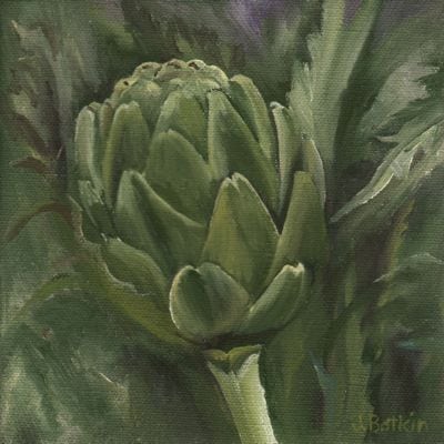
Artichoke before: arti 1309

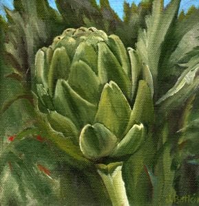
Artichoke after: 1309 Artichoke

Now that is an unfair comparison. The scans turned out differently, although the size is supposed to be the same it is not, and I guess you’ll just have to see the painting in person. I promise that I didn’t mess with the greens. I did mess with the color and exposure on the computer, trying to get the 2 to match, but something just isn’t working.

Never mind. Have a nice day. Thanks for stopping by and making it to the end of this post. Perhaps I should just get to the easels and finish the Kaweah Post Office.


Long Way There

(Happy Birthday, Melissa!)

Anyone remember the Little River Band? Does the song “Long Way There” do anything for you? I loved it in 1978, and I still do.

Many people think of “Long and Winding Road” when it comes to driving to Mineral King. That is probably a more accurate theme song, but I used up that title on a pencil drawing many years ago.

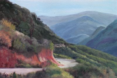
So “Long Way There” is the title of this series of paintings. The first time I painted the Mineral King Road, it looked like this:

1317mkrd

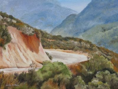
I liked it a lot. A friend liked it too and commissioned me to repaint it in a much larger size than I was used to. It just flew out of my paintbrushes, and it may have been the first time I really felt as if I was painting, instead of struggling with paint.

MINOLTA DIGITAL CAMERA

When helping her move a few weeks ago, it surprised me to see that I still like the painting. That doesn’t always happen.

Because I was feeling so confident about this scene, I painted it again, just to have in inventory.

LWT #3

It didn’t sell. It didn’t sell. It didn’t sell.

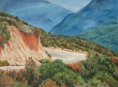
So, I studied it carefully to see if I could figure out how to make it better. The usual things – brighter colors, more detail, higher contrast, cleaner edges – all seemed necessary.

IMG_1414

Long Way There, 12×16″, oil on wrapped canvas, $250

I love the blue with the orange. (Yeppers, I’m a color junkie.)

Wildflower Oil Paintings

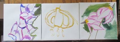
Remember these wildflower oil painting beginnings? First, I drew them with my paintbrush.

wildflower oil paintings

Stage two was to get the first layer of color down.

wildflower oil paintings

The real fun was putting in the detail.

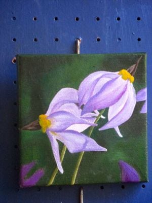
Jeffrey Shooting Star

It isn’t often that I get to paint with these colors, and it just makes my heart sing.

Lalalalalalala! LALALALALA!

Excuse me. Got a little carried away with that purplish-pink.

IMG_1409

Now I just know you are singing too!

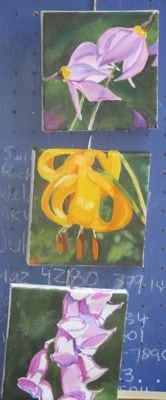
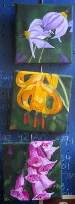
Top to bottom: Jeffrey Shooting Star, Leopard Lily, Foxglove. Yes, I know foxgloves are not native flowers around here, but they certainly go wild!

These are commissioned oil paintings of wildflowers. When they are dry, I’ll sign them, then scan them, then probably wrap and deliver. (It’s a wrap – another wildflower song in the can!)

Oil Paintings at Home

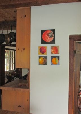
Oil paintings at someone else’s home. Someone else who really likes my work. Someone whom I really like. But, this is the World Wide Web, so her identity will not be revealed.

IMG_0967 IMG_0968

She has others that are not yet hung, only propped against the wall the last time I was over. As she and I discussed the paintings she was considering, I suddenly had a flash of insight. “AHA! You are a color junkie, just like me!”

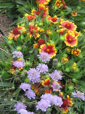
When one color junkie identifies another, there is no need to explain. We just get each other. Look at the flowers in her front garden!

IMG_0969

When she wants a painting, it doesn’t feel like the business of selling; it is simply helping a friend with good taste, an interest in beauty and some disposable income (“disposable”? Who decided that word should go with the word “income”??). I love to help people choose the right picture, whether it is one I have already painted or drawn or one they ask me to create for them (the fancy word is “commission”.)

Sold Sunflowers

Remember I talked about painting things just because I love them? That is a different category than painting something because it sells.

Sometimes, the things I paint for myself sell quickly. This is a mixed blessing – WAIT! I wanted that one! Oh. That’s right. I paint to sell things. It beats getting a job.

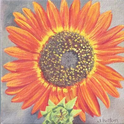
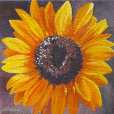
A friend/customer stopped by one afternoon and fell in love with the sunflowers.

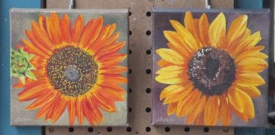
This is how they looked at the time of her visit:

sunflower oil paintings

Together we evaluated them. We agreed that the yellow one is brilliant, and that the orange one doesn’t quite have the pizzazz.

It didn’t matter to my friend because she wants to buy them both. I told her I’d study up on the orange one – probably just needs more color and contrast, the usual things. (Other common things that are lacking are sharp and fuzzy edges or needing more detail – it isn’t all color and contrast).

Her husband called me to say he wants to buy them for her for their anniversary. I delivered the yellow one wrapped, and when the orange one is dry, it will join its brother.

IMG_0957

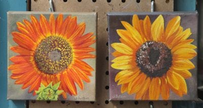
First, let’s get that hanger problem fixed. The mini green sunflower belongs at the bottom edge of the painting, not on the side. Since I paint these 6×6″ oils while holding them in my hand and rotating them around and around, sometimes they get sideways. I reattached the hanger, painted out and repainted my signature.

Done yet? After a few more layers of a brighter yellow, I think I will stop now.


IMG_0962

Okay, now I think this one is worthy of joining the yellow sunflower!

IMG_0949_2


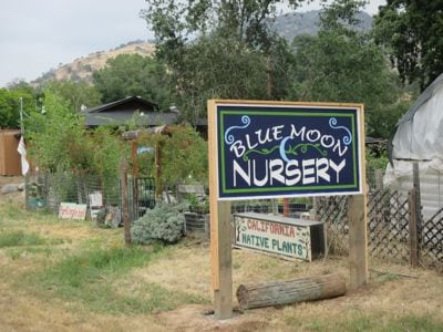
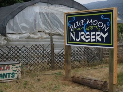
Blue Moon Sign in Situ

(Happy Birthday, Ann!)

“In situ” means in position. Isn’t it fun to learn new expressions?

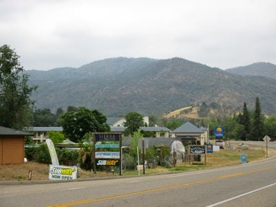
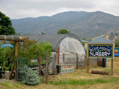
The question that nagged me during the entire process of designing and painting the Blue Moon Nursery sign was this: Would it be able to complete with all the signage along that stretch of the highway in Three Rivers?

See? A whole messa signs! But, I can spot ours. . . can you?

IMG_0970

blue moon nursery

Here is the light blue with the darker green.

IMG_0978

This is the darker blue with the light green.


IMG_0979

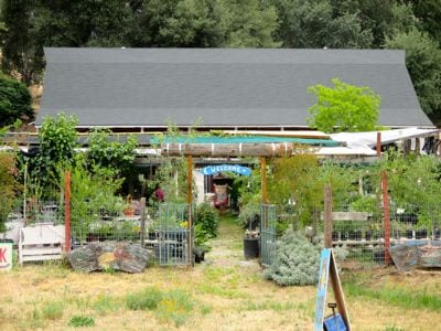
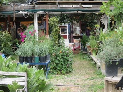
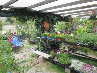
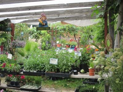
Let’s go inside the nursery.

IMG_0973

IMG_0980 IMG_0982 IMG_0983 IMG_0984 IMG_0985IMG_0988 IMG_0989 IMG_0991 IMG_0987 IMG_0986

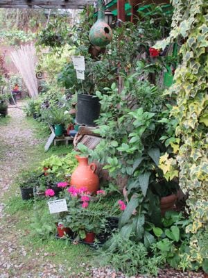
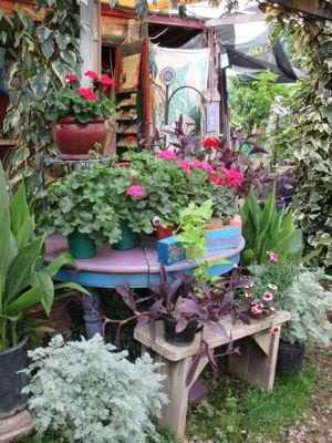
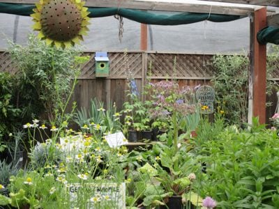
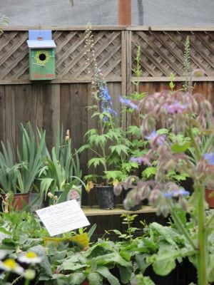
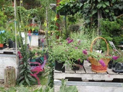
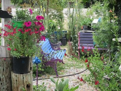
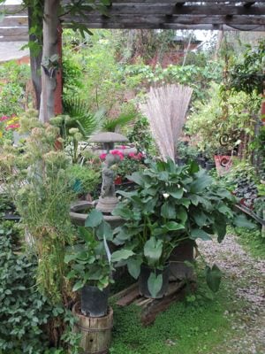
Blue Moon Nursery in Three Rivers is a charming place with a variety of plants, including natives and drought tolerants. Check out Seger’s blog and find the hours here: Blue Moon Nursery.

Odd Job, Chapter Four

Finally, I got to the actual painting stage of my odd job.

The Blue Moon Nursery got a 4’x8′ piece of very thick plywood, built a frame around it and painted it with multiple coats of white paint. This was a result of walking out to the road and measuring the existing signs. A medium sign looks like an unnoticeable postage stamp when you pass it in a car. A big sign might get noticed. A huge sign is too much for this Central California artist, so we just went with big.

I traced our final design onto a clear piece of plastic and using an overhead projector in three stages of measuring and adjusting. I used a Sharpie marker to transfer the image, along with a square, a yardstick, and a long tape measure. It took a very long time.

Then, I traced it from Side One onto 2 18″ x 8′ pieces of tracing paper, retraced it with a very black pencil on the back side, taped the 2 sheets to Side Two of the sign, and retraced it over the top with a pencil to transfer the design to the sign. Then I retraced the faint pencil transfer with the Sharpie. This took a very very long time.

Do you need a nap yet? Hang on, color is coming!

After a very fun color mixing session with the owner of Blue Moon, I began painting.
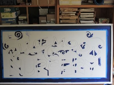
IMG_0933

First, a small brush to reach into the pointy places.
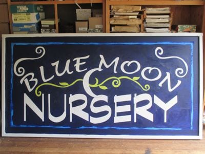
IMG_0944

Then, 2 coats of the dark blue. Next the green. Hmmm, we really like the color of the masking tape with the dark blue.
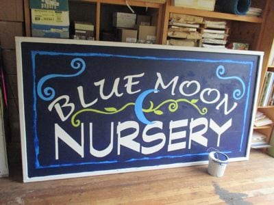
IMG_0945

I can mix that color! (This is actually side 2, after we chose a different blue for the moon and the spirals). The new blue called for a new green.
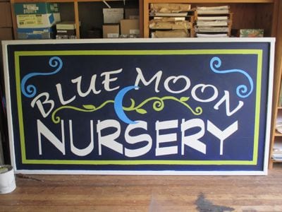
IMG_0946

Check out Side Two, with masking tape blue and light spring green!
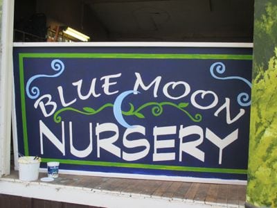
IMG_0947

This is Side One, with a darker green and a lighter blue.
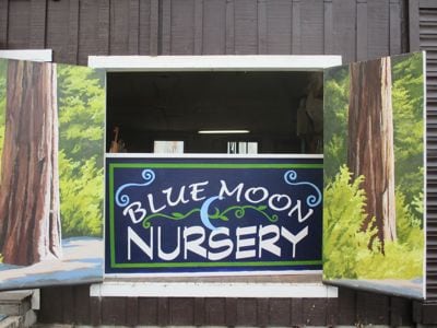
IMG_0948

Isn’t this cool? The owner of Blue Moon and I both are slightly offbeat, marching to the beat of a different drummer, enjoying variety. (After being friends for 4-5 years, we discovered that we were in the same class in the same high school!)

So, we decided to let the 2 sides remain in different (but very close) colors, and then we’ll listen to people’s comments. It is my guess that very few people will even notice the difference.

Thus, I conclude my story of yet another odd job for this Central California artist. It is a pleasure to beautify Three Rivers!

Do you have a preference on the colors on Side One and Side Two? I’d love to hear your opinion!
Odd Job, Chapter Three

My odd job of painting a sign for the Blue Moon Nursery in Three Rivers progressed through the decision making progress.

IMG_0935

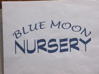
This combination of type was our first choice. The style of Blue Moon is a little hippy-dippy, loosey-goosey, whimsical (sorry, can’t think of a rhyme for that word). “Nursery” looks solid, professional, steadfast, here to stay.

IMG_0936

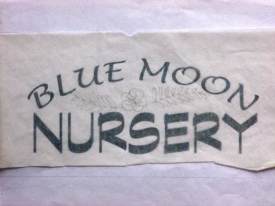
It needs some decoration, but this wasn’t the right one.

The owner and I decided on the best combination of type and decorations, and then got to the part we both love (both avowed color junkies).

IMG_0934

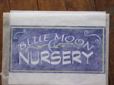
We both love the dark purply-blue, the high contrast with the white lettering, and it is a given that the growy needs to be green and the moon needs to be blue. Color is sooooo fun.

Now what? How will I get this colored sketch onto a 4′ x 8′ board??

Stay tuned!

Is white a color or an absence of color?

In December and January, I was struck by the number of white things in my yard. Is white a color or the absence of color? If I am drawing, white is paper color, and I draw around the white things. In painting, I use more white than any other tube of paint.

Notice I said “tube” rather than “color”. This is because my question remains, “Is white a color or an absence of color?”

Forget it. Let’s look at pictures of white things. 

IMG_1083 IMG_1084 IMG_1086 IMG_1089 IMG_1090 IMG_1092

White must be a color. If it wasn’t, these things would be clear, transparent, see-through.

There. Glad that got settled!

P.S. Yes, this is how December and January look in Three Rivers. Payback time is in July, August and September when other parts of the country are green and we are crunchy brown, gray, a bit of yellow, and just plain dusty.