If you can’t see the photos, go here: cabinart.net/blog.
Three Returns
One advantage (and disadvantage) of being in the art business in the same county year after year after year, is that sometimes your art gets returned to you. Some are happy returns, some are hassley returns.
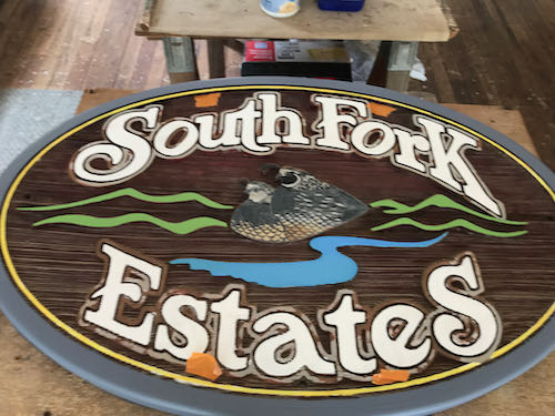
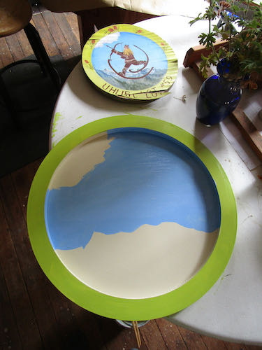
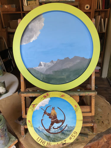
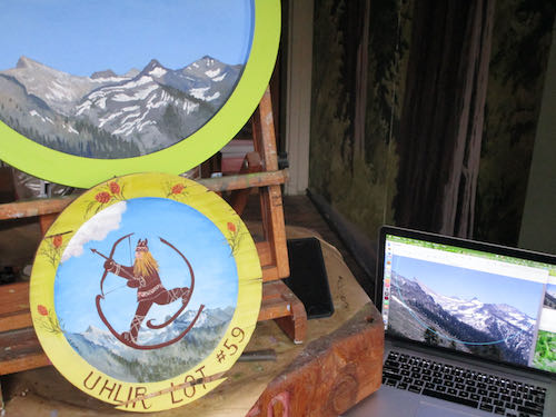
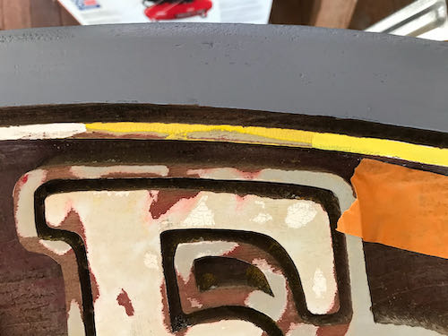
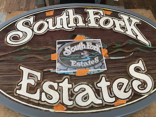
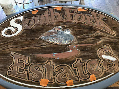
The circle is a sign, painted by me about 10 years ago. The customer was happy and now the disintegrating sign needs to be replaced, larger this time.
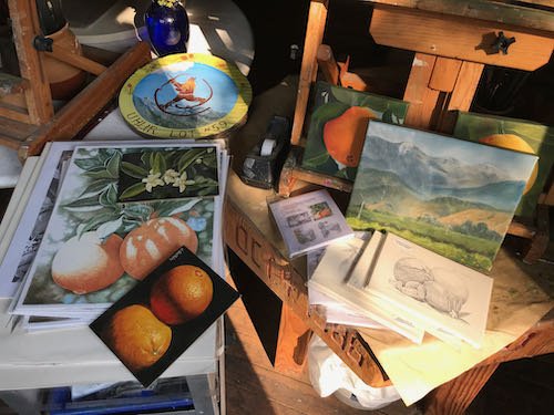
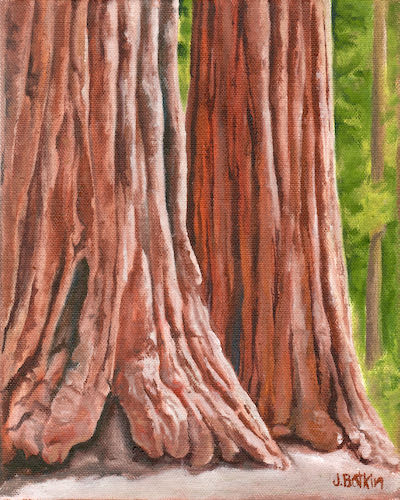
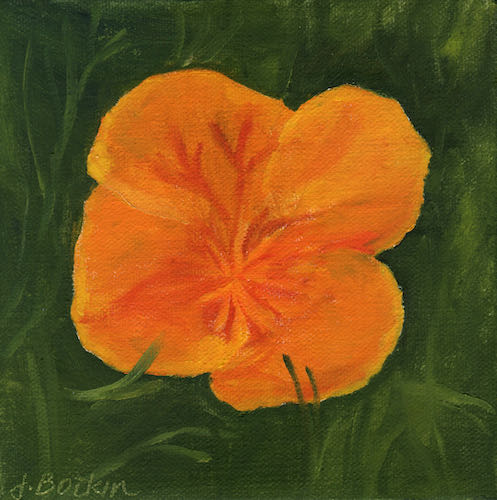
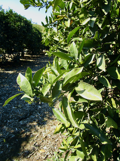
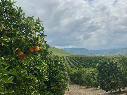
The citrus art was for sale at Farmer Bob’s World, and nothing sold. The customer wasn’t happy, apparently. (Who was the customer? No one.) I am happy that I can sell it in a place with greater visitation.
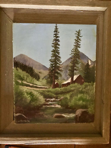
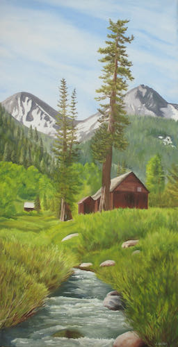
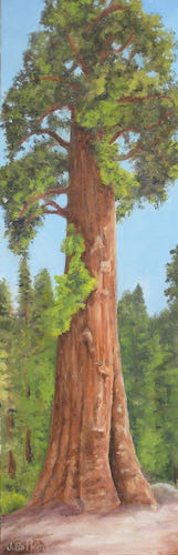
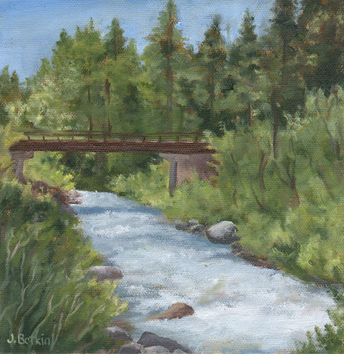
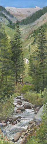
Many years ago when I began oil painting, a friend (because almost everyone in Tulare County is a friend, unless he is a friend of a friend) bought this painting. That friend has moved on to his reward, and the painting was given to the Mineral King Preservation Society. The MKPS brought it to me because it needed a little attention after all these years. This is not a happy return because my friend is gone, but it is a happy return because I can spruce it up.
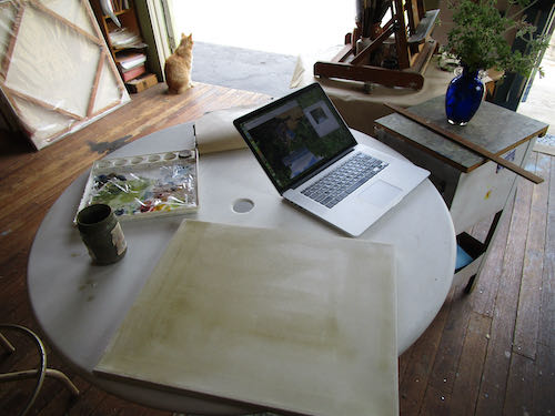
Interruption: What is Pippin Doing?
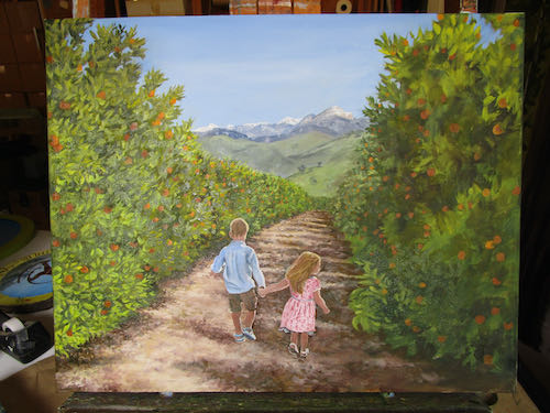
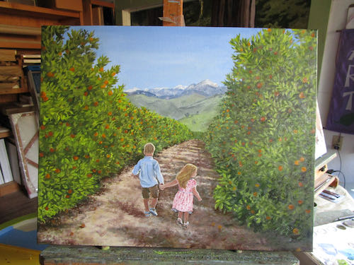
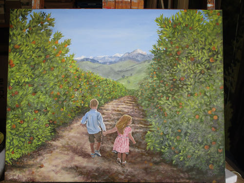
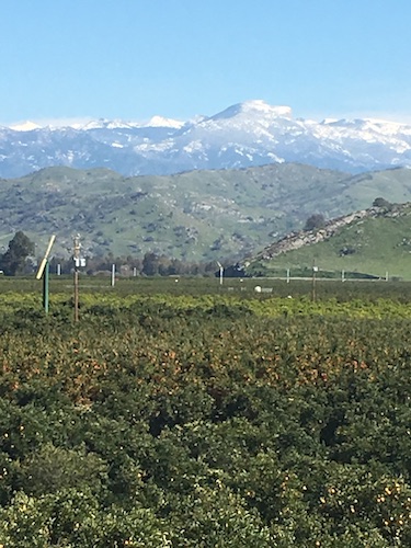
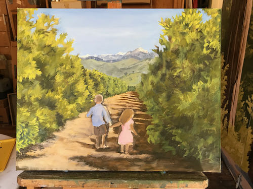
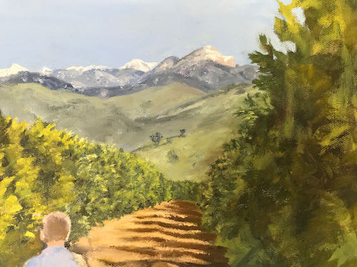
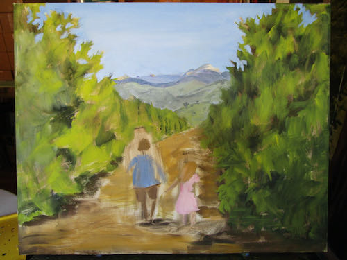
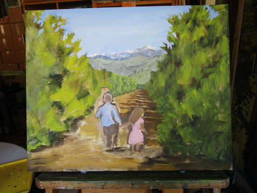
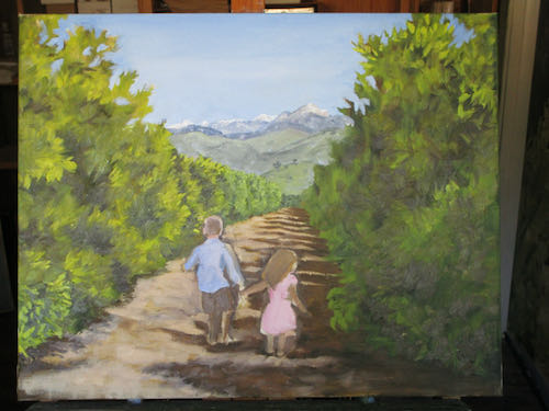
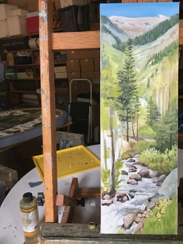
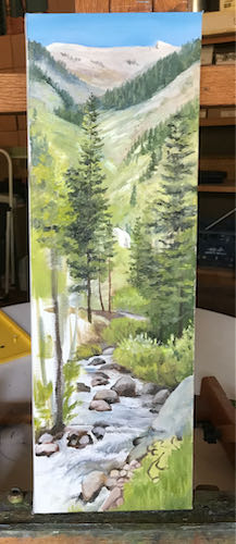
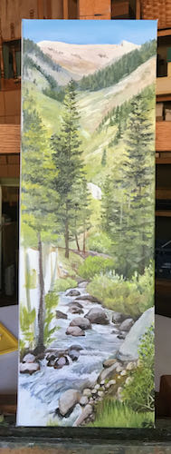
If This Ever Gets Returned…
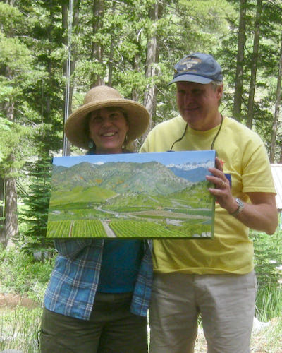
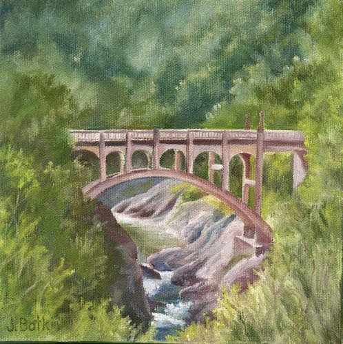
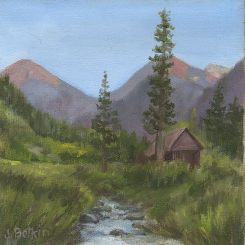
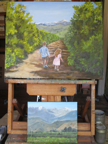
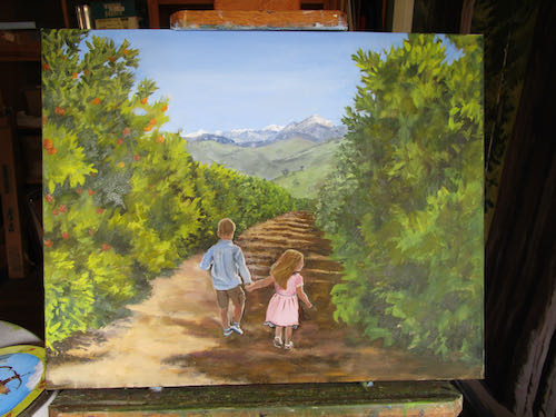
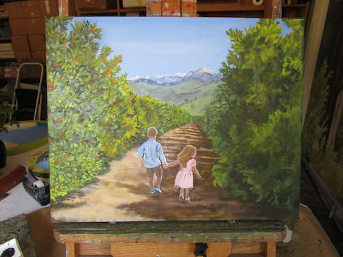
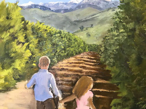
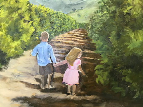
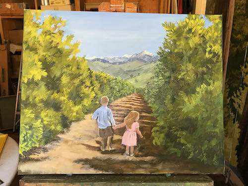
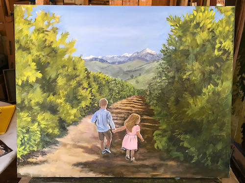
The customers presented this painting to the happy recipient, who got a little teary-eyed. He and I have many things in common, and we just chattered away about various aspects of this painting, such as how the idea was conceived, what exactly is in it, why I left some things out, and how much we love this view. He is sort of like anutter brutter from our utter mutter. (And if this painting gets returned, I’m hanging it in my house!)
No More Return
I returned to this colored pencil drawing. The original concept was to only use the 24 Prismacolor colored pencils in their limited set. Those stupid pencils kept breaking, so I started using lots of other colors too. It reminded me of one of the many reasons I quit using colored pencils.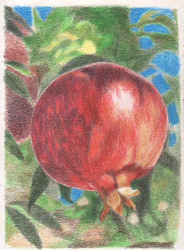
I doubt if I will be returning to colored pencils any time soon.
Not Returning This Either
About a year ago after a whole lot of trouble, I finally bought a mini fridge for the painting workshop. The freezer is where I store my oil painting palette, a convenient luxury. The big box store was TERRIBLE to deal with. A few weeks ago when I retrieved my palette, it was HOT inside the fridge. Sigh. I unplugged it, pulled it off its pedestal, propped the door open, and now I have to figure out how to get rid of it. I am NOT going back to the extremely inept, incompetent, undertrained, understocked, understaffed, and apathetic big box store. Instead, I will consider it one year of luxury, now both a memory and a hassle. (Learned in June 2021, #10)


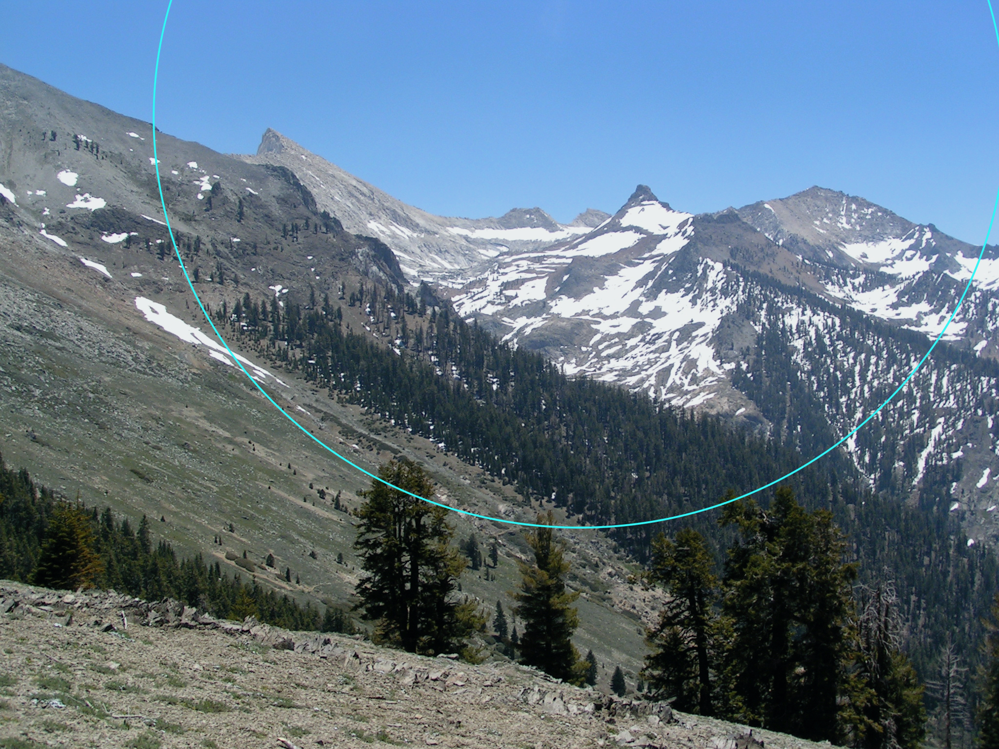
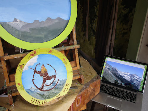
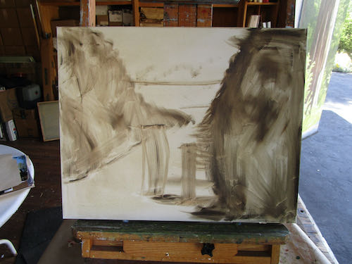
 I have finally learned how to scan and photoshop this size of painting in spite of it being too long for my flatbed scanner. When combined with Photoshop Junior, I can patch the 2 scans together.
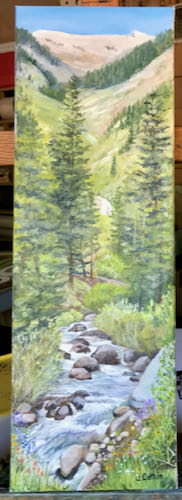
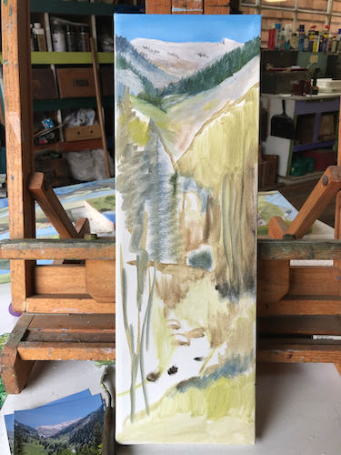

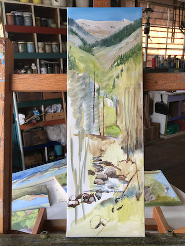
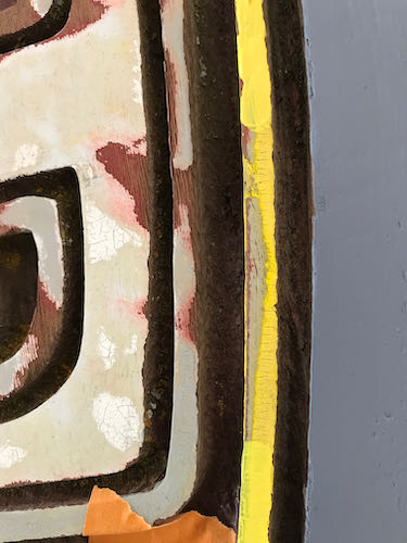
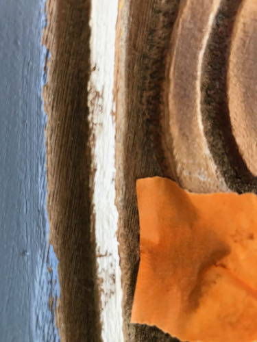
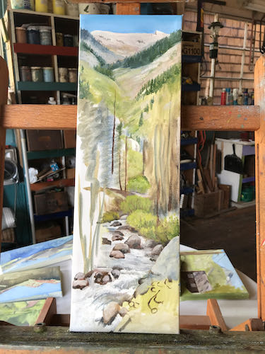 This represents an afternoon of work, trying to perfect the detail on the first pass, knowing full well that I will need to make corrections as the other parts get completed. And then those “other parts” will need to be corrected.
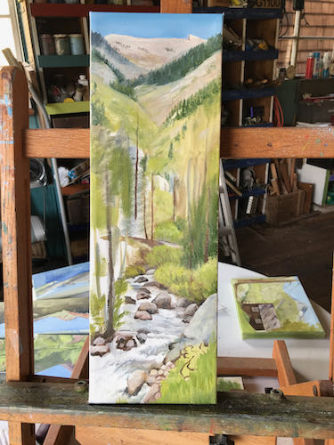
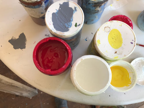
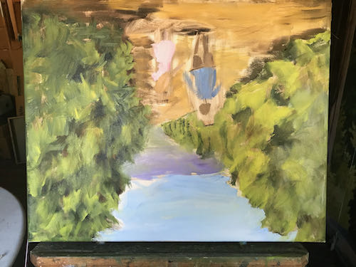
 After 5 hours, I felt an unavoidable slide into Idiotland, where Sloppy, Stupid, and Careless all reside. Besides, my cheater-readers kept falling off when I leaned over the sign, and then I painted a blue streak on my face by accident.