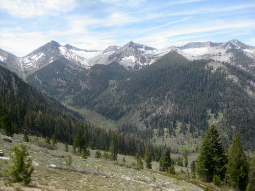
You, me, anyone who reads the blog but isn’t retired or on vacation in Mineral King. While I was painting walls inside Three Rivers buildings, Trail Guy went hiking in Mineral King.
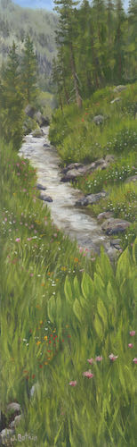
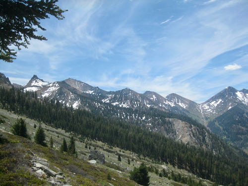
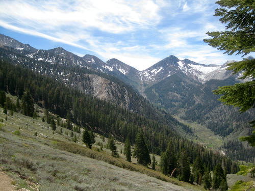
He went up toward Timber Gap, and then to Empire, but not to the top, just a loop that gives good views.
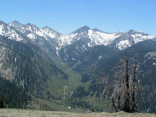
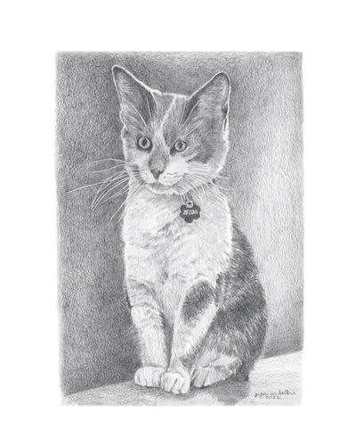
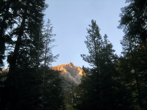
This is Ranger’s Roost, AKA Mather Point, looking through the timber of Timber Gap. When you are looking at Timber Gap, it is the bump to the left/west. The Mather Party came over Timber and saw Mineral King. I drew the cover in pencil and colored pencil for a book about it, but I haven’t read it. I just look at the pictures. (This was a second edition—the original drawing on the first edition went missing so the publisher commissioned me.)
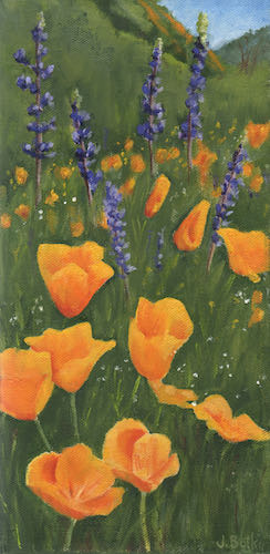
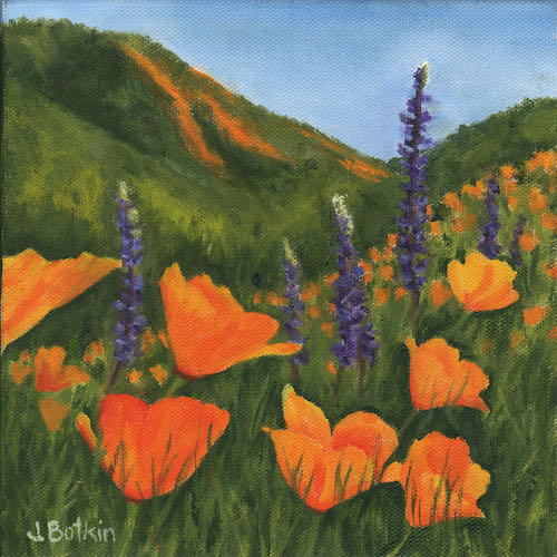
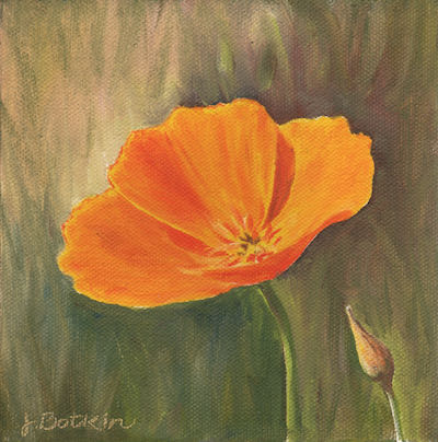
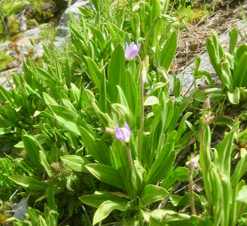
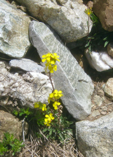
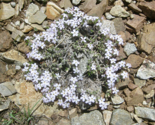
There were a few flowers: shooting star, Western wallflower, phlox.
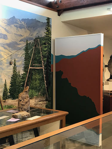
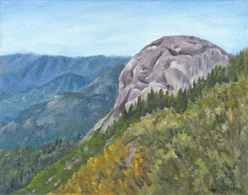
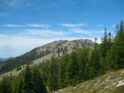
This is the rock outcropping on Empire that gives the false impression of being the actual peak. It is a favorite for enjoying alpenglow in the evening light.
There have been several times in my career when I have been asked to change someone else’s art. I have repaired a torn canvas, changed a boulder in a painting that looked like a skull, fixed a child that looked like a little hunchback, and brightened colors in a dull painting. All these were done without knowing the original artist, and with assurance that the original artist would never know.
The Mineral King Room makeover was a different story. The original designer is highly educated, experienced and respected in The Art World. I am somewhat known in the local Art World, but I try to keep a low profile when it comes to any formal types of situation where I might be outed as a total DBO, mostly self-taught, Tulare County native. (You know how I feel about ArtSpeak. . . ugh.)
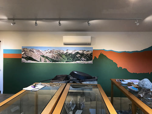
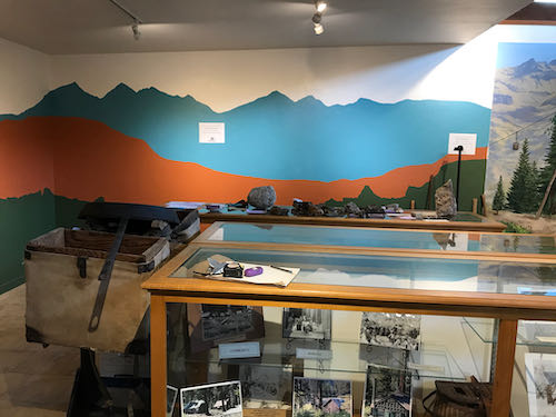
I respect the original artist of the Mineral King Room and understand that she put a lot of thought into the design. The folks who approved the design were awed by her work, and didn’t think that there would be a strong reaction to the teal color and the stylized mountains, which were all effective from a designer’s point of view.
The approvers were mistaken about the reaction, which was strongly against the color and the mountain shapes. This necessitated a call to your Central California artist, who also is the local Mineral King artist.
The designer wasn’t pleased when she learned that I would be giving her design a makeover. (What artist would be??) I don’t blame her, because she chose all the shapes and colors based on her design expertise, to provide the best interpretive background for historic displays. She was professional and polite, while sounding as if she was defending a dissertation, not in a defensive way, but protective and offering the rationale for her design decisions.
My approach, on the other hand, also based on training and experience, is to simply please the customer. (My very wise dad taught me the all important business principle of “You kiss their fanny and take their money”.) We have to think about who the visitors and supporters of the Mineral King Preservation Society are, and what they will understand. The answer to that is that they love Mineral King, not a stylized version of it. (“Nosirree, I’ve climbed Sawtooth, and that ain’t it!”)
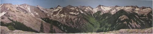
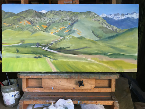
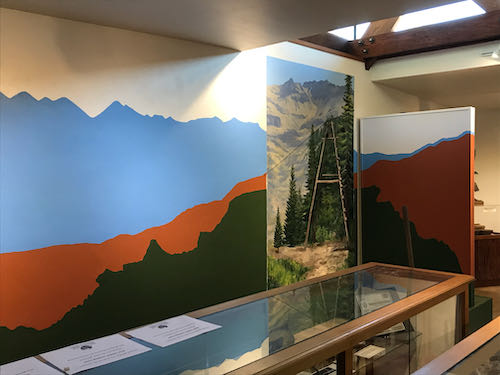
This is how the mountains surrounding the Mineral King valley really look.
So, with respect to the designer, who is very good at what she does, I just dove in and “corrected” her work. I don’t mean that it wasn’t good; it just wasn’t right for the audience.
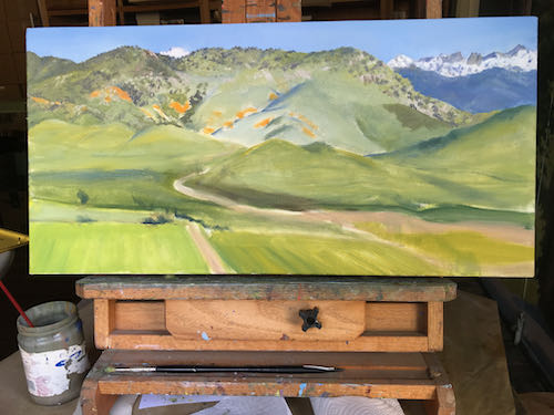
Recently, the room started getting a facelift, or perhaps “makeover” is a better word. I was at the museum for something, went in the Mineral King Room, and saw the beginnings. My first thought was that it was colorful and spiffy looking; my second thought was that the blue didn’t match the sky in the murals, and my third thought was that the supposed Mineral King peaks did not look like Mineral King.
Several weeks later, another Mineral King person stopped by and said, “That color of blue is doesn’t look like a Mineral King color, and I don’t recognize those peaks.”
Thus, I got a phone call, asking if I could change the color of blue and fix the line of mountains.
Aren’t you just dying to see what I am talking about?
An incidental thought about that blue: it is a great color, kind of a turquoise or teal, something I have quite a bit of in my wardrobe. It just doesn’t happen to match a sky in Mineral King. It might look better with the rust than the sky blue, but reality has to take precedence.
It has been awhile since I did a Brag List. Perhaps it could be called a Reassurance List, because when my business hits a lull, it reassures me to see that work has sold recently.
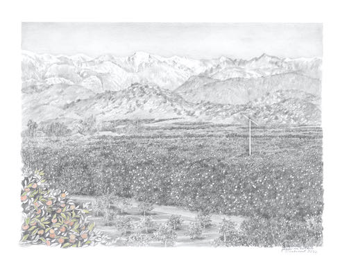
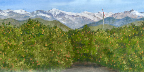
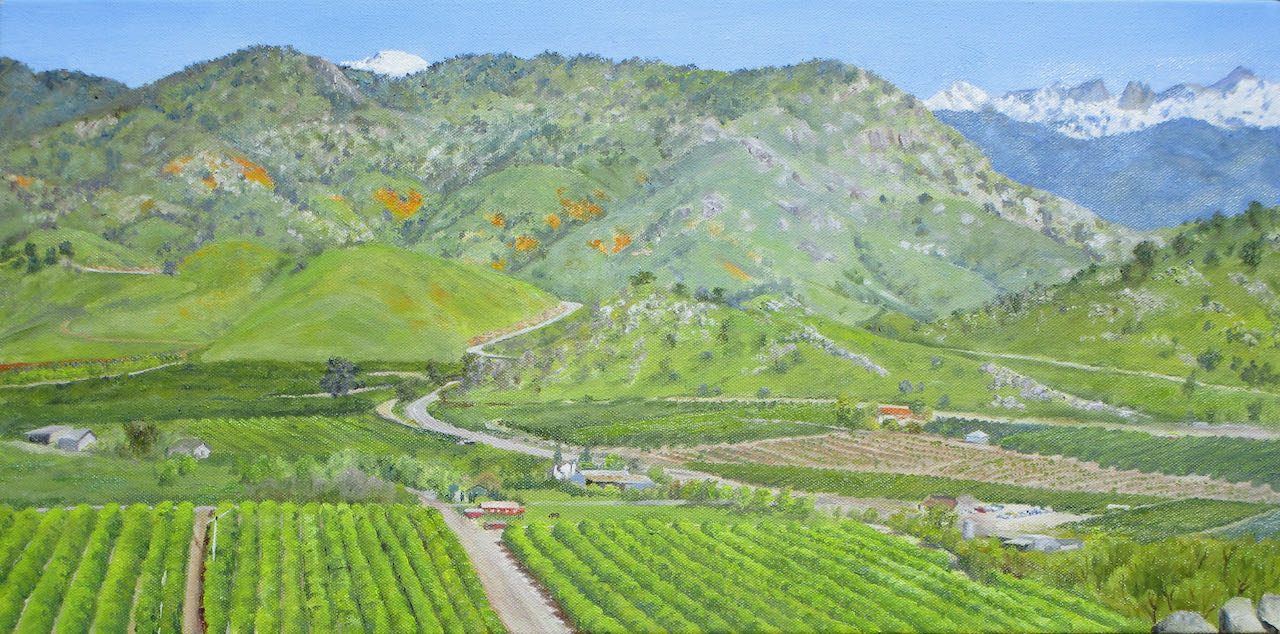
When I look at a finished painting in person, it seems truly finished. This painting signifies the best of Tulare County to me, and I am not always objective.
However, when I look at a photograph of the painting on my screen, sometimes things appear that weren’t all that noticeable in person.
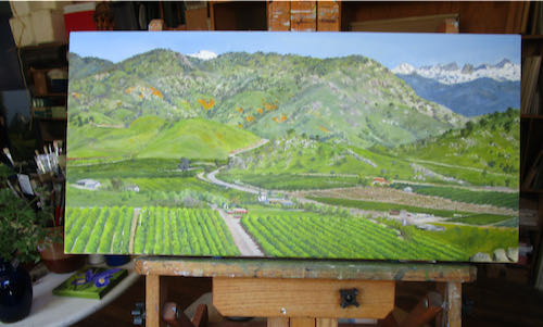
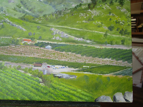
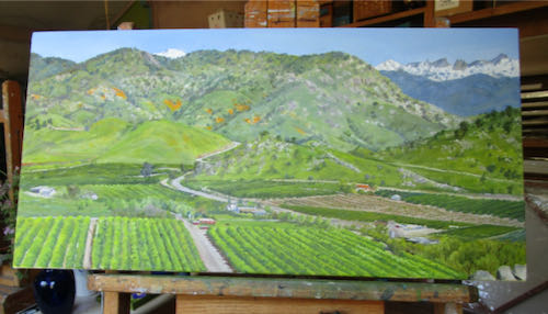
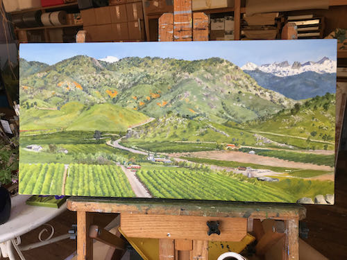
Here is a progression of the untitled painting that is finished, or maybe not.
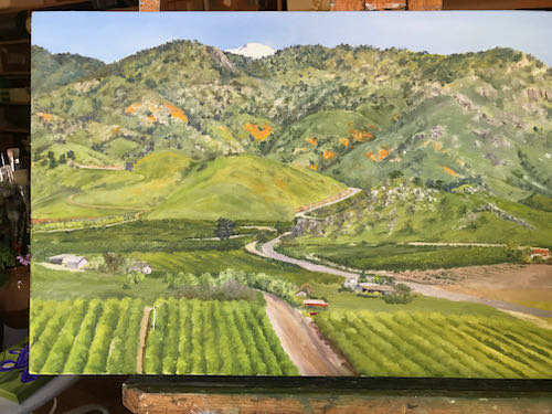
Tuesday morning overview.
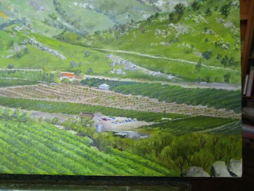
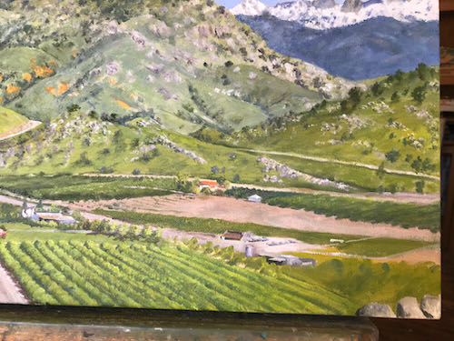
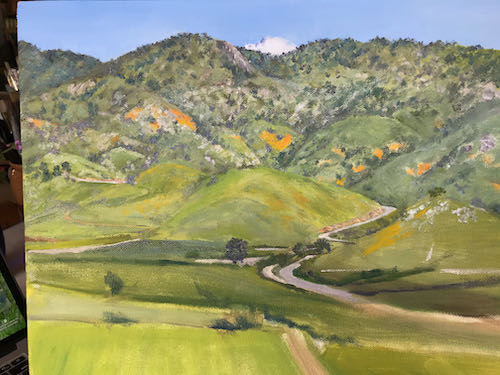
Tuesday morning lower right corner, unfinished.
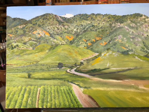
Wednesday morning lower right corner, finished (but in shade so hard to tell what is what).
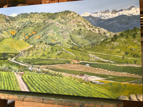
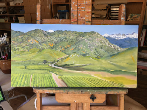
May I be finished now? Better put it in the sunshine for a truer color photo.
Now may I sign it, and then paint the edges?
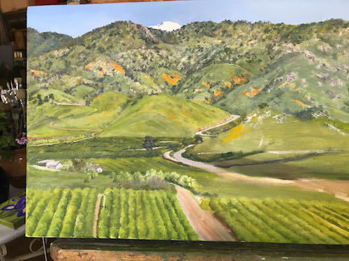
Maybe, maybe not. Better let it mull a bit, study, scrutinize, put on my truth glasses (just a figure of speech) and try to be objective.
Or maybe I should show the customers and see if they think I am finished.
When I paint commissions, I go through stages something like this:
Not sure, but I will try
Piece of cake
What is this mess?
What have I gotten myself into?
I’ve got this.
What is this mess?
Who told me I could paint?
Ooh, I love to draw with my paintbrush!
What is this mess?
Oh my goodness, I think I am going to finish soon!
What is this mess?
Make a harshly honest list and fix those things.
Can’t find another thing to fix, better sign it and get it out of my face before I mess it up.
This was probably about step 8.
Then I hit step 9.
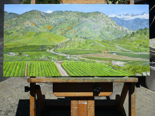
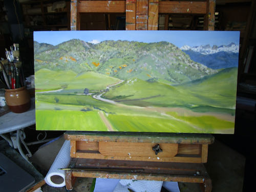
I painted for a morning, repairing all sorts of messes, drawing with my paintbrush. Can you see the improvements?
Now it might be at step #10.
It looks wrong in this light. But you can see that only a small portion in the lower right hand corner remains untouched. I might hit a couple more “What is this mess” stages. I went a little nutso trying to get the highway better, narrowing the driveway at the bottom, detailing the rows of citrus trees more, adding in a few more buildings and tightening up the ones that were there, and planting a couple of new groves. I did not darken the blue mountains but actually lightened them. However, this is not apparent in the poor light of early afternoon photography.
Then I had to quit because my friends were waiting for me to come over and make some more stepping stones.
More remains, but the fat lady will be warming up her vocal cords soon.
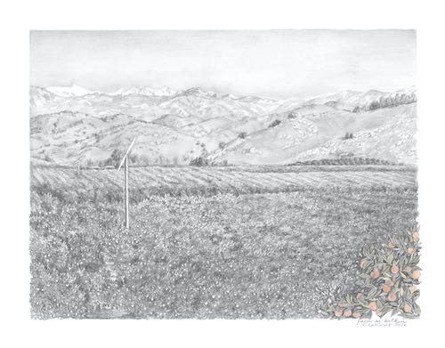
This commissioned oil painting is highly detailed, in spite of the fact that it is a landscape. People who see it want to know where it is, where I was when I got my photos, what are they seeing.
It is impossible to put in every single grove, building, road, dirt road, and random tree. I enlarge the photo on my laptop to an astronomical size in order to see what the tiny spots are, decide the main landmarks that would be helpful to the viewer, try to get them in the right place, and then use my tiniest paintbrushes to indicate them.
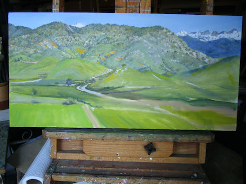
Can you see the added detail?
Every time I work on this painting, I have to change things that I thought were right.
I am not worried. There is still time to finish and to finish well, believably, and with confidence that this will be my best work.
But maybe I should put more hours into this custom oil painting and stop making stepping stones.
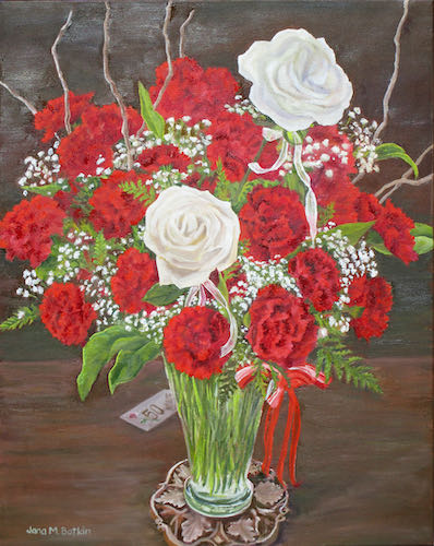
This is the best photograph I was able to get of the Fiftieth Bouquet. (It just occurred to me that I may not have actually titled the painting!) I was able to eliminate the shiny spots but cropped the left side a bit. One of the things that is always pounded in all art advice workshops, classes, books, and websites is to hire a professional photographer for one’s work.
Fall down laughing.
That might work for people who just complete one painting a month and then sell it for $5000 or $50,000, but that is not the way things work for this Central California artist. So, I bumble along with my PHD* camera. (My more expensive cameras have broken so I no longer waste money on them.)
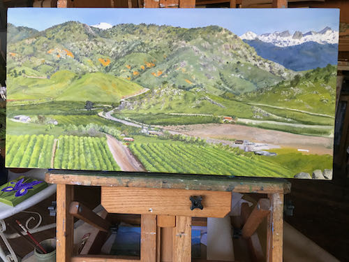
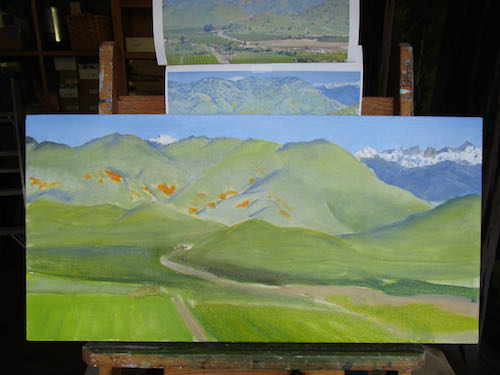
I also inched along a bit more on my favorite subject.
Can’t wait to get back to this one, but then I will finish and have to say goodbye to it.
Life is a series of decisions, choices and consequences.
After spending a good chunk of an afternoon drawing with my paintbrush, perfecting the detail on the 50th Anniversary Floral Bouquet oil painting, I had a real hankering to return to the commissioned oil painting of my favorite subject. “Slamming out” some quick small paintings for the Redbud Festival just wasn’t lighting my candle.
This painting was calling my name.
I began texturing the distant hills.
Then I built a few roads.
If this wasn’t a commissioned piece, it would go in my dining room. I can paint another for myself, but there is enough other (PAYING) work that it is not a priority.
So, I will enjoy the process of being mired in detail for someone else’s happiness. Snow, GREEN, poppies, CITRUS. . . the very best that Tulare County has to offer. (But remember, we have bad air, high unemployment, diabetes, teen pregnancies, high welfare, no Trader Joe’s or Whole Paycheck grocery stores, and a severe lack of education. Just sayin’ in case you were thinking of bringing some big city values to our little piece of California’s flyover country.)
 This is Ranger’s Roost, AKA Mather Point, looking through the timber of Timber Gap. When you are looking at Timber Gap, it is the bump to the left/west. The Mather Party came over Timber and saw Mineral King. I drew the cover in pencil and colored pencil for a book about it, but I haven’t read it. I just look at the pictures. (This was a second edition—the original drawing on the first edition went missing so the publisher commissioned me.)
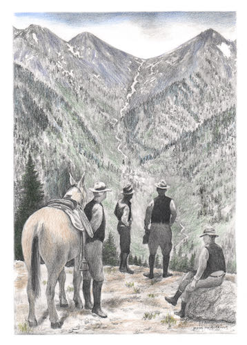
 There have been several times in my career when I have been asked to change someone else’s art. I have