Day Two on Indoor Murals

Why does the title say “murals” instead of “mural”? Because there will be more in this location.

I started with the hardest one of the four because there will be new flooring installed in this room next week. So far I haven’t spilled, dripped, or dropped a brush. I am making a conscious effort to be very neat, and so far I haven’t wiped my brushes on my pants once! I decided that an old pair of jeans could become my painting pants, and while I am okay with getting paint on them, I am trying to break the habit of using them as a paint rag.

Here is the progression on Day Two. 

I began on the left side, filling in behind the blossoms from Day One because it didn’t have enough depth. Then I painted in a few “strings” toward the middle. If I put in a vertical line as a stem, I can build the blossoms around it.

You can see more blossoms happening toward the middle of the vine here. I had high hopes of finishing it in two days, but hadn’t taken into account the filling in of Day One’s work.

It seemed like a good plan to put background blossoms in first – a bit lighter, a bit bluer in color, and somewhat blurry.

The closer blossoms have darker and lighter colors with more parts, including a bit of greenery. (Yes, I know it is hard to tell in these little dark photos.)

About 6 hours of painting straight is my limit. Much longer and my work starts getting sloppy. (Might even accidentally clean my brush on my pants.) So, I got off the ladder and put dirt and grass at the base of the vine. This way, if the Customers decide to move the bed, the vine won’t just drift off into Quitsville.

I wonder if I will be able to finish this on Day Three. As I move out to the right side, there will be fewer blossoms, with the heaviest concentration in the middle. More will be revealed in the fullness of time. You will probably learn about this some time next week. 

That Was Quick

On Friday I delivered some notecard packages to the Mural Gallery in Exeter. Manager Cindy told me of good sales of paintings there and said someone bought an 8×8″ oil painting of a poppy. That someone also requested the same size of an orange and another of a pomegranate. I asked a few questions, then went off to the Courthouse Gallery for a day of gallery-sitting and painting.

A little later, I heard from Cindy that the customer is from Barcelona, Spain, and will be returning there shortly after Christmas. That’s cutting things a little close, especially since I may not be going back down the hill before then.

When I looked in my crate of supplies, I saw an 8×8″ canvas with a photo of an orange lying on top of it. Hmmm, I wonder. . .

So, I started a new painting of an orange.

Because I have painted more oranges than I can remember, I was able to veer away from the photo but keep it believable. Of course, I had my painting friend with me to point out any areas of weakness.

I bypassed a few steps here: no wire on the back, no layering, no drying, no scan, no varnishing. But it will dry, Cindy will deliver, and our customer from Spain will go home with 2 paintings in her luggage!

Painting More Than Sawtooth

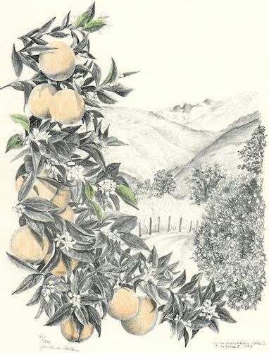
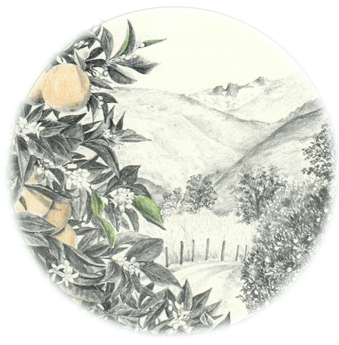
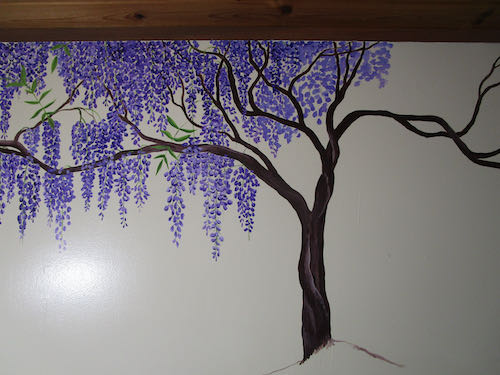
Do you remember that I sold this painting of the Middle Fork of the Kaweah River more than one time at the opening to my show, “Images of Home”?

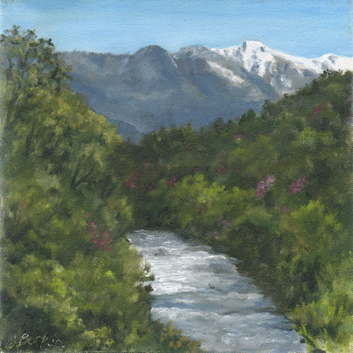
The second purchaser requested a thicker canvas, so as soon as it arrived, I dove in. (Have you ever noticed that “dove” means both the past tense of “dive” and a bird, depending on how you pronounce it?)


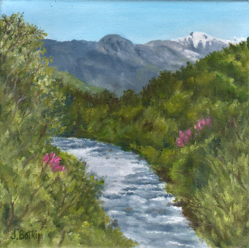
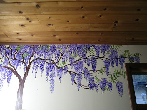
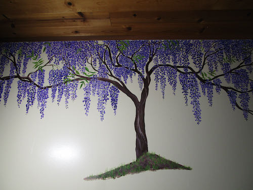
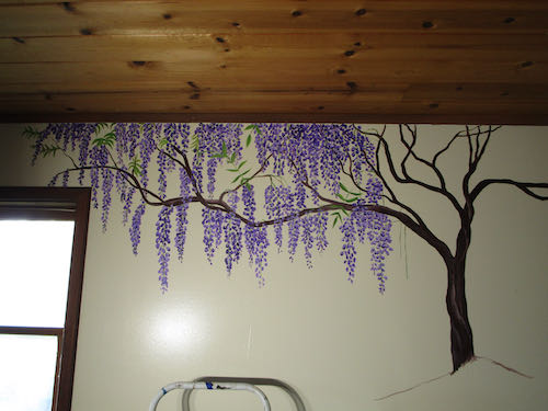
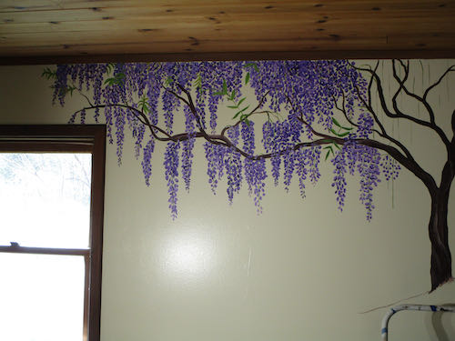
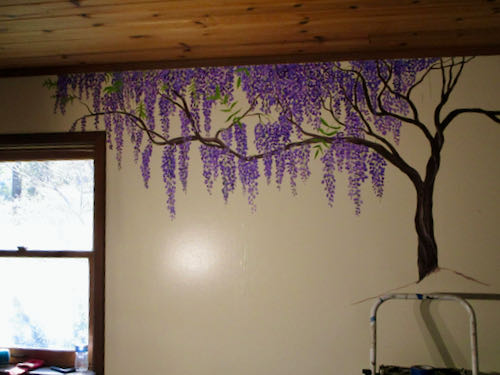
Notice that the redbud are brighter in this one. The colors on our screens don’t adequately reflect the reality of the paintings. At one point I walked to the place in my yard where Moro Rock and Alta Peak are visible so I could clarify a few things that weren’t clear in my reference photos; that was convenient!

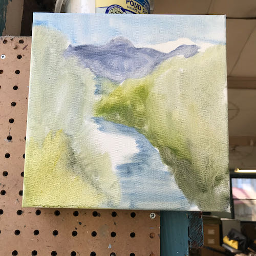
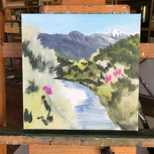
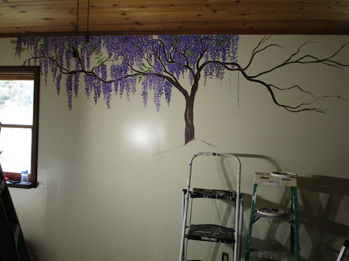
I also worked a tiny bit on this painting that has been a difficult project. I took it to the painting session in Exeter where my honest and helpful friends could help me discern some of the weaknesses.

First, I removed the stump that identified the spot on the trail because no one else cares besides me; the point of painting is to make it irresistible to any random viewer, not just painting because it makes sense to me. The fact that it is signed and yet I continue to work on it should indicate my level of desire to make it better – normally after I sign, I stop looking at a painting.

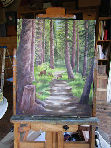
Then I widened that tree where the stump was, taking it out to the left edge of the canvas.

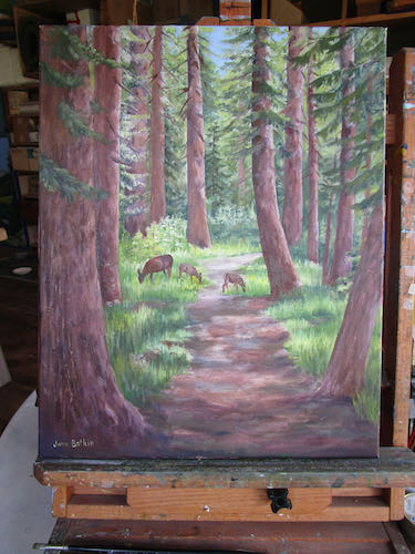
We also decided on these changes: have the light come from the left side instead of the right (or, gasp of horror, both sides), straighten the leaning tree on the right to make it cease pulling your eye out of the picture, add a bit more visible sky, vary the tree sizes, add more branches because real life is messy, and whatever I do, DO NOT TOUCH THE DEER. (That’s because they are tiny and difficult – if it ain’t broke, I ain’t “fixin'” it!)

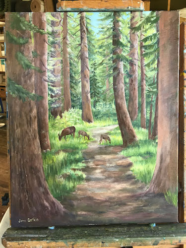
Still not finished, but definitely better. It needs texture on the tree on the right, light corrections on all the trees (it is on the wrong side of most of them), more branches, a few more skinny trees.

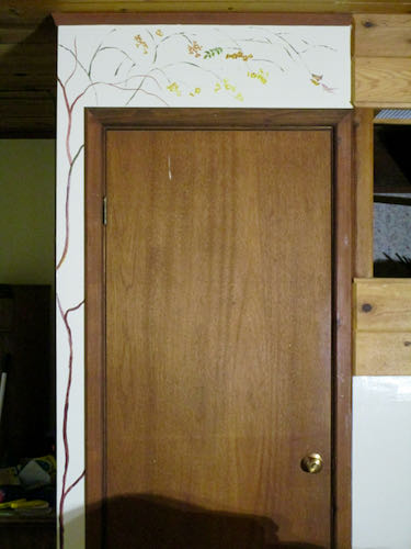
This is artWORK;  not artPLAY.


Almost Finished with the Sawtooth Paintings

At the time of this writing, 2 of the Sawtooth paintings are finished, and the third just needs a small area before joining the others in their finished state. I had leftover paint on my palette, so I painted the edges. This made them a bit too wet to handle, so #3 had to be on hold for a bit.

As I show you these photos of the paintings in progress, I get more and more confused as to which painting is in what stage; I’m like the mother of triplets who lost the note telling which kid has a mole on his 2nd toe or something else to distinguish them (but I don’t have difficulty in real life because they are 2 different sizes and have an inventory number on the backs).

Sometimes when I look at photos of the finished paintings, I see more things to correct. Unless they are glaring mistakes, I will ignore them. These patient customers would like their paintings sometime, preferably sooner rather than later.

Here – you can see a few more and join me in my state of confusion. This top one is finished, but we are hard pressed to tell in the high contrast sunshine.  
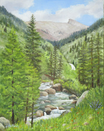
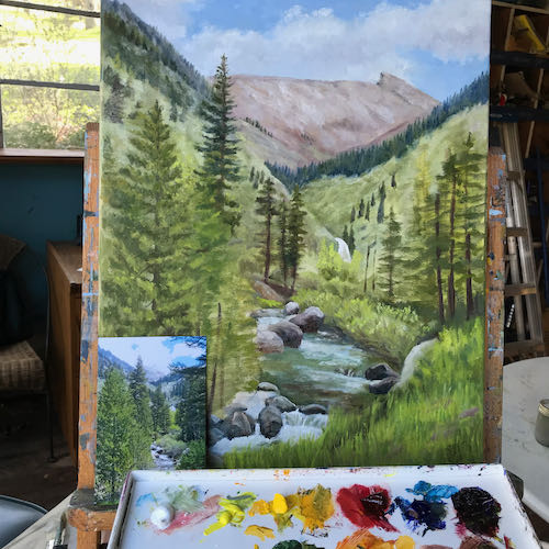
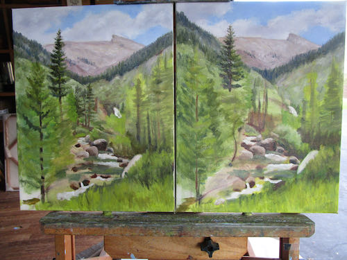
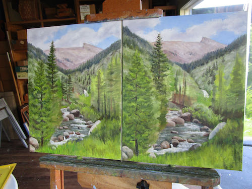
The 16×20 is finished; the 11×14 beneath it isn’t – look at the trees on the right (middle) side. 
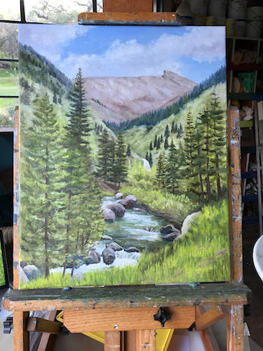
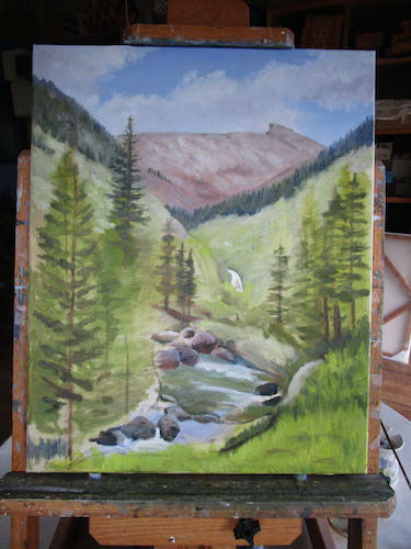
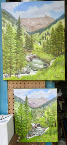
This one looks finished. I wonder if it is the 16×20 or one of the 11x14s. 
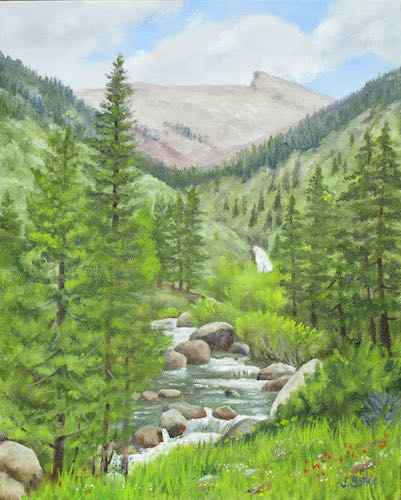
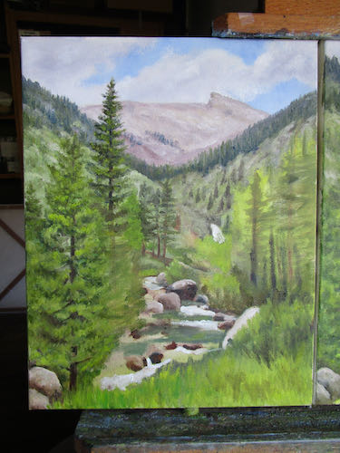
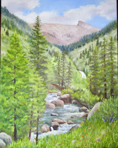
This one needs mid-ground trees and foreground grasses and flowers. 
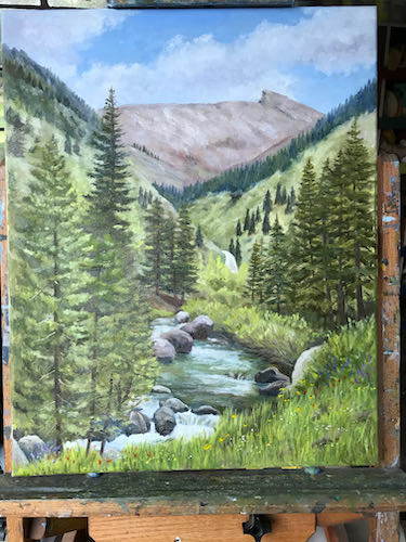
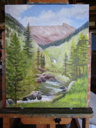
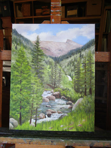
Definitely not finished. 
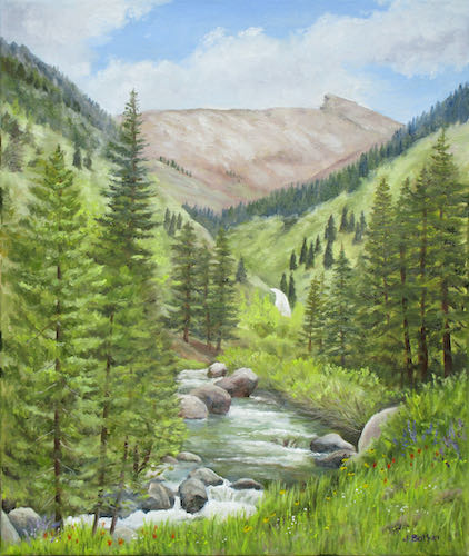
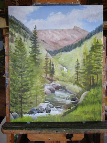
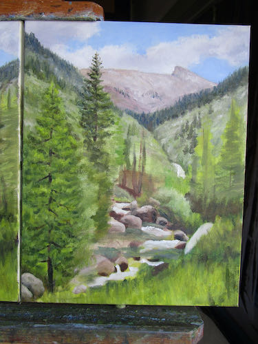
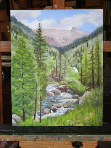
This one appears to be finished. When there are grasses and tiny colored dots for flowers, it is finished.

What’s harder? Painting the same scene three times, or trying to sort the photos and show people? Or trying to comprehend a blog post about it? (See? I always have questions!)

Lots of Sawtooths (Sawteeth? Nah)

Painting the same complicated and difficult picture multiple times doesn’t seem to make it any easier. But, since I have done it before, I know I can do it again (and again, and yet again).

This is the 16×20″ version.

These are the two 11×14″:
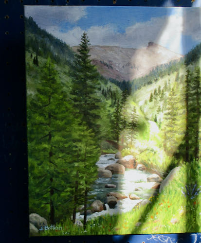
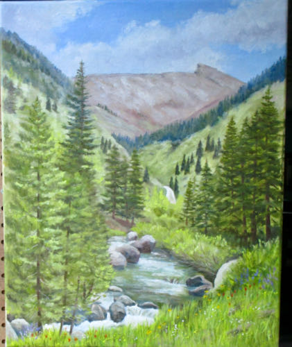
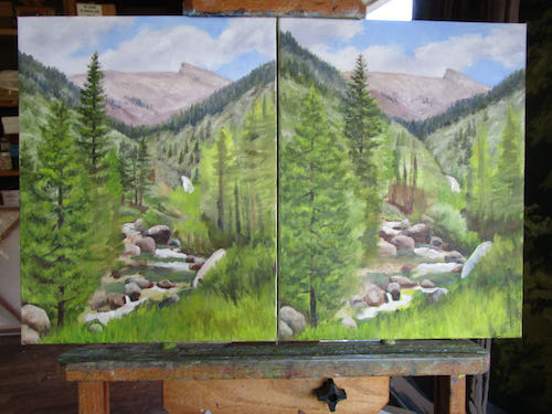
It takes some discipline to not get too far ahead on each one. Even if I am on a roll, I have to move to the other 2 canvases to repeat a successful rock, tree, texture, or stretch of water. When all are finally finished, I will evaluate each part, decide which painting is the best in that area, and then bring the other two up to the level of the best.

P.S. Who’da thunk that the plural of “Sawtooth” would be “Sawtooths?”

How I Designed a Logo, Chapter 8

The new drawing was in place, but I thought the type was overpowering to the drawing. The customers had a different thought, which really surprised me: they preferred the placeholder drawing to the new one!

I realize that what I consider to be a good drawing versus what people who don’t draw consider to be a good drawing differs. But, I could not not not let this drawing from the last century go into the new logo. NOT.

So, I drew it again.

Before:

Edited to:

After:

The road and the fence were what spoke to them in the old drawing. I did better mountains, better foothills, and because they grow both oranges and lemons, we included both. 

But wait! There will be more. . . stay tuned!

How I Designed a Logo, Chapter 7

My customers chose this version of their logo.

Now, it was time to do the original drawing to customize the logo for them.

They requested color, but before I added it to the drawing, I put it into the logo instead of the place holder.

Getting there, but more polishing and adjusting ahead. Logo design is tricky stuff, and there has to be clear communication between me and the customers in order to get it just right for them.

To be continued. . .

How I Designed a Logo, Chapter 6

I sent 3 rough-drawn logo options to my customers, and they chose this one for me to refine.

I downloaded the typeface that was closest to this, and then began manipulating it to fit around the circle. We began talking about what to do with “Orchards, Inc.”, whether or not to include it, how to make it look good.


Which one did they choose? Stay tuned. . .

How I Designed a Logo, Chapter 5

After looking at Western typestyles, sketching out some ideas, and turning a pencil drawing of a citrus scene into a circle, I began refining the five design ideas.

Time to mull it over, chose three, and show the customers. I sent the first three and scrapped the other two. They might have been workable, but enough already!

To be continued. . .