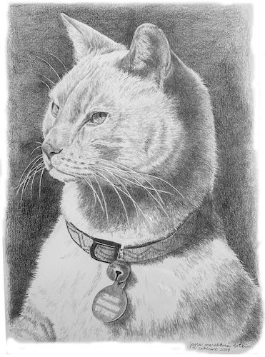
 That was one alert cat!! When I was taking his photos, I reached out to touch him. He pulled away in a very subtle but arrogant manner. Made me laugh.
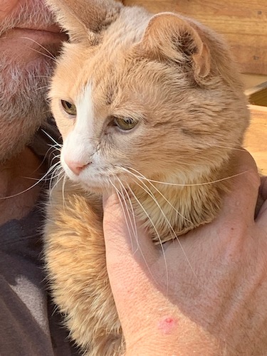
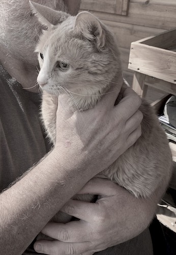
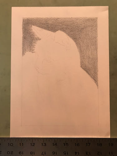
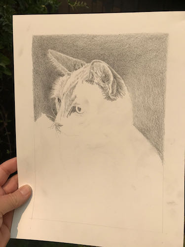
 That was one alert cat!! When I was taking his photos, I reached out to touch him. He pulled away in a very subtle but arrogant manner. Made me laugh.


This sort of smoky light means it is hard to see to paint, but if I open the doors for better light, then it is hard to breathe. So, I get to spend another day in the studio with my pencils. (I love to draw – did you know that?)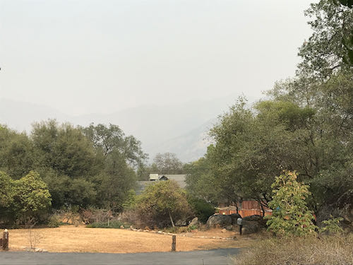
This is a large collage drawing, a commissioned piece 14×18″, that will incorporate 3 different scenes. In designing, I tried something new – I used photoshop instead of doing sketches. I sent the customer 2 versions and she chose this one.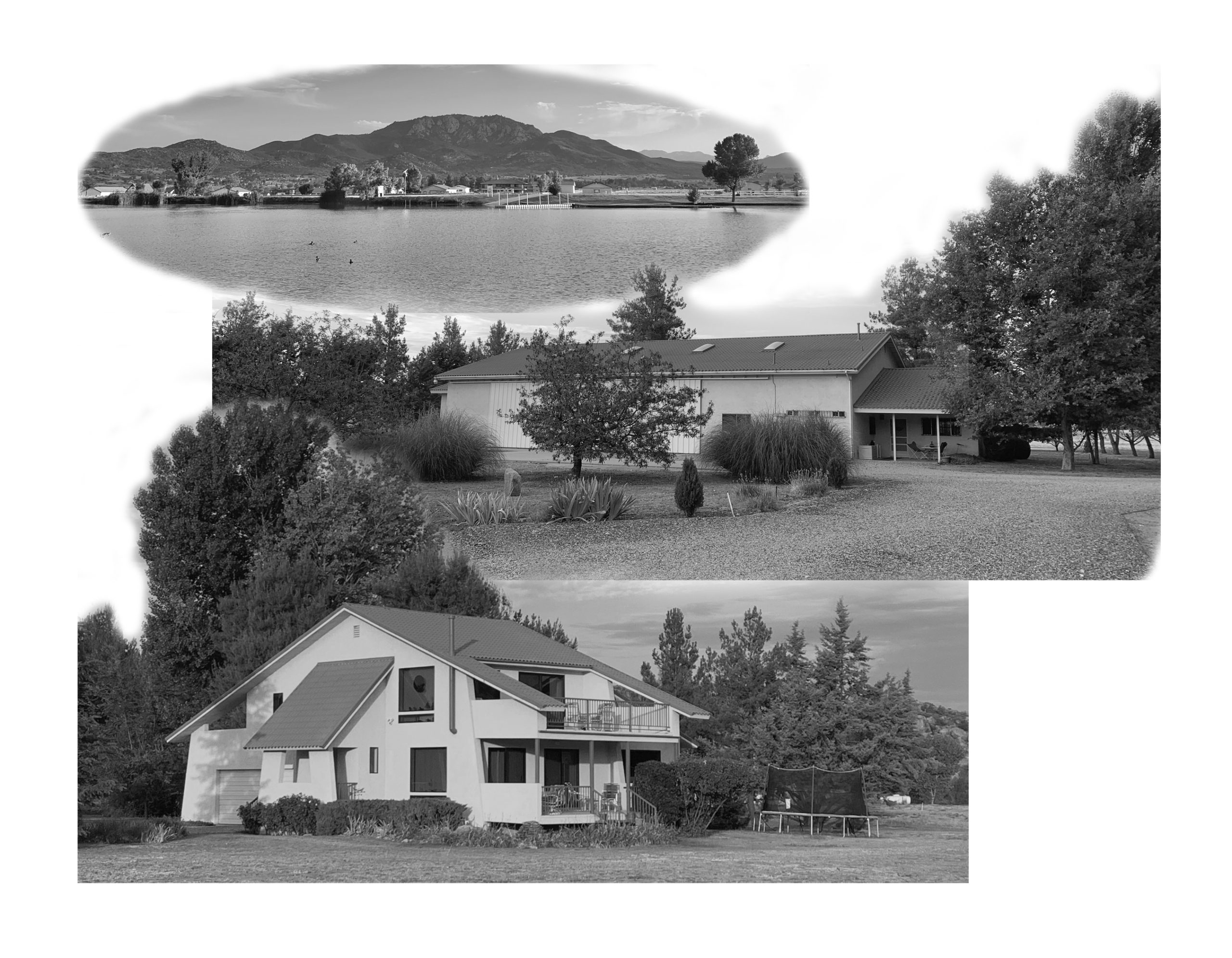
Here you can see the faint outline where things will go. I started at the top on the left, because as a right-hander, this helps to cut down on excessive smearing.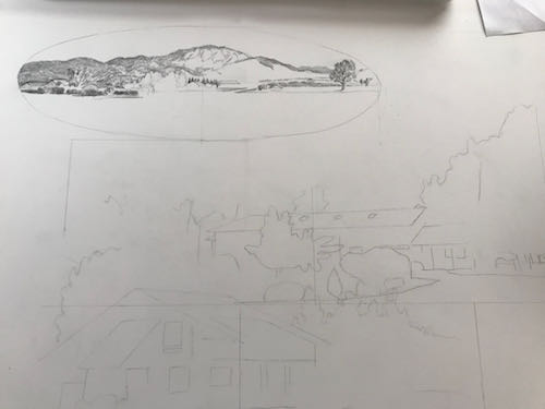
Setting it up took as long as getting it to this stage.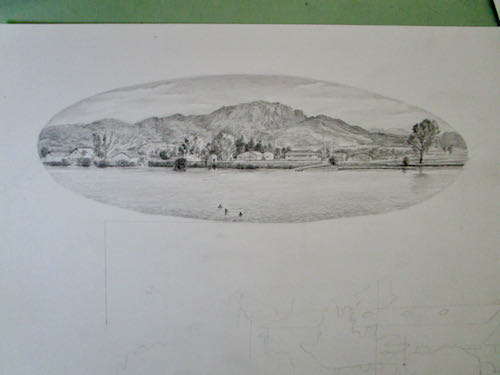
I had enough time to begin the next segment.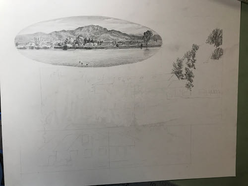
Next, I heard from the customers on the lengthy logo design project. Calling it “lengthy” is not an insult; this is a very challenging job, because the customers have been without a logo since 1980, logo design isn’t my strongest skill so I am slow, and together we are carefully working out the best design possible. This is the next piece in the puzzle.
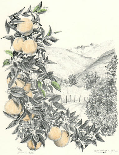
I used an old (1997) drawing as a place holder, drew a new picture for them, and then we discovered that the old drawing was a better match. Alas, it wasn’t very well done. Well, it was fine for back then, but I was barely out of my Primitive Era in the last century. So I drew it again, and this time I added lemons, along with other improvements that probably only my drawing students will be able to appreciate. But I want this to be The Very Best Possible for my customers and not an embarrassment to my artistic reputation.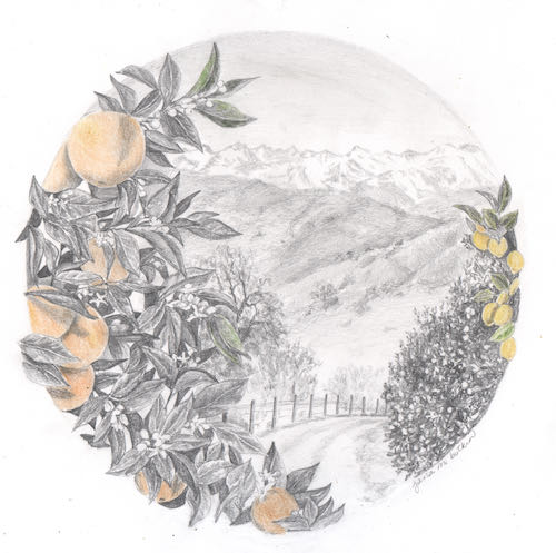
Hey look! It is clearing up! I could tell that something was taking place outside because there were some helicopters overhead, and they made the drawing table vibrate.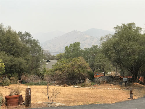
See? Clear as a bell!
Not. But clear enough for air support as the fires continue to rage through Sequoia National Park and fill Three Rivers with worry, smoke, ash, fire equipment, and fire personnel.
If you are someone who talks to God, please keep praying for good slow soaking rain without any lightning.
We cannot get to Mineral King just now. It probably looks like it did last year at this same time.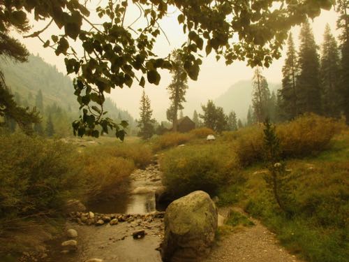
So, let’s just reminisce about better times and look at this important painting I recently completed. Can’t share any details as to why it is “important”, but I can show you the steps. I want this to be the best version of this scene that I have ever painted.
I began the painting while in Mineral King. The idea was to size and place the main parts.
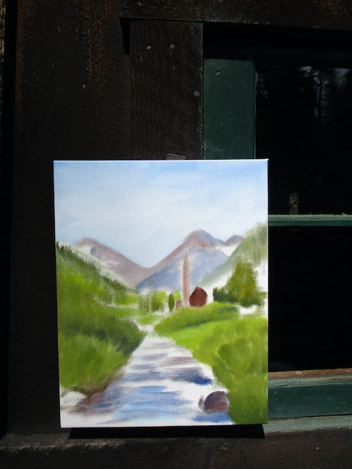
Once I was back home in the studio, I began putting in the details, working from top to bottom, back to front (which means I paint the things that are farthest away first).
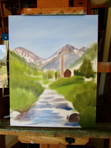
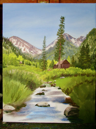
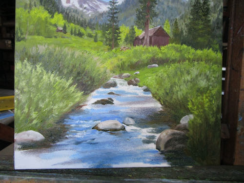
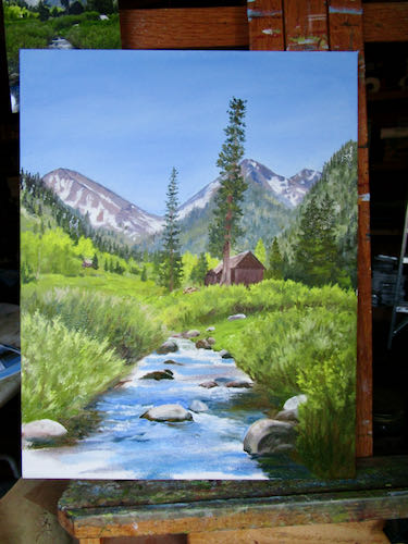
This is fun. It is classic “drawing with my paintbrush”, a frowned upon practice in the Art World. Hey Art World, are you wanting to buy my paintings?
Silence.
Thought not. Well, I’m not making art for the Art World. Instead. . .
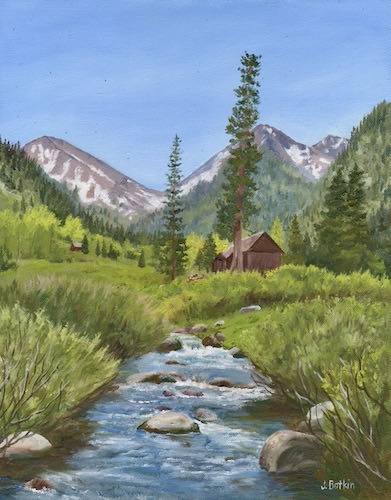
P.S. It looks better in person (Yeah, I always say that, because they always do.)
That’s Paradise Ridge, not Paradise the town, which we know burned a couple of years ago (or was it last year? It’s all a smoky blur).
Trail Guy and I spent a good chunk of a morning talking about what to take, making piles, filling boxes. All the while, we had no intention of evacuating unless the fire gave us no choice.
What are these relics? Is that ash? Are there any treats? Tucker wants to know.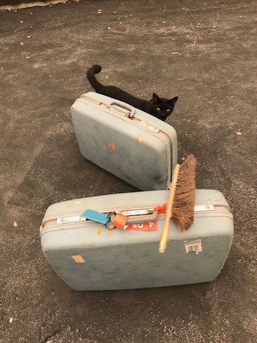
After getting our piles somewhat in order (oh dear, I have way too many sweaters – how am I supposed to decide which ones to leave behind, possibly to never see again??), I went out to the studio to get some work done. Having an emergency doesn’t give me license to create emergencies for my customers.
This drawing might be a little bit too hard for me. Many details are hidden in shadow, and there is a horse. (At least his tongue is inside his mouth). It is good to tackle the hardest part first.
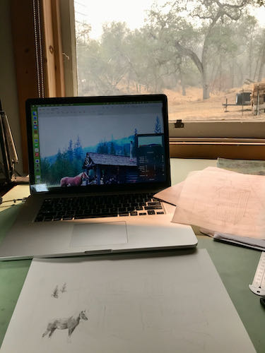
There might be a problem with his feet, so I moved onto the things that I can do with one hand tied behind my back and half my brain occupied with wildfires (and sweaters).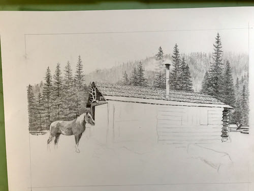
Working from the laptop screen definitely has its advantages. I can embiggen the photos and even lighten the shadows to understand what the various black blobs are.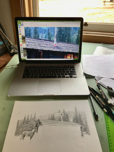 I drew most of the afternoon while listening to helicopters overhead, a welcome sound after they were silent throughout the smoky and worrisome morning.
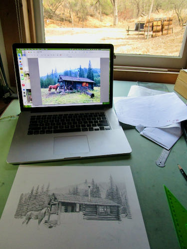
And this is how it looked at the end of the day.
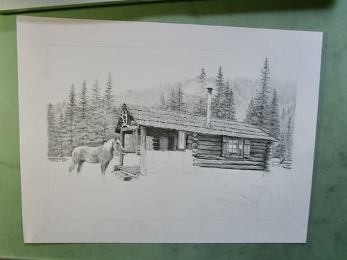
This is a commissioned pencil drawing of a cabin in Montana for a repeat customer who is a joy to work with and for.
In case you were wondering about the reference to the horse’s tongue, here you go. 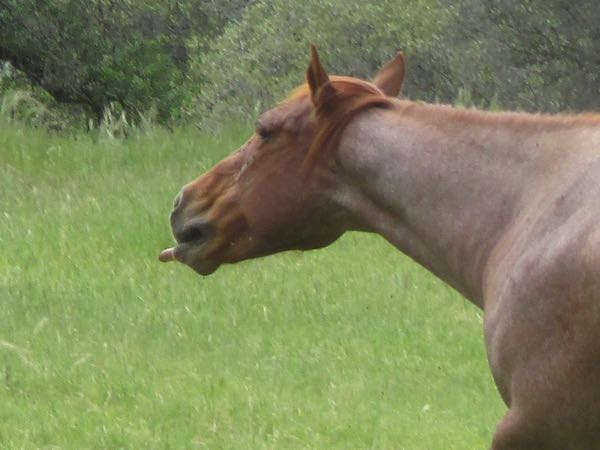
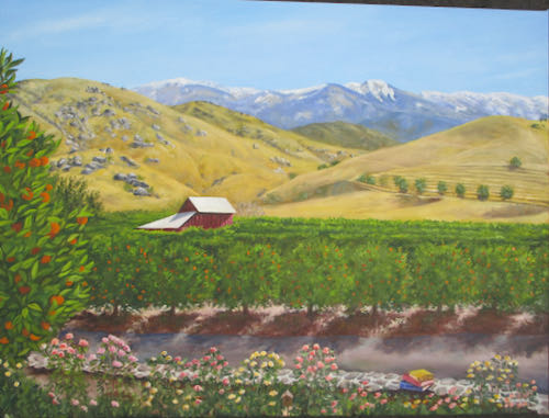
I left the oil painting alone for a week or so, in order to gain distance and objectivity. (Yes, wonky photo, because in spite of this camera’s superiority to its predecessor, the screen is still invisible in the bright sunshine).
Then I switched the photo to black and white, in order to study the contrasts.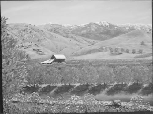
This session of study resulted in a list.
All nine items have been addressed. Can we see the difference in this black and white version?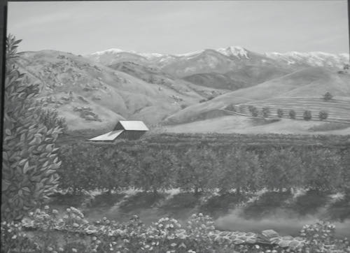
Maybe.
Here is the new color version (also taken in such bright sun, although filtered through a layer of smoke from the fire at Lake Isabella).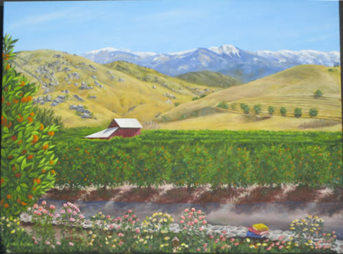
Obviously, this painting is going to be a challenge to photograph well.
Just for interest’s sake, here is the sketch (the post about it is here):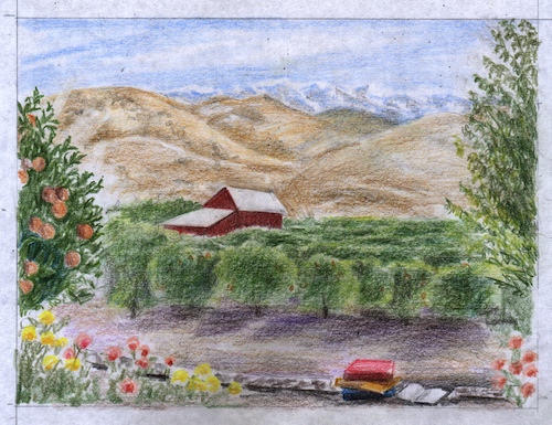
It has come a long ways since the beginning, first shown in this post.
And thus we conclude the ongoing saga of The Large Important Commission Oil Painting.
Maybe, maybe not. Maybe the books need to be less jarring. On the other hand, maybe they are supposed to pop out of the painting because it is for the Tulare County Library (Woodlake branch).
More oil paintings, finished and drying. Have a look at the process. The first one is a commission, the second is just because.
Oops. I forgot to take in-progress photos.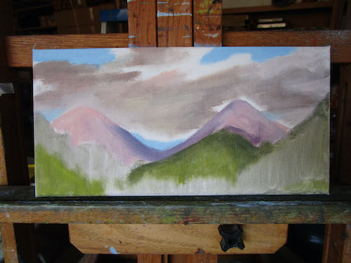
This one has more steps. You already saw the completed version in the Friday post about Mineral King, because this is a Mineral King oil painting, and I delivered it to the Silver City Store. (It could even be sold by now.)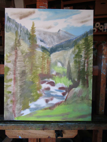
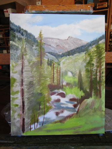
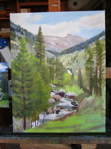
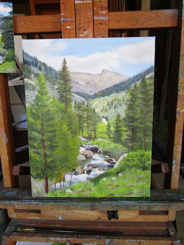
I was very thankful to be able to find the original photo on the computer so I could enlarge to see what the mess of rocks in the stream truly looked like.
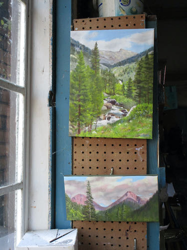
Sawtooth as it looks (okay, I admit to slightly enhancing it) from the Nature Trail and the now famous Alpenglow on Farewell Gap, a commission delivered a few days ago.
“Famous”? Okay, I admit to slightly enhancing the claim.
For awhile now I have told you that my favorite subject to paint is citrus against the foothills and the mountains. It is almost my favorite subject to draw in pencil too. It is right up there with cabins, (published an entire book about them here), old homes (recently drew this one) and the Oak Grove Bridge. (One post about it here).,
Now I am working on a logo design, and it calls for a drawing. (I gave you a little teaser about it here.)
Here it is in progress. I used every source I could find – photos on my computer, previous drawings, physical snapshots – and then proceeded to make up the leaves and oranges and grove.
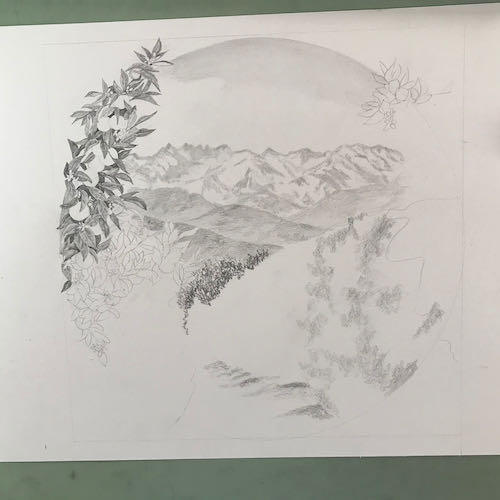
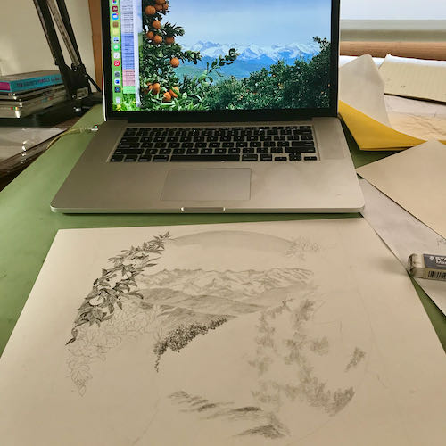
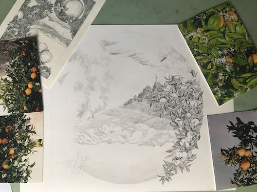
This took much longer than a painting or a drawing of a cabin. I forgot how slow it is to place and delineate every leaf and orange.
Here it is almost finished.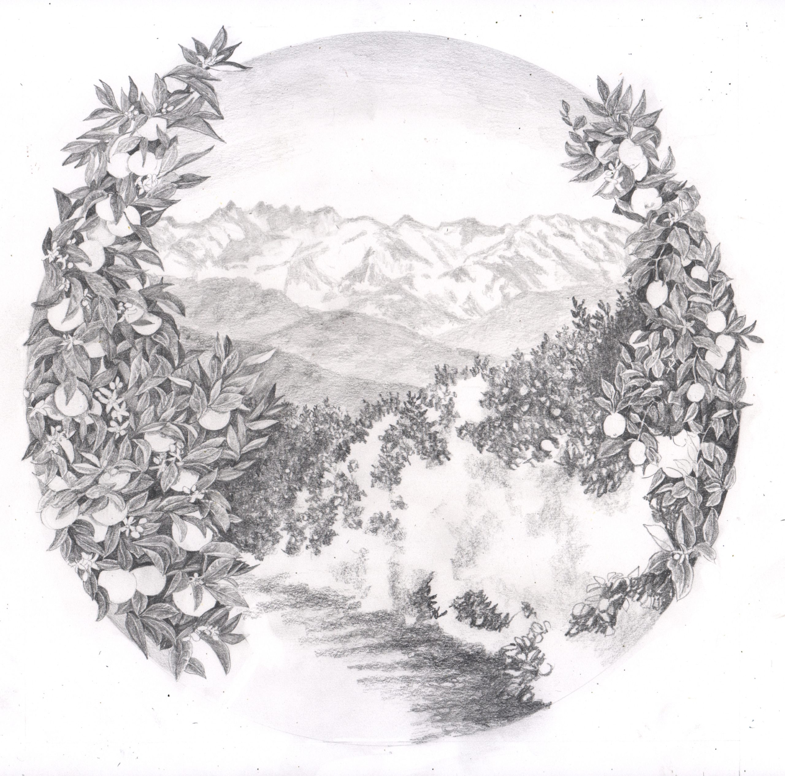
And here is it after photoshopping out all the grayish background.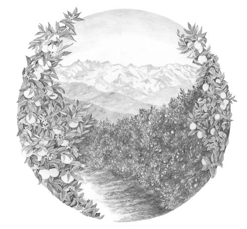
If/when the customers approve, I will add colored pencil: orange in the oranges on the left, yellow in the lemons on the right, and a little bit of green to the leaves.
Portraiture is the most difficult type of art. The only thing more difficult would be multiple portraits in the same piece. Sometimes when people ask me to draw or paint a portrait, I just say no. I have painted a few people, always with no faces visible.(one more here) I have done many pencil portraits, and each one feels as if it will NEVER look right.
I drew a pair of Basset Hounds for someone. She showed it to a friend, who sent me a photo of a little girl holding a baby and asked me to draw it. After studying it, thinking about the oblique angle of the girl’s face plus the fact that squinchy-eyed sleeping babies all look alike, realizing that I have many tools with which to “cheat”, I agreed.
Here is the progression of the drawing, which I expected to be a little bit too hard but turned out to be a pleasure to draw. Seeing the photo on the laptop allows me to convert it to black and white or back to color, enhance the contrast, and enlarge anything that I am not quite sure about.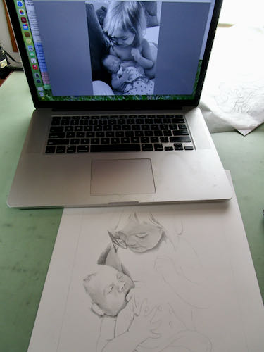
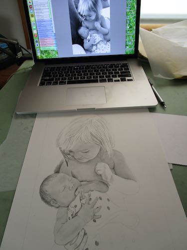
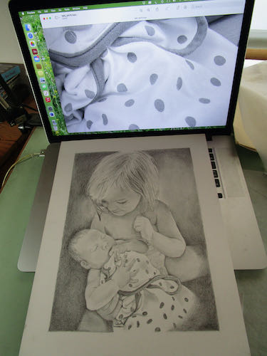
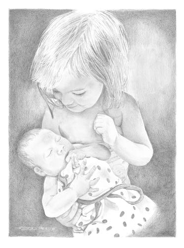
Faces first, because if that part doesn’t turn out, I can quit without too many hours wasted. There were many shapes and textures in the background, and I chose to eliminate them in order to put the focus solely on the little humans. The customer was very pleased and said, “That picture brought tears to my eyes! It’s wonderful!”
That sentiment could have brought tears to my eyes, tears of relief. But I soldiered on to the next project, taking comfort in the fact that it was mountains and citrus groves. (I told a fellow artist that if I was a smoker, I would have lit one up at the completion of this commission.)
Here is a link to the last portrait I drew, hoping it would be the last portrait I drew. Reluctant Portrait
. . .in a barely cool painting workshop in early August, but thankful for the swamp cooler. The day before, I stood the entire time while painting. This day I sat the entire time.
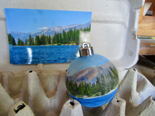
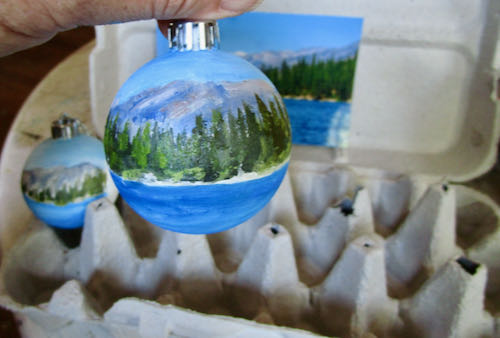
Thank you to Reader Anne for the suggestion of using an egg carton for the ornaments. It sort of worked, but I ended up holding each one in my hand. They are looking better, but still have many layers ahead. These photos are just more teasers about how they are moving ahead without revealing much except that Hume Lake will be on one side.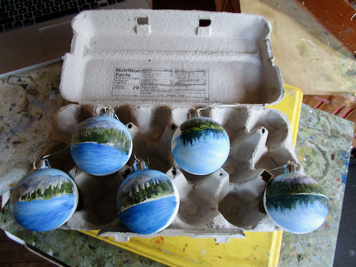
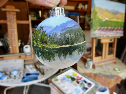
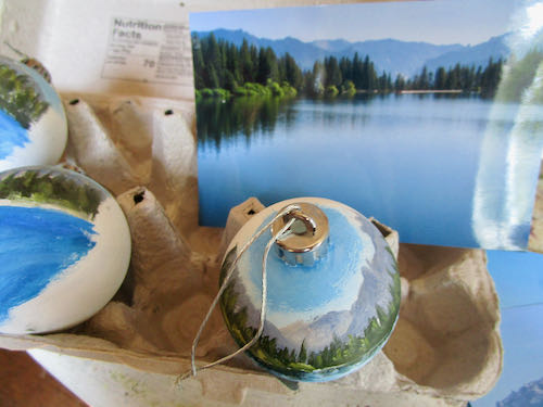
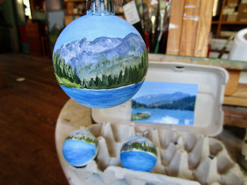
I touched up the 8×16″ of Farewell Gap in Mineral King, but you might have to see it in person to catch the improvements.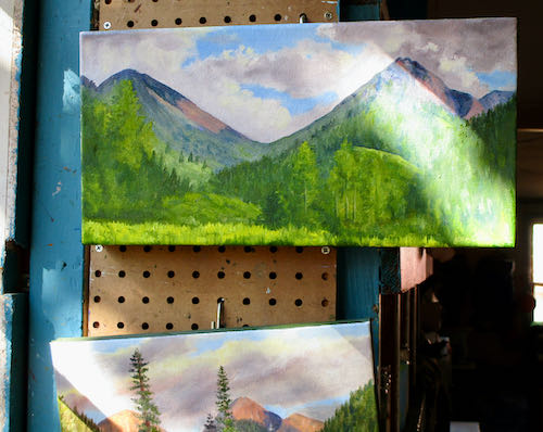
Since Kelly’s Sunset (also in Mineral King) has sold, I painted another one. I have altered the placement of trees from Kelly’s original photo, and altered them again in version #2. In these photos, I can see that the angle of the left flank of Vandever (peak on the right) is too steep. Will anyone else notice? Will the piece not sell? More will be revealed in the fullness of time.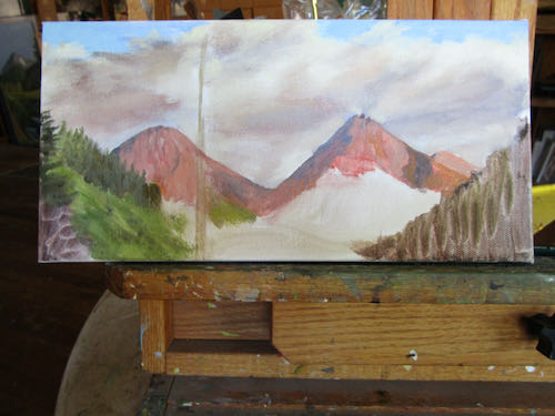
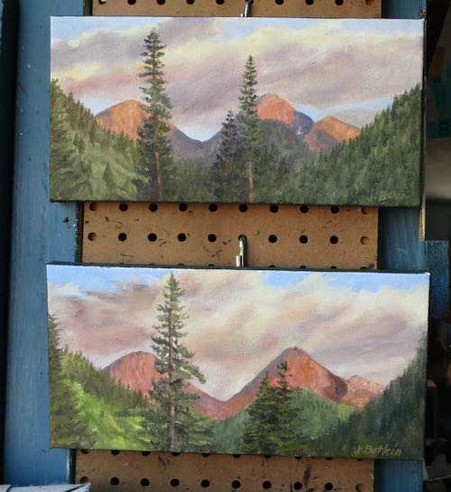
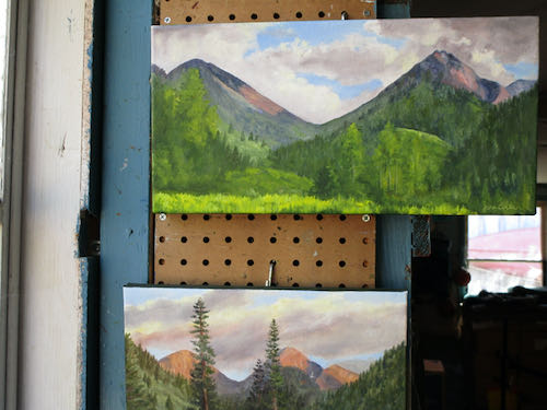
P.S. UPDATE: the smaller sunset painting with the wrong angle on Vandever and a single tree sold immediately.
This large important oil painting commission is getting to be fun. With some custom art, the customer directs many parts of the process. With others, they cut me loose to just do my best and make it look good. This project is the latter. (so far)
The color on the top photo is early morning light in the painting workshop. I started with the close orange tree on the left, worked across the front row of the orchard, moved into the shadows beneath the orchard, and then began laying stones on the wall. The final photo shows the beginnings of rose bushes in the foreground.
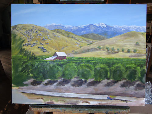
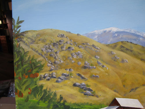
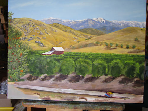
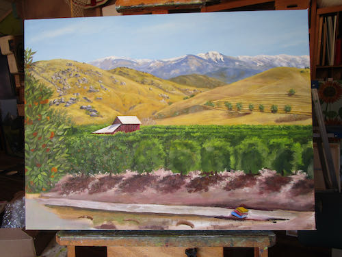
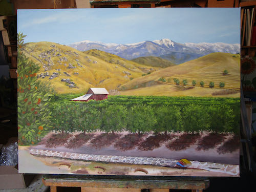
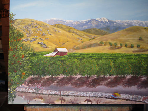
I will continue correcting the colors, tightening the details, fixing wonky stone walls, and studying this until I know it by heart. It is large (for me), important, and deserves as much attention and care as I can possibly give, because there is no deadline!
P.S. Yes, that is a little stack of books. It will be improved on as the project progresses. Remember, this is for the Tulare County Library, to be displayed in their Woodlake branch.