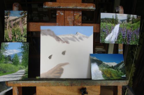
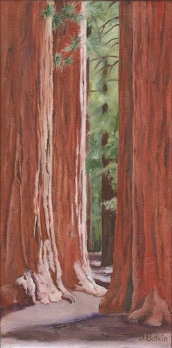
Your Central California artist bumbles along on one Tulare County oil painting, almost finished another, and finished a commission. Let’s start with the bumble.
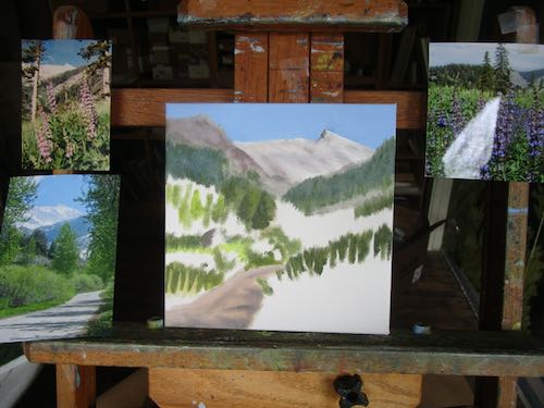
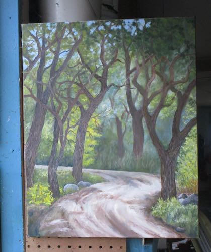
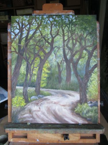
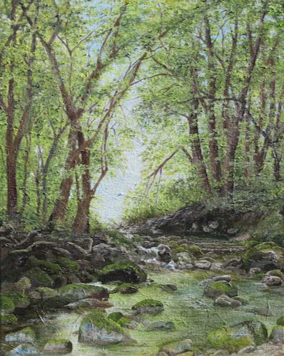
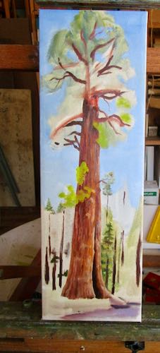
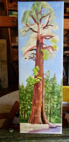
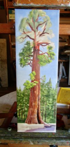
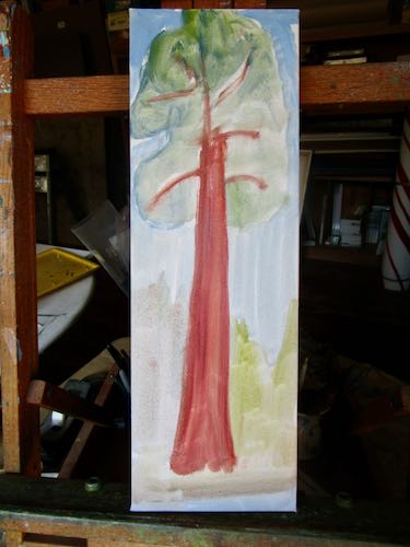
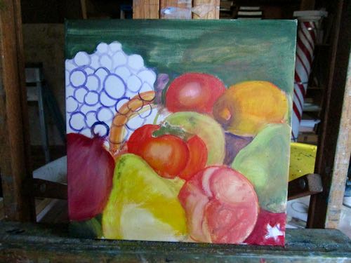
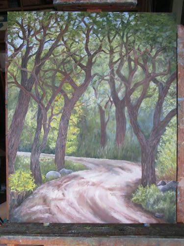
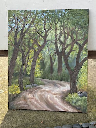
The differences are subtle between the before and the after version. In the after version, the lower left corner makes more sense, and there are more branches on the trees.
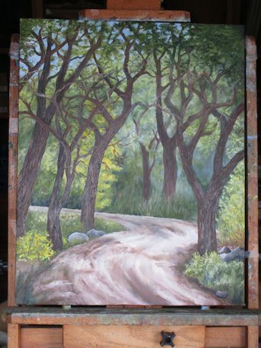
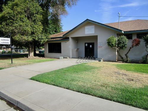
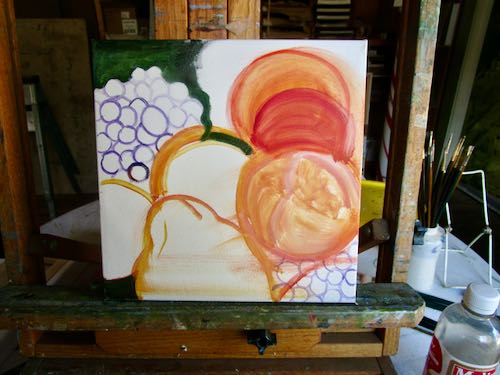
A neighbor-friend stopped by to bring her recyclables because we share garbage services. She works alone at home as I do, and sometimes we just visit for awhile, perhaps our version of hanging out at the water cooler. (Pay no attention to those garbage cans.) She expressed an interest in my current projects, and when I showed her my challenging painting, together we came up with a couple of ideas for improvement. I will continue to bumble along on this difficult painting.
But wait! I made two more adjustments, and then photographed it more carefully. My neighbor approved, which gave me hope. (There will be more adjustments, corrections, and added details.)
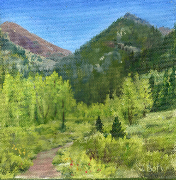
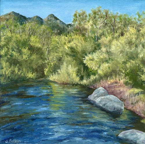
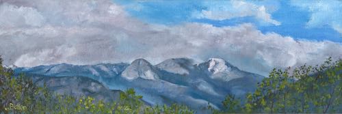
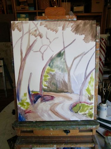
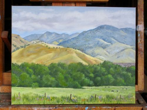
I thought I was finished on the Lower Dry Creek Road oil painting. However, the closer fence posts might require some wire. On the other hand, I might not be capable of such minuscule detail. It still needs a signature and the edges to be painted.
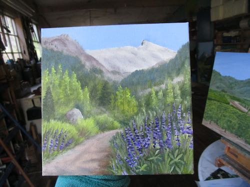
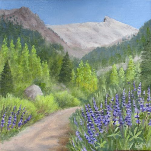
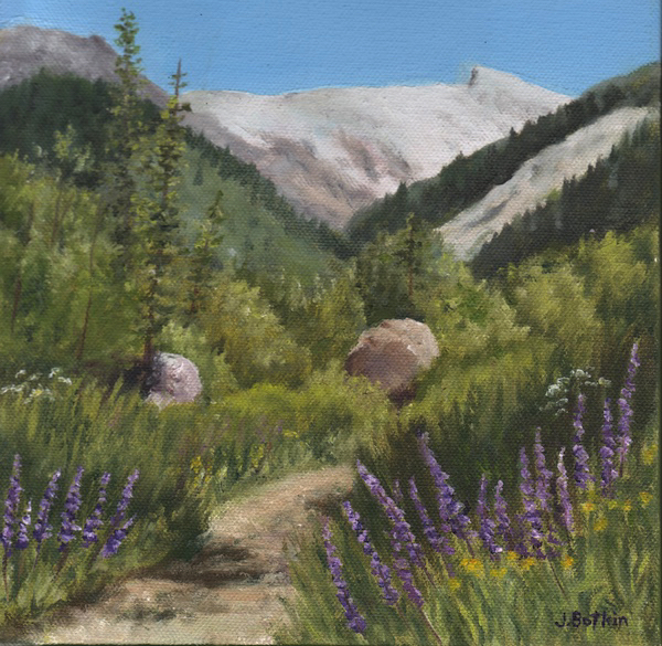
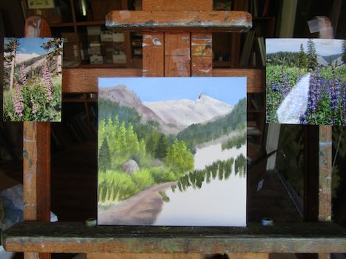
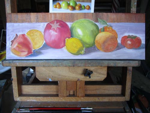
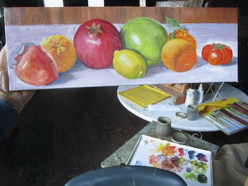
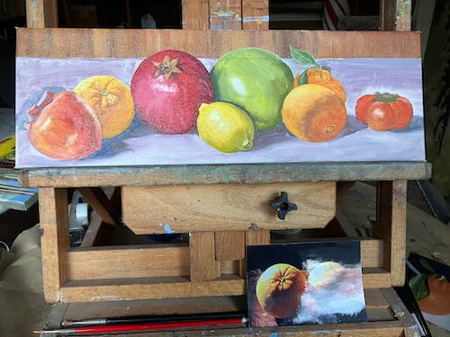
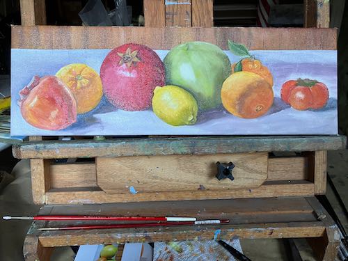
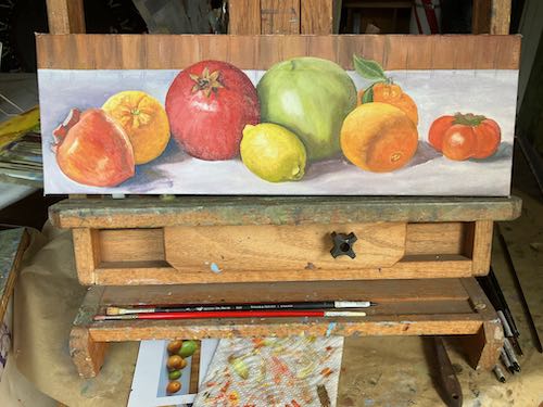
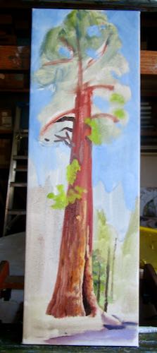
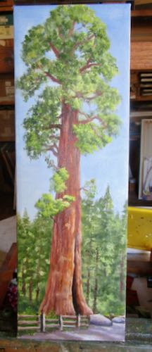
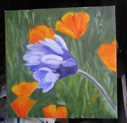
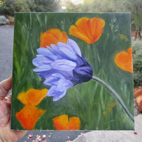
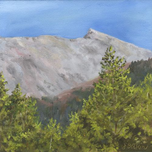
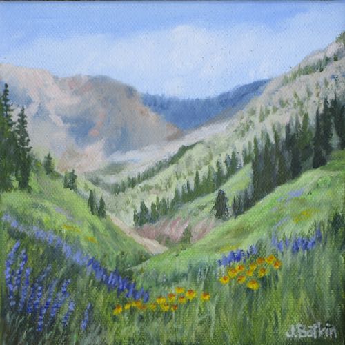
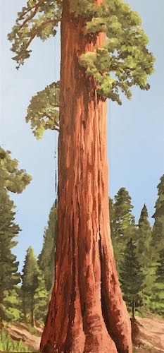
Better detailing, stronger colors, and a signature now done on Sawtooth #34, a commissioned oil painting for JL’s son. This one is only photographed, not scanned, because it is wet.