One Bridge, Two Friends, Two Paintings

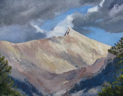
A few years ago, I was hiking with a friend. She wasn’t familiar with the foothills of Sequoia National Park, so I took her to see the Buckeye Bridge. She exclaimed, “Oh my, that is so beautiful! If you paint it, I will buy it!”

Being a realist (both as an artist and in life), I recognized the exclamation as an emotional reaction to beauty, a momentary response rather than a commission to paint.

I also recognized the scene as a potential subject, so I painted it.

Buckeye Bridge 3

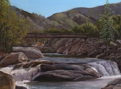
Buckeye Bridge, 12×16″, oil on wrapped canvas, $225

When my friend saw the 12×16″ oil painting, she asked how much. I told her the price of $225, and she got all quiet. Then she said, “Oh. I thought it might be around $75.”

Ahem.

Doesn’t matter. I used the painting in my 2015 calendar of paintings called “Beautiful Tulare County”. Another friend who shares my love of art and this area, got all excited when she turned to the May page of her calendar. Her friend’s dad helped to build that bridge, and she commissioned me to paint it 6×6″ as a gift for that friend.

buckeye bridge painting

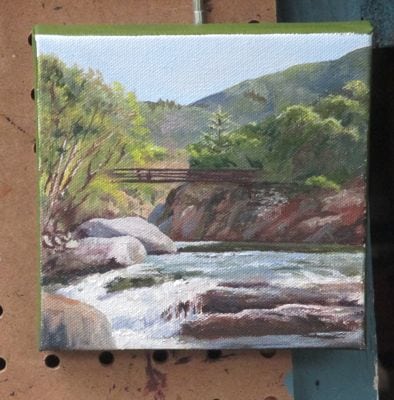
It is almost finished – maybe a few more little touches and then a signature.

I paint better now. The original painting will get moved into the category of “Do Over”, AKA “I Paint Better Now”. Or, perhaps I photograph better now?

What Shall I Paint?

Have you ever wondered how an artist decides what to paint?

Me too.

What I paint falls into 4 categories:

  1. Things I know will sell
  2. Things I want to paint
  3. Commissions
  4. Reworking old paintings

Category #1 includes Sequoia scenery, anything Mineral King, citrus, the Kaweah Post Office, the Kaweah River, the Oak Grove bridge and poppies.

sawtooth XI

Sawtooth Peak, 8×10, sold (Mineral King)

Category #2 can be flowers, fruit, an experiment, something with great light or a color that makes my heart sing, a gift for someone, or something so beautiful that I cannot resist.

Category #3 is anything a customer has requested, usually paid for up front, and sometimes working from his photos.

IMG_0951

Sequoia painting in progress, sunflowers because I want to paint them, Buckeye Bridge as a commissioned piece.

Category #4 happens when I look objectively at a painting that’s been hanging around for awhile (literally) and decide that I paint better now.

Lake Kaweah

Lake Kaweah, or perhaps Kaweah Lake, 16×20, $350, repainted, revised, and revisited more times than I can remember. The constant improvement is bound to catch the eye of a customer. Oh – it is called “Lake View VII” on my website!

Odd Job, Chapter Four

Finally, I got to the actual painting stage of my odd job.

The Blue Moon Nursery got a 4’x8′ piece of very thick plywood, built a frame around it and painted it with multiple coats of white paint. This was a result of walking out to the road and measuring the existing signs. A medium sign looks like an unnoticeable postage stamp when you pass it in a car. A big sign might get noticed. A huge sign is too much for this Central California artist, so we just went with big.

I traced our final design onto a clear piece of plastic and using an overhead projector in three stages of measuring and adjusting. I used a Sharpie marker to transfer the image, along with a square, a yardstick, and a long tape measure. It took a very long time.

Then, I traced it from Side One onto 2 18″ x 8′ pieces of tracing paper, retraced it with a very black pencil on the back side, taped the 2 sheets to Side Two of the sign, and retraced it over the top with a pencil to transfer the design to the sign. Then I retraced the faint pencil transfer with the Sharpie. This took a very very long time.

Do you need a nap yet? Hang on, color is coming!

After a very fun color mixing session with the owner of Blue Moon, I began painting.

IMG_0933

First, a small brush to reach into the pointy places.

IMG_0944

Then, 2 coats of the dark blue. Next the green. Hmmm, we really like the color of the masking tape with the dark blue.

IMG_0945

I can mix that color! (This is actually side 2, after we chose a different blue for the moon and the spirals). The new blue called for a new green.

IMG_0946

Check out Side Two, with masking tape blue and light spring green!

IMG_0947

This is Side One, with a darker green and a lighter blue.

IMG_0948

Isn’t this cool? The owner of Blue Moon and I both are slightly offbeat, marching to the beat of a different drummer, enjoying variety. (After being friends for 4-5 years, we discovered that we were in the same class in the same high school!)

So, we decided to let the 2 sides remain in different (but very close) colors, and then we’ll listen to people’s comments. It is my guess that very few people will even notice the difference.

Thus, I conclude my story of yet another odd job for this Central California artist. It is a pleasure to beautify Three Rivers!

Do you have a preference on the colors on Side One and Side Two? I’d love to hear your opinion!

Odd Job, Chapter Three

My odd job of painting a sign for the Blue Moon Nursery in Three Rivers progressed through the decision making progress.

IMG_0935

This combination of type was our first choice. The style of Blue Moon is a little hippy-dippy, loosey-goosey, whimsical (sorry, can’t think of a rhyme for that word). “Nursery” looks solid, professional, steadfast, here to stay.

IMG_0936

It needs some decoration, but this wasn’t the right one.

The owner and I decided on the best combination of type and decorations, and then got to the part we both love (both avowed color junkies).

IMG_0934

We both love the dark purply-blue, the high contrast with the white lettering, and it is a given that the growy needs to be green and the moon needs to be blue. Color is sooooo fun.

Now what? How will I get this colored sketch onto a 4′ x 8′ board??

Stay tuned!

Odd Job, Chapter Two

It is a bit odd for a pencil artist/drawing teacher/oil painter/muralist to be asked to paint a sign. The owner of Blue Moon Nursery in Three Rivers knew we would work well together, so she decided to overlook my lack of experience and hire me for the odd job. (Odd job to me, but sign painting is a solid profession. I’d like to have the tools, ability and knowledge to do it well.)

After messing around with typestyles and shapes and weights, it was time to add the extras. A nursery asks for things that look growy, and “Blue Moon” is sort of a gimme.

IMG_0937 IMG_0938 IMG_0939 IMG_0940

None of these made the cut (what exactly and literally does that mean??).

The owner of Blue Moon Nursery had some definite and good ideas, and together we came up with an excellent combination of type and frou-frous.

Stay tuned for the decision and the next steps.

Odd Job, Chapter One

Is sign painting an odd job for an artist?

It depends. If you live in a city where there are sign painters, they would be a logical choice for a sign.

If you live in Three Rivers, have a limited budget, would rather not drive 35 miles and want to have input, then choosing an artist might be a good decision. Blue Moon Nursery, AKA Sierra Garden Center, is one of my top 5 places to spend money in Three Rivers. (grocery store, post office, hardware store and Sierra Subs)

My sign painting odd job began with a conversation: “How comfortable are you with lettering?”

I’ve learned to just listen and ask questions, so we moved along until I decided that perhaps I could figure this thing out.

First, I messed around with type – the styles and the arrangements seemed endless.

IMG_0941 IMG_0942 moon 7 moon 8

It was a progression as I experimented with different styles, different weights and different curves. The final one here was my first choice.

Stay tuned to see what the next decision was!

Odd Job Based on Mineral King

After many years of being an artist in Tulare County, and specializing in Mineral King, people often think of me when they need an artist. I get asked to do unusual things, which I call “odd jobs”.

This one was a first for me – drawing in a manner that could be sandblasted onto granite for headstones. The lines had to be a certain thickness, and little white spaces couldn’t be too little. I learned that black equals blasted, and that Sharpies can really get up your nose.

The designs are for people who were very dear to me, our cabin neighbors in Mineral King.

He wanted Farewell Gap. She wanted Sawtooth. Their daughter and I figured out how to do both on one stone.

Farewell, Jock. Thank you for closing the gap between my 2 front teeth, for giving me to okay to date Trail Guy, for being a wonderful generous neighbor and friend, and for rearing a daughter who feels like the missing half of my brain.

Farewell, Ora Kay. Thank you for helping Jock fix my teeth, for being my first good friend in Mineral King, so welcoming and loving and enthusiastic, for rearing such a great daughter to become my friend when you were stricken by MS and couldn’t come to the cabin much anymore (and I forgive you for running over my foot with your wheelchair.)

Do-Over and other juvenile expressions

When you were a kid, did you sometimes allow do-overs on the playground? You know, you go to serve the volleyball, the class clown belches your name so you drop the ball instead of hitting it, and you get a do-over because it wasn’t fair?

I began a painting of pumpkins several years ago. It was to be a gift for someone who did me a favor, but the favor went south and the friendship did too. I couldn’t bring myself to finish it. I tried and tried to disassociate the painting from the incident, but every time I looked at it, I felt yucky.

Wow, this is a juvenile sounding post. “Do over” and “yucky”. Wonder what’s gonna sneak out next?

A customer requested a painting of Sawtooth after she saw my cards with that scene. I am always willing to paint something again, so I thought “Do-over? Sure!”

When I went into my canvas stash, I saw that dreaded pumpkin painting. Hmmmm, I wonder. . . Then, I couldn’t find the photo. No problem, because it was part of the first calendar of paintings I had printed (the 2013 calendar).

Look! Something weird is happening to those unfinished pumpkins!

Isn’t that weird?

I think it worked! The colors will be a bit brighter on this second version of Sawtooth because I am working from the printed version, which has exaggerated colors. I think it is funner this way.

There! Got in another juvenile expression!

When this dries, I will detail the branches in the foreground.

P.S. Sawtooth is the name of a prominent peak in Mineral King, the part of Sequoia National Park in the southern Sierra Nevada where I spend the most time.

Challenging Pencil Commission, Finished!

I made the changes suggested by Cowboy Bert’s wife. She is very aware of what a mule looks like from all angles, and very observant of details. (As a retired law enforcement Captain, she sometimes refers to herself as a “trained observer”.)

Here it is:

The customer requested color, in a hand-tinted old photo sort of manner. This is how it looks:

The customer requested more color. I’m on my way out to the studio to work on that. . . or “back to the drawing board”.

Ahem. Perhaps I underbid this job slightly.

P.S. Did you figure out that this is Mineral King?

Working Through a Challenging Pencil Commission

There I was, faced with the necessity to draw the north end of a mule headed south, and no reference material!

What’s a Central California artist to do?

Call in Cowboy Bert, of course.

That would be Cowboy Bert, Equine Photographer, who graciously set up one of his mules and positioned him for numerous photos. I was able to print out 3 for reference, but because it took a couple of hours for them to load on my computer, I didn’t save the photos to show you.

Then, I commenced drawing. When I can see what I need to see and know what I am seeing, I can draw very quickly. When I am drawing the north end of a mule headed south and the photos are all just a tad bit different and various pieces of information are obscured behind a tail or in shadow. I take my time. Here are a few of the stages that the drawing went through:

Nope, not drawing anything I can’t see. Waiting for photos. . .

Okay, let’s try this thing.

Hard to see the difference from the previous one. Maybe it is time to get an expert opinion.

At this point, I emailed it to The Captain, who is the prettier partner of Cowboy Bert. She has also taken drawing lessons from me, so I knew she’d observe every detail and prevent me from exposing my ignorance of a mule’s back side.

We laid tissue paper over a printout of the drawing, and the Captain showed me what she saw while explaining it. I repeated it back to her to be sure I understood, and then wrote notes so I could fix things later. (This all happened while setting up for her father’s memorial service – shows you what a thoughtful generous person she is, and possibly what a jerk I am for asking such a thing at such a time.)

Stay tuned for the final drawing. (At the time of this post, it isn’t yet finished.)