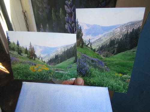
Recently I told an old friend that I have no commissions. He said, “I have one for you”. Many years ago he bought a couple of Mineral King paintings from me. One was when I was very new to painting, and according to Friend, I was reluctant to accept his hard-earned dollars for it. He wanted me to paint the two again, so he could see the difference.
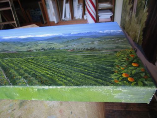
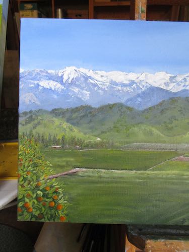
After he sent me a photo of the two paintings on his Mineral King wall, I asked if he wanted one or both, and what sizes. He chose one, a 6×6″, and it is the newer of the two paintings. However, it is still before I kept good records of completed work. (I started oil painting on March 8, 2006. Yes, I remember the date.)
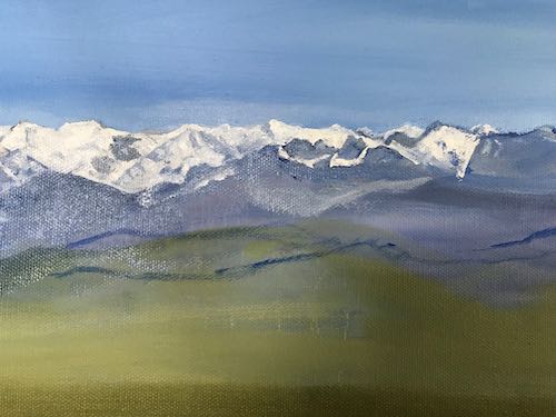
This is his photo: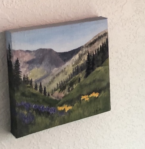
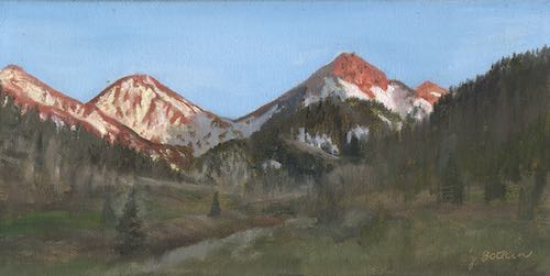
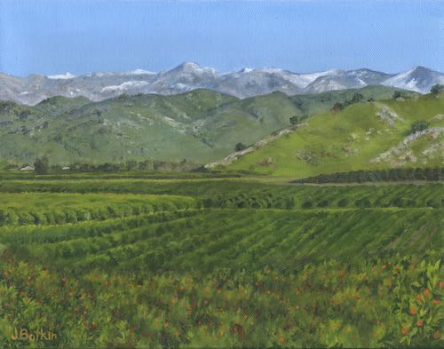
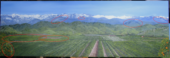
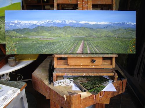
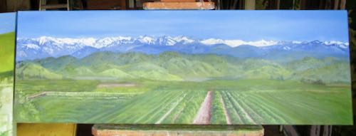
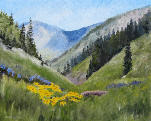
I looked through my files of completed oil paintings, and holy guacamole, look how many paintings of this scene I have in my records!
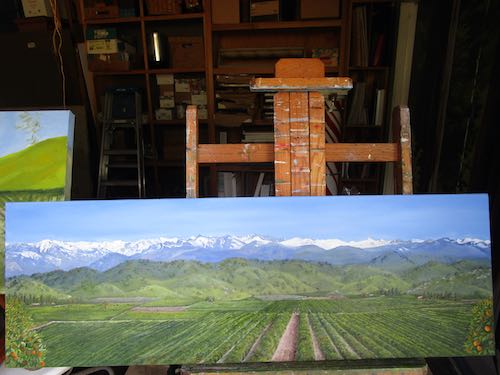
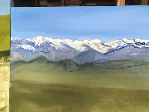
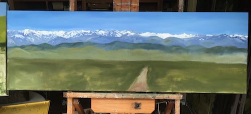
This is the first one, probably from 2006 or 2007, when I was still painting on boards rather than wasting canvas.
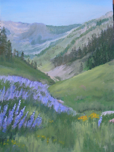
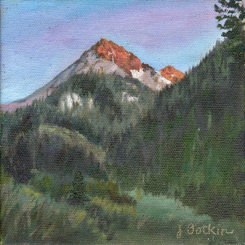
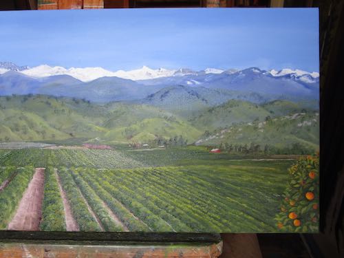
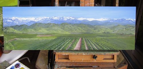
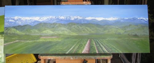
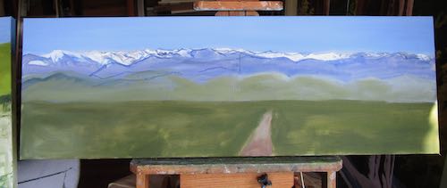
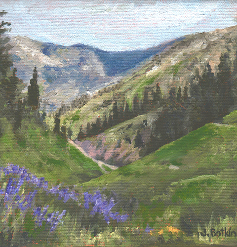
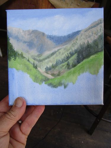
This is from 2010.
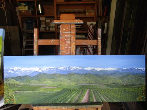
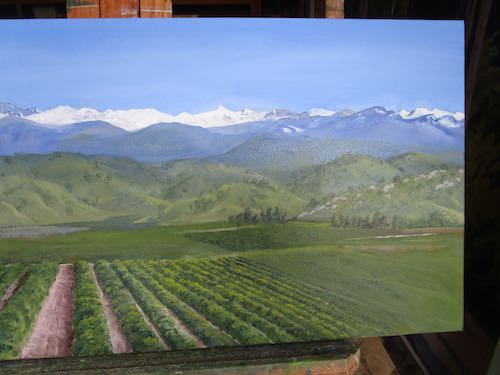
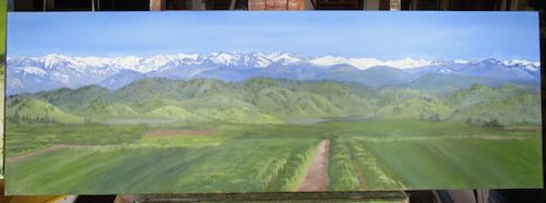
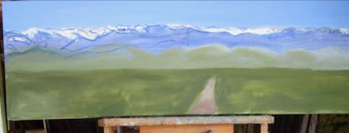
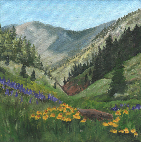
2013
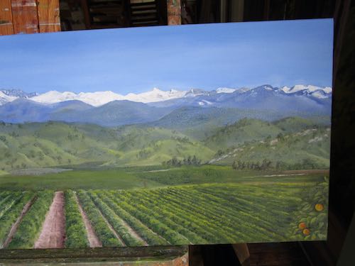
2014
Can’t tell. . .
- . . .if these are painted from the same reference photos or not. I can tell that none of them are the one that Friend owns.
- . . .if these improve through the years.
- . . .if the 2023 version will be superior to these.
Excuses
- It is too hot to paint for very long this time of year
- When the swamp cooler was roaring in the painting workshop last week, I didn’t hear the plumber arrive, so the gate was closed and he left. I now have to wait AGAIN for him to show. (WHY doesn’t he call first??)
- I am out of practice.
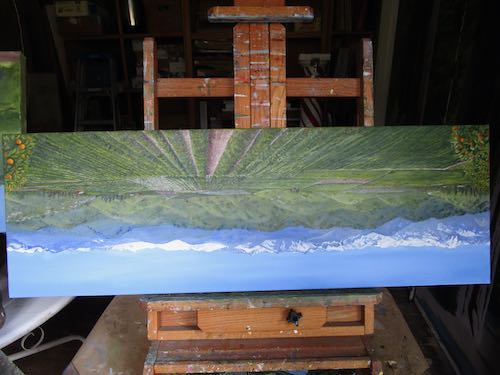
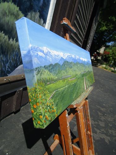
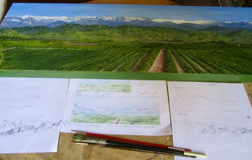
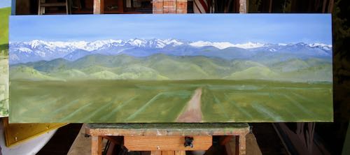
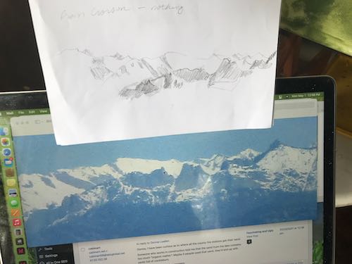
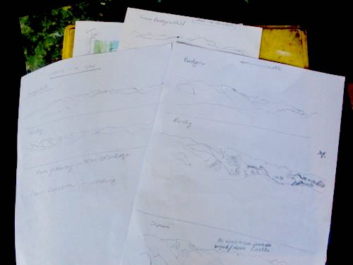
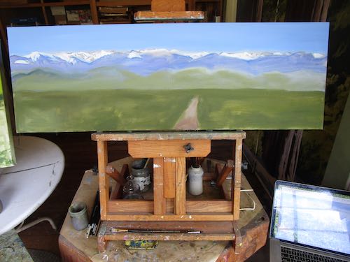
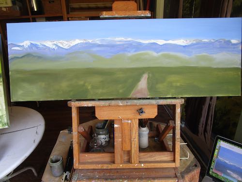
Beginning steps
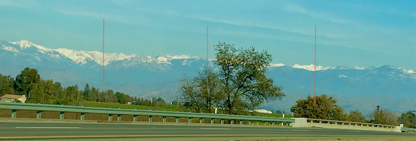
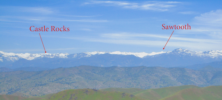
I found two photos to help me get this right.
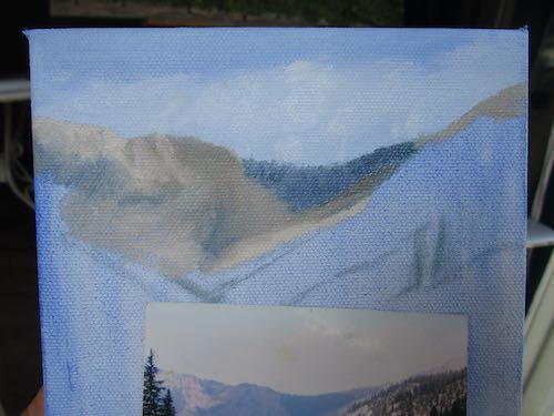
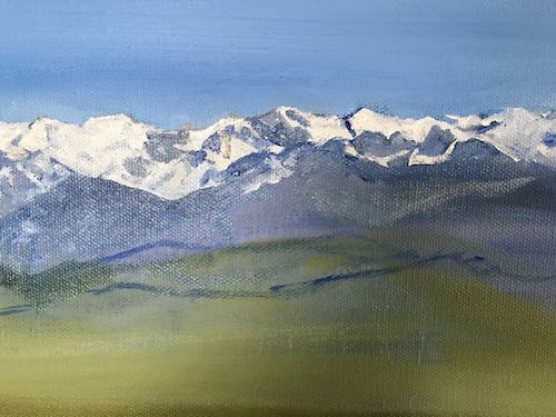
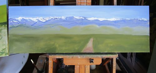
Ugh. It’s hot and the swamp cooler is roaring, and I want lunch. There is no deadline, so I will paint slowly with many corrective layers.
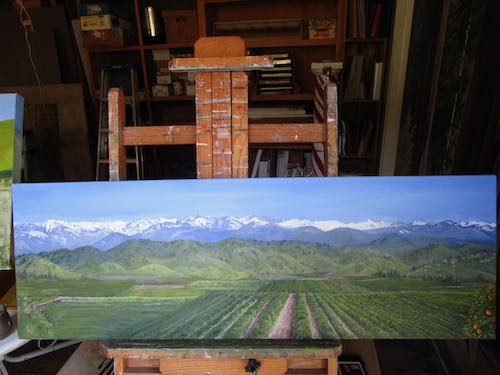
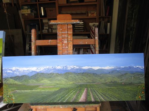
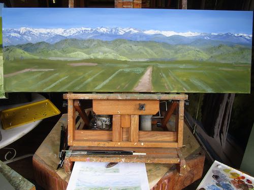
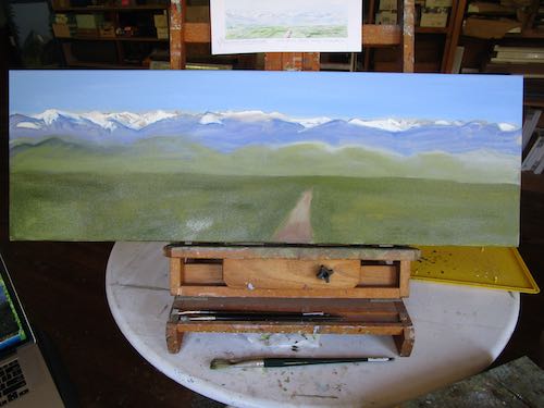
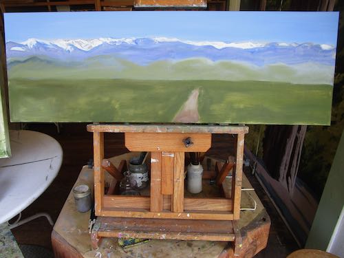
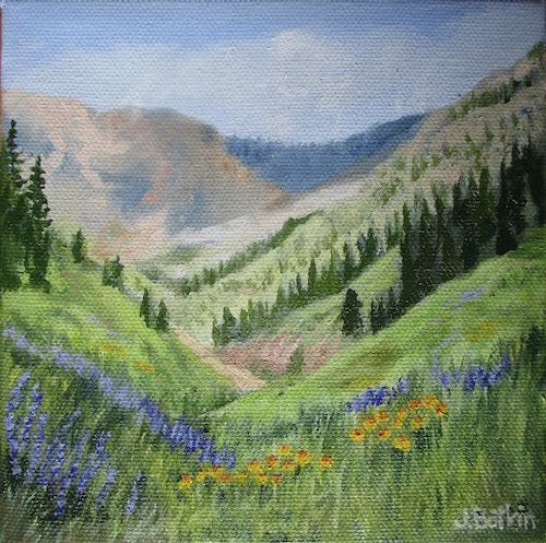
Done.
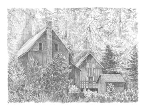
Now, we return to our regular broadcast, a series called “Cabin Life”.