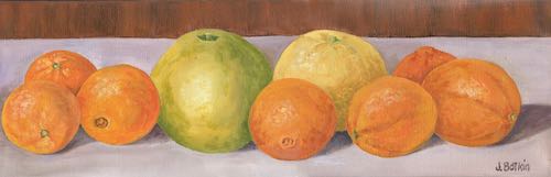
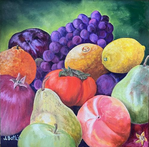
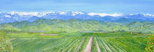
Feeling fruity around here lately. A month or 2 ago, I painted this to decorate a banquet for a citrus marketing outfit.
A friend who has bought more of my paintings than anyone else saw this. She said, “If it doesn’t sell at the event, I want it!”
I took the painting to her, and she said, “I’ve been thinking. . . could you change one of these to a pomegranate? And include both kinds of persimmons?”
I said, “Sure, I can do that!”
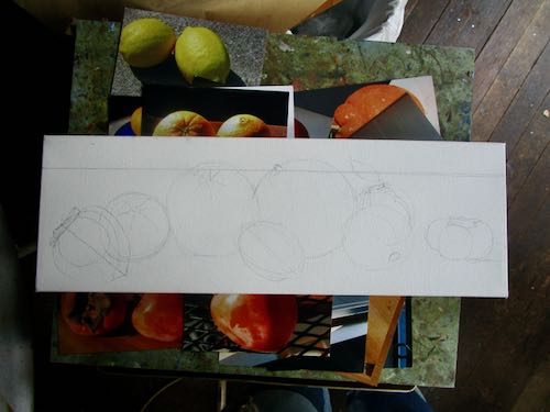
Then I brought it home, thought it over, and decided to do a new piece for her. I dug through my fruit photos, looking carefully at the lighting and angles. Then, unlike my normal approach, I drew it out.
This is going to be good—colorful and well planned.
The other fruit painting I recently painted as a gift, I did without any real planning. I just pantsed it, trying this and that with paint, having fun with color.
I like it, and so does the recipient. Yeah, yeah, it probably would have been better to plan it. Sometimes I just rebel.
P.S. Good thing I painted a new one because the original, Citrus Row, sold at CACHE’s Holiday Fair!
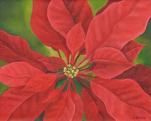
“Margaret’s Poinsettia, package of 4 cards and envelopes, 4.6×7.2”, $20. Inside message: Wishing you Christmas joy and blessings in the new year!
Through the years I have designed, printed and sold hundreds, nay, THOUSANDS of little cards. “Notecards”, as I refer to them, are perfect to say “thank you”, “hi”, “just one more thing”, “I appreciate you”, or even “I’m sorry”. If you write real big, you can get by with just one sentence.
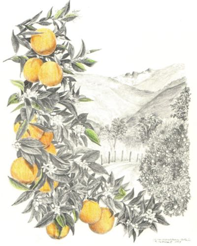
“Sun Kissed”, pencil and colored pencil drawing, package of 4 notecards and envelopes, 4-1/4 x 5-1/2″, blank inside, $10
Designs come and go; sometimes I redraw something and then get rid of the older version. Other times, it seems as if a design has run its course and needs to be retired. Sometimes I have too much inventory, so I let a design run out for awhile. And sometimes a design that really grabs me just doesn’t speak to the buying public.
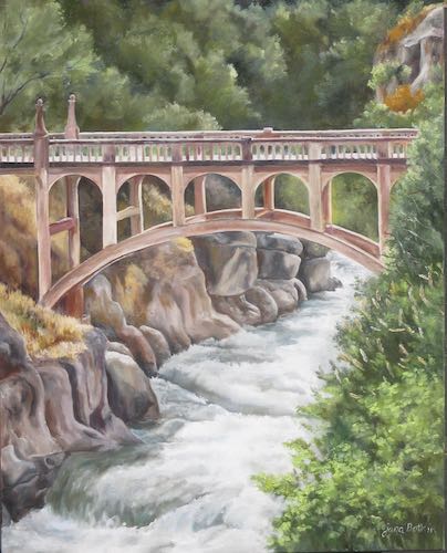
“Oak Grove Bridge #28″, oil painting, package of 4 notecards and envelopes, 4-1/4 x 5-1/2”, blank inside, $10
I used to sell my cards in many stores around the county. Most of those stores are now closed. Even if the stores were still around, my costs are so high that if I sell them at a wholesale price to a retail store, there is zero profit for me. This means that I am working for free. That’s just dumb business.
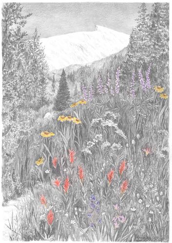
Sawtooth and wildflowers, pencil and colored pencil drawing, package of 4 cards and envelopes, blank inside, 4-1/4 x 5-1/2″, $10
Nowadays I sell the cards here on my website, occasionally when I do a bazaar or if I am having an art showing or exhibit (what’s the diff? I dunno), and on consignment at a very few places. “Consignment” means that they pay me after the cards sell, which means a lot of checking in, rewriting lists to keep current on supplies, making bills, sending the bills, paying attention to what has sold and what needs to be restocked.
Farewell Gap in Mineral King, pencil drawing, package of 4 cards and envelopes, blank inside, 4-1/4 x 5-1/2″, $10
It’s all part of the business of art, which involves many decisions. Most of those decisions would be better if I had a crystal ball. Lacking that, I look at the history of sales, look at the current economy, look at the venue and think about the customers. If consignment, I look at the store’s record of payment, if the cards are getting shopworn and need to be repackaged, or if the store hasn’t been displaying the cards in a manner that the customers can see them.
“Sawtooth”, oil painting, package of 4 notecards and envelopes, 4-1/4 x 5-1/2″, blank inside, $10
The business of art is a complex and delicate blend of science, art, and guesswork.
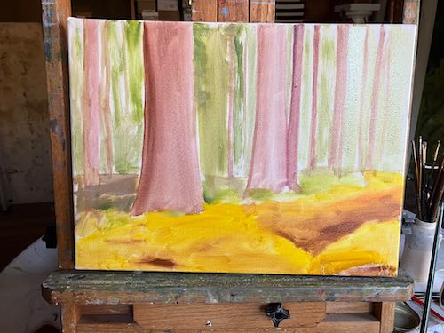
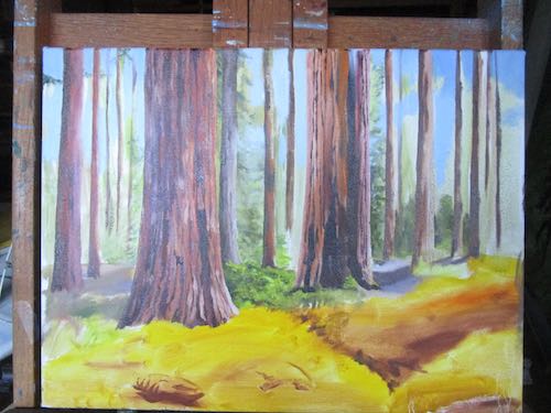
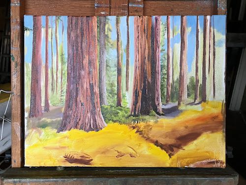
After a chunk of time away from the easels, I was very happy to return.
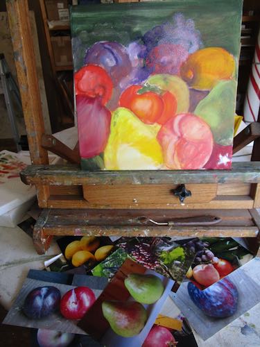
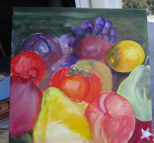
First I got to finish the fruit painting that will be a gift. (I will be GIVING it, not “gifting” it.)
This is wet, photographed here in the box I used to carry it into the house to dry.
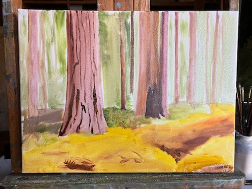
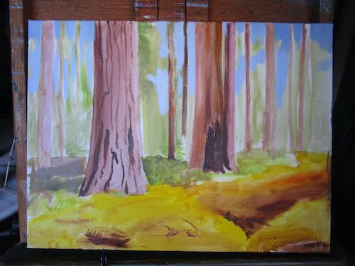
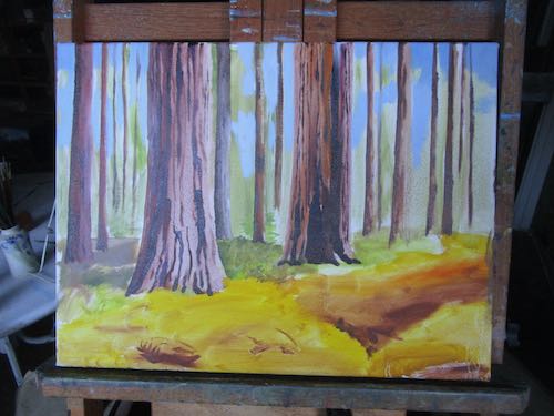
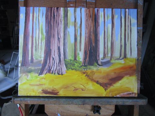
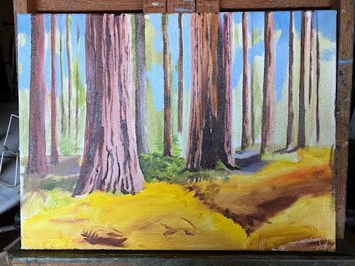
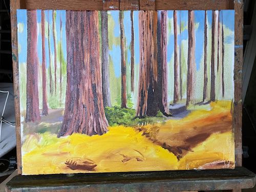
I started this quite awhile ago, working from a photo shared with me by one of my drawing students. The ferns had been nipped by frost, turning them golden.
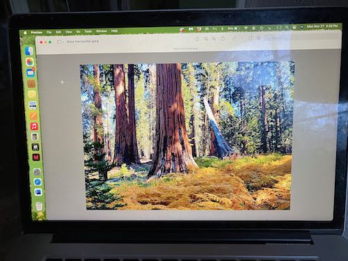
Although I am working from a photo, I am rearranging the trees. Here is a photo of the photo, which I am looking at on my laptop while painting.
My hope is to make those ferns perfect. Just perfect. But there is lots to be painted before I get there.
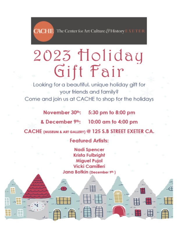
The new paintings won’t be at the Gift Fair but there will be plenty of merchandise to choose from.
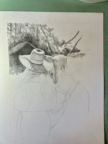
Because I teach people how to draw, it is prudent for me to keep in practice. I have no commissions right now, so this means I can draw whatever I want.
I began a drawing that was full of challenges, showing my students that I follow the same steps that I teach them. Then I had some interruptions to my work life and just set it aside for awhile. When I returned to the drawing, it was hard to focus.
Flowering pear
I pulled out the drawing and decided EVERYTHING was wrong. So I stared out the door for awhile.
Finally I went back to the drawing, following the advice I would give one of my students to see what, if anything was wrong. I discovered one part that was easy to correct, and then decided that I wasn’t focused enough to work on detail. So I went to the blurry, dark, somewhat unimportant background. “Unimportant” in that its accuracy was irrelevant, but important in that it be a support to the main part of the drawing without drawing attention to itself.
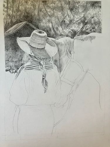
I didn’t document the earlier phases of the drawing because it didn’t seem like a potential blog post. The hat was the most important part to me, so I did it first, figuring that if it didn’t look good, I could just toss the drawing without having invested too much time.
You can see a serious erasure under the horse’s chin. That was the easy-to-fix part, and I hope I can bury the messed up part in some background.
I walked back to the house after this bout of serious focused work (fall down laughing). Told you this was distracted drawing, didn’t I?
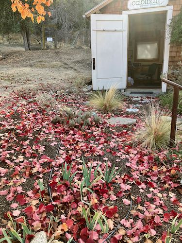
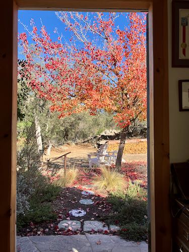
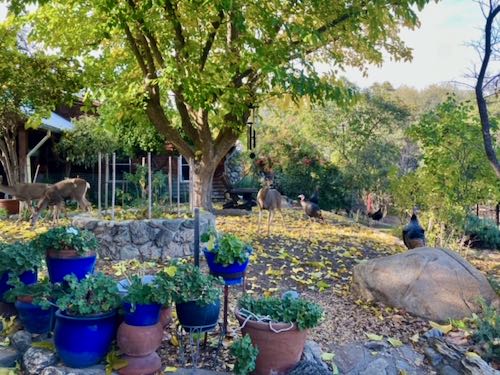
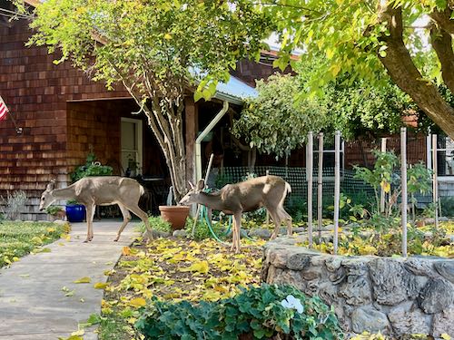
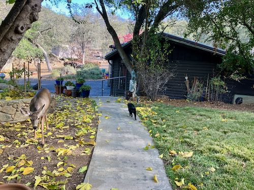
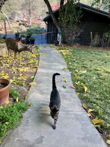
Wild turkeys and deerFearless deer are vacuuming up the mulberry leaves.
Tucker and the deer don’t really care about each other.
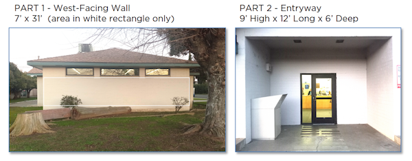
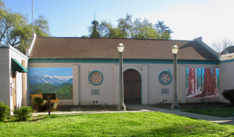
Today I will show you what I submitted for the 2nd mural on the Ivanhoe Library.
For review, here is what the selection committee provided.
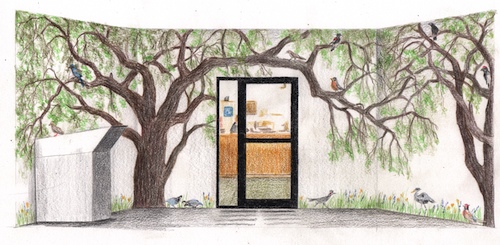
Here is what I submitted for this entry way.
Here is my explanation.
“Mural B shows 2 Valley Oaks, quercus lobata, which is the largest American oak, native to Tulare County. In and beneath the trees are local birds, all seen in and around Ivanhoe, along with a few wildflowers at the base. This could be used as a fun method for children to learn their local birds.
Now, we shall see if I actually get to paint these two murals.
P.S. The commenting part of the blog has been misbehaving but comments are coming through anyway. So to those of you who soldiered through, thank you!
Okay, I’ll quit stalling now. This is what the Ivanhoe Library mural project gave to the potential artists.
First, I introduced myself with this.
“I am very pleased to be able to submit two designs for the library of my youth. I grew up outside of Ivanhoe, attending Ivanhoe Elementary School K-8. I credit my 6th grade teacher, Tom Stroben, with teaching me to draw, and much of my childhood was spent reading books from this library. It would be a huge honor to be selected as the muralist for this Tulare County treasure.”
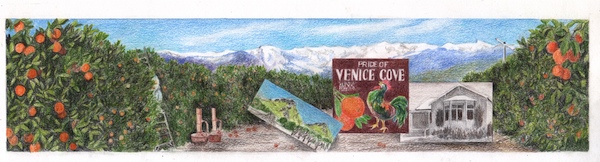
And this is what I submitted for the long wall.
This is the explanation that accompanied the sample. The selection committee didn’t ask for this, but they got it anyway.
West Wall is an orange grove with the mountains in the distance and three insets. The mural shows a picker on a ladder (partially hidden), smudge pots, and a wind machine. In the distance are the Sierra Nevada as the peaks show on a clear day from Ivanhoe. The insets are (L to R) Twin Buttes (a geographical landmark north of Ivanhoe), an old citrus label from Klink Citrus (chosen because of the colorful rooster and the name “Venice Cove”, a nod to another geographical landmark, Venice Hills, east of Ivanhoe), and the old Ivanhoe School Auditorium, which housed the school library in the years I attended school there. (1964-1973).
Okay, I’m going to drag this out for another day. Next post about this project will appear on Monday, November 27.
I am stalling in showing you the actual designs because I feel gun-shy. After 14 months of working with a large organization and then never getting the job, I am cautiously optimistic that this mural job will come to fruition.
So, today I will simply show you the pictures I presented to the mural selection committee of previously completed murals. Had to prove that I knew what I was talking about.
Top to bottom:
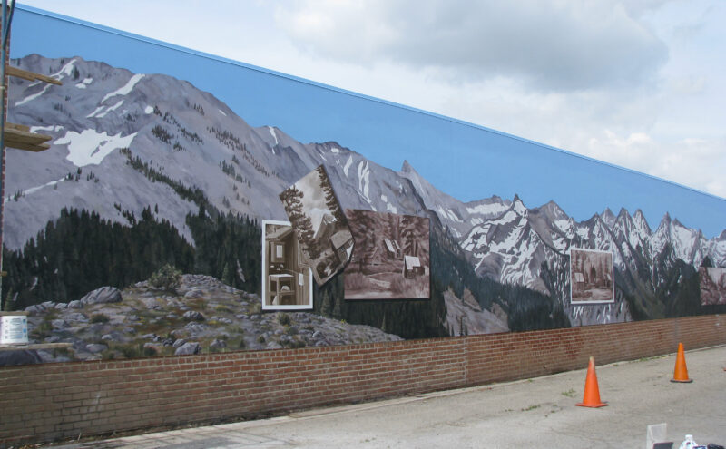
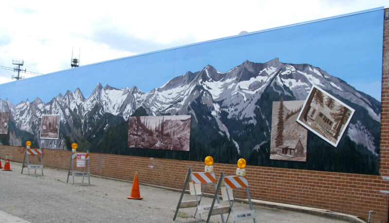
1. Mineral King in Our Backyard, E Street, Exeter, 13×110’, completed in 2009 and refreshed in 2017, as seen looking east
2. Same mural, looking west
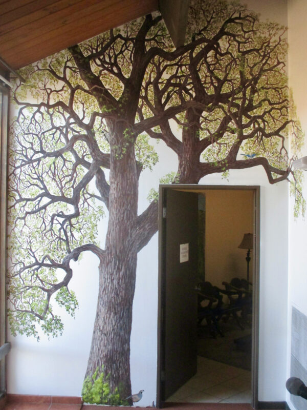
3. Oak tree, St. Anthony’s Retreat, Three Rivers, interior mural completed 2020
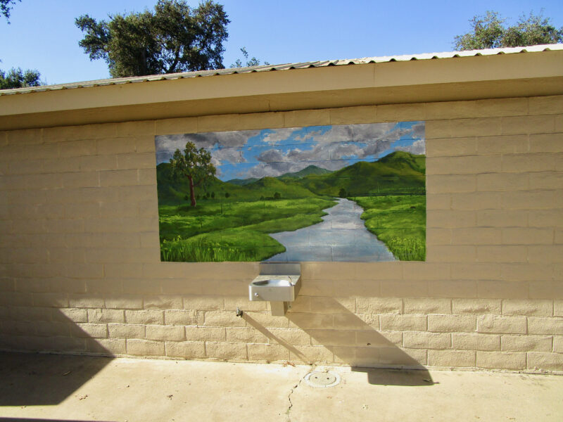
4. Yokohl Creek, Mooney Grove, 4×8’, completed 2022
5. Tulare County History Museum, 4 exterior murals, completed 2020
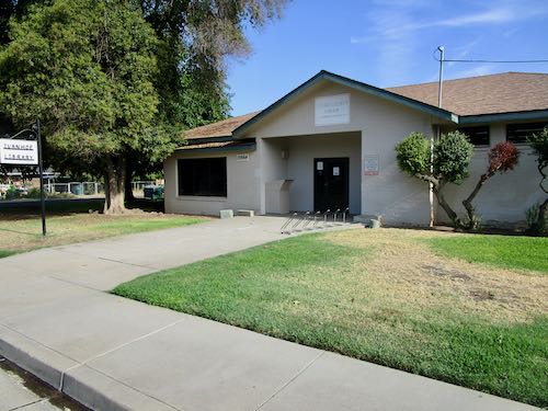
I grew up in the country, with the choice of asking Mom to drive me or riding my bike if I wanted to go somewhere. (One did not bother Dad, because he was working; we were Mom’s work.) She rarely denied me when I asked her to take me to the library 2-4 miles away (we moved closer when I was in 6th grade), which was (and is) very small.
It was a challenge to find new books to read in that tiny building, but I never gave up trying. We either didn’t know about or didn’t have the option of ordering books from other county libraries as we do now. And I remember the first time I went to the library in the big town instead of the little burg—it was mind-boggling in its enormity. So many books, so little time!
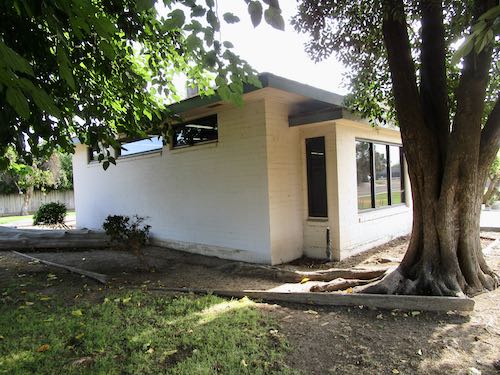
Over a year ago, I was asked to paint an outdoor mural on the library of my youth. Within a week, I drove there with sketch paper and a tape measure. I met the librarian, who turns out to be a close friend of my sister-in-law. (Welcome to Tulare County, and never talk bad about anyone!)
Immediately, I began scouring my memory for ideas, and without knowing the budget, I came up with 3 versions—each one emphasizing different aspects of that nondescript rural unincorporated town, and different sizes for pricing options.
Alas, the Asker didn’t return my phone calls. I saw him in person, he apologized, and then still didn’t follow up. So, I let go of that dream.
Several months later, the Arts Consortium put out a Call-To-Artists, for not one, but TWO murals on the library of my youth. WHAT?? That was supposed to be MY mural.
Allll-righty-then, at least I had a headstart. I designed a second one, did the best presentation sketch possible, and even wrote an (unasked for) explanation and a (also unasked for) heartfelt statement about why I am the most qualified for this particular project. I met the deadline, and then waited to hear when I could begin. (Can you say “overconfident”?)
The deadline to notify the winner came and went. Silence. I asked the Arts Consortium who got the job, and the reply was that the selection committee was unable to meet. More months passed, and I asked again. This time the answer was that the selection committee was unable to decide.
I gave up, let go, moved on, while wondering what in the world is wrong with organizations and why I allow them to waste my time. I lost the big Catholic church murals—might as well add this to the pile of missed opportunities, and make a note to just deal with individuals in the future, rather than large outfits.
Then, 14 months after I was asked to paint a mural on the library of my youth, the Arts Consortium emailed that I HAVE BEEN CHOSEN FOR THE JOB!!
Stay tuned to see the sketches, hear the explanations, and learn when it will begin.
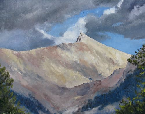
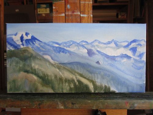
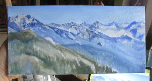
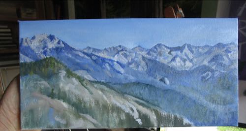
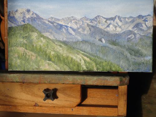
The Great Western Divide is the name given to the ridge of peaks seen from the top of Moro Rock in the Sierra Nevada. On this side, water drains west and on the other side, it drains east .
I haven’t painted this before, at least not from this view. The mountains show in the distance of many of my citrus/foothills/mountain scenes, but only once did I try to make them perfect. And that was tricky, because I worked from many photos, piecing the range together, and then faking the hills.
Why did I fake the hills? Because they were different in every single photo, because each photo was taken from a different place. There is no place besides an aircraft where you can see the entire width of the Sierra Nevada.
Here we go. . .
At the end of the painting session, the light was a bit too low to be accurate on both the colors and the shapes.
So, I photographed it the next morning in the bright sunlight. Looks washed out because the wet paint is reflective.
When it is dry, I will scan it, and then, as always, I will tell you it looks better in person.
The Great Western Divide, oil on wrapped canvas, 6×12″, $125.
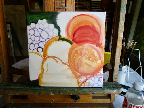
Yesterday you learned the term “glazing” for building a painting in layers.
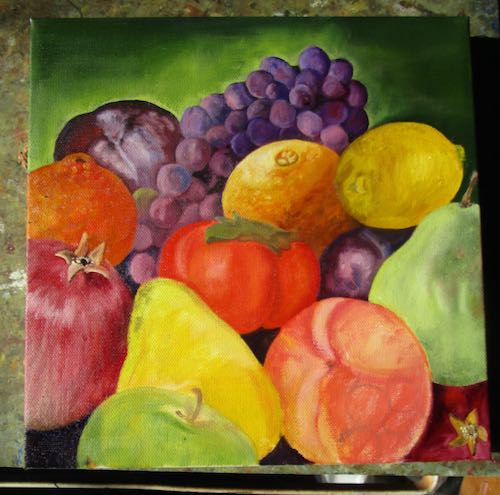
Now let’s look at glazing some fruit.
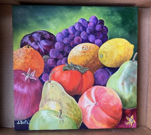
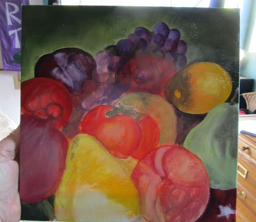
This was a little tricky. I started with a photo, then started rearranging and adding more fruit so that there was more color. I kept gathering more photos, trying to make this look believable but also full of variety and vibrance.
The color varies from photo to photo here because of the light differences in the painting workshop, depending on the angle and the time of day.
It needed an orange, and obviously the orange will need some brightening up.
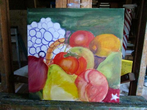
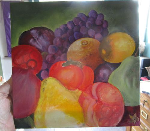
At the end of the painting session I realized that the light on the fruit was not consistent. So, I lifted off the lemon and will paint another one over the top. The orange needs to be brighter. The apple was a good way to calm down that giant yellow pear. The persimmon needs detailing on its green top. A tangerine will be a good addition where the red circle is. Obviously the pomegranate, yellow pear, and peach need to be finished.
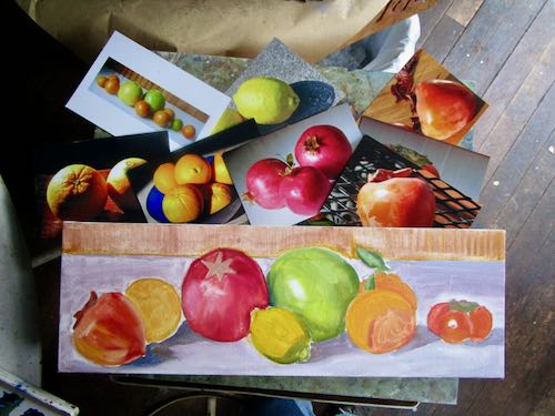
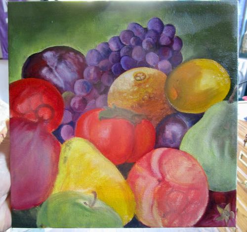
Then, everything will need to be tightened up even more. Since this painting is a gift, I can spend as much time as I want without paying attention to whether or not the price is right.
The next morning, I had a few hours to make a little more progress.