The ArtSpeak word for slowly building paintings with layers is “glazing”. You’re welcome.
This might be finished. The photo on the left was taken in the afternoon; the one on the right was taken the next morning. I’m hard-pressed to tell you which is more accurate.
Wait, nope, I spent yet another hour on the phone with someone whose main phrase was, “Yes Ma’am”, as she tried to figure out AGAIN why my new phone won’t work. Or wait, is it the new SIM card? Perhaps it is the new provider?
See a pattern here? It is the word “new”.
STOP WITH THE CHANGES AND UPGRADES AND UPDATES ALREADY!!
Okay, where were we. . . oh yes, in the day’s accomplishments and forward progress at the easels.
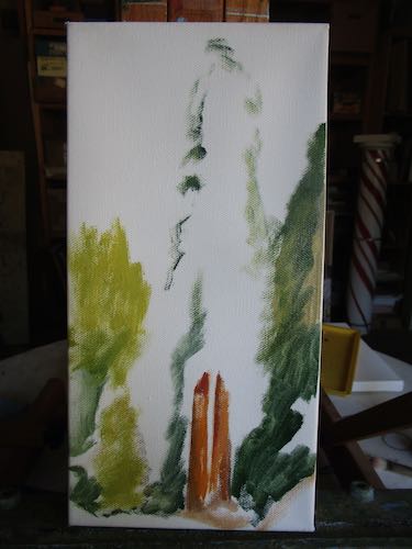
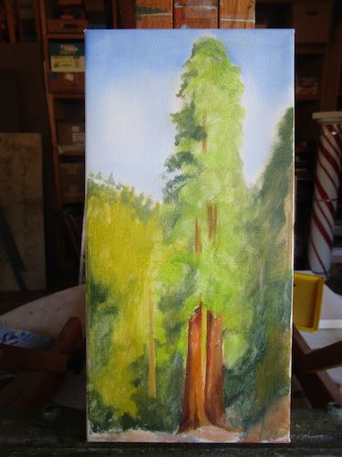
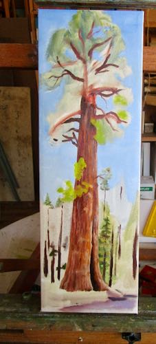
Neither of these paintings are finished, but they are both much closer than the last time you saw them.
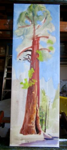
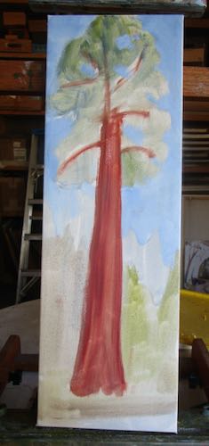
The base of the tree was beginning to look good.
Not good enough yet, but much closer.
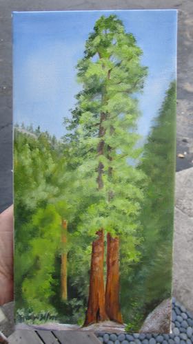
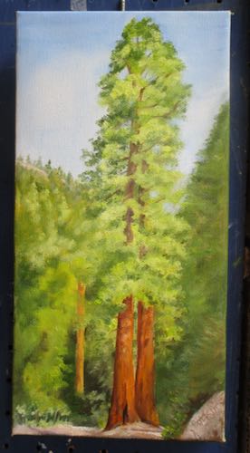
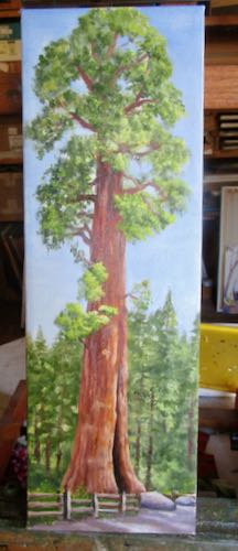
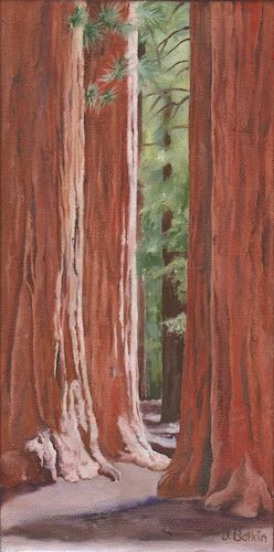
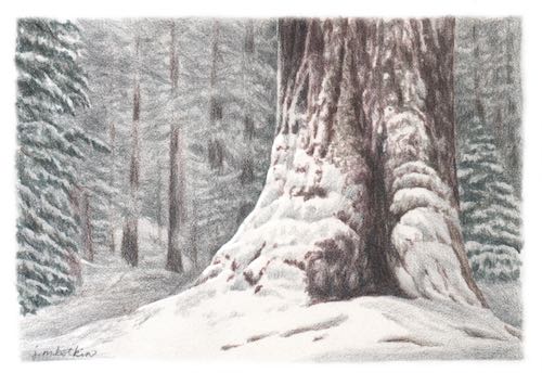
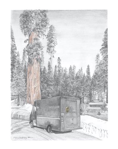
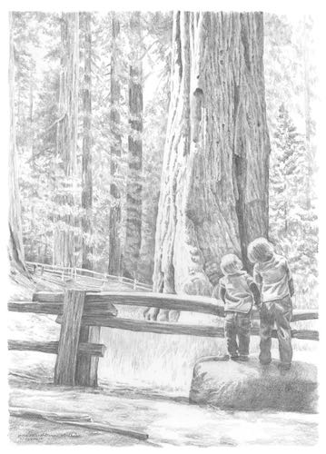
That Sequoia is called the Sentinel Tree and it is in front of the building formerly known as the Giant Forest Market. Now it is the Giant Forest Museum.
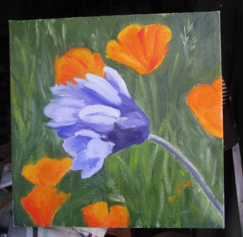
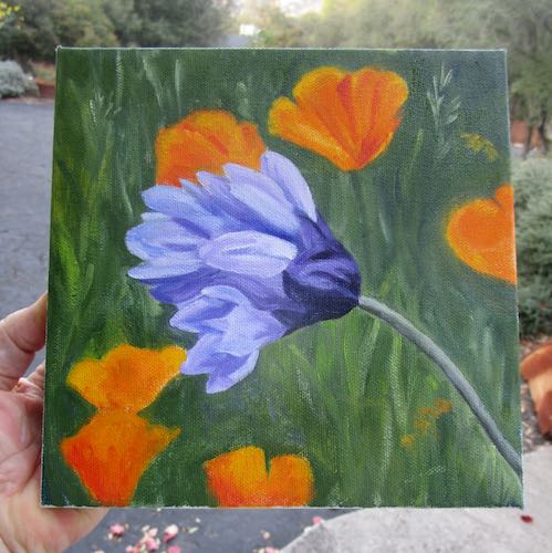
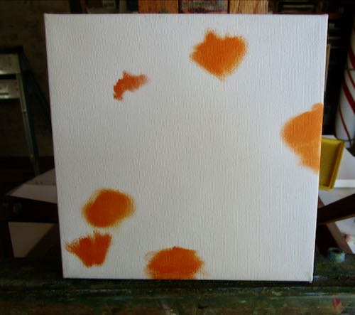
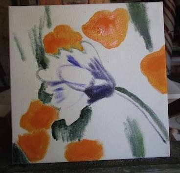
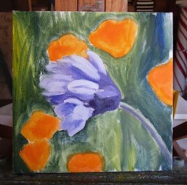
The difficult thing about this commission wildflower piece is keeping the edges of the poppies slightly blurry so that the brodiaea AKA Blue Dick really jumps out.
I love this kind of detailed realism, even if it does take (almost) all day. And both of these subjects are exactly what one would expect from a Central California artist. All that is missing is some oranges.
Hmmm, I am sort of like country music with my three subjects: redwood trees, poppies, and citrus. (Country music’s three subjects are cheatin’, drinkin’, and storytellin’.)
Wait, I also paint Mineral King, cabins, single oranges, entire groves, the foothills with mountains in the background, various views of the Sierra Nevada, Three Rivers, and whatever else people are interested in hiring me to paint.
Phew. Thought for a moment I was gittin’ real simple-like.
See? I did more than just be on hold and paint. . . I did me some thinkin’. Real high-quality thought.
This painting needed some improvement on the arrangement. That’s called the “composition” in ArtSpeak.
This next painting is a commission. I am combining multiple photos, trying to somewhat match a looser painting that the customer admired, but wanted in my detailed style. Because it is of wildflowers, I have lots of reference photos to work from. It is fun to use bright colors, in this and in the fruit painting above.
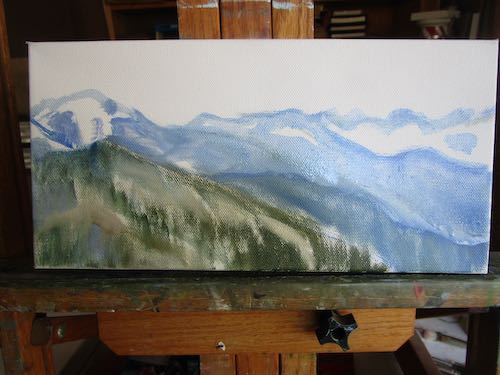
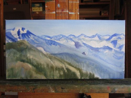
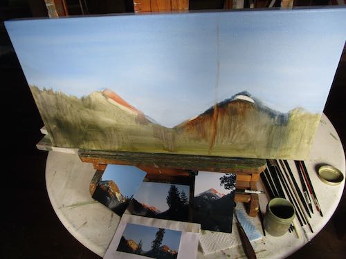
The next one is a 6×12″ of part of the Great Western Divide, as seen from Moro Rock. I sketched it with a paintbrush while the canvas was upside down. When I flipped it over, I decided there needed to be less sky, so I scooted everything a bit higher, while improving accuracy of the shapes.
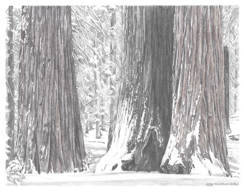
Kaweah Arts requested some Sequoia trees, so here we go again. . . This is the pair of redwood trees at Redwood Canyon, or simply “Redwood” on the Mineral King road. Some former cabin neighbors referred to them as “Aunt Tilly and Uncle Pete”. I can’t tell which is which. Must have been married so long that they started looking alike.
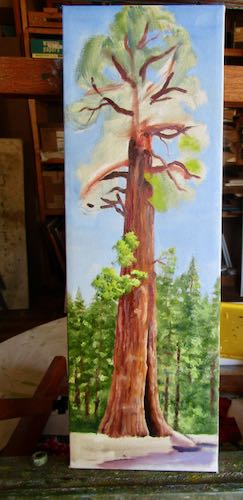
This last one is 6×18″ and is the Sentinel Tree, in front of the Giant Forest Market. I mean the museum. My cousin worked there one summer (or more), and used to get a kick out of customers who would ask, “Where can I see the big trees?” She would simply point out the door.
All of these need to be relayered, then detailed, my favorite part. After they are dry, I will either scan or photograph them. Next, I will post them on the blog and tell you that they look better in person.
For several months, I had no work. Instead of worrying about it, I enjoyed guilt-free time at the cabin. Well, guilt-free except for the fact that the road was closed, and other people couldn’t enjoy Mineral King this past summer. Life is a series of good things and not-so-good things; we do our best with what we have been given. Or I do. Most of the time. I don’t know what you do. Maybe you just complain. . .
My point, and I do have one, is to show you that I did have a few sales. One must pay closer attention when times are a little hard, because the negatives are often much louder than the positives. Here are my positives from that slow period plus a couple of months beyond.
I am guessing on the titles and some of the sizes. Closies count. . .
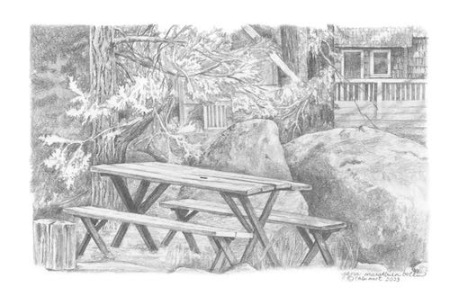
Pencil, 6×9″, a commmission drawing
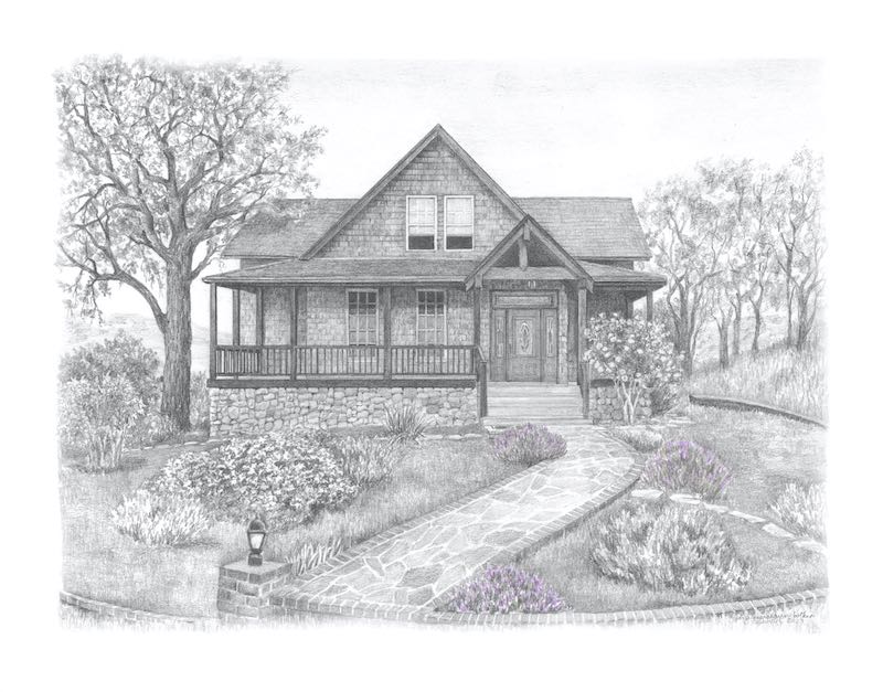
Pencil, 11×14″, a commmission drawing
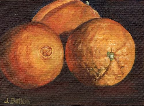
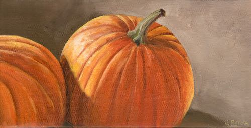
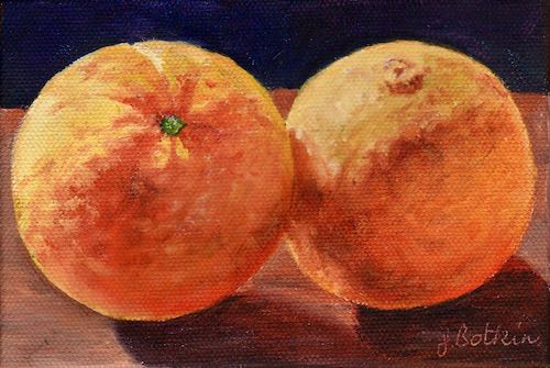
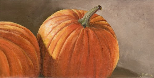
Oranges, 5×7″, oil on panel
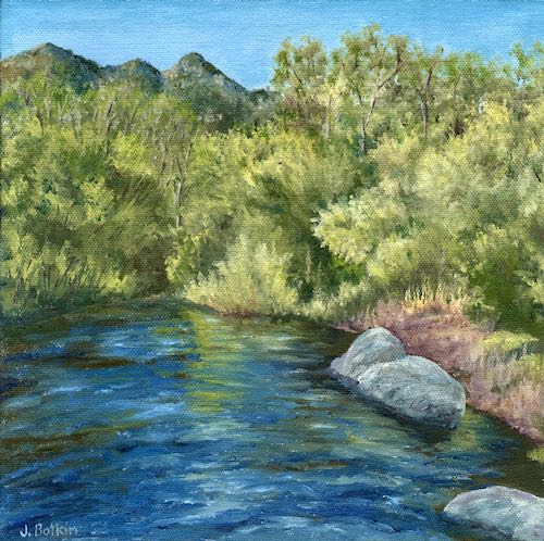
North Fork, 10×10″, oil on canvas
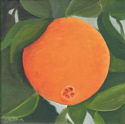
Navel, 6×6″, oil on canvas
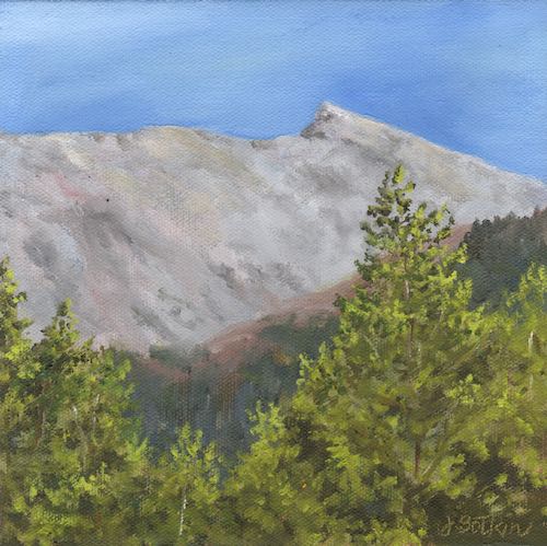
Sawtooth, 8×8″, oil on canvas
Unspiced, oil on canvas, 6×12″
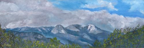
Alta and Moro After a Storm, 6×18″, oil on canvas
Craig’s View, 6×6″, oil on canvas, a commission painting
It is time to do a few small paintings to sell at Kaweah Arts. The proprietor requested Sequoia trees and mountain ranges. I looked through my canvas sizes, looked through my photos and made some decisions. Inventory number, title, wire on the back, add to the inventory lists, crop and enhance the photos—all needs to happen before paint lands on the canvas.
Wait! This isn’t a Sequoia tree or a mountain range. What is it?
It is a scene I have wanted to paint for many years, but felt it was a bit too hard. This will be one of my long slow paintings, with many many layers. There is no deadline, and I want it to be Most Totally Excellent.
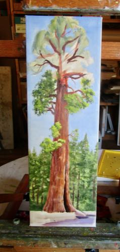
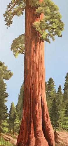
Okay, this is a standard 6×18″ painting of a big tree, AKA redwood, AKA Sequoia, formally known as Sequoia gigantea, not to be confused with the redwoods of northern California, called Sequoia sempervirens.
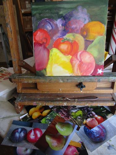
WHAT IS THIS???
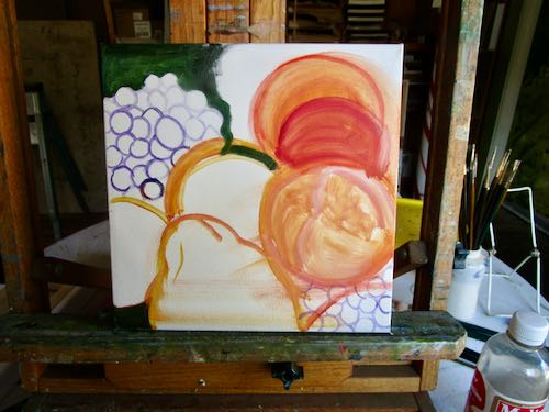
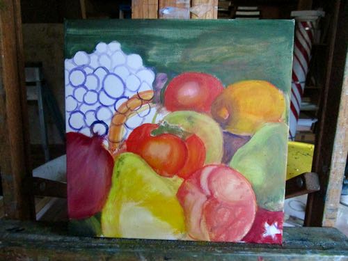
This is a work in progress, a housewarming present for someone Very Important in my life. She showed me the pieces she has in her kitchen, and I was inspired to ask her what I could paint to add to the collection. (These might not be the actual pieces that she has, but hers are very similar to these.)
The sequoias and mountain range paintings can just hold their camels* for a little bit. I have some designing, improving, polishing, rearranging, composing ahead.
*Learned to say this while in Israel back in 2016 and decided it is more fun than horses.
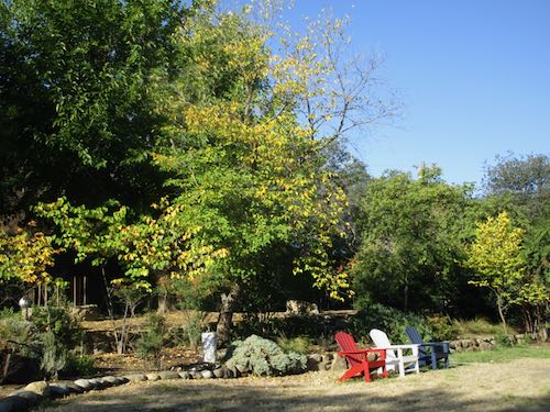
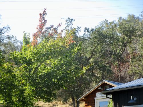
Fall is supposed to be a relief from the heat. Last week we hit the 90s, AGAIN. Although my mind has the facts of seasonal changes, doubt holds me hostage.
So, I was seeking signs of fall, anything for encouragement that summer wouldn’t last forever.
The redbud trees in our yard are getting some yellow leaves.
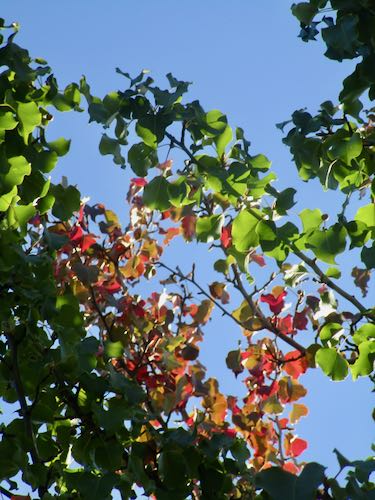
Two red branches are appearing at the top of my flowering pear by the studio.
See? Weird, eh?
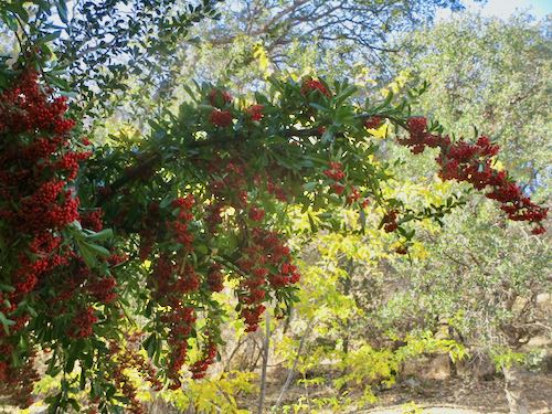
The pyracantha berries are getting good color, and the mulberry is getting a touch of yellow in the leaves.
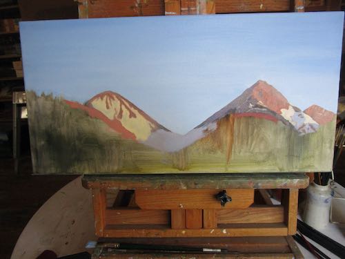
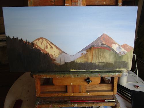
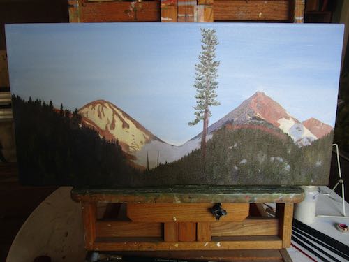
I am referring to finishing a large (12×24″) oil painting that I started in August, and then left to gather dust and spider webs while I worked on smaller paintings. Smaller paintings provide something closer to instant gratification; larger paintings build character.
These photos were taken in August.
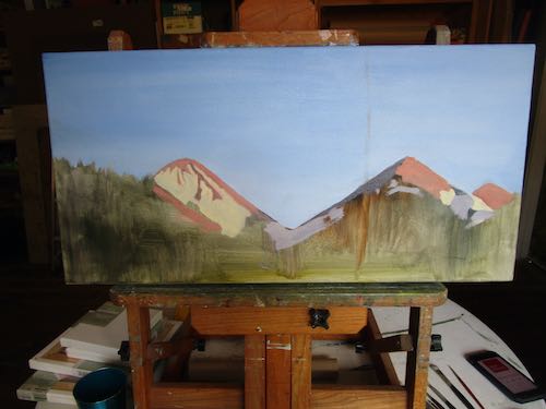
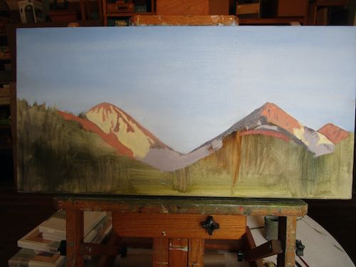
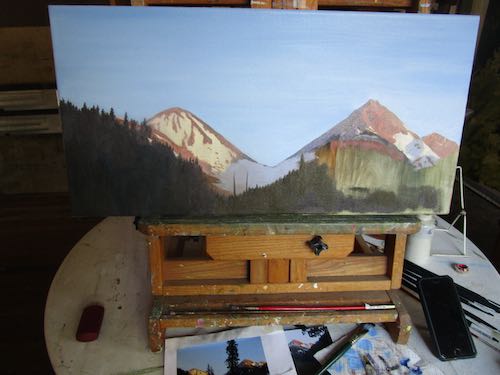
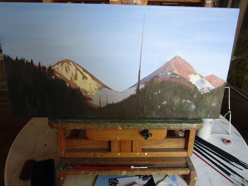
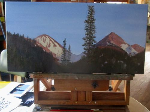
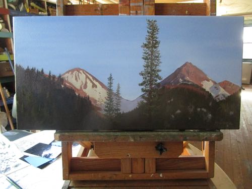
These were taken in October, a progression of adding paint. You might notice that Vandever (the peak on the right) grew in height. If you are particularly observant, you may notice some angle changes too.
The painting was wet and shiny, so the final photo is not telling the true story. (. . . pants on fire)
I rotated the easel every direction, wasting film like crazy.
NO, I WASN’T WASTING FILM! I have a digital camera. But you probably knew that, because I am so modern, so quick to adopt new technology.
I can hear you thinking sarcastically, “Sure you are.”
This is Farewell Gap at dusk, in Mineral King. (I bet you guessed that already). Perhaps the title will be “Farewell Gap at Dusk”, because I am just clever that way sometimes.
These new oil paintings may look familiar to you from seeing them in progress.
Inventory was low; with the Holiday Bazaar in the near future (November 18 at the Three Rivers Veterans Memorial Building) and seeking a new vendor, it was time to start producing.
Salt Creek Trail, 8×8″, $100
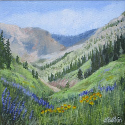
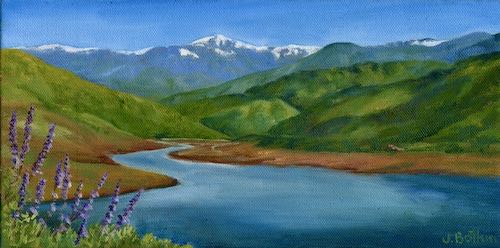
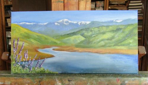
Alta, Kaweah Lake, Lupine, 6×12″, $125
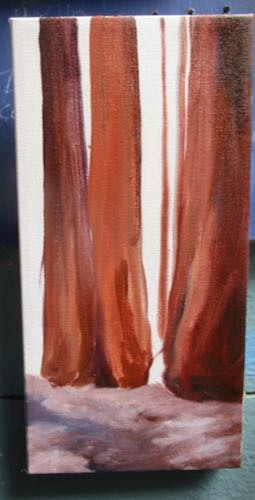
Sunny Sequoias II, 6×12″, $125
Cattle Crossing, 6×6″, $60
P.S. They all look better in person, but I think you might know that by now.
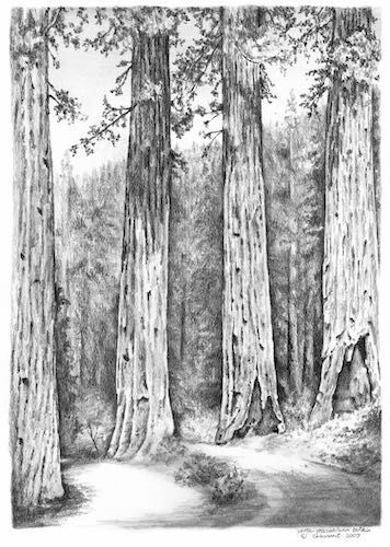
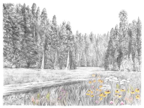
Yesterday I showed you some oil paintings of Sequoia, the non-Mineral King part of the park. Today here are some pencil drawings (I LOVE to draw—did you know that??)
These don’t have sizes and prices. Some are sold, some might be framed, and most are probably just in a flat file in my studio. (If you want to buy any, email me at cabinart AT cabinart DOT NET—written this way so robots won’t bother me any more than they already are—and I will see if I can find the original for you.)
One or two might be available as a reproduction print. (Since I am old now, according to The Beatles, I can’t remember.)
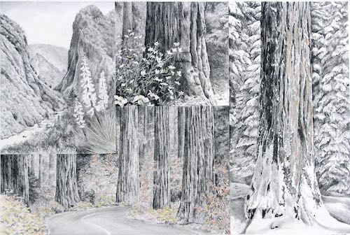
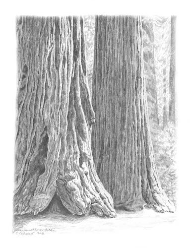
Four Guardsmen (minus the smaller foreground trees that block these giants
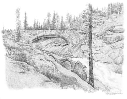
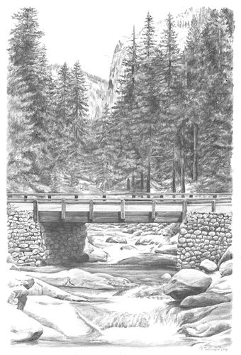
Clover Creek Bridge, a fabulous structure NOT built by the Civilian Conservation Corps, one of about 3 pretty bridges in Tulare County. YOU CAN LEARN MORE HERE: Tulare County Treasures
“On the Easels” isn’t exactly accurate; it is a euphemism for “paintings in progress”. It has been awhile since you have seen what oil paintings I am working on. With the annual Holiday Bazaar coming up on November 18 (sounds far away but is actually now closer to us than summer was), I have to be ready to fill my booth with little items that folks like to buy for Christmas gifts.
Yes, there will be 2024 calendars.
These current paintings are all about Three Rivers, because what doesn’t sell at the bazaar will go to the gift shop at St. Anthony’s Retreat Center. This is a new location for my paintings. With the Silver City Store closed over the summer, it is prudent to find new outlets.
Kaweah Lake with Alta Peak and lupine is always popular. (6×12″)
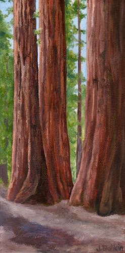
Must always have paintings of the Sequoia trees! (6×12″)
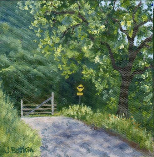
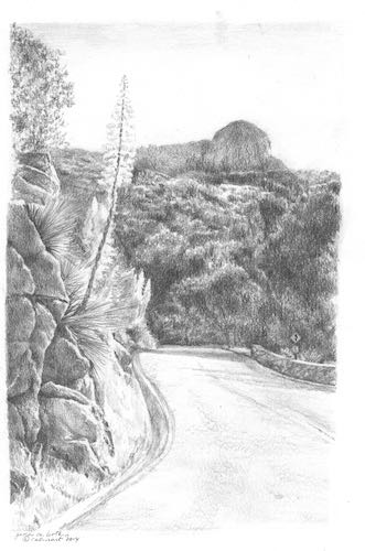
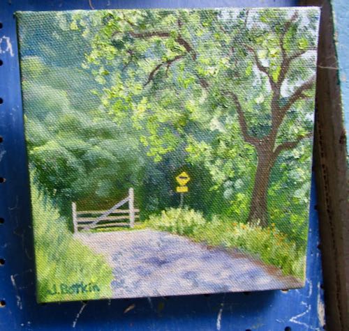
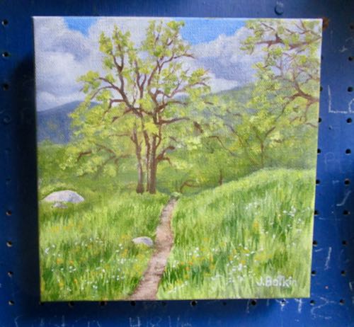
I don’t remember where this is but think it might be up South Fork Drive in Three Rivers. (6×6″)
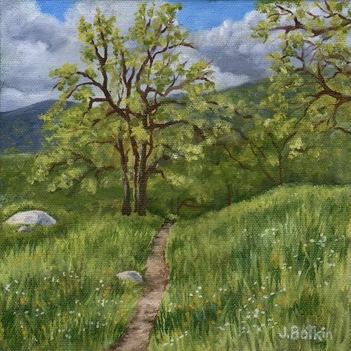
This is a trail on the BLM land near St. Anthony’s Retreat Center. (8×8″)
People often think that an artist must be “inspired” to create work. Maybe. But must a baker be “inspired” in order to keep the display cases full? Must a farmer be “inspired” to keep the trees irrigated, fertilized, and pruned?
Inspiration comes from many sources. Sometimes mine comes from a particular quality of light, sometimes from not knowing what else I could do to earn a living, and sometimes it comes from the fact that Fernando has 248,000 miles and won’t last forever. An artist I greatly admired used to say that his inspiration came from the bills in his P.O Box.