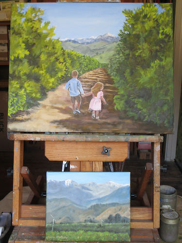
 If you can’t see the photos, go here: cabinart.net/blog. Just another hot day at the easel, painting another orange grove.
Is it an “orange grove” or an “orange orchard”? We tend to call it “orange grove” or “orchard”. Some people call it a “ranch”, but I have yet to see any cattle in an orange grove.
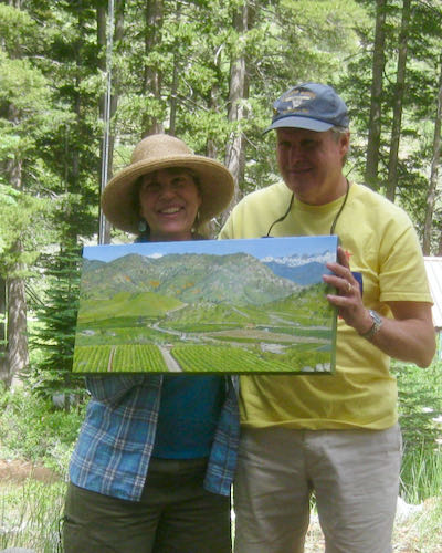
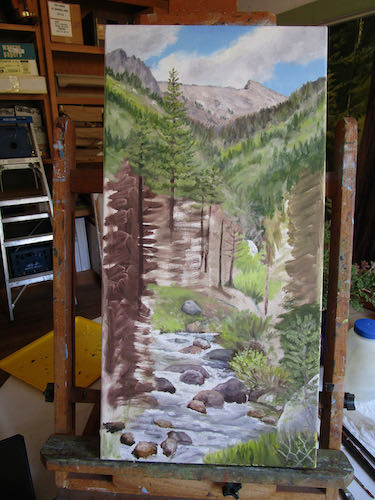
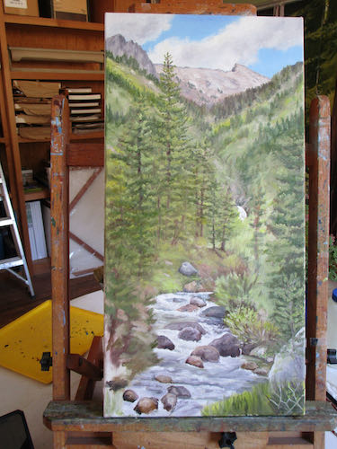
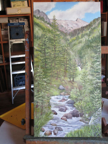
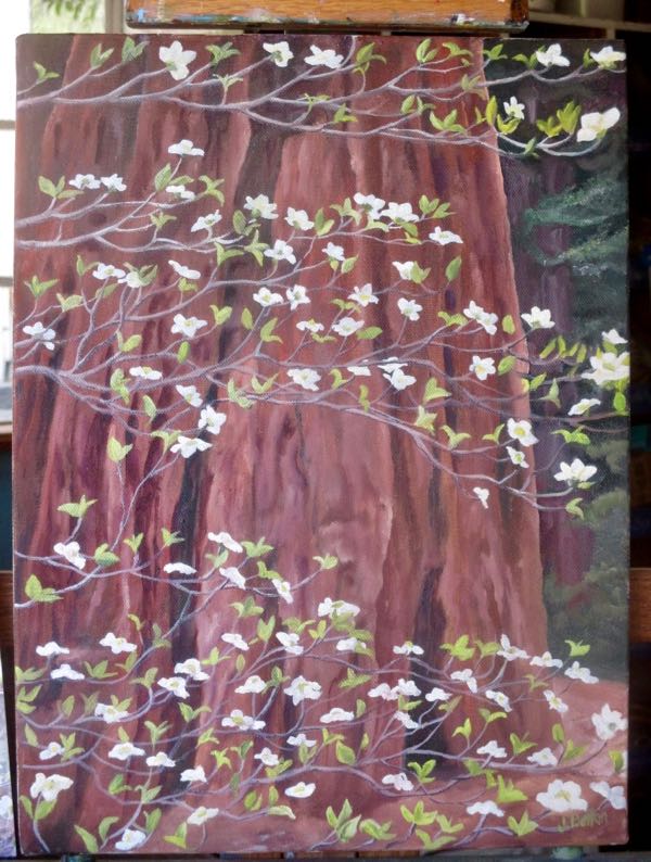
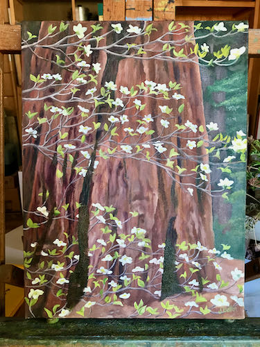
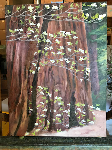
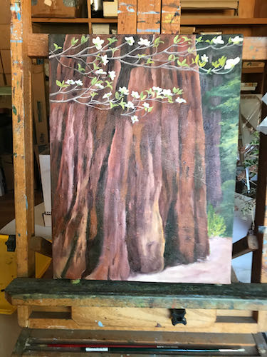
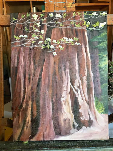
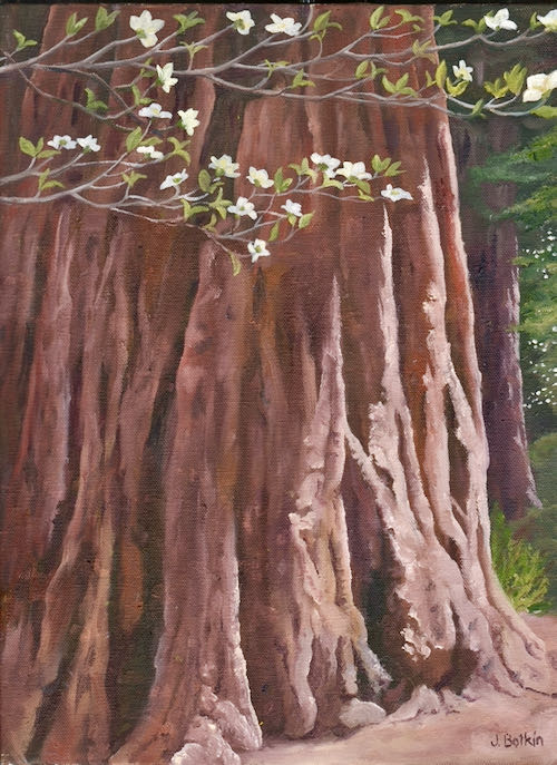
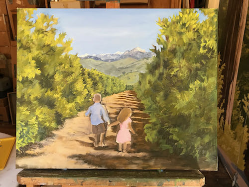
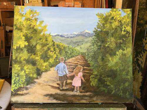
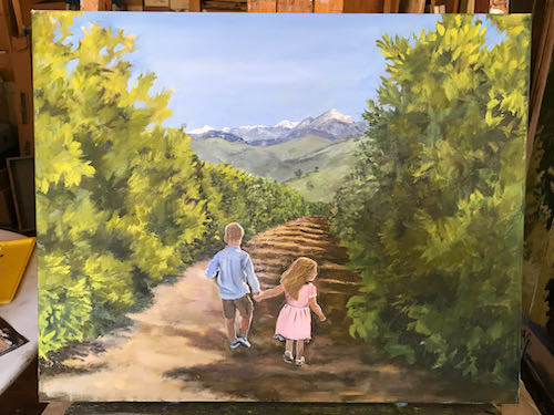
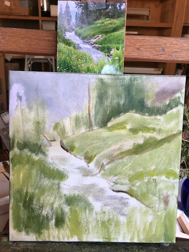
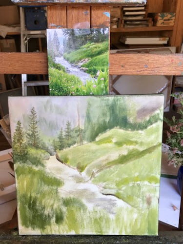
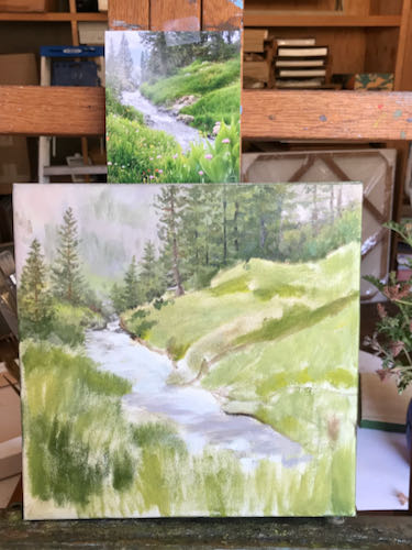
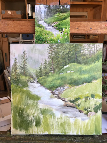
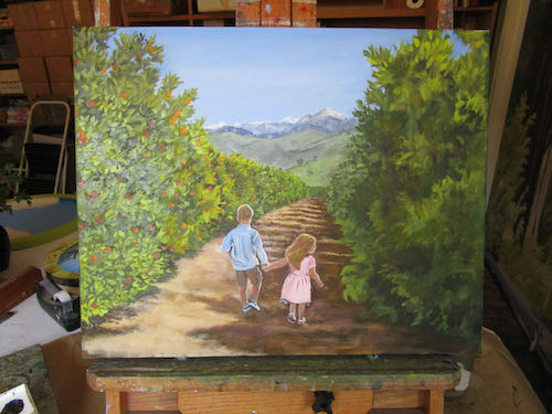
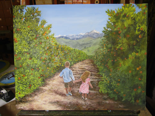
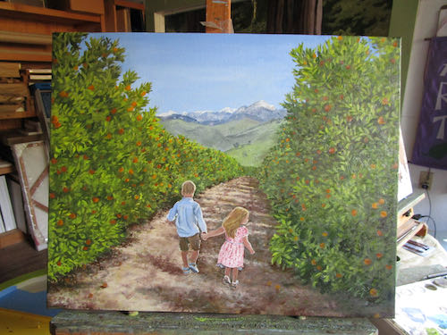
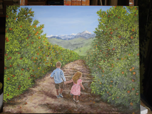
Commissioned Oil Painting
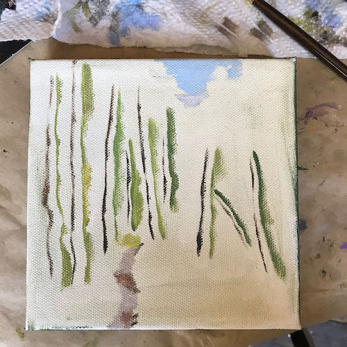
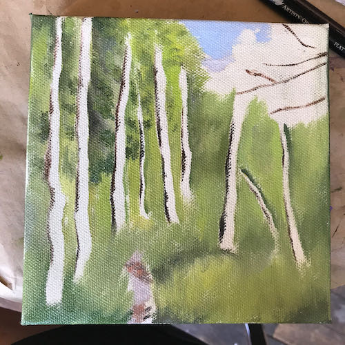
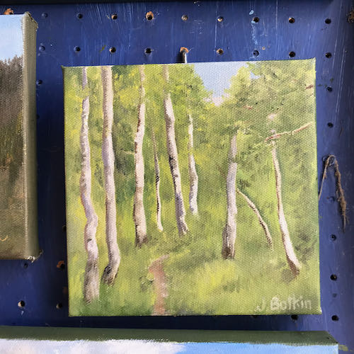
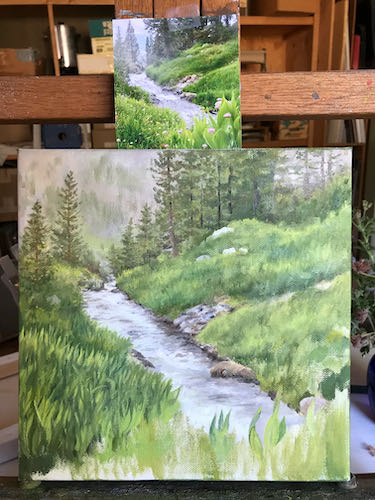
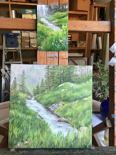
The swamp cooler kept me at the easel working on this commissioned oil painting until early evening. Growing leaves takes some time, particularly on a 16×20″ custom oil painting.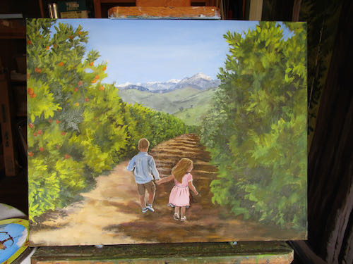
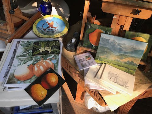
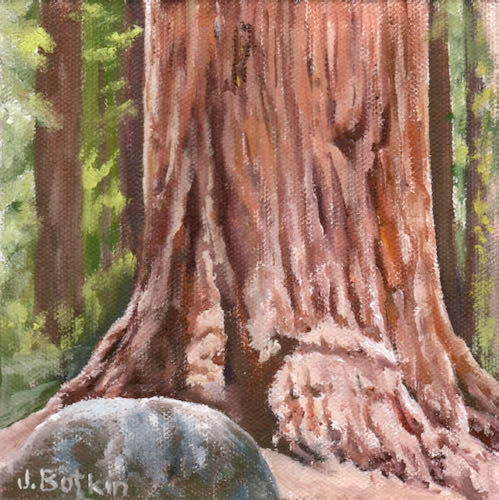
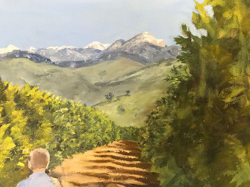
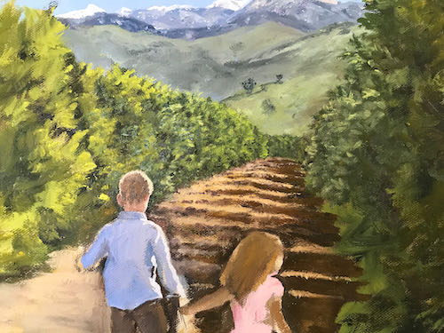
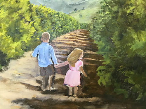
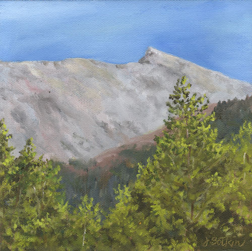
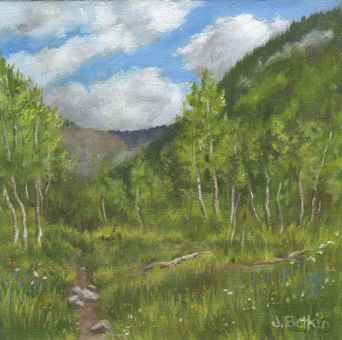
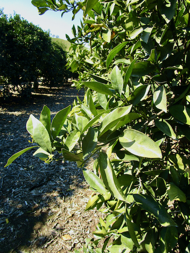
Reference Photos
In spite of being a familiar subject to paint, the piece is a challenge due to the melding of multiple scenes in multiple lights with multiple sizes and perspectives. My goal is consistency, believability, and of course, beauty. Always beauty, along with as close I can get to truth while fabricating the scene.
Here are a few of the dozen or so photos that I referred to. (Not showing the children because I respect people’s privacy here on the World Wide Web).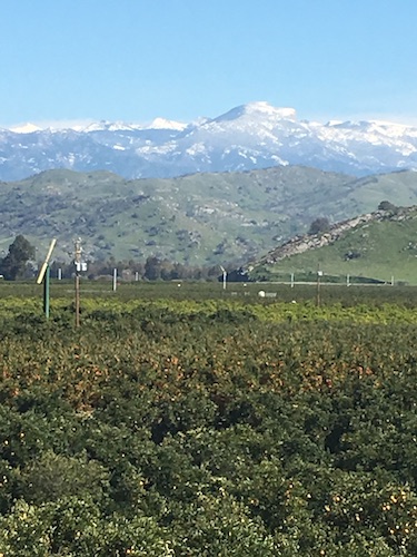
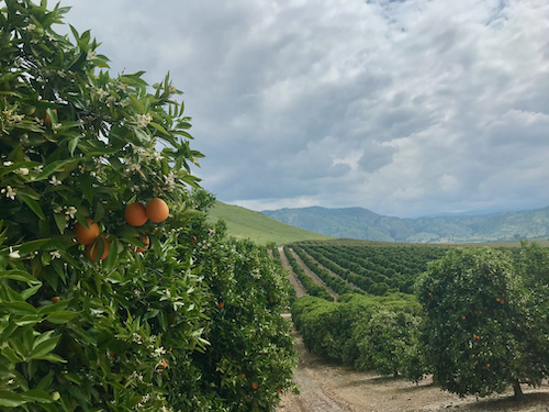
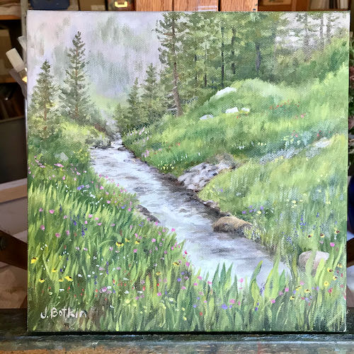
I love this photo. If I could have figured out how to put the children in this one and have the sizes all make sense AND be large enough to paint some detail, I would have used this one.
The painting still needs orange blossoms, and might need a wind machine. And because I believe it depicts the best part of Tulare County*, I will probably keep polishing it, drawing with my paintbrush, not wanting to quit.
Good thing there isn’t a deadline.
*I asked Ecosia (a new-to-me search engine instead of DuckDuckGo) to find me information on “the best of Tulare County” and it went to the Exeter Sun-Gazette, an article about Tulare County leading the nation in illiteracy. Sigh.