If you subscribe to the blog and read the email on your phone, the photos might not show up. (Some people get them, some do not; it isn’t a problem I know how to solve.) You can see them by going to the blog on the internet. It is called cabinart.net/blog, and the latest post is always on top.
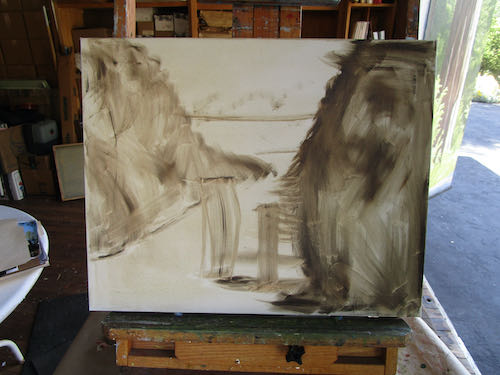
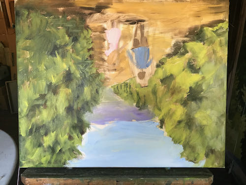
Here is another new Mineral King oil painting of an old subject, the Honeymoon Cabin, which is a museum for the Mineral King Preservation Society. It was in a state of rough first layer for a few weeks, and then suddenly July happened, which is when sales pick up at the Silver City Store.
Chop-chop, Central California artist!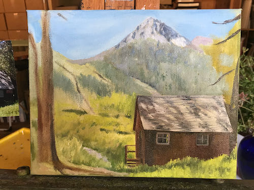
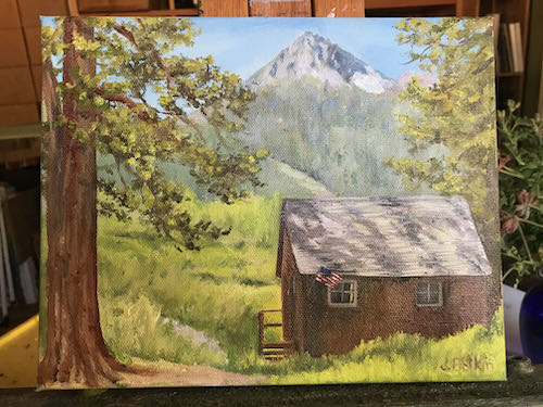
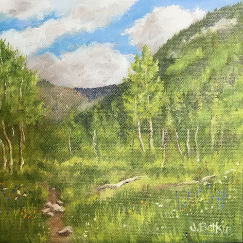
8×10″, $125 (+sales tax), probably underpriced, quick, get it before I raise my prices.
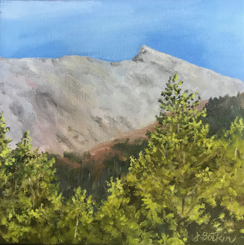
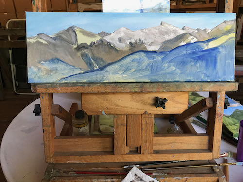
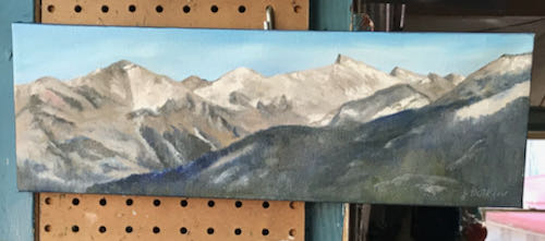 I looked again at this painting of Sawtooth, which has been hanging for awhile as I mulled it over before putting it on the scanner.
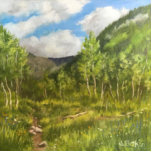
While flipping through my photos, I ran across one with my favorite yellow wildflower, Bigelow Sneezeweed (terrible name for a delightful bloom). I said to myself, “Self”, I said, “Why not?”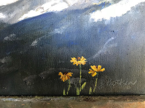
If this 6×18″ oil painting with its radical addition of yellow flowers doesn’t sell, I can always paint them out. I am 62 years old, self-employed, experienced in all subjects Mineral King, and I get to do what I want to my paintings.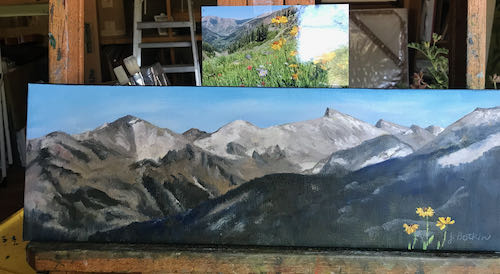
Any questions?
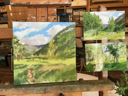
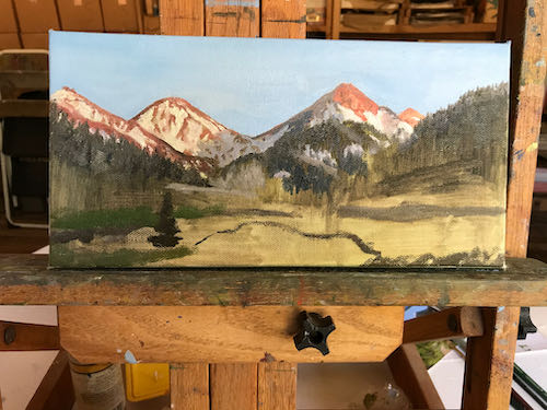
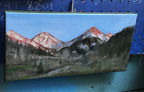

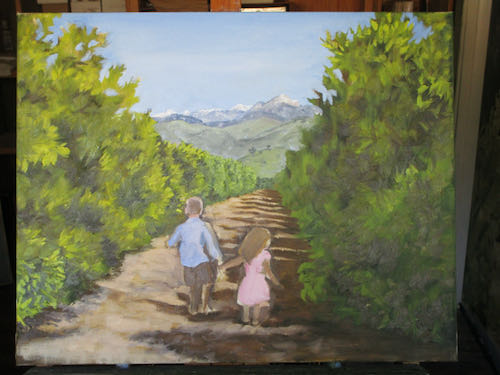
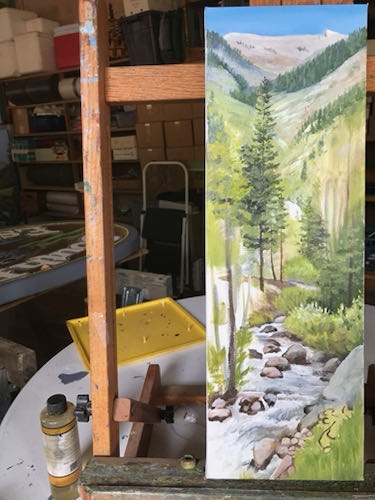
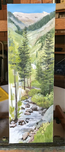
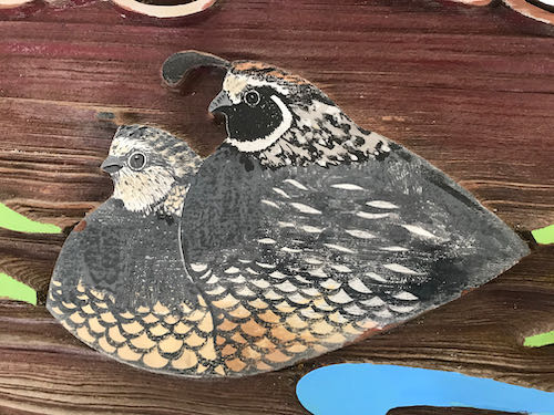
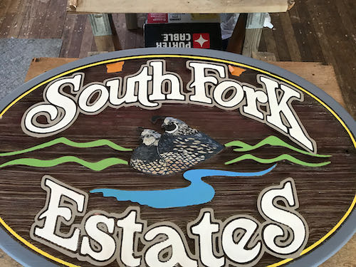
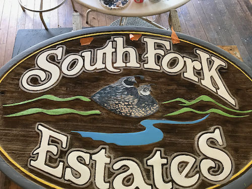
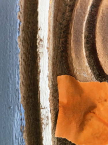
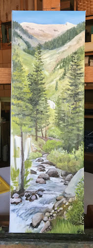 I have finally learned how to scan and photoshop this size of painting in spite of it being too long for my flatbed scanner. When combined with Photoshop Junior, I can patch the 2 scans together.
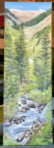
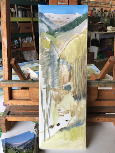
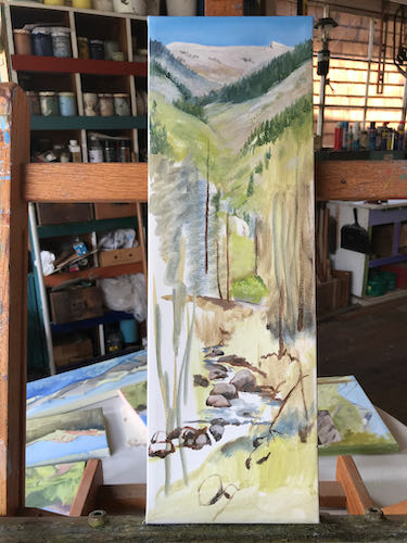
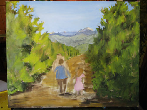
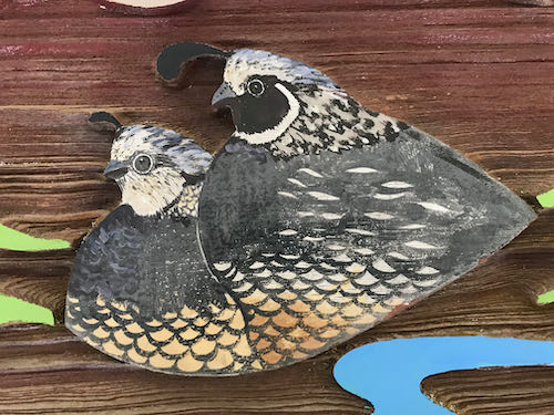
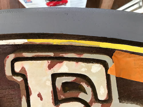
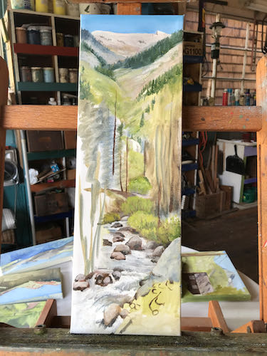 This represents an afternoon of work, trying to perfect the detail on the first pass, knowing full well that I will need to make corrections as the other parts get completed. And then those “other parts” will need to be corrected.
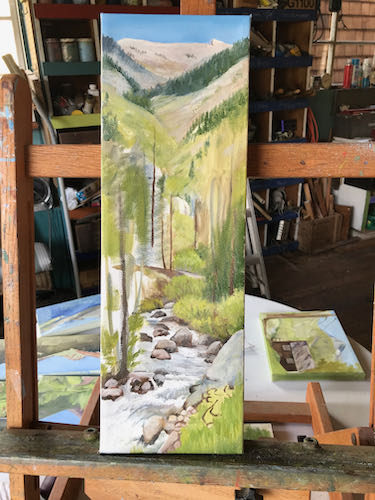
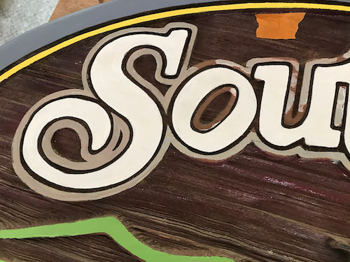
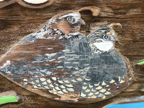
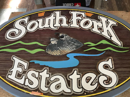
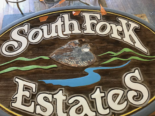
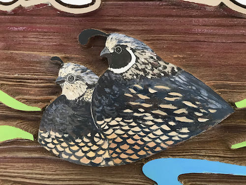
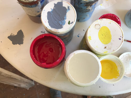

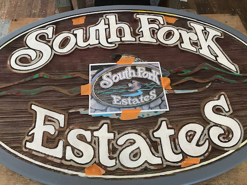
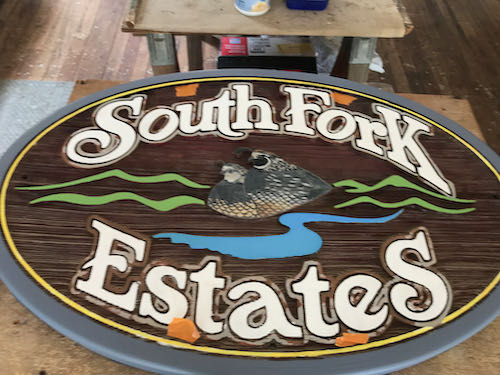
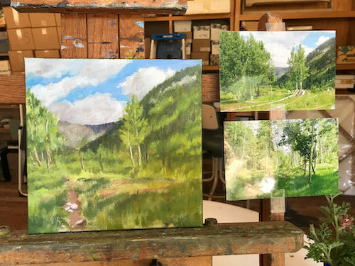
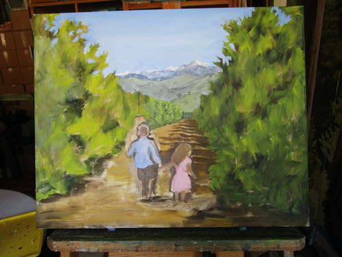
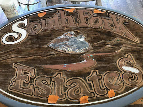 After 5 hours, I felt an unavoidable slide into Idiotland, where Sloppy, Stupid, and Careless all reside. Besides, my cheater-readers kept falling off when I leaned over the sign, and then I painted a blue streak on my face by accident.