Still More Painting in Church

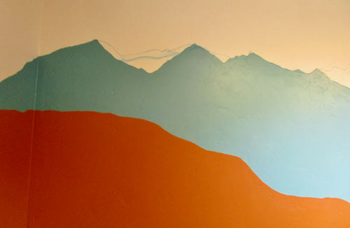
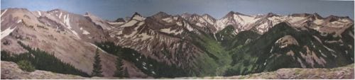
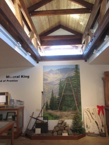
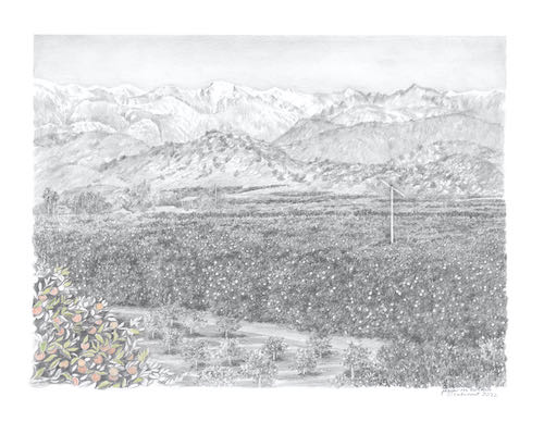
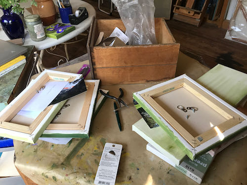
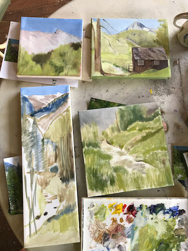
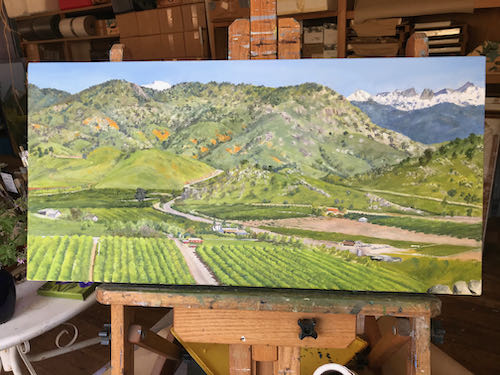
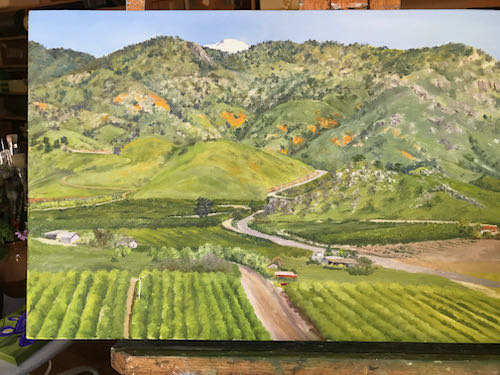
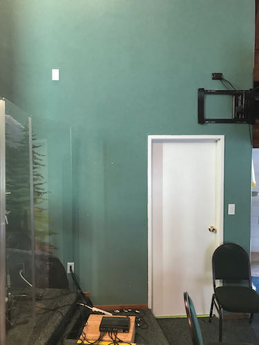
After having the audacity to mess with someone else’s art, I returned to the endless mural at my church. (It would be a real blessing if someone else messed with this one for me.) This blank right side needed to be finished. 

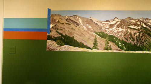
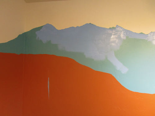
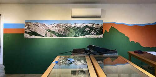
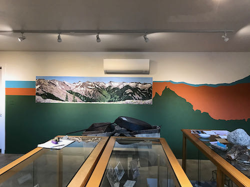
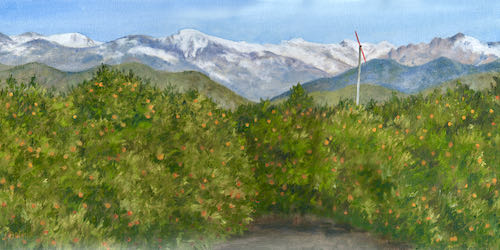
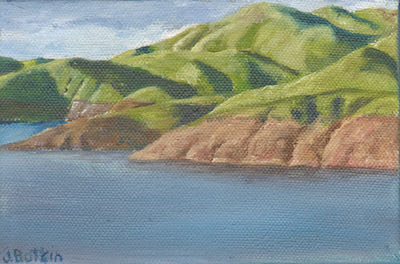
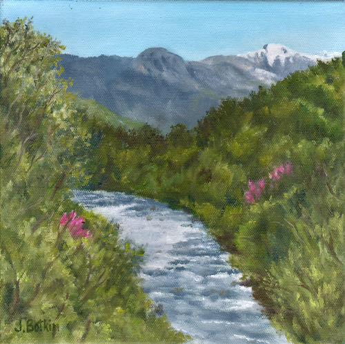
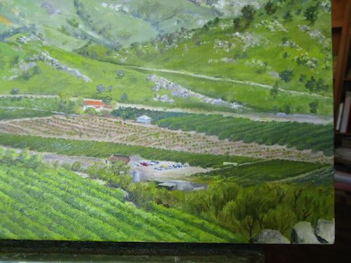
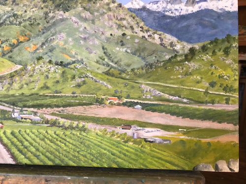
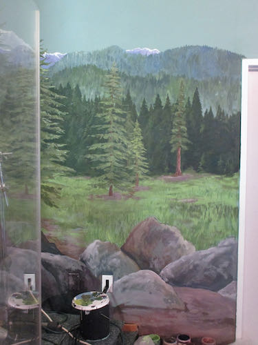
Weird color because the big stage spotlights are on.

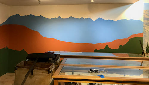
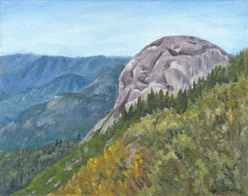
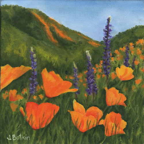
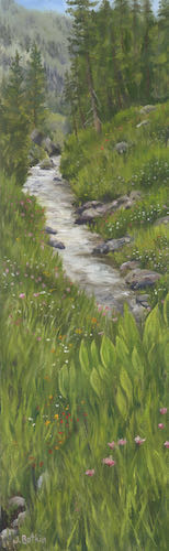
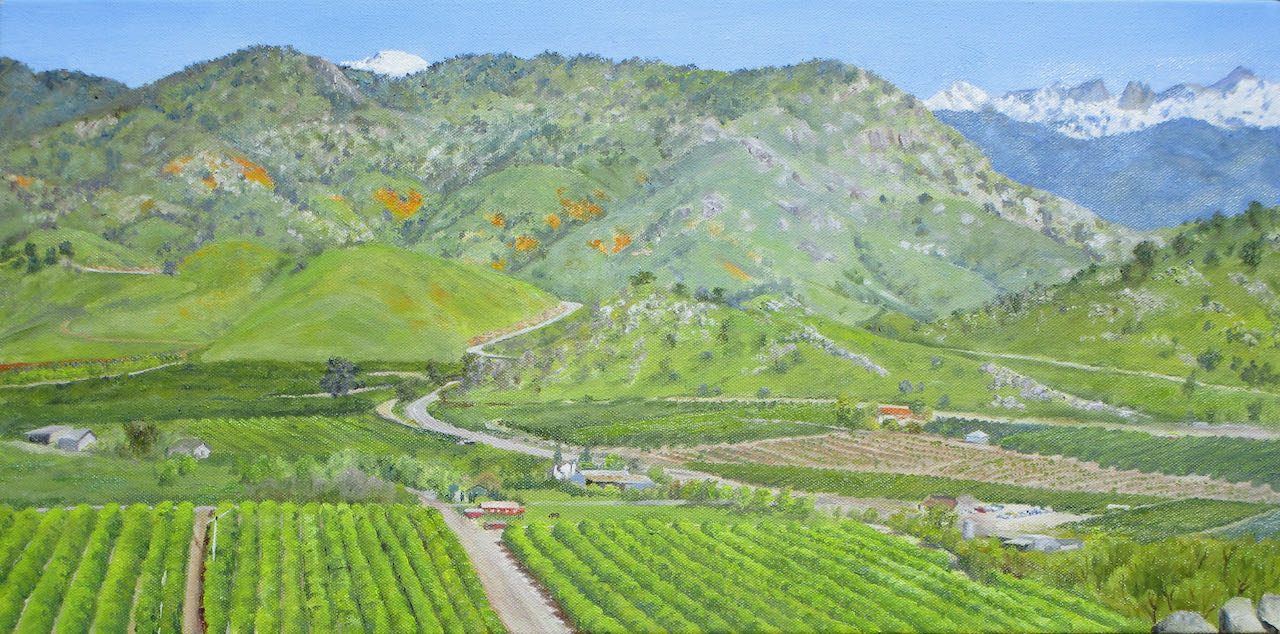
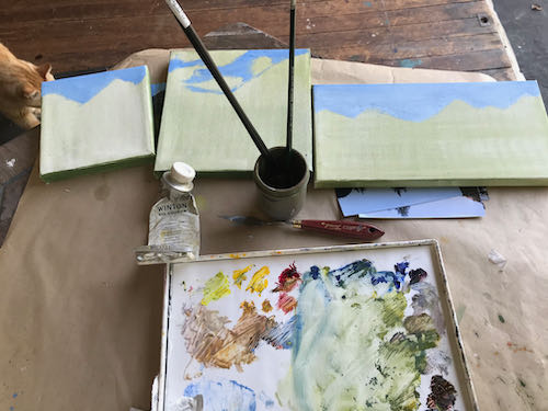
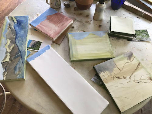
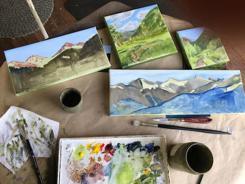
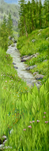
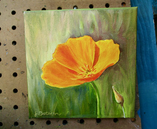
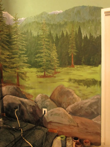
I started by defining and filling in the different segments from farthest away to closer (called “planes”, which is a word you might recall from geometry.) 
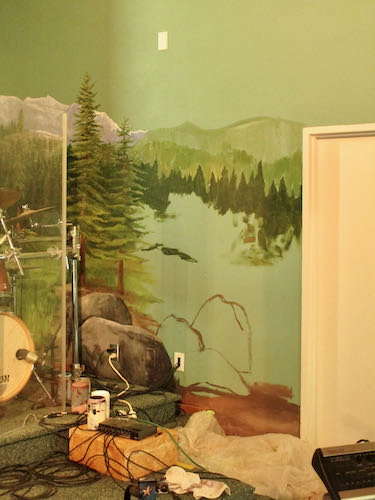
Boulders seemed like a good solution. It is better if the two “wings” aren’t symmetrical, which means that they don’t mimic one another. That wouldn’t look natural, as if it is natural to have a giant mural of a fake Sequoia meadow on the stage of a church. (I love Three Rivers, with all our original authentic uniqueness. Sometimes it seems as if we use our location as permission to be mavericks.)

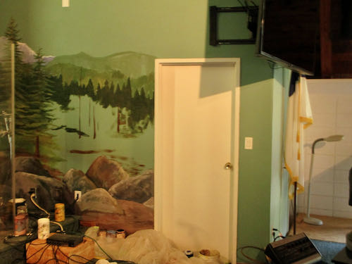
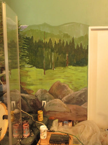
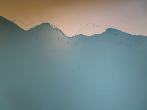
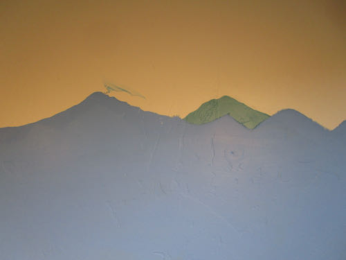
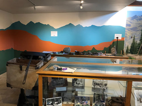
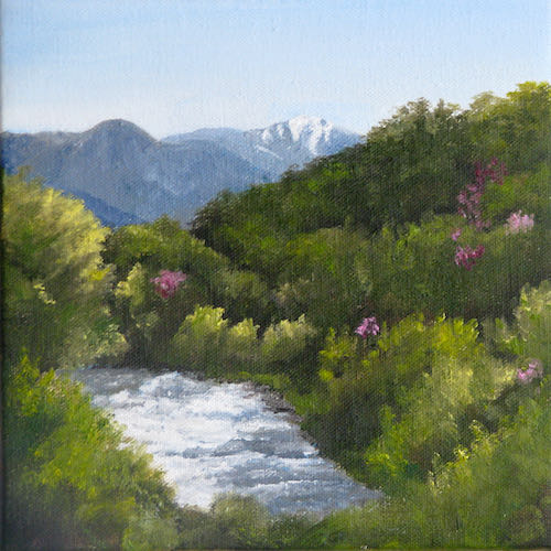
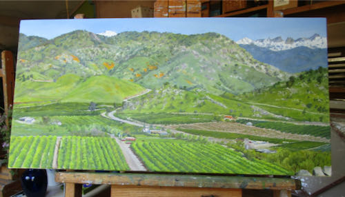
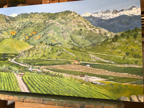
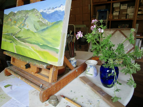
I found a different setting on my camera to show the colors more true. 
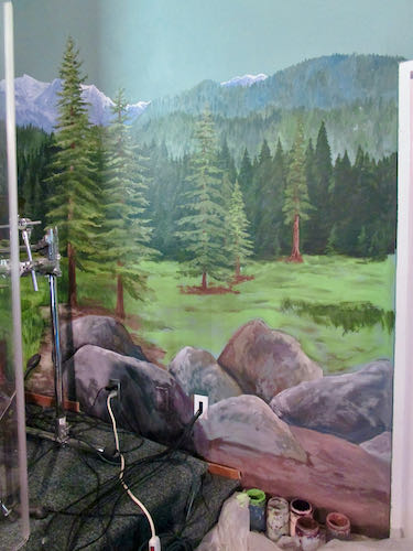
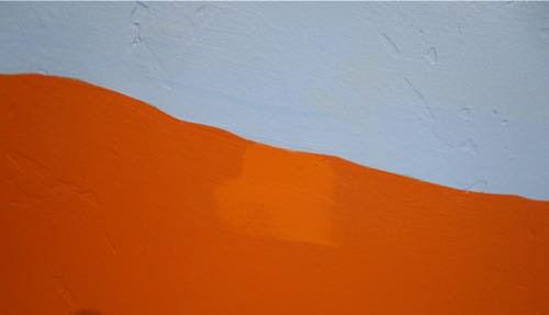
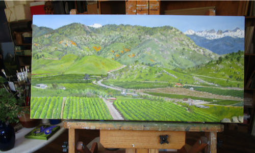
After 5 hours, I dropped off into Idiotland, where I began to get sloppy and stupid. It isn’t good to get sloppy in a place with carpet and painted areas that have no touch-up paint available.
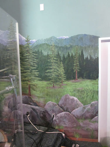
Am I finished?

Maybe, maybe not.

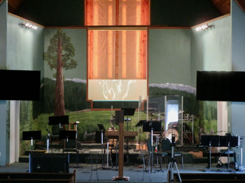
It will probably take a month or two of Sundays before I decide. 

Maybe I just won’t sit where I can see this, and then I won’t pick it apart. It looks fine from this angle.

So there.

I mean “Amen”.

P.S. The drummer gave me a wonderful compliment about the mural extensions. He said they looked so right, so perfectly continued from the rest of the mural that he didn’t notice that they were there.


Did Mineral King Need a Paint Job?

Did Mineral King need a paint job?

No, but the Mineral King Room at the Three Rivers Historical Museum did. The blue didn’t match the murals in the room, and the mountaintops weren’t recognizable. (You can see the murals here.)

First, I was determined to mix the right shade of blue using whatever paints I had on hand. Lightfastness isn’t a problem on indoor murals, so I was able to use a can of indoor white paint that came from who knows where, along with my 2 mural paint blues. Mural paints are highly pigmented and that makes them very useful for making my own interior colors.

Second, we taped all the parts that needed protection. (This was not the royal we—I had great help from MKPS Sandi).

Next, I traced the tops of the mountains on the mural showing the peaks surrounding the MIneral King valley. This provided a guide to redraw the peaks to match reality. (This was based on the assumption that I painted the mountains accurately in the mural.)

I drew the mountains on with chalk. (It wasn’t a Mineral King blue either but it matched my painter’s tape.)

Then, I started painting and almost immediately, dripped onto the rust color.

Good thing there is touch-up paint for all the colors involved. 

Here is an example of something weird that I have learned about acrylic paints, as opposed to oil paints: they are LIGHTER when they are wet. Doesn’t make sense, but it is true.

That teal color was great with the rust, but just not right for the subject matter. I told the Mineral King Preservation Society that if they are just going to waste the paint, I’ll be happy to take it off their hands. I’m sure I can find a use for it. (Weird how the rust looks like red here, and the white looks like light tan).

Now look at the room so you can see the corrected peaks and the color that matches the murals. (I’ll show a before and after on the 2nd shot for you.)

Before:

After:

The mountains in the Before photo are more dramatic and more proportionally pleasing. However, the mountains in the After photo are realistic rather than stylized, match the murals and give more display space for whatever will be going on the wall.

Tomorrow I will tell you a few thoughts about this job.

Quick Quick, Can You Help Us?

The Mineral King Preservation Society has 2/3 of a room at the Three Rivers Historical Museum. We call it The Mineral King Room, in spite of sharing it with another exhibit. 

A few years ago I painted some murals in that room.

Recently, the room started getting a facelift, or perhaps “makeover” is a better word. I was at the museum for something, went in the Mineral King Room, and saw the beginnings. My first thought was that it was colorful and spiffy looking; my second thought was that the blue didn’t match the sky in the murals, and my third thought was that the supposed Mineral King peaks did not look like Mineral King.

Several weeks later, another Mineral King person stopped by and said, “That color of blue is doesn’t look like a Mineral King color, and I don’t recognize those peaks.”

Thus, I got a phone call, asking if I could change the color of blue and fix the line of mountains.

Aren’t you just dying to see what I am talking about?

An incidental thought about that blue: it is a great color, kind of a turquoise or teal, something I have quite a bit of in my wardrobe. It just doesn’t happen to match a sky in Mineral King. It might look better with the rust than the sky blue, but reality has to take precedence.

Sold in April and May

It has been awhile since I did a Brag List. Perhaps it could be called a Reassurance List, because when my business hits a lull, it reassures me to see that work has sold recently.

Mineral King Painting Machine

I have 11 paintings ready to deliver to the Silver City Store for the season, which begins on Memorial Day weekend. (I think this is the correct way to designate the last weekend in May.)

Having just finished the commissioned oil painting, I could have just quit painting for a week or two. My art business is usually feast or famine, and when there are no impending deadlines, that is the time to plan and work ahead.

Here are the steps to firing up the Mineral King Painting Machine:

  1. Grab a random assortment of canvases off my shelves, nothing larger than 6×18 or 10×10.
  2. Cover them in a layer of paint, any paint, whatever is left on the palette
  3. Pull out my prechosen photos. I have to choose the right photos ahead of time, being careful to keep scenes that I painted in recent years separated. Although I paint the same scenes over and over (Mineral King doesn’t have that many different options), the goal is to change the shapes, the times of day, and the angles from which I photographed the popular scenes.
  4. I pull out the list of sizes and subjects that I have already painted for this year, and then choose new photos of the ones most likely to sell first.
  5. The photos get paired with the canvases, making sure that the sizes and shapes are different from the ones already finished for the year.
  6. Each canvas gets a title, inventory number and hanging hardware.

7.  I usually begin with skies; it is most efficient to do all the same color in one session.

8. Next, I either block in the main shapes or I draw them in with a small paintbrush. None of this is how I was taught in any of the various classes and workshops. It just happens to be the most efficient way that I have developed.

9. When I have finished about half of the canvases, I begin getting tired and sloppy. So I just slap on approximate colors in the basic shapes, knowing that the next time I paint, the guidelines are in place, the proportions are correct, and there is enough paint down that the canvas won’t show through.

I had ten canvases out, primed, and wired, then only worked on eight. I wasn’t sure that the last 2 photos were appropriate for the 6×6″ canvases—too many details on too small of a canvas means too much effort for too little money. My prices are competitive with other local artists, but when Silver City takes its hard-earned bite, my “wages” drop considerably. Thus, it behooves me to be efficient with my time.

Does this post affect you the same way that watching sausage get made might affect you? Make you not want to eat sausage anymore, or make you not want to buy paintings?

I hope not!

Little Do-Over

This little 4×6″ oil painting has been around for a few years. I thought it was quite charming, but apparently I was alone in my opinion.

A friend is leaving Three Rivers, so I gave the painting a do-over to give to her.

If it looks familiar, it is because it is the fourth time I have painted this scene.

I don’t remember the order in which I painted them. And here is my normal disclaimer: they ALWAYS look better in person.

I will miss my friend. She will miss her river in real, but at least will have this little painting.

Maybe, Maybe Not

When I look at a finished painting in person, it seems truly finished. This painting signifies the best of Tulare County to me, and I am not always objective.

However, when I look at a photograph of the painting on my screen, sometimes things appear that weren’t all that noticeable in person. 

Here is a progression of the untitled painting that is finished, or maybe not.

Tuesday morning overview.

Tuesday morning lower right corner, unfinished.

Wednesday morning lower right corner, finished (but in shade so hard to tell what is what).

May I be finished now? Better put it in the sunshine for a truer color photo.

Now may I sign it, and then paint the edges? 

Maybe, maybe not. Better let it mull a bit, study, scrutinize, put on my truth glasses (just a figure of speech) and try to be objective.

Or maybe I should show the customers and see if they think I am finished.

Maybe, maybe not. 

What is this mess?

When I paint commissions, I go through stages something like this:

  1. Not sure, but I will try
  2. Piece of cake
  3. What is this mess?
  4. What have I gotten myself into?
  5. I’ve got this.
  6. What is this mess?
  7. Who told me I could paint?
  8. Ooh, I love to draw with my paintbrush!
  9. What is this mess?
  10. Oh my goodness, I think I am going to finish soon!
  11. What is this mess?
  12. Make a harshly honest list and fix those things.
  13. Can’t find another thing to fix, better sign it and get it out of my face before I mess it up.

This was probably about step 8.

Then I hit step 9.

I painted for a morning, repairing all sorts of messes, drawing with my paintbrush. Can you see the improvements?


Now it might be at step #10.

It looks wrong in this light. But you can see that only a small portion in the lower right hand corner remains untouched. I might hit a couple more “What is this mess” stages. I went a little nutso trying to get the highway better, narrowing the driveway at the bottom, detailing the rows of citrus trees more, adding in a few more buildings and tightening up the ones that were there, and planting a couple of new groves. I did not darken the blue mountains but actually lightened them. However, this is not apparent in the poor light of early afternoon photography.

Then I had to quit because my friends were waiting for me to come over and make some more stepping stones.

More remains, but the fat lady will be warming up her vocal cords soon.

Dragging it Out

This commissioned oil painting is highly detailed, in spite of the fact that it is a landscape. People who see it want to know where it is, where I was when I got my photos, what are they seeing. 

It is impossible to put in every single grove, building, road, dirt road, and random tree. I enlarge the photo on my laptop to an astronomical size in order to see what the tiny spots are, decide the main landmarks that would be helpful to the viewer, try to get them in the right place, and then use my tiniest paintbrushes to indicate them.

Can you see the added detail?

Every time I work on this painting, I have to change things that I thought were right. 

I am not worried. There is still time to finish and to finish well, believably, and with confidence that this will be my best work.

But maybe I should put more hours into this custom oil painting and stop making stepping stones.

She Loves Flowers, Chapter Two

After obsessing over the wildflowers on the hillside behind my house, I headed to the painting workshop to paint some of my own wildflowers.

But wait! There are other flowers in bloom in the yard, and they also deserve attention. I picked some Lemon Geranium to put in a vase near my work station, because it keeps mosquitos away. (in theory)

Wait! I can’t work on that piece today. It doesn’t have the tight deadline that the Redbud Festival is pressurizing me with. IT IS TOMORROW, 10-5 at the Three Rivers Memorial Building and SUNDAY, 10-4.

Get to work, Central California artist! Chopchop.

I love this view of Franklin Creek, at the upper crossing, below the dam.

Mineral King Wildflowers, 6×18″, oil on wrapped canvas, $165 (plus that pesky California sales tax).

Then I finished this 6×6″ poppy. 

I have more finished little paintings for the Redbud Festival but you might have to go to the show to see them.

Maybe I’ll show you those other flowers in the yard on Monday’s post. Or maybe I will tell you that I sold everything at the Redbud Festival. Or maybe nothing will have sold and I will invite you to a bonfire.

JUST KIDDING!