Just Another Day at the Easels. . .

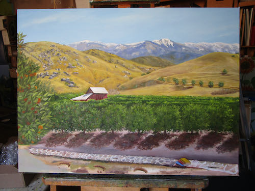
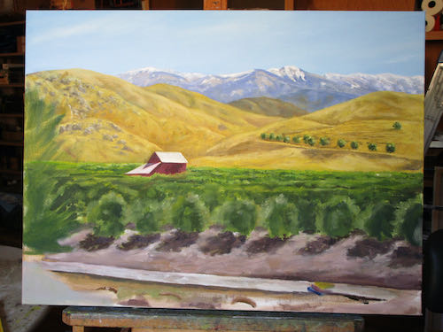
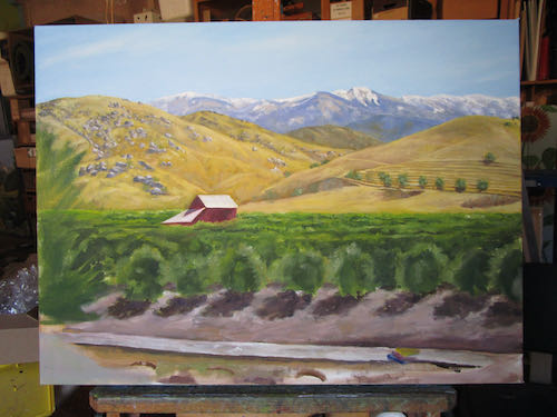
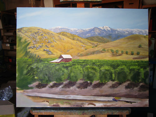
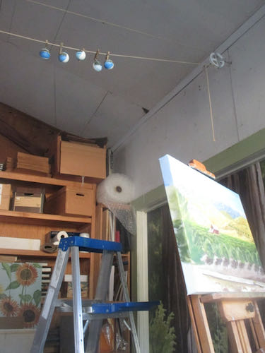
. . .in a barely cool painting workshop in early August, but thankful for the swamp cooler. The day before, I stood the entire time while painting. This day I sat the entire time. 

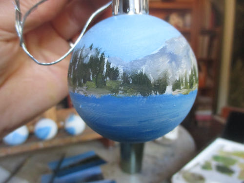
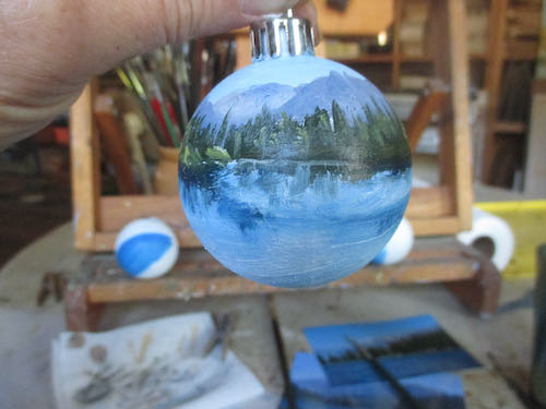
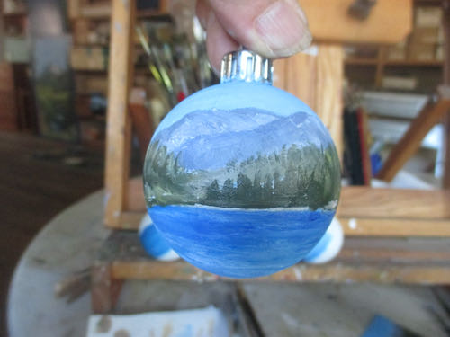
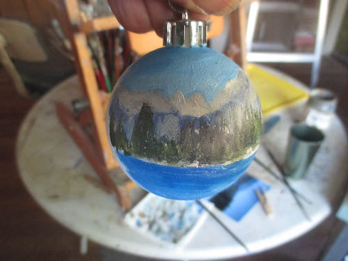
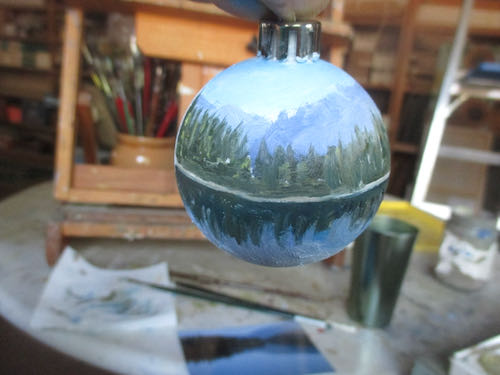
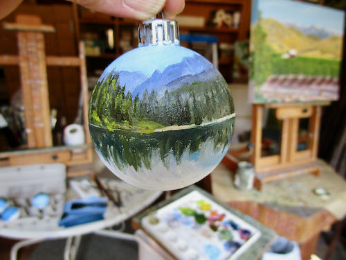
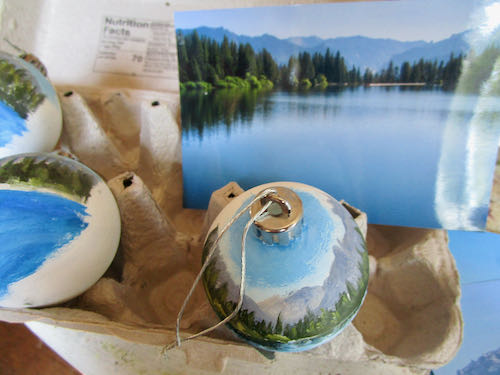
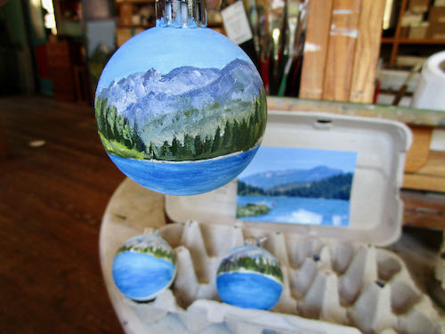
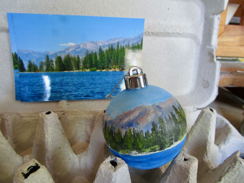
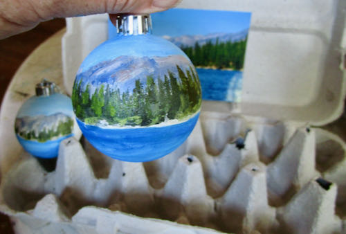
Thank you to Reader Anne for the suggestion of using an egg carton for the ornaments. It sort of worked, but I ended up holding each one in my hand. They are looking better, but still have many layers ahead. These photos are just more teasers about how they are moving ahead without revealing much except that Hume Lake will be on one side.

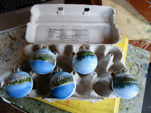
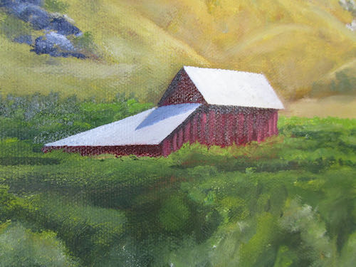
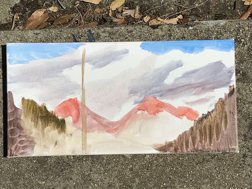
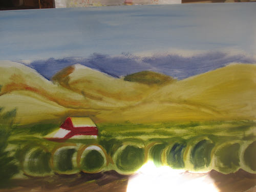
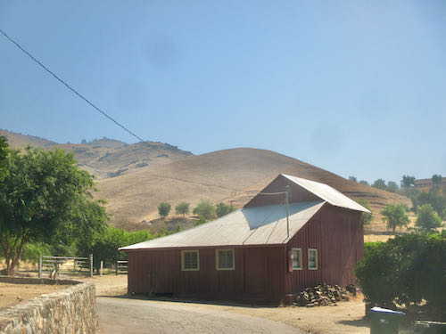
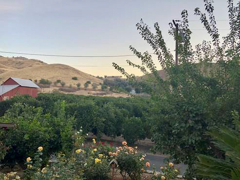
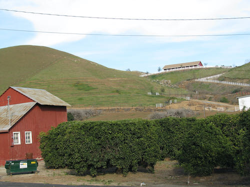
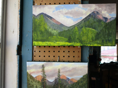
I touched up the 8×16″ of Farewell Gap in Mineral King, but you might have to see it in person to catch the improvements.

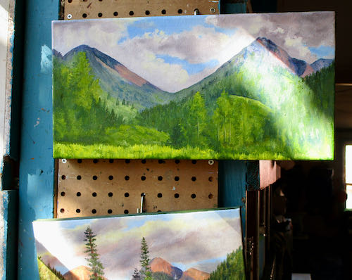
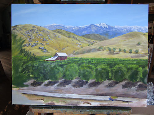
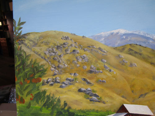
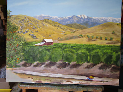
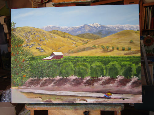
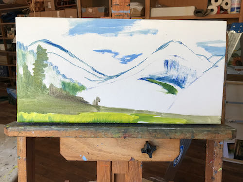
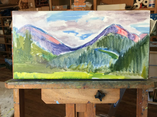
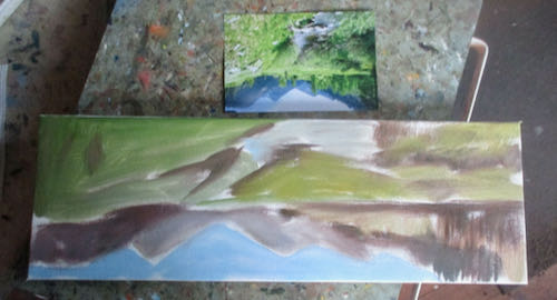
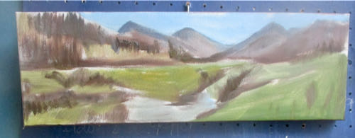
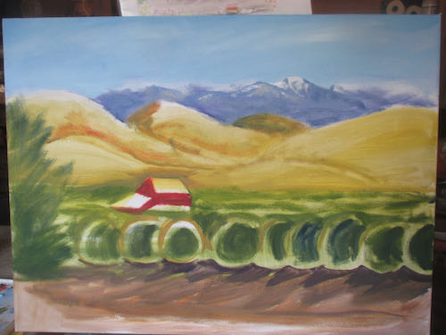
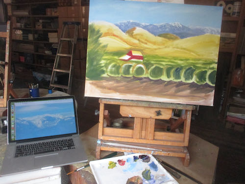
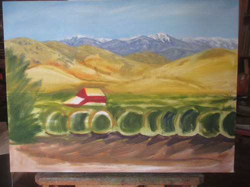
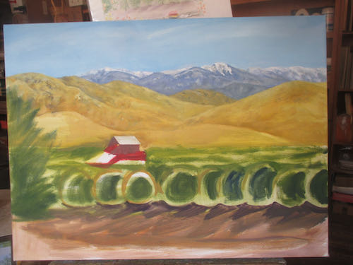
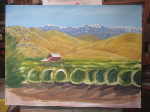
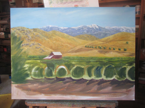
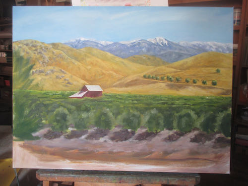
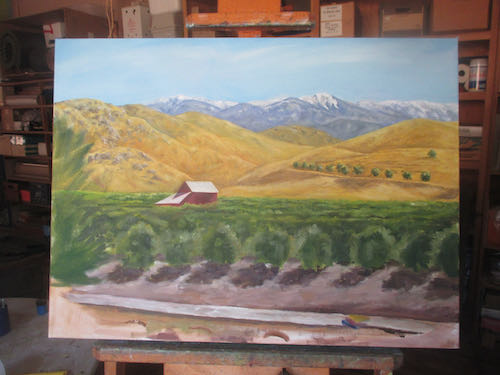
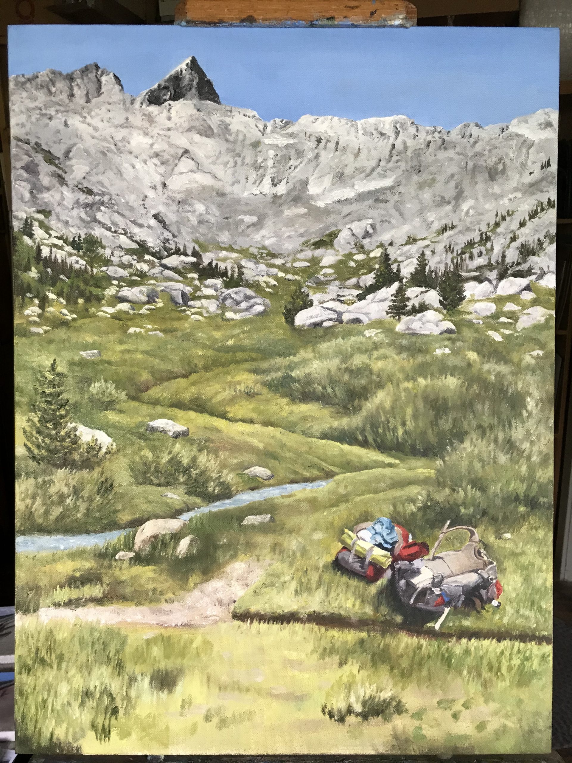
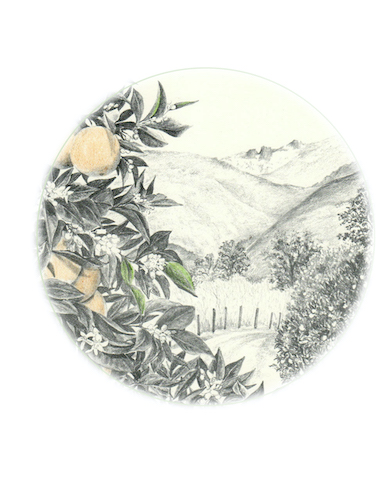
Since Kelly’s Sunset (also in Mineral King) has sold, I painted another one. I have altered the placement of trees from Kelly’s original photo, and altered them again in version #2. In these photos, I can see that the angle of the left flank of Vandever (peak on the right) is too steep. Will anyone else notice? Will the piece not sell? More will be revealed in the fullness of time.

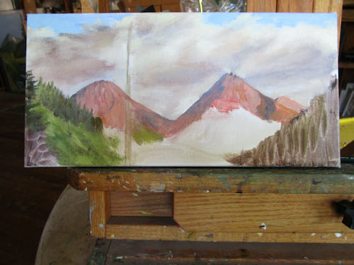
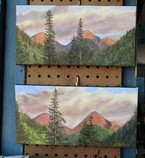
P.S. UPDATE: the smaller sunset painting with the wrong angle on Vandever and a single tree sold immediately.

Large Important Commission, Chapter 7

This large important oil painting commission is getting to be fun. With some custom art, the customer directs many parts of the process. With others, they cut me loose to just do my best and make it look good. This project is the latter. (so far)

The color on the top photo is early morning light in the painting workshop. I started with the close orange tree on the left, worked across the front row of the orchard, moved into the shadows beneath the orchard, and then began laying stones on the wall. The final photo shows the beginnings of rose bushes in the foreground.

I will continue correcting the colors, tightening the details, fixing wonky stone walls, and studying this until I know it by heart. It is large (for me), important, and deserves as much attention and care as I can possibly give, because there is no deadline!

P.S. Yes, that is a little stack of books. It will be improved on as the project progresses. Remember, this is for the Tulare County Library, to be displayed in their Woodlake branch.

Large Important Commission, Chapter 6

It was time to get back to the Large Important Commission. I repainted the sky, mountains and foothills, this time adding detail. I wanted to copy the rocks EXACTLY, which is ridiculous, because the hills are sort of made up. So I made up the rocks, and when I stepped back, they looked believable. That is the goal, rather than becoming a human Xerox machine.

I stopped for a minute to sit down and mix some colors, and immediately Tucker jumped onto my lap. He was lucky to not get any paint on his tail, which was sticking straight up toward my palette.

The last time, the barn roof got a little bit pink. You know how I love to draw with my paintbrushes – this was a very satisfying fix. Because the paint is wet, it is shiny. And isn’t this the strangest roof?  

Next session I will keep adding detail to the orange trees, maybe add fruit, put the dirt and shadows in, start the wall, maybe even indicate where the roses will go. 

In other painterly news, since Kelly’s Mineral King Sunset sold, I am painting another one to sell at Silver City, continuing to strike while the iron is hot. And since I am on a roll with Farewell Gap on very horizontal canvases, might as well start a second one, this time 8×16″ instead of 6×12″. This is the base coat on each one, just covering the canvas, getting the pieces in place, using colors that are close enough. Some people start with just browns or grays, but I think color is more fun.

Odd Job Times Five Continues

Painting on spheres the size of a tennis ball definitely qualifies as an odd job. Painting five of them means the odd job provides lots of opportunities to practice. 

I photographed each ornament after putting the next segments on them. This has to be done in parts, because wet paint on a complete sphere is a messy situation. After seeing these photos, it is clear to me that I need to be doing this in better light rather than at the end of the day when the light is low. 

This time I had the foresight to attach a wire, dig out the clothespins, open the ladder, and clip each ornament to the clothesline/pulley arrangement above the easels and painting tables. (Trail Guy assembled this so our friend who grows lavender would have a place to dry her bunches a few years ago).

There was paint left on the palette, and it is a shame to waste paint. It will keep overnight, and it does okay in the freezer for awhile, but I was heading up the hill and wouldn’t have a chance to use the paint before it got too tacky. So, I got out a photo of Mineral King and a 6×18″ canvas, figuring I could stretch the scene into a panoramic format.

Upside down forces me to evaluate the shapes correctly, not that it matters when I am distorting a scene to this degree. You can see that the colors are wrong. However, those are the colors that were left on the palette, and it really doesn’t matter for the first layer.

I can make this work. But first I need to finish the Large Important Oil Painting and make better progress on those five ornaments. Unless, of course, one of the four places that sells my work calls for more Mineral King paintings.

9 Steps on a Custom Painting, Chapter 5

That’s a title change from the story of a large and important commissioned oil painting, but the saga continues as I build up the layers of paint and try to figure out how to make this worthy of “large and important” as a description..

Here are some thoughts and explanations as I bumble along. (The numbers don’t correspond to the photos.)

  1. The first photo has bright morning sunlight at the bottom; I wish I knew how to duplicate this sort of contrast with paint.
  2. As always, I started with the farthest items first – sky, then distant peaks, foothills next, citrus grove, etc.
  3. The mountains are from a photo I took north of Ivanhoe, which isn’t too much different from the view seen from this place between Lemon Cove and Woodlake.
  4. I moved the barn higher, which might have been a poor decision. The light and shadow on the roofs of the barn look pretty good.
  5. I have some confusion as to how to arrange the trees, because I am working from photos of differing viewpoints plus envisioning whatever makes sense from my previous experiences painting citrus groves.
  6. When I took the photos, there was a wildfire putting a dull haze of smoke over the colors. I am exaggerating the brightness because it makes for a more pleasing painting.

Now it needs to dry awhile. Next, I will correct things that are not believable, correct colors, tighten up details, and then wait for more drying so I can add more details, wait for more drying, add even more details. . .

Large Important Oil Painting, Chapter 4

Are you wondering why I asked the library to pay a 1/2 deposit on the commissioned oil painting? I have learned that if a place or person doesn’t pay a deposit, sometimes they disappear. Not often, but it has happened enough that I believe in the importance of a financial commitment on the part of the customer. With a place like the library, someone could change jobs and then the newcomers have no idea what took place. (I didn’t get to year #27 as your Central California artist by making the same mistakes more than once, no twice, wait, . . . never mind.)

I asked the librarian if she wanted to see photos of the painting in progress; she politely declined. I asked if I could show them on my blog; permission was granted.

Upside down forces me to see the proportions and shapes. The first layer is very thin, loose, nay, downright sloppy.

It’s okay. I know what I am doing. (It’s about time, eh?) It has been awhile since I reminded you that:

I use pencils, oil paint, and murals to make art people can understand of places and things they love for prices that won’t scare them.

Large Important Oil Painting, Chpt. 3

This commissioned oil painting is important, because it is for the library, because it is dedicated to the memory of someone loved by her family, and because all my custom art is important.

It will be 18×24″, which is large for me. Not the largest oil I’ve painted, but certainly larger than my usual small works that sell steadily to visitors passing through, larger than most of my commissions (remember, we are poor in Tulare County), and large enough to put in the many details that the customers are requesting.

In order to be sure that I understood what the librarians wanted (and I am guessing they showed the family who donated the money for the painting), I had to do a sketch. I also had to do the sketch in order to see if I could fake all these details into something believable. Believability is what I aim for, because real life is messy and there are rarely photos that tell what we remember, or what we wish was there.

THEY LIKED IT!

I had quoted them prices for their requested 24×36″, but they chose 18×24″. I told them the price for this size, they requested an invoice so they could send me a check for half, and instead of waiting for the check, I ordered the canvas and started painting.

Next week Chapter 4: the beginnings on the canvas.

Large Important Oil Painting, Chpt. 2

You were left with a cliff hanger yesterday, probably wondering how you would be able to sleep last night.

When I asked the librarian what was meant by “incorporating books”, she showed me this commissioned oil painting from my blog last year, scenery with backpacks, and said to put books in, the same way I put backpacks in this painting. Here is that painting in progress, and you can read the final posting on the job here. Completed Commission

It felt like a daunting request, so I drove to the property, went up the driveway as if I had been invited, and took some photos, one overheated morning, when the light was all wrong.

The stone wall held promise. I could stack some books there.

(Remember Reading Rabbit? I used to post about books I had read. Why did I stop? Too many other topics, and besides, if people didn’t like the books I liked, they might quit reading my blog, saying I had gotten too political or too religious or some other sort of terrible offense. Can’t have that now, can we?)

This is going to take some thought. Next, I will show you the sketch that I did to show the librarians. Sketches are vitally important when doing custom art, because most people aren’t able to visualize.

Next chapter – the sketch.

Large Important Oil Commission

This will be a long story, told in multiple chapters. 

Because I have been an artist for a long time in the same county, often people think of me when they need an artist. This is a good thing, because even if I am not the right person for the job, I often know who might be.

Someone from the county library emailed me, looking for a portrait artist. Nope, not me. The library received a donation in memory of a patron and wanted to hire someone to paint or draw a portrait of the woman. Nope, not me. I could tell that the poor librarian did not even know the right questions to ask, so I called her and gave her a rather detailed set of instructions about how commissions work, what questions to ask, what to expect, and a couple of names of artists who might be available. Nope, not me.

I followed up the phone call with a summary, and included samples of my work, both pencil and oil, and of course I sign all business emails with my website address. I made it abundantly clear that I don’t accept commissions for portraits, but should they change their minds, I would be very happy to work with them on this project.

A few weeks later, they decided, yeppers, me, because scenery instead of a portrait would be just fine with everyone concerned. The instructions were vague, so I pushed for more information. They provided a few photos of the ranch owned by the family, and requested that the painting include books. Say what?

WAIT A MINUTE!  I recognize that barn!

Remember this pencil drawing? Probably not. I did it in March of 2013. 

I took this photo back when I was looking for the right way to show off this area:

it is an odd-looking barn, which makes it memorable.

Okay, where were we? To be continued. . .


Dead Saloon and Western Bang Bang

Excuse me??

I am working on a logo design for a customer-friend (if it is business, “customer” is the right term, but they are friends too). He requested “western type”, so I went searching on the Duck. DaFont, actually.

The names of those typestyles are hilarious! Look at these: Eastwood, I Shot The Serif, Bleeding Cowboys, Insane Rodeo, Boots and Spurs, Dust West, Confetti Western, Lost Saloon, Fort Death, Tequila Sunrise, Cowboy Cadaver, Poker Kings, Texas Tango, Macho, Western Swagger, Old Bob Junior, Dusty Ranch. . . they go on and on and on. Lots of them look alike, so I will just keep sketching, figuring out which type fits with which sketched logo design. 

The logo will include something that looks a bit like this:

And that’s all I will reveal at this time. More will be revealed in the fullness of time, or as my dad used to say more succinctly, “Time will tell”.

P.S. Logo design is not my strong suit, but pencil drawing is. I have done quite a bit of work for these folks, they are easy to please, and I have a lot of ideas for them. Remember this logo design? I like it a lot, and it inspired my confidence to offer to do this job for these folks.