Drawing in Pencil for the Joy of It

A few months ago I started this pencil drawing, simply for the joy of drawing (and to prove to my drawing students that I can draw). I worked from photos that I took in Mineral King last fall. The light, Audra’s hat, the lack of dealing with a face or an actual complete horse all caught my interest, along with the dynamics between the woman and the horse.

This horse was the last one to get loaded for transport down the hill. Audra was so patient, just waiting for this recalcitrant horse to follow her into the trailer. “Recalcitrant” because he spent most of the summer outside the corral with a couple of mules. The others just watched while staying in the boundaries. Then, sure enough, this guy was not interested in joining the herd to head down for the winter.

Because the hat seemed to be the most important part, I started with it. If I can’t get the most important part to look right, there’s no need to waste time on the rest of the picture.

I had a little bit of difficulty with some of the shapes, so I made corrections and showed those to my students to demonstrate how to repair problems (and to stay humble). But I didn’t photograph the corrections—they were for my drawing students to learn from. (Do you want lessons? I have a waiting list, and you are welcome to get on it!)

Drawing lessons were suspended in December, because that’s the way we roll. I was occupied with many things, some work-related (painting, blogging, participating in a little bazaar, resupplying my vendors, filling calendar orders, sending Christmas cards to my students, sending out 2 newsletters—are you on that subscription list? —planning a solo show for Autumn 2024, ordering supplies, doing some year-end bookkeeping) and some non-work-related (you don’t need a list of this stuff).

As you have recently read here, I was a little flummoxed by how to proceed on several paintings, so I used the excuse that it was too cold to paint in the workshop and went into the studio to finish this drawing. (I love to draw in pencil—did you know that?)

Because I wasn’t showing my drawing students along the way, I didn’t photograph or scan any of the rest of the steps.

Here it is almost complete. “Almost”?? Yeppers, because when I scan it, the white paper scans as gray, and the pencil has a brownish cast.

This is unacceptable, so I use Photoshop Junior (actually Photoshop Elements) to erase the margins.

The drawing is simply titled “Audra”, not “A Girl and Her Horse” (she’s a grown woman and it ain’t her horse), not “Big Hat, No Cattle”(no cattle in Mineral King because it is National Park, not National Forest) or “Wranglers Are For Women Too”. . . wait, that one is pretty cute. Maybe it should be called “Wranglers Aren’t Just For Cowboys”.

Nah, the hat is more important.

Six Reasons I Loved Painting This Rose

The rose painting went to Kaweah Arts for the final hurrah before they close (reopening in March). This meant that I didn’t give it a clever name, just slapped it with “Rose”.

I loved painting this because:

  1. There were specific things to paint rather than vague landscape textures.
  2. It didn’t matter if I matched the color or the shapes precisely.
  3. It was small enough to finish quickly.
  4. The colors were different than in a landscape, my normal subject.
  5. It restored a bit of confidence in my ability to paint when I had so many incomplete pieces without answers as to how to make them look right.
  6. It is just pretty, really truly pretty.
Figuring Out a Painting Challenge

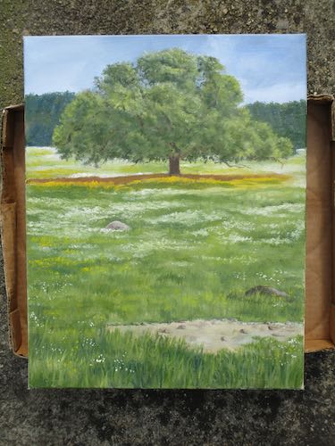
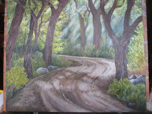
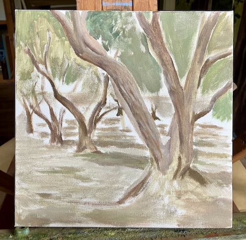
This painting has been in a bit of a time-out. I was a little bit stuck in the messy middle. There are too many instructors in my head, telling me things like “loosen up” and “stop drawing with your paintbrush”.

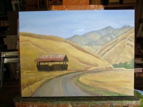
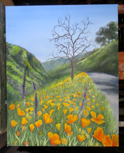
After studying it a bit, I remembered who is the boss. The Central California artist is known for drawing details, having begun her art business with pencils, drawing cabins and homes and eventually landscapes in minute detail.

Now that she paints in oil, if she leaves out those details, she doesn’t like her paintings and her friends and family ask her if she is finished because it just doesn’t look right.

Allll-righty then.

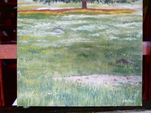
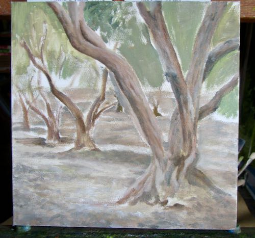
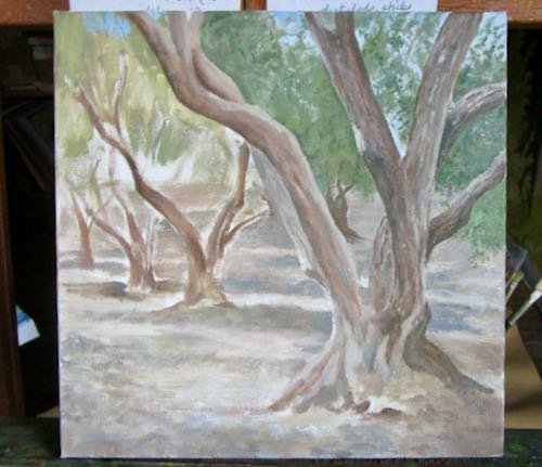
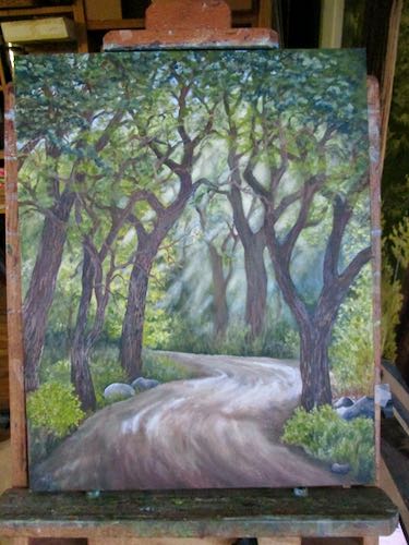
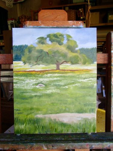
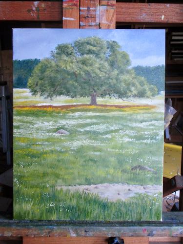
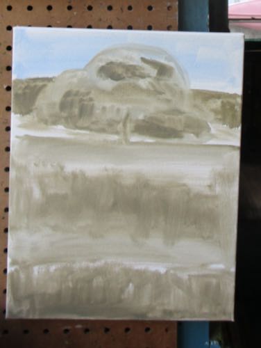
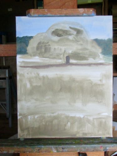
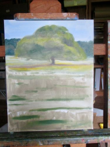
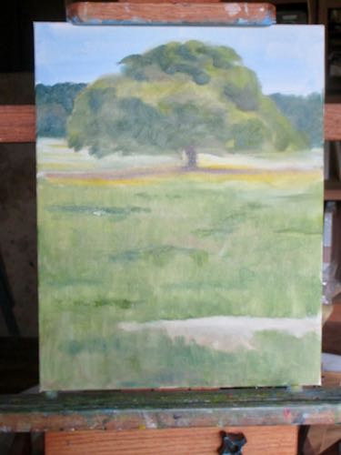
The trees are too smooth, the foreground is messy-looking, and oy vey, those upper leaves.
Bark texture! Better rocks!
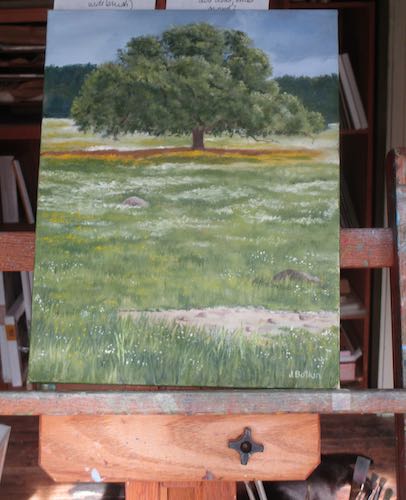
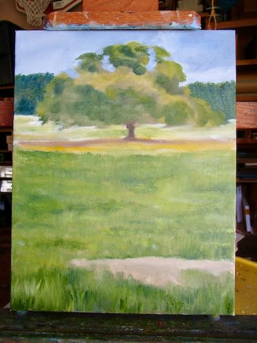
Notice anything peculiar about the painting here? (I have no idea how this happened.)
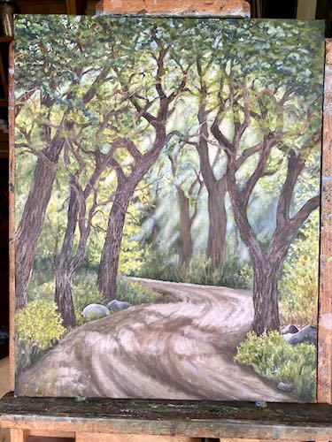
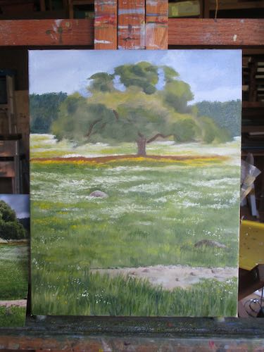
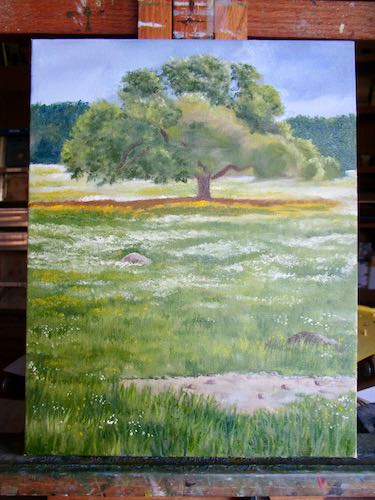
More sky holes, more bark, better contrasts, branches growing more believably, more details in the distance.

There is still work to be done in the bark, branches, and upper leaves but now I believe this eventually will be worth signing. I don’t remember where I took the photos, but I know it was in Tulare County, most likely right here in Three Rivers.

A Nameless Rose Painting in Seven Steps

Step one: Slap some paint in the approximately correct colors in the approximately correct shapes and sizes on a 6×6 canvas: Outline, background, interior parts.

Step two: Detail the background but not too carefully because the rose is the star here. Just hint around at leafy shapes, using darks and darkers to suggest lots of greens.

Step three: Start on the rose, putting in the darkest areas of shadow that helps to shape the petals. (Pay no attention to the painting behind it on the easel, because I am not . . . I’m doing some productive procrastination here. )

Step four: work from the outermost petals inward. (Why? Because I am the boss of my painting and this makes sense to me.) You can see that I rotated the 6″ canvas so that I could visually follow the tip of my brush. This is called “drawing”; it’s how I paint details. The arrows show you the petals I worked on (so does the glare of wet paint) working from the outermost petals inward. (Why? Because I am the boss of my painting.)

Step five: Paint more petals, continuing from the outside toward the center.

Step six: work on the center with a tiny brush.

Step seven: touch up the lighter parts for more of a glow, and sign it.

There are more steps: let it dry, scan it, spray varnish so the shiny parts (with extra walnut oil to make the paint obey me) won’t stand out, give it a title.

Rose, By Any Other Name, No Thorns, Floral Perfection, Gordon’s Rose, any other ideas for this painting??

Progress On My Favorite Subject

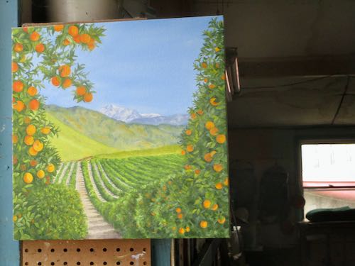
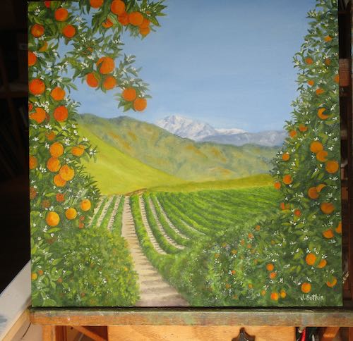
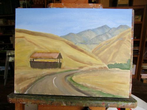
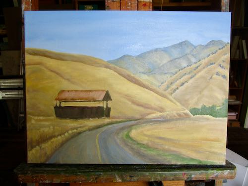
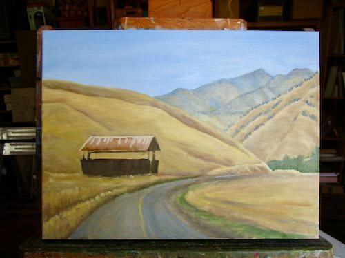
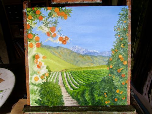
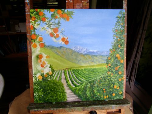
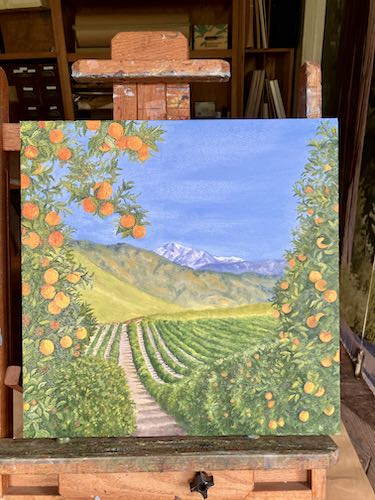
For the past few years, my favorite subject to paint is orange groves with hills and mountains.I’ve had a large (for me) painting in progress in a time-out for awhile. In that bonus week between Christmas and New Year’s Day, I worked on it.

First, I photographed it, studied it on my laptop screen, and circled the parts that were not up to snuff (weird cliché, whose meaning I do not know).

I started with the mushy rows in the red oval. It’s all wet and shiny, so these photos may not appear to be an improvement.

The orange oval was next, and I kept expanding the area around it.

The upper right corner was next. I ignored the pink, yellow, and light green ovaled areas, because I am the boss.

Now let’s look at the painting as a whole.

The usual excuses for photography that doesn’t do justice to the verbal explanations: low light, shiny paint, photographed with inferior phone instead of camera, and of course, there are many areas remaining to be detailed. I can’t tell you that it will look better when it is scanned, because it is too big to scan. But I can tell you that it looks way better in person!

Hopeful Beginning and Messy Middle

If you receive this in your email and want to see the photos, click on the title.

When I begin a new painting, there is a sense of “oh boy, this is going to be great!”

When I am in the middle of a painting that doesn’t seem to be improving, I encourage myself that when I can add the details, it will improve. It’s just the Messy Middle.

Here is a look at a hopeful beginning: this is a rose grown by my brother-in-law that just slayed me with its beauty. I took a photo thinking it might be helpful to one of my drawing students, but then I was captivated, captured, mesmerized, gone-zo. (See? hopeful!)
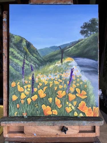
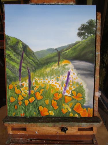
While I worked on it, the painting of the road hovered and lurked in the background, grousing, “What about me? When is it my turn again? HEY, Central California Artist, aren’t you supposed to be getting me ready for a show? Hunh, hunh?”

It was sideways on the easel so that I could visually follow the tip of my brush for more accuracy. I flipped the photo back vertical so you won’t hurt your neck.

Layer by layer, leaf by leaf, branch by branch, I think it is getting better.

Mineral King—Painting the Details

If you receive this in your email and want to see the photos, click on the title.

When we last saw this most popular Mineral King scene on the easels, it looked like this.

A little more work brought it to this stage.

That big juniper tree needed attention, as did Vandever (the peak).

Next, I worked on the shrubs and the stream bank.

It was time to make sense of the stream, starting the farthest away where it curves to the left. That’s not technically correct, because it is flowing toward us, coming from the left. You know what I mean, yes?

Now, let’s back up and see the whole picture again.

Looking good, except the stream was definitely lacking detail.

Next time I show you this painting, I will back up so you can see the whole thing. Then I will probably start adding more detail to the shrubs. Details are my favorite part, but you knew that already.

Five Steps Closer on this One

If you receive this in your email and want to see the photos, click on the title.

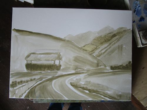
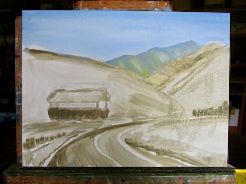
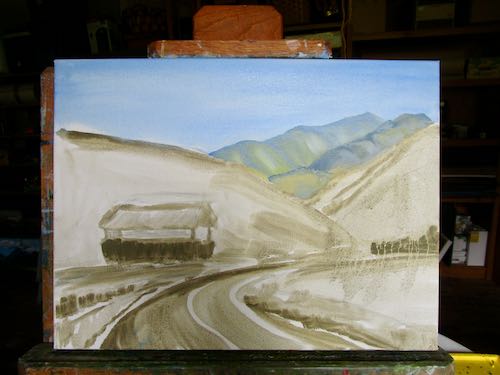
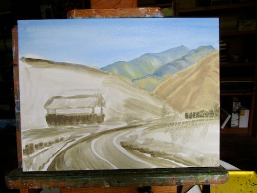
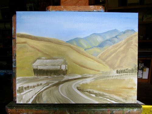
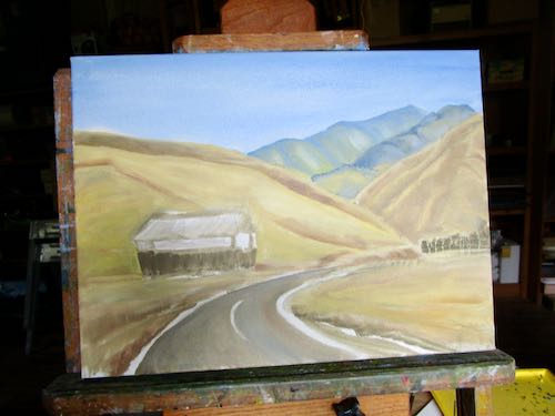
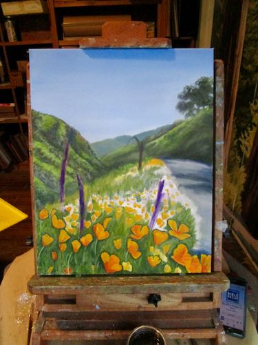
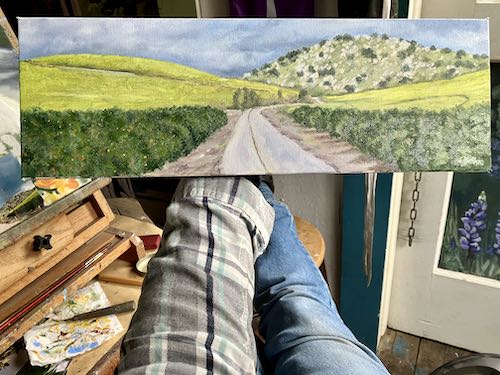
This painting was waiting patiently for some attention. I gave it an entire afternoon, photographing it at 5 stages.

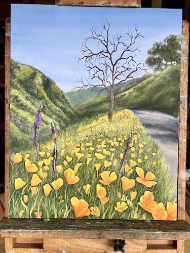
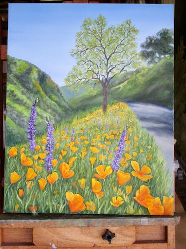
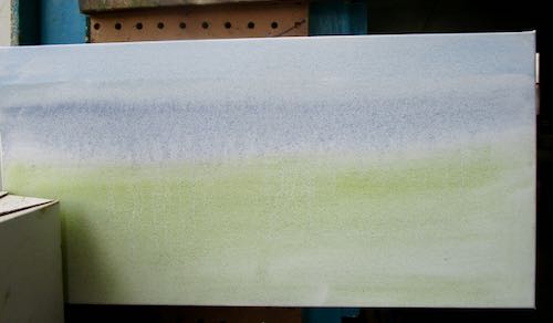
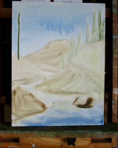
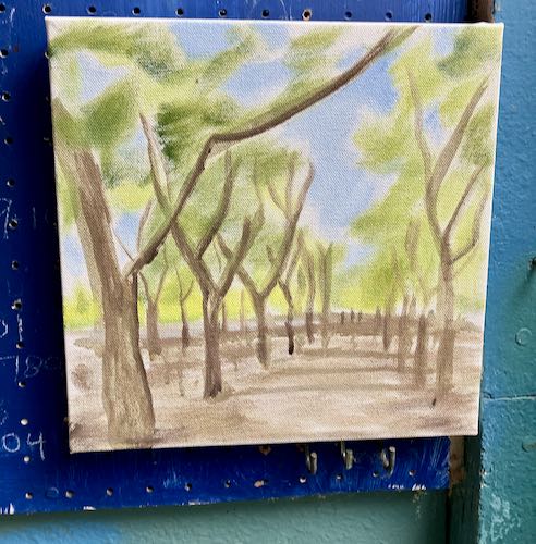
First, I put in some sky patches in the upper left.

Next, I strengthened the trees. They are all sort of skinny in the photo, so I will probably choose a few to fatten up. Later.

I mixed several greens and just danced around all over the canvas without a real plan.

Then I worked on the road, along with a bit more specificity in the greens.

Finally, I paid attention to the details in the closer things off the shoulders of the road.

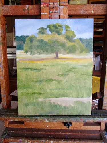
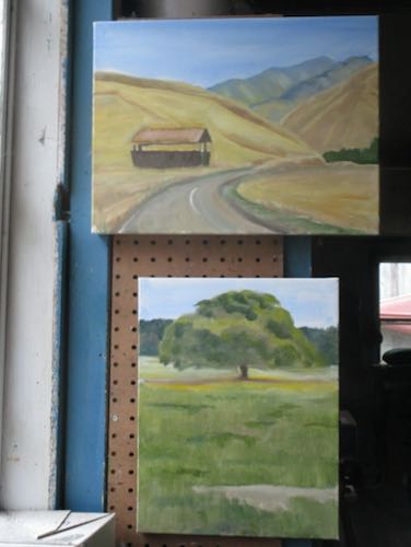
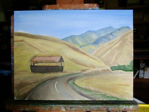
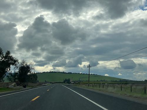
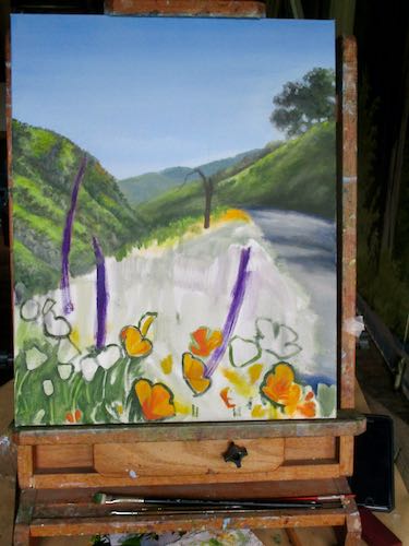
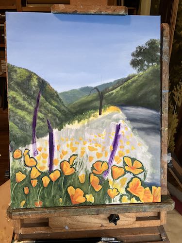
In conclusion, the photo is mostly a suggestion of shapes and light. The details are murky, so I am just winging it, pantsing it, trying this and that with an occasional peek at the photo. Photos. I have several, and yet have no memory of taking these pictures.

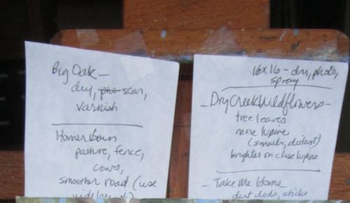
Two titles are under consideration: “Take Me Home. . .” and “Somewhere in Three Rivers”.

Improving One, Fixing Two

If you receive this in your email and want to see the photos, click on the title “Improving One, Fixing Two”.

When a painting doesn’t sell for awhile, I evaluate it, trying to figure out what isn’t resonating with possible customers. Yarn and Dutch iris are two things I love, but something was preventing the sale of these two paintings. Never mind that I kept them in the house instead of putting them out in the public—they started in the public and when they weren’t purchased, I took them home.

The yarn on the left is a favorite color combination of mine. (Doesn’t it remind you of the beach?) Apparently, it isn’t a favorite combination of other knitters. So, I added red and yellow. The teal is still teal, not blue, but the painting doesn’t photograph as well as it scans, and it was wet. I will add some green and some purple next, maybe orange and blue too. People love color. Me too, especially if it is brown with teal.

Dutch Iris might be my favorite domestic flower. I’ve sold several of these, but not this particular painting. I studied it awhile and decided it needed a darker background. And as with the yarn, it will scan more accurately than it photographed in low light while wet.

Those two paintings were a warm-up session before returning to this painting.

The plan was to detail the ferns, and as I was getting into it, I decided to fill in more in the greenery, improve the distant trees, just dance all over the canvas as I saw things to fix.

It’s better, but not finished yet. For some reason, the paint was misbehaving, making precision more difficult than normal. The paint was either clumping off the brush, or it wouldn’t come off at all. Walnut oil (this is my choice instead of linseed) didn’t seem to make a difference. So, this will need to just dry for awhile before I continue detailing.

The Most Popular Mineral King Oil Painting Subject

Five steps closer to completing a new painting of the classic Mineral King view, but still about 60 steps from actual completion.

Remember this?

It is 30″ high, and I can’t reach the top very well. That’s okay, because it is movable.

The cabin is too wide.

Better.

I’m not trying to be exactly true to the photo. I am trying to make it look believable, and after looking at it for 39 years, drawing it about a dozen times in pencil and painting it at least 64 times*, I can recognize when things aren’t quite right.

However, I am making free with the locations of the rocks in the river.

Now there is a base coat on almost everything. Maybe two more layers will do the trick: one to fill out and finish covering the shapes and another to detail it. But then I’ll have to detail it more. And then it will need more correcting. After I show it to my most discerning critics, I’ll need to correct it even further. (See? 60 more steps ahead)

Changing the sizes, the lighting, the cropping—these things keep me interested when I continue to paint the same scenes over and over.

*Really! I counted my photos of the completed paintings, so I know this is true, and there might even be more that I didn’t photograph. Curious? Here they are up through 2016, when the count was at 32.

Same Mineral King Scene

More Farewell Gap Mineral King Oil Paintings

Mineral King Oil Paintings, Continued

Still Oil Painting in Mineral King

And Yet More Mineral King Oil Paintings

The Last Oil Paintings in Mineral King

One More Mineral King Oil Painting?