A Cat Called Chaos

A Chat Called Chaos? A Cat Called Caos? Never mind. Here is the story.
 
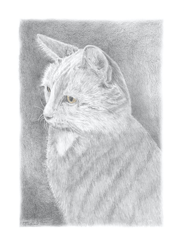
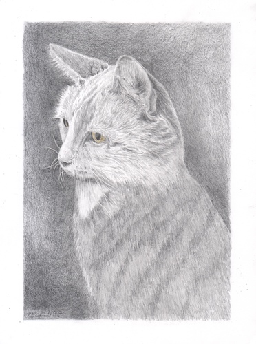
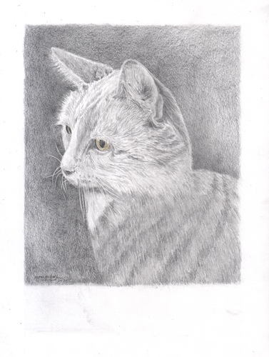
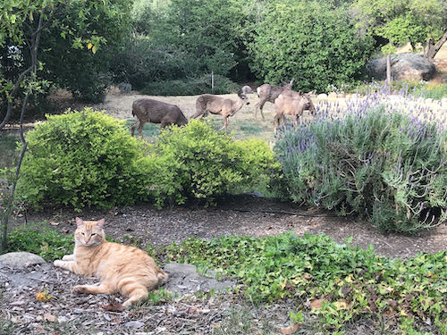
In 2004 I drew a cat for some folks who actually brought him to my studio. This was in the days of film cameras (Nope, not an Early Adopter of anything), so I didn’t save a photo of the drawing. Snowcat’s people recently asked me to draw their current cat, Chaos, and although I remembered Snowcat, I couldn’t remember the drawing. They sent me a photo.That was one alert cat!! When I was taking his photos, I reached out to touch him. He pulled away in a very subtle but arrogant manner. Made me laugh.
 
Their current cat spent the first 2 years of his life in a dog grooming shop and used to create chaos there. He is getting up in age, so they asked me to draw him, sending a handful of digital photos.
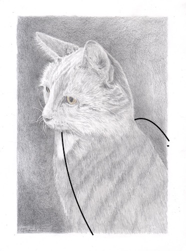
Chaos looks more alert in the lower photo, but the man appears to be strangling the cat. I asked for a few more photos with a different hand position.
This is less worrisome for the cat’s survivability, but the hand appears larger than the cat’s head. That won’t do.
 
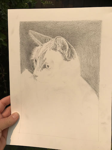
I decided to just start drawing and figure it out as I go.
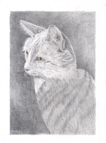
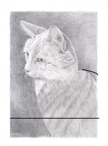
The weird orangish tint is due to the smoky light coming through the window over my drawing table.
This time to photograph it, I carried it outside for better light.
To be continued. . .


Still Smoky, Still Drawing

This sort of smoky light means it is hard to see to paint, but if I open the doors for better light, then it is hard to breathe. So, I get to spend another day in the studio with my pencils. (I love to draw – did you know that?)

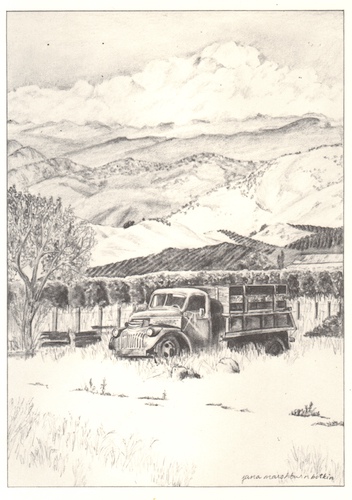
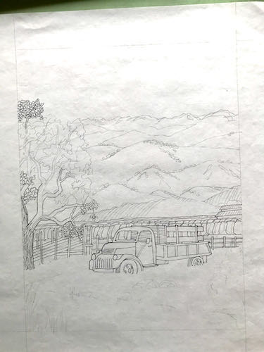
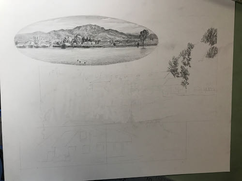
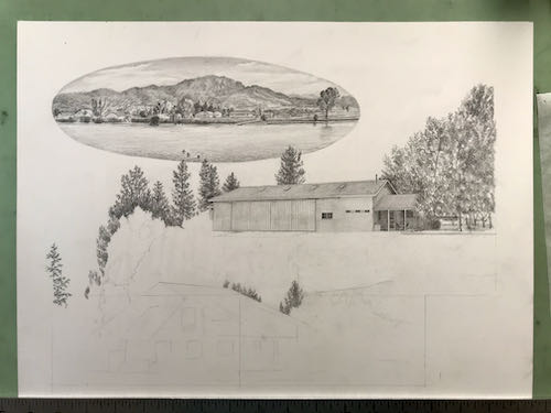
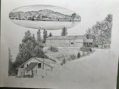
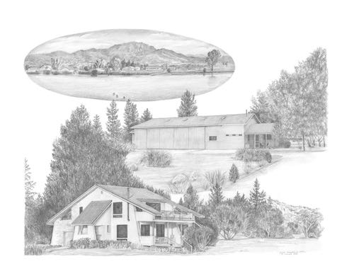
This is a large collage drawing, a commissioned piece 14×18″, that will incorporate 3 different scenes. In designing, I tried something new – I used photoshop instead of doing sketches. I sent the customer 2 versions and she chose this one.

Here you can see the faint outline where things will go. I started at the top on the left, because as a right-hander, this helps to cut down on excessive smearing.

Setting it up took as long as getting it to this stage.

I had enough time to begin the next segment.

Next, I heard from the customers on the lengthy logo design project. Calling it “lengthy” is not an insult; this is a very challenging job, because the customers have been without a logo since 1980, logo design isn’t my strongest skill so I am slow, and together we are carefully working out the best design possible. This is the next piece in the puzzle.

I used an old (1997) drawing as a place holder, drew a new picture for them, and then we discovered that the old drawing was a better match. Alas, it wasn’t very well done. Well, it was fine for back then, but I was barely out of my Primitive Era in the last century. So I drew it again, and this time I added lemons, along with other improvements that probably only my drawing students will be able to appreciate. But I want this to be The Very Best Possible for my customers and not an embarrassment to my artistic reputation.

Hey look! It is clearing up! I could tell that something was taking place outside because there were some helicopters overhead, and they made the drawing table vibrate.

See? Clear as a bell! 

Not. But clear enough for air support as the fires continue to rage through Sequoia National Park and fill Three Rivers with worry, smoke, ash, fire equipment, and fire personnel.

If you are someone who talks to God, please keep praying for good slow soaking rain without any lightning.


When It Is Too Smoky To Paint…

… then I draw. (Unless I spend time on the computer designing a calendar, a new coloring book, a custom collage drawing, or some cards). But yesterday, I drew.

In 2022, the Gateway Bridge, AKA Pumpkin Hollow Bridge, will be 100 years old. This means there will be some attention on the bridge, which will probably bring about some opportunities to sell images of the bridge. Remember, I am a business person whose product is art, although I often act like an artist trying to figure out the business end of things.

People often confuse my favorite bridge, Oak Grove, with the Gateway Bridge. Let me help you with this:

Oak Grove: single arch, deep canyon of the East Fork of the Kaweah River, 6.5 miles up the Mineral King Road

Gateway Bridge: three arches, shallower canyon of the convergence of the East Fork and Middle Forks of the Kaweah River, just below the entrance to Sequoia National Park on Highway 198

This new pencil drawing is 9×12″, unframed, and I haven’t decided what to do with it yet. That will be a business decision, and yesterday I was focused on being an artist.

P.S. The top view is supposed to look like this:

Working Anyway (Cough cough)

If you think your cabin and cabin community might burn up along with your home and your town, you can spin in circles, nervously jabber on the phone, send endless emails and texts, putter, make a dog’s breakfast of your knitting, compulsively refresh websites with fire maps, randomly go through cupboards, seek oral gratification, pace, try to take deep breaths and then experiment with your new wheezy smoker’s cough.

You can also put on your big girl pants and do some work.

Montana Cabin, commissioned pencil drawing, 9×12″
The Orchard, original oil painting, 12×12″, $250 (plus tax, but you know that)
New drawing lesson with C via email – a demonstration on how to draw a dog eye from a fuzzy photograph of a now deceased black dog, the most difficult of all possible drawing situations.

Cough cough, hack, wheeze. 

It was actually sort of not too smoky yesterday so we took a walk. 

See what I mean about helicopters and the little marbles they carry?

Looking downstream – not too bad.

Looking upstream – yeppers, big wildfire, but smoke not as bad as it has been.

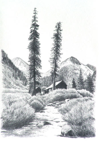
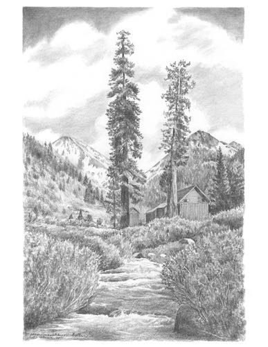
At one time, it looked this way. It could again. We could get rain. There is no reason to think that winter will never happen again. The peaks upstream don’t show in this drawing because it was winter and they were hidden by clouds, not smoke. Remember those days?

Oops. See what I mean about nervously jabbering?

Drawing While Paradise Burns

That’s Paradise Ridge, not Paradise the town, which we know burned a couple of years ago (or was it last year? It’s all a smoky blur).

Trail Guy and I spent a good chunk of a morning talking about what to take, making piles, filling boxes. All the while, we had no intention of evacuating unless the fire gave us no choice. 

What are these relics? Is that ash? Are there any treats? Tucker wants to know.

After getting our piles somewhat in order (oh dear, I have way too many sweaters – how am I supposed to decide which ones to leave behind, possibly to never see again??), I went out to the studio to get some work done. Having an emergency doesn’t give me license to create emergencies for my customers.

This drawing might be a little bit too hard for me. Many details are hidden in shadow, and there is a horse. (At least his tongue is inside his mouth). It is good to tackle the hardest part first.

There might be a problem with his feet, so I moved onto the things that I can do with one hand tied behind my back and half my brain occupied with wildfires (and sweaters).

Working from the laptop screen definitely has its advantages. I can embiggen the photos and even lighten the shadows to understand what the various black blobs are.I drew most of the afternoon while listening to helicopters overhead, a welcome sound after they were silent throughout the smoky and worrisome morning.

And this is how it looked at the end of the day.

This is a commissioned pencil drawing of a cabin in Montana for a repeat customer who is a joy to work with and for.

In case you were wondering about the reference to the horse’s tongue, here you go.


Another Emailed Drawing Lesson

Remember Buck, AKA Mr. Curly? C and I are continuing to work on him via email. She is a remarkably clear communicator, so this is working out well for us. She had specific questions, which always makes it easier to offer instructions.

This is how he looked when we last saw him. I sent her written instructions that corresponded to each colored oval.

This is the most recent iteration of Buck, complete with more colored ovals.

1. The upper neck/mane: You were right about this area. (She had circled it, said it looked wrong and asked about a particular fix.) If you study this area on the drawing versus the photo (I recommend upside down), you will see that the mane sort of curves downward into the neck. Hmmm, words aren’t working. Let me show you.
2. My blue circle: At the intersection of the leg and chest, that slight corner needs to be higher. Look at the photo to see EXACTLY where it lines up with the nostril. Essentially, you will be lengthening the leg by making that intersection a bit higher. Look at it all upside down to re-examine the shape between the face and chest. (A tiny thing that might not matter, but I am scratching around, looking for answers).
 
3. Red circle: study the photo to see where the nostril/cheek indentation and the neck intersect. (Another tiny thing that might not matter but try it just in case. . . )
 
4. Purple circle: All of this area needs to be much darker with the segments less defined because they are in shadow. The exception – keep this little bump light.
 
Does this all sound like gobbledygook to you? Good thing C and I have been working together for a couple of years, because it does make sense to her. 

Most Favorite Art Subject

For awhile now I have told you that my favorite subject to paint is citrus against the foothills and the mountains. It is almost my favorite subject to draw in pencil too. It is right up there with cabins, (published an entire book about them here), old homes (recently drew this one) and the Oak Grove Bridge. (One post about it here).,

Now I am working on a logo design, and it calls for a drawing. (I gave you a little teaser about it here.)

Here it is in progress. I used every source I could find – photos on my computer, previous drawings, physical snapshots – and then proceeded to make up the leaves and oranges and grove. 

This took much longer than a painting or a drawing of a cabin. I forgot how slow it is to place and delineate every leaf and orange. 

Here it is almost finished.

And here is it after photoshopping out all the grayish background.

If/when the customers approve, I will add colored pencil: orange in the oranges on the left, yellow in the lemons on the right, and a little bit of green to the leaves.

A Little Bit Too Hard

Portraiture is the most difficult type of art. The only thing more difficult would be multiple portraits in the same piece. Sometimes when people ask me to draw or paint a portrait, I just say no. I have painted a few people, always with no faces visible.(one more here) I have done many pencil portraits, and each one feels as if it will NEVER look right. 

I drew a pair of Basset Hounds for someone. She showed it to a friend, who sent me a photo of a little girl holding a baby and asked me to draw it. After studying it, thinking about the oblique angle of the girl’s face plus the fact that squinchy-eyed sleeping babies all look alike, realizing that I have many tools with which to “cheat”, I agreed.

Here is the progression of the drawing, which I expected to be a little bit too hard but turned out to be a pleasure to draw. Seeing the photo on the laptop allows me to convert it to black and white or back to color, enhance the contrast, and enlarge anything that I am not quite sure about.

Faces first, because if that part doesn’t turn out, I can quit without too many hours wasted. There were many shapes and textures in the background, and I chose to eliminate them in order to put the focus solely on the little humans. The customer was very pleased and said, “That picture brought tears to my eyes! It’s wonderful!”

That sentiment could have brought tears to my eyes, tears of relief. But I soldiered on to the next project, taking comfort in the fact that it was mountains and citrus groves. (I told a fellow artist that if I was a smoker, I would have lit one up at the completion of this commission.)

Here is a link to the last portrait I drew, hoping it would be the last portrait I drew. Reluctant Portrait


Large Important Oil Commission

This will be a long story, told in multiple chapters. 

Because I have been an artist for a long time in the same county, often people think of me when they need an artist. This is a good thing, because even if I am not the right person for the job, I often know who might be.

Someone from the county library emailed me, looking for a portrait artist. Nope, not me. The library received a donation in memory of a patron and wanted to hire someone to paint or draw a portrait of the woman. Nope, not me. I could tell that the poor librarian did not even know the right questions to ask, so I called her and gave her a rather detailed set of instructions about how commissions work, what questions to ask, what to expect, and a couple of names of artists who might be available. Nope, not me.

I followed up the phone call with a summary, and included samples of my work, both pencil and oil, and of course I sign all business emails with my website address. I made it abundantly clear that I don’t accept commissions for portraits, but should they change their minds, I would be very happy to work with them on this project.

A few weeks later, they decided, yeppers, me, because scenery instead of a portrait would be just fine with everyone concerned. The instructions were vague, so I pushed for more information. They provided a few photos of the ranch owned by the family, and requested that the painting include books. Say what?

WAIT A MINUTE!  I recognize that barn!

Remember this pencil drawing? Probably not. I did it in March of 2013. 

I took this photo back when I was looking for the right way to show off this area:

it is an odd-looking barn, which makes it memorable.

Okay, where were we? To be continued. . .


Dead Saloon and Western Bang Bang

Excuse me??

I am working on a logo design for a customer-friend (if it is business, “customer” is the right term, but they are friends too). He requested “western type”, so I went searching on the Duck. DaFont, actually.

The names of those typestyles are hilarious! Look at these: Eastwood, I Shot The Serif, Bleeding Cowboys, Insane Rodeo, Boots and Spurs, Dust West, Confetti Western, Lost Saloon, Fort Death, Tequila Sunrise, Cowboy Cadaver, Poker Kings, Texas Tango, Macho, Western Swagger, Old Bob Junior, Dusty Ranch. . . they go on and on and on. Lots of them look alike, so I will just keep sketching, figuring out which type fits with which sketched logo design. 

The logo will include something that looks a bit like this:

And that’s all I will reveal at this time. More will be revealed in the fullness of time, or as my dad used to say more succinctly, “Time will tell”.

P.S. Logo design is not my strong suit, but pencil drawing is. I have done quite a bit of work for these folks, they are easy to please, and I have a lot of ideas for them. Remember this logo design? I like it a lot, and it inspired my confidence to offer to do this job for these folks.