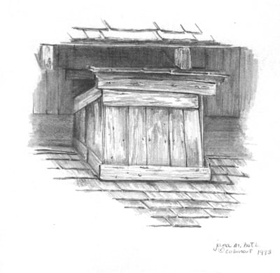
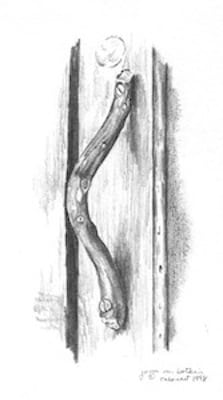
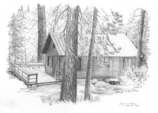
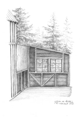
There are many seasoned artists who freely share their experience with other artists. One of the nuggets I’ve gleaned through the years is “Get rid of your junk”. There is no reason to keep things around that do not sell or do not represent your best work.
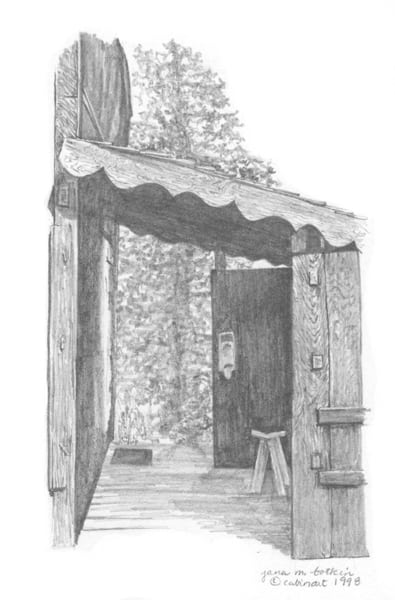
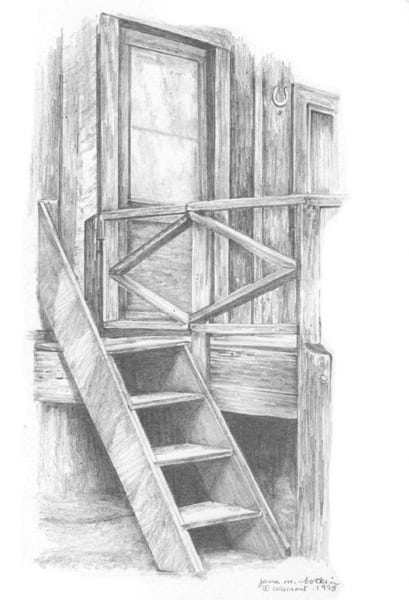
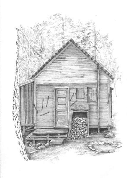
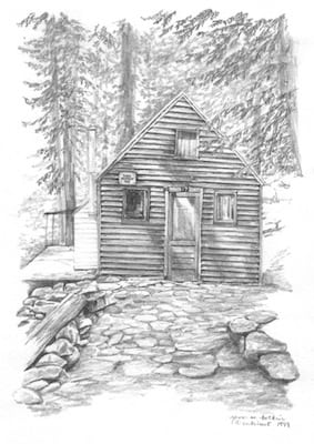
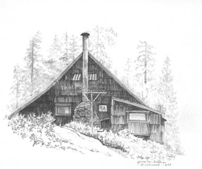
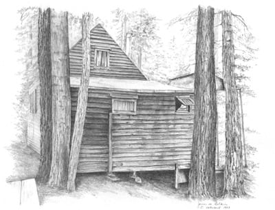
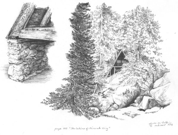
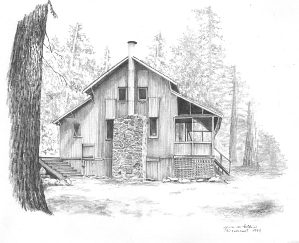
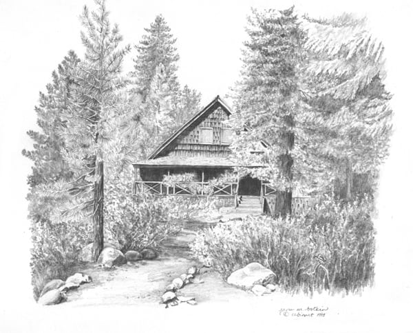
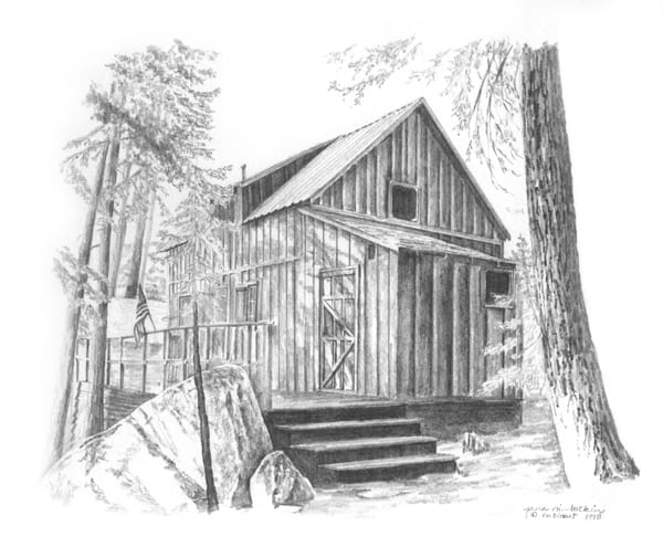
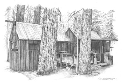
The Cabins of Mineral King represented my best work in 1998. I draw better now, which is good; I would better have improved over the last 20 years or that would be a sorry situation. (That was an awkward sentence – anyone know a good editor?)
Still, the unsold drawings haunt me, take up space and just need to go away, either through a sale or through a shredder.
Before they go into the shredder, here is a chance for you to own an original pencil drawing for a peanut butter sandwich, as my dad used to say. I will consider offers, as long as they are not insulting.
One month from today, October 7, is the deadline on this batch of drawings.
4-1/2 x 5″, $20, SOLD6-1/2 x 4″, $25, SOLD7 x 10″, $904-1/2 x 5″, $25, SOLD4-1/2 x 6-1/2″, $35, SOLD5 x 7″, $40. SOLD
As a full time professional artist since 1993, I have accumulated a pile of work. It is overwhelming at times for several reasons.
If I am looking for something in particular, I have to sift through many other things.
If the flat file drawers get too crowded, some of the paper folds, squishes, migrates to the back of a drawer, or otherwise gets wrecked. I hate it when that happens to an original drawing!
Unsold things haunt and taunt me. They say, “Loser! Poser! Fake artist! No one wants your work!” They are mean, and eventually those mean words work their way into my psyche. (What’s a psyche??)
Therefore, I have made a decision. Unsold and unframed original drawings from The Cabins of Mineral King (published in 1998) have been here long enough. If a cabin owner doesn’t value original art of his cabin, why should I? I have my own preferences and favorites already jamming up my flat files (and they treat me better than those other unsolds).
Before these go into the shredder, I will show them to you and give them one last chance. I might even send out a newsletter to those who might open an email but don’t read the blog. I will tell you the approximate size and the price, and consider all offers (unless they are insulting. The drawings are already insulting me enough, and your Central California artist can only take so much abuse.)
Let’s begin, shall we? If these drawings aren’t sold by October 6, one month away, then say “Hasta la vista, baby”.
8-1/2 x 6″, $50, SOLD8-1/2 x 6-1/2, $55, SOLD5 x 6-1/2″, $40 SALE PENDING9 x 12″, $100, SOLD8 x 11″ – $95, SOLD7-1/2 x 9-1/2″, $80 SALE PENDING10 x 11″, $125 SALE PENDING9 x 11″, $120, SOLD8 x 12″, $100, SOLD
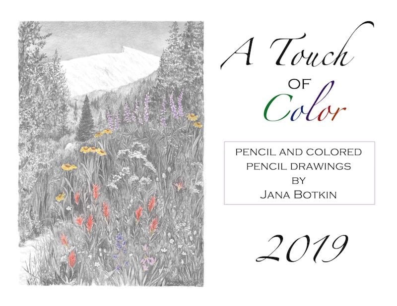
It has pencil drawings with, you guessed it, a touch of color. Each subject is something in my life, drawn from my photos (except for one when I didn’t have my camera and a friend came to my rescue.)
Some people who buy my calendars like all the pictures to be a surprise (I’m looking at you, SD). Out of respect for that contingent, I’ll just show you the front cover. To see the back cover, go to the calendar link below.
This year I am not offering an early-bird discount. It is simply $15, which will include tax if you live in California. I will pay the mailing costs.
There will be 100 available. No, make that 99, because I will keep one for myself. Wait – 98! I gave one to my friends who feed my kitties when I am away. Better hurry and order, because there are so many helpful people in my life that I am prone to give calendars to. (Wait – isn’t this supposed to be a business??)
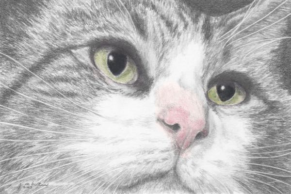
Someone very dear and important to me recently had a birthday. Awhile ago, she sent me a photo of her cat and said she wanted to commission me to draw it. Or maybe she said to paint it. I forget – it has been awhile.
With her birthday coming (do they ever stop coming, faster and faster and even faster??), it seemed like a good idea to draw it for her. I could have painted it, but as you know, I love to draw. Besides, I know she loves drawings, so that was my choice for her cat.
She rescued this guy, perhaps from the middle of a road in the middle of the night. I forget. There have been many. Mr. Mittens is a huge cat with some sort of eating disorder, not uncommon in strays. He also is a polydactyl, which means he has giant multi-toed paws. He also looks like a very large version of my skinny old Perkins. Sigh.
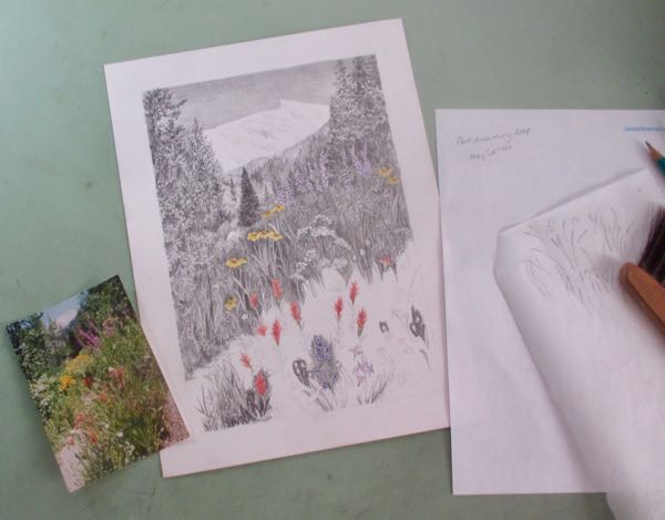
Sawtooth Peak is figuring large in my work life lately. Sometime last week I spent a few days in the studio listening to the reassuring hum of the air conditioner and listening to my own thoughts, and finally, listening to podcasts. This was all to keep me from falling asleep while working on a new pencil drawing of Sawtooth.
While listening to podcasts, I jot notes, and when I take breaks from staring at teensy details through a magnifying glass, I look up things. Gretchen Rubin’s podcast “Happier” mentioned a dish pattern, and something called a “corkicle”. . . had to see those things. She mentioned a writer named May Sarton who has a memoir called Plant Dreaming Deep; of course I had to click on the link to Amazon, then read about it on GoodReads, and finally, look for it in my library’s online catalog system.
Victor Davis Hanson uses big words to convey large ideas, and occasionally I write notes or look up words online when I hear him speak. Usually I just replay his interviews a few times to see if I understand his concepts.
All this listening helps me get through the seemingly endless miniature details of the current drawing.
And in spite of all this listening, learning, and thinking, I still haven’t decided if it is a good thing or a bad thing to put links within my own blog. Perhaps you will be so kind as to let me know if that is helpful or annoying. . .
My horsey friend didn’t respond to my request for help on the drawing that is too hard; my horsey drawing student did, and we experienced a serious role reversal!
She offered detailed advice and supplied photos to help me understand the things that weren’t visible in my photo.
I followed her instructions as best as I could, and then decided I didn’t care if the horses were rideable or not, had 3 or 6 legs, or if they needed a veterinarian (or an eraser). When I couldn’t think of anything else to fix or change, I scanned it and sent it to her, saying that I’d listen if she had more suggestions that I’d listen but it would be after banging my head on the wall.
Here is what my horsey helpful drawing student/commission coach said:
“Instead of banging your head I think you should sit back with a cold drink and celebrate…this looks REALLY good. I think the recipient will be thrilled.
While I might have been able to offer suggestions, I definitely could not have drawn this, so my hat is off to you. Well done.”
Lessons are free for her in September when we resume classes.
Phew!!
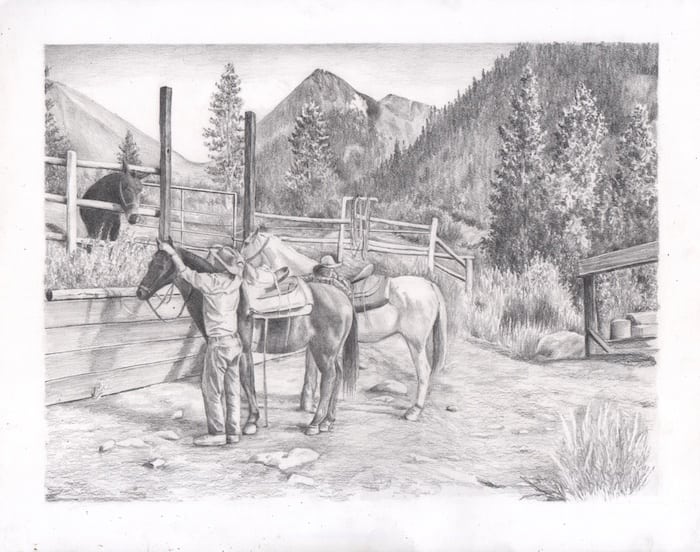
P.S. Someone else saw the completed drawing and thought the mule’s ears were still too small. Bummer. The drawing is now at the framer, and I am DONE with it.
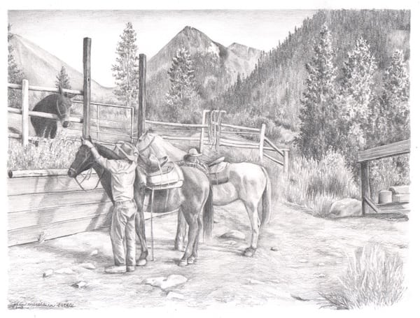
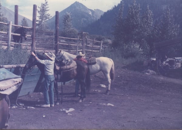
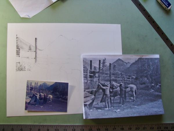
A dear friend asked me to do something almost impossible. He wanted me to draw something for which he had no photo: the Mineral King Pack Station as it appeared in the 1980s. This was before everyone and his brother carried a camera around, documenting lives as if getting paid for it. (Or is it that people now document their lives because if it isn’t recorded, they aren’t sure it happened??)
I put out the word for help. It took 6 months, but I finally located a photo that I could almost see to draw from. If I knew horses and mules, this might be adequate. Barely. However, there is a lot of detail buried in shadow and the general mushy deterioration of a photo printed on a rough surface about 30 years ago.
I soldiered on. Gotta start somewhere, so I started with what I know – the mountains in the background. Printing the photo larger after converting to black and white helped somewhat.
Inching along – good thing there is no hard deadline.
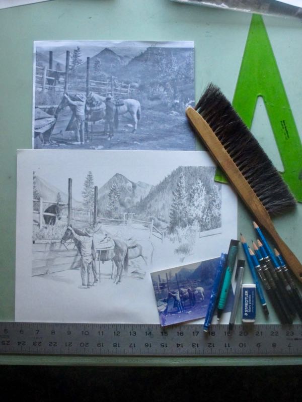
Notice the collection of erasers. This is too hard, and a friend who knows horses offered this most welcome advice: “I think the mule may need a bit longer ears still and the dark horse in the front needs a bit of work. His face seems a bit too long and narrow to me and the front hoof seems a bit too big and clubby (that’s what we call hooves shaped like that in the horse world)”. See why I need all these erasers? Very non-forgiving subjects from a very non-visible photo by a very non-horsey artist.
Mineral King Pack station in the 1980s.
I almost finished it but forgot part of a saddle. Forgot? More likely procrastinated, because it was a blob of dark shapes. Regardless of the missing saddle, I scanned it and sent it to another very horsey friend.
I await her counsel as to whether or not these horses can be ridden or if they need a veterinarian or perhaps a bullet.
Wise artists know better than to draw or paint things they don’t know; someone who does know will know that I don’t know. Wise artists know better than to accept commissions for which there are no or poor reference materials.
Kind artists tell their dear friends they will try.
Wise or kind? This is a little bit too hard for me. And,I may not be charging enough. . .
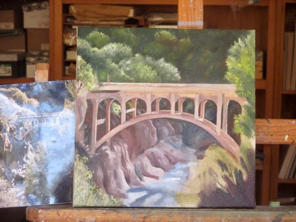
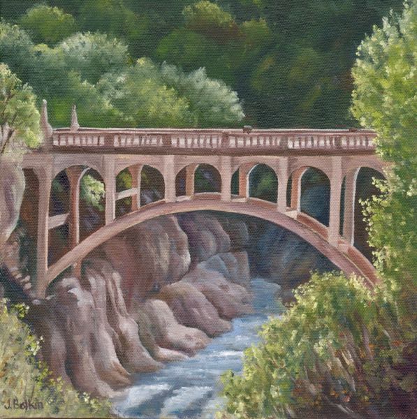
I thought about calling this “Final Chapter”, but I hope I live on to keep painting the bridge and improving with each one.
We made it through about 23 oil paintings of the Oak Grove Bridge. There were repeated views, color adjustments and exaggerations, brighter versions, muted versions, paintings with sharp clean edges, paintings that looked sort of blurry, and the last one from a completely different angle.
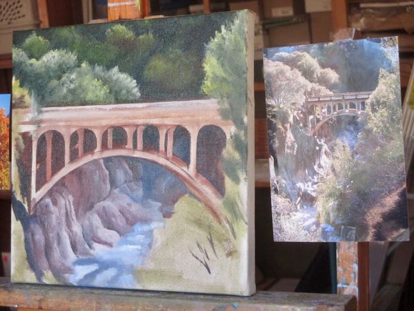
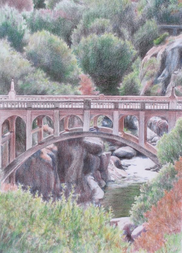
Then, I began working on the commissioned oil painting that combines the bridge with Homer’s Nose, a prominent landmark granite rock outcropping. The bridge felt too hard in this one, so I decided to do a smaller version of the exact same view in order to work out some difficulties.
“Difficulties”? I might be a slow learner, or perhaps a bit simple. I’ve painted the thing 23 times and still have difficulties?
Just try to be polite here, ‘kay?
Here is Oak Grove Bridge XXIV in a few steps (although it took many more than a few steps to do this).
As you last saw it. . .Beginning to tighten things up, like the tree/shrub on the far left that overlaps the bridge, ditto on the right, and adding light and detail to the bridge posts.A few minor adjustments remain, but it is SOLD!
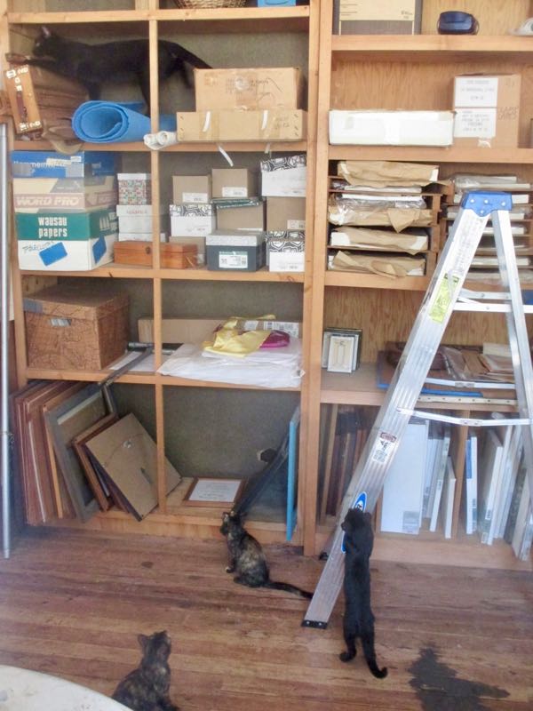
There were some shenanigans by some hooligans while I was trying to concentrate.
This photo tells me that perhaps when I have finished all the commissioned paintings and drawings, I might do a bit of shelf straightening.
My favorite bridge is the Oak Grove Bridge, 6.5 miles up the Mineral King Road. It is also my favorite subject to draw and paint. There are three reasons for this (maybe even more, but we’ll go with 3 for now):
A bridge is the perfect blend of architecture with landscape.
This bridge is a fantastic surprise on a winding mountain road, one that is so rustic that it doesn’t even bother with a center line or fog lines.
This bridge is a bright spot of architectural dignity in a county sorely lacking in such landmarks.
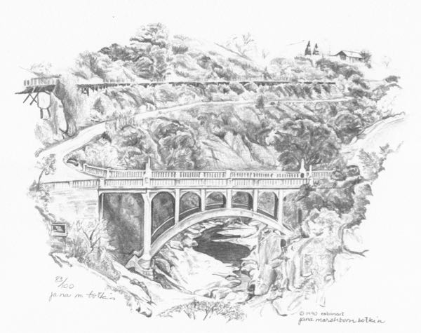
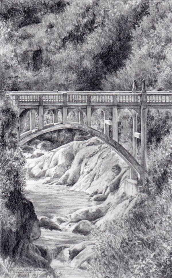
I used to only draw in pencil. This is the first time I drew the bridge, from a view upstream of the bridge. I didn’t draw very well back then, but people were polite and encouraging.
First pencil drawing of the Oak Grove Bridge, 1990
I drew it at least once more, but was very casual about keeping records of my work.
After learning to oil paint using only the primary colors, I decided to see if it was possible to do a full-color pencil drawing using a box of only 12 colors. It sold. (I think I could do a better job now.)
Oak Grove Bridge in colored pencil, 2006
The most recent pencil drawing of the bridge also sold. This one is a popular design on notecard packages that I continue to reprint.
“Rural Dignity”, the Oak Grove Bridge in pencil, 2011
I would draw it again, but pencil drawings don’t sell very fast. People prefer oil paintings, or color, or both.
Come back tomorrow and you can see some of my paintings of this beautiful bridge in Tulare County.
Farewell Gap, a pencil drawing, will be available as a framed original for $400 and in card sets.
After 7-8 months of painting toward a show about Mineral King and (almost) in Mineral King, it is tomorrow!
Is it considered shouting to use bold type? Or is that only for capital letters? I’ve always always always considered italics to be whispering, so maybe this paragraph will be more soothing to your ears.
Four artists with cabins in the Mineral King area will be showing and selling our work on the deck of the Silver City Store tomorrow, June 30, 10 AM until 3 PM.
The Silver City Store is 21 miles up the Mineral King Road. It is a long way there, a long and winding road, and it is well worth the effort it takes to get there. The store is at about 6700′ in elevation, and it is no longer called “The Store” but now is “The Silver City Resort”. The store itself has been remodeled into a new rustic elegant interior; the artists will be on the spacious outdoor deck.
Linda Hengst, Joan Keesey, John Keesey and I will be there. Linda paints in acrylic (or is it oil? Hard for me to tell the difference), Joan does tight realistic botanicals in watercolors, and John does whimsical playful watercolors of somewhat stylized scenery of the area. Linda’s work makes you say “Ahhhh”, Joan’s work makes you say, “Ooooh”, and John’s work makes you smile. My work? Um, let’s see. . . “How much for this one?”
I am taking 23 oil paintings (some of which I have shown you on this blog), 5 pencil drawings (all of which you have seen on this blog), Mineral King cards (old and new designs), a few reproductions of pencil drawings (also of Mineral King, duh) and some copies of my book The Cabins of Wilsonia. (The Cabins of Where? Yes, they have been requested.)
Let’s roll! See you tomorrow??
Art: Inspired byMineral King
Show and Sale
FOUR ARTISTS: Jana Botkin, Linda Hengst, Joan and John Keesey
SILVER CITY RESORT, 21 miles up the Mineral King Road
Saturday, June 30, 2018
10 a.m. – 3 p.m.
Honeymoon Cabin #33, 6×18″, $160 inc. tax. (I like this one so much that if I saw it in a gallery, I’d probably buy it.)