W.I.P.

That means Work In Progress. I just made it up, but I’m probably not the first to do so. I’m also making this up, revising as I go, and Mrs. Bob said the most wonderful thing to me about that:

“Do whatever!  You’re the artist and I relish that…I love your work so do what you think looks best!”

Wow! This is the most fun possible with art – the challenge of a collage, Ireland (sigh), drawing with pencil, and complete freedom to use whatever ideas develop. Life is good. 😎

Did you really think those were armadillos??

Delight Abounds (more on the Collage)

Mrs. Bob reviewed the sketches. To my delight, she had an immediate first choice! Bob looked it over and suggested a change. To their delight, I immediately erased and redrew the good suggestions, and we were all pleased with the results.

Isn’t that a royal mess? Good thing Bob and Mrs. Bob know that I can draw or they might just say “I’ll think about it” and hit the door!

Beginning a Collage

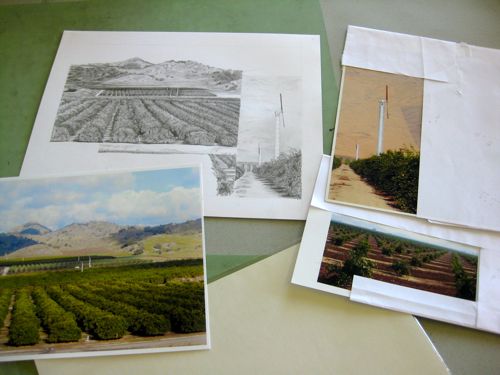
Drawing is one thing; planning a drawing is another; planning a collage is on another planet of complexity! I love love love to do these. The first time I thought of it was on a backpacking trip. In order to take my mind off my aching feet, I began designing pictures in my head. Because I wanted the trip to be a real vacation, I brought no pencil or paper along. This meant I started scratching in the dirt with a stick so I could see if the idea of multiple subjects in one drawing was even feasible. When I got back from the trip, I began the planning of 3 pictures I referred to as My Big Fat Masterpieces. This will have to become another posting, because the point of today’s post is to show you the beginnings of the collage for Mrs. Bob, lovely wife of My Favorite Customer.

Here are the steps involved.

  1. Spread out all the potential photos.
  2. Decide which photos are the most likely candidates.
  3. Choose which are the main subjects and which are secondary for filling smaller spaces.
  4. Draw boxes that are proportionally correct to the size of the finished piece.
  5. Begin sketching the general shapes.
  6. Rearrange the shapes several times so there are options for the customer.

Here is the result of those six steps:

Hint: Turn your head sideways for the 2 on the bottom. Which arrangement do you like best? Hard to decide, hunh?

Cottage Commission Completed

This is the photo provided by Bob, My Favorite Customer. (That is a lot to type so I will refer to him simply as Bob for the rest of this posting.)

It is in color, and probably taken with a wide angle lens which makes the perspective look a bit distorted. In addition, there is a lot of unnecessary and unsightly material in the photo. Real life is messy and artists get to clean it up without even getting sweaty!

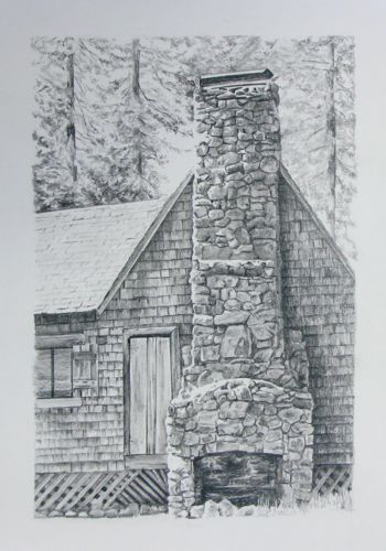
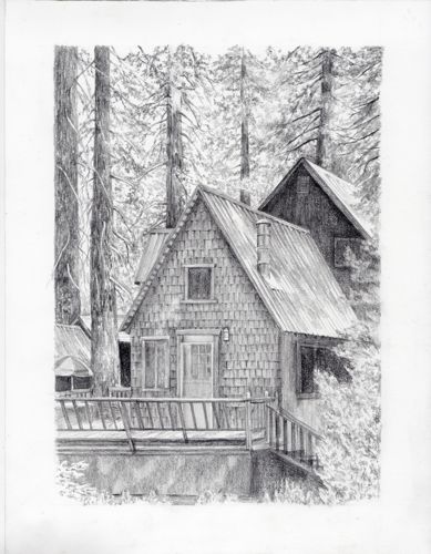
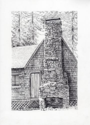
Here is how I drew the cottage. Bob was very pleased with the results, which is always a great relief to me. (Someday I may do an entire posting on the emotions of commission work.) Now, his wife and I have plans for a collage of the high points of the entire Irish trip. He may have the title of Favorite Customer, but she is an utter delight to work with! Would you believe we have known each other since 1973?? I just love living in the place where I was born and reared, unlike the adventurous and determined man who was born in this cottage, emigrated to the USA, and now has a descendant who is a great patron of the arts!

Cottage Commission Commenced

I am creating a piece of art to the specifications of Bob, My Favorite Customer. (Since he calls me his Favorite Artist, it is only fair that I return the compliment!) He and his family discovered a piece of their history while in Ireland, and I have the privilege of drawing it in pencil.

Bob requested a sketch before I began because the cottage is dilapidated and needed some artistic remodeling. That’s to be expected of something built in 1873.

Good thing Bob knows I can draw or this sketch might have frightened him away. Instead, he approved it, and I began the drawing. Notice the use of 2 separate words to describe what is taking place – “sketch” is loose, rough, for the purpose of conveying visual ideas. A “drawing” will be much more careful and refined.

Bob likes to see the process as it is taking place. Some people prefer to just be surprised at the end; others like to be included and involved. I do my best to accommodate my customers’ wishes.

In teaching drawing, I urge my students to develop the habit of shading from top to bottom and left to right (left handers should move right to left) because it lessens the smearing. Me? I’m experienced enough to do it any way I want and not have a smearing problem! Or it may be that I am experienced enough to know how to deal with the smearing problem, should one occur!

Pencil Explanation, Part Four

This is a post on how to layer with drawing pencils. I used to only use a 6B; you can read about it here. Then, I met someone who drew beautifully using the full range. I had no idea how to use them and figured they must layered  lightest to darkest. Or maybe they were meant to be used one at a time, depending on how you wanted things to look. Kind of weird that as an art major I never learned these techniques. Anyway, I never could quite achieve the kind of blacks that my drawings needed. After joining the Colored Pencil Society of America, I began applying things learned from their workshops to my graphite pencil drawings. Look at what I learned about layering graphite pencils:

Defies logic! But the evidence is right here. If you have paper and pencils, try it for yourself! I’d love to read your comments once you have experimented with this sort of layering.

Pencil Explanation, Part Three

School pencils are rated #1, #2 and #3.  It is a different rating system, one which I haven’t researched because I am a pencil artist, not a student nor a school teacher. #3 is really hard, and it is horrible if you are writing on a soft surface such as a math workbook. #1 is really dark and wonderful if you get one by accident. #2  are the most common and are the same as the HB drawing pencils. Ever notice that before?

School pencils come with erasers. Those erasers never last as long as the pencils. Drawing pencils don’t come with erasers. My theory is this: the eraser will wear out very quickly but you will have the habit of flipping the pencil over. If you have that habit, when your eraser is gone, you will scratch the heck out of your drawing. Then you will cry. Your drawing will be wrecked. If you are used to reaching for a separate eraser, there is less chance of this sort of disaster. Or tragedy.

Pencil Explanation, Part Two

Pencils are made from a blend of graphite and clay. If they have more clay, they are harder and lighter. If they have more graphite, they are blacker and softer.

H is for Hard, B is for Black.  I don’t get why those two are considered opposites in Pencil World. (Hey Pencil Manufacturers, tune in here!)

Usually the H and the B are accompanied by a number, usually 2 – 6, but occasionally as high as 9 depending on the brands. If there is no number with the letter, a 1 (one) is implied. HB is right in the center. F is an unnecessary interloper that shouldn’t be included in a set because it takes up space that could be better used for a more useful pencil. I’d like a set without an F and with an extra 6B, please. (Pencil manufacturers, are you listening??)

The higher the number, the more the particular quality of that pencil. A 6H is very hard, very pale, and very easily scratches the surface of the drawing paper. A 6B is very black, very soft, and will crack, crumble or collapse internally if you so much as frown in its direction. This is why I’d like a second 6B included in a set of pencils. (Hey Pencil Manufacturers, I’m talking to you!!)

Pencil Explanation, Part One

When I began drawing, I only used the Turquoise brand. Or it might have been called Eagle or Berol or Sanford. They keep buying each other out, and sometimes these graphite pencils now say “Prismacolor” despite the fact that they are all shades of gray. The outer paint color remains turquoise, so I’ll just call them Turquoise pencils in spite of their multiple marriages.

After Turquoise, I discovered blue. Blue pencils are made by Staedtler. Or by Mars. Or maybe they are made by Lumograph. Anyway, their outer casings are a beautiful shade of blue and they tend to be softer and blacker than the Turquoise pencils of the same rating.

Red is not my favorite color – you will seldom see me wearing it. But when it comes to pencils, I LOVE these little red guys. They were made by Stabilo. Sob. Stabilo doesn’t make them anymore. These are the best pencils I have ever used. There may not be much difference between them and the blue pencils, but for some reason, these pencils are about as close to perfection as pencils can be!

And more links to learning to draw

Morro Rock

When I was growing up in Tulare County, I thought the only real beach, the beachest of all beaches, was Newport in Orange County. In fourth grade, we took a field trip to Mission San Miguel and then went to Pismo Beach. It was flat, had giant clam shells, the sand was fine and sort of muddy, and there were no noticeable waves. I was also stunned, just stunned I tell you, to learn there is another Morro Rock! Of course it is spelled incorrectly – the Moro Rock I first knew (and climbed at age 3 I’m told) has only 1 R in its Moro. And isn’t it odd they are both in California, within driving distance of one another? Most convenient for this California artist!