What You Really See

As we learn to put on paper what we really see instead of our symbols, it is shocking to learn how much is really there and how it is really shaped or sized. Drawing upside down is one tool; tracing the basic elements and only looking at the tracing instead of the photo is another tool. Another way to simplify what is in front of our eyes is to squint, and the detail fades.

You saw an example of Farewell Gap as it was interpreted by someone who didn’t see or chose to ignore reality. Here is a drawing I did of Farewell Gap a long time ago when I was still bound to photos. It was such a thrill to put on paper exactly what I saw that I didn’t have any interest in editing or creating. I was lost in the joy of “I CAN DO THIS!”

This is not the actual photo from which I worked – 1994 is too long ago for me to be able to put my hands on that exact piece of paper! However, here is the photo of Farewell Gap for comparison purposes:

What we think we see

When we are beginning to make art, we depend on symbols more than visual information. The symbols come from our memory, from what we know. The visual information comes from what is in front of our eyes, regardless of what we know. You may know that a table has a round top, but what your eyes are telling you is that it looks like an oval. How can this be?? What do I trust? It takes a leap of faith to ignore what is in your mind and draw what is in front of your eyes. The first time someone tries this and it looks “real! it looks like a photo! I can draw!”, it is a thrill!

At the risk of annoying or offending (always a risk – why are folks so spring-loaded these days??), I want you to see a mural in downtown Visalia. I don’t know who painted it and I don’t know their instructions. I also don’t know their intentions. What I do know is it appears to sort of be Farewell Gap, sort of, maybe, kind of. This is an example of someone looking at a photo and painting from symbols in their heads. Those of you who are spring-loaded in the defensive position may be thinking that the artist(s) were being creative, not bound to the photo, and simply expressing themselves with a derivative work, using the photo for reference, et cetera. That’s fine, but I am trying to show examples here, and this fits, so just take a deep breath and try to follow along.

For comparison, here again is the photograph of Farewell Gap:

Three ways of interpreting

This will be a four parter, and thank you to Bill T. a workshop participant for the idea!

There are 3 ways of seeing when one is making 2 dimensional art. “Interpreting” might be a more accurate term here.

1. What we think we see – When we are children, or when we are untrained adults, we tend to put on paper what we think we see. For example, it is a table, we know it is a table, it has a rectangle and 4 sticks for legs, what is the problem?? The problem is the lack of realism, depth, perspective, proportion and believability. This isn’t a problem if you are 5 years old, but when you begin to understand more of life, it is highly discouraging to realize that your drawing isn’t as great as your Grandma thought.

2. What we really see – As we learn what is really in front of us visually, our work becomes more realistic. We can see distance, and things make sense. One of the tools for achieving this type of accuracy is the simple step of working upside down. No, I don’t mean standing on your head – this doesn’t work for plein air! Turn both your photo and your drawing upside down and the result will first be confusion. Then, your brain will shift into its right-seeing mode (right in both senses of the word), and your shapes will become proportioned correctly.

3. What we wish we could see – One day, we realize that real life isn’t all that grand to look at. Wouldn’t it all look better if we could just edit out the telephone lines, the power poles, the scruffy branches and the garbage cans? In fact, what if we could scoot that mountain over a bit (even without the faith of a mustard seed!) and perhaps reroute that stream? As our skills and confidence grow, we realize we can! “I’m fifty-one and I can do whatever I want! Besides, it’s MY picture!” This obviously has a few shortcomings – there are times when reality has to be recorded, but it is good to recognize the times that we as artists get to do our own arranging.

In conclusion to this introductory explanation, have a look at this photo of Farewell Gap. It will be the basis for illustrating the 3 ways of interpreting what we see.

Workshop in Porterville

What a strikingly beautiful weekend! This type of day is why February is my favorite month. This is the depot where the workshop was held:

This is the mirror so I could show the massive crowds my work and they could watch me produce it. Nice idea, but there were about 9 folks who braved the storm Friday night, so I was able to pass around my examples and let each person examine them closely.

These are the folks who decided to return on Saturday for the hands-on workshop. There could have been a crowd of 30, so this small group was almost just like my regular drawing lessons. It was a real  treat to get to know each person a little bit and spend more time helping each one.

Baxter was my host on Friday night. Terrific dog!

Three Kinds of Artists

Seventh in the series “Thoughtful Thursdays”

A simple way of categorizing artists is to divide the approaches to art into 3 varieties: those who make art for fun, those who make art as a secondary occupation, and those who earn a living from their art.

Those who make art for fun undoubtedly have it the easiest. Without thinking about what might sell or being bound to any one style, this type of artist is free to try any medium or technique. He can bounce from teacher to teacher, class to class, pottery to watercolor to drawing in any order. He can dabble at anything that strikes his fancy. Goals may be set, and even reached, but in the end, fun and self-expression seem to be the main purpose. Once I even had a drawing student tell me, “I don’t care much about art – I just want to meet women!”

Those who straddle the line between a day job and making art probably have it the hardest. To make quality art in enough quantity to sell takes an enormous amount of time, and it is very difficult to fit this into a week with a 40+ hour bite already missing.  There is a struggle while working a “real” job to focus on the task at hand while one’s mind is roaming the halls of Artland. I remember working in a dining hall at a camp and constantly being distracted by the deep golden brown color of a giant container of tea, or admiring the brilliant orange of grated carrots against the spring greens of lettuce. Needless to say, my co-workers thought I was a nut-job.

Engaging in art as one’s main paid occupation rather than as a pastime is a highly rewarding approach to art-making. It takes a strong commitment, an unwavering resolution to never give up. When sales drop, galleries and shops close, students get old and no new ones come, long-term art shows fold, there is much to do besides make art. If sales don’t happen, there is no income! Art is a luxury item, not a necessity, and in the current economic atmosphere this fact is more evident than usual. Tulare County has higher unemployment, poverty and welfare dependence than much of the country even in good times. Despite that, it is possible to earn a living as a professional artist here. In upcoming articles, I will explain some of the avenues I have followed to make that dream a reality.

Wave Action, 10×8″, graphite, $100

Demonstration and Workshop

On February 25 and 26, I will be giving a demonstration and workshop in Porterville for their very active art association. There is still space if you’d like to register. The cost is $30 for members of the P’ville Art Assn. and $35 for non-members. I may have mentioned a time or two that I love to draw, and pencil drawing will be the subject of the events.

Everyone likes a freebie – door prize, raffle prize, pick-a-prize, silent auction, live auction, buy-one-get-one-free. (I like free stuff too, particularly consumables, specifically dark chocolate.) This is what I am donating to the Porterville Art Association – not sure how they will turn it into a freebie. Guess we will all have to attend!

Words Mean Things

Sixth in the series “Thoughtful Thursdays”

When teaching people how to draw, sometimes it is difficult to articulate my thoughts. A picture is worth a thousand words, and sometimes a thousand words still can’t explain the picture. Often, I can’t find the right word, so I will make one up. The funny part is that my students understand the meaning!

A woman was working on some boulders but something wasn’t looking believable. The problem was that she had inadvertently drawn potatoes and an oversized pinto bean! We figured out how to turn them in to rocks, and then she asked how to draw some grass behind the boulders. I was trying to keep her from making a lot of little lines all in a perfect row. Remember the bird “Woodstock” in the comic strip Snoopy? His word bubble had a lot of little vertical lines. To help her not make Woodstock word marks, the instructions came out, “You need to sort of bounce your clumpage along – that’s it, just horizontalize it a bit more”. She got it.

Some folks have taken lessons so long that I have become a habit to them. I tell them they don’t need lessons because they know how to draw. They tell me that unless they pay their monthly fee, they will not carve out time in their lives to draw. While they draw, we talk about art, drawing and life.

Truthfully, I love my students – we become friends, comrades, buddies in the artworld. I show them my art and give them the freedom to tell me anything they think about it, good or bad. We speak truth to one another and try to use known English words.  It is helpful and refreshing and sometimes, it can be hilarious!

Swirls – 11×14″ – pencil

Drawing or Art?

Fifth in the series “Thoughtful Thursdays”

In college, an art professor said to me, “Just because you can draw doesn’t make you an artist”.  I was devastated, insulted, dismayed, shocked, and any other adjective you can think of for the situation – how dare he say that to me!! Now that I have the advantage of life experience and wisdom, I know he was right, even if it was an insensitive and snotty remark. His point was that there is more to making art than simply drawing.

Master of Fine Art, or MFA, is the highest degree possible in art.  My college professors may have had their MFAs but mostly they walked around the room while taking a break from their own work, and offered criticism and snide remarks (”Just because you can draw. . .” or “You need to work on composition”) without ever bothering to actually teach, to demonstrate or share information.

I have been teaching people how to draw for 16 years without an MFA.  Drawing is a skill, and in teaching the skill, many other things about art can be shared. We talk about different styles, ways to set up a drawing from the beginning, ways of arranging the elements in a drawing, and lots of technique. First I show how, then I explain why.

Through the years, only two of my students that I can think of have pursued art as a career.  Everyone who has stayed long enough to learn to draw has learned to draw, and they each have drawings they can proudly show off to prove that they know how to draw. Even without going into art full-time, learning to draw has give each one confidence.

A year or 2 ago I saw 3 former drawing students. Louis was in the Navy, Stephanie was thinking about occupational therapy, and Mark was a cowboy. Drawing lessons were not a waste of time for any one of these wonderful young folks – they learned to draw (duh), learned to communicate with people of all ages (that is the way my classes are arranged), explored a type of art in a comfortable environment, got to display their work in a show or two, developed a bit more confidence, and made new friends.

I enjoyed every moment spent with each of these people and love seeing how they are turning into adults. We have an easy friendship that transcends age and that has lasted through time and changes.  They can draw; are they artists? I think so! And I am an artist in addition to being a teacher and being able to draw, so there, you Snotty Professor who is now probably just a retired teacher!

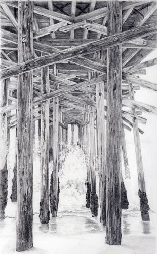
The Beach House, graphite, 10×8″

private collection

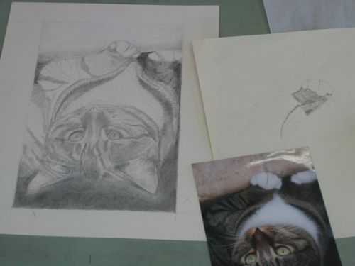
Professor 6B

Diane commented on my post “The Rules” about Professor 6B and it was funny. Made me realize I had lapsed into a bit of jargon, so here is some clarity for you all. And here is a weird thing – not a single art teacher taught me any of these basics. I learned about them from digging around on my own. Sure, a person can draw without knowing all this stuff, but it is better to know about one’s tools than to just bumble along, particularly if one calls herself a professional!

First, I no longer have all those mugs of pencils on my desk. The colored pencils are in a basket on a shelf overhead. Every so often I have a Clutter Attack, and stuff starts flying out the door. Having unused things, no space, too much stuff in general just bugs me. I’ve mentioned before that I may have whatever is the opposite of that Hoarding problem.

Pencils are not made of lead but the writing part is still called a “lead”. They are made of a combination of graphite and clay: the more graphite, the blacker and softer the lead; the more clay, the lighter in color and the harder the lead. Differing manufacturers combine these things in different percentages, but they all use the same rating system. B = black, H = hard. The higher the number with the letter, the stronger that particular quality is. So, a 6B is blacker than a 4B. A 5H is harder than a 2H. HB is dead center – I’m guessing 50% graphite and 50% clay. If it has only H on it, that is the equivalent of 1H. They assume we will figure that out. (Ditto for B.)

Pretty straightforward, but then some of those manufacturers have to throw a monkey wrench in the simplicity of the system with a pencil called “F”. Excuse me?? I used to think it stood for “funky” because it didn’t fit into the rating system. Turns out it stands for “fine” because it can be sharpened to a fine point. So can every other pencil, so I fail to see the point. Oops, a pun. It seems to be about the same hardness as an H.

The softer/blacker pencils get used up much more quickly than the harder ones. I still have my original 6H from a college art class, although the lettering is worn off the casing. If you drop one of the softer pencils on concrete, you might as well put it in the trash, because it will be broken all the way through and the lead will fall out in little pieces every time you sharpen it. I can hear the collective “aha” as you all realize you have experienced this annoying phenomenon.

One last piece of trivia – those #2 pencils required by test givers to fill in the bubbles are the same as HB. If you look closely at the words on the casing you might even find “HB” written there. It remains a mystery to me why there are 2 rating systems for pencils.

Perhaps next time I will write about erasers (and the lack of them on drawing pencils).

The Rules

This is the 4th in the series entitled “Thoughtful Thursdays”.  These are reprints of articles written by me for the local newspaper called The Kaweah Commonwealth with a few modifications for a wider audience.

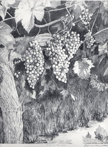
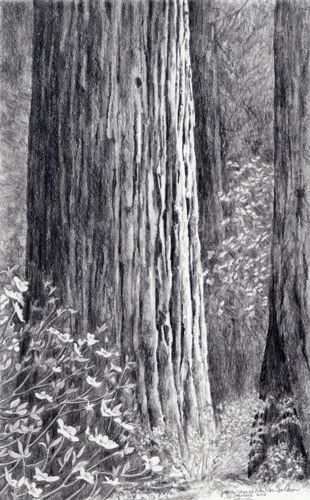
This was drawn using the entire range of pencils available.

There have been many art teachers in my life. Each one seems to have hard and fast rules that they insist apply to and be followed by everyone, or at least by all their students. Since I teach drawing, I understand this, but I try to clarify the reasons for my rules so that the students can decide for themselves.

One colored pencil teacher said to ALWAYS put the darkest color as the bottom layer and work up to the lightest color. (Gary Greene) Another said ALWAYS start with the lightest color as the base and then add layers in order of increasing darkness.(Ann Kullberg)  I have done both on the same drawing and gotten the same result! Other times, there is a difference, and I don’t know why.

Several colored pencil teachers have said NEVER USE BLACK. If you want darkness, build it up by layering the darkest colors. When I do that, it rarely looks dark enough but instead, looks as if I layered the darkest colors because I couldn’t find my black pencil. When asked about this bad black pencil theory, a different teacher of colored pencil simply said, “If you aren’t supposed to use black, why do they manufacture it?”

Some of the painting teachers I have listened to say “NEVER use white alone”. (What color is one supposed to use if white is the needed color??)  Most say, “NEVER use black”. I spoke to a professional painter whose paintings sell for more than my car is worth. He told me of his layering process and it included black paint!!

The best drawing teacher I ever had only let us use a 6B pencil, which is very soft and dark. We could not smear or blend with any tool, including our fingers. His premise was that if you could learn to control that one pencil, you could make any pencil do anything you wished it to do. He was right, but then it took me years to be able to use the entire range of pencils available because his idea was so deeply etched into my head.

This is a piece done under the guidance of Professor 6B.

Many of my students ask how to hold their pencils. I show them how I hold mine, and tell them to try it, and also to try anything that feels comfortable to them. As in handwriting, everyone has a different look to his drawings. The point is that there are many places in life where there are rules, but in art the only absolutes are determined by the results you desire.