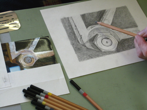
Growth, part five (Facing Faces)

After about 9 years and on the fourth address for cabinart, it became apparent that notecards were fading fast, and the local market for house and cabin commissioned drawings was getting saturated. The next step? Portraits! I had skirted around this subject for years, refusing commissions, terrified of not being able to capture a likeness. This was and is a reasonable fear. If someone pays you to draw Steve, they expect you to draw Steve, not his cousin! Faces are so subtly different; we all have the same components, and yet we most definitely do not look like one another. (However, I do tend to get all the cookie-cutter blondies on The O’Reilly Factor mixed up. . . )

pict0001.jpg

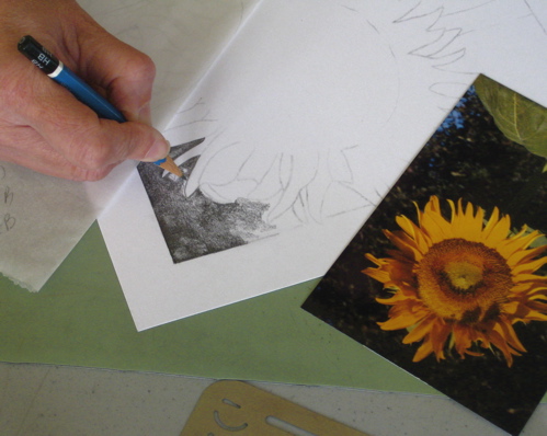
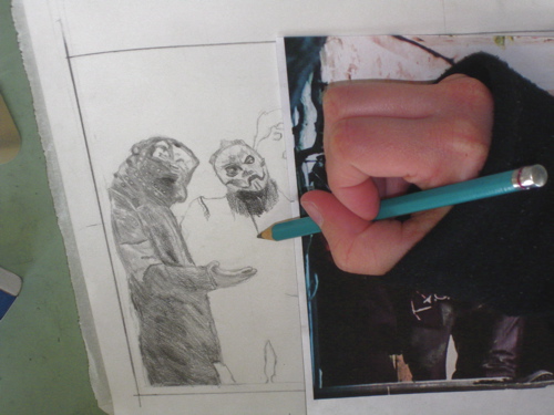
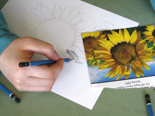
What to do? This was a brick wall on which I had been bashing my head for years. A wise friend said, “Why don’t you pray about it?” Duh. So, I did. Within the year, the CPSA offered 2 separate workshops on colored pencil portraiture, and the principles definitely crossed over to graphite. I was on my way in portraits! However, this will always be a difficult subject for me; unless I pray through each and every portrait, I do tend to draw the guy’s cousin. The subtle differences can just divert a face from the intended person to a stranger or a distance relative with a slight mis-stroke of the pencil.

Growth, part four (Venturing into color)

 just_picked.jpg

Just Picked – colored pencil – 18 x 21″ – $550

Just when I thought I “had it made” and was settling in to The One Way To Do An Art Business, several of my students wanted to learn colored pencil. In high school, my friend Lisa thought watercolors were for babies, and I had the same opinion of colored pencils. First, I had to find a new attitude toward colored pencils; second I had to learn to use them correctly. This happened through books and the Colored Pencil Society of America. They offer seminars and workshops that are phenomenal in their variety and scope  – this is a wonderful organization. http://www.cpsa.org/

orange_juice.jpg

Orange Juice – colored pencil – 11 x 14″ – $200

Growth, part three (Learning to teach)

The next step in the saga of growing an art business was teaching people how to draw. It has always been a very rewarding challenge to help people learn to see, to break down the process into manageable steps and to spend time with wonderful people that I might never have gotten the chance to know.  That grew, and eventually I had to move somewhere that gave me the flexibility to teach more classes. Over time, the list of people wanting to take lessons expanded to 85 people! I had as many as 50 students at one time in classes of 4-5 per hour.

boots.jpg

Pencil drawing by S. Brown – private collection


Growth, part two (Cards & Commissions)

img_0338.jpgimg_0339.jpgimg_0359.jpgimg_0362.jpgimg_0363.jpg

I used to draw pictures that fit nicely into sets of notecards, which then sold very well both retail and wholesale. I still do a few cards, but the market just isn’t as big. In fact, it is microscopic. Tell me, how many cards, thank yous and little notes do you send a year? How many do you receive? Hmmmm, really have to think about that one.  Cards do sell, but not very many anymore. (Despite the handiness of communicating via computer, the truth is, no one ever cherished an email, so there.)

pict0008.jpg

In addition, I drew cabins and homes on a commission basis. (still do!) That was the sum total of my abilities in the early years, and it kept me quite busy.

an_enviable_place.jpg

Growth, part one

Ever read the book Who Moved My Cheese?  If I remember it correctly, it is about the necessity of changing and keeping up. Way way way back when I first started selling art, I drew a picture of the Kaweah Post Office. It was not very good, but I was too dumb to know the difference between good and not good and too excited to calm down and study it and repair the not-so-good parts. Instead, I had 100 reproductions made and began selling them. If you have one of those and would like to trade it for a better version, please let me know – it will be FREE. This offer is good for the first 9 8 people who respond and PHYSICALLY HAND ME THE OLD PRINT!! Of course, if you’d like to just buy one, you may do so here: https://www.cabinart.net/reproductions_new.shtml There are only 2 remaining prints of the Post Office, so the offer is now officially expired.

kpo.jpg

Inner Slob

img_0332.jpg

You have probably heard it said that inside each fat person is a thin one screaming to be set free. 

pict0023_1_1.jpg

I am the converse of that statement.

img_0514.jpg

 Don’t think that I think I am thin; I’m not, but I’m certainly not obese.(or “obeast” as I heard an acquaintance once pronounce it. I’m guessing she isn’t much of a reader.) 

img_1177.jpg

However, each day as I march out the door to take a power walk (4-8 miles at a 15 minute mile pace), I am leaving coffee, a comfortable armchair, the woodstove in the winter, knitting, my Bible, a library book or two, my cats, and many other lovely sedentary preoccupations. 

pict0002_1.jpg

 Each day as I resolutely march out to my studio to paint, draw, plan, return phone calls or any other task necessary to keeping my business going, I pass numerous Adirondack chairs strategically placed around my yard for the purpose of taunting me. 

pict0012.jpg

They call out, they whisper, they cajole, they plead. 

pict0044_1.jpg

What are they saying? “Sit and knit!

pict0188.jpg

 Enjoy life from a stationary viewpoint!

pict0193.jpg

 Relax! 

pict0044.jpg

LEAVE THE INNER FAT GIRL ALONE!”

pict0001.jpg

 One time I finally sat down and this is what happened to the chair.  A girl could get a fat complex. . .

Drawing versus art

In college, I had an art teacher in a design class or some other esoteric subject who said to me, “Just because you can draw doesn’t make you an artist”. I was devastated, insulted, dismayed, shocked, and any other adjective you can think of for the situation—how dare he say that to me!! Now that I have the advantage of 35+ years life experience and wisdom, I know he was right, even if it was an insensitive and snotty remark.

Drawing is a skill that can be taught, learned, developed and is sometimes just innate. Art has to be something that one learns about, develops over time, and comes about because of a love for the subject. Art can encompass many skills, forms and be useful in many careers.

Drawing is a skill that is useful regardless of one’s career, and it definitely is useful in any art career. One can become an artist without the ability to draw, particularly in this age of multiple tools.  A number of years ago, I had an interesting conversation with an art teacher friend. She was teaching her junior high students more than any of my college professors ever taught me—principles, elements, styles and history.

My college professors may have had their Master’s of Fine Arts degrees, but mostly they walked around the room while taking a break from their own work, and offered criticism and snide remarks (“Just because you can draw. . .” or “You need to work on composition”) without ever bothering to actually teach, to demonstrate or share information.

I have been teaching people how to draw for over 30 years. (and that is without an MFA – imagine that!) It is a skill, and in teaching the skill, many other things about art can be shared. We talk about different styles, ways to set up a drawing from the beginning, ways of arranging the elements in a drawing, and lots of technique. (The main thing I ever want to learn is HOW and the second is WHY, so that is what I share with my students.)

Through the years, only a small handful of my students (that I know of) of have pursued art as a career. Everyone that has stayed long enough has learned to draw, and they each have drawings they can proudly show off to prove that they know how to draw.

I couldn’t draw this well in college; growth is the goal of many years of practice.

Drawing lessons were not a waste of time for any of my former or present students. They learn to draw (duh), learn to communicate with people of all ages (that is the way my classes are), explore a type of art in a comfortable environment, develop a bit more confidence, and make new friends.

I enjoy every moment spent with each of my students. We have easy friendships that transcends age and last through time and all its changes. In conclusion, I can draw AND am an artist, so there, you Snotty Professor who are now probably just a retired teacher! But I’m not bitter.

The Rules

There have been many art teachers in my life, and each one seems to have hard and fast rules. Several colored pencil (CP) teachers have said NEVER USE BLACK. Another CP teacher said, “If you aren’t supposed to use black, why do they manufacture it?” That strikes me as pure (un)common sense.

One CP teacher said to ALWAYS put the darkest color as the bottom layer and work up to the lightest color. Another said ALWAYS start with the lightest color as your base and then add layers in order of increasing darkness.  I have done both on the same drawing and gotten the same result! 

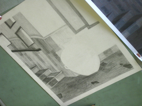
My best drawing teacher in college only let us draw with a 6B, which is a very soft black pencil. He did not let us smear or blend with any tool, including our fingers. He never told us why this was So Very Important, but now with many years of hindsight, I have this guess:  if you could learn to control that one pencil, you could make any pencil do anything you wished it to do. It took me years to be able to use the entire range of pencils available because his idea was so deeply etched into my head. This is a drawing from his class:

boots-sandal.jpg

Some of the painting teachers I have listened to say “NEVER use white alone”. (What are you supposed to use if that is the color you need??)  Most say, “NEVER use black”. At an art show of Very Big Deal Artists, one of the artists I spoke with told me of his layering process and it included black paint!! Go figure.

Many of my students ask me how to hold their pencils. I show them how I hold mine, and tell them to try it, and to try anything that feels comfortable to them. The point is that there are some places in life where there are absolutes, but in art the only absolutes are determined by the results you desire. 

Flags should be in color!

flag-house.jpg

  This little gem was fun! Seems to me that any time there is a flag, color should be applied. On the last commission, the customer and I discussed adding color to the flowers. We concluded that there was only one place it would work, and then the front door would no longer be the main event. With this drawing, the color is conveniently located next to the front door, so that is not an issue. (Ick, that word really bugs me. However, note its proper usage here.) 

And here is an admission: I am getting old. I know this, because 8×10 feels very very small. Much of this drawing happened under a giant lit magnifier. Those diamond shaped windows next to the front door took an alarmingly long time to get right – no pencil point can be sharpened small enough. This used to be normal work for me, and now it is so very very tiny that I can’t believe I used to draw this way! And to any of my drawing students who are reading this, please please forgive me for expecting the same from you if you are over 45 years old!! 

All About Drawing Pencils

pencils.jpg

  I use three different brands of pencils. None is particularly better than any other, but my current favorite is the red one, Stabilo. I can’t find them anymore, but being someone who dislikes shopping, I haven’t tried very hard yet. The blue ones, Staedtler,  are pretty good, quite dark, but not as dark as the Stabilo. Turquoise, made by Sanford, are the ones I used in college, so there is a weird sense of loyalty even though they aren’t as dark as the others. Besides, they are very easy to find.  There are other brands, but these are enough for me. You can see colored pencils in the cups in the background, but that is for another entry.

That little black and silver dealie on the end of the three pencils in the lid of the box is a pencil extender. It used to be a bit of a game to me to see how short I could get a pencil and still use it. Then carpal tunnel syndrome kicked in, and it became clear that the longer the pencil, the less the pain.

For years I drew without understanding what the H and B actually stood for on those drawing pencils. With some reading, I finally learned that H is for Hard and B is for Black. The higher the number with the letter, the more there is of that particular quality. So a 5H is harder (and lighter) than an H (which is 1H but the 1 is assumed). A 6B is blacker (and softer) than a 3B. An HB is exactly in the middle, and is the equivalent of a #2.

And get this: the lead is a combination of graphite and clay. The more clay, the harder and lighter the pencil. The more graphite, the softer and blacker the pencil. Ever used a pencil that scratched? It probably had a rough piece of clay in it. (Don’t you just hate that?)

  Sometimes students ask why the pencils don’t come with erasers. EASY answer! Because we would use the eraser up long before the pencil, and then we would automatically flip the pencil over to erase and scratch our drawings. By forcing us to develop the habit of picking up the separate eraser, the pencil manufacturers are sparing us some unnecessary pain. (And for that,we thank you, lovely Pencil Manufacturers.)

  All this leaves me with some questions: 1. Who decided that hard is the opposite of black? and 2. What in the world does F stand for? 3. How does this all fit with the school-type rating of pencils, 1, 2 and 3?