I believe in creation or “intelligent design” rather than evolution. God is perfect, so he got it right the first try! However, I am far far (oh so very very far) from perfect. Evolution is the way my portraits get finished. Have a look at the evolution of this week’s work:(These are photos of the drawing as it progressed) The changes are very subtle, and it has been amazingly difficult to capture a likeness in this man that I really do not know. All I can do is match the chosen photo to the best of my ability. Each time I think he matches his photo, I email the office manager who is my main contact. She and the others in the office evaluate the likeness, then she calls me and explains the ways I have not yet captured his personality. Meanwhile, I add clothing and background. I haven’t heard yet if the latest version does the trick. When the drawing is photographed, some of the details and subtleties get lost. He is really a pleasant looking man, despite the fact that the photo of the drawing looks a bit worried. So we wait. . . (his portrait and I – there is no mouse in my pocket!)
Dr. Done!
(I know, it should say “finished” instead of done, because he is not a roast in the oven! But I like the alliteration of Dr. Done, and this is my blog, so there.)
Now that the drawing is here on the screen, I can see that that background needs a bit of smoothing. It doesn’t look that rough in the original drawing, but it couldn’t hurt to perfect it a bit more. How does one know if a drawing is finished? When one cannot think of another thing to do to make it better AND when the customer is happy!
All About Drawing Pencils
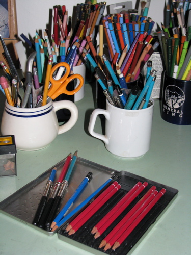
I use three different brands of pencils. None is particularly better than any other, but my current favorite is the red one, Stabilo. I can’t find them anymore, but being someone who dislikes shopping, I haven’t tried very hard yet. The blue ones, Staedtler, are pretty good, quite dark, but not as dark as the Stabilo. Turquoise, made by Sanford, are the ones I used in college, so there is a weird sense of loyalty even though they aren’t as dark as the others. Besides, they are very easy to find. There are other brands, but these are enough for me. You can see colored pencils in the cups in the background, but that is for another entry.
That little black and silver dealie on the end of the three pencils in the lid of the box is a pencil extender. It used to be a bit of a game to me to see how short I could get a pencil and still use it. Then carpal tunnel syndrome kicked in, and it became clear that the longer the pencil, the less the pain.
For years I drew without understanding what the H and B actually stood for on those drawing pencils. With some reading, I finally learned that H is for Hard and B is for Black. The higher the number with the letter, the more there is of that particular quality. So a 5H is harder (and lighter) than an H (which is 1H but the 1 is assumed). A 6B is blacker (and softer) than a 3B. An HB is exactly in the middle, and is the equivalent of a #2.
And get this: the lead is a combination of graphite and clay. The more clay, the harder and lighter the pencil. The more graphite, the softer and blacker the pencil. Ever used a pencil that scratched? It probably had a rough piece of clay in it. (Don’t you just hate that?)
Sometimes students ask why the pencils don’t come with erasers. EASY answer! Because we would use the eraser up long before the pencil, and then we would automatically flip the pencil over to erase and scratch our drawings. By forcing us to develop the habit of picking up the separate eraser, the pencil manufacturers are sparing us some unnecessary pain. (And for that,we thank you, lovely Pencil Manufacturers.)
All this leaves me with some questions: 1. Who decided that hard is the opposite of black? and 2. What in the world does F stand for? 3. How does this all fit with the school-type rating of pencils, 1, 2 and 3?
Eyes again
Eye-eye, Cap’n!
No lines, only blurs, smears and fuzzes. No outlines, only edges. No hard edges, only soft edges. Those are the main rules in drawing faces. (side rule – don’t photograph work under the fake colored lights at my drawing table!)
John Singer Sargeant was one of the greatest portrait artists to ever come from the United States. He has been quoted as saying, “A portrait is a picture of a person where the mouth is a little bit wrong”. So, in between teaching drawing classes today, guess what I will be working on?
Tut tut, it looks like rain
That’s what Winnie-the-Pooh said when he was posing as a little black raincloud, hovering over the honey-tree. However, I am not “tut-tutting” about rain, but rejoicing! It does mean that the light isn’t quite good enough for painting, so I finished up Oranges 38 (too long to write in Roman numerals!) in the waning light. I could paint oranges with half my eyes tied behind my back! Low light meant drawing instead of painting. The magnifying glass lamp makes it possible to draw in any conditions, provided it is black and white rather than color. I started on another portrait and had a few thoughts to share about drawing faces. If you draw faces and want them to look realistic and pleasing, there are some definite rules. 1. Use no lines at all, only blurs, fuzzes and smears. 2. NEVER have any outlines, only edges. 3. NEVER have any hard edges, only soft ones. As usual I learned this stuff the hard way (“Why does he look so much older in the drawing?” . . . hmmmm, better figure this out or not get paid!) I am redrawing someone who was made to look like the dictator of an evil empire in a previous drawing by another artist. It is imperative that I show his warmth, concern, and sense of humor in order to erase the image damage from the previous portrait, and I am thoroughly enjoying the challenge! These sorts of drawings always cause me to ponder the question of why laugh lines and wrinkles cause a man to become more handsome and a woman to freak out and start thinking about Botox. . . wasn’t the feminist movement in the 70s supposed to take care of that kind of baloney? Let’s hear it for inner beauty!! Here, contemplate these nice faces:
How splitting wood is like drawing with pencils
Sports are not for me – in fact, I’ve been known to say that I have only two sports: walking and splitting wood. I love to split wood! That is the axe my dear husband gave me for my birthday, and this weekend I was thrilled to get to try it.
As I was splitting wood, it occurred to me that there are many parallels between splitting wood with an axe and drawing with a pencil. Look at these:
1. Neither require electricity.
2. Both require a sharp edge – blade or point.
3. For best results, start with the large and move to the small.
4. They both make wood bits – shavings from the sharpener or splinters from the axe.
5. Lots of strokes are required for results.
6. One has to start with good stuff to get decent results – great scenes make great drawings, and good clean-grained wood makes good shaped pieces.
7. Both require paying close attention to what one is doing, unless one doesn’t mind wasting time and energy.
8. The terms “hard” and “soft” are always being flung around, both with wood and with pencils.
9. Cedar makes the best pencils and also the best-splitting wood.
I’m sure there are more parallels; can you think of any?
Lessons About Men
Here is the second portrait in a series of four (see? series, series, series!). I learned 2 new things about men in this particular drawing.
1. Most men are incapable of trimming sideburns equally – a retired barber explained that to me. She said that she could always tell whether a man was left or right handed by which of his sideburns was shorter! Now that I know this, it is my responsibility as an artist to even up those things.
2. A tied tie is supposed to be completely even with the top of the collar, and there should be absolutely no shirt wrinkles that let the viewer know about a too-tight shirt or an undone top button! When this man asked me, prior to the photography session, if his tie looked all right, I had to tell him that that I know nothing about ties because there are no men in my life who wear them. (My husband has worn ties 4 times in the 23 years I have known him: 1. when we got married 2. when our friend’s daughter got married – hey Bob E., are you reading this? 3. when he was in a friend’s wedding and 4. when we went to a reception at the White House.)
A little bragging
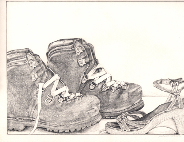
Because I have this great new camera, I took it to drawing lessons yesterday to show off a little. Two of my students happened to finish and sign their pieces, so I showed them how to photograph their work and explained what it takes to get it to look right for the internet. Aren’t they good? The lion is called “Tawanda” and was done with a limited palette of colored pencils, a box of 24 colors by Staedtler-Mars with a neato triangular cushioned grip. The boots are untitled as of yet, and were done from the student’s photos. Outstanding work, people!!
An individual matter
De gustibus non est disbutandem – “it is useless to argue over matters of taste” somehow sounds better in Latin. (My Oh-So-Wise-Dad used to say this in Latin because it was more fun that way.) 😎 For years I have drawn in pencil. Many of my drawings have been reproduced, and then I put in a small hint of color to mimic the look of an old hand tinted black and white photo. Yesterday a customer requested a few of my reproduction prints of citrus. This customer requested that I brighten and strengthen the color. There are several choices in this situation: 1. Tell the customer to forget it, that it is the way it is because I made it that way. 2. Tell the customer yes, but it will cost. 3. Ask the customer how much color she would like, and get out my colored pencils and just do it. Wisely, understanding that taste is an individual matter, I chose option 3. (Dad also said, “You kiss their fanny and take their money”.) And, I am so appreciative of folks who still prefer pencil art to oil – it helps me to not think that the last 15 or so years were wasted!! And here is another thing: Putting bright color into the print makes me wonder – should I have been doing this all along? Just because I was timid with color doesn’t mean everyone else thinks that is good. . . hmmmm . . .(that is the sound of my brain humming along)