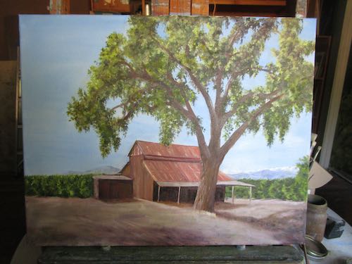
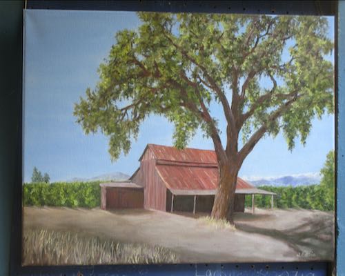
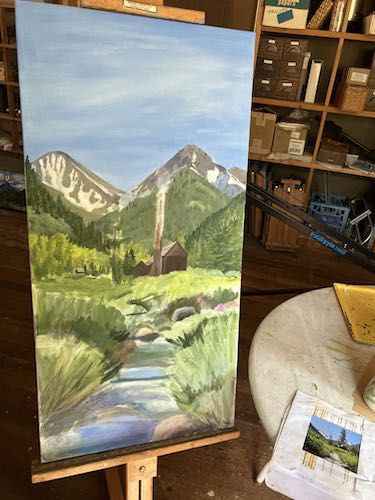
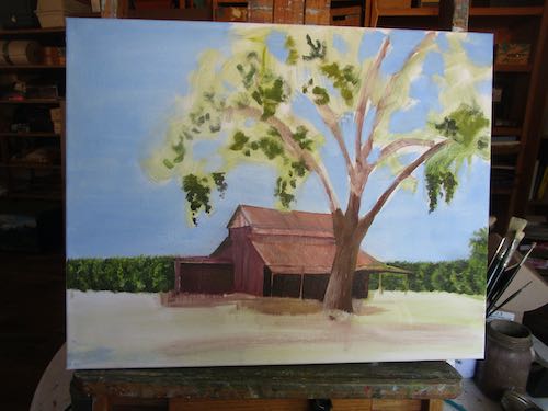
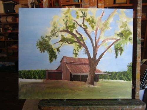
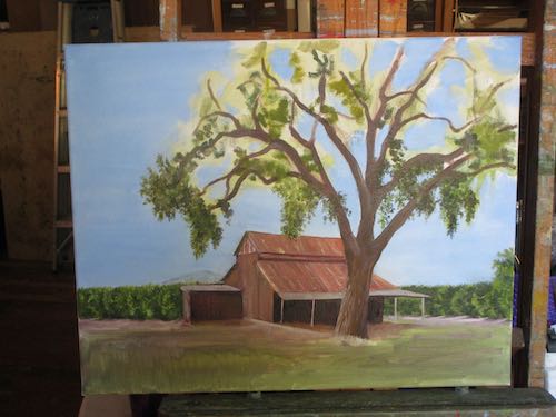
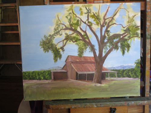
I made a list of what to fix on Red Barn, Big Oak, fixed it, and decided it is good enough to sign. (There is time to change my mind and add, correct, or subtract.)
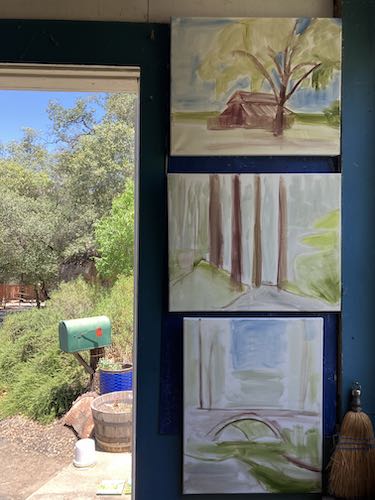
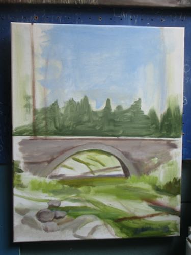
I put another layer on the bridge, which is going to be a challenge for many reasons. This is the Marble Fork Bridge, one that most people probably just zoom over and don’t notice.
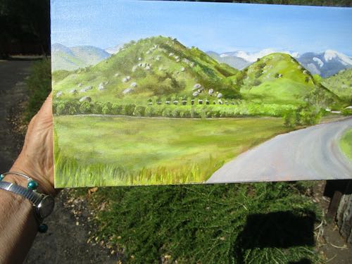
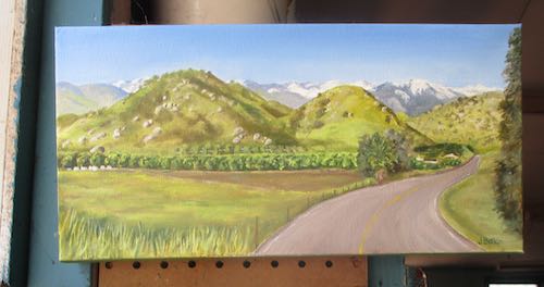
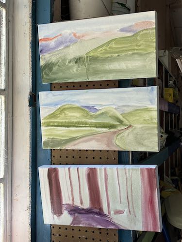
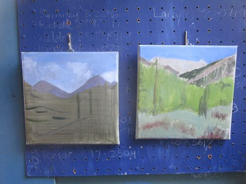
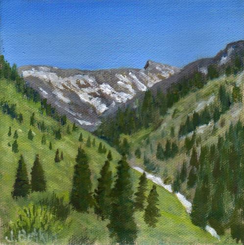
After taking another series of drive-by-shots, sketching some possible corrections, and making a list of things to improve, these hills seemed ready to sign.
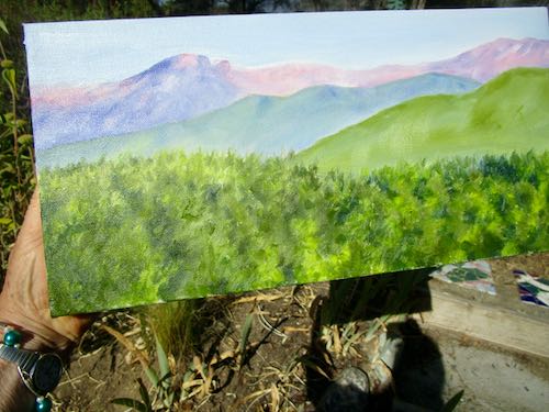
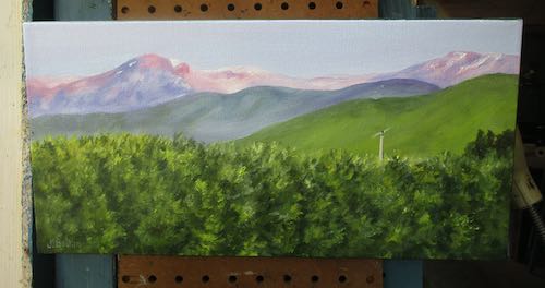
Glowing Homer’s Nose was fun with these colors and simple plain distant hills. It seemed ready to sign.
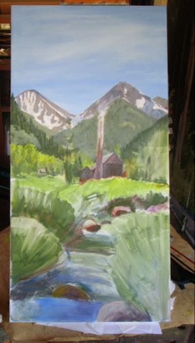
I added a lot of detail to the big Classic Mineral King painting, but didn’t even get to all that was on the list. It isn’t ready to sign yet.
None of the colors seem accurate, but I photographed all the paintings inside on a day when the light outside was orangey because once again, it is fire season in Three Rivers, Sequoia, and the foothills.
The day finally came to finish this painting. Well, not entirely finish, because after I photograph a painting, I usually see a long list of things to fix or change or improve. I don’t know why this becomes evident when looking on a screen; it is also true for my drawing students and other friends who paint or draw.
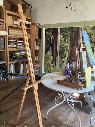
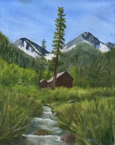
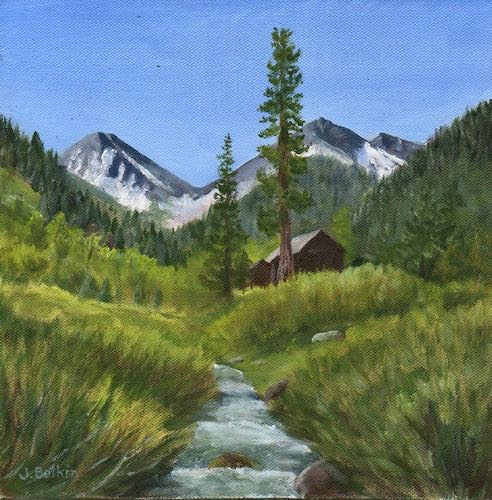
The tall trees were the next thing to paint, and I decided it was time to go in search of my floor easel for larger paintings. We have a lot of storage space, and it wasn’t easy to find or retrieve this thing. But, it was worth the effort—tall easel=ease of painting but ease of locating.
I cleared off the table where an easel usually sits. Whoa, I have a lot of brushes.
Then I lowered the painting so I could sit on the stool and still reach the top. I used to paint standing up. My feet used to not be numb. I’m thankful I can still paint at all.
Stop procrastinating, Central California Artist! You have a large painting to complete, so chop-chop!
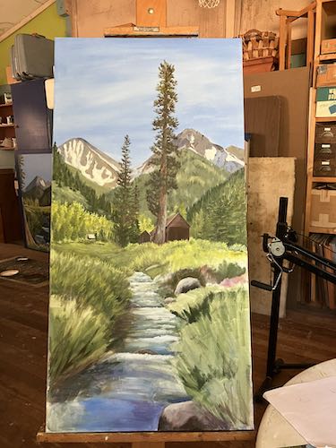
First, I redid some of the background details (not so as you’d notice in these little photos, but I didn’t want you to think I was just sitting there.)
A tree grows in Mineral King/Three Rivers/on canvas.
And another tree grows.
Shrub and water time.
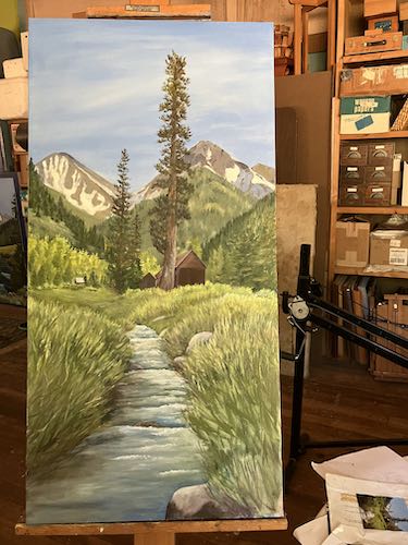
Now the canvas is covered. Time to let it dry.
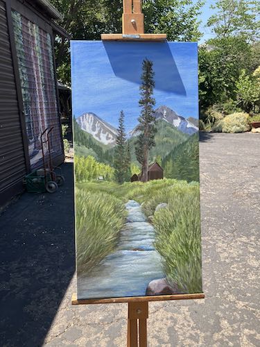
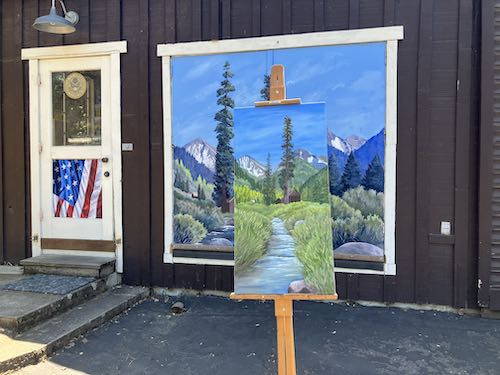
I wondered what it looked like in real sunshine so I carried it outside for a photo. It isn’t signed and the edges aren’t painted, so it didn’t matter that the easel cast a shadow on the top.
Let’s have a little fun. . .
I think this is fun. Simple pleasures. . .
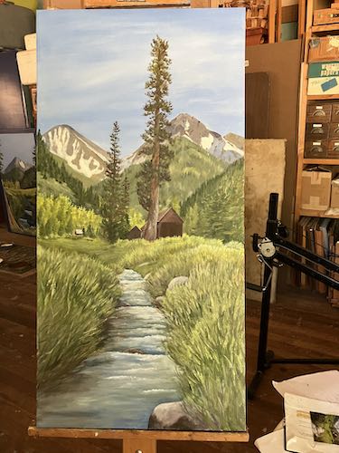
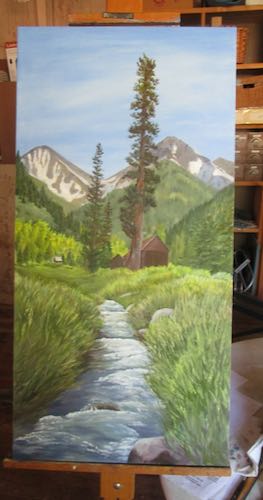
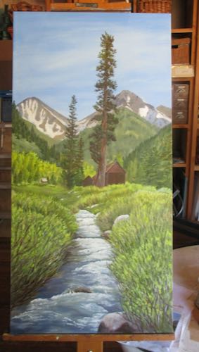
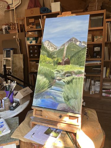
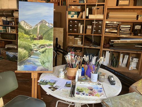
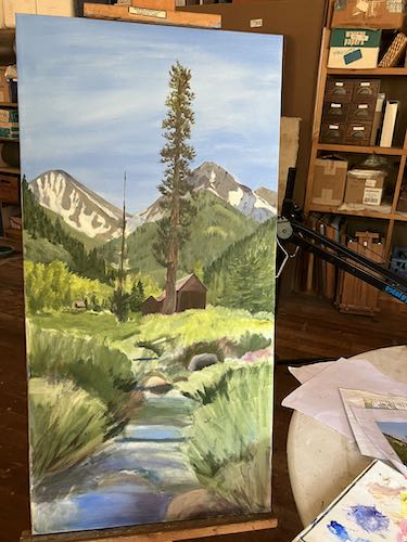
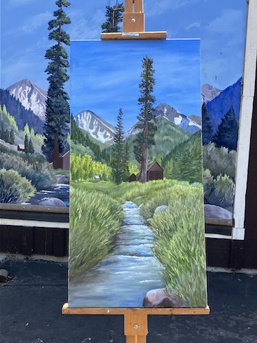
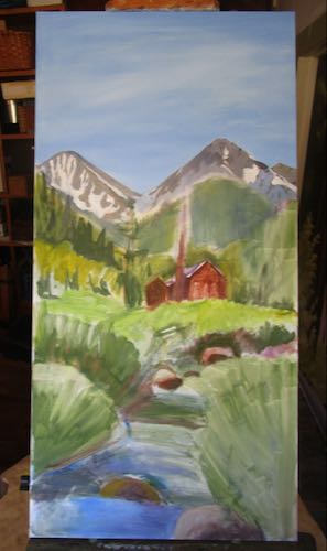
Before I put on my metaphorical critical hat, I just want to enjoy the sense of almost completion of this 18×36″ oil painting of classic Mineral King. I wonder if it will sell at Silver City, sell from my website, or hang on until the solo show in October at CACHE. . . more will be revealed in the fullness of time.
18×36″, oil on wrapped canvas, suitable for framing or ready to hang as is, Classic Mineral King, $1500
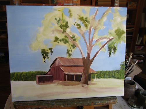
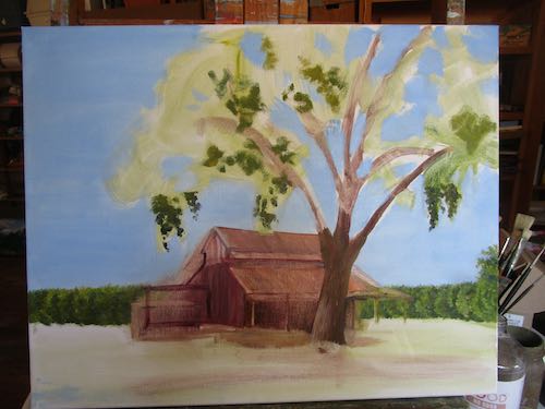
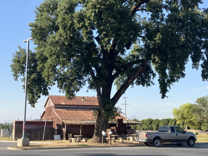
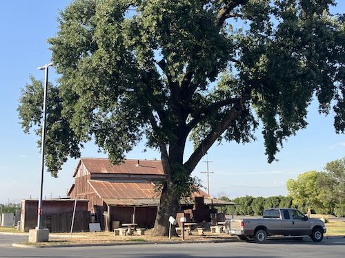
At The Four-Way, right next to the Chevron station, there is a classic red barn with an enormous Valley oak tree, quercus lobata. It’s just part of the landscape, and one day while I was getting gas, I realized that this barn could just tumble, or the excess pavement near the tree could prevent it from getting the water it requires and BOOM, gone-zo. So, I took a photo to paint from, realizing there would need to be some severe editing and a liberal application of artistic license.
I started painting it one morning when I was a bit short on time but eager to get rolling. A friend stopped by to visit and kept me company while I started. I felt pretty optimistic about the painting by the end of the session.
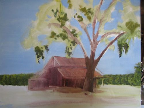
Then I looked at this photo and realized the barn’s proportions were completely whackadoodle. So, I erased the worst parts.
Then I drew them in correctly. (How/why did I skip this step initially?? Never mind about having a friend hanging out. . . I used to be able to talk and draw.)
Back on track. . .
I realized that the orange trees needed to be different shades of green from the oak, so I mixed new greens and fixed up that grove.
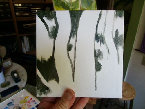
Then I started working on the tree.
There was too much sky, and it needed hills and mountains.
Those clumps of leaves seemed to take forever.
It was a good day painting, and when I finished, I sat across from it with my critical hat on (metaphorically speaking because I wasn’t actually wearing a hat), I made a list of about 10 things to correct or add.
Want to see the photo that I snapped while I was getting gas?
You can see that severe editing was required to turn it back into a real countrified scene. And you can probably see about 90 things that I can do to make it be a better painting.
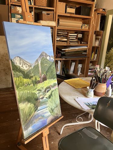
On my first day back at trying to be fully human, I resumed detailing this piece. This Mineral King painting was a big challenge on many levels, and I am now quite happy with it.
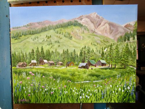
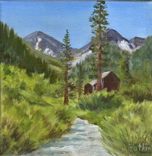
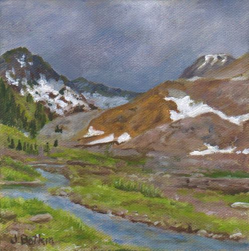
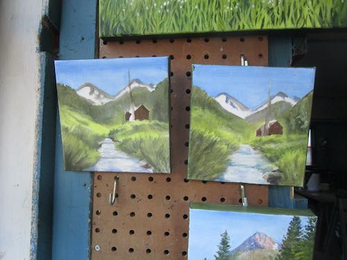
Cabins below Timber Gap and Empire.
Feeling accomplished, I chose the next painting to work on, thinking it would be a piece of cake. This is a scene I have admired for decades and photographed it many times. It often looks great when I am driving back to Three Rivers (it doesn’t show on the way down the hill unless I do the Linda Blair head-twist, and no, I didn’t see the movie) There is no turnout, so it gets shot through the windshield. Very few of the photos are worthy, so it will require lots of ad libbing.
With a good start on my first 8×16, I started the next one, also a drive-by shot, that will also require some ad libbing.
I know that I might have more paintings of orange groves with mountains than there will be interested parties. But then again, maybe not. Guessing, speculating, and winging it are all part of the business of art. Apparently, so is ad-libbing. In ArtSpeak, it is called “artistic license”.
A week ago, I had a situation to deal with: I got sick. Such a disruption. I was only able to paint a little bit before the need to lie down took over.
While reclining, I used the laptop to look carefully at the paintings finished and paintings needed for the upcoming solo show at CACHE. More paintings are needed, but feeling poorly meant that I would paint poorly.
There were other tasks to tackle, ones that didn’t require heavy concentration. One day I gathered canvases, put on the hanging wires, chose titles, assigned inventory numbers, and actually slapped on a light layer of paint. I knew it wasn’t a good day for painting when I dropped my palette. It landed upside down, of course. I headed back to the couch.
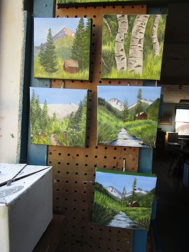
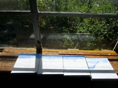
These are all 8×16″, a new size for me. 10×20″ was too big, and 6×12″ was too small. These might be just right, as Goldilocks said.
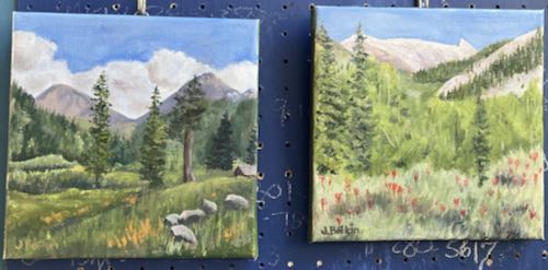
These are all 16×20″.
Another simple task for another day was to scan these two new Mineral King paintings.
Sawtooth #61, 8×8″, $145Mineral King Valley #7, 8×8″, $145
Recovery came; it always does (except when it is time for the big dirt nap).
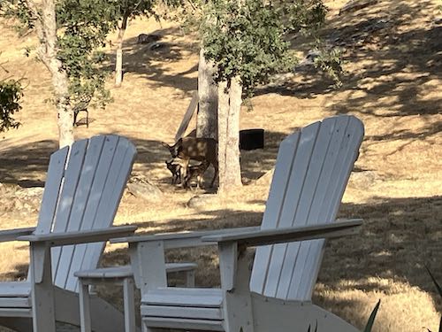
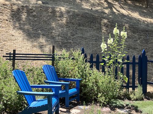
If you look in the shadows between (and beyond) the 2 chairs, you might be able to discern a doe with 2 fawns, probably born that very day.
While getting gas at the Four-way (local vernacular for an important intersection), I snapped this photo. Barns this classic and oak trees this majestic, quercus lobata, are standard but disappearingTulare County items, and when seen together, they should be painted or drawn or just photographed. (If I paint this, I will edit it severely.)
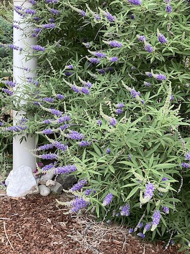
This is called a vitex tree. Doesn’t that sound like some sort of diet supplement? We tend to refer to these as “lupine trees”.
I finished 2 more Mineral King paintings, both 8×8″, drying quickly in the heat.
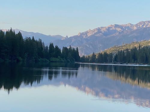
My friend with the Hume Lake cabin sent me this photo, which might possibly be the most beautiful one I’ve ever seen. Maybe I shall paint it. . . yes, I KNOW it is in Fresno/Fres-yes County but it is a well-loved place, even among us ignorant, fat, uneducated, poor, diabetic Tulare County hon-yocks.
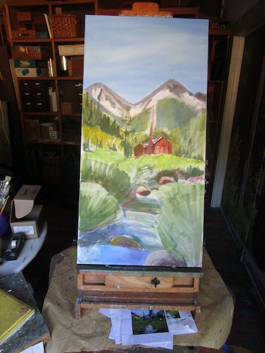
On another hot day with my brave swamp cooler, I focused on the giant oil painting of the classic Mineral King scene.
I was thankful to have the sky finished—well, finished unless I decide later that it isn’t finished. It is just too tall for me to reach, so some logistics must be addressed each time I work on it. Tabletop about 3′, lowest easel setting about 5″, top of painting another 3′. I’ve used a ladder in the past but my numb feet don’t want to stand on a rung these days. I do have a large floor easel, but am too lazy to set it up. It’s just one painting—I can stretch.
Details on the peaks, building up the background as I work lower (and closer to the viewer in the scene).
Fix that cabin!
Sort out the river ripples, rocks, and layers of willows according to the “map” I drew a couple of weeks ago. This distinction isn’t very visible in the final photo, but it makes sense to me.
Give up and go in the house. Five hours in the swampy heat is enough for today. I’m guessing to have about 15 hours remaining to completion. That is a WAG (Wild [Donkey] Guess), for those readers who always like to know how long a painting takes. This probably already had 3 hours in it before I started back up.
Thanks for taking a detour with me to Hume Lake. I came home and went straight to the easels. Mineral King is my main subject this time of year, a short season with no time to lollygag around. (Imagine taking a vacation FROM Mineral King!)
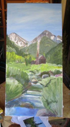
This piece got sky, and I started shaping the mountains that form Farewell Gap. It is 18×36″, and will take awhile to complete.
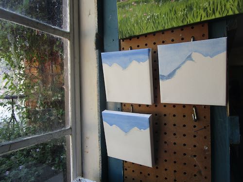
So, it is necessary to focus on some small pieces. Again.
I finished these five. One of the Mineral King Family Cabin paintings was painted for a blog reader, but I haven’t heard back from her, so maybe she didn’t read the comment reply or the email I sent her. (HELLO, JO L! ARE YOU STILL INTERESTED?)
These two 8×8″ canvases will become Sawtooth #61 and Mineral King Valley #7.
All the paintings are to be sold at the Silver City Store, unless they sell here first.
Remember last week or so I showed you some completed paintings intended for Silver City, unless they sold first?
They sold.
Someone else asked for the one called Mineral King Family Cabin about 5 minutes after it sold, so I told her I’d paint another one for her.
Of course I needed to paint some new little pieces for Silver City too.
These look distorted in the photo; in reality, they are each 6×6″.
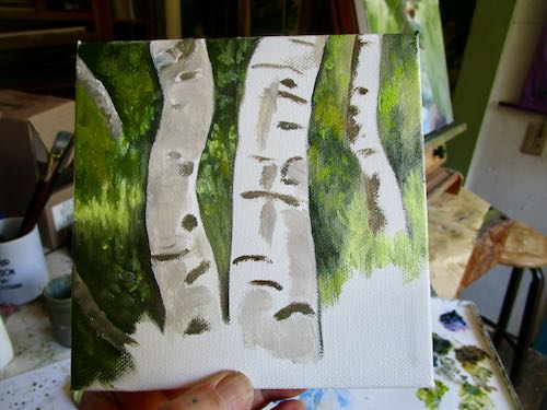
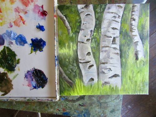
These aspens really caught my attention, maybe because of all the details, maybe because I have been painting many paintings of the same scene recently. They aren’t finished, but I signed them anyway. It was so hot in the workshop even with the swamp cooler, so maybe my brain was melting a little.
This one needs a do-over on the sky, and the flowers were put in too early. It needs to dry before I put those dots of color in. I signed it too. Brain melt.
I figured these could wait until another painting session, but a friend came over and kept me company, so I just kept working. Such a good friend, to sit in the swamp cooler “cooled” workshop with me!
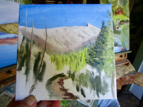
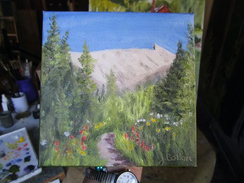
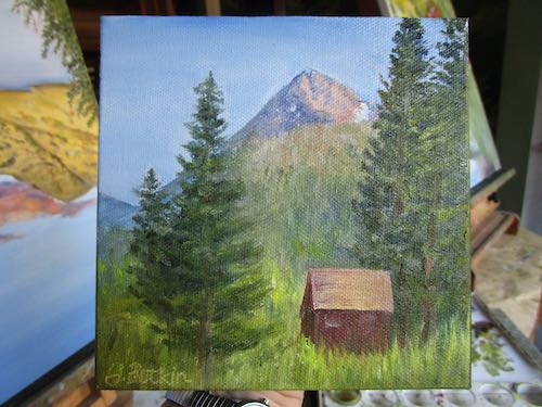
This is a view of the Honeymoon Cabin I haven’t tried before. I signed it too. It isn’t finished —the angle of Vandever is too steep, and the cabin roof is the wrong proportions. But, that melting brain did at least allow me to get this far.
It was the first hot spell of the season, and maybe it isn’t hot compared to real summer. (It is still spring on the calendar.) Things felt hotter than normal because the previous night we were without power for 12 hours. This means no A/C, no fans, no internet, no landline, no cell phone (because we don’t have service without wifi). It also meant almost no sleep.
I thought about why we can easily live without any of those things in Mineral King. Simple. We live simply there. Woodstove, propane fridge, no phone, and no A/C or fans required.
What does an artist do all day? For this artist, every day is different. Yeah, it seems as if all I did all winter was paint, paint, paint. That’s different right now.
First, I walked with my neighbor (numb toes, but manageable for 2 miles), then I worked in my herb garden for about an hour.
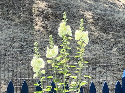
The deer aren’t messing with these hollyhocks. Haha, deer.
I put together a bank deposit, and then had to make a phone call that ended up taking a full hour. It was a successful attempt to untangle a Word problem. Nope, not a crossword type word problem, the Microsoft type of problem.
This led to about 2.5 hours of proofreading.
Suddenly, the morning was over, and I had to paint a sign. Sometimes I do odd jobs like that.
Suddenly the afternoon was almost over and I hadn’t oil-painted and it was killer hot and the swamp cooler hadn’t been turned on. Yikes! I went into the studio for a bit to scan 2 new paintings in hopes that the swamp would have a chance to get rolling.
Classic Mineral King, 8×10″, $145
Classic Mineral King 2, 10×10″, $200
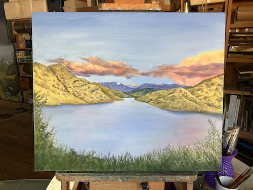
I had some iced tea (herbal, because caffeine is a bad choice in the afternoon), and then went to the easels. It was too hot to putter or just dink around*, so I dove in fully focused with a game plan. Mike Rowe kept me company interviewing Riley Gaines—no relation to Chip and Joanna as far as I know—about her new book**, Swimming Against the Current. (The link is for ThriftBooks rather than the big A.)
A few hours later, this was almost finished, and I was too.
All it needs is the edges painted. And a few houseboats—I forgot about that part. It also needs a title beyond the working title of “Rachel’s View”. Full Lake? Full Lake at Sunset? Lake Kaweah is Full? Still Waters? (corny. . . nope) Drowned Wildflower Seeds? (My great-uncle used to mourn the drowned wildflowers after the dam was built. . . I guess I have come by my love of wildflowers honestly, eh?)
*Sometimes I am not very focused, just moving from painting to painting, dabbing a bit here, perfecting a bit there.
**Imma wait for the liberry copy. It is because that’s what frugal people do.