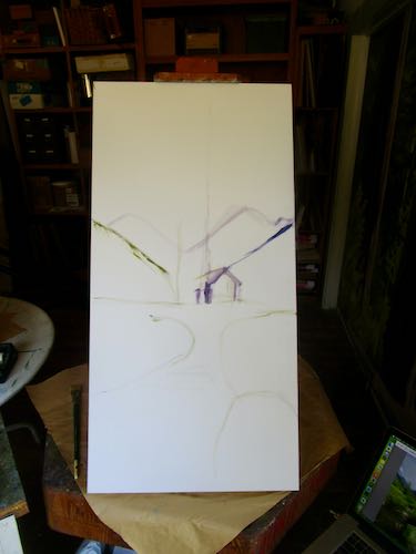
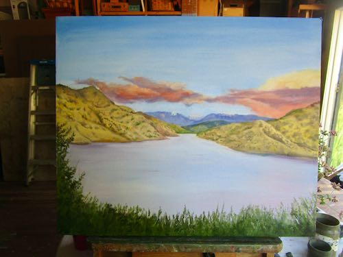
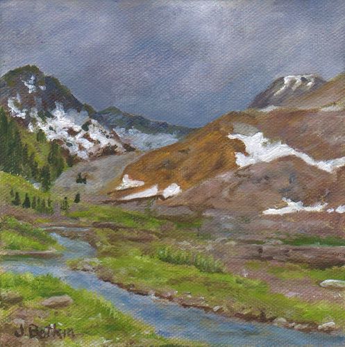
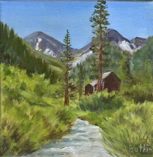
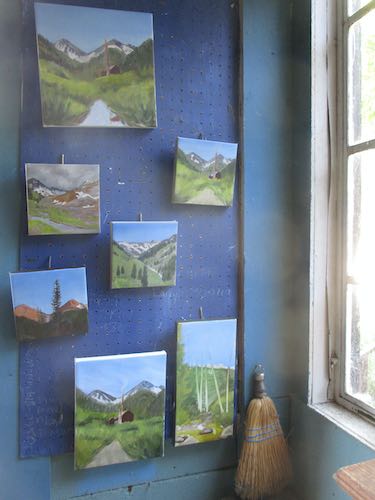
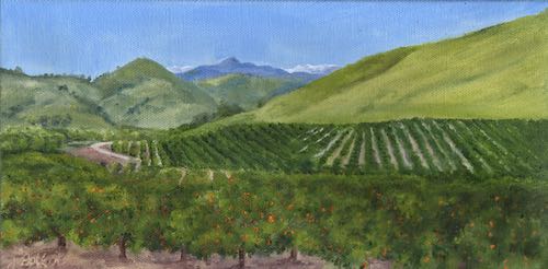
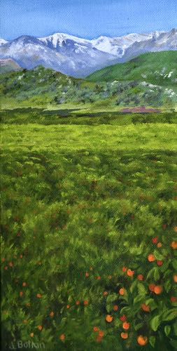
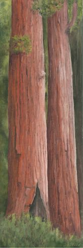
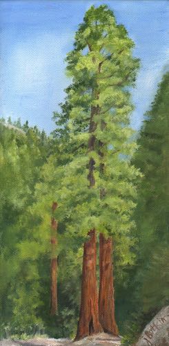
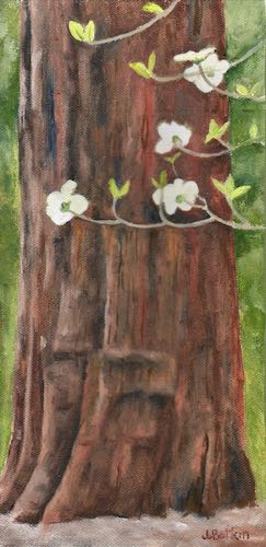
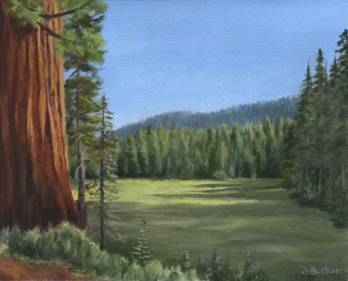
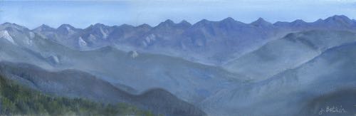
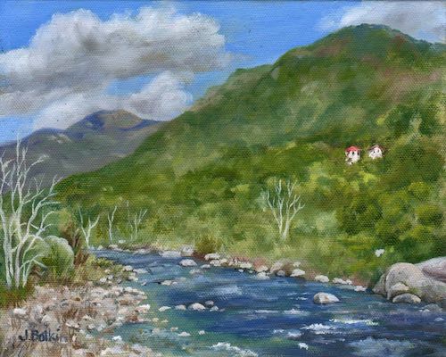
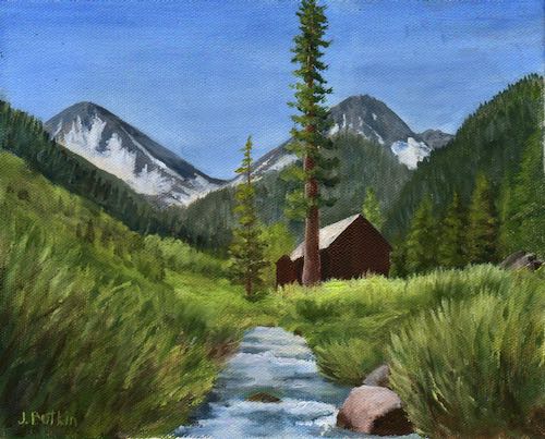
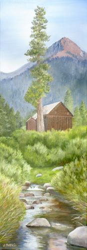
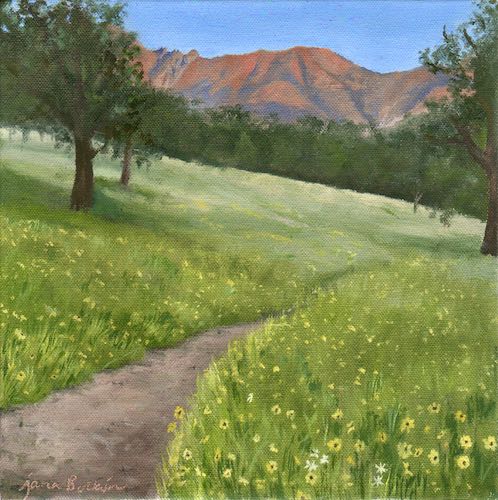
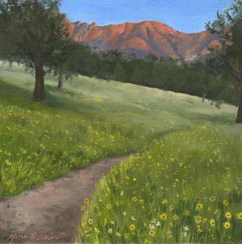
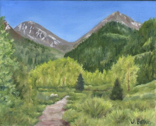
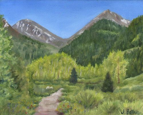
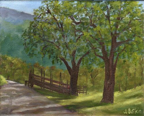
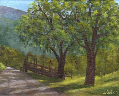
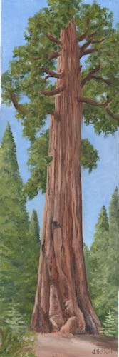
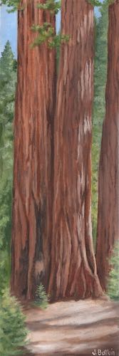
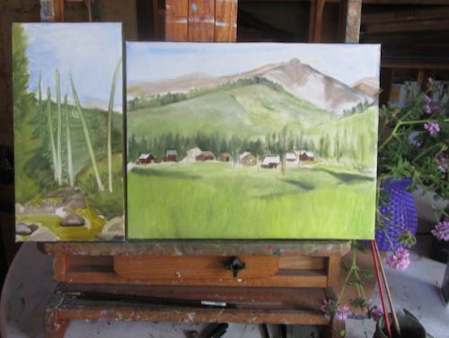
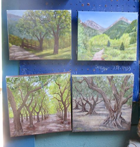
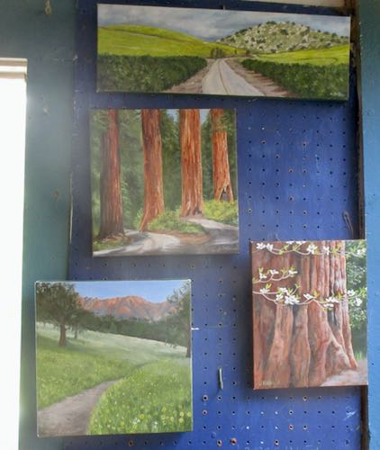
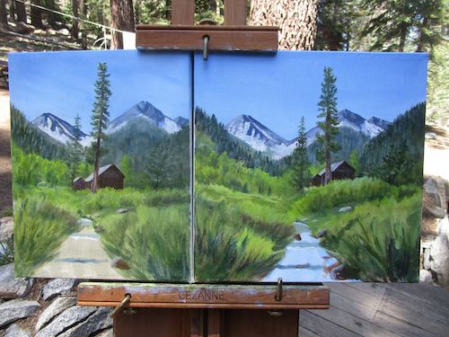
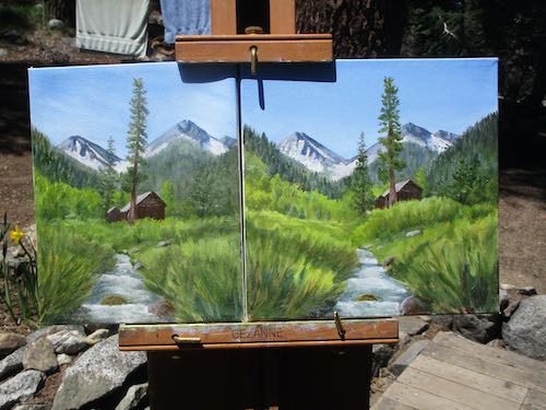
The view of a family cabin from the Mineral King bridge with Farewell Gap in the back and the stream in the front is the most popular scene that I paint of Mineral King. Sales have been brisk, and I am trying to get some inventory ready to go. So, instead of just hanging out in Mineral King, I did some work.
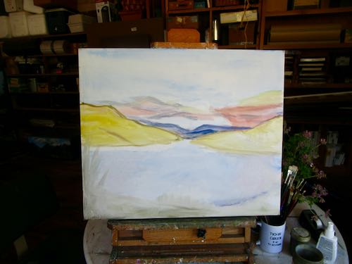
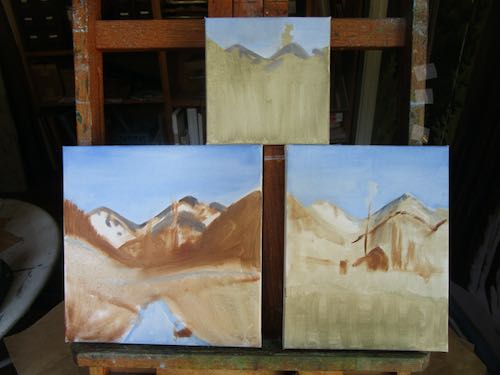
First, I started painting without the easel. It is annoying to set up, and I just wanted things to be easy.
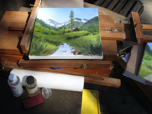
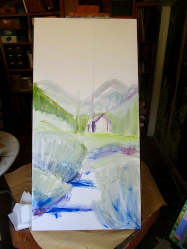
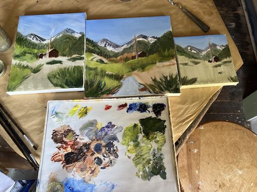
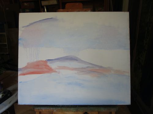
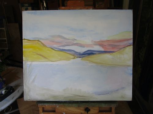
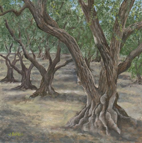
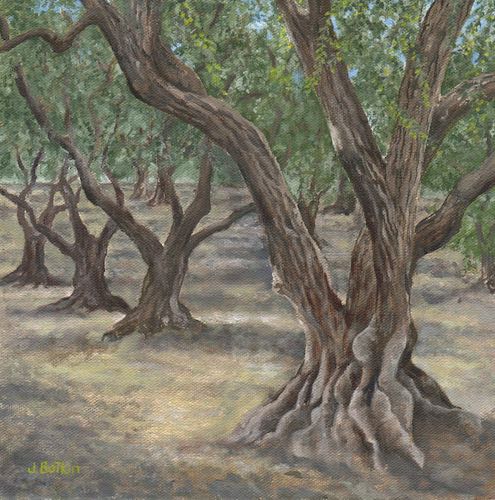
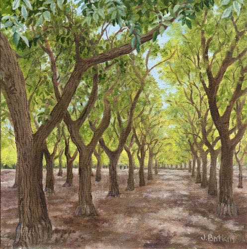
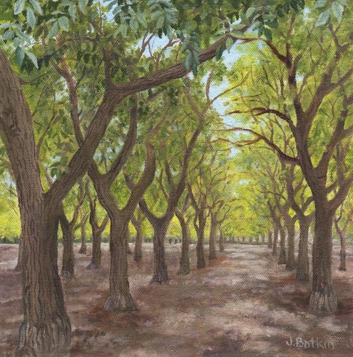
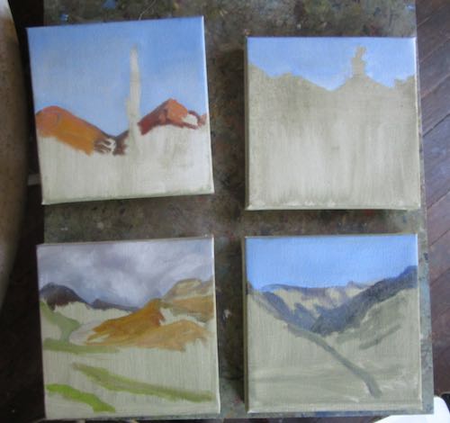
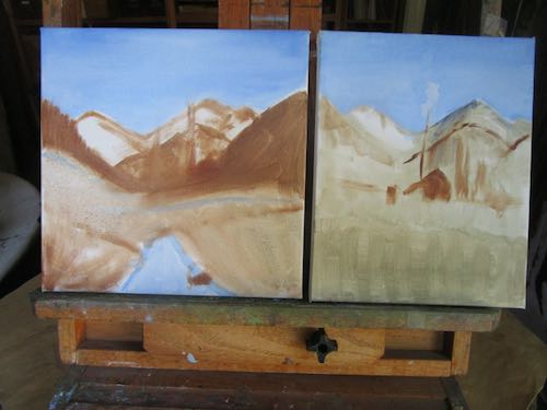
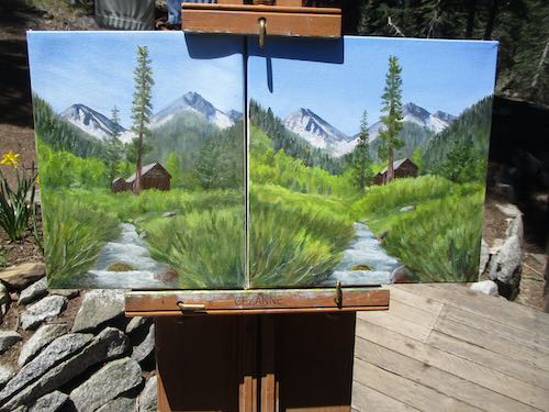
Then I changed my mind. It seemed possible to set up both paintings side-by-side on the easel, which would make it worthwhile to hassle with the easel.
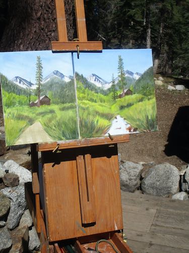
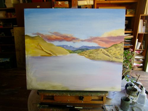
Yeppers, this works.
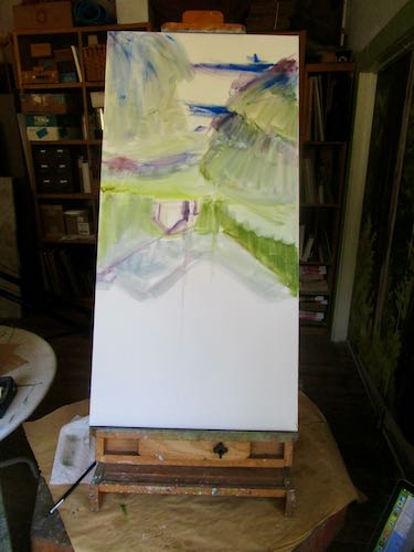
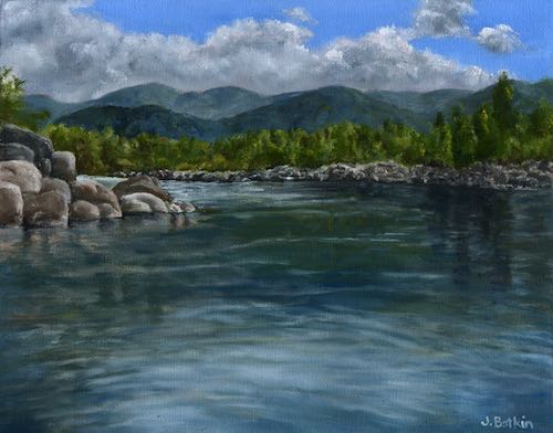
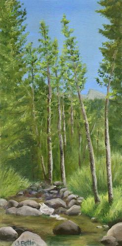
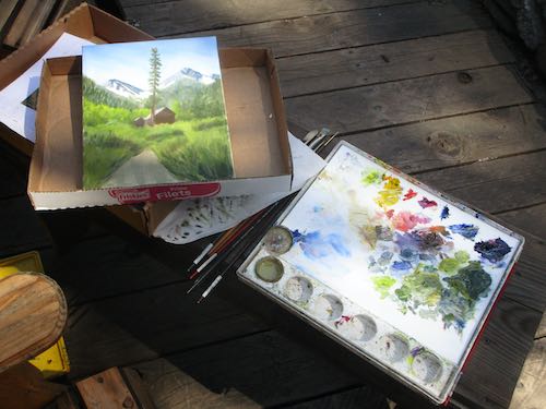
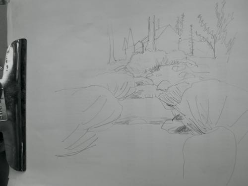
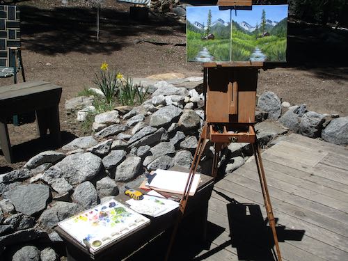
After awhile, the paintings felt too hard. I was looking at about 6 different photos, getting confused about which one to follow for which part on which canvas. Which which which. Time for a break. I walked to the bridge and sketched the various ripples, rocks, and willows, which all showed because the willows weren’t leafed out yet.
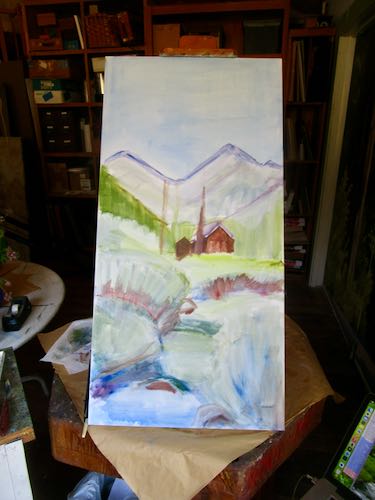
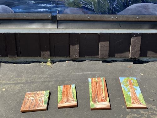
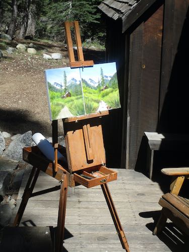
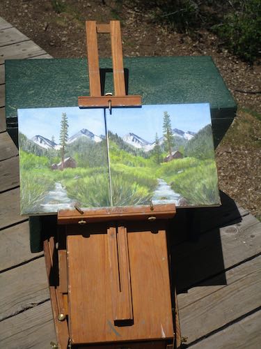
Finally, I set it up to dry so that I could get it home without incident.
I’d rather not work while in Mineral King, but if I cannot hike, I might as well be productive. And it is pretty handy to go see the real scene instead of relying on photographs.