Well, not exactly regular, because it involved gathering paintings from Kaweah Arts and pricing them for the Redbud Festival. But that is all part of the business of art in the life of your Central California Artist.
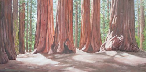
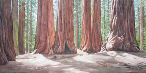
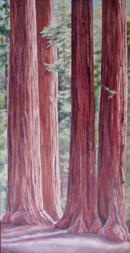
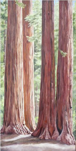
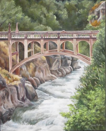
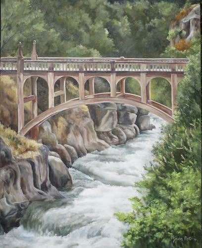
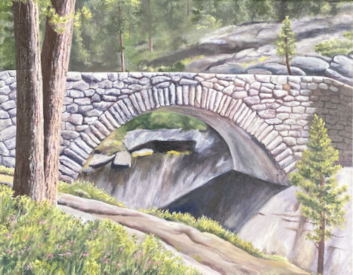
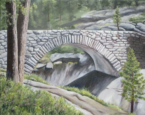
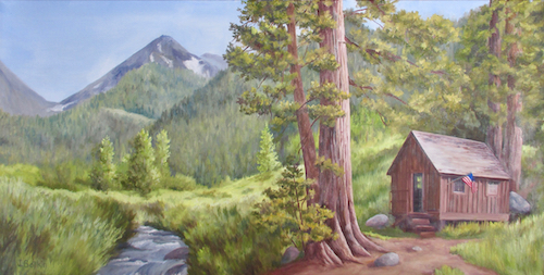
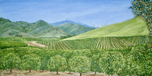
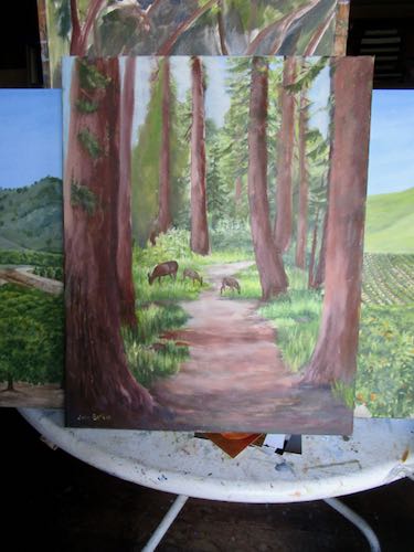
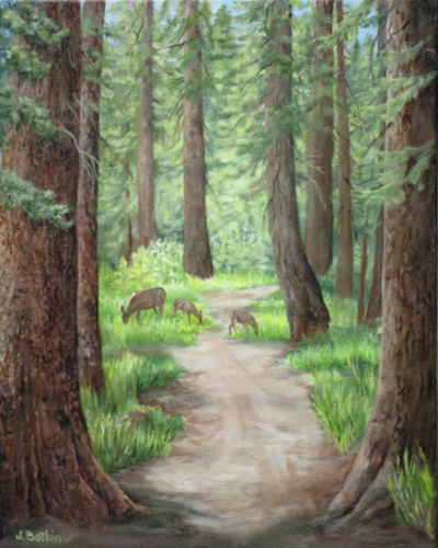
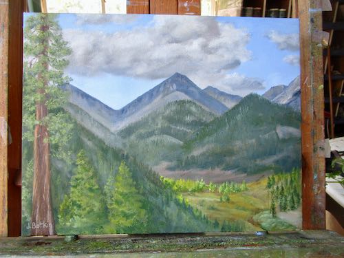
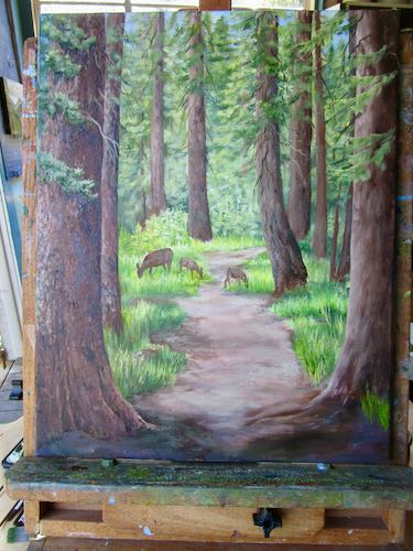
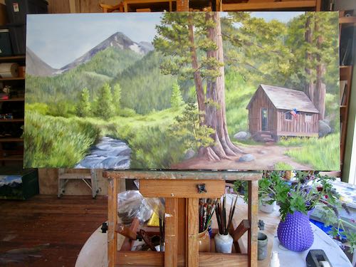
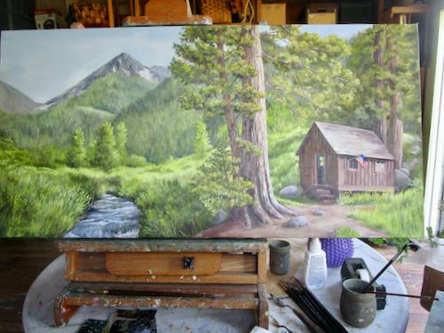
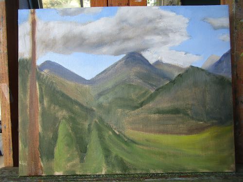
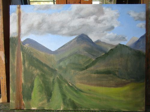
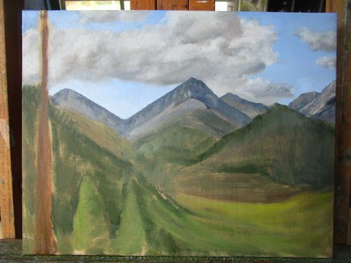
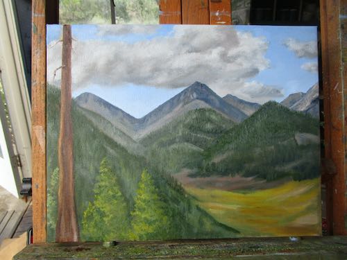
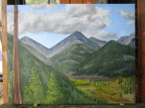
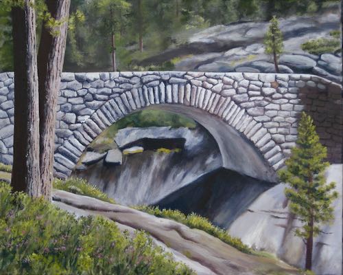
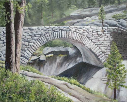
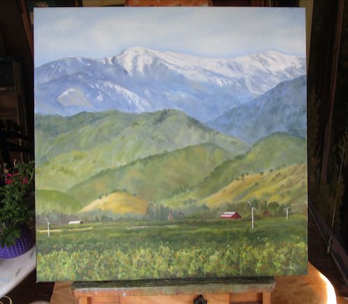
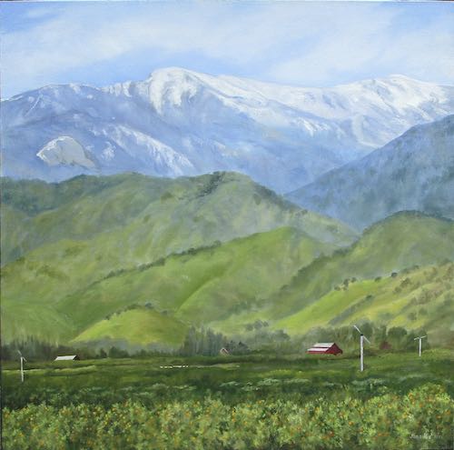
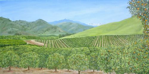
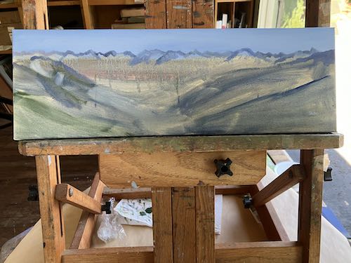
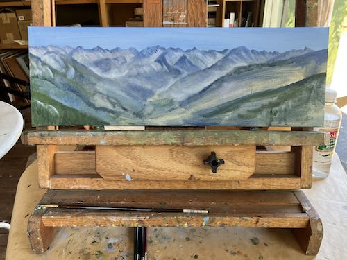
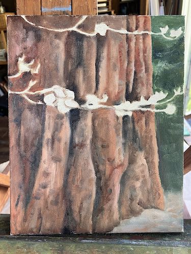
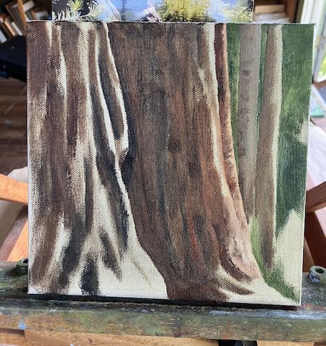
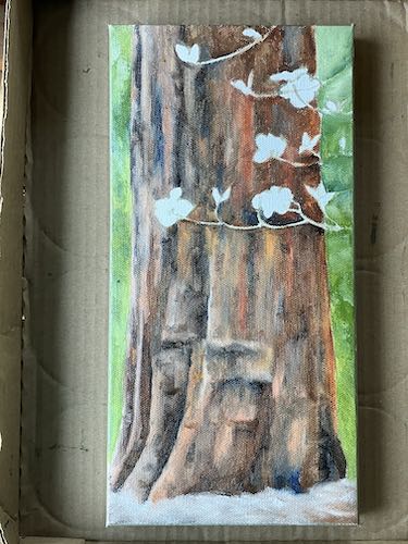
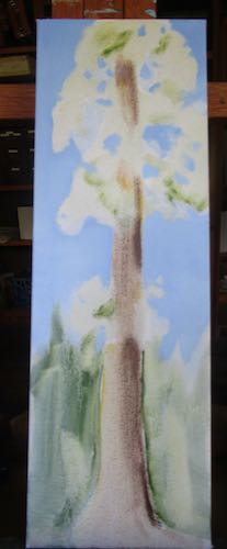
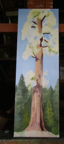
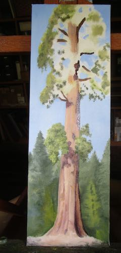
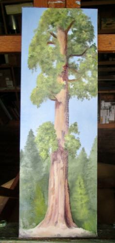
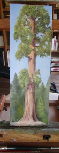
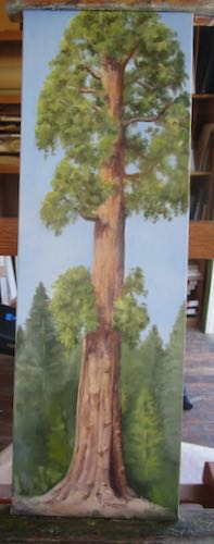
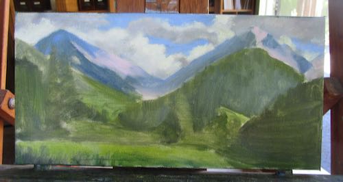
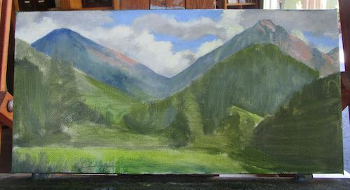
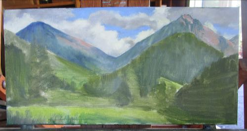
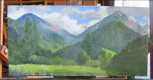
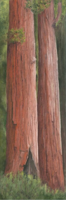
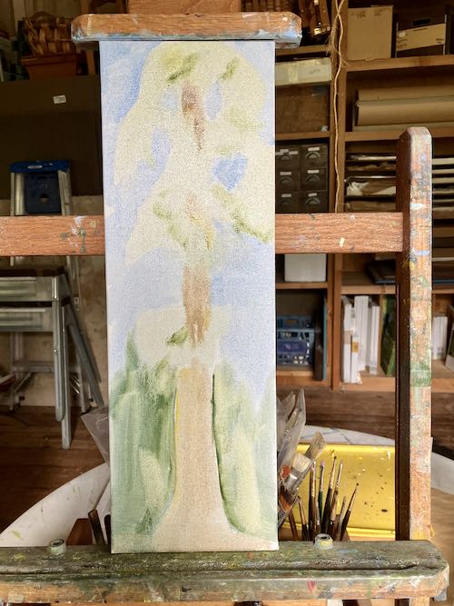
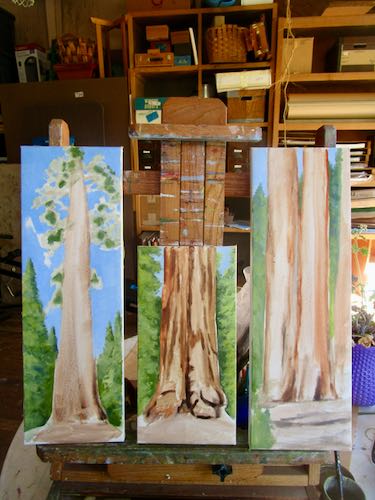
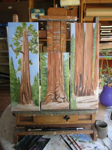
I started 3 new sequoia paintings so that Kaweah Arts has back stock.
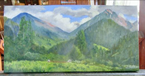
Then it was time to drive to Kaweah Arts to collect paintings that might sell at the Redbud Festival. I gathered all except one, because it was hanging on a hanger that I couldn’t figure out how to operate.
I piled all the paintings according to size and attached price stickers. No matter how I do this, they don’t stay on. I did it anyway, because someone(s) else would be minding my booth for me on Sunday and I wanted it to be easy for them. Sunday mornings at the Redbud Festival have historically very low attendance, but it would be wrong to leave my booth unattended while I attended to my responsibilities at church.
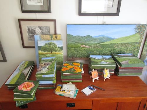
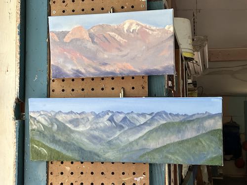
This doesn’t look like very many, does it? There are about 30 here, stacked on the desk.
Something happens when I am seeing them all together and studying them up close and in good light: suddenly, none of them look quite good enough. Sigh. I hate that.
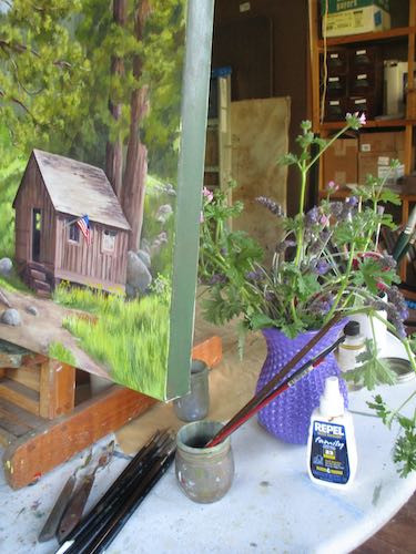
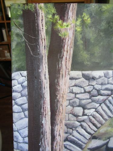
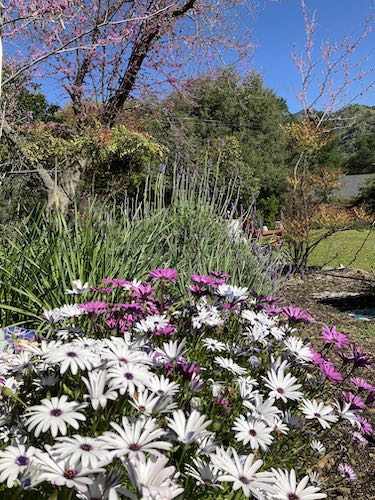
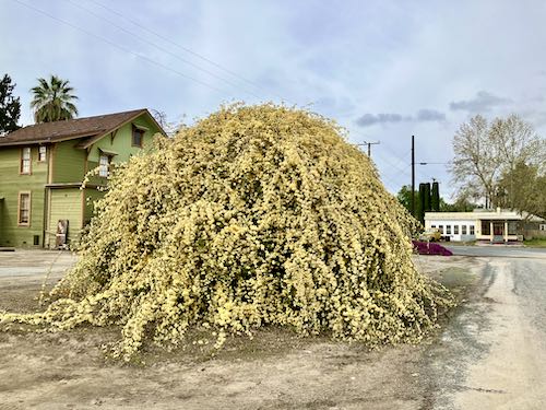
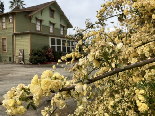
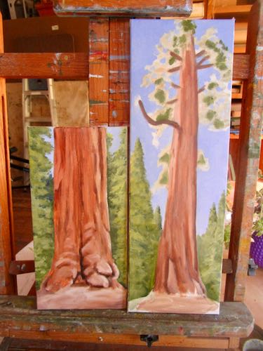
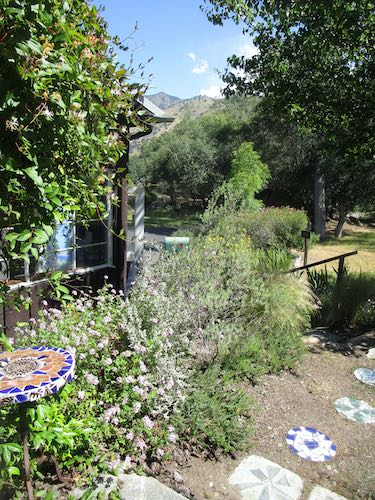
It was a beautiful day, and I worked with the studio door open.
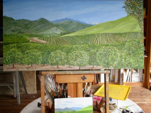
Then I painted some more until it was time to set up for Redbud.
The plan was to get all the structures in place and then take the paintings and other merchandise on Saturday morning. It was so very windy that we just unloaded the display pieces and headed home. I didn’t take any photos of the wind for you.
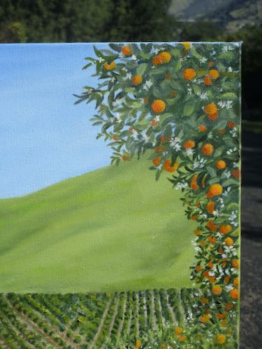
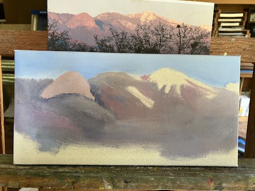
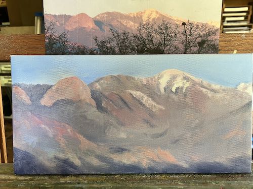
About the paintings: if I mix up and paint each color across three paintings at once, it goes a bit faster. It’s a continual struggle to not spend too much time on paintings, because the prices have to be sensible for the tourists, and the stores keep 30%. I often hear that my prices are “too low”, but it is good to be realistic about Tulare County. Besides. . .