Beginning Two New Paintings

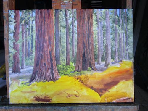
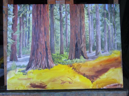
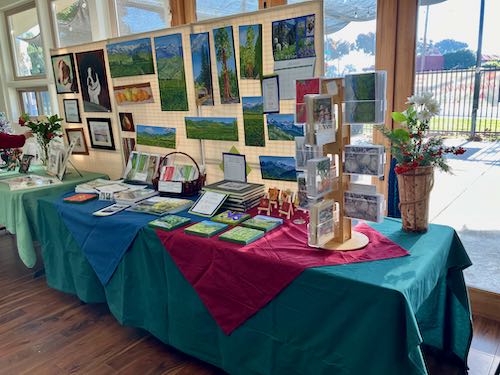
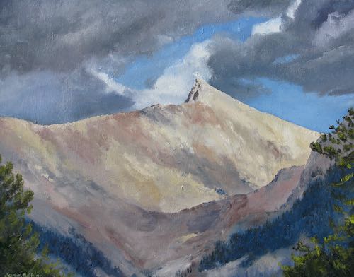
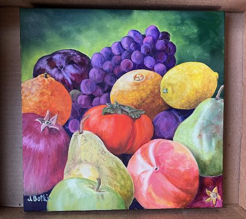
Here is a look at two new paintings, begun for the solo show in October of 2024. Seems very far away, but it takes awhile to paint enough pieces to fill a gallery on one’s own. I have about 30 available (several unfinished but in progress which I will show you tomorrow) so I need to paint another 10-20 pieces. I’m thinking 20 is better, because I paint small. Even when I think it is HUGE, such as 18×24 which feels ENORMOUS and takes FOREVER, it looks like a postage stamp in a gallery.

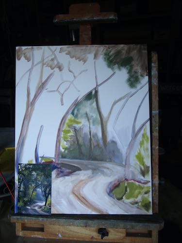
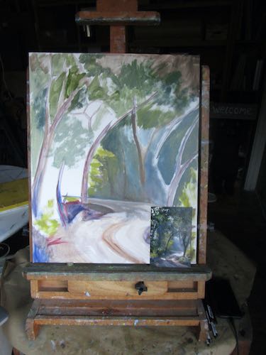
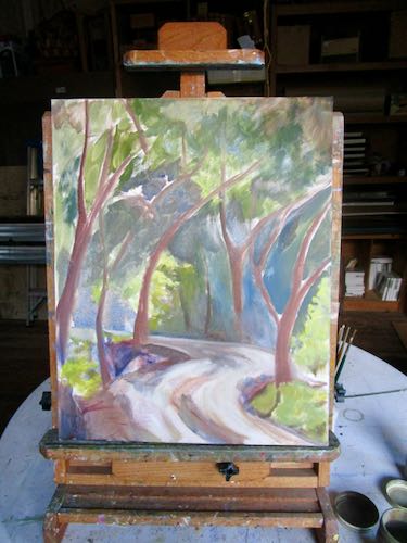
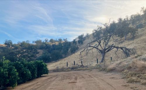
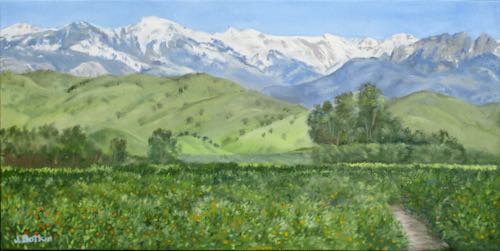
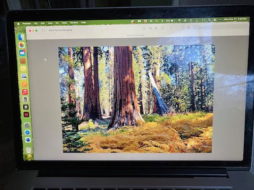
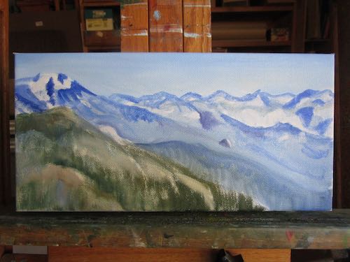
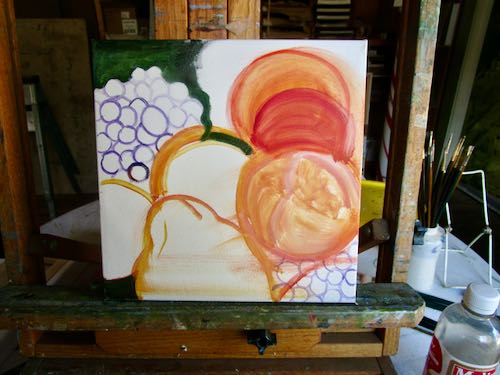
This one is 16×20. I can’t find the photo on my computer, don’t remember where or when I took this, and can’t really discern the details on the little photograph.

So why bother? It has wonderful light and the road pulls the viewer in.

It will involve some “artistic license”, and I will focus on the contrast between light and shadow. Slow layer after slow layer, lots of thinking and evaluating—that will be the process on this one.

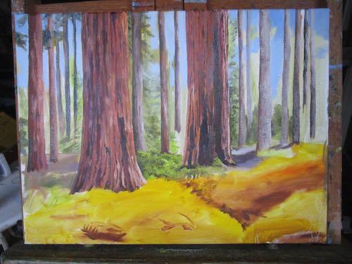
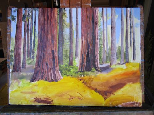
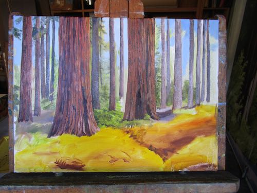
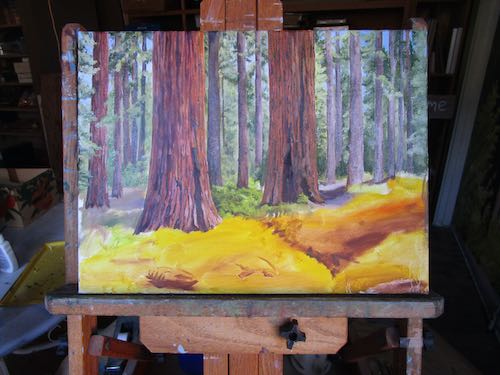
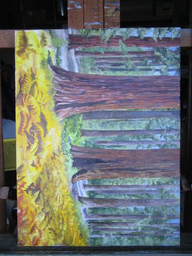
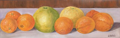
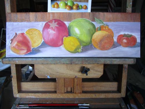
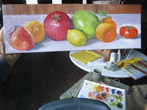
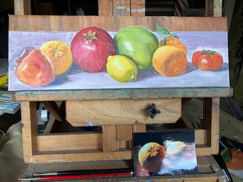
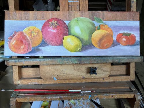
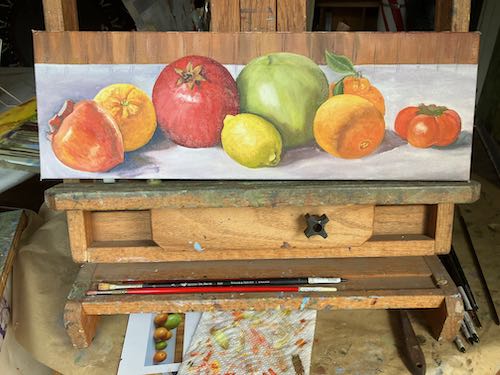
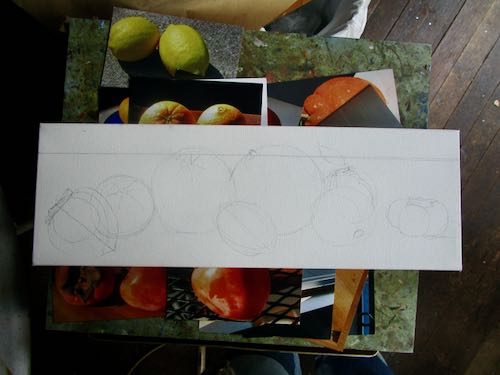
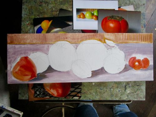
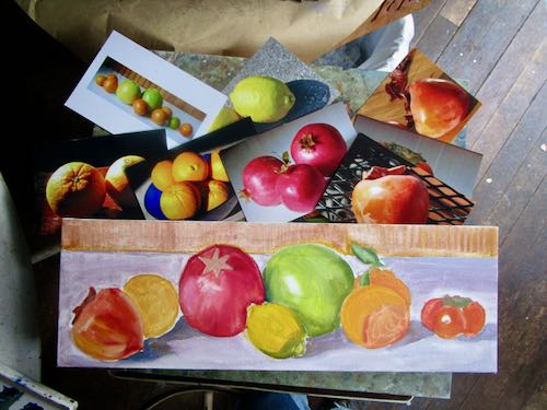
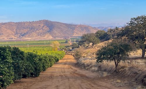
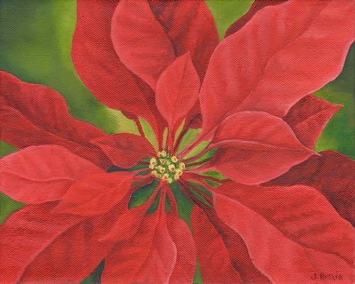
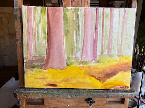
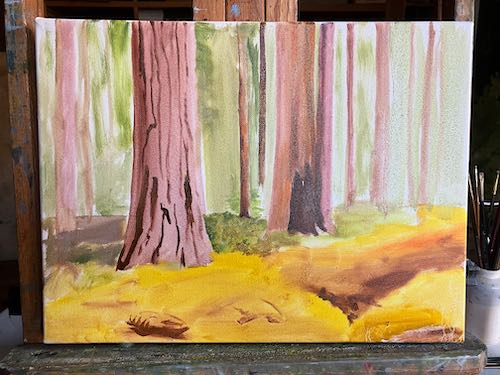
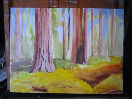
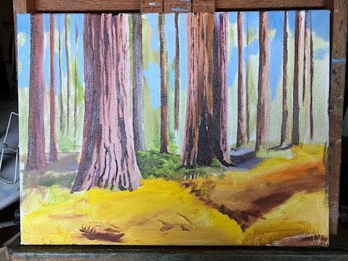
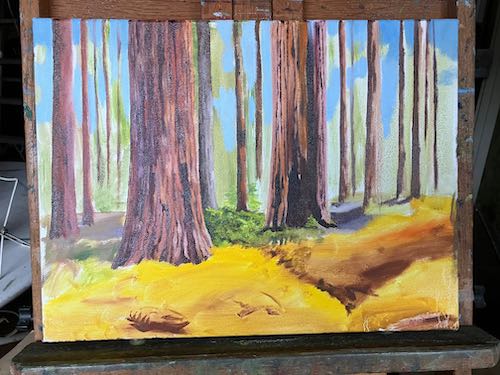
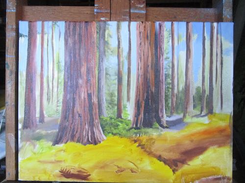
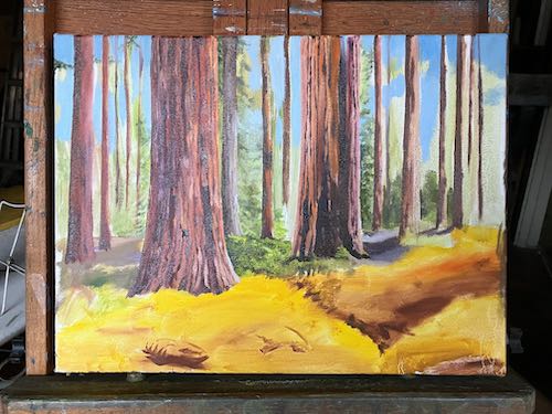
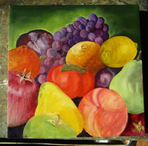
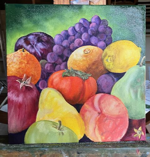
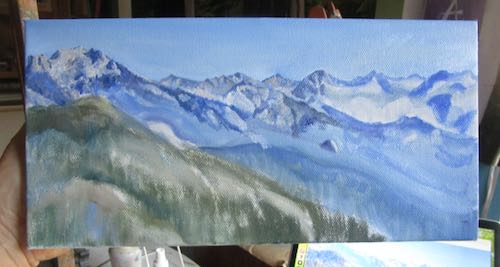
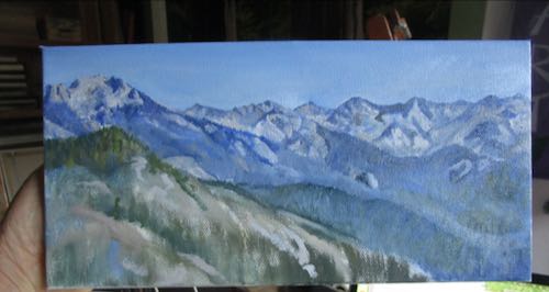
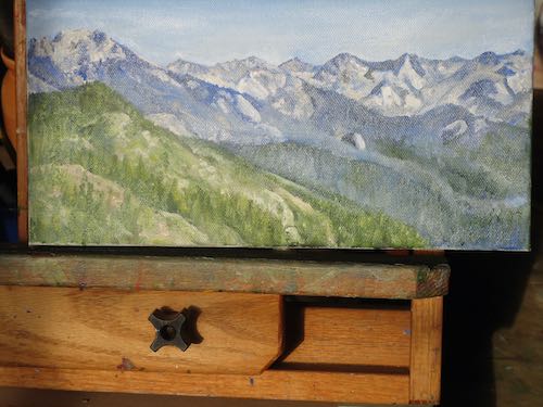
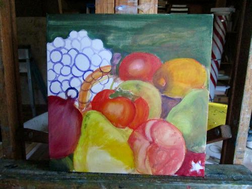
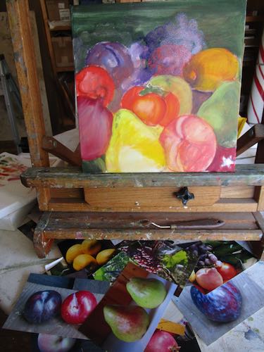
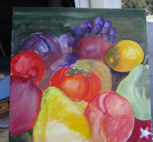
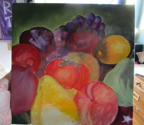
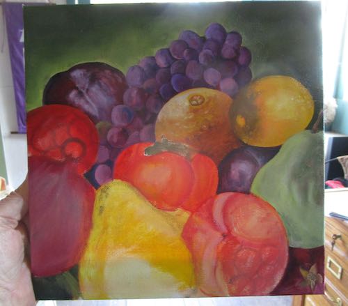
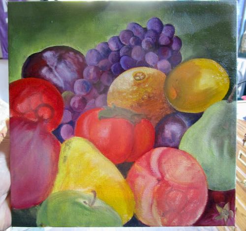
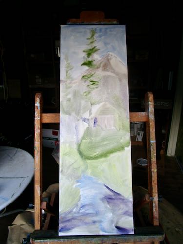
I decided to do something different with something familiar, using a 10×30″ canvas that I had on hand. The sizes of canvas on hand often dictates what I paint. If it isn’t a tried and true subject, I keep the painting small. This is a tried and true subject, even if you can’t tell what it is at this early stage.

Can you recognize what this mess is?

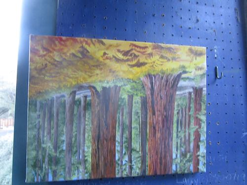
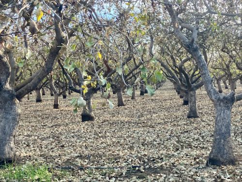
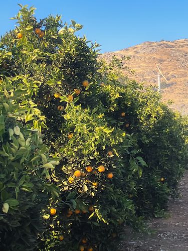
Lots of painting ahead for your Central California artist as she plans the best way to show off the parts of Tulare County that keep her from moving to the beach. (As if she could afford that; besides, she’d miss Trail Guy.)

Practicing Painting

Practice Painting? Painting Practice? Paint Practicing?

Never mind. Doctors practice medicine, attorneys practice law, and this artist practices painting. Some days I feel as if I am brand new, with no idea how to tackle a subject. Some days I think I’m figuring it out. Only once in awhile does the process feel easy.

I have a solo show coming up a year from now, and I want to be ready. No last-minute panic painting, just a well-planned body of work that is cohesive, looks good together, represents my best efforts, and most of all, represents the best parts of Central California, specifically Tulare County. Or perhaps is the best representation of Tulare County, a place of superlatives, both great and terrible.

Hey Central California, stop your bloviations and show us some work.

Ahem. Would you like to see what I was practicing on?

About time.

I started with more detailing on the trees.

Then it was time to work on the background. All those vague and messy branches and clumps of needles were a bit confounding, but that’s okay, because I was just practicing. It helped to put in the sunlit strips of ground.

I had to turn the canvas sideways in order to place the tip of my brush WHICH I WAS DRAWING WITH, SO THERE, in the right place to get accuracy. In order to paint those ferns in detail, I DRAW WITH MY PAINTBRUSH.

Finally, I hung it on the wall to dry, and that’s when I realized I had begun the scene upside down but hadn’t actually reversed the canvas. Oh well. A wire is easy to move.

Painting Fruit Instead of the Golden Gate Bridge

I had a few unexpected hours available to paint and decided to not waste that time doing something useless like weeding or vacuuming or painting the Golden Gate Bridge (just your basic endless repetitive chore).

I worked on the commissioned oil painting, 6×18″ for my friend/customer to fit between 2 other fruit paintings in her kitchen. She saw the painting Citrus Row and requested the addition of pomegranates and persimmons but gave me the freedom to arrange and fill with whatever else I chose. Instead of adding those P fruits, I started a new painting.

She sent me this photo to show me where she wanted to put the painting.
Back wall first
The fruit on the far right is a fuyu persimmon, not a tomato. I don’t know why I started on the right side instead of the left, which is normal when I draw so that my hand doesn’t drag over the completed area.
This picture looks worse than the previous one because the paint was quite wet and the late afternoon light made it very reflective.
Incomplete: the table, stem on the pomelo, and the cap on the fuyu. and the edges and signature.

It is quite a thrill to be able to mix and use all these bright colors. Of course, having painted this at the end of the day’s light, it could look rather wrong when I see it in normal daylight.

Yeppers, the table needs work. The leaf on the tangerine is blending into the table. The shadowed part on the orange on the right isn’t right. The fuyu persimmon might need some color correction. The shade from the lemon on the pomelo looks like an outline. On and on and on it goes.

It’s a wonder that any paintings ever get finished.

Feeling Fruity Around Here

Feeling fruity around here lately. A month or 2 ago, I painted this to decorate a banquet for a citrus marketing outfit.

A friend who has bought more of my paintings than anyone else saw this. She said, “If it doesn’t sell at the event, I want it!”

I took the painting to her, and she said, “I’ve been thinking. . . could you change one of these to a pomegranate? And include both kinds of persimmons?”

I said, “Sure, I can do that!”

Then I brought it home, thought it over, and decided to do a new piece for her. I dug through my fruit photos, looking carefully at the lighting and angles. Then, unlike my normal approach, I drew it out.

This is going to be good—colorful and well planned.

The other fruit painting I recently painted as a gift, I did without any real planning. I just pantsed it, trying this and that with paint, having fun with color.

I like it, and so does the recipient. Yeah, yeah, it probably would have been better to plan it. Sometimes I just rebel.

P.S. Good thing I painted a new one because the original, Citrus Row, sold at CACHE’s Holiday Fair!

Two Outings

Private collection, 12×36″

In 2023, I participated in exactly one art boutique/fair/bazaar. ONE. It was in Exeter on a Saturday at the history museum/art gallery, CACHE. This was the inaugural event, the reviews are mixed, and I am guessing it won’t become an annual event.

However, I had a good day! One painting sold (Citrus Row) and many smaller items too, all adding up to YES IT WAS WORTH IT.

Being sort of accidentally semi-retired this year*, I decided that a good day of work deserved a good day of hanging out with friends. Because I still live in the same area where I was reared (children are reared, vegetables are raised), when long-time friends return to the area, they often request a get-together. This isn’t always practical, but it is usually a real treat.

I left the house at 10:30 AM and got home at 5:30 PM, just to “go have lunch”. This is why I often turn down such requests, unless I have recently had a good day of work and don’t have any looming deadlines.

The drive was interesting (I actually left Tulare County!), the company stellar, and lunch was delicious.

Our post-lunch walk was exactly up my alley.

The dead tree was interesting, but I won’t paint it.
I will probably paint this. If I really squint, I can see the mountains. We were too far north to be looking at Alta Peak.
I will paint this, minus the white spots (whitewash against thrip?) and pokey little twigs. I’ll probably fake in a navel.
My friend had to help me with these: pistachios! She said that the crop was left to fall on the ground this year. What a terrible waste.
Of course I will be painting a version of this. Shall I make the hill green?

Two outings: one work, one semi-work related, both social, one closer but more taxing (talking to people all day makes me tired), the other far but entirely up my alley with 2 close and long-time friends in the country surrounded by foothills and oranges.

“The Best View”, 10×20″, $400, currently my favorite subject matter

*Because I had no work this summer I may have forgotten how to work.

The Business of Art: Notecards

“Margaret’s Poinsettia, package of 4 cards and envelopes, 4.6×7.2”, $20. Inside message: Wishing you Christmas joy and blessings in the new year!

Through the years I have designed, printed and sold hundreds, nay, THOUSANDS of little cards. “Notecards”, as I refer to them, are perfect to say “thank you”, “hi”, “just one more thing”, “I appreciate you”, or even “I’m sorry”. If you write real big, you can get by with just one sentence.

“Sun Kissed”, pencil and colored pencil drawing, package of 4 notecards and envelopes, 4-1/4 x 5-1/2″, blank inside, $10

Designs come and go; sometimes I redraw something and then get rid of the older version. Other times, it seems as if a design has run its course and needs to be retired. Sometimes I have too much inventory, so I let a design run out for awhile. And sometimes a design that really grabs me just doesn’t speak to the buying public.

“Oak Grove Bridge #28″, oil painting, package of 4 notecards and envelopes, 4-1/4 x 5-1/2”, blank inside, $10

I used to sell my cards in many stores around the county. Most of those stores are now closed. Even if the stores were still around, my costs are so high that if I sell them at a wholesale price to a retail store, there is zero profit for me. This means that I am working for free. That’s just dumb business.

Sawtooth and wildflowers, pencil and colored pencil drawing, package of 4 cards and envelopes, blank inside, 4-1/4 x 5-1/2″, $10

Nowadays I sell the cards here on my website, occasionally when I do a bazaar or if I am having an art showing or exhibit (what’s the diff? I dunno), and on consignment at a very few places. “Consignment” means that they pay me after the cards sell, which means a lot of checking in, rewriting lists to keep current on supplies, making bills, sending the bills, paying attention to what has sold and what needs to be restocked.

Farewell Gap in Mineral King, pencil drawing, package of 4 cards and envelopes, blank inside, 4-1/4 x 5-1/2″, $10

It’s all part of the business of art, which involves many decisions. Most of those decisions would be better if I had a crystal ball. Lacking that, I look at the history of sales, look at the current economy, look at the venue and think about the customers. If consignment, I look at the store’s record of payment, if the cards are getting shopworn and need to be repackaged, or if the store hasn’t been displaying the cards in a manner that the customers can see them.

“Sawtooth”, oil painting, package of 4 notecards and envelopes, 4-1/4 x 5-1/2″, blank inside, $10

The business of art is a complex and delicate blend of science, art, and guesswork.

Bright Fruit and Sequoia Trees on the Easels

After a chunk of time away from the easels, I was very happy to return.

First I got to finish the fruit painting that will be a gift. (I will be GIVING it, not “gifting” it.)

This is wet, photographed here in the box I used to carry it into the house to dry.

I started this quite awhile ago, working from a photo shared with me by one of my drawing students. The ferns had been nipped by frost, turning them golden.

Although I am working from a photo, I am rearranging the trees. Here is a photo of the photo, which I am looking at on my laptop while painting.

My hope is to make those ferns perfect. Just perfect. But there is lots to be painted before I get there.

The new paintings won’t be at the Gift Fair but there will be plenty of merchandise to choose from.

Best or Worst Critic?

“You are your own worst critic” is something I hear from time to time. That is actually a positive trait, because who else is going to be completely honest to help me improve my work?

Today’s post is one to help me think about how to make this painting be the best possible. This painting is a conglomeration of a stack of many photos, in an attempt to make it the most colorful that I can.

These are my thoughts as I study the painting:

  1. The two pomegranates look good, which makes sense because I’ve painted many pomegranates.
  2. The orange needs a bit more brightening.
  3. The tangerine is a good idea, but doesn’t look quite right; maybe it is Sumo, maybe a mineola tangelo. (Are those even grown anymore?)
  4. The hidden plum is a little weird with that highlight–maybe it should just go dark.
  5. The upper left plum looks almost finished, only lacking some highlighting on the left side.
  6. The grapes need more variety in their color, along with highlights on the left edges.
  7. The lemon needs better color, highlights on the left, detail in the stem. (I took away the shading from a previous iteration because the light source was on the wrong side.)
  8. The persimmon looks too red here, but that might be the way it photographed. Worth checking. It needs detail in the green thingie, called a “sepal”, and the green is wrong.
  9. Both pears need detail; the yellow one has been shrunk and only has a base coat, and the green one lost its freckles.
  10. The peach needs fuzz and it needs those ghost grapes to get buried.
  11. It won’t take long to finish the apple.
  12. The background needs the glow to be more subtle so it doesn’t look like a halo around the plum and grapes.

Good thing there is no deadline on this. It’s a great exercise in making things up and keeping them believable. It is also a great exercise in patience, in reining in my natural bent to git-‘er-dun. So much in life is better when we see it as an opportunity to learn rather than a nuisance.

Here you can see I improved the background, light on the upper plum and grapes, the tangerine, persimmon sepal, the flower ends of the pomegranates (in spite of thinking they were finished), the green apple. Of course, it is wet and shiny so doesn’t photograph well.

Perhaps I am my own best critic, rather than worst critic?

Great Western Divide

The Great Western Divide is the name given to the ridge of peaks seen from the top of Moro Rock in the Sierra Nevada. On this side, water drains west and on the other side, it drains east .

I haven’t painted this before, at least not from this view. The mountains show in the distance of many of my citrus/foothills/mountain scenes, but only once did I try to make them perfect. And that was tricky, because I worked from many photos, piecing the range together, and then faking the hills.

Why did I fake the hills? Because they were different in every single photo, because each photo was taken from a different place. There is no place besides an aircraft where you can see the entire width of the Sierra Nevada.

Here we go. . .

At the end of the painting session, the light was a bit too low to be accurate on both the colors and the shapes.

So, I photographed it the next morning in the bright sunlight. Looks washed out because the wet paint is reflective.

When it is dry, I will scan it, and then, as always, I will tell you it looks better in person.

The Great Western Divide, oil on wrapped canvas, 6×12″, $125.

Land of Fruit and (no) Nuts

Yesterday you learned the term “glazing” for building a painting in layers.

Now let’s look at glazing some fruit.

This was a little tricky. I started with a photo, then started rearranging and adding more fruit so that there was more color. I kept gathering more photos, trying to make this look believable but also full of variety and vibrance.

The color varies from photo to photo here because of the light differences in the painting workshop, depending on the angle and the time of day.

It needed an orange, and obviously the orange will need some brightening up.

At the end of the painting session I realized that the light on the fruit was not consistent. So, I lifted off the lemon and will paint another one over the top. The orange needs to be brighter. The apple was a good way to calm down that giant yellow pear. The persimmon needs detailing on its green top. A tangerine will be a good addition where the red circle is. Obviously the pomegranate, yellow pear, and peach need to be finished.

Then, everything will need to be tightened up even more. Since this painting is a gift, I can spend as much time as I want without paying attention to whether or not the price is right.

The next morning, I had a few hours to make a little more progress.

This is really fun!