This is a scarf, knit for a friend. The colors reminded me of her, and I couldn’t decide between 2 different yarns, so I got both. It is really a dark burgundy, but both the camera and the computer lie.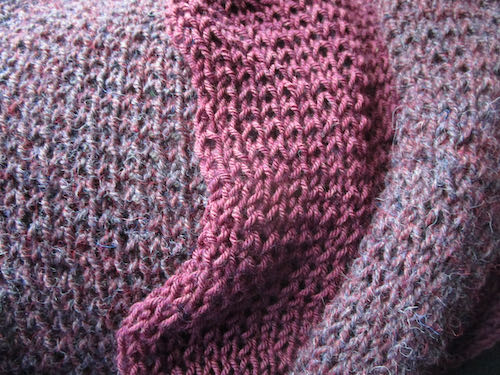
None of our three cats are allowed indoors. Oops. Is that Pippin in the living room again?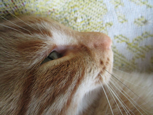
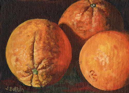
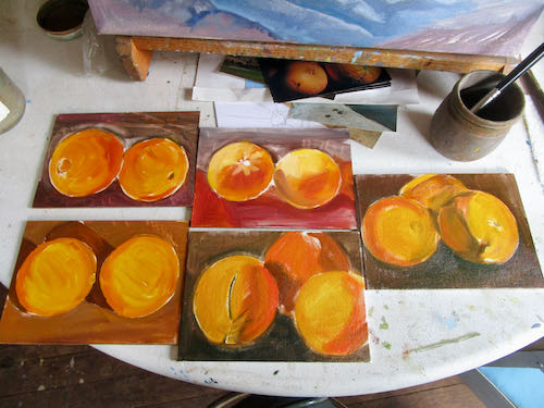
Stop puttering and get to work!
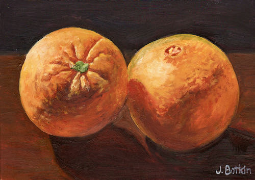
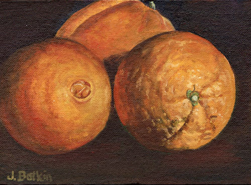
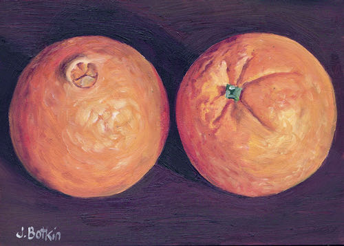
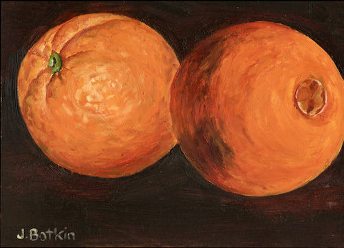
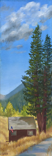
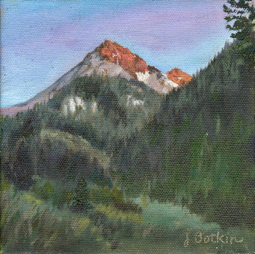
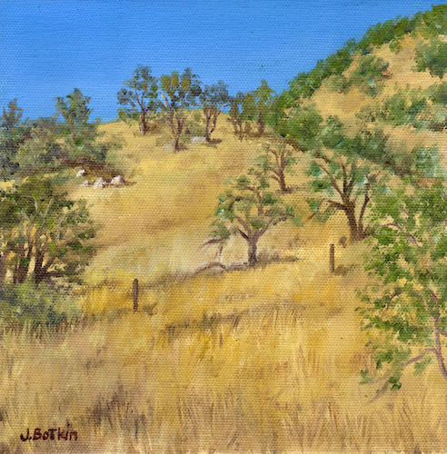
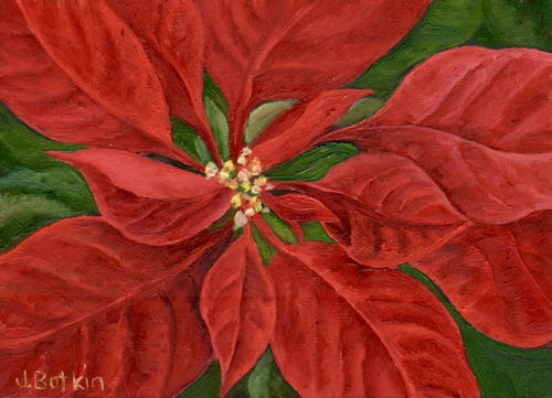
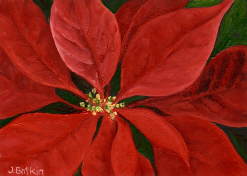
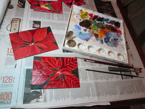
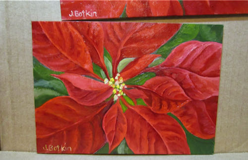
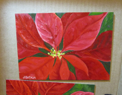
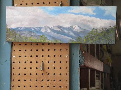
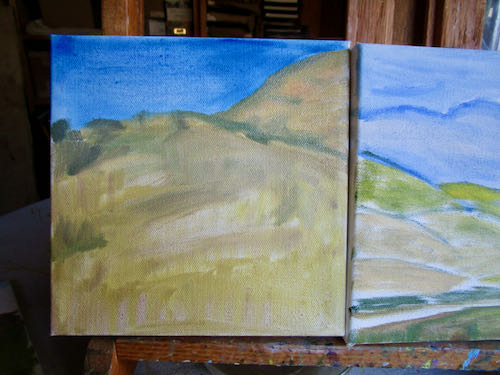
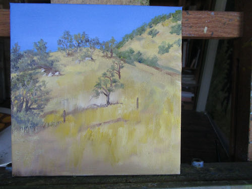
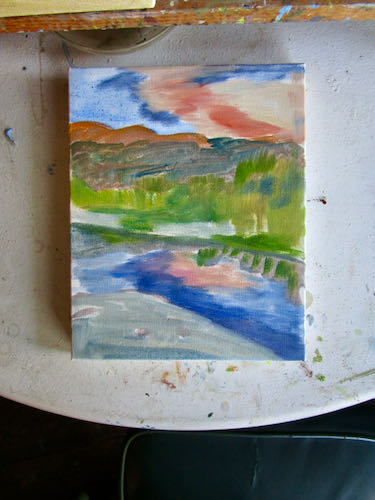
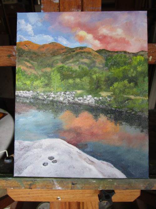
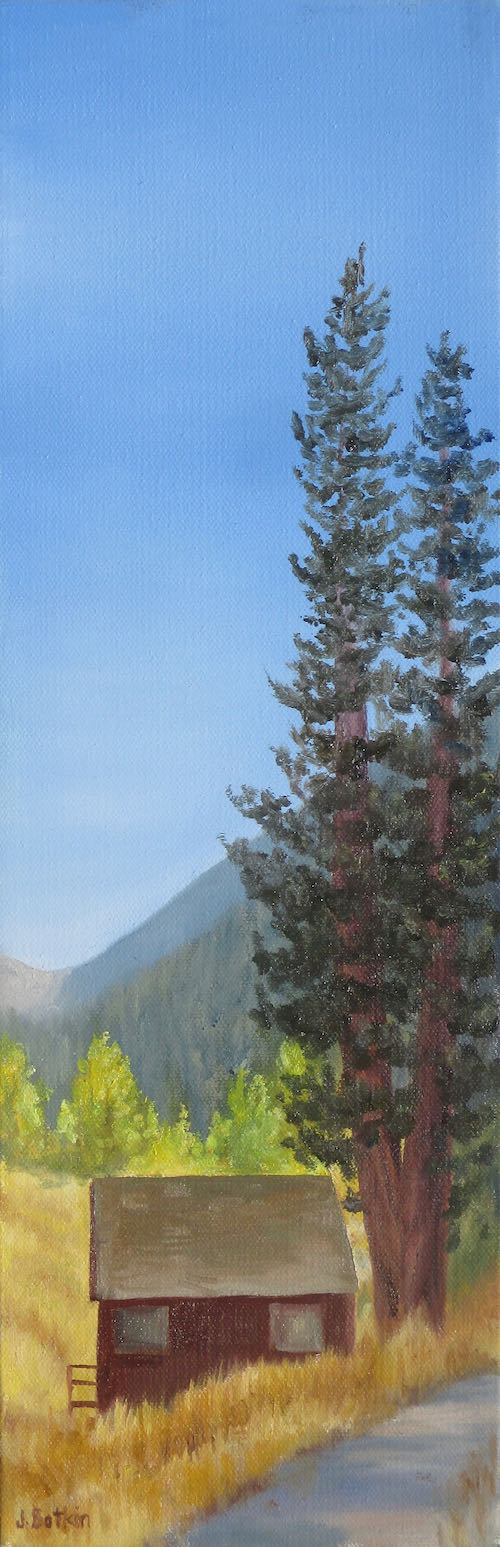
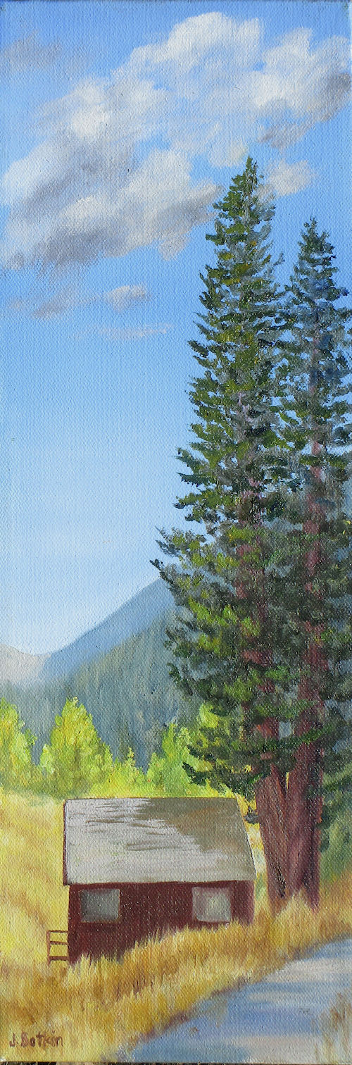
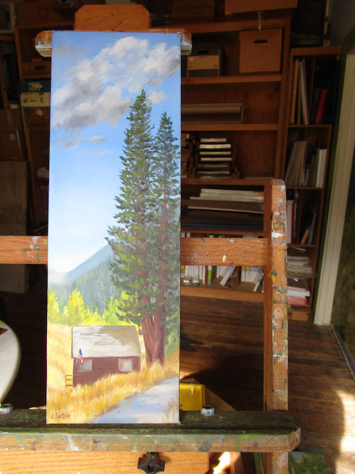
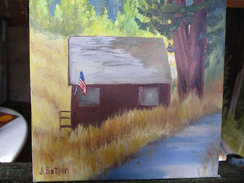
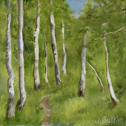
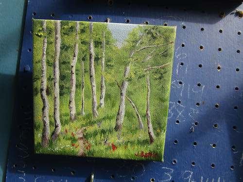
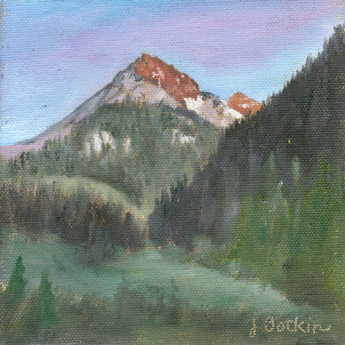
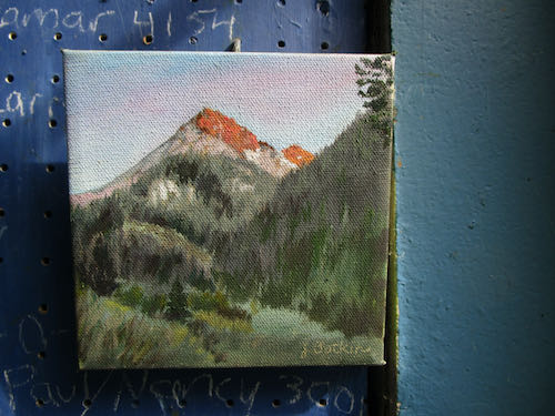
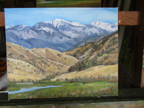
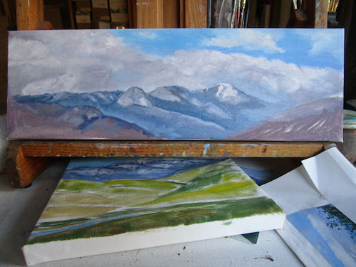
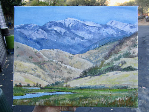
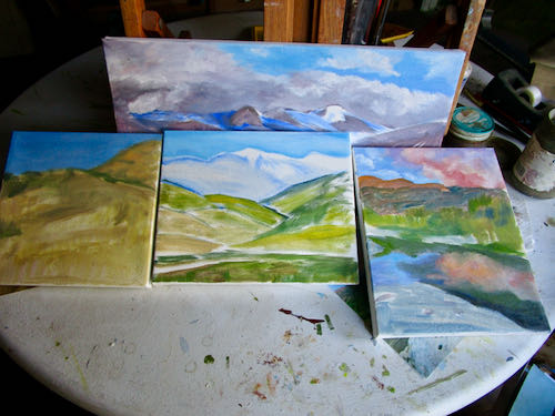
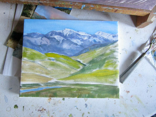
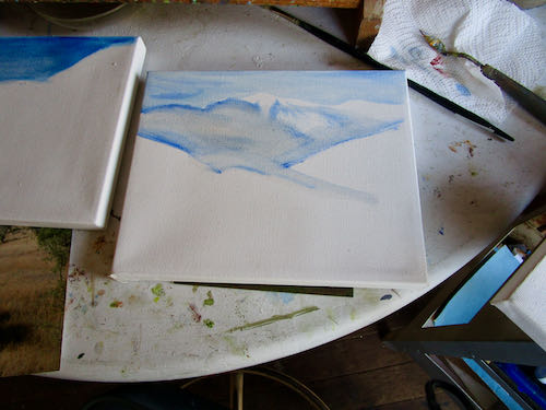
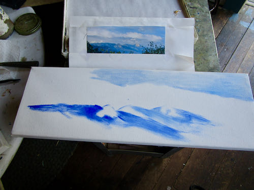
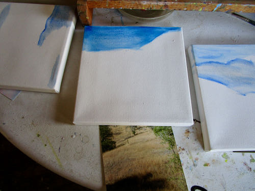
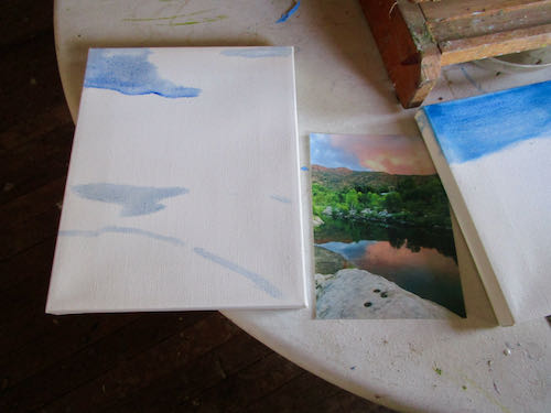
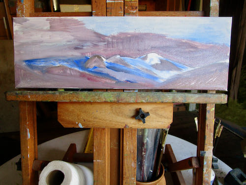
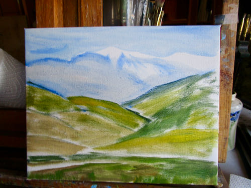
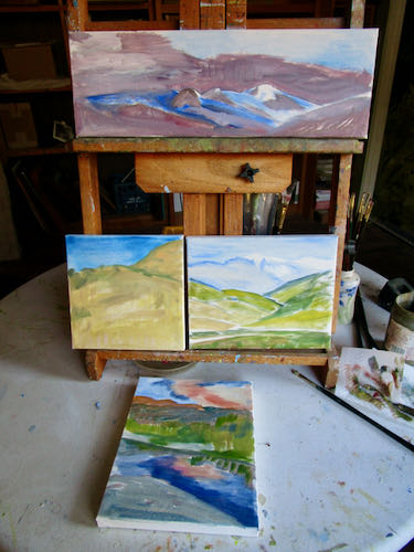
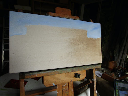
I have two 10×20″ oil painting commissions to complete and mail before Christmas. This is tricky to accomplish unless I put down the camera, put down the knitting, and plant my feet in front of the easels.
It might be tricky anyway, because the photos are less than stellar, less than clear, and full of murky indiscernible things. 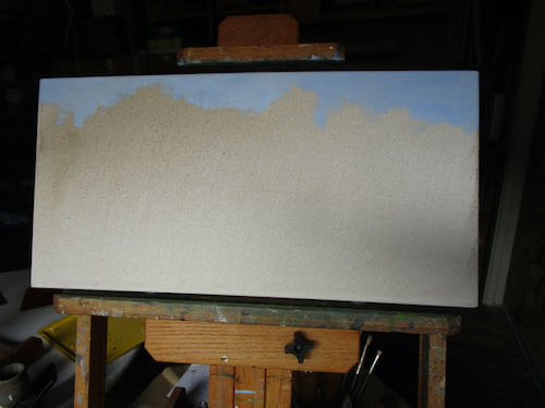
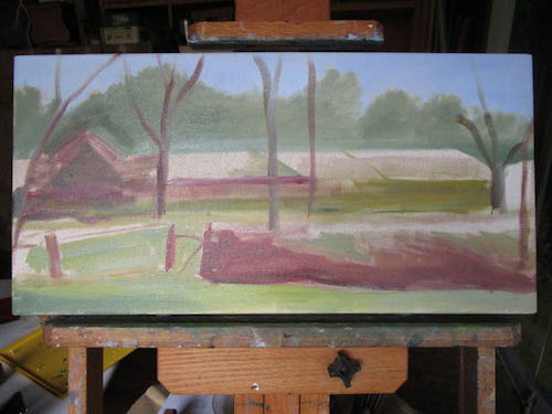
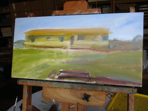
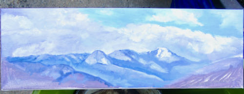
After getting the beginnings of both those oil paintings accomplished, I retreated to the studio for a bit of forward motion on the commissioned pencil drawing.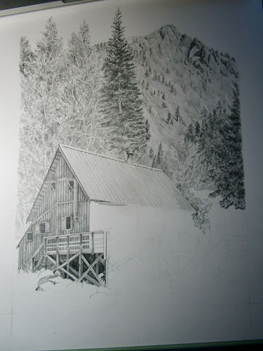
Inching forward. . .