Attending to Other Jobs

When I began these paintings, navels were still hanging on trees, and the blossoms began. Orange blossoms are my favorite scent. Suddenly, orange blossom season was almost over, and I hadn’t touched these 2 small paintings.


They are now available at the Mural Gallery in Exeter. 6×6″, $60; 4×6″, $50 (PLUS TAX, OF COURSE!) The Mural Gallery doesn’t have a website; it is at the park with Exeter’s first mural, next door to the Wildflower Cafe.

Speaking of Exeter’s first mural, here is the beginnings of a similar painting, another painting of my favorite subject.

This one will be fun. It is a commission, and I know I can do it because I painted the same scene a few years ago as a 16×20″. Or maybe 18×24″. I’ve slept since then (and painted many similar scenes).

P.S. The paintings are NOT scratch ‘n’ sniff.

Productive Painting Day

Look at all these canvases! It is time to figure out what to paint of Mineral King in order to have inventory to sell at Silver City Mountain Resort, more commonly known as the Silver City Store, informally called by locals, “The Store”.

First I randomly chose a variety of sizes. Seven canvases seemed like a good number to begin with, 6×6″ up to 6×18″, including 8×8″, 8×10″ and 10×10″.

Then I sorted through my photos and chose subjects that were familiar and added a few more scenes that I haven’t tried before. Some will need to be cropped or stretched or somehow manipulated to fit the chosen canvas shapes.

I put a little bit of another base coat to help me remember which scene goes on which canvas. 

But, there are other jobs to be attended to while these seven dry.

Mañana.

Those Flowers Smell Like Oil Paint

Those flowers smell like oil paint because that is what they are made out of. 

This is a fun project, unlike anything I have ever painted before. I have painted individual flowers on 6×6″ canvases, but never a 16×20″ bouquet, with all its tangled and overlapping pieces. I am also just making up the background, intending to adjust the darks and lights to best show off the flowers. (A 50th wedding anniversary bouquet, commissioned as a painting so it will last forever.)

Background first.

Find where the ribbons might be draping. Since there is red on the brush, work on the carnations.


Keep working on the carnations, fill in more greenery, dab a few more baby’s breath, add the white ribbons hanging from the white roses.

Better.

Now I can see that the bouquet is slightly weighted toward the left side.

I took out a leaf on the lower left, but I don’t think that was enough.

This is better. I erased more of the lower left leaves, added another leaf to the upper right (smallish, beneath the top rose and to the right), fixed some other weird leaves, and added a bit more curly willow to the upper right.

Everything will need another layer or two or even three.


Building a Bouquet With Oil Paint

Yesterday you were left with this cliff hanger:

Beginning the detail on the roses required some intense study, because my brain says, “White rose”, but my eyes say, “There are shadows which allow you to discern the individual petals—what colors are those shadows?” (Do your eyes talk to you?)

The main bouquet photo is on my laptop, so I am able to enlarge it hugely and study the photo.

The shadows are appearing to have a yellow base in this rose. 

How about this one?

Grayer than the other but still with cream undertones, so this also will have some yellow.

Time to start drawing with my paint brush.

The roses got difficult (everything is difficult – get used to it, Central California Artist), so I started experimenting with the carnations.

It was fun to jump around – a few carnations, a little more around the roses to make them pop out, some leaves, a touch of baby’s breath.

After waiting a couple of days for the white to be drier (white dries the slowest of all the paint colors), I could see that the upper rose was too large. Using a dark background color, I trimmed the upper rose to a better size.

You probably can’t even tell the difference. I can and it looks better. I don’t have to match the photo exactly (good thing—that just isn’t possible) but I do have to make this be the most believably beautiful bouquet ever.

Fifty Years

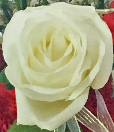
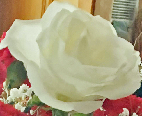
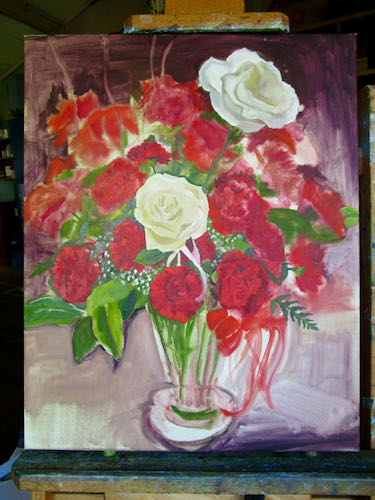
Mr. and Mrs. Customer had their fiftieth wedding anniversary. Mr. Customer sent Mrs. Customer a bouquet of 50 red carnations with 2 white roses. Mrs. Customer wanted it to last forever, so they asked me to paint it for them.

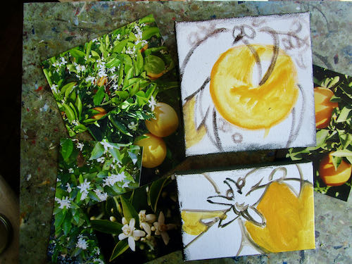
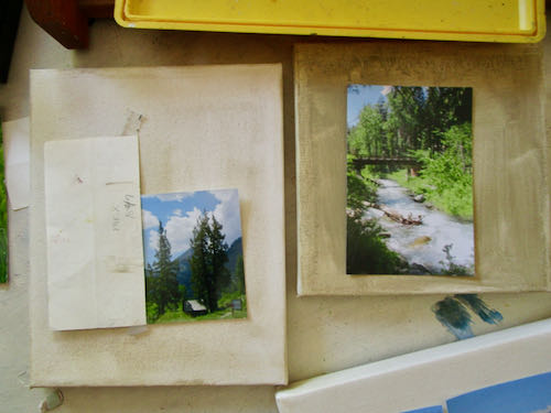
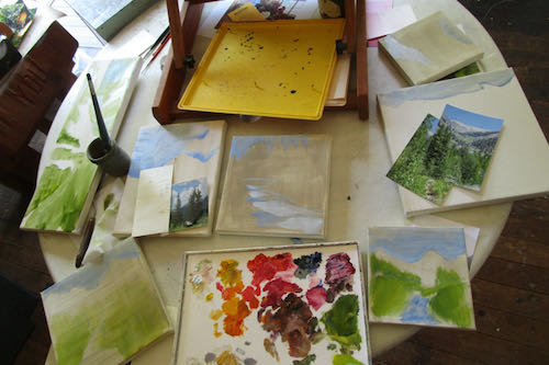
They emailed me photos, and then I experimented with various methods of cropping. 

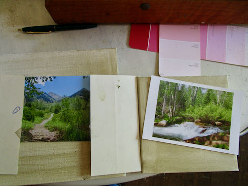
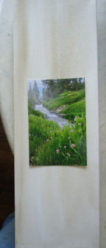
I realized that the color in the photos wasn’t telling the whole story so I asked if I could go photograph the flowers in person. I took along some paint samples in order to match the right reds, my camera for a few close-ups (although the roses were drooping), and my computer so they could see the ways I had cropped. I also asked questions to learn what parts were important to them: the background realistic like their home interior or just whatever shows off the flowers? the vase? the coaster the vase is sitting on? as many flowers as I can cram into the painting?

This is going to be complicated and slow, because I will be working from multiple photos. I don’t want it to look like just any bouquet of flowers—it needs to be as special as these people. So, it will take time and thought, enormous detail, and a willingness to make adjustments that enhance the painting rather than slavishly copying a photo.

Enough jibber-jabber.

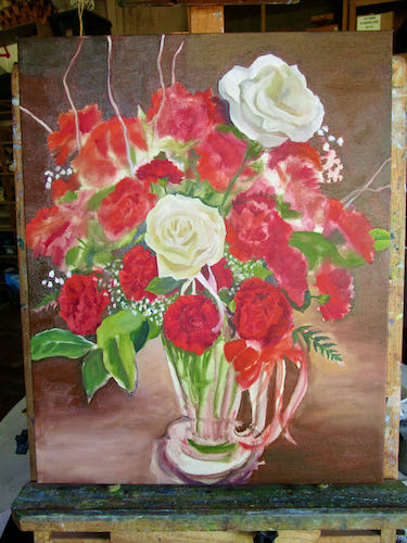
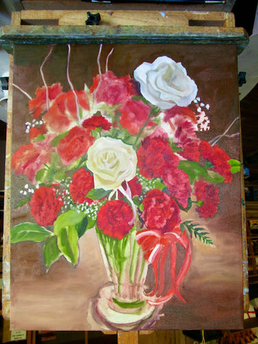
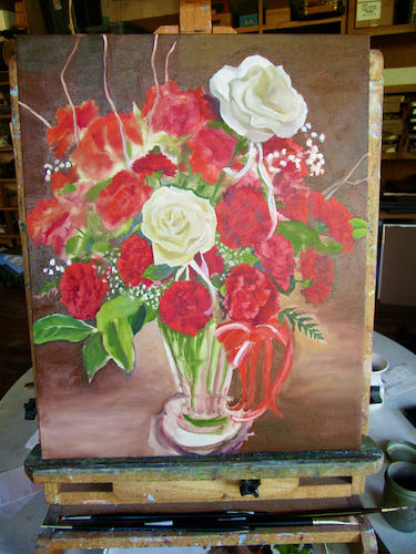
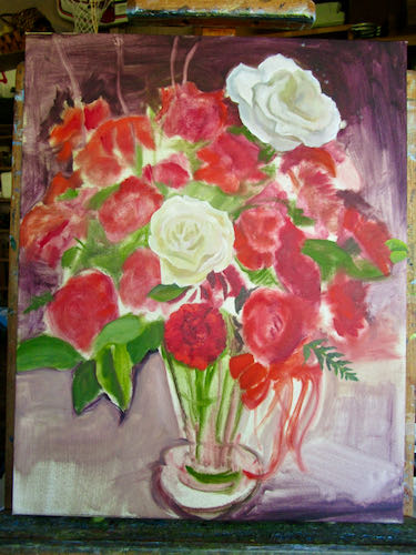
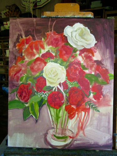
Start upside down. Make some blobs, get them to roughly correspond to the arrangement in the photos because a professional flower arranger knew what she was doing (and I don’t).

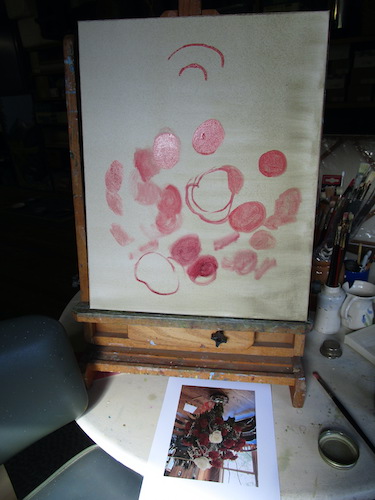
Right side up, add some background, resize things to better fill the canvas, correct the vase shape, include the ribbon.

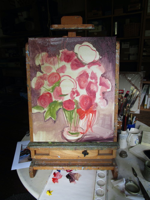
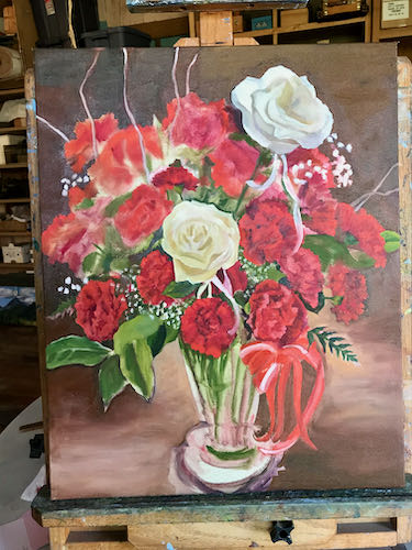
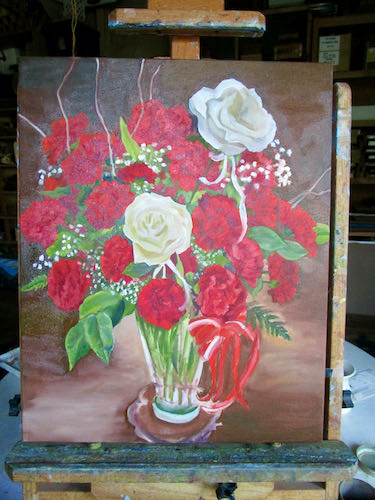
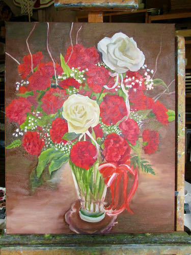
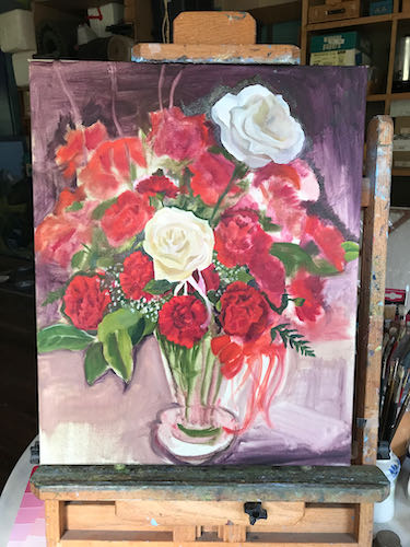
Lift out places for curly willow, begin shaping the outer edges, cover the surface, start indicating some darks and lights within the carnations.

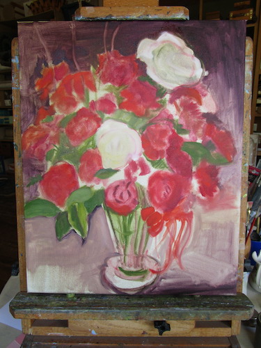
This is a little bit too hard for me, but not as hard as drawing a 1-3/4″ face from a little photo. I had to take a break and go pull some weeds.

Mr. Customer said they’d like it sometime before their second fiftieth. I can accommodate that request.

A Few More Orange Groves in Paint

Here is the rest of your tour through Tulare County’s finest scenery, as interpreted in oil paint.

This was a commission, the very first time I painted a citrus grove with hills in the background.

In the Orchard (sold)

Tulare County’s Best (24×24″, available, $1000)

This was a thank you gift so it didn’t need a name.

Citrus Sunset (sold)


This was a commission.

Another commission.


And the latest with the appropriate title of “Citrus and the Sierra”.

Citrus and the Sierra, 10×20″, oil on wrapped canvas, $350 (plus tax if you live in California)

P.S. I thought this piece was spoken for, but I didn’t put the size on it and the intended customer’s intended wall is not wide enough.


Orange Groves in Oil Paint

These are several oil paintings of my current favorite subject: orange groves with foothills and mountains in the background. Looking at these (and showing them off) helps me regain my confidence as an artist after the tiny face show-down.

Citrus Cove (sold)

Looking East (sold)

Lemon Cove (sold)

Picking Time (10×10″, available, $150)

In the Orchard (sold)

If you have a hankering for a painting of this type of scene, I am available for commissions. Just tell me the size, which mountains you want visible in the background, and anything else you’d like in the painting. Then, I will put your project in the queue.

There. Seeing all those “sold” signs, and knowing there is a queue all helped repair the ding to my confidence after the face trouble.


Name That Painting

My current favorite subject for painting is classic Tulare County—citrus and mountains, two things I consider to be the best parts of living here.

Today I am asking for a little help. My most current painting is nameless, and I am out of ideas.

Would you like to name this painting for me?

Thanks! (You know it looks better in person, don’t you?)

Here are some ideas that were submitted in response to my emailed newsletter:

Here and There

The Elephant and the Orange

Beyond the Trees

Foothill Bounty

Sierra Oranges

Orange View

Oh Beautiful!

Before 50/50 bars

California’s Peaks and Navels

Spruce Road, East

On a Clear Day

Citrus and the Sierra 

Classic Tulare County

The Best of California

Last minute update: the painting was spoken for, the buyer chose the name, and then she measured her wall. Oops. It won’t fit. It is my fault for not publishing the size, 10×20″. It is now available, $375 (this includes sales tax if you live in California or shipping if you don’t), here on my website, or in all the usual ways such as seeing me in person, calling, emailing, etc.


An Orange Grove in Oil Paint

Poppies and oranges and orange groves and poppy fields: that’s what I paint in the winter and spring. (Unless I am painting Sawtooth).

Remember this? It was on the easel until the poppies started selling like hotcakes.

I finished 6 new small oil paintings of poppies, and was so pleased to have paint in the right colors left on the palette to finish this painting.

It is signed, but you can’t really tell in the last photo. After it dries, I will photograph it in good light for you (and my website and portfolio and records, etc.)

This type of painting really says Tulare County to me. Now it needs a title.