How Do You Handle Customer Requests?

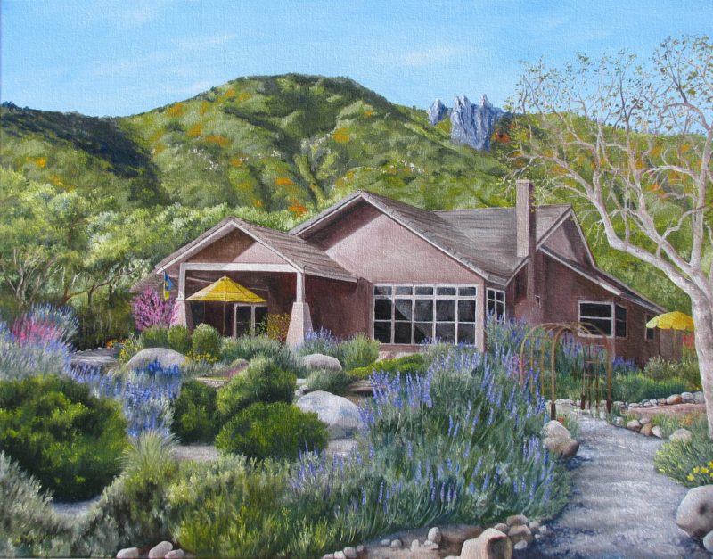
A commissioned oil painting in which the customer gave me much free rein along with many requests, all good suggestions.

“Just curious–do you get annoyed, or do you appreciate it when someone makes a change/suggestion to an already completed painting?”

A friend and my most regular commenter asked me the question above.

Here is my reply:

“I am happy to do whatever the customer requests, as long as I have the ability and it doesn’t mess with the scene’s believability.”

She responded:

“That’s very kind (and flexible) of you. I can only speak for the audio arts, but I have seen situations where we took an arrangement and made a few cuts and lyric changes, and the arranger became incensed that we DARE change his precious arrangement.
I like your policy better!”

And I replied:

“I am very practical about the need for flexibility if I want to stay in business. I am here to serve the customer, not to serve my own art. If I was a hobbyist instead of a professional, I would probably have a different view. And I do put my foot down when it comes to logo design, because Design-By-Committee is how we got a camel when we needed a horse.”
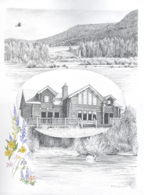
A pencil commission from customer-supplied photos, with some free rein and lots of suggestions and requests, all good and manageable.

Here’s my guess about the difference between my approach and what my friend/commenter experienced:  I, the original artist, get to make the changes; my friend’s experience was that her music department was making changes on someone else’s piece. 

I recently heard an interview with an artist who said she likes commissions because she can charge more for them. Really? Should I be doing that?

Better commission me soon before I decide to raise my prices.
Another Think

Ever heard the saying, “He has another thing coming”? The correct version of this is actually, “. . .another THINK coming”. Really. I’m not making this up.

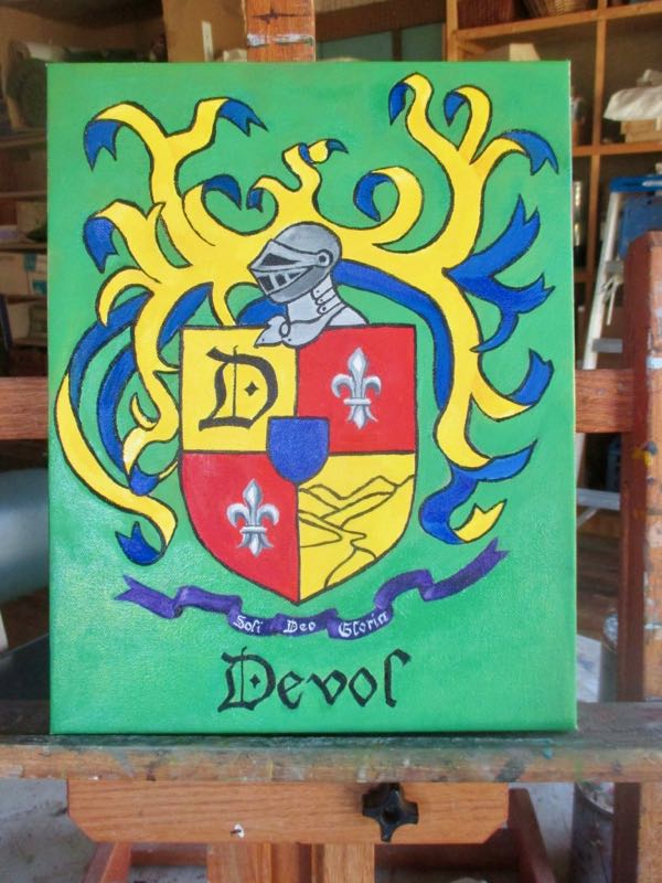
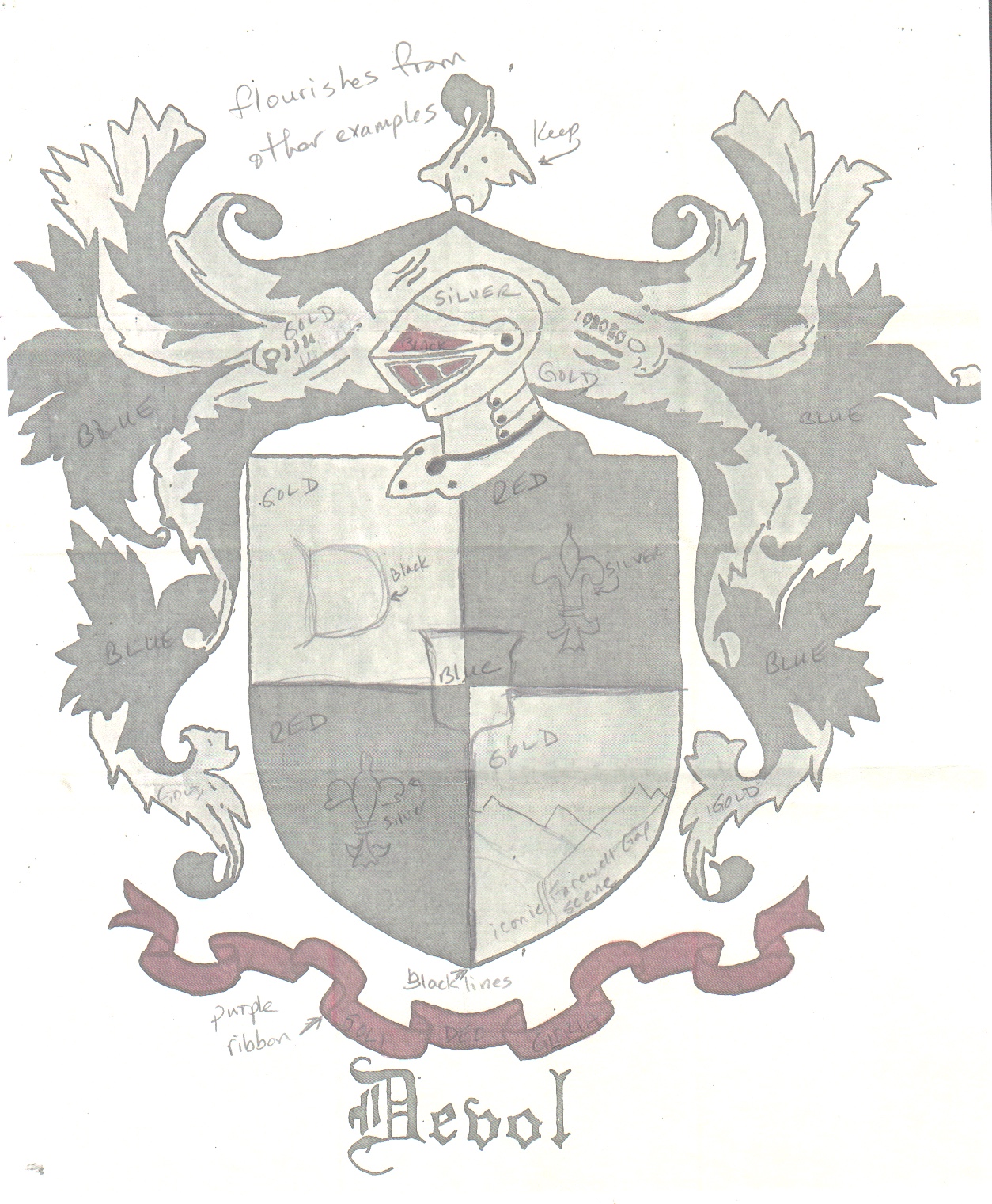
As I was working with my Friend/Customer on her coat of arms, we designed it together. I took the approach of “The Customer is Always Right”, and didn’t look at it critically through my own lens of opinion. 

There’s nothing wrong with that in commission work.

Or is there?

My Friend/Customer wasn’t as happy with the results as we had hoped. I showed her every step of the process, both the designing and the painting. We discussed shapes and colors and placements and sizes, but something didn’t mesh for her after she received the painting.

This troubles me, not in the sense of being annoyed with her, but in wondering where I went astray in the process. My job is to help the customer know and get what she wants, and I failed.

My conclusion is that if a customer thinks she knows her mind, don’t leave her out there in Design Land alone. Be critical (as in helpful and discerning), make suggestions, and help her see the best possibilities instead of letting her drive the process alone.

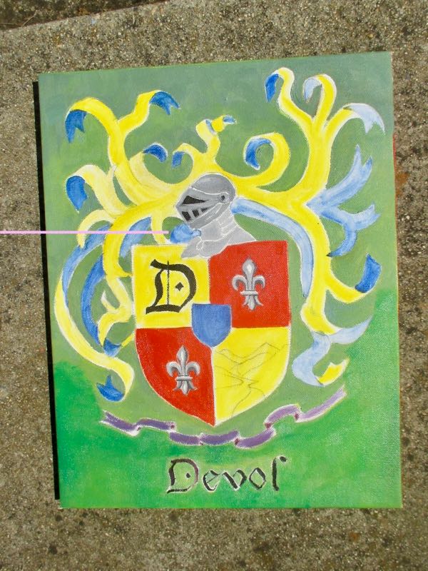
We are now rethinking the design. Here are the original, the painted version, and a sloppy photoshop revision. 

The shield is ever so slightly larger, some ribbons are narrower, and some ribbons are now gone.

She is a good friend, we communicate often, and together we will solve this!


Summer Sales Ahead

That’s an optimistic title, wouldn’t you say?

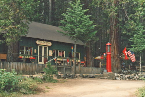
Back when it was a simple mountain market called “The Silver City Store”. (photo 1985)

The store at the Silver City Resort below Mineral King has a projected opening date of June 5. (I still call the whole place the Silver City Store although it has become an almost swanky resort instead of a little mountain  store.)

My oil paintings sell very well there each summer. I have high hopes for this year in spite of the Shut Down. 

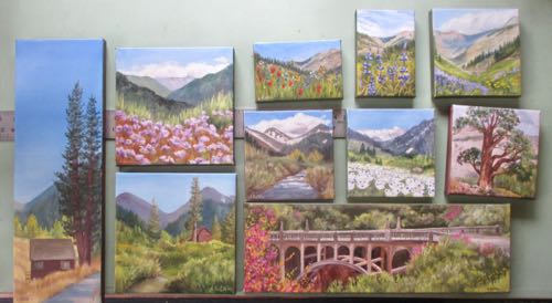
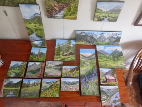
When the manager said they were ready for my paintings, I spread them all out, and then made decisions. Eventually I hope all will make it up the hill, but we only show about 10 at a time.

These went up the hill in round one.
These stayed back until some of the earlier pieces have sold.

It is always a guess – how many of which subjects and which sizes?

Every year I think I have it figured out, and often end up cranking out paintings mid summer because something popular has sold out in a certain size. This year’s paintings are heavy in wildflowers. 

This summer is full of more unknowns than usual. As always, more will be revealed in the fullness of time. 


Two Job Conclusions

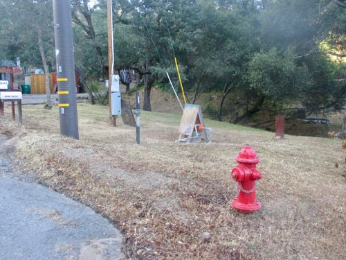
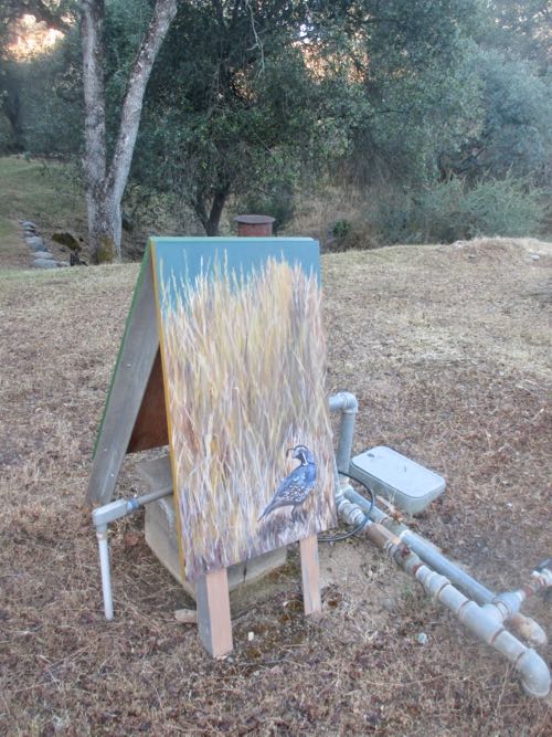
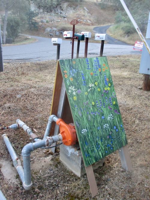
Thing One: the A-frame is now in place. I stopped driving by the pump like some weird stalker, and just waited. Eventually, a neighbor left a nice message on the phone saying how good the sign looked, and was it my work?

So, I walked that direction the next morning.

Hey! What’s that??

The dry season is to the front.

Spring is to the rear. I wonder, will it get rotated next year?The A-frame is in place.
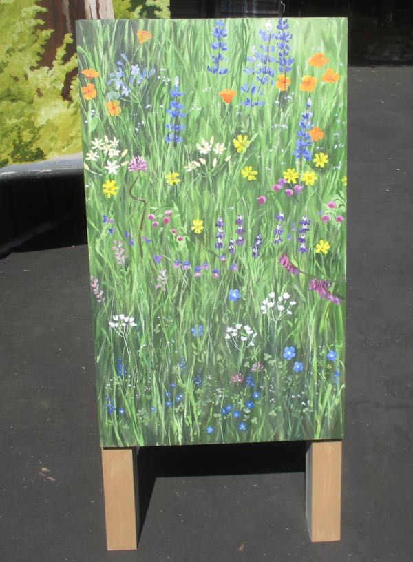
Thing Two: I mailed the Coat of Arms on a Monday and was told the expected arrival was Thursday. It was received on Tuesday!

Now what’s next??

Kaweah Lake Paintings, Part 2

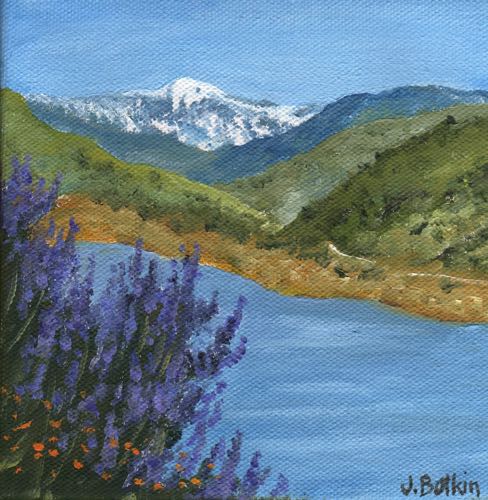
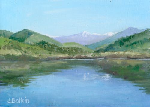
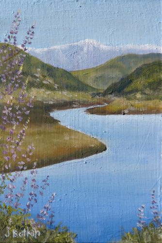
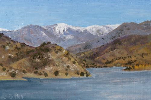
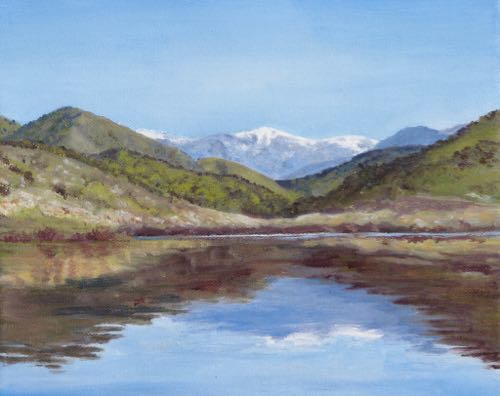
These are more recent paintings of The Lake, also known as Lake Kaweah, and Kaweah Lake. In addition to not remembering the correct way to state the name, I often wonder if it is in Lemon Cove or Three Rivers. 

Life is full of unanswered questions.

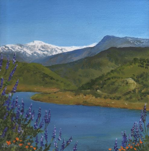
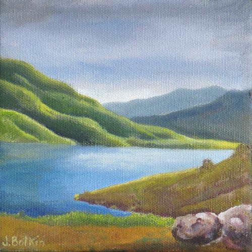
This painting of Kaweah Lake was done in 2014, probably on a 6×6″ canvas.
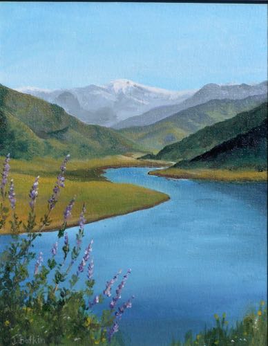
Painted in 2015
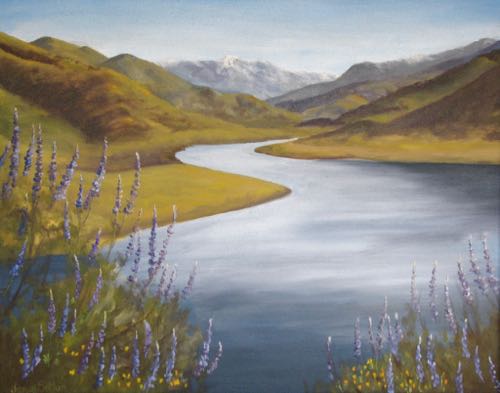
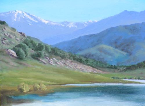
Painted in an unknown year.
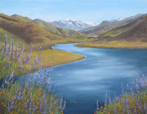
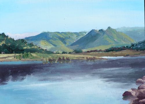
Same painting, repainted in another unknown year as my skill grew. 

I also painted the lake other ways.

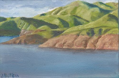
The Lake, oil on wrapped canvas, 4×6″, $50


This was painted in my phase of making colors brighter than they appear in real life.

That concludes our tour through paintings of Kaweah Lake. Tomorrow we’ll move on to other topics.

Kaweah Lake

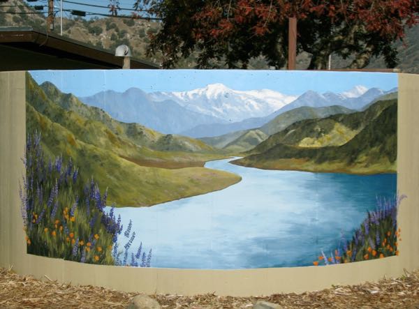
As I refreshed the mural at the Tulare County South Fork fire station #14 in Three Rivers (sorry for all the words – it helps Uncle Google find my posts), I thought of all the times I have painted Kaweah Lake. This subject isn’t as popular as Mineral King, of course, but very little is that popular.

These are the first ones I painted of the lake, back in 2007 when I had only been oil painting about a year. I didn’t have a good inventory system set up yet, so I don’t know the sizes. I think they were either 4×6″ or 5×7″. Who bought them? I don’t know that either. If you own one of these, THANK YOU!

These were painted a bit later, maybe in 2009. I still didn’t record the sizes and didn’t yet have a scanner or Photoshop Junior. This is the same year that I first painted the water tank at the Tulare County South Fork fire station.

2009, when the mural was new, after I practiced the subject at least 8 times on canvases and boards.

We’ll continue our tour of Kaweah Lake on Tuesday.

Finished and Finished

The green looks a bit uneven because it is wet. Those tiny white letters were challenging, nay, CHALLENGING!

The two sided A-frame mural (sign? what is this thing?) needed a few touch-ups.


In case you are wondering, yes, I can name all the flowers. They are all foothill flowers, not in my wildflower book Wildflowers of Mineral King: Common Names.
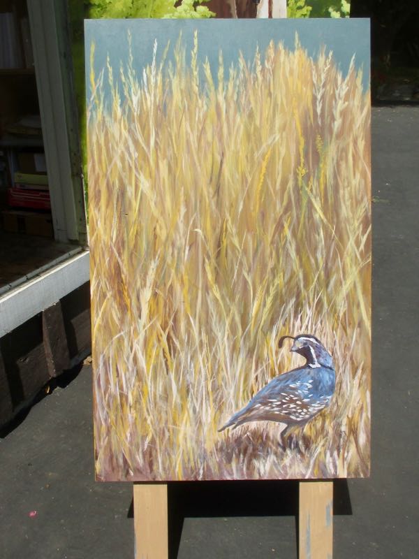
 

Other than getting the quail as close to reality as possible, this side was just lots of scribbling in brownish yellows and yellowish browns. 
Now what am I going to work on??

Odd Job, Day 5

Back to the coat of arms painting, an odd job of an oil painting commission.

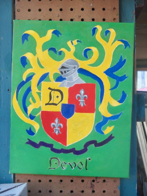
I mixed and applied the correct green, along with a strong purple for the bottom ribbon. (It will need some detailing).

Then I mixed and applied a more golden yellow and a stronger blue.

The edges are a little weak, but the entire piece will get black outlines. This is a simple painting, but there is very little forgiveness with strong colors each abutting other strong clean colors. It requires a lot of drying time in between layers.

Odd Job, Day 4

Yesterday I showed you the not-so-good green on the background of the odd job, a Coat of Arms for my customer/friend. (Remember, “odd” means “unusual” – I am NOT insulting my friend or her job here!)

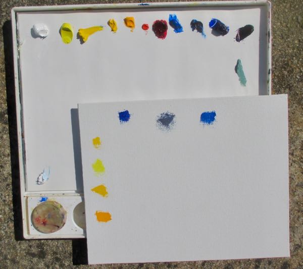
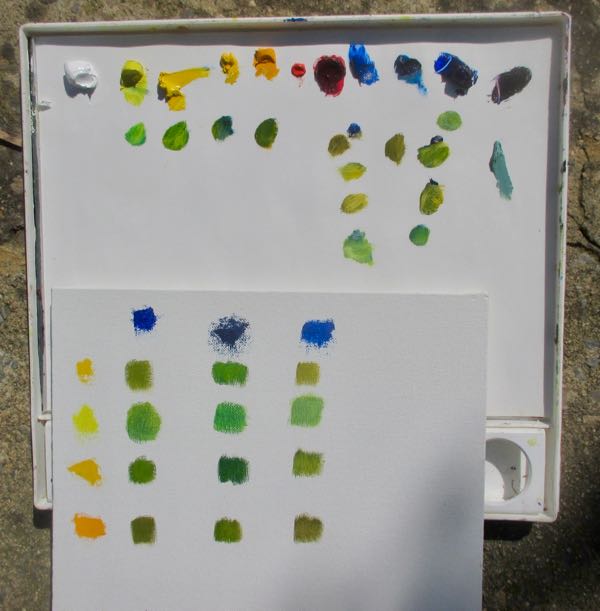
Since beginning to oil paint, I have met up with two new yellows and one new blue. It is time to get a grasp on how they all interact to make greens.

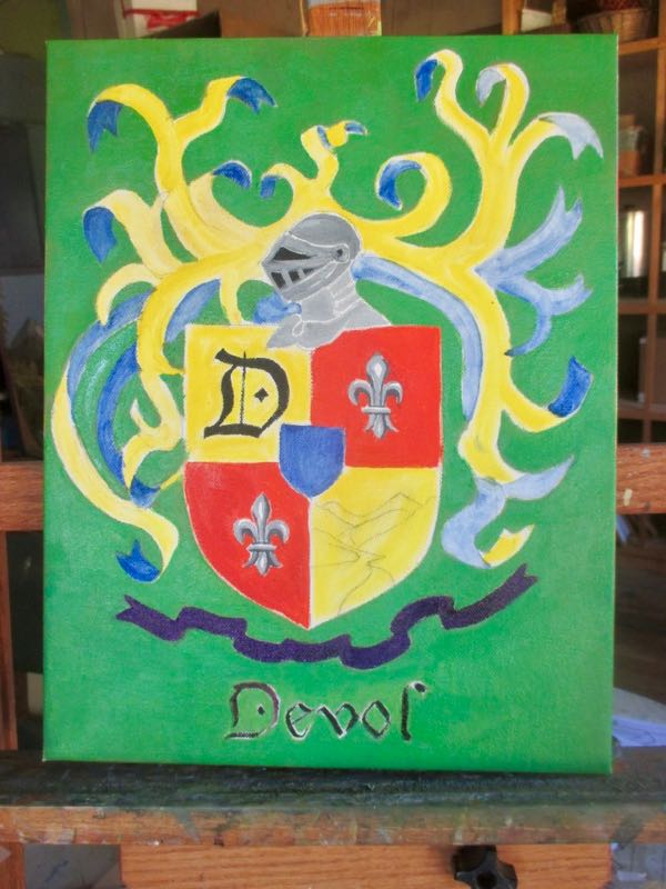
My friend said, and I agree, “More Kelly than lime”. Photoshop Junior used Kelly green, but I wasn’t very careful with mixing in the first pass over the canvas.
Clearly we need the second green down in the middle row.

Better, but too wet to continue. 

Tomorrow is the end of the month listicle. 

This coat of arms will have to wait. Another odd job awaits! (How’s that for an exciting cliff-hanger?)

Odd Job, Day 2

After my customer sent me a chart of colors to include, it was time to try it with Photoshop Junior to see how it would look. Looking at her list of colors within the Coat of Arms, I saw that green was missing, so that became the background. 

This is actually the 2nd or 3rd iteration from many conversations and adjustments as we worked out the design together.

The pointy-pokey waving arms didn’t please her, so she sent many other design to consider. I developed a more ribbon-like look on the left side.

The symbolic Farewell Gap needed simplification too.

We had a few more discussions about black outlines, smoothing out some of the bends in the purple ribbon.


Everything is now ironed out, so it time to move to canvas. 

Tomorrow. . . 

P.S. I am guest posting once a week on the Mineral King Preservation Society website, under the topic of “An Artist’s Inspiration”. The first post went live yesterday. www.mineralking.org