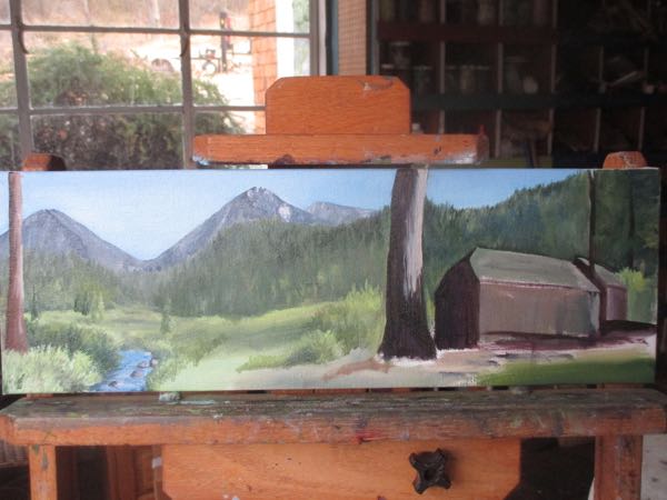
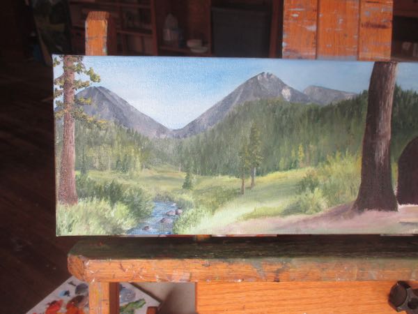
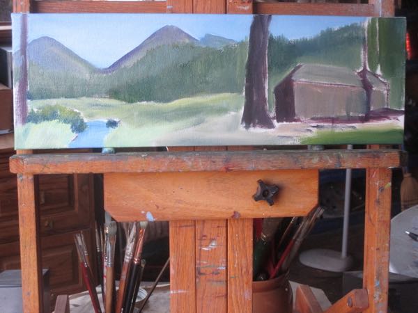
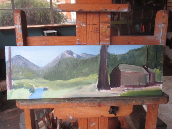
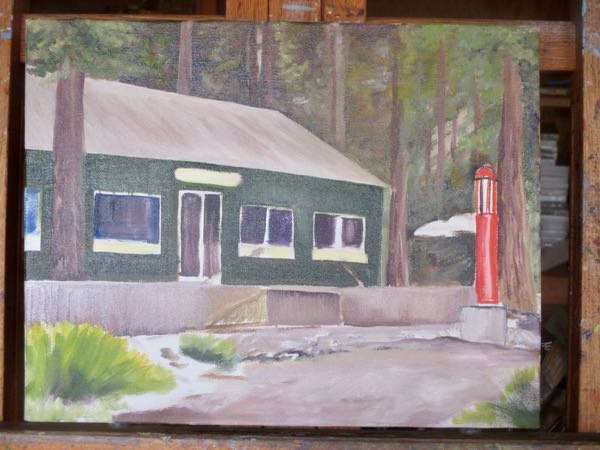
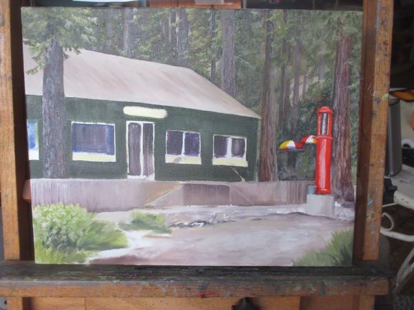
We last saw the cabin scene oil painting when I was confused about the conflicting light sources:
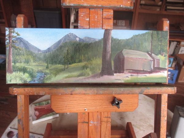
With each successive layer, cohesion and coherence gets restored. (Aren’t big words great?)
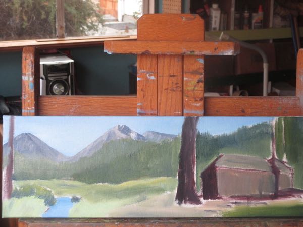
I’m still missing the details needed to confidently paint this side of the cabin. My photo is outdated, and I have word out to some people who might have the necessary visual information.
It is rather astonishing and somewhat disappointing to me that I don’t have the details of every cabin memorized. One would think as an artist. . . but one would be wrong.
I just bumble along like the rest of the world. So, enjoy a closer look at the left side of the painting. It might be finished, sort of, maybe, but then again, I might want to continue adding details.
That’s what pencil artists do with enough time when handed oil paints and tiny brushes.
Making a cabin scene is different from just making a scene.
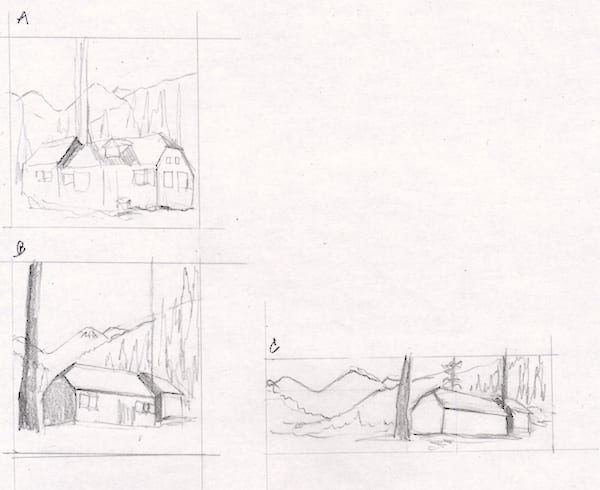
A cabin owner requested a painting of her cabin as a gift for her husband. (He only looks at the blog when it is about Mineral King AND she forwards the link to him, so I’m not ruining any surprises here.) She wants it to include a view that normally doesn’t show with the cabin, and requested a square format.
Because this is a little difficult, all this mind-reading, designing, and putting together things that aren’t normally together, I didn’t make a scene but began with sketches.
If you recognize this cabin, SHHHHH, IT IS A SURPRISE!!
She asked for square, so I showed her two squares plus a 6×18″ and this cabin painting; she agreed with me about this size and shape working well for her idea.
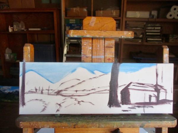
I thought I was out of this size of canvas, so I ordered some more. After they arrived and I was putting them away, I saw that I already had some that size. Someone around here could use an assistant, or perhaps a better administrator. Oh well. . . they won’t go to waste.
Will this fit?Yeppers, it fits, so get some paint on this canvas!
They all start ugly. No need to be afraid for me or the painting or the customer or the husband. No one will need to make a scene. (But wait! Is this creative??)
Starting with what I know, I put paint on Farewell Gap in the distance.The trees are next. They are just a mass of greens with some variation in the values (ArtSpeak for lights and darks).
A risk of this sort of photo-combining is that the 2 photos might have the light coming from 2 different sources. Would the customer or the viewer notice? I might be able to cheat, but it might bug me forever. So I began reworking the color on the mountains, because it is easier than figuring out how the cabin shadows could be reversed. I pushed more paint around until my fingers got cold and my efforts felt ineffective. This is far enough for now.
Realizing the problem of conflicting light sources almost caused me to make a scene, but that would have only served to upset Tucker and Scout.
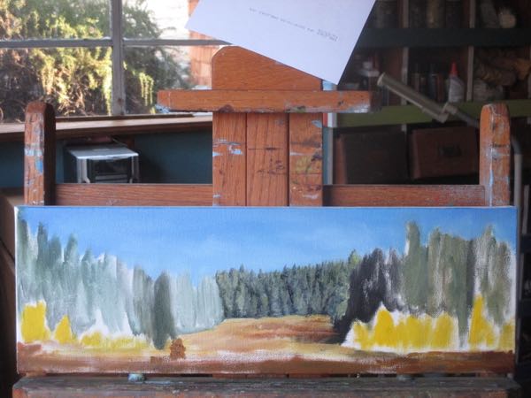
One layer at a time, with oil paint on canvas, a 6×18″ canvas to be specific. Canvases this size and shape have become popular; they seem to fit well into odd spaces for people. I can accommodate this.
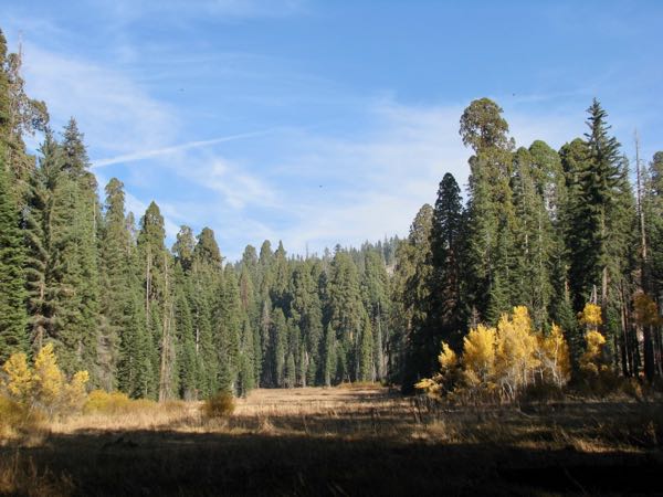
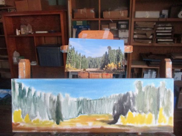
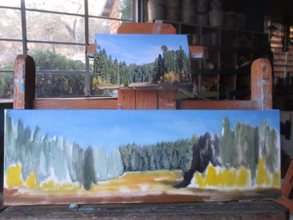
This is how Crescent Meadow in Sequoia National Park looked about 2 weeks ago.
Crescent Meadow
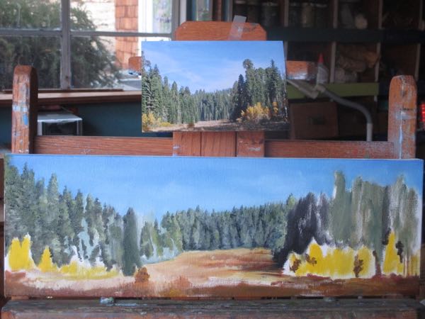
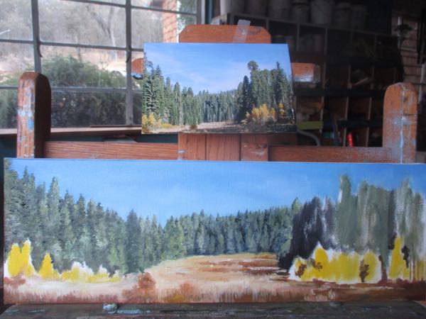
The proportions are different in this photo than on a 6×18″ canvas. Can I squish this into a horizontal format? Can I stretch it out and remain believable? Sure. This is a forgiving subject, not an architectural exactitude where I have to artificially elongate things, maybe shorten the height and add a few windows. That would be neither forgiving nor believable.
This messy and sort of ugly beginning lets me know this will work.Tucker doesn’t care, because there is something much more intriguing up the hill.All this discussion about proportion, believability and elongating has put Scout to sleep.Better sky (it is the farthest element), next grayish green on the trees that are farthest away.Those distant grasses come next.More trees, both near and far. Closer trees on the left.Closer trees on the right, bright yellow ones last.
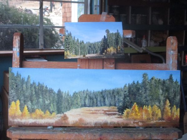
After this is dry, I will look at it with more critical eyes, add a few more details, decide if the colors are really correct, and then sign it.
And honestly, Dear Readers, my paintings look a ton better in person.
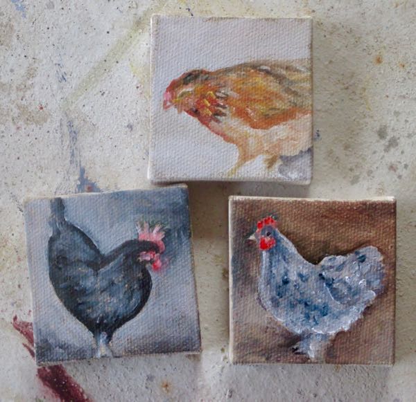
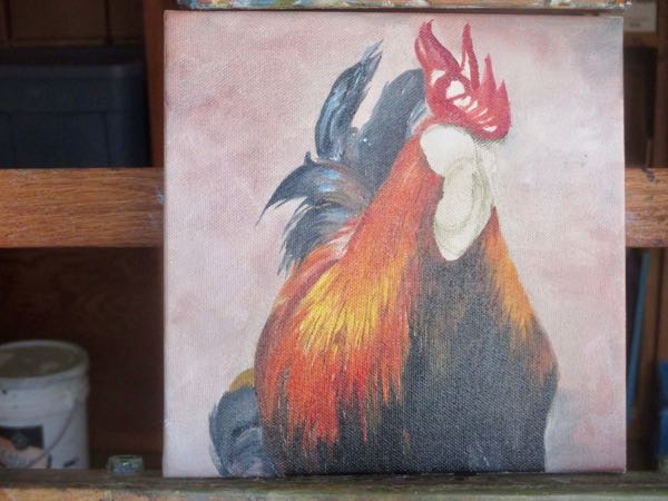
I’m never quite sure what to do with these 2×2″ canvases. I thought I was ordering 6 but ordered 60 by accident. (This was quite a few years ago.) They are difficult to paint, and it doesn’t seem right to ask more than $20 apiece. Each canvas with an easel cost me about $3, and each one takes about 2 hours to complete. I probably could find a better paying job than this, but I’d have to put on real shoes and leave the house.
This was the first pass over the canvas. I wasn’t sure whether or not they were worth finishing, and I couldn’t find anyone to tell me the answer to this. Sometimes it might be nice to have a job with a boss to tell me what to do because then stupid decisions wouldn’t be my fault.
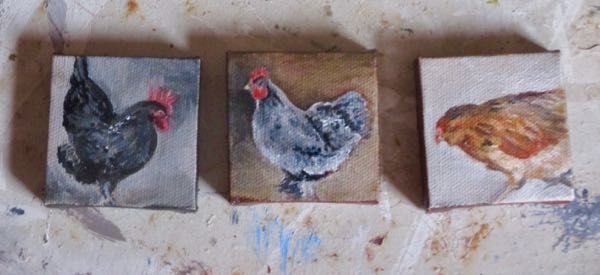
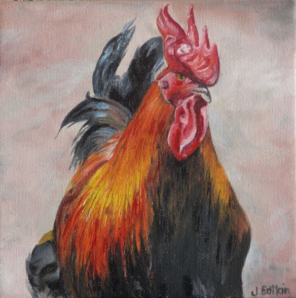
Now they are finished, except for signing. That is its own challenge on a canvas too small for a signature. (I sign the edges, and they have to dry first.)
Only the chicken in the middle remains at the time of this post – the other two have sold.
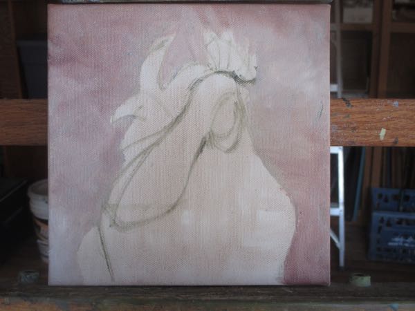
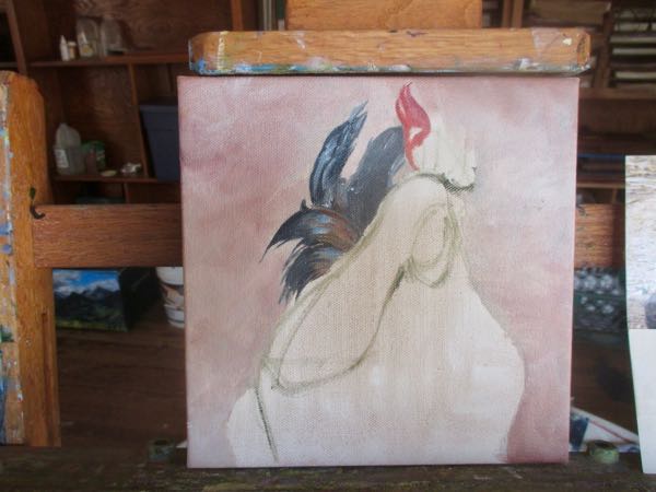
What is this unit?Maybe you can tell here.I bet you’ve figured it out by now.
I completed the first pass, waited a few days, and then revisited the painting with my tiniest brushes and strong magnifying glasses (the ones that melted a big divot in my stereo), There is never too much detail in my estimation.
Original oil painting, cleverly titled “Rooster”, 8×8″ on wrapped canvas, $100
Remember to contact me if you bought a 2019 calendar in person – if you bought it through the website, I have your info already.
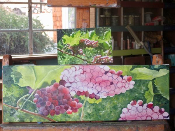
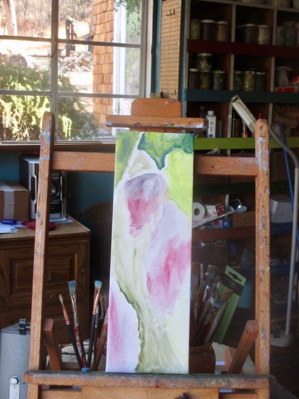
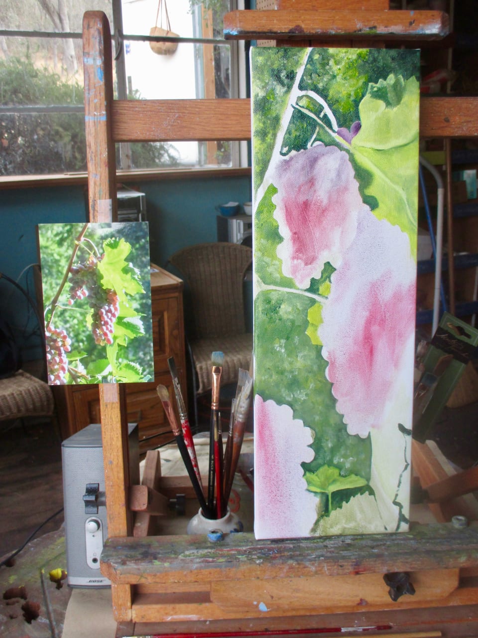
Is watching grapes get painted about the same as watching paint dry on a fence?
Don’t answer that!
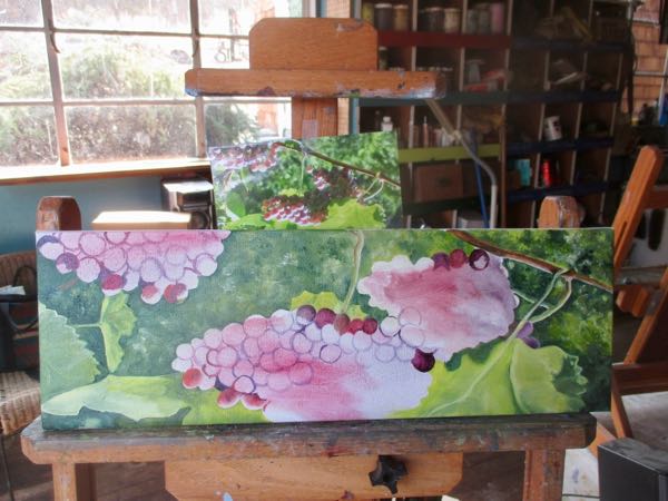
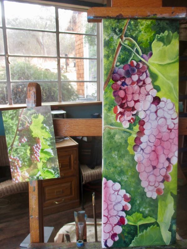
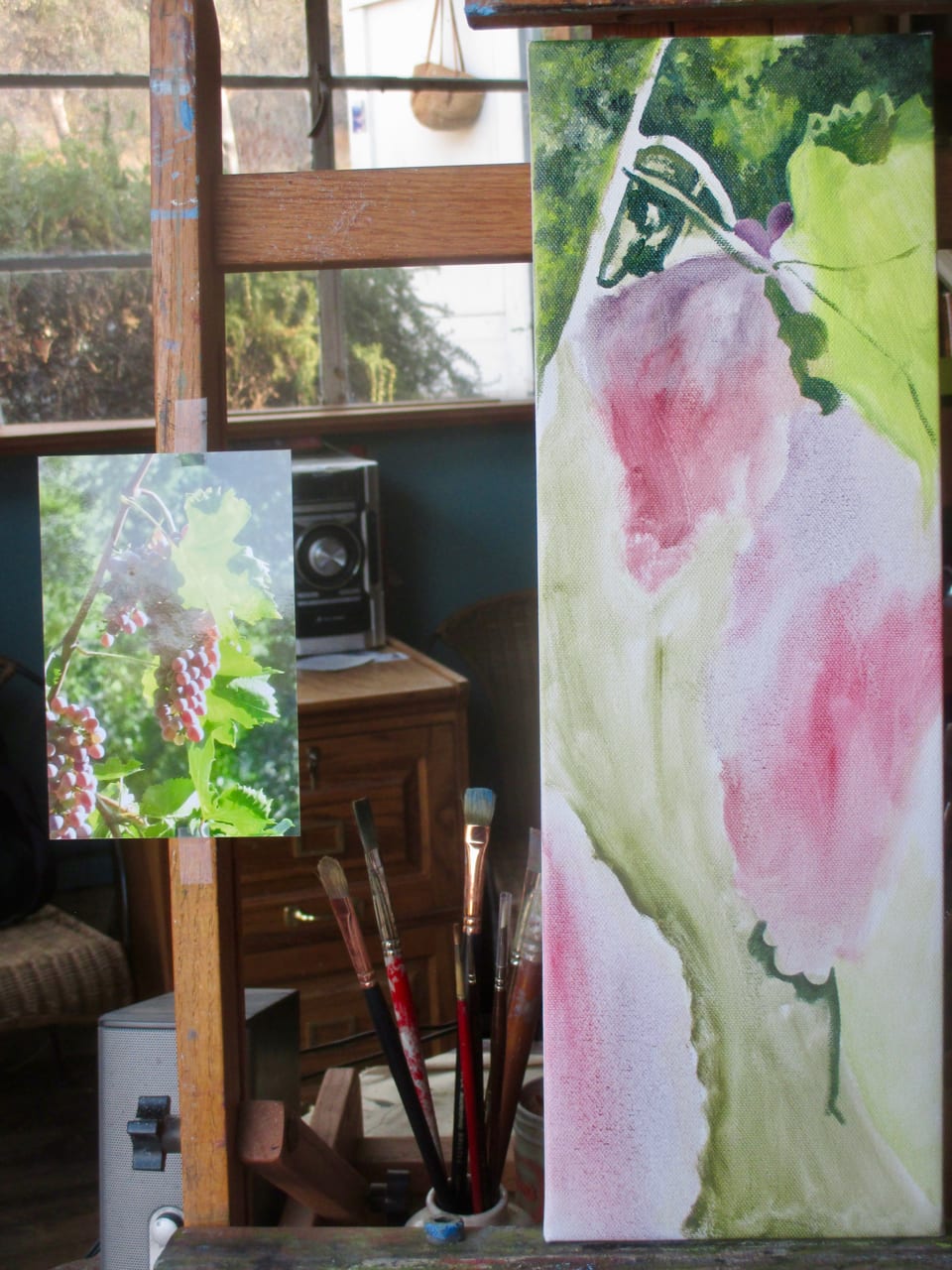
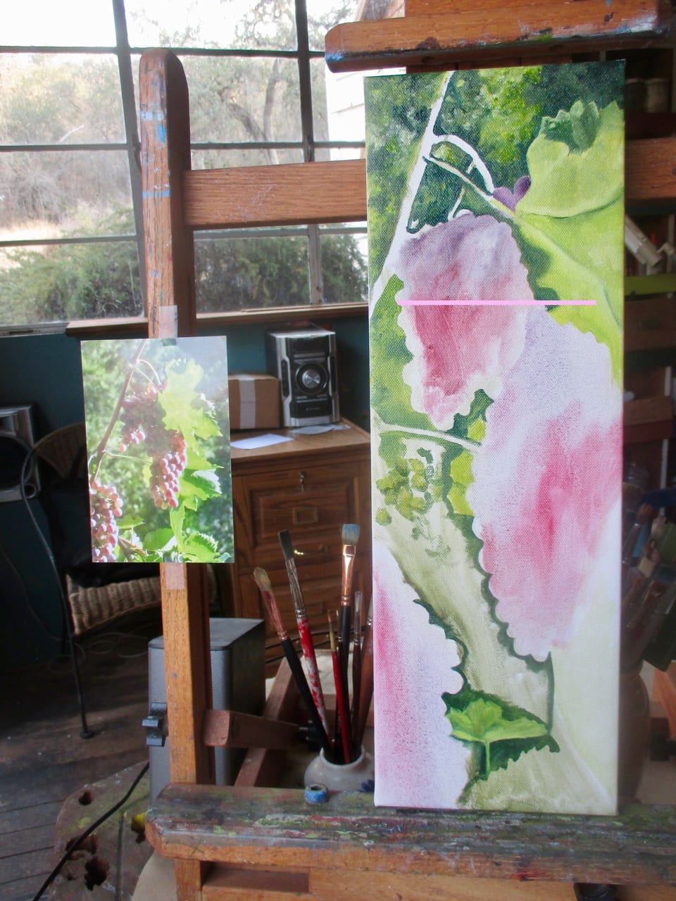
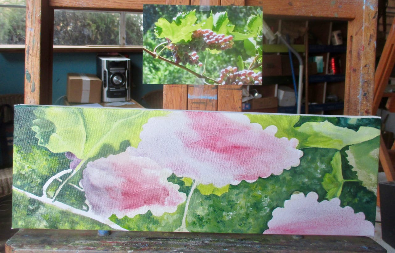
Outlining the grapes first seemed like the right approach.I wanted to start filling them in before the outlines were finished, but restrained myself.Sometimes it is easier to support my hand in a different position. Besides, to draw a circle, it is best to be on the inside of the circle.I filled them in from top to bottom, and for the most part, I just ignored the photo. And grapes come in all sorts of shades of purple, violet, red-violet, greenish purple (gurple), so no matter what I do within those boundaries, it will be believable.And kept rotating the canvas as I went.
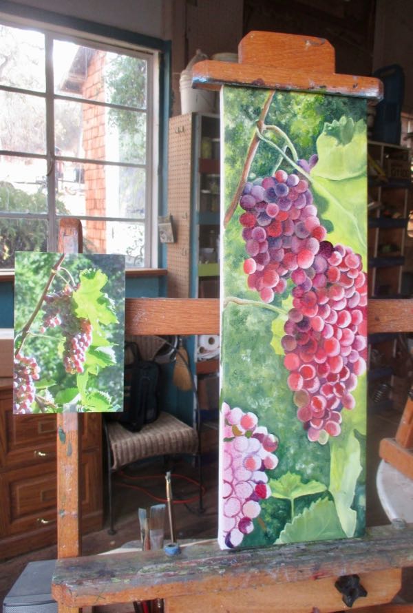
When this is dryer, I will add brighter sunshine on the edges of some of the grapes. That contrast is what made me go for my camera when I saw these grapes.
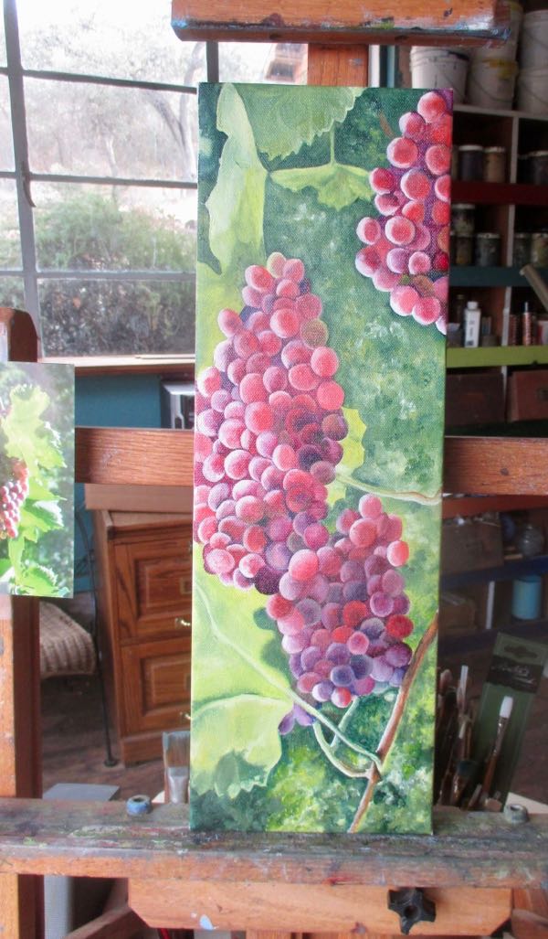
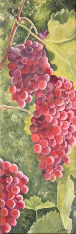
And now it is dryer, and I am finished! Looks better right side up, yes?
Remember to contact me if you bought a 2019 calendar in person – if you bought it through the website, I have your info already.
A dear friend bought some little fruit paintings for her dining room a couple of years ago.
She decided that another painting would look good on the other side of the window. I agreed.
We discussed the options, and she thought grapes would be good there. I told her that grapes are crazy hard, so we discussed another option, maybe a collage, but the design process made grapes sound pretty good. She and I have been friends since about 5th grade, and I am willing to do crazy hard for her. Crazy hard in painting beats crazy hard in design right now. . . don’t know why, but that’s the way it is.
The pink line is just a weird thing that my computer does some times – it is not part of the painting.
Remember to contact me if you bought a 2019 calendar in person – if you bought it through the website, I have your info already.
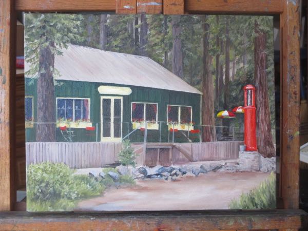
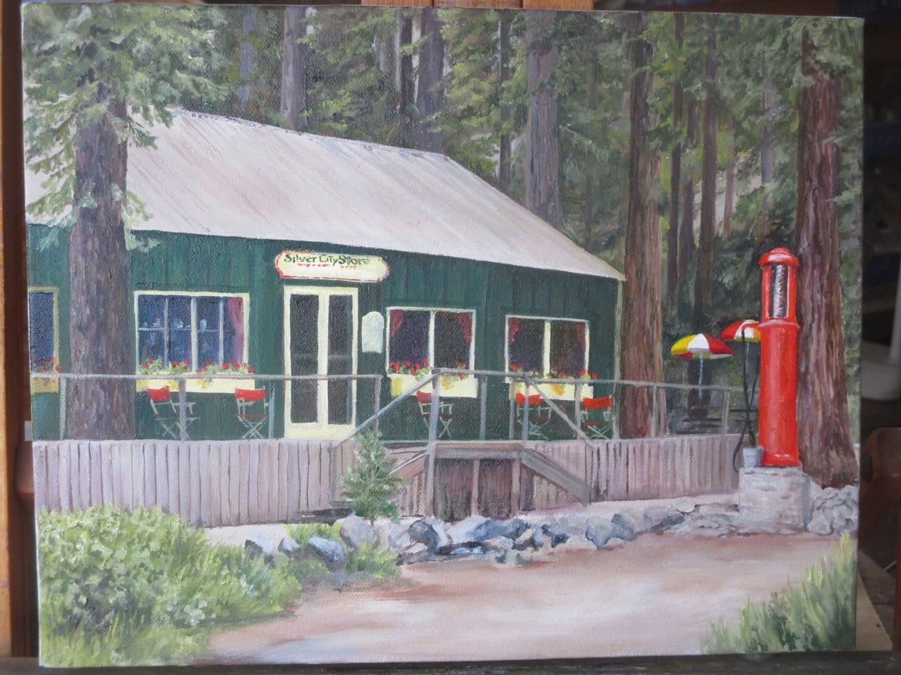
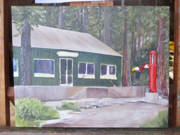
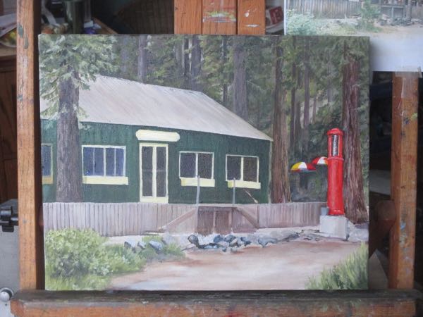
Until I began this painting, I never noticed that the sign above the door is not centered.
Now there are chairs on the porch and geraniums in the window boxes.
And now, it is finished! Next, I’ll sign it, paint the edges, wait for it to dry, scan or photograph it, varnish it, wait for it to dry again, and then mail it.
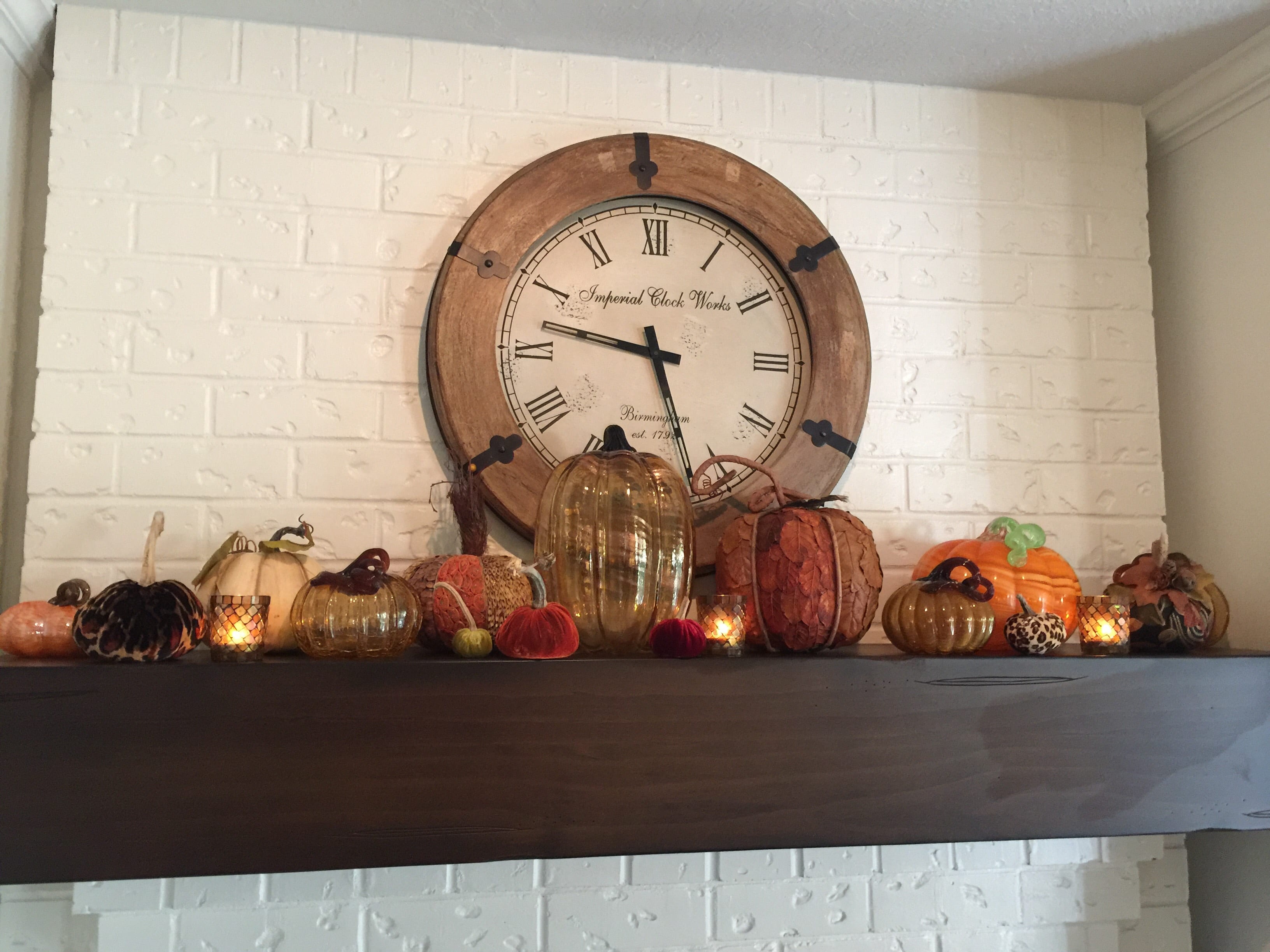
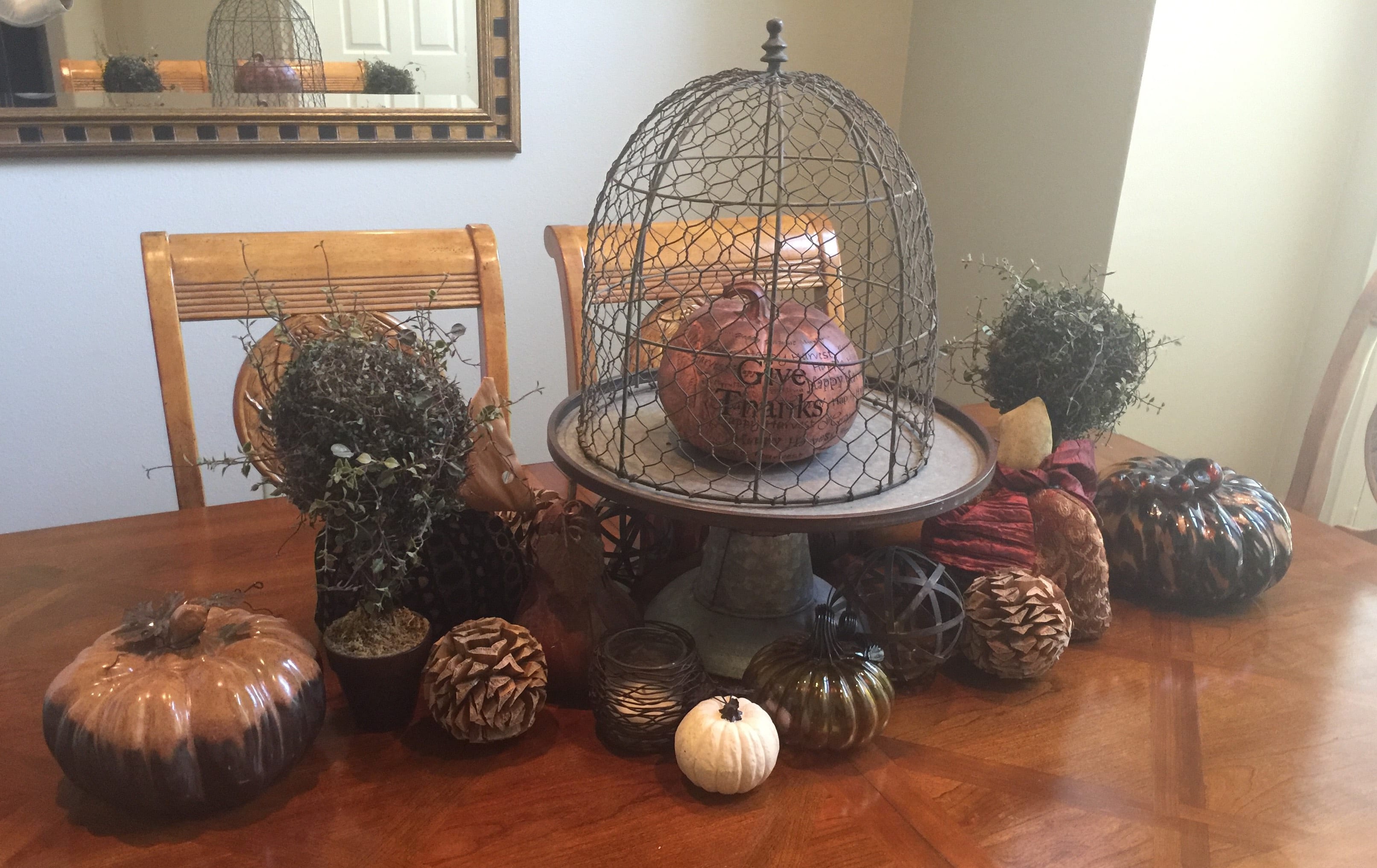
This the season of pumpkin spice everything. This blog post is pumpkin, minus the spice.
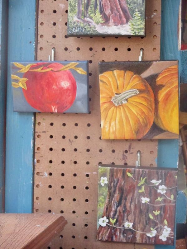
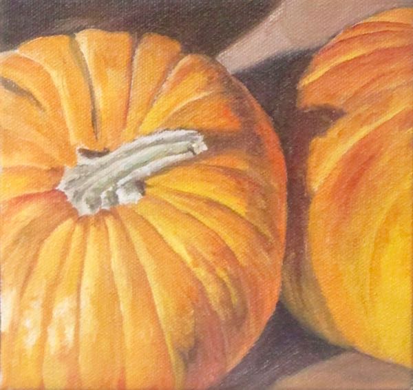
I posted this photo of paintings in progress.
A regular blog reader said she’d like to buy the painting. I touched it up, signed it, varnished it, and mailed it off to her. I forgot to scan it, so this is the best I could do from the above photo to have a record of the painting.
And here is the email conversation I had with this friend/reader. I found it charming and appropriate for Pumpkin Spice Season.
I collect pumpkins (since I have an October birthday)
It started with my 60th birthday … instead of gifts … I asked for pumpkins … have the givers name on the bottom of each .. so when I set them out, I am remembered of how much I am loved!
I actually started with some of my own, and friends knew I liked pumpkins prior to my 60th.
And some friends gave me multiple small ones… disclaimer that I have sooooo many friends! Ha ha.
For me .. the gift of friendship was most important, and this was a reminder of those treasured friendships. I just turned 64 and at this stage I don’t want (or need) stuff. I want time with those I love.
To top it off, she shared these photos with me, which I like so much that I am sharing with you.
Thank you, Anne, for sharing your pumpkin friendship thoughts and including my painting in your collectoin.
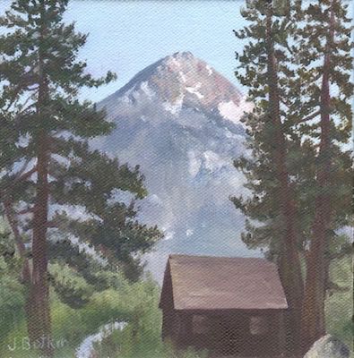
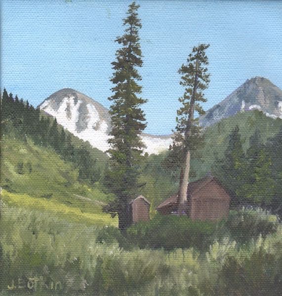
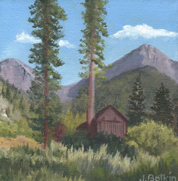
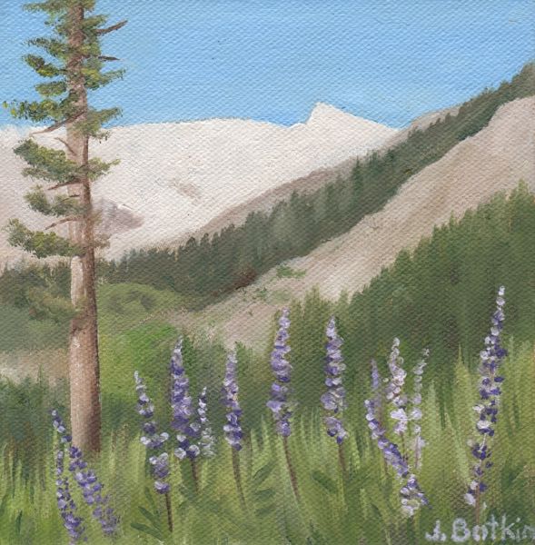
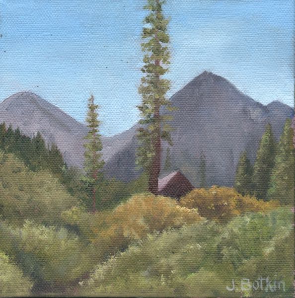
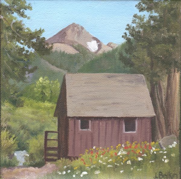
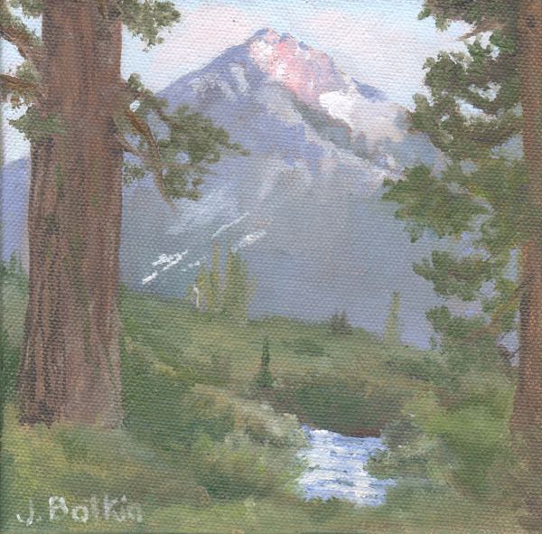
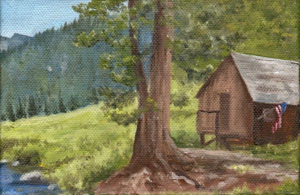
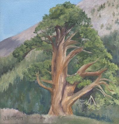
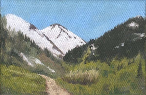
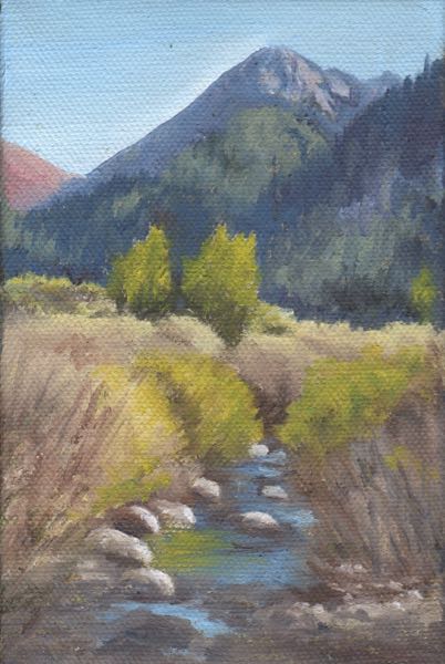
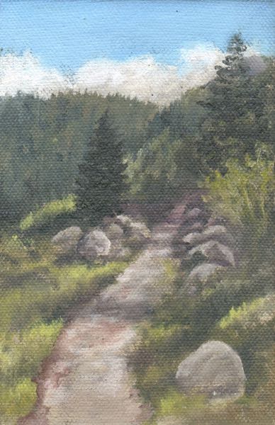
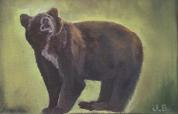
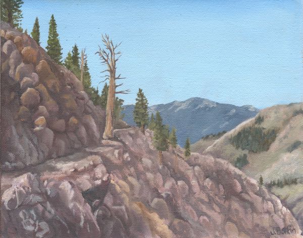
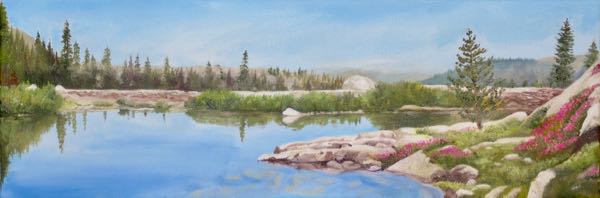
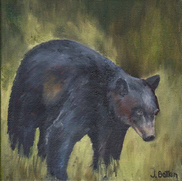
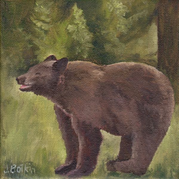
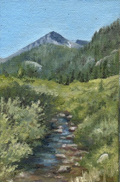
Did you forget that I was showing you the Mineral King oil paintings that sold in Silver City over the summer? Here is the other half:
As before, the sizes shown here are a little whacky in terms of how they are relative to one another. I was shocked by the stellar rise of the Honeymoon Cabin to the top position this year and also shocked by the relative unpopularity of Sawtooth. One, maybe two, are all that sold of that subject, previously #3 in popularity. The second top seller was the view of the Crowley cabin and Farewell Gap as seen from the bridge.
What a year! If the economy keeps clicking along this way, next year I may bring some of my larger pieces. In the past, people admired them, but they didn’t sell and then I didn’t have them when I needed them for other places and events down the hill. But who knows. . .?
Since 2010, the Silver City Store has been selling my oil paintings. It began as a tentative experiment, with no confidence that visitors up that rough road would want to spend their hard-earned dollars on original oil paintings rather than (or in addition to) tee shirts and post cards.
The highest number of paintings that sold in the past summers was 16.
In 2018, the store was remodeled to a brighter more spacious place with a new elegance, and the economy is doing quite well. These two reasons together might be why THIRTY-ONE paintings sold this year! (The gracious store manager says it is also because people like my work. Aw shucks, thank you, Hannah!)
When painting the same subjects over and over, naming becomes a problem, and I rely on my inventory numbering system to keep the paintings straight. But sometimes I don’t include those numbers when I bill the store, so my records are a teensy bit wobbly. So, I won’t show you all thirty-one paintings, but here are half of the ones I was able to track down a photo of. The other half will come later.
The sizes they appear here on the blog are not accurate in terms of how they look against one another. For example, the painting of Eagle Lake was 6×18″, and the one directly above this paragraph was 4×6″.
I gathered a few ideas of what to paint in which quantities and sizes for next year, and hope I don’t lose my notes.
P.S.(If you click/tap on the link to the store website, which will open in a new tab, you may notice some similarities between our websites – I used the same web designer as they did)
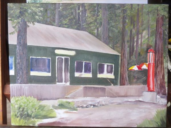
 Until I began this painting, I never noticed that the sign above the door is not centered.