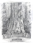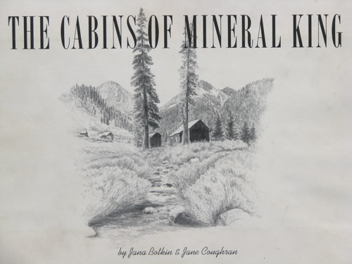
About 11 years ago I was puzzling over how to make my microscopic art business grow. A friend (aka “Limeygirl”) proposed I write a book to feature my art. I laughed aloud, and said “People don’t write books!”, meaning people such as myself. She said “Of course they do, Silly!”As I pondered her suggestion, it came to me that what I knew and drew best was (and remains) Mineral King. How does one write a book? For guidance, I wrote a letter (this was when snail mail was still sort of normal) to my friend and cabin neighbor Jane Coughran, who was at that time a picture editor for Time-Life Books. She said that if I would be willing to include historical photographs, she would help me. Took me about 1/2 a second to agree!
Together, we formed Cabinart Books, a publishing company for the purpose of making a book about the cabins of Mineral King. (Silly aside – choosing a title for the book was quite difficult. I had read that every book with the word “naked” in it becomes a best-seller, so we thought briefly about calling our book “The Naked Cabin”.) We planned the chapters, each page, how it would be shaped, where there would be drawings, text, quotes, and photos. We sent an advice-seeking questionnaire to anyone we remotely knew who had published a book. We learned about Library of Congress Card Catalog, ISBN, copyrights, permissions, bar codes, book binders, and even trucking companies. We sent a questionnaire to many many cabin people seeking stories and quotations, went on a quest for old photos and permission to use them.
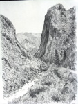
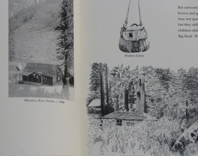
We spent 3 weeks together in Mineral King laying out the look of our book and photographing the cabins from every conceivable angle. Some of the cabins were in places that precluded a good photograph, others had nothing of apparent significance or obvious beauty, so we circled them and discussed their various attributes until something of interest emerged.
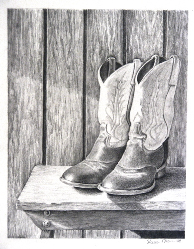
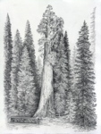
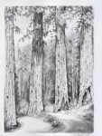
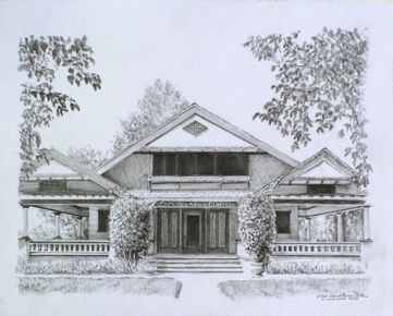
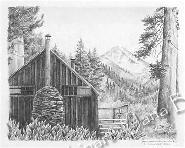
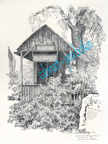
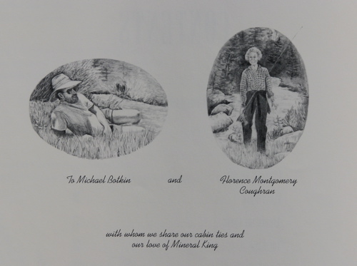
We planned our timing to have the book appear in early November. Janey found a book designer to prepare the pages for the printer. She began compiling the quotes and writing the text. I started drawing and drawing and drawing – 150 pictures in all. Several were borrowed back from the folks who had commissioned me to draw their cabins, but many of my earlier drawings no longer met my new standards. (I have been asking several of those folks to let me have their drawings back so I can fix them but this only makes them laugh at me!) To pay for all of this, I got a business line of credit and we presold as many books as possible. We had carefully calculated how many books we thought might sell, added another three or four hundred and followed the advice of a local writer to bind 75% as hardcover and reserve the remaining 25% for softcovers, should there be demand later. After months and months of work the books were finally ready. Dad and Michael drove to a trucking company in Fresno to retrieve the books in time for our book signing event. They were not allowed to peek until we had them at my studio. Together we opened a box, and when I got to the dedication page, I passed the book to Michael. He saw the drawing of himself on that page, along with Janey’s mom Florence, and he said, “Hunh. My hat is sitting kind of high on my head.” I responded, “That is because you were wearing it that way in the photo.”
Within a year or two all the hardcovers were sold. We had the remaining books bound as softcover and sold them for 1/2 as much. It took another 3-4 years to sell all of those, and now, if one gets lucky, The Cabins of Mineral King can be found on eBay or Amazon for around $100!