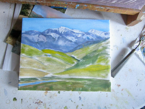
Painting Three Rivers

Did you think I forgot these paintings? Not a chance; I have a little bazaar coming on November 19 in Three Rivers and need some appropriate merchandise (besides just 2023 calendars and cards and coloring books.)

Did I think you forgot them? Not gonna let you forget—don’t worry your pretty little head about that.

One:

(Please, do not sing about this.)

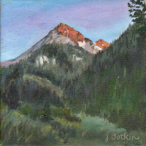
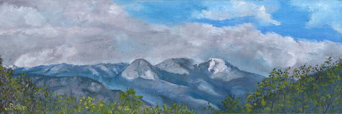
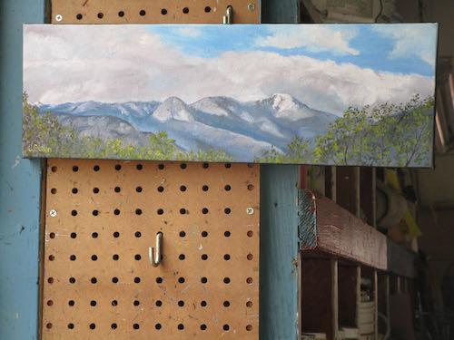
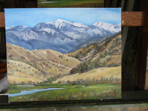
It is now finished, drying, and awaiting a scan so you can see the colors more accurately. The title is Alta Peak/Moro Rock View. (Yes, I know it is brilliant and clever and original.)
Two:

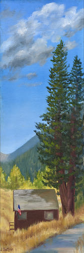
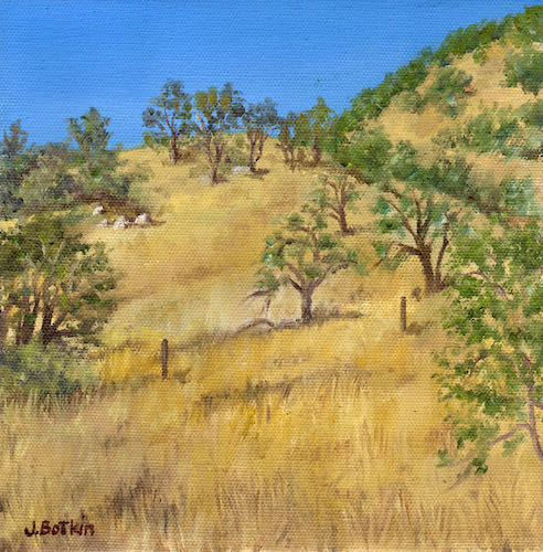
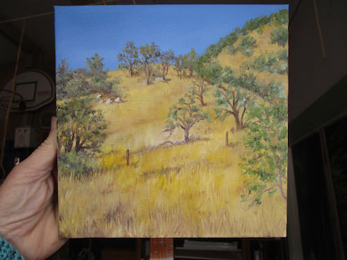
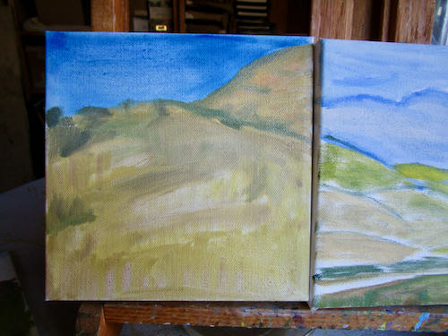
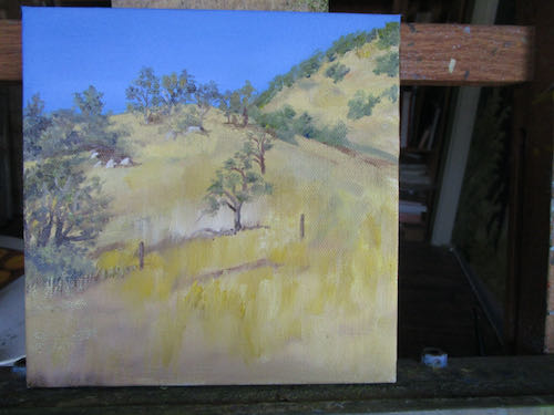
Just a bunch of yellow grass couldn’t possibly take that long, could it?

Yes, it could and it is. It isn’t titled yet. Perhaps “Yellow Grass and Live Oaks” would be appropriately creative and original. . .

Three:

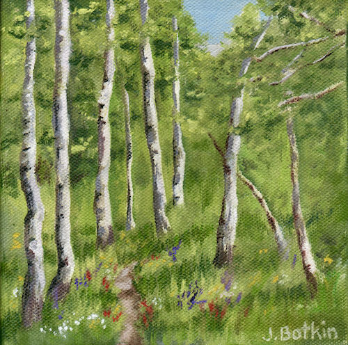
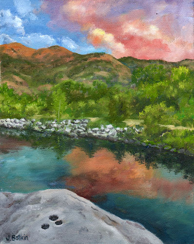
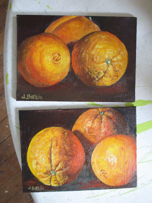
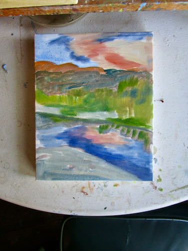
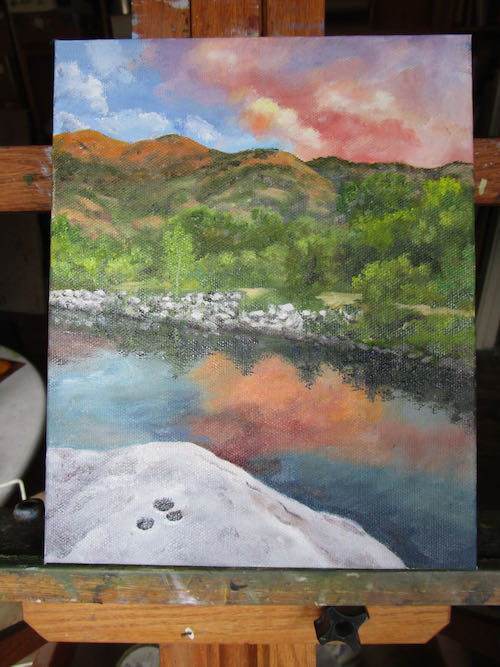
Mixing colors for this one has been fun. My paintings tend to be all greens, grays, and browns, or nothing but orange (poppies and oranges, over and over).

How about calling it “Three Indian Grindholes on the Middle Fork of the Kaweah River in Three Rivers at Sunset”?

Nope. It is only an 8×10″ oil painting, so there isn’t enough room on the back of the canvas to write all that.

Part of the business of art is coming up with good titles. I’ve got some thinking to do.

P.S. Happy Birthday, Laurie!


Painting As If I Have a Deadline

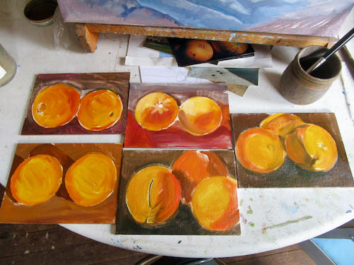
After finishing three more 5×7″ oranges on easels, they sold within days. The director of the Mural Gallery asked for more, so I set up an assembly line to get the first layer on the panels.

That was sloppy business. I prefer to work with exact, tight, precision, so I moved back into this 8×10″ painting of a typical Three Rivers scene, and got serious about making it as accurate as possible.

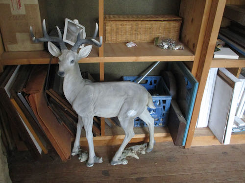
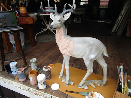
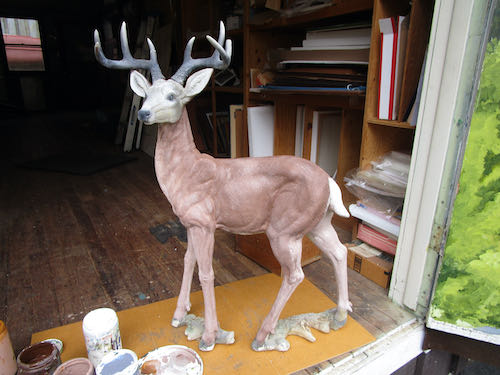
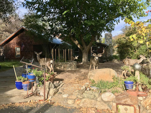
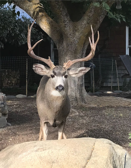
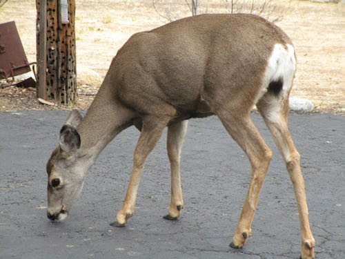
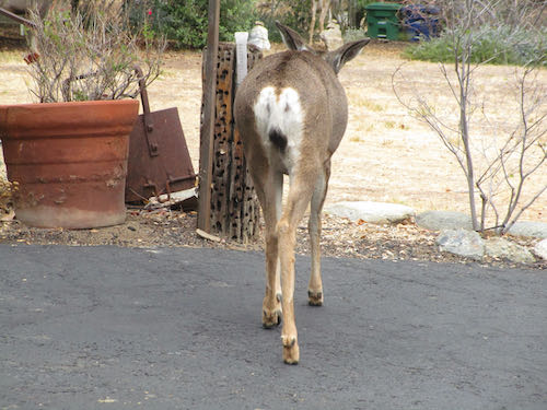
Then I got a call from a man for whom I had done an odd job this summer. He has a deer, which has faded from the sun, and wondered if I could freshen it up. He was able to provide a photo of it when it was new, which will help me get this done right. I said yes, and then we had to figure out how in the world I would charge him for this odd job. He told me what he paid for it initially, we figured out how much he was willing to spend, I told him how many hours that would cover, and then we made a plan. I will paint one side only, keeping track of my hours, and if there is enough time and money left in the budget, I’ll paint the backside. If not, I’ll just paint the backside plain brown, no detail. 

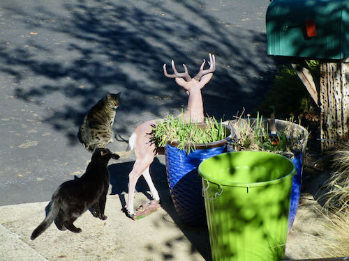
The cats aren’t a fan of this guest in their safe room. I expect they will adjust soon.

A Short Painting Session, 3 Photos of 2 Paintings

I was able to slip another hour or two of painting into my other responsibilities.

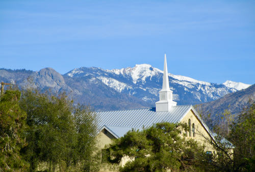
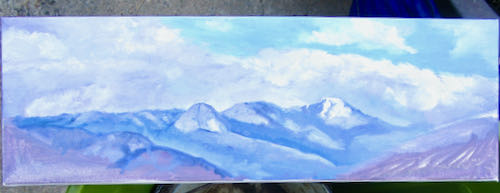
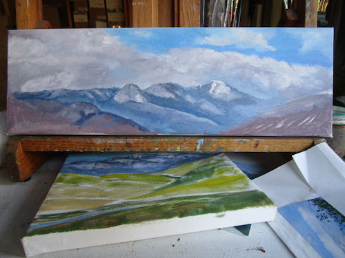
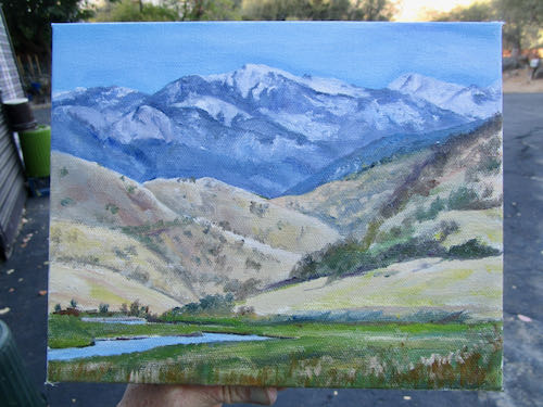
Using the leftover blue and gray sky colors, I mixed a bit more Distant Mountain Blues and Grays in order to detail the mountains on two paintings. Both of these paintings feature Moro Rock and Alta Peak, standard landmarks seen from many places in Three Rivers.

The colors look a bit off in this photo, so I carried it outside. Then the colors looked very wrong. Nope, this is not being painted for Disneyland’s Small World (and please do NOT start singing.)

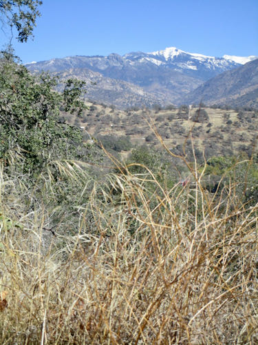
This view of Alta Peak and Moro Rock is from Kaweah Lake in early winter. In this scene, the lake is low (and behind the viewer) and there is some snow in the mountains because winter hasn’t begun in earnest.

It appears that winter has begun in earnest early this year!

My colored pencil artist friend from Kansas, Carrie Lewis, requested a guest post for her blog on last Saturday, so I wrote of my experiment using colored pencils in Mineral King, A Plein-Air Experiment.

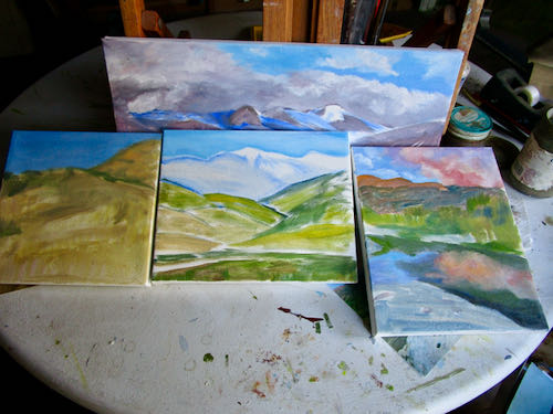
2 Photos of 4 Paintings in Progress

November is my busiest month, workwise. Commissions, selling the 2023 calendar, the Holiday Bazaar, supplying the places that sell my work, planning for some (maybe) murals, working with an author as we close in on a 5-year project* together (he is writing, I’m editing)  . . . 

So, I paint when I can fit it in, mostly in 1-3 hour sessions. 

It is necessary to be efficient in these sessions, so I do things like mix up some sky colors and then do just the skies on all four paintings of Three Rivers scenery.


But then I couldn’t stop listening to a certain song, so I kept hitting repeat and painted some mountains. It was a logical next step because I was able to mix those sky colors into Distant Mountain Blue (but not too distant).

I’d like to put a lot more detail into these mountains, and probably want to put as much detail as possible in the entire  picture. But for now, it is time to stop playing the song over and over and over. . . .

*The project began when the writer asked me for some illustrations in September 2017.  Here are three posts about those illustrations. One, Two, Three.

Whatcha doing, Central California Artist?

Messy beginnings

All my paintings begin this way. It no longer causes me distress, that continual uncertainty about my skills. With approximately 1300 paintings (not counting murals) completed since 2006 and most of those sold, I am learning to just flow with the mess. 

Planning

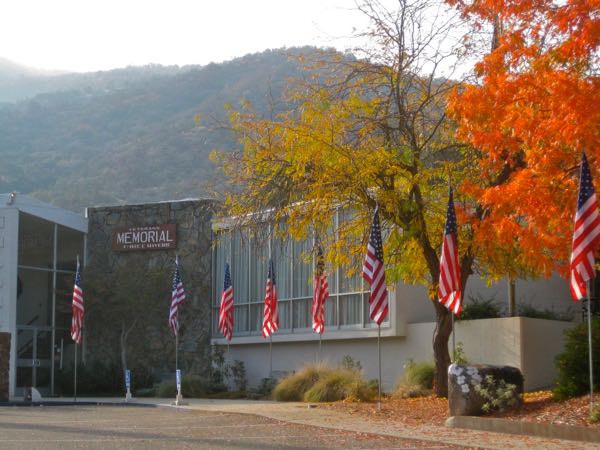
With the Holiday Bazaar happening soon (Saturday, November 19, Three Rivers Veterans Memorial Building, 9-4), I needed to take inventory and plan. I counted up the number of available paintings by subject, tallied them by size, and came up with a plan. 

Three Rivers subjects are in the shortest supply. 8×10 and similar sizes are the most likely to sell at a one day bazaar here in town. So, two 8×10″s, one 8×8″, and a 6×18″. (Priced at $125, $100, and $165)

Chop chop and hubba hubba

I went quickly through my photos, going on “gut instinct” rather than evaluating to the same degree that I evaluated sizes and subjects, and without hesitating, assigned inventory numbers and titles, wired the backs for hanging, and started painting.

Cover that canvas

Take a break for drying

These will turn out just fine. Most paintings do. If not, I will just add more layers or turn them into Sequoia tree oil paintings. It’s just the business of art.

Cool Enough To Paint the Kaweah Post Office

(I don’t mean that I painted the building.) I am referring to the weather in my painting workshop, equipped with a fairly adequate swamp cooler, unless it is over 95 and/or humid.

Every year people say, “It has been such a hot summer!” as if that is news. Every summer in Tulare County is a hot one. My theory is that if it starts mild, you pay in September and October. This is the real world, muchachos, and you are in it.

Kaweah Arts had two oil painting versions of the Kaweah Post Office for sale. This is a quaint little old building three miles up the North Fork of the Kaweah River, which, until recently, was the smallest operating post office in the United States. Alas, it sold, and the new owner closed it. It is still cute and quaint, so I didn’t paint out the images on those canvases.

However, I decided that I could do a better job.

BEFORE:

One would think that I could just make this up without a photo after painting it about 20 times (if you count the do-overs, it is probably more). One might be right, but one isn’t going to know, because I won’t be attempting it AND I might not need to paint it any more. 

DURING:

BEFORE:


DURING:

These are hard to photograph while on the easels. When they are dry, I’ll scan them for you (and for my records, of course.)

This is a first for the aloof Jackson. He has never inspected my work before.


What’s Wrong With This Picture?

Sometimes when a painting has been hanging around for awhile, I have to ask myself a question that is hard to answer: What is wrong with this picture?

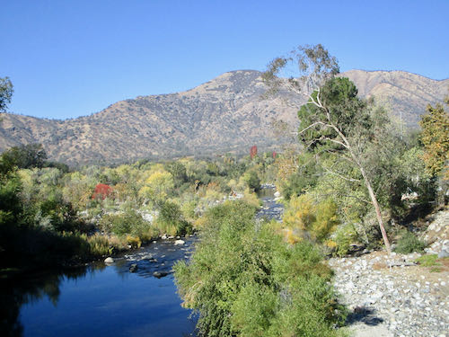
This painting has been hanging around too long. It is the North Fork of the Kaweah River in Three Rivers, looking downstream from what used to be known (maybe still is) as The Airport Bridge with Blossom Peak(s) in the distance.

This is what might be wrong:

  1. Blossom Peak(s) in the distance need to be more separate from the trees in front of them.
  2. The main rock needs to be blurrier where it contacts the water.
  3. The sky looks murky.

Stay tuned to see if those changes fix the painting. 

Odd Job, Chapter 4

If you subscribe to the blog and read the email on your phone, the photos might not show up. (Some people get them, some do not; it isn’t a problem I know how to solve.) You can see them by going to the blog on the internet. It is called cabinart.net/blog, and the latest post is always on top.

This was the day for the careful work on my odd job of repainting signs for a subdivision in Three Rivers: a gray line around all the letters, and repainting the California quail.

Thin Gray Line

Mixing the color was fun, because I had success quickly. Color precision isn’t terribly important here, but I like to practice my skill. You can see the new gray around the S and the old gray around the other letters. Same, same!

The California Quail

These were harder. I couldn’t tell for sure about the colors, and this particular one had such a sheen to it that I began to suspect it was a decal rather than something that was painted directly on the redwood.

On the more weathered sign, it was clear that the quail were painted directly on the redwood.

The photo only showed the quail on the less weathered sign, which should have been adequate.
When I moved over to the other sign, I couldn’t figure out why I wasn’t able to duplicate the quail when I turned my back. It took a few flailing efforts before I realized they were facing the opposite directions. 
I didn’t do a perfect job, but I was able to make them look believable.

Here are the two signs, finished as far as I am able.

Finishing

The lead man on the project knows that I don’t know how to finish these. Mendosign kindly emailed me with a suggestion to use wood stain with a red tint, saying that wood needs to breathe, and that the stain would easily wipe off the painted parts. 

Mr. South Fork Estates thought there was a risk that it would make the painted parts look grubby. He will call a painter friend in Visalia for some advice. 

So, they will figure it out, and I am finished. 

Bye-bye signs. Thank you, TT and TG!

Odd Job, Chapter 3

If you subscribe to the blog and read the email on your phone, the photos might not show up. (Some people get them, some do not; it isn’t a problem I know how to solve.) You can see them by going to the blog on the internet. It is called cabinart.net/blog, and the latest post is always on top.

Yesterday’s post about refreshing 2 signs left you hanging. I hope the anticipation of today’s continuation didn’t disrupt your sleep last night.

After applying 2 coats of the rim color, some confidence began developing. Time to tackle the narrow yellow line. You can see the old color in the middle; I put a bit of white on the left, and some brighter lightfast yellow on the right.

The yellow needed some red, along with a touch of white.

You might be able to tell that the upper yellow is now better, but since the lightfast yellow is transparent, it needed a primer coat beneath. No need to color fuss here because the goal is to make it look good.

As I painted the narrow line with white, I realized that the wood is quite splintery. This means that getting a smooth edge isn’t going to happen the entire distance on any of the sign. But, it is a sign, not a piece of fine art to be viewed closely.

With the warm weather, swamp cooler blowing, and big doors open, the paint dried quickly. I could paint one sign, turn and do the other, go back to sign #1 for the second coat, and then turn and second coat sign #2.

The white letters seemed like a good next step. These also soaked up the paint and required 2 coats. The rough edges bothered me at first. Then I remembered that this will be viewed from inside people’s cars, until they stop noticing at all. After 5 hours, I felt an unavoidable slide into Idiotland, where Sloppy, Stupid, and Careless all reside. Besides, my cheater-readers kept falling off when I leaned over the sign, and then I painted a blue streak on my face by accident.

So, that’s all on this Three Rivers custom art project for today. The quail and the narrow gray line surrounding the letters will require a strong focus (and a better fitting pair of cheater-reader glasses).

Odd Job, Chapter 2

If you subscribe to the blog and read the email on your phone, the photos might not show up. (Some people get them, some do not; it isn’t a problem I know how to solve.) You can see them by going to the blog on the internet. It is called cabinart.net/blog, and the latest post is always on top.

Because I am an artist in a small town, I get asked to do a variety of things.

This keeps me growing, learning, and becoming more capable of doing more odd jobs. Still, I start out a little unsure of where to begin and unsure of my abilities to git ‘er dun well.

The outer rim of each sign is a grayish blue, or perhaps a bluish gray. It looked pretty straightforward, both in the mixing and the application. I put these 2 colors together and made the gray on the top of the lid.

You can see that I tried a few versions.

Because my gray had a purplish cast, I put in a smidgeon of yellow, which is opposite purple on the color wheel. (The ArtSpeak word for that is “complementary color”, as in “complete” because its presence completes the 3 primary colors which can be blended to make every color in the world. Not white. White is the absence of color.)

A touch more white, and then it was close enough. 

Clearly I had to be very very careful because Pippin was underfoot.

Let’s continue tomorrow, shall we?