Mr. Art Patron returned from his vacation to find an indoor mural on his wall at Visalia Granite. He was very pleased, and asked for a few minor adjustments. They were improvements, and I am glad he noticed and asked.
Oh, that troublesome beam. Not knowing how to deal with it, I simply painted the sides a solid color. It shows from the the conference room, and Mr. Art Patron had a good idea.
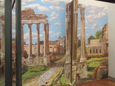
It wasn’t easy. The only thing about this mural that was easy was maybe, just maybe the sky (in spite of not having a photo). It was also easy to paint in a controlled environment. Mr. Art Patron tells me it wasn’t a true challenge for me because he says I’m an art-chitect and excel at architecture. I feel confident with pencils, a drafting table, T-square, triangle and a big fat magnifying light, but on the wall, I’m a newbie at this type of subject.
Anyway, here is how the mural now appears from the conference room.
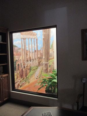
Now it looks like a HUGE column instead of a metal beam with brown paint on the side. (“Brown”?? How about “Dark Chocolate” or more accurately, “Burnt Umber”?)
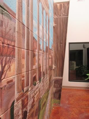
There was also the troublesome piece of metal that secures the beam to the floor.
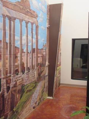
See it there? Easy solution, but I didn’t think of it when all I could see was the finish line.
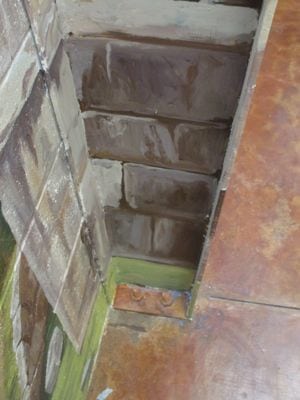
Just match the floor!
My little camera didn’t do the trick, but Mr. Art Patron’s iPhone had this fantastic panoramic feature, and he was like a human panning machine/tripod thing, and held steady as he panned.
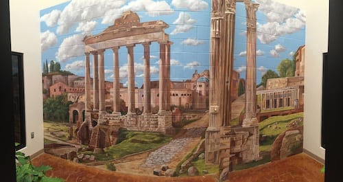
When Mr. Art Patron handed me this subject, I almost choked. I gasped a bit, made a few shocked noises, and wondered if he was overestimating my abilities.
Now, I REALLY REALLY LIKE IT!! (Are artists allowed to like their own work??)