I sent 3 rough-drawn logo options to my customers, and they chose this one for me to refine.
I downloaded the typeface that was closest to this, and then began manipulating it to fit around the circle. We began talking about what to do with “Orchards, Inc.”, whether or not to include it, how to make it look good.
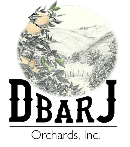
Which one did they choose? Stay tuned. . .

5 Comments
Do they want the “Inc.” included? DbarJ Orchards would be classy. Adding the “Inc.” makes it too . . . corporate. Unless that’s what they want. My personal choice? They’re all good, but I would choose second from the bottom without the “Inc.”
Sharon, I think that if a business is incorporated, it is required to use “Inc.” Regardless, you will need to stay tuned in to discover what they chose!
Oh, I will “stay tuned” for sure, even if a few days late. Tomorrow is Turkey Day at a friend’s house, and Friday I have a 7-hour drive ahead of me to be at Kristy’s memorial service on Saturday. Busy weekend. Emotional time. May I feel God’s comfort! 2 Corinthians 1:3-4
I am so sorry that you lost your cousin. This is a weird place to say that because it belongs in a card in the mail. I am truly sorry for your loss (and for my rudeness).
I am grateful for your kind comments, whether by email, card, text, or blog comment. She loved Mineral King, and I have a feeling Kathy will see to it that a part of her will remain there.
Comments are closed for this article!