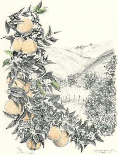
The new drawing was in place, but I thought the type was overpowering to the drawing. The customers had a different thought, which really surprised me: they preferred the placeholder drawing to the new one!
I realize that what I consider to be a good drawing versus what people who don’t draw consider to be a good drawing differs. But, I could not not not let this drawing from the last century go into the new logo. NOT.
So, I drew it again.
Before:
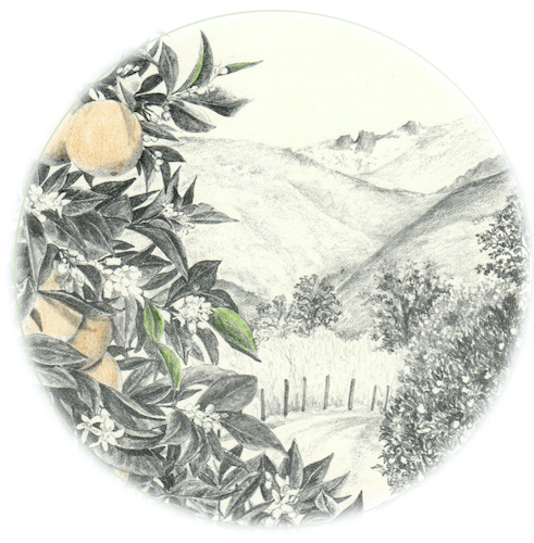
Edited to: 
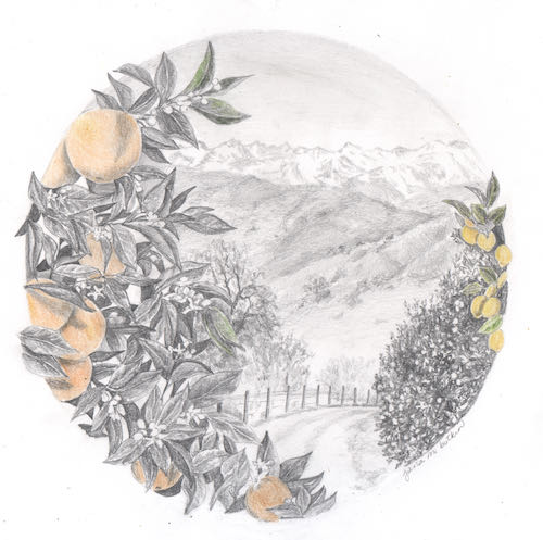
After:
The road and the fence were what spoke to them in the old drawing. I did better mountains, better foothills, and because they grow both oranges and lemons, we included both.
But wait! There will be more. . . stay tuned!
4 Comments
Hmmmm, this reminds me of another example of “what I consider to be a good drawing versus what people who don’t draw consider to be a good drawing differs.”
FWIW, I like the round drawing better. The foreground isn’t as “in your face” as the vertical one. But then again, I don’t draw. 🙂
Sharon, I have edited the blog post to show the rectangular drawing as it was edited to a round version. This will allow you to compare “oranges to oranges”. Keep in mind that the old one is not a scan from the original but a scan from print – several generations away from the original.
I see now. It looks like the main differences are the hills in the background, and adding a lemon tree on the right. Both round versions look really nice!
Thank you for helping me clarify things for the readers!
Comments are closed for this article!