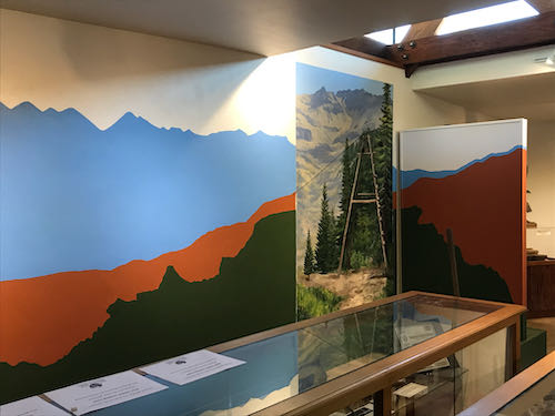
 There have been several times in my career when I have been asked to change someone else’s art. I have repaired a torn canvas, changed a boulder in a painting that looked like a skull, fixed a child that looked like a little hunchback, and brightened colors in a dull painting. All these were done without knowing the original artist, and with assurance that the original artist would never know.
The Mineral King Room makeover was a different story. The original designer is highly educated, experienced and respected in The Art World. I am somewhat known in the local Art World, but I try to keep a low profile when it comes to any formal types of situation where I might be outed as a total DBO, mostly self-taught, Tulare County native. (You know how I feel about ArtSpeak. . . ugh.)
I respect the original artist of the Mineral King Room and understand that she put a lot of thought into the design. The folks who approved the design were awed by her work, and didn’t think that there would be a strong reaction to the teal color and the stylized mountains, which were all effective from a designer’s point of view.
The approvers were mistaken about the reaction, which was strongly against the color and the mountain shapes. This necessitated a call to your Central California artist, who also is the local Mineral King artist.
The designer wasn’t pleased when she learned that I would be giving her design a makeover. (What artist would be??) I don’t blame her, because she chose all the shapes and colors based on her design expertise, to provide the best interpretive background for historic displays. She was professional and polite, while sounding as if she was defending a dissertation, not in a defensive way, but protective and offering the rationale for her design decisions.
My approach, on the other hand, also based on training and experience, is to simply please the customer. (My very wise dad taught me the all important business principle of “You kiss their fanny and take their money”.) We have to think about who the visitors and supporters of the Mineral King Preservation Society are, and what they will understand. The answer to that is that they love Mineral King, not a stylized version of it. (“Nosirree, I’ve climbed Sawtooth, and that ain’t it!”)

So, with respect to the designer, who is very good at what she does, I just dove in and “corrected” her work. I don’t mean that it wasn’t good; it just wasn’t right for the audience.
4 Comments
I’m so very happy it got corrected!
Thank you, Virginia! It has been interesting to hear the various responses to the project. I’m glad you think it was a good idea. It helps mitigate my discomfort from messing from someone else’s art.
I can sympathize with the original designer. Her work looked very beautiful to me, and only locals would know it was not strictly accurate. The “folks who approved the design” are to blame here, for not knowing their audience well enough, or for not specifying to the original designer that the mural should accurately reflect all the colors and shapes exactly as they are in real life. But isn’t that what photography is for? I thought art was the representation of what the artist sees, not just an exact reproduction of a photographic image.
Also, what is a “total DBO” for those of us who don’t do abbreviations???
Marjie, thank you for checking in. It is a treat to hear your thoughtful opinion. I too sympathize with the original designer. So often people need to commission an artist, but don’t know how to clearly communicate their needs. In this case, they were desirous of a realistic depiction, but didn’t express that, or perhaps weren’t aware of what they truly wanted at that time. Graphic art is a different situation than fine art, because its purpose to enhance or liven otherwise dull visual displays. Without specific instructions, the artist can do whatever suits her sense of good design. I have been in that mess multiple times, giving my very best efforts at good design, but unable to read the customer’s mind, and the customer didn’t have the vocabulary or foresight to clarify their desires.
DBO is Ditch Bank Okie; having just finished reading The Four Winds by Kristin Hannah (about the Dust Bowl refugees), I learned that these folks (fiction based on history) often did reside by the banks of a ditch. Around here, some of us refer to ourselves that way when we do makeshift things, either from a lack of supplies or a lack of knowledge. Right now I am using a bungee cord to keep my dryer door shut, for example. 😎
Comments are closed for this article!