That coat of arms requires much mulling, both by me and the customer. I have done 4 revisions using Photoshop Junior. (The current wonkiness of the blog is only allowing photos to appear as squares, so these pictures aren’t showing you the entire image on new photos.)
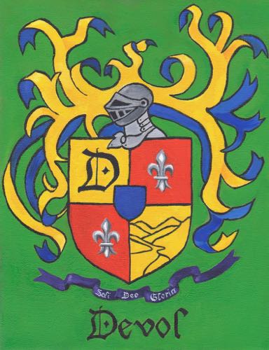
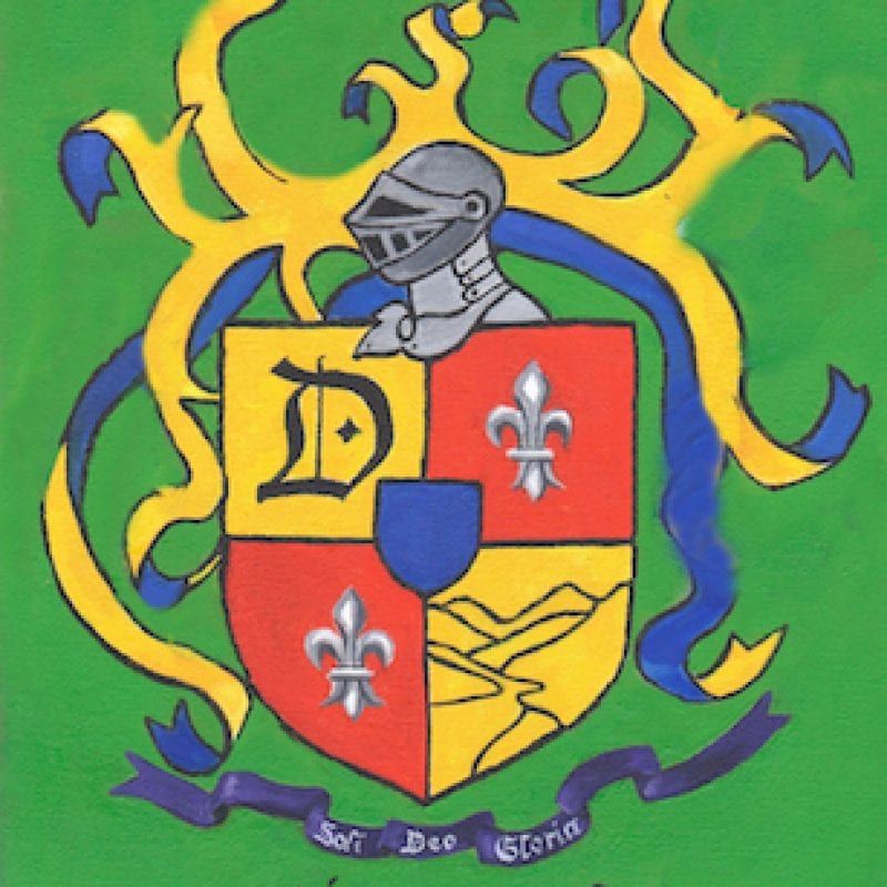
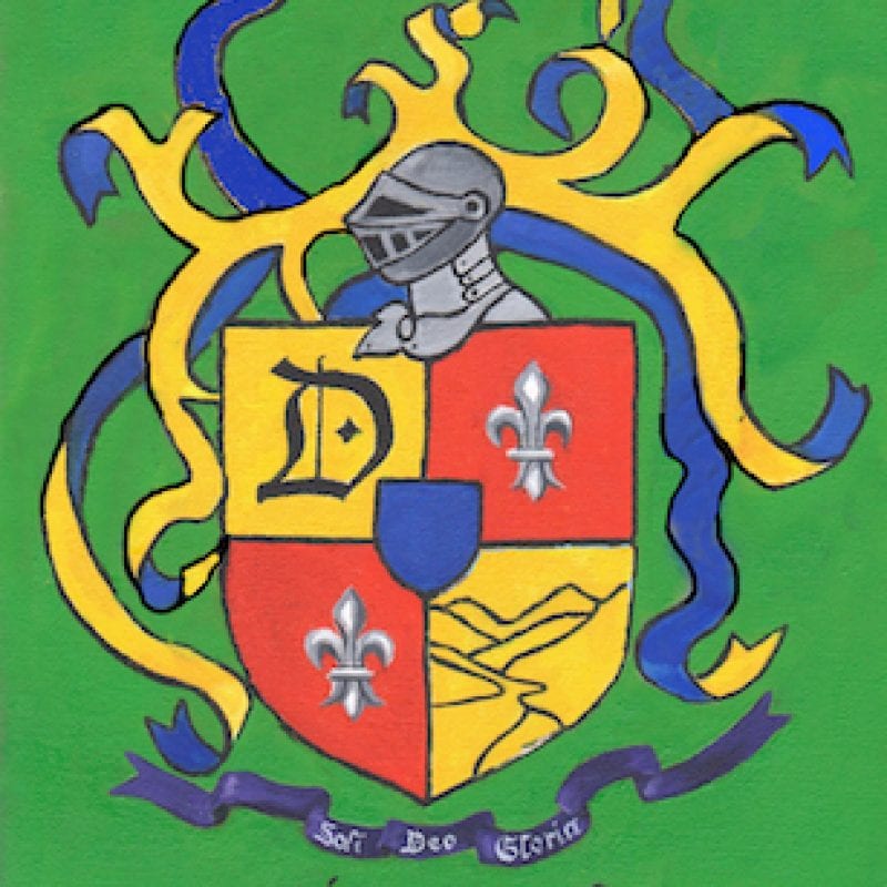
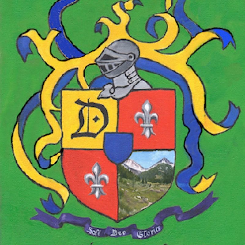
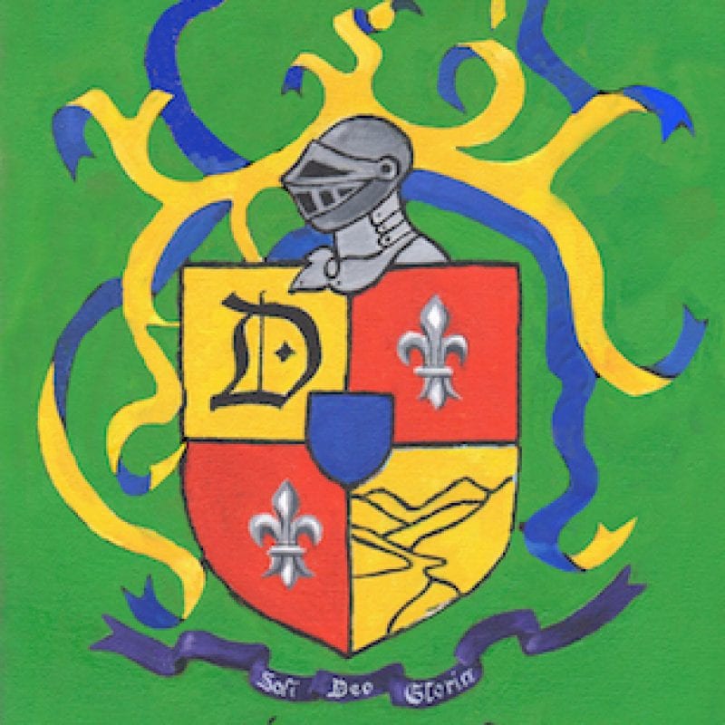
We will continue to revise and discuss this. I have asked my customer if she has an idea to replace one of the fleur de lis (those silver symbols in the red sections) so there is more variety. She is probably still mulling that over. She is considering #2 and #4; I think when we get together, we will find a satisfactory solution in a #5 or #6.
This is one of the most unusual and difficult commissions I have ever tackled. Any ideas? input? advice? I will take it all “under advisement”, which means I reserve the rights to adapt, adopt, or ignore.
10 Comments
Hi Jana! The coat of arms is wonderful. Many coat of arms adorn flags. I have noticed flags are usually divided into for equal squares. The upper left black, the upper right red. The lower left red, the lower right black. Then, they put the coat of arms on top of the squares and the background colors make the coat of arms, pop!!! . I think that will help define the coat of arms better. I used the colors black and red randomly, you can pick any color. Just a thot. Hope this makes sense. If not, see you Tues and I will draw it out.!! And then, it could be a terrible idea too! LOL!!!
Hugs
Melissa
Melissa, I look forward to learning from you on Tuesday! Thank you for checking in.
What if you moved the D to the middle of the shield and put a drawing of a cat or train as Sharon suggested in it’s place. Just a thought.
A good thought, Laurie. Thank you!
I had no idea this would be such an ordeal, and am embarrassed it has turned out to be so. I should have just given you, the artist, free reign throughout. My Bad, as they say.
I like both Marcia and Char’s comments; they make some good points. I hope others chime in, as “3rd party” commentators.
I hadn’t thought about replacing one of the fleur de lis images with something else, because one of the designs I saw online had both on the shield like that. But I suppose replacing one with a simple drawing of a train or a cat might work. Or a cat on a train. But I’m inclined to keep it as is.
Have you ever finished a painting, stood back to take a look, then whitewashed the entire canvas and started over? If so, your client should pay you accordingly!
Sharon, we WILL get this figured out. I just did a bit more sketching on some tissue paper over the top of revision #4, incorporating suggestions from Marcia, Char, and someone who emailed me privately.
IMHO I would like to see the ribbons flow a little better…especially on the top half . Can you change the shape and/or color and/or simplify them or do you have to keep them as is? There seems to be a lot going on there and for me…they are distracting from the shield. I think, maybe, the yellow in the ribbon color is too strong & competing for attention. I like the line drawing of Mineral King.
Marcia, I wish you were here, sitting next to me as I use Photoshop to try your suggestions! Thank you – I will consider all you have suggested.
I like the first one best …. but I don’t like the green background too much …. and am not crazy about the other colors …. how ‘out black, white, gray and red? I like those colors. Not much help, I know, but you DID ask …..
Char, this is so out of my realm of experience. I’m trying to find a balance between what looks good and what the customer is asking for, and it’s a wobbly position!
Comments are closed for this article!