This mural was painted as a thank you for my friend Cowboy Bert, who built a handrail for the steps up to my studio.
Last year we began discussing it, and I posted it on the blog in March. However, when my website broke, lots of photos disappeared, so you don’t get a link here to go back and see.
I first looked through Mrs. Cowboy Bert’s photos. We talked a lot. That’s what we do. This time it was about ideas.
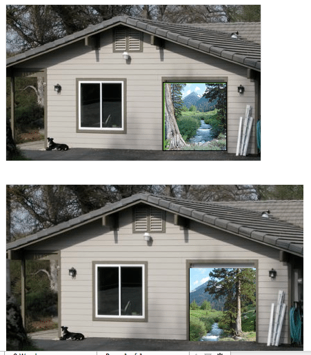
Then I did a bit of photoshopping to get the idea ball rolling. Here are a couple of the things we tried:

(I’m not that good at Photoshop. Just be polite, okay?)
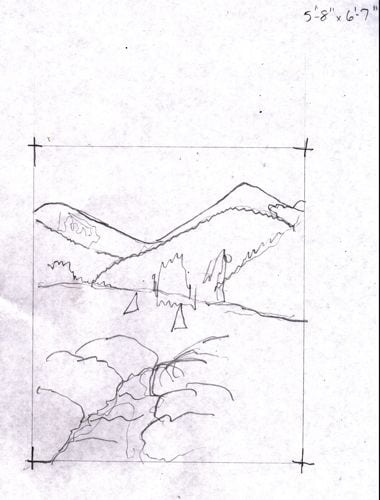
Then, we conversed some more. Mrs. Cowboy told me more about her vision, which developed with time and talk. It resulted in this sketch, which she whole-heartedly approved.

Good thing she knows that I can draw and paint, because otherwise, this might have been a bit too sketchy for her. (Ever wonder where the word “sketchy” came from? Now you know!)
That is Farewell Gap which is in Mineral King. Are you surprised??
2 Comments
Hi, they are both nice but I like the one on the bottom, where the tree is on the right. It seems to create more dimension and depth for some reason. Perhaps a different angle in layering? Trees and water give infinite fodder for contemplation, don’t they?
So, which one did you guys decide? The third in pencil?
Jennifer Dougan
http://www.jenniferdougan.com
Jennifer, the winner is the pencil sketch. Sounds ugly for a mural, but it depicts the right landmarks that my customer wanted!
Comments are closed for this article!