My odd job of painting a sign for the Blue Moon Nursery in Three Rivers progressed through the decision making progress.

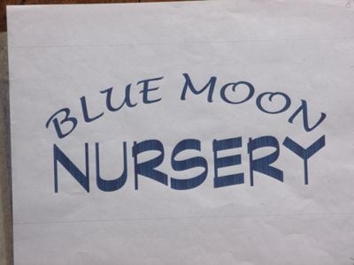
This combination of type was our first choice. The style of Blue Moon is a little hippy-dippy, loosey-goosey, whimsical (sorry, can’t think of a rhyme for that word). “Nursery” looks solid, professional, steadfast, here to stay.

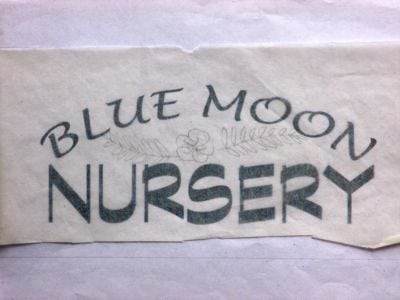
It needs some decoration, but this wasn’t the right one.
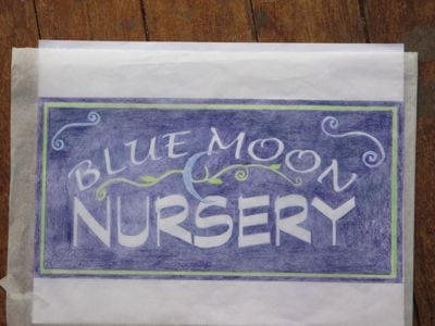
The owner and I decided on the best combination of type and decorations, and then got to the part we both love (both avowed color junkies).

We both love the dark purply-blue, the high contrast with the white lettering, and it is a given that the growy needs to be green and the moon needs to be blue. Color is sooooo fun.
Now what? How will I get this colored sketch onto a 4′ x 8′ board??
Stay tuned!