It just occurred to me that perhaps you might disagree with my evaluation of what “drawing better” actually looks like.
Bummer. Having a blog often means taking a risk, so here goes.
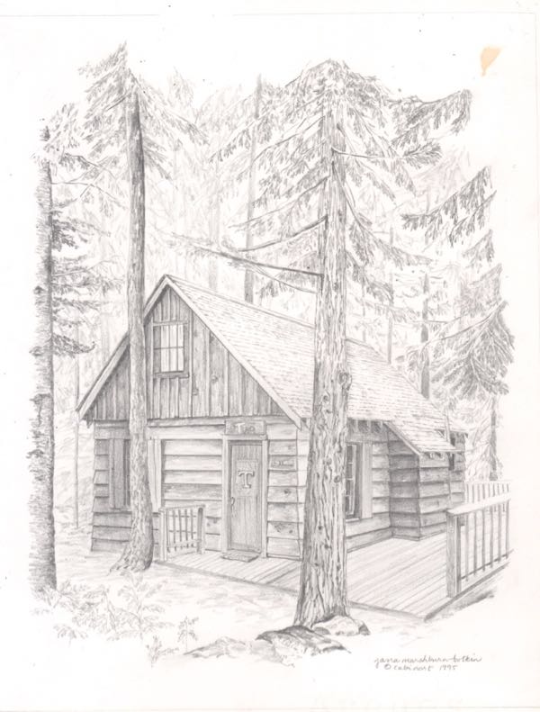
This is the little Hume Lake cabin as I drew it from the customer’s photos in 1995. (I didn’t draw the bug spot, or whatever that is.)

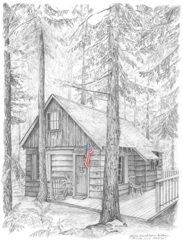
Here it is after reworking it, using photos I took earlier this month.

I feel relieved to have gotten a second chance to make this drawing the best I know how.
4 Comments
Thank you for the nice card I received from you last week. I chatted with Melinda yesterday and heard a lovely story about 2 days at that cabin recently. I’m back in circulation.
Bob, how nice to hear back from you! I meant every word on that card – Thank you for reconnecting me with Melinda!
The original drawing is lovely; the reworked drawing has more shading and contrast. Both are very acceptable, but the addition of the American Flag (in color!) is the “icing on the cake!”
Sharon, if only I thought to add flags in color from the beginning of my business. . . but it cost a fortune back in the olden days to reproduce color, so that might be the reason. And, the customer didn’t have a flag in her photos. . . the daughter said her dad was the most patriotic pacifist in the world (Mennonite).
Comments are closed for this article!