Sidetracked and Distracted

Since we are nearing the end of my favorite time of year, I thought I’d give you a break from watching painted flowers develop and show you a bit of the rest of my world at the time I was painting that bouquet. 

There are many distractions when one works at home. 

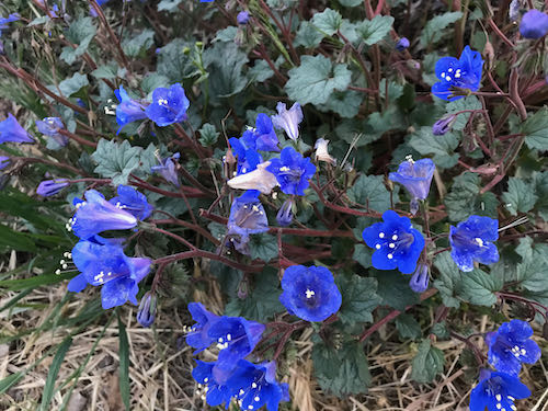
First, my neighbor has this incredible plant, and I don’t know the name, but the deer haven’t eaten it yet, so I NEED the name, because I NEED this color.
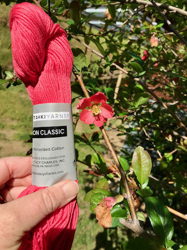
The mail came, and it contained a package of 2 new yarns. I haven’t talked about knitting for awhile; didn’t want to lose any more readers than I’ve already lost because the emailed subscriptions don’t show photos on people’s phones. (Still unsolved; my web designer is still too busy.)

The pinkish red yarn might exactly match the few remaining flowering quince. As a self-proclaimed color junkie, I had to check, and yeppers, it matches. (Destined to be a baby blanket).
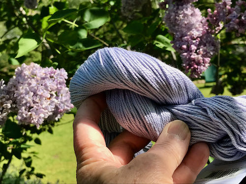
I also needed to know if the lavender matched my blooming lilacs.. Nope, not quite. This one is destined to become another sweater that I don’t need; my knitting is a continual triumph of hope over experience, just like my gardening efforts. Sometimes I get lucky and all the parts work out. Usually the sleeves are too tight or too loose, the buttons keep falling off, the ends don’t stay woven in, I find a dropped stitch after wearing it several times, the collar won’t lie down, it is too short and fat, it is too long and tight. . . you get the idea. (Baby blankets always fit their recipients.)
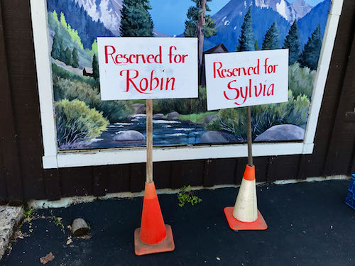
I really did have some work to do that day. When one is an artist in a small town (the sign for Three Rivers says 2600 but I don’t know if all those people really live here) where one’s life overlaps with friends on many levels, one is often privileged to help out. This was fun, but definitely best viewed from the back of a fast horse. (Would take too long to explain and I’ve already stretched your attention span by going on and on about color and knitting.).
On one of my trips back to the house (a 30 second trip on the Zapato Express*), the light was beautiful on the hillside.
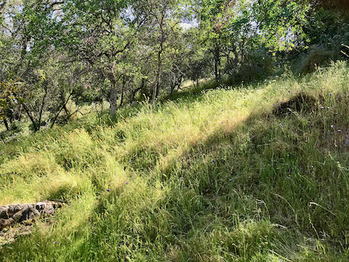
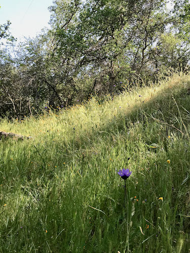
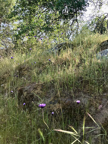
The green and the wildflowers are so fleeting; my daffodils no longer look like this.
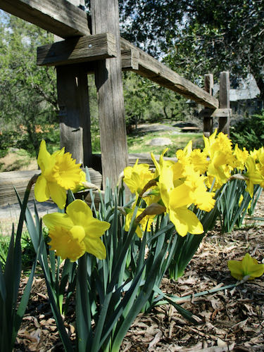
So, even though all this distraction and sidetraction (that’s a good word, don’t you agree?) is taking me from my real work, I believe that it is an artist’s obligation to absorb as much beauty as possible whenever it is available. That’s part of the business of art.

*Zapato Express means I walked.

The Rain Stopped and The Sun Came Out

The rain stopped briefly and the sun came out, so I went for a walk here in Three Rivers. This was on February 12, but there were other things to blog about last week.

Look! The buckeye trees, always precocious, are leafing out already. 

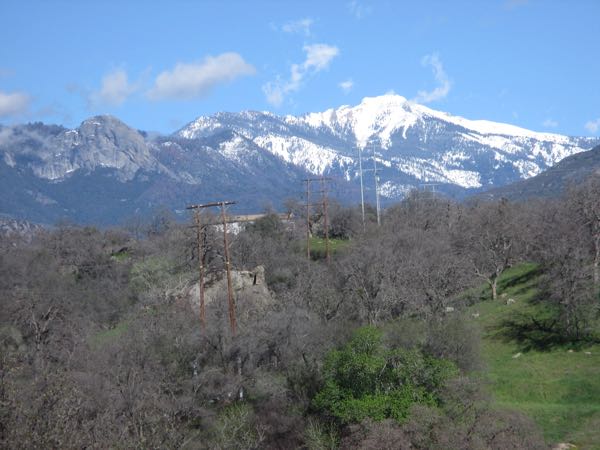
Here is an unobstructed view of Alta Peak and Moro Rock.

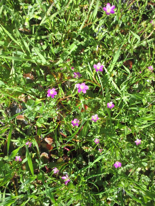
The Red Maids are in bloom!

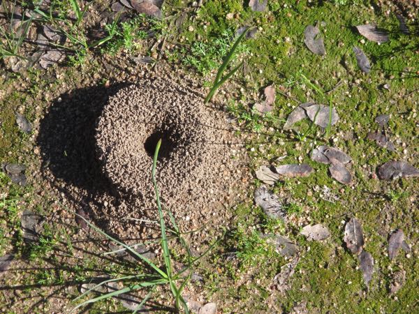
This ant hill is definitely a peculiar sight.

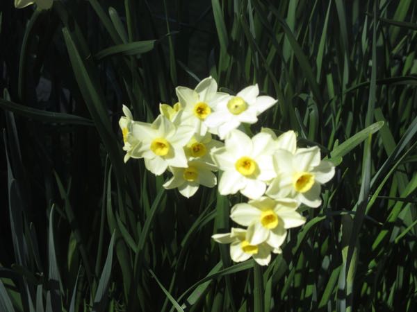
The narcissus are in bloom in my yard.

 And what does a Central California artist do for fun when the sun is out?

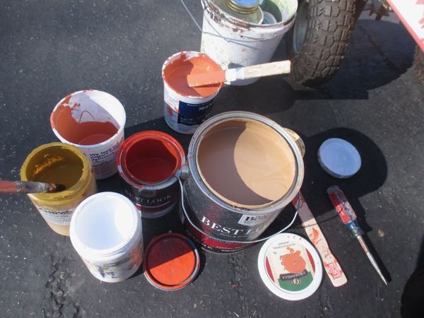
She mixes a paint color for her neighbor’s kitchen, of course.

Neighbor recently was in Italy and fell in love with a particular color. (Could there possibly be 2 color junkies in the same neighborhood??) The hardware store mixed a too-bright red, so together we figured out the color she wanted. This required adding tan from the gallon container, lightening it with white, and correcting the resulting pinkishness with yellow ochre. Then, we tried it on a kitchen cupboard door and declared it a winner. (It took 3 attempts with minor corrections each time.) Next, I had to match that exact color to convert the rest of the too-bright-red to our newly named “Red Pepper Cream Sauce”. (Last time we invented the color of “Orange Blossom Special” for her kitchen, which looks spectacular with the Red Pepper Cream Sauce.)*

*My own kitchen is blue and white, has been blue and white for 18 years, and probably will probably be blue and white for as long as I live here. Thanks for asking.

Oil Paintings at Home

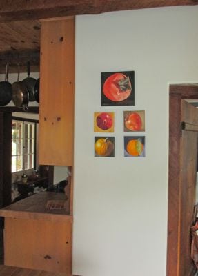
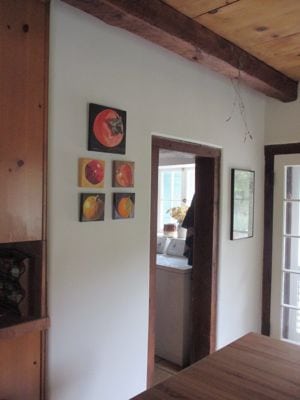
Oil paintings at someone else’s home. Someone else who really likes my work. Someone whom I really like. But, this is the World Wide Web, so her identity will not be revealed.

IMG_0967 IMG_0968

She has others that are not yet hung, only propped against the wall the last time I was over. As she and I discussed the paintings she was considering, I suddenly had a flash of insight. “AHA! You are a color junkie, just like me!”

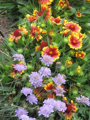
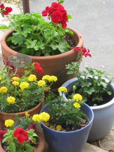
When one color junkie identifies another, there is no need to explain. We just get each other. Look at the flowers in her front garden!

IMG_0969

When she wants a painting, it doesn’t feel like the business of selling; it is simply helping a friend with good taste, an interest in beauty and some disposable income (“disposable”? Who decided that word should go with the word “income”??). I love to help people choose the right picture, whether it is one I have already painted or drawn or one they ask me to create for them (the fancy word is “commission”.)

A Color Junkie Goes on About Primary Colors

I am a color junkie. It jumps out at me everywhere, and I think about it without meaning too. Primary colors are the basis for all colors, and when I began oil painting, I became even more aware of colors, particularly the primaries.

Red, yellow, and blue make up all the colors in the world. I have to add white for painting.  I’ve heard it described as the absence of color, the sum of all colors, the coldest color and some people refuse to call it a color. Doesn’t matter – it is impossible to mix colors without it.

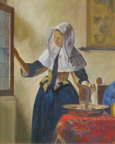
The primaries keep appearing in my life. Early in my painting career, I was given the assignment to copy one of the old masters. I chose Vermeer, and later realized the primaries figured in large in the painting.

Vermeer

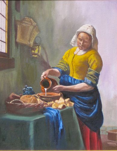
I liked the painting so much that I did another one. Red, yellow and blue are all over the place in this one too. (Of course they are all over – I did the entire painting using nothing but the primaries and white.)

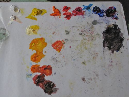
See my palette? White, yellow, a mixed orange, 2 reds, 2 blues, a mixed purple and then the other colors that I mixed for whatever I was supposed to be painting when I was procrastinating by photographing the palette.

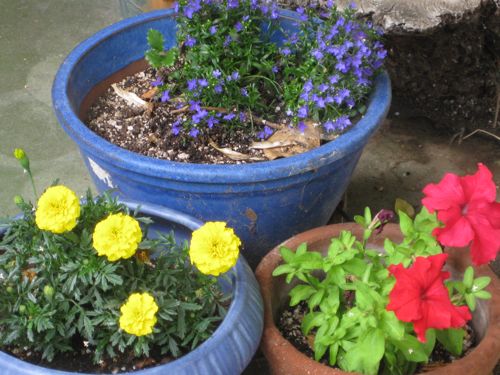
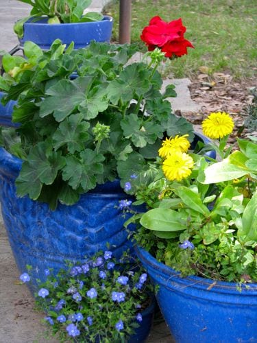
Every spring I look for blue flowers to put in my blue pots, completed by reds and yellows. No pinks, no purples, an occasional white, but mostly the primaries.

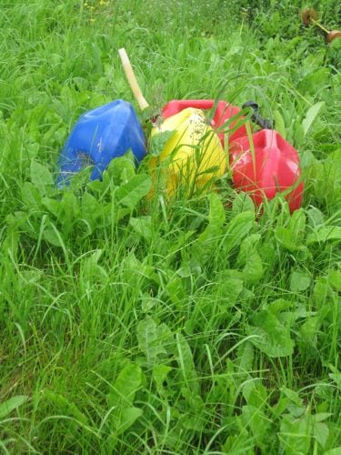
Last summer we were walking through a village on an island in Alaska and I saw these cans.

Only a color junkie would get excited about a scene like this.

Something Fun for Color Junkies

A few years ago I was at my local yarn store. There were some bins of sale yarns. I could not concentrate until I had arranged the yarns in those bins by color. The woman working there at the time told me it was because I am a color junkie.

WOW! A term to describe my obsession with color!

I wonder why I was happy drawing in pencil for all those years when I definitely have an obsession with color. Since I’ve devoted this entire year to completing all the pencil drawings for the upcoming book The Cabins of Wilsonia, I really get immense pleasure from working with color wherever I can – knitting, arranging the clothes in my closet in color order (Everyone does that, right?), mixing paint to cover up dress up parts of the workshop, organizing my drawing students’ colored pencils, et cetera.

Awhile ago, I discovered something really fun to do online. It is a color test, and it is free. I scored very high (low, actually, because in the test low is a high score.) Then I forgot about it until last week. I took the test again and look!

Isn’t that thrilling??

You can take the test too. Try it and tell me what you think, either by email or by commenting on this blog. I’d love to hear if it is as fun for you as for me. It’s probably just me. That’s okay, I’m used to being different from the average bear.

Color Lesson: About Lavender

First, a confession. I thought “lavender” was spelled “lavendar”. Really! Me, the Typo-Psycho! I was getting it mixed up with “calendar”. This is a prime example of the Middle-Aged-Mush-Brain I am currently experiencing.

Barbara’s Lavender

Now that I know how to spell it properly, let’s talk about it.

Lavender is light purple. I used to hate that color. This was the result of a trauma that happened when I was in about the 3rd grade.

My older sister had a bee-yoo-tee-full lavender dress that I COULD NOT WAIT for her to outgrow. Finally, finally, it came to me. I tried it on, looked in the mirror and was HORRIFIED. My skin looked YELLOW!! I ran to find Mom and told her, “This dress makes my skin look yellow!” She was astonished that yes indeed, it did make my skin look yellow and probably even more astonished that her 8 year old daughter noticed such a thing.

It was a life-defining moment, although I didn’t know it at the time.

In the 1980s, my Mom took my older sister and me to a color consultant to “have our colors done”. (My younger sister was and is too smart to need this and too cute to care.) Doesn’t that sound wonderful?

It was. Turns out that everyone can wear almost every color. The problems occur when you choose the wrong shade. That lavender did not have enough blue in it to suit me. I still have my color swatches from that session, and they have helped me tremendously through the years.

You can learn about it from a book called “Color Me Beautiful” by Carole Jackson.

Penstemmon

I also learned that as we age, our eyes become more aware of the color purple. Sure enough, in the last 5 years or so, I have come to be almost obsessed with the purple color that has a ton of blue in it. There is a version called periwinkle, and a darker version that is the color of my favorite dutch iris and some lupine and definitely a penstemmon and for sure my favorite Mineral King wildflower called “Explorer’s Gentian.


Explorer’s Gentian

So, I’ve grown from “I hate lavender” to “Oh wow, check out that color!”

What else would you expect from a color junkie?


Lupine