Odd Job, Chapter 4

If you subscribe to the blog and read the email on your phone, the photos might not show up. (Some people get them, some do not; it isn’t a problem I know how to solve.) You can see them by going to the blog on the internet. It is called cabinart.net/blog, and the latest post is always on top.

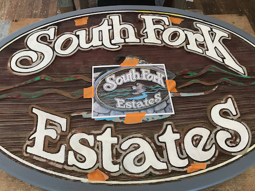
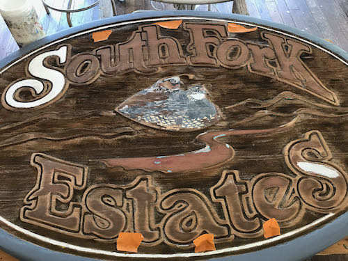
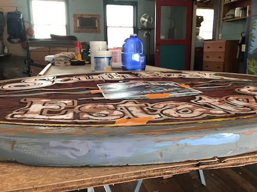
This was the day for the careful work on my odd job of repainting signs for a subdivision in Three Rivers: a gray line around all the letters, and repainting the California quail.

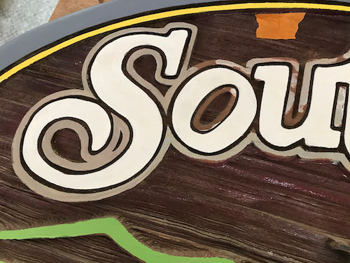
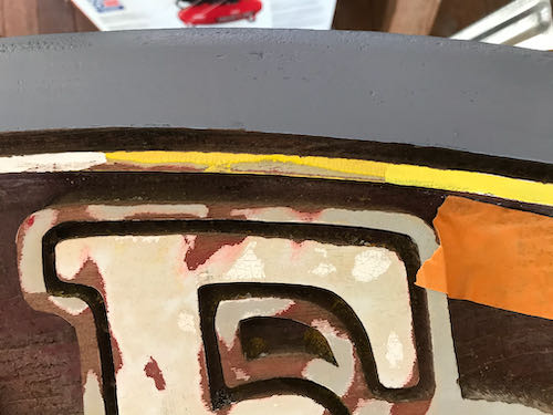
Thin Gray Line

Mixing the color was fun, because I had success quickly. Color precision isn’t terribly important here, but I like to practice my skill. You can see the new gray around the S and the old gray around the other letters. Same, same!
The California Quail

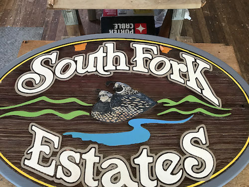
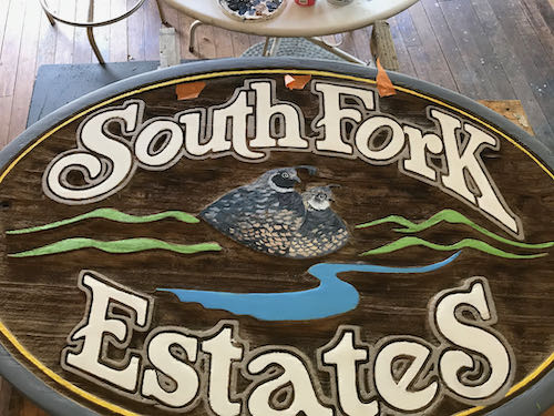
These were harder. I couldn’t tell for sure about the colors, and this particular one had such a sheen to it that I began to suspect it was a decal rather than something that was painted directly on the redwood.
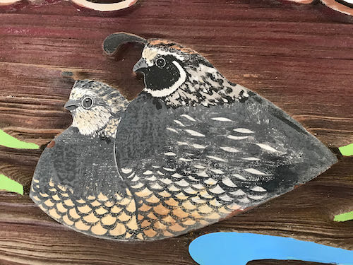
On the more weathered sign, it was clear that the quail were painted directly on the redwood.
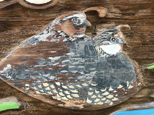
The photo only showed the quail on the less weathered sign, which should have been adequate.
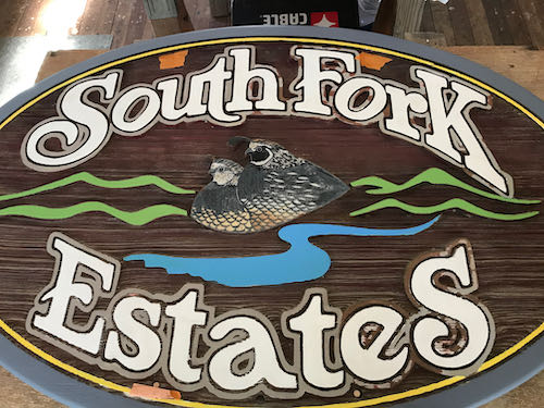
When I moved over to the other sign, I couldn’t figure out why I wasn’t able to duplicate the quail when I turned my back. It took a few flailing efforts before I realized they were facing the opposite directions. 
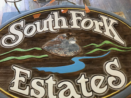
I didn’t do a perfect job, but I was able to make them look believable.
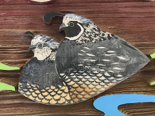
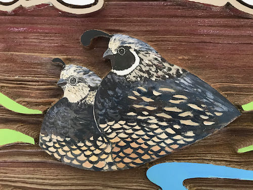
Here are the two signs, finished as far as I am able.
Finishing

The lead man on the project knows that I don’t know how to finish these. Mendosign kindly emailed me with a suggestion to use wood stain with a red tint, saying that wood needs to breathe, and that the stain would easily wipe off the painted parts. 

Mr. South Fork Estates thought there was a risk that it would make the painted parts look grubby. He will call a painter friend in Visalia for some advice. 

So, they will figure it out, and I am finished. 
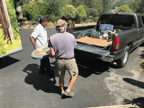
Bye-bye signs. Thank you, TT and TG!
Odd Job, Chapter 3

If you subscribe to the blog and read the email on your phone, the photos might not show up. (Some people get them, some do not; it isn’t a problem I know how to solve.) You can see them by going to the blog on the internet. It is called cabinart.net/blog, and the latest post is always on top.

Yesterday’s post about refreshing 2 signs left you hanging. I hope the anticipation of today’s continuation didn’t disrupt your sleep last night.

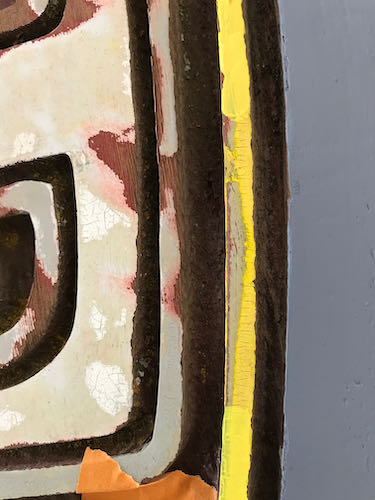
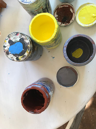
After applying 2 coats of the rim color, some confidence began developing. Time to tackle the narrow yellow line. You can see the old color in the middle; I put a bit of white on the left, and some brighter lightfast yellow on the right.

The yellow needed some red, along with a touch of white.

You might be able to tell that the upper yellow is now better, but since the lightfast yellow is transparent, it needed a primer coat beneath. No need to color fuss here because the goal is to make it look good.

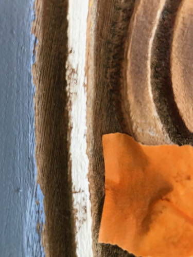
As I painted the narrow line with white, I realized that the wood is quite splintery. This means that getting a smooth edge isn’t going to happen the entire distance on any of the sign. But, it is a sign, not a piece of fine art to be viewed closely.

With the warm weather, swamp cooler blowing, and big doors open, the paint dried quickly. I could paint one sign, turn and do the other, go back to sign #1 for the second coat, and then turn and second coat sign #2.

The white letters seemed like a good next step. These also soaked up the paint and required 2 coats. The rough edges bothered me at first. Then I remembered that this will be viewed from inside people’s cars, until they stop noticing at all. After 5 hours, I felt an unavoidable slide into Idiotland, where Sloppy, Stupid, and Careless all reside. Besides, my cheater-readers kept falling off when I leaned over the sign, and then I painted a blue streak on my face by accident.
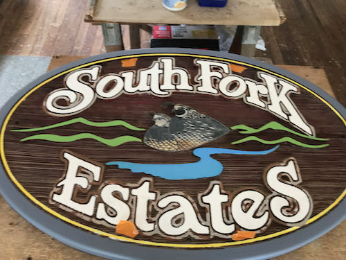
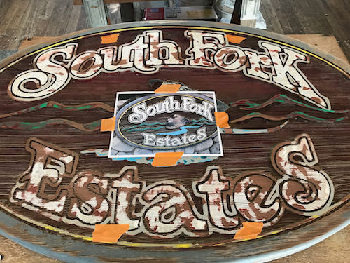
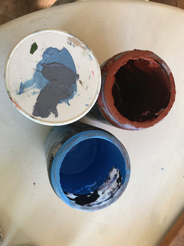
So, that’s all on this Three Rivers custom art project for today. The quail and the narrow gray line surrounding the letters will require a strong focus (and a better fitting pair of cheater-reader glasses).

Odd Job, Chapter 2

If you subscribe to the blog and read the email on your phone, the photos might not show up. (Some people get them, some do not; it isn’t a problem I know how to solve.) You can see them by going to the blog on the internet. It is called cabinart.net/blog, and the latest post is always on top.

Because I am an artist in a small town, I get asked to do a variety of things.

This keeps me growing, learning, and becoming more capable of doing more odd jobs. Still, I start out a little unsure of where to begin and unsure of my abilities to git ‘er dun well.

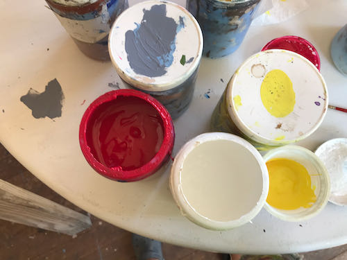
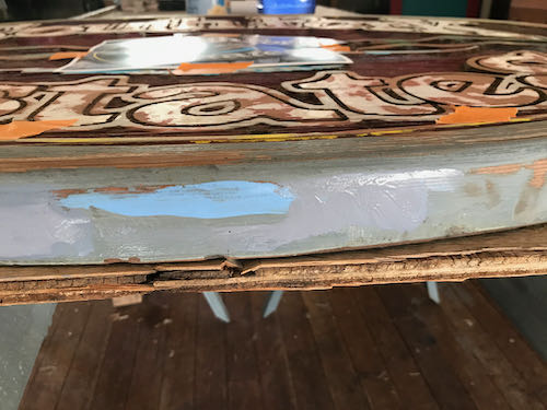
The outer rim of each sign is a grayish blue, or perhaps a bluish gray. It looked pretty straightforward, both in the mixing and the application. I put these 2 colors together and made the gray on the top of the lid.

You can see that I tried a few versions.

Because my gray had a purplish cast, I put in a smidgeon of yellow, which is opposite purple on the color wheel. (The ArtSpeak word for that is “complementary color”, as in “complete” because its presence completes the 3 primary colors which can be blended to make every color in the world. Not white. White is the absence of color.)

A touch more white, and then it was close enough. 

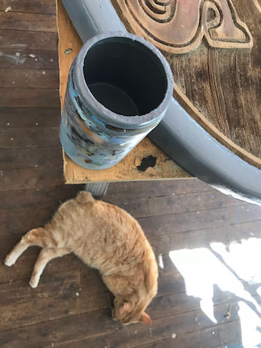
Clearly I had to be very very careful because Pippin was underfoot.

Let’s continue tomorrow, shall we?

Did Mineral King Need a Paint Job?

Did Mineral King need a paint job?

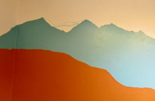
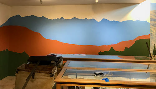
No, but the Mineral King Room at the Three Rivers Historical Museum did. The blue didn’t match the murals in the room, and the mountaintops weren’t recognizable. (You can see the murals here.)

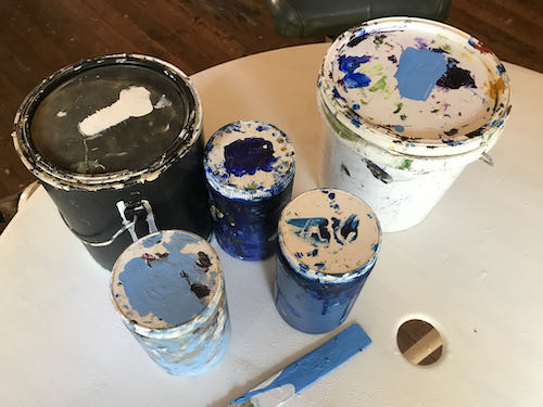
First, I was determined to mix the right shade of blue using whatever paints I had on hand. Lightfastness isn’t a problem on indoor murals, so I was able to use a can of indoor white paint that came from who knows where, along with my 2 mural paint blues. Mural paints are highly pigmented and that makes them very useful for making my own interior colors.

Second, we taped all the parts that needed protection. (This was not the royal we—I had great help from MKPS Sandi).

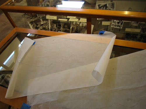
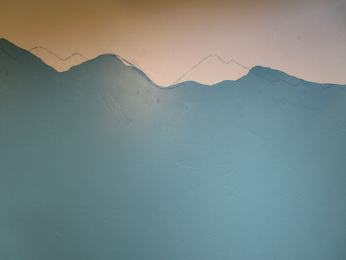
Next, I traced the tops of the mountains on the mural showing the peaks surrounding the MIneral King valley. This provided a guide to redraw the peaks to match reality. (This was based on the assumption that I painted the mountains accurately in the mural.)

I drew the mountains on with chalk. (It wasn’t a Mineral King blue either but it matched my painter’s tape.)

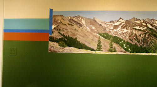
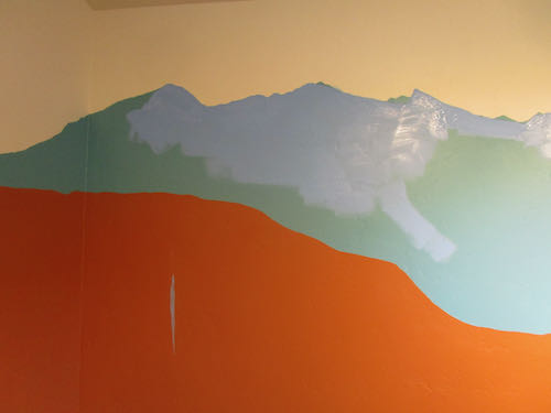
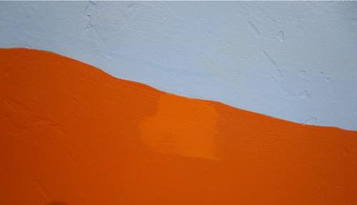
Then, I started painting and almost immediately, dripped onto the rust color.

Good thing there is touch-up paint for all the colors involved. 

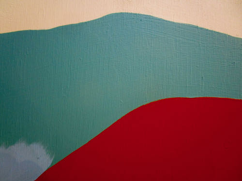
Here is an example of something weird that I have learned about acrylic paints, as opposed to oil paints: they are LIGHTER when they are wet. Doesn’t make sense, but it is true.

That teal color was great with the rust, but just not right for the subject matter. I told the Mineral King Preservation Society that if they are just going to waste the paint, I’ll be happy to take it off their hands. I’m sure I can find a use for it. (Weird how the rust looks like red here, and the white looks like light tan).

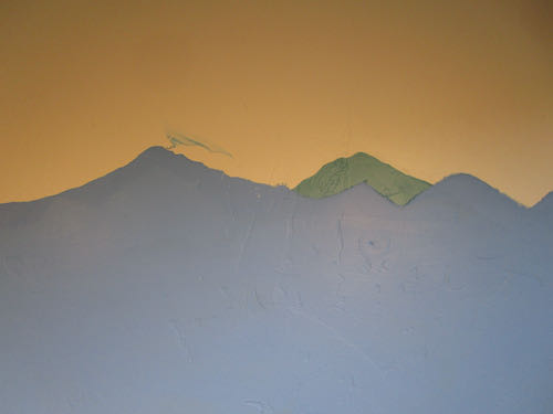
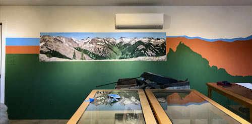
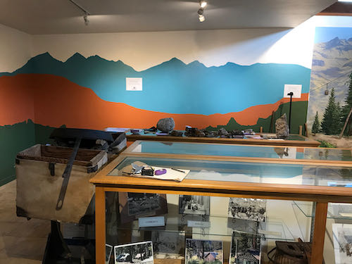
Now look at the room so you can see the corrected peaks and the color that matches the murals. (I’ll show a before and after on the 2nd shot for you.)

Before:

After:

The mountains in the Before photo are more dramatic and more proportionally pleasing. However, the mountains in the After photo are realistic rather than stylized, match the murals and give more display space for whatever will be going on the wall.

Tomorrow I will tell you a few thoughts about this job.

What Matters on a Commissioned Oil Painting

This wisdom about perfecting a painting is from Betty Edwards, most known for her book Drawing on the Right Side of the Brain. She also wrote a helpful book about color, helpfully titled Color.

  1. Do any of the lightest lights seem to pop out rather than staying anchored?
  2. Do any of the darkest darks seem to carve holes?
  3. Does any area that is not the main event seem to fight for attention?

Turn it upside down to evaluate for these next questions:

  1. Does it seem heavy on one side or the other, or on the top or bottom?
  2. Does anything seem out of place, either too bright or too dull?

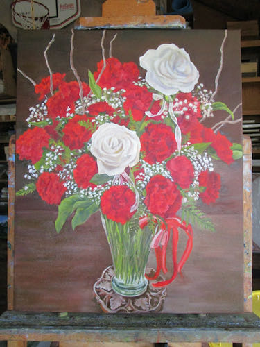
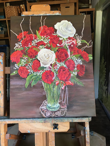
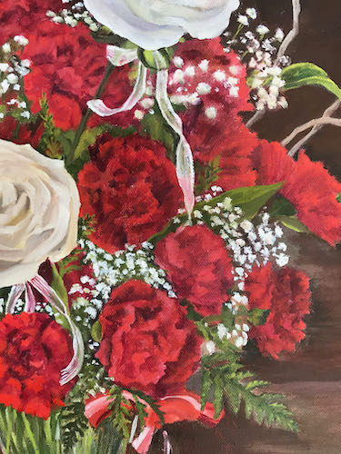
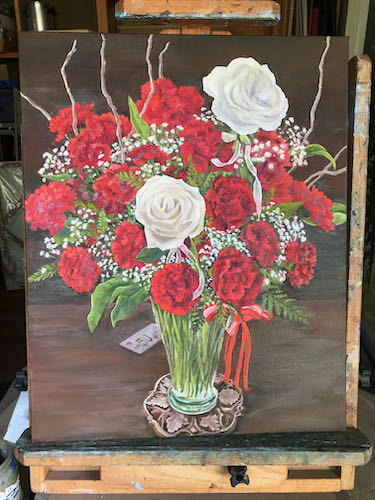
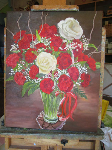
I evaluated the anniversary bouquet painting using these questions. It went from looking like this:

to looking like this:

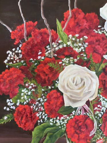
Then I incorporated the very apt suggestion from reader (and friend and former drawing student) Nikki to make the edges of the carnations more fringed. Here is better fringiness on the left side:

And the not yet fringed right side for your comparison:

Then I fixed the hanging ribbon, the patchy-looking background, the repaired coaster, a dab here and a touch there, and finally added in a little something on the bottom left quarter.

Now it will dry, I will continue to mull it over, study it, and eventually, I hope to find the courage to sign it and call it FINISHED. (Mr. and Mrs. Customer are no help in this finalizing and nitpicking because they have been thrilled with the painting at every stage!) 

P.S. It looks better in person; there are weird shiny spots because so many parts are wet.


Variety in the Working Life of a Central California Artist

There you go, Search Engines. Hope you like that ridiculously long title.

I had a day of great variety, all of it interesting, all of it productive

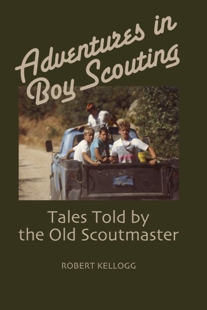
  1. This book, Adventures in Boy Scouting, will soon be available as an ebook through Bookbaby. It took a lot of learning, and a lot of proofreading. The print version is available at the Three Rivers Mercantile, Three Rivers Historical Museum, and BookBaby.com
  2. After enjoying the nice fire in the house (in the wood stove—no need to be concerned) while proofreading (we had a few cold days), I moved to the painting workshop to do a bit of polishing on the Fiftieth Bouquet oil painting. “Polishing” here means making some small corrections. The roses, red bow, vase, coaster and background are not finished.
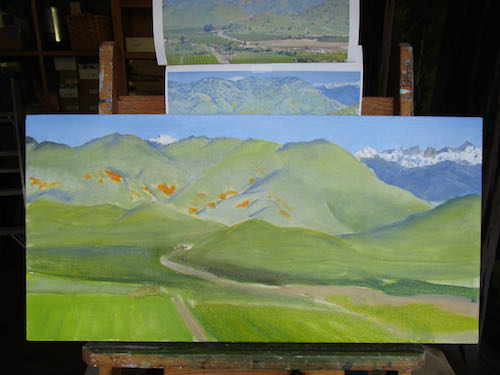
  3. I detailed the mountains and put a second layer on my favorite scene.
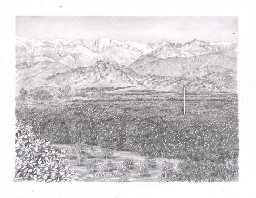
  4. Then I left the painting workshop and moved into the studio to finish a drawing. After scanning it, I sent it to the customer to get her approval before spray-fixing it and then adding color.

It was a good day of working on projects that are all presold. While it is fun to just paint and draw what I want, it is more satisfying to paint and draw for other people, particularly when they choose subjects that float my boat.

In case you have forgotten because I haven’t shouted this at you for awhile:

Using pencils, oil paint, and murals, I make art that you can understand, of places and things you love, for prices that won’t scare you.


A Special Commission

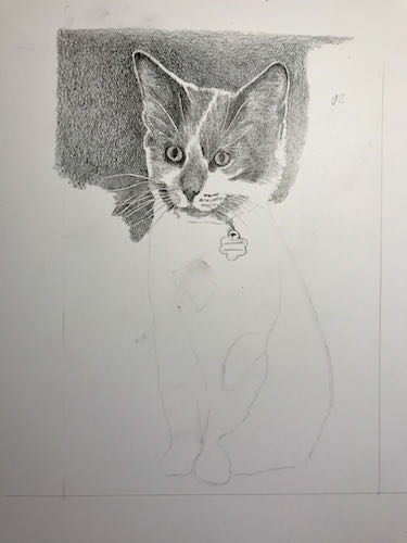
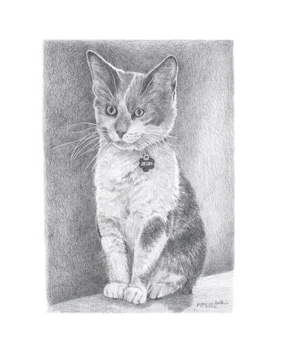
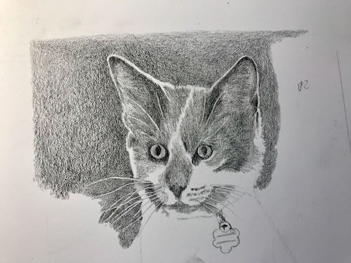
If you have followed this blog for awhile, you may have noticed that I have a slight touch of a Cat Disorder. Nothing crazy. Trail Guy brings sensibility into my life, so we only have 3 cats. (We’ve had as many as 8, but that was short lived.)

Some dear friends who live far away have an unusually personable cat named Zelda. They sent a few photos, and I put all jobs aside to work on this one.

Everything else had to wait.


ONE MORE THING:

BOOK SIGNING SUNDAY, APRIL 24, THREE RIVERS HISTORICAL MUSEUM, NOON-4 PM. I will be joining Bob Kellogg as he signs his book “Adventures in Boy Scouting: Tales by the Old Scoutmaster”.

Never Learn, or Never Give Up?

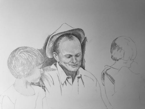
For years I thought that I was hopeless at capturing a likeness in a portrait. After taking a workshop from a premier colored pencil portrait artist (Ann Kullberg), I learned the all important principle, “Never draw a face smaller than an egg”. (not talking quail egg or hummingbird egg, preferably a goose egg)

This information helped, but I have never gotten comfortable or confident about capturing a likeness. I can spend hours making tiny adjustments, and in the end, I still have just drawn the guy’s cousin. 

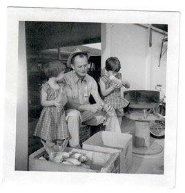
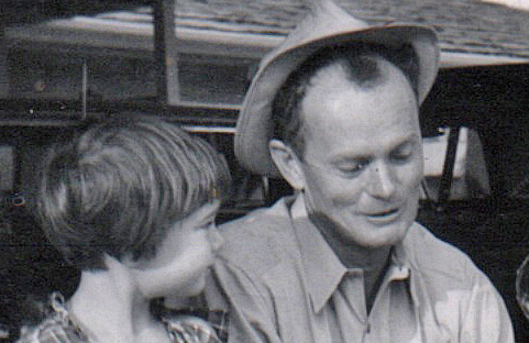
When I asked a friend/blog reader/customer, let’s call her M, if she would like a print of the Sisters in the Orchard (2 girls drawn from the back, no faces involved), she declined, but then sent me a photo of a photo that she would like me to draw.

The original photo is about 3×3″. This version is blurry. I said that it was too hard because it was too small and too blurry.

She sent me the original so I could scan it, sharpen things, lighten and brighten and enlarge and SEE!

I really really like this person and never want to disappoint a friend. So, rather than sticking to my conviction that this is really too hard for me, I went with the principle of It Never Hurts To Try.

I scanned the photo and worked it over on the computer. Then I employed every tool that I have (not going to bore you with technicalities or give away any secrets—I save those for my drawing students).

The plan was to do Dad’s face first, because if I couldn’t make him look right, there would be no reason to continue.

I am more of a “precrastinator” than a procrastinator; in other words, do the hard thing before there is time to fret, backpedal, renege, or chicken out. 

I sent this to M, and now we will see if the drawing passes the recognition test.

I am incapable of perfection, but I can see right now a few adjustments that need to be made. When the face is only the size of an average chicken egg, every adjustment is the barest little pencil stroke, a gentle tap-tap with an eraser, a teensy blur and a smudge, all done under a huge lit magnifying lens.

Will I ever learn to say no to these types of jobs?

Prolly not. . . eternally optimistic in the growth of my skills, the continual triumph of hope over experience.

Oranges in Pencil, The Point

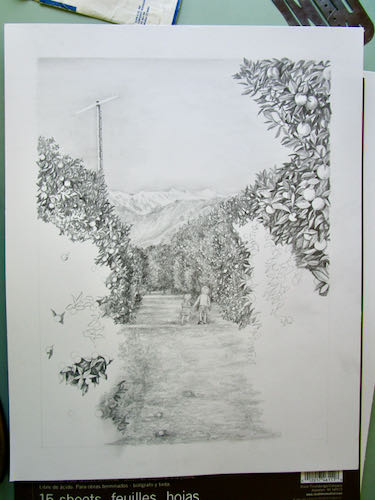
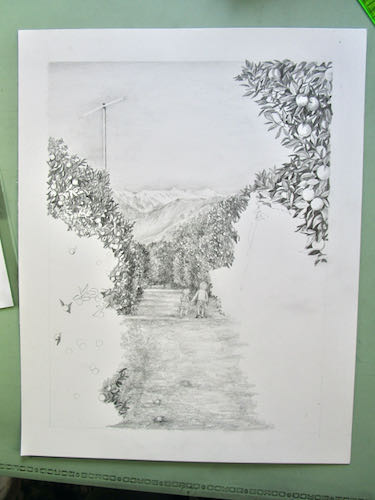
What’s my point? Not the point of my pencil. The point of all this careful drawing and explaining is to make everything in this custom pencil drawing believable.
I have added a ladder to the wind machine, smoothed the sky, and begun the lower leaves and oranges on the bottom left. Have a look at the 2 little girls, the way I see them under the giant lighted magnifying glass. They truly are almost impossible to draw and hardly show up. But they will have color on them at the end, so they will be more visually significant.
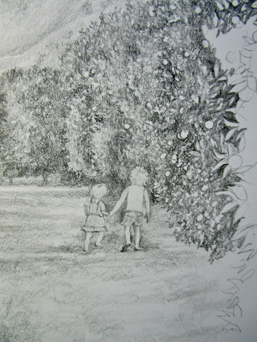
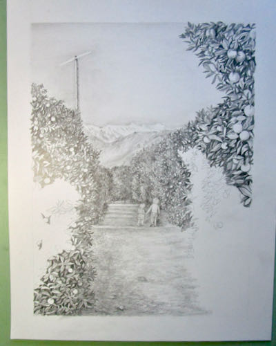
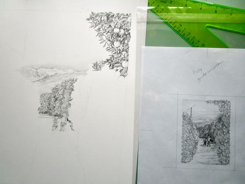
Building up the foliage is tedious; some might say “restful”; others might call it “zen”. The tedium is alleviated by the continual need to check the sizes of the leaves and fruit, thinking about where they are landing on the rows of diminishing sizes. 

I also worked on the ground a bit. I want it to look real and as always, believable. Usually within an orchard, there are many dead leaves, broken sticks, and dropped fruit. So, I will put some of this in but be careful to not have it too noticeable, because it isn’t the point. What is the point??

Believability!

Inching Forward With Pencils

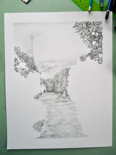
The custom pencil drawing of 2 little girls in an orange grove is going to take awhile. I can quickly scribble in the distant orange trees and have them be believable, but everything up close needs to be carefully drawn.

In order for the snow-covered mountains and the wind machine to show up, it needs sky. This is because you cannot draw white; you have to put shading around a white thing for it to appear.

You can see that the leaves on the trees are getting added to, and the distant hills and mountains are too. One side of the wind machine is darker than the other; this will require some attention. 

I think this drawing will have quite a bit of “put some on, take some off, put some on, take some off”. Sounds like a middle-aged woman trying to get comfortable, but I am talking about pencil here. I keep adjusting darks and lights in the distance, looking for the best way to make it look the most believable.