More Orange Groves in Pencil

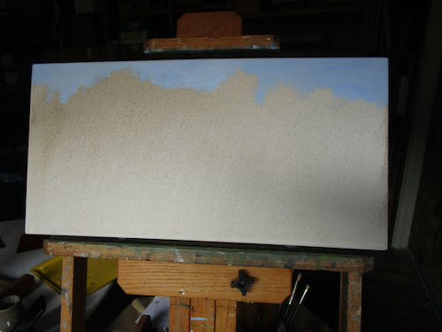
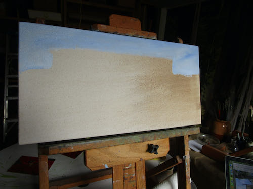
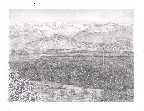
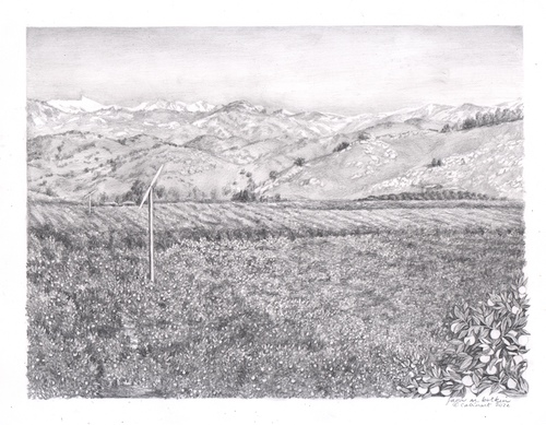
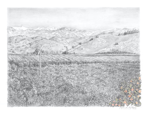
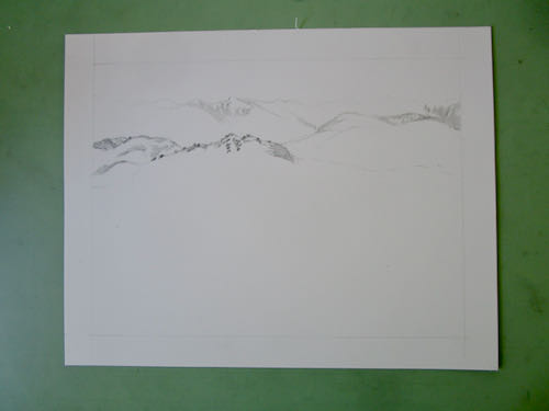
I have two new pencil commissions, both of orange groves with foothills and mountains in the distance. 

I love this stuff! (Big happy face emoji could fit here but this is a blog, not a text, and we speak English here, not hieroglyphics).
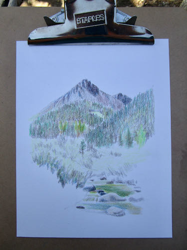
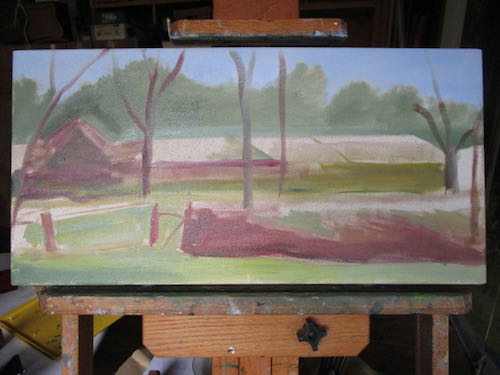
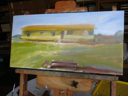
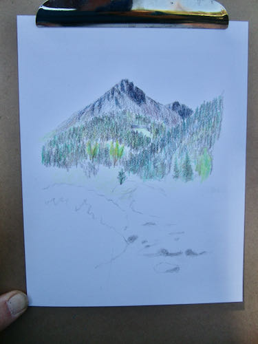
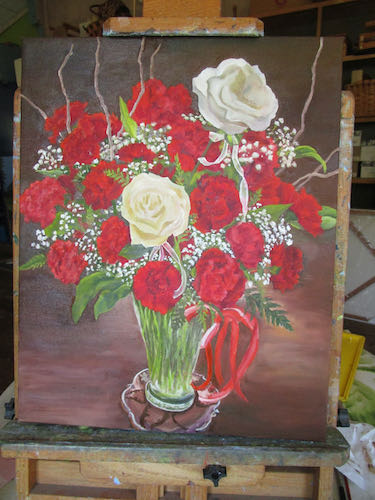
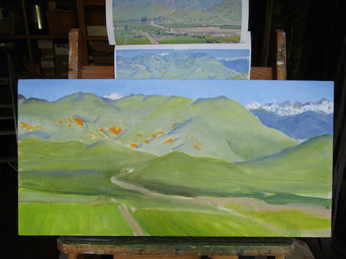
Here are 4 ideas for the customer to choose from or develop into something else. Good thing she knows that I can draw.

She didn’t specify whether she prefers horizontal or vertical, nor did we establish which part of the mountains she prefers: Alta Peak with Castle Rocks or a bit farther south to show Sawtooth and Homer’s Nose.

She did say that she wanted a little bit of color.

You probably have a clear favorite but it is the customer’s opinion that will prevail.

More About Drawing as a Skill

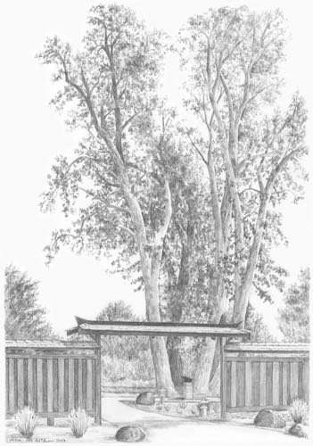
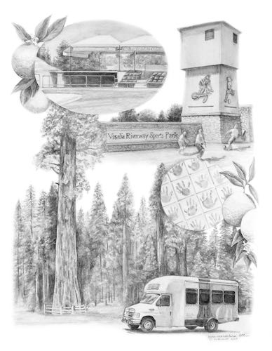
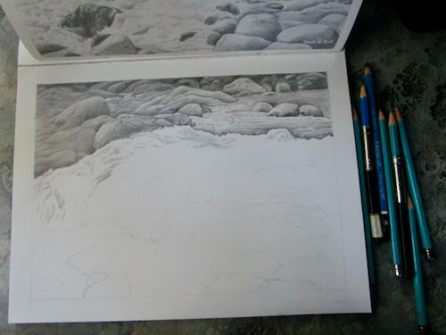
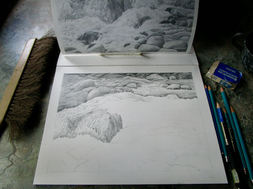
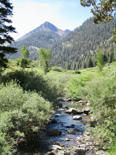
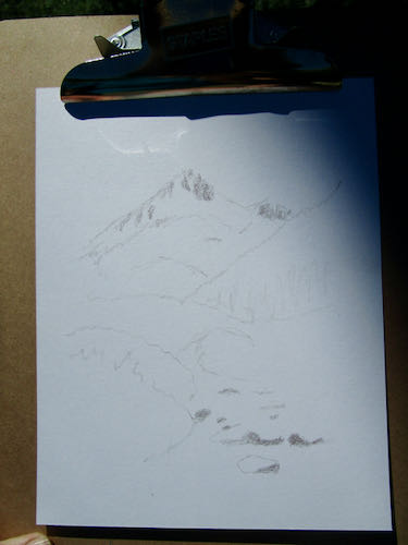
I teach people how to draw, working from photographs. Because it is a skill, not a talent, we need a still photograph, on paper, so that we can measure, rotate the photo and the drawing to view it from other angles, and work as slowly as necessary.When I began drawing, I was a slave to the photographs that I worked from. I learned how to draw from real life, but nothing would hold still long enough so that I could measure. I didn’t have the skill, the instruction, the freedom and confidence to just loosen up and let my pencil fly around, getting close enough. 

It has taken me many years to be able to draw without reference photos. I can only do this on a few subjects, and I have to check with at least one of three things before I am convinced that it is a decent piece of work: 1. a reference photo, 2. the scene in real life, 3. after a bit of time, just study it to see if it is truly believable.

I am still learning. You too can learn.

Here are links to previous blog posts about drawing lessons:

Lighthearted Lessons

(More) Lighthearted Lessons

Drawing Lessons — Fast or Good

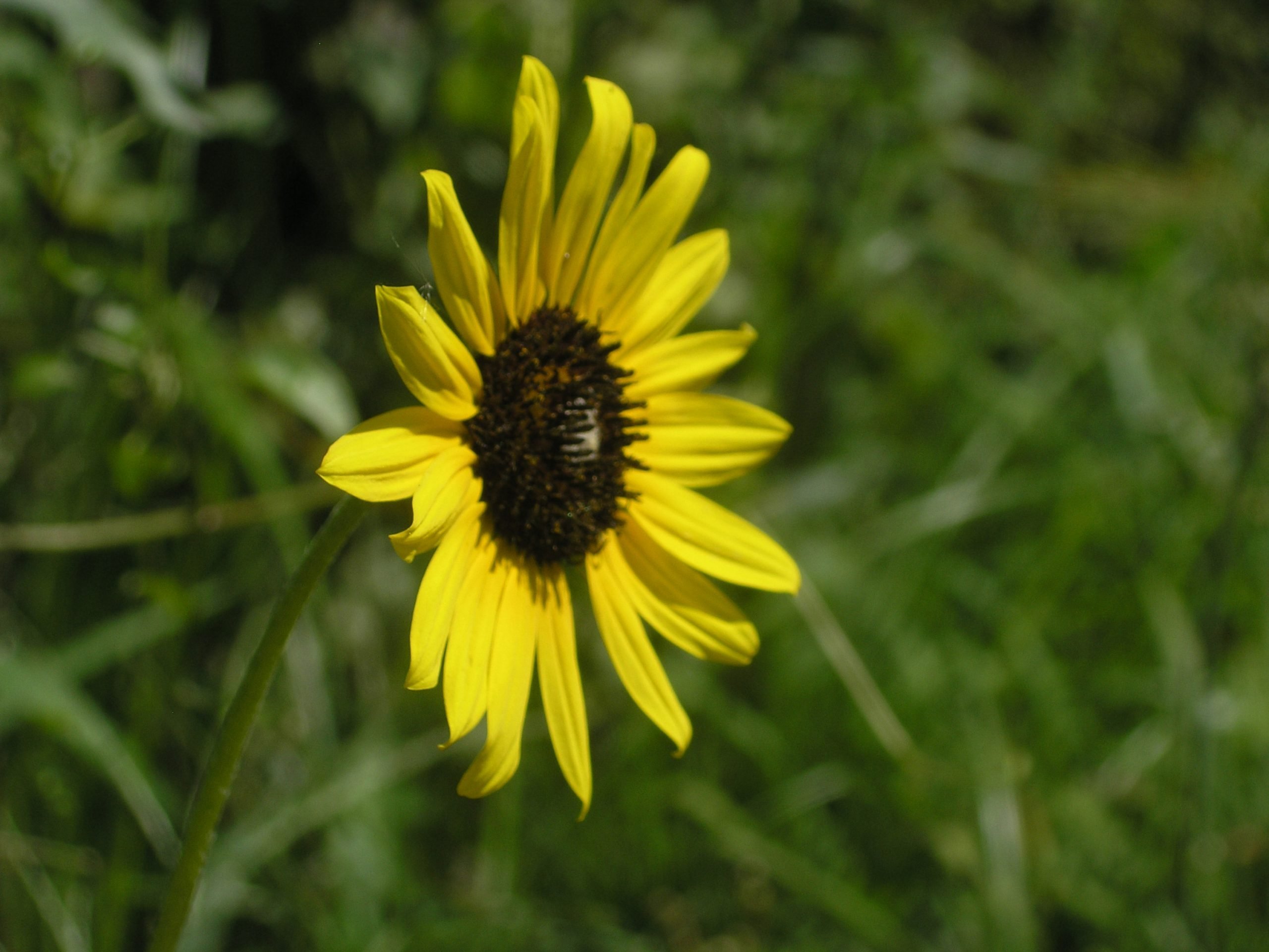
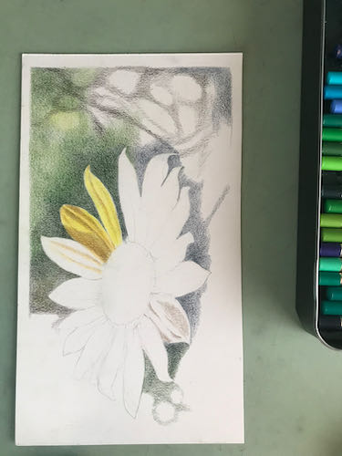
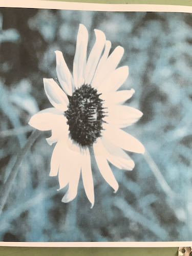
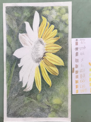
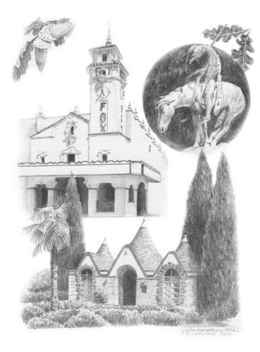
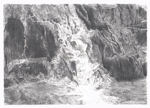
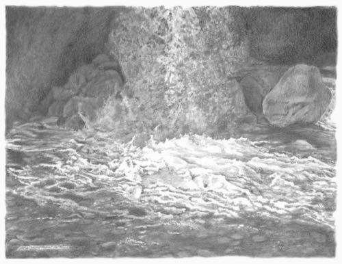
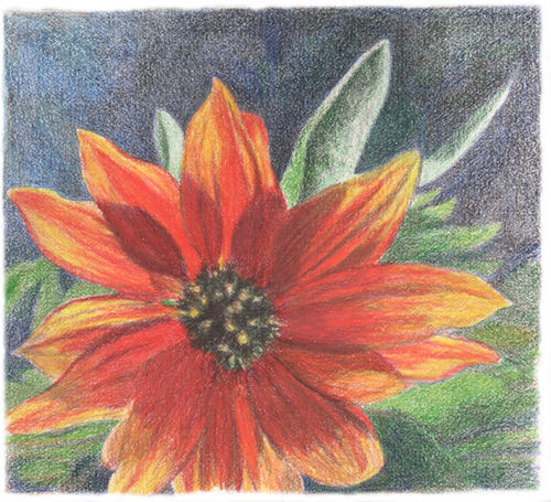
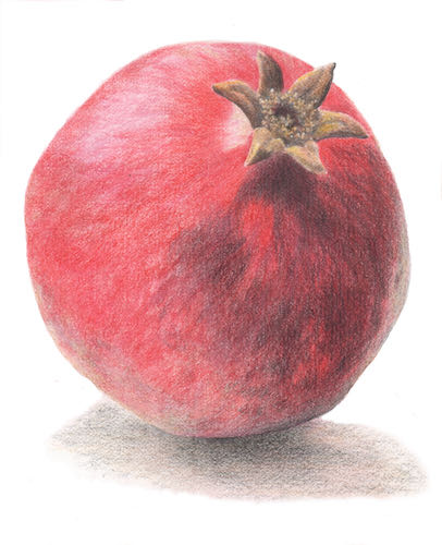
P.S. Today’s drawings are from my drawing students.

Pencil Oranges, Aiming for Perfection

It is time for me to really study this pencil commission. The pencil drawing needs to be perfect, because the next step is to spray it with a fixative, to prevent smearing when I add colored pencil to a few areas. 

Mr. Customer asked for clouds, so I decided some wispy types would add texture, variety, and interest without becoming too busy. Everything else is highly detailed, so the sky needs to be somewhat visually restful. 

All this remains to be inspected:

  1. The trees must look believable as they recede into the distance. 
  2. The ground needs to have texture, but not so much that it competes with the leaves.
  3. The closest branches need to have the largest leaves and fruit.
  4. The sky needs to be dark enough to show off the clouds, snow on Sawtooth, and the windmachine.
  5. The little girls have to be perfect. 

After I addressed all those items, I scanned the drawing, cleaned up the scanner messes (it ALWAYS leaves spots, and the paper color scans as gray), and emailed it to Mr. and Mrs. Customer for their final approval.

More will be revealed in the fullness of time, or as my dad used to say, “Time will tell”. Meanwhile, I will continue to. . .

. . . use pencils, oil paint, and murals to make art that you can understand, of places and things you love, for prices that won’t scare you.

Oranges in Pencil, The Point

What’s my point? Not the point of my pencil. The point of all this careful drawing and explaining is to make everything in this custom pencil drawing believable.
I have added a ladder to the wind machine, smoothed the sky, and begun the lower leaves and oranges on the bottom left. Have a look at the 2 little girls, the way I see them under the giant lighted magnifying glass. They truly are almost impossible to draw and hardly show up. But they will have color on them at the end, so they will be more visually significant.

Building up the foliage is tedious; some might say “restful”; others might call it “zen”. The tedium is alleviated by the continual need to check the sizes of the leaves and fruit, thinking about where they are landing on the rows of diminishing sizes. 

I also worked on the ground a bit. I want it to look real and as always, believable. Usually within an orchard, there are many dead leaves, broken sticks, and dropped fruit. So, I will put some of this in but be careful to not have it too noticeable, because it isn’t the point. What is the point??

Believability!

And More Orange Groves

Remember this painting?

A friend saw it and wondered if I could draw a similar scene in pencil, this time adding in two little girls. Because I love to draw, love to draw and paint orange groves, and really like my friend, I said yes.

Ahem. There isn’t a photo of the two little girls from the back, walking together holding hands, because one doesn’t even walk yet. 

My friend sent me photos of the girls as they look now. Then I went to The Duck (search engine DuckDuckGo) to see if I could find helpful photos. 

From those photos, I did this little sketch.

Good thing my friend knows that I know how to draw. He was very taken with the sketch, so I think this idea will work, IF I CAN DRAW TWO LITTLE GIRLS THAT I CANNOT SEE!

No pressure or any undue stress.

Just shut up and pick up your pencils, Central California Artist.

A Cat Called Chaos

A Chat Called Chaos? A Cat Called Caos? Never mind. Here is the story.
 
In 2004 I drew a cat for some folks who actually brought him to my studio. This was in the days of film cameras (Nope, not an Early Adopter of anything), so I didn’t save a photo of the drawing. Snowcat’s people recently asked me to draw their current cat, Chaos, and although I remembered Snowcat, I couldn’t remember the drawing. They sent me a photo.That was one alert cat!! When I was taking his photos, I reached out to touch him. He pulled away in a very subtle but arrogant manner. Made me laugh.
 
Their current cat spent the first 2 years of his life in a dog grooming shop and used to create chaos there. He is getting up in age, so they asked me to draw him, sending a handful of digital photos.
Chaos looks more alert in the lower photo, but the man appears to be strangling the cat. I asked for a few more photos with a different hand position.
This is less worrisome for the cat’s survivability, but the hand appears larger than the cat’s head. That won’t do.
 
I decided to just start drawing and figure it out as I go.
The weird orangish tint is due to the smoky light coming through the window over my drawing table.
This time to photograph it, I carried it outside for better light.
To be continued. . .


Still Smoky, Still Drawing

This sort of smoky light means it is hard to see to paint, but if I open the doors for better light, then it is hard to breathe. So, I get to spend another day in the studio with my pencils. (I love to draw – did you know that?)

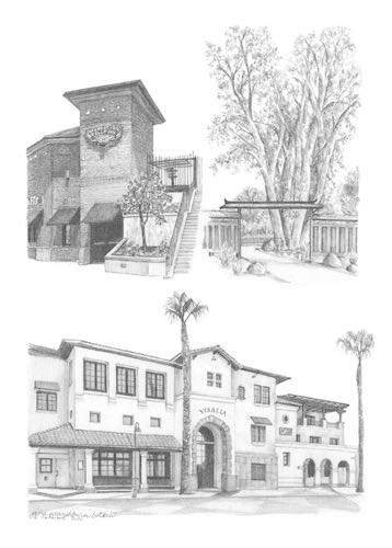
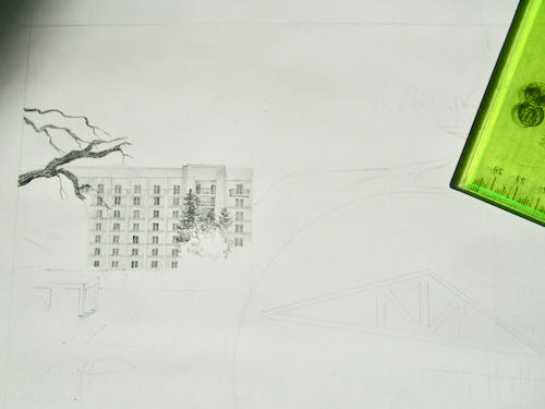
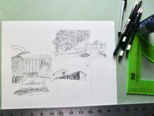
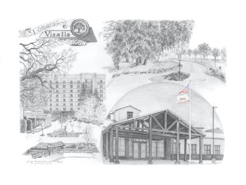
This is a large collage drawing, a commissioned piece 14×18″, that will incorporate 3 different scenes. In designing, I tried something new – I used photoshop instead of doing sketches. I sent the customer 2 versions and she chose this one.

Here you can see the faint outline where things will go. I started at the top on the left, because as a right-hander, this helps to cut down on excessive smearing.

Setting it up took as long as getting it to this stage.

I had enough time to begin the next segment.

Next, I heard from the customers on the lengthy logo design project. Calling it “lengthy” is not an insult; this is a very challenging job, because the customers have been without a logo since 1980, logo design isn’t my strongest skill so I am slow, and together we are carefully working out the best design possible. This is the next piece in the puzzle.

I used an old (1997) drawing as a place holder, drew a new picture for them, and then we discovered that the old drawing was a better match. Alas, it wasn’t very well done. Well, it was fine for back then, but I was barely out of my Primitive Era in the last century. So I drew it again, and this time I added lemons, along with other improvements that probably only my drawing students will be able to appreciate. But I want this to be The Very Best Possible for my customers and not an embarrassment to my artistic reputation.

Hey look! It is clearing up! I could tell that something was taking place outside because there were some helicopters overhead, and they made the drawing table vibrate.

See? Clear as a bell! 

Not. But clear enough for air support as the fires continue to rage through Sequoia National Park and fill Three Rivers with worry, smoke, ash, fire equipment, and fire personnel.

If you are someone who talks to God, please keep praying for good slow soaking rain without any lightning.


Drawing While Paradise Burns

That’s Paradise Ridge, not Paradise the town, which we know burned a couple of years ago (or was it last year? It’s all a smoky blur).

Trail Guy and I spent a good chunk of a morning talking about what to take, making piles, filling boxes. All the while, we had no intention of evacuating unless the fire gave us no choice. 

What are these relics? Is that ash? Are there any treats? Tucker wants to know.

After getting our piles somewhat in order (oh dear, I have way too many sweaters – how am I supposed to decide which ones to leave behind, possibly to never see again??), I went out to the studio to get some work done. Having an emergency doesn’t give me license to create emergencies for my customers.

This drawing might be a little bit too hard for me. Many details are hidden in shadow, and there is a horse. (At least his tongue is inside his mouth). It is good to tackle the hardest part first.

There might be a problem with his feet, so I moved onto the things that I can do with one hand tied behind my back and half my brain occupied with wildfires (and sweaters).

Working from the laptop screen definitely has its advantages. I can embiggen the photos and even lighten the shadows to understand what the various black blobs are.I drew most of the afternoon while listening to helicopters overhead, a welcome sound after they were silent throughout the smoky and worrisome morning.

And this is how it looked at the end of the day.

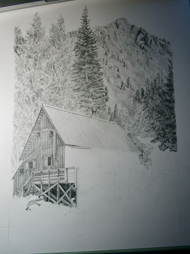
This is a commissioned pencil drawing of a cabin in Montana for a repeat customer who is a joy to work with and for.

In case you were wondering about the reference to the horse’s tongue, here you go.


Dead Saloon and Western Bang Bang

Excuse me??

I am working on a logo design for a customer-friend (if it is business, “customer” is the right term, but they are friends too). He requested “western type”, so I went searching on the Duck. DaFont, actually.

The names of those typestyles are hilarious! Look at these: Eastwood, I Shot The Serif, Bleeding Cowboys, Insane Rodeo, Boots and Spurs, Dust West, Confetti Western, Lost Saloon, Fort Death, Tequila Sunrise, Cowboy Cadaver, Poker Kings, Texas Tango, Macho, Western Swagger, Old Bob Junior, Dusty Ranch. . . they go on and on and on. Lots of them look alike, so I will just keep sketching, figuring out which type fits with which sketched logo design. 

The logo will include something that looks a bit like this:

And that’s all I will reveal at this time. More will be revealed in the fullness of time, or as my dad used to say more succinctly, “Time will tell”.

P.S. Logo design is not my strong suit, but pencil drawing is. I have done quite a bit of work for these folks, they are easy to please, and I have a lot of ideas for them. Remember this logo design? I like it a lot, and it inspired my confidence to offer to do this job for these folks.