A Cat Called Chaos

A Chat Called Chaos? A Cat Called Caos? Never mind. Here is the story.
 
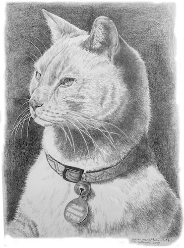
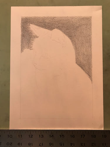
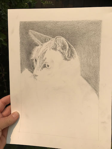
In 2004 I drew a cat for some folks who actually brought him to my studio. This was in the days of film cameras (Nope, not an Early Adopter of anything), so I didn’t save a photo of the drawing. Snowcat’s people recently asked me to draw their current cat, Chaos, and although I remembered Snowcat, I couldn’t remember the drawing. They sent me a photo.That was one alert cat!! When I was taking his photos, I reached out to touch him. He pulled away in a very subtle but arrogant manner. Made me laugh.
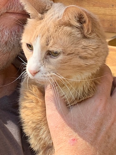
 
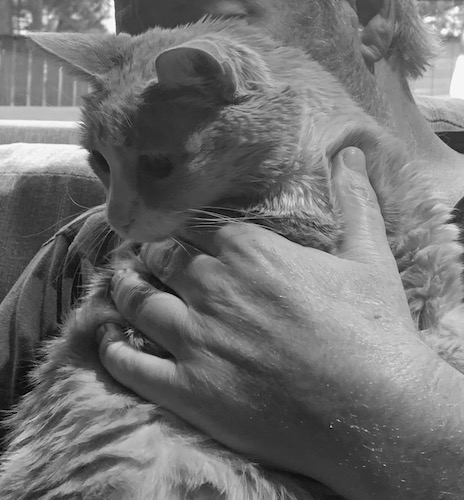
Their current cat spent the first 2 years of his life in a dog grooming shop and used to create chaos there. He is getting up in age, so they asked me to draw him, sending a handful of digital photos.
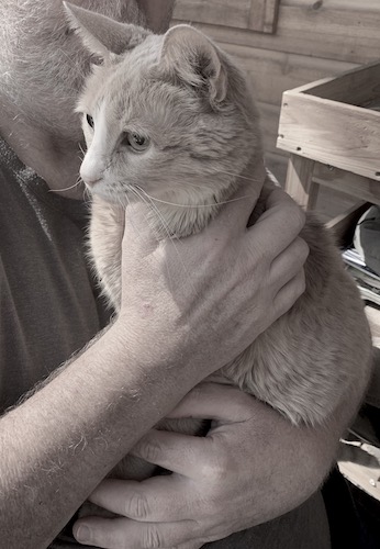
Chaos looks more alert in the lower photo, but the man appears to be strangling the cat. I asked for a few more photos with a different hand position.
This is less worrisome for the cat’s survivability, but the hand appears larger than the cat’s head. That won’t do.
 
I decided to just start drawing and figure it out as I go.
The weird orangish tint is due to the smoky light coming through the window over my drawing table.
This time to photograph it, I carried it outside for better light.
To be continued. . .


Still Smoky, Still Drawing

This sort of smoky light means it is hard to see to paint, but if I open the doors for better light, then it is hard to breathe. So, I get to spend another day in the studio with my pencils. (I love to draw – did you know that?)

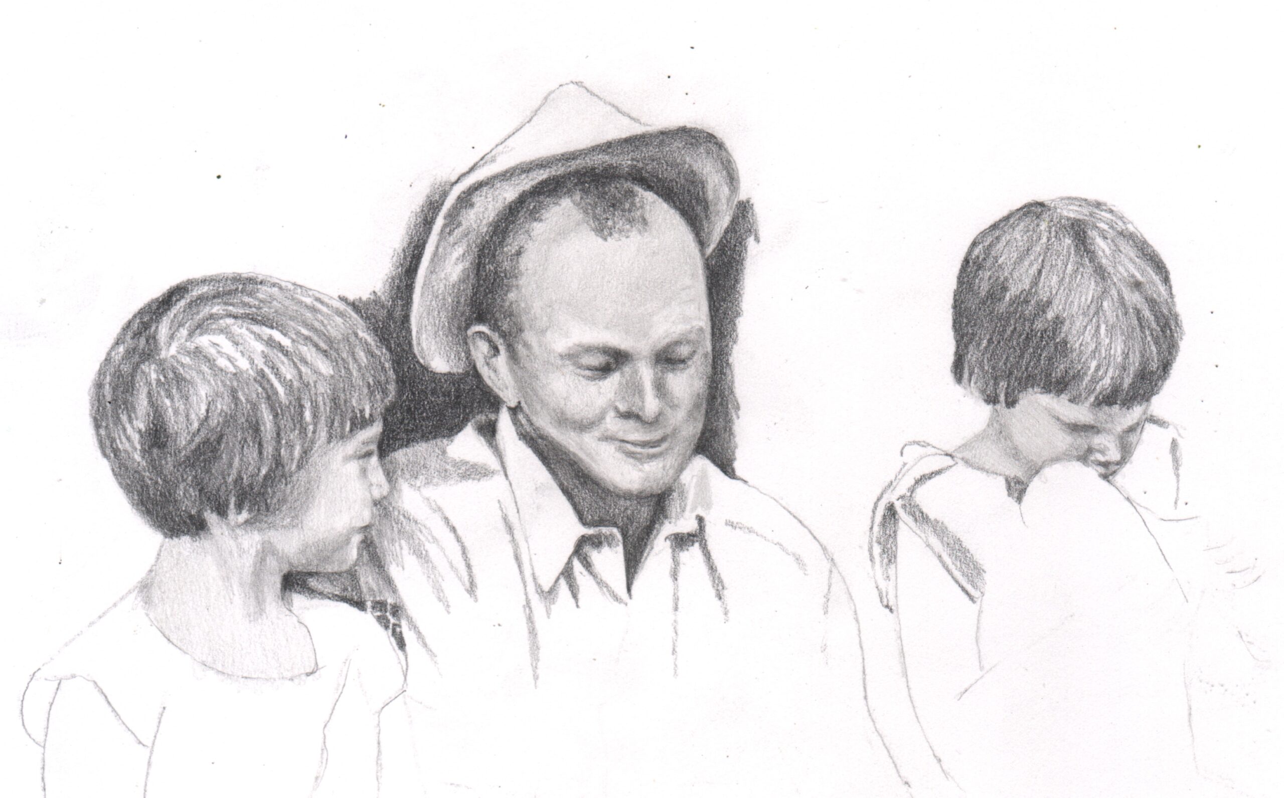
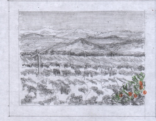
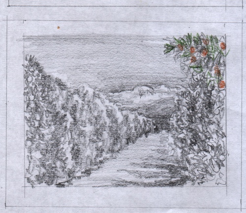
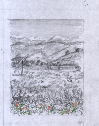
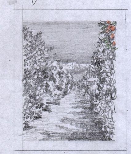
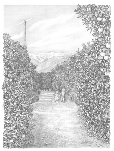
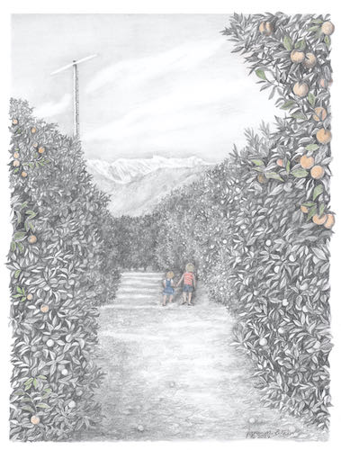
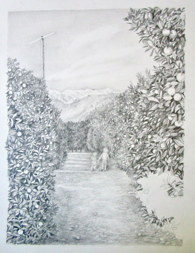
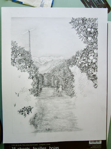
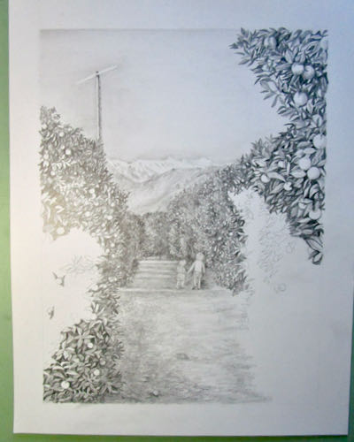
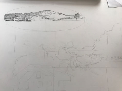
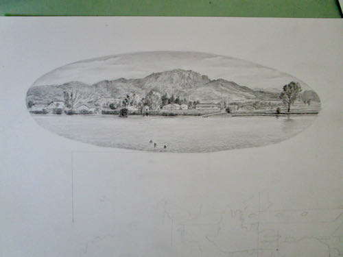
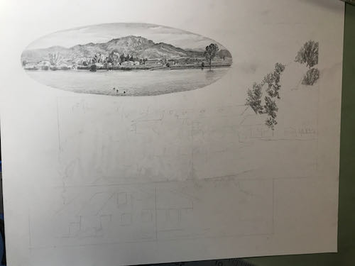
This is a large collage drawing, a commissioned piece 14×18″, that will incorporate 3 different scenes. In designing, I tried something new – I used photoshop instead of doing sketches. I sent the customer 2 versions and she chose this one.

Here you can see the faint outline where things will go. I started at the top on the left, because as a right-hander, this helps to cut down on excessive smearing.

Setting it up took as long as getting it to this stage.

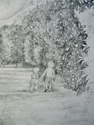
I had enough time to begin the next segment.

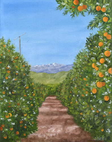
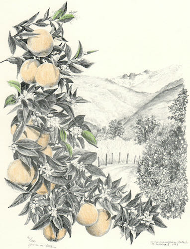
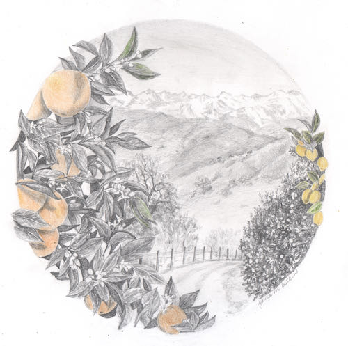
Next, I heard from the customers on the lengthy logo design project. Calling it “lengthy” is not an insult; this is a very challenging job, because the customers have been without a logo since 1980, logo design isn’t my strongest skill so I am slow, and together we are carefully working out the best design possible. This is the next piece in the puzzle.

I used an old (1997) drawing as a place holder, drew a new picture for them, and then we discovered that the old drawing was a better match. Alas, it wasn’t very well done. Well, it was fine for back then, but I was barely out of my Primitive Era in the last century. So I drew it again, and this time I added lemons, along with other improvements that probably only my drawing students will be able to appreciate. But I want this to be The Very Best Possible for my customers and not an embarrassment to my artistic reputation.

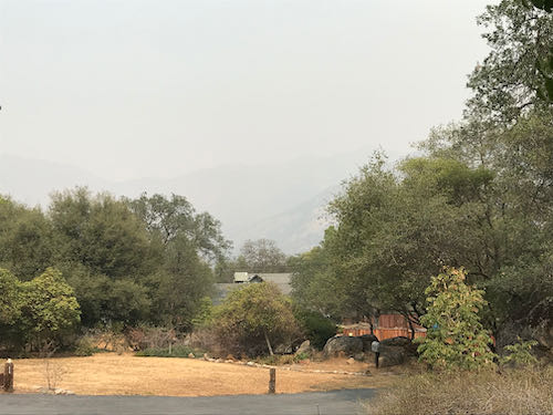
Hey look! It is clearing up! I could tell that something was taking place outside because there were some helicopters overhead, and they made the drawing table vibrate.

See? Clear as a bell! 

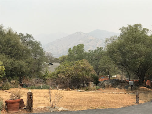
Not. But clear enough for air support as the fires continue to rage through Sequoia National Park and fill Three Rivers with worry, smoke, ash, fire equipment, and fire personnel.

If you are someone who talks to God, please keep praying for good slow soaking rain without any lightning.


Drawing While Paradise Burns

That’s Paradise Ridge, not Paradise the town, which we know burned a couple of years ago (or was it last year? It’s all a smoky blur).

Trail Guy and I spent a good chunk of a morning talking about what to take, making piles, filling boxes. All the while, we had no intention of evacuating unless the fire gave us no choice. 

What are these relics? Is that ash? Are there any treats? Tucker wants to know.

After getting our piles somewhat in order (oh dear, I have way too many sweaters – how am I supposed to decide which ones to leave behind, possibly to never see again??), I went out to the studio to get some work done. Having an emergency doesn’t give me license to create emergencies for my customers.

This drawing might be a little bit too hard for me. Many details are hidden in shadow, and there is a horse. (At least his tongue is inside his mouth). It is good to tackle the hardest part first.

There might be a problem with his feet, so I moved onto the things that I can do with one hand tied behind my back and half my brain occupied with wildfires (and sweaters).

Working from the laptop screen definitely has its advantages. I can embiggen the photos and even lighten the shadows to understand what the various black blobs are.I drew most of the afternoon while listening to helicopters overhead, a welcome sound after they were silent throughout the smoky and worrisome morning.

And this is how it looked at the end of the day.

This is a commissioned pencil drawing of a cabin in Montana for a repeat customer who is a joy to work with and for.

In case you were wondering about the reference to the horse’s tongue, here you go.


Dead Saloon and Western Bang Bang

Excuse me??

I am working on a logo design for a customer-friend (if it is business, “customer” is the right term, but they are friends too). He requested “western type”, so I went searching on the Duck. DaFont, actually.

The names of those typestyles are hilarious! Look at these: Eastwood, I Shot The Serif, Bleeding Cowboys, Insane Rodeo, Boots and Spurs, Dust West, Confetti Western, Lost Saloon, Fort Death, Tequila Sunrise, Cowboy Cadaver, Poker Kings, Texas Tango, Macho, Western Swagger, Old Bob Junior, Dusty Ranch. . . they go on and on and on. Lots of them look alike, so I will just keep sketching, figuring out which type fits with which sketched logo design. 

The logo will include something that looks a bit like this:

And that’s all I will reveal at this time. More will be revealed in the fullness of time, or as my dad used to say more succinctly, “Time will tell”.

P.S. Logo design is not my strong suit, but pencil drawing is. I have done quite a bit of work for these folks, they are easy to please, and I have a lot of ideas for them. Remember this logo design? I like it a lot, and it inspired my confidence to offer to do this job for these folks.


More On Drawing Lessons

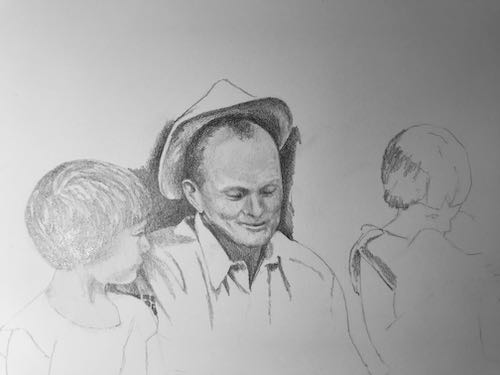
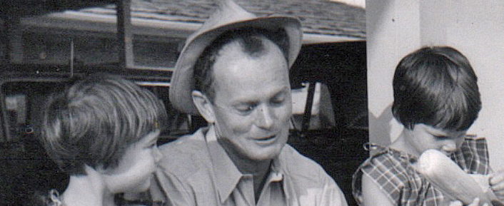
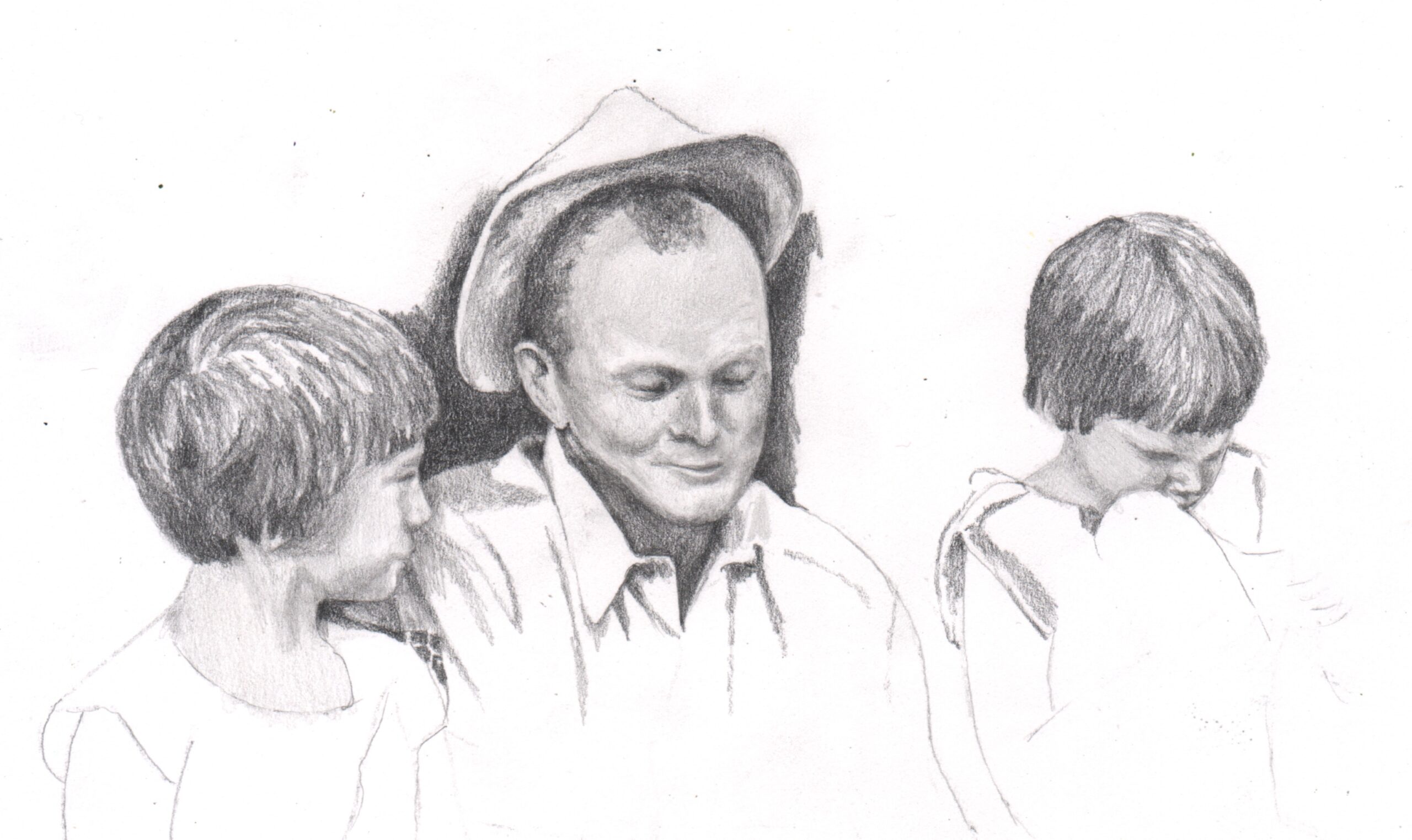
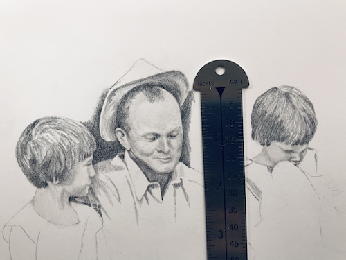
These drawings are all by my drawing students, in progress, quickly photographed by my inadequate phone.

Different levels of experience, different levels of completion, but all work at their own speeds on subjects they choose.

Some of the things I tell them: “You can try this if you really want to, but it might even be too hard for me”; “You draw better than I do so I’m not sure why you are here but I will try to help you”; “That looks really fun!”; “Oh wow, that is going to take a long long time”; “I drew something like that once and ended up hating the subject”; “That is a great photo and will make a great drawing”; “Good thing you know your subject matter because it is really difficult to tell what is happening in that little area”.

I also help with step by step instructions. Lessons last 1 hour with 4 students per class. $55/month plus supplies, no lessons in July, August, or December. If you would like to know more, email me (cabinart at cabinart dot net, spelled out because it is supposed to discourage robots from contacting me) or use the contact button here on the website.

Drawing Lessons

Drawing is not a talent; it is a skill, and if you can listen and be patient with the process, you can learn.

Look what is in progress right now with my drawing students of all levels (I took the photos quickly with my phone so OF COURSE they look better in person):

Some are almost finished, some have weeks or even months to go. Each student works at her own pace on the subject of her choosing. Some work from their own photos; others find photos from other sources. Some are doing the drawings as gifts; some turn them into cards; some have reproduction prints made from their originals to share with people; some are drawing commissioned work.

Everyone has fun (including me). 

More later.

Drawing Buck

My drawing student C and I continue to work on her pencil drawing of the horse, Buck. This last time she took a photo of the drawing instead of scanning it. I tried to help and was able to show her how to put a lock of hair across the eye. She also asked me about her hair shading techniques, and after staring at it a bit, I finally concluded that it was all too squarified for me to tell what was pencil and what was pixel.

Here is what I told her in the email (because I think my writing is a little bit too sloppy):

“About the hair crossing over the eye: The question to be answered is always: Which is darker? sometimes the only way to tell is to squint at the photo so the detail and color blur. Another way is to turn your photo to black and white, but this sort of feels like cheating. Well, not cheating, but bypassing the ability to learn to see values by letting the computer do the work. Often the black and white method backfires, because the 2 things are the same value (darkness). This means you get to decide (you are the boss of your picture.)
 
“The hair is darker in some places and lighter in others. Just make the adjustments to whatever is behind the little clumps so that it shows up. It is okay for the clumps to look broken or disconnected.
 
“Hair always tapers at the tips.
 
“I can’t help you on the shading; because of the pixelation, it is too hard to tell what you have actually done and what is getting squarified. 8-( 
 
“You can either keep going and then scan it, or you can rescan this and I can keep going here!”
 
So, this lesson is on hold for a bit.
My show “Still Here” is still there, at Arts Visalia, that is. The phone # to make an appointment to see it is 559-739-0905. Gallery hours are Wednesday through Saturday, noon-5:30. The last day to see my work there is Friday, April 30.


New Virtual Drawing Lesson #2

Last week we saw the beginnings of C’s new horse drawing.

The eyes are the best place to start when drawing a living being. The eyes on Mr. Curly were too dark to see on the photo, so I used the computer to lighten and enlarge. (If you can’t see a thing, it’s almost impossible to draw the thing. Duh. You are welcome.)

Eye on the left after enlarging and lightening:

Eye on the right, after lightening and enlarging:

My demonstrations and notes, scanned a little darker than accurate in order for C to be able to read my handwriting, which makes the drawing parts a little too dark. There are many drawbacks to this virtual stuff, but C is a very committed drawing student and an excellent communicator.

I wonder how many of you will unsubscribe to my blog because this type of post is making your eyes cross.

Virtual Drawing Lesson 5

Virtual Drawing Student C finished her drawing of the horse, Rocky. She sent me a new photo that I named Mr. Curly, and I have instructed her how to begin.
About starting Mr. Curly:
1. First step is always to decide how big and where on your paper that Mr. Curly will go.
2. Remember to draw a border so that you don’t view the edge of the paper as the edge of your drawing. Margins are necessary for many reasons.
3. Do you have tissue paper so you can trace the main shapes? The purpose of this is to simplify the image in order to get the bare bones laid out on your new paper.
4. If you don’t have tissue paper, you can skip that step. It is a little harder to see the main shapes with all those colors and textures than if you are looking at just an outline on tissue.
5. Remember to look at the drawing (and the tracing or the photo) upside down, sideways, other sideways, and then finally right side up. 
6. Go slowly, draw light, and don’t stop until all the shapes look perfect. Okay, you can stop if you need a break or feel stuck, but don’t begin shading until you have all the outlines down. Remember to draw the dog before you draw the fleas.
7. After it looks perfect, scan and send it to me so I can see if there are any problems with the proportions.
 
P.S. Maybe Mr. Shaggy or just Shaggy would be a more appropriate name. Or how about Lurch?

Virtual Drawing Lesson 4

C sent me her drawing with a list of 5 questions. This time I was more orderly, instead of making little patches of topics all over the paper. She only had one area that I needed to demonstrate, but I handwrote the entire sheet of instructions anyway. Then I realized that no one else would want to read all that scribbling.

Here is her drawing:

And here is a more concise list of instructions.

  1. There are a couple of scratches on the drawing. These can be fixed with a super sharp 2H or lighter pencil, working under a magnifying glass. (Yes, it is difficult – I can do this, and you may address me as “Dr. Pencil”.)
  2. Her decision to make the horse’s upper lip look more like reality than the photo was a good decision. (You may address me as “The Mayor of Realville”).
  3. She circled an area of the chest and said it didn’t look right to her. I told her it is because the strokes are too long, and I demonstrated those, scanned them, and emailed the scan. 
  4. When I spray-fix my drawings, I use Blair Matte Spray Fixative to keep my drawings from smearing. Beware: it alters the colors of some colored pencils (had a terrible spray fix accident once, still scarred), and I always try a little squirt first to make sure the nozzle isn’t clogged. 
  5. The best paper for my style of drawing is Strathmore (brand) Bristol (weight) Smooth (surface) 400 Series (quality).

I provide most of the paper to my drawing students in person. There are many things that are better about taking drawing lessons in person, but we are doing the best we can with this. I think C is doing a great job in communicating clearly, working on her own, and encouraging her reluctant instructor to push through her annoyance with technology.