After my customer sent me a chart of colors to include, it was time to try it with Photoshop Junior to see how it would look. Looking at her list of colors within the Coat of Arms, I saw that green was missing, so that became the background. 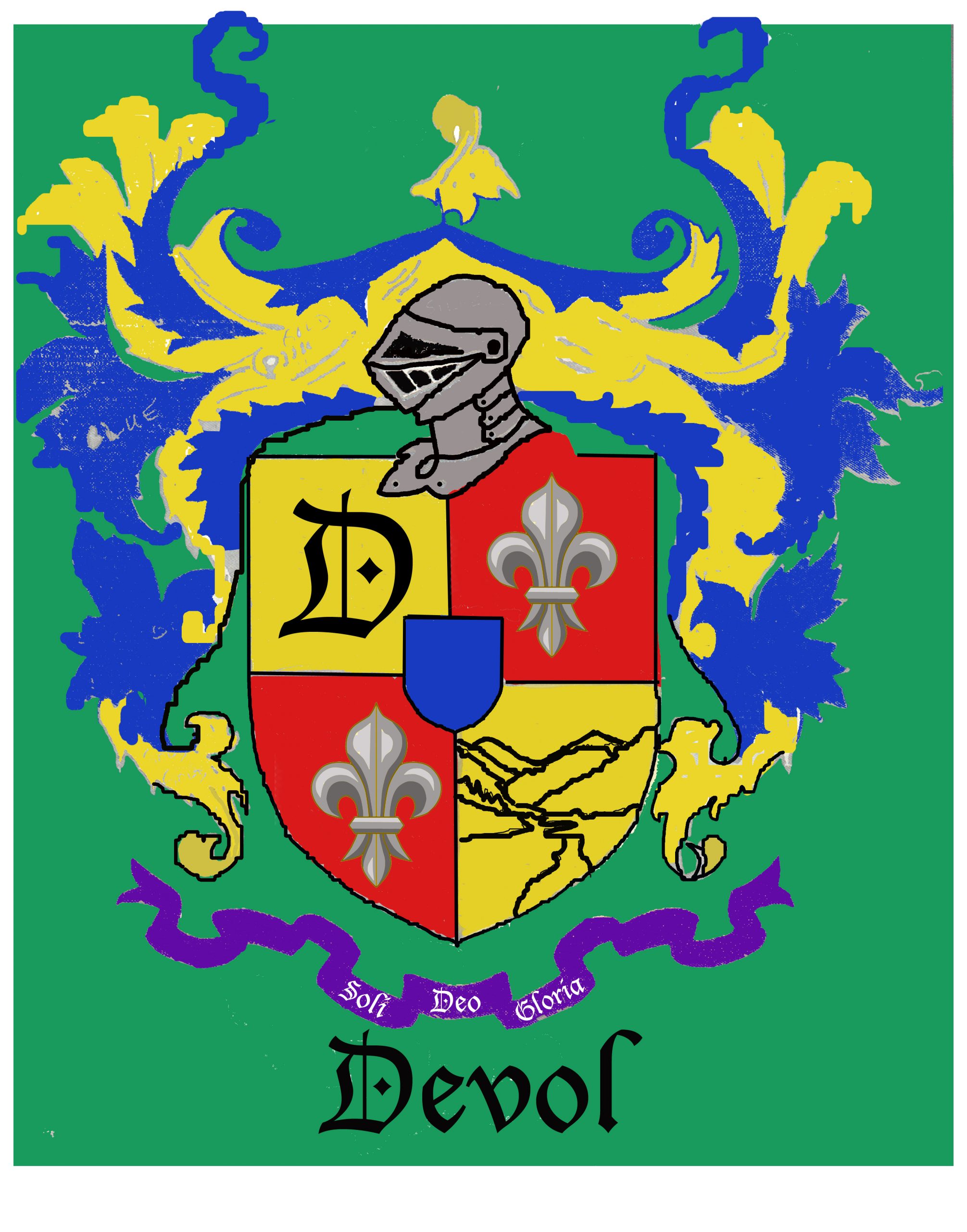
This is actually the 2nd or 3rd iteration from many conversations and adjustments as we worked out the design together.
The pointy-pokey waving arms didn’t please her, so she sent many other design to consider. I developed a more ribbon-like look on the left side.
The symbolic Farewell Gap needed simplification too.
We had a few more discussions about black outlines, smoothing out some of the bends in the purple ribbon.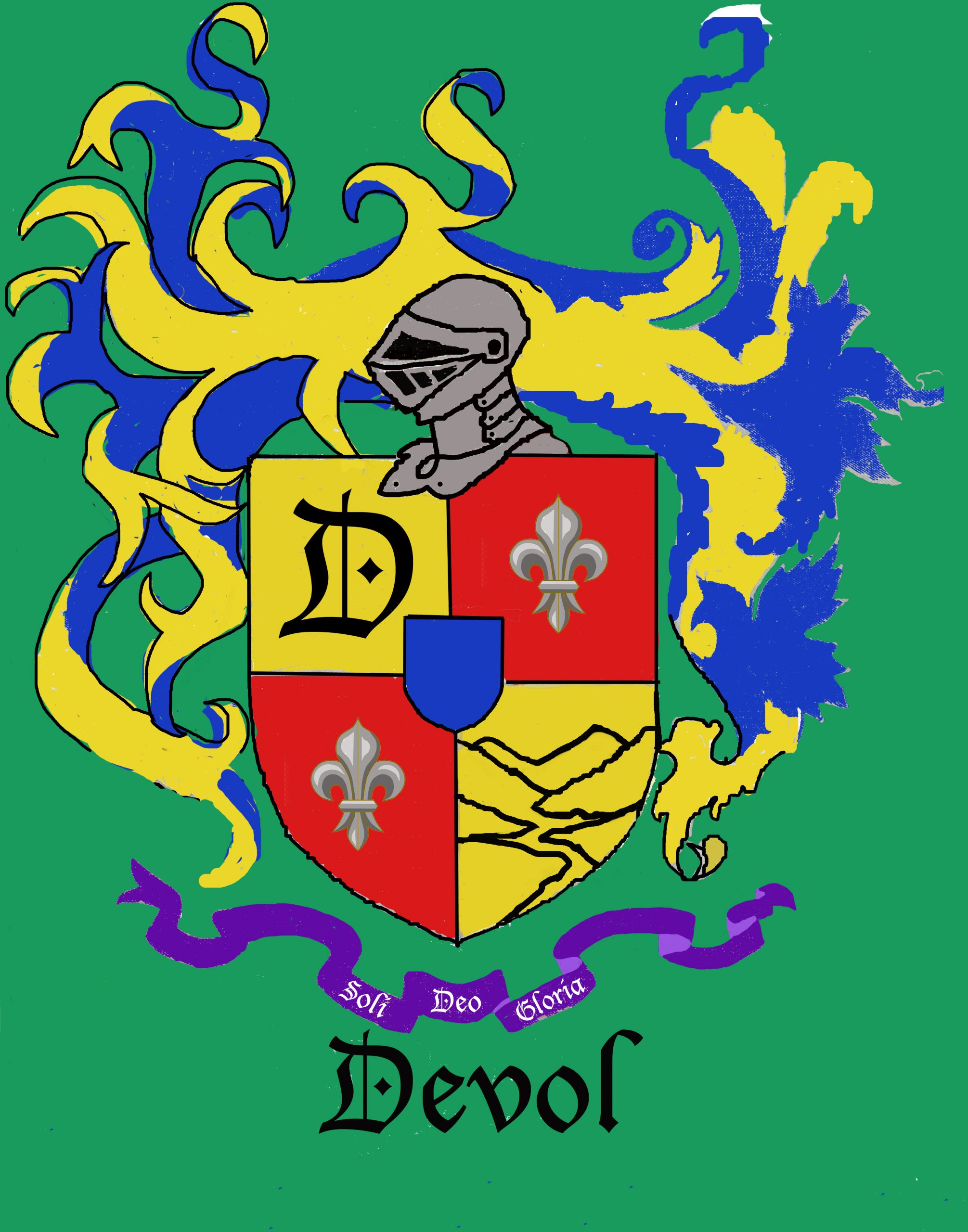
Everything is now ironed out, so it time to move to canvas.
Tomorrow. . .
P.S. I am guest posting once a week on the Mineral King Preservation Society website, under the topic of “An Artist’s Inspiration”. The first post went live yesterday. www.mineralking.org
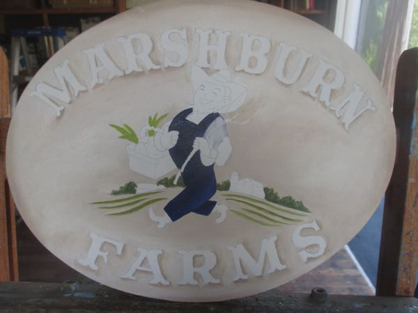
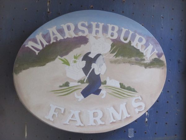
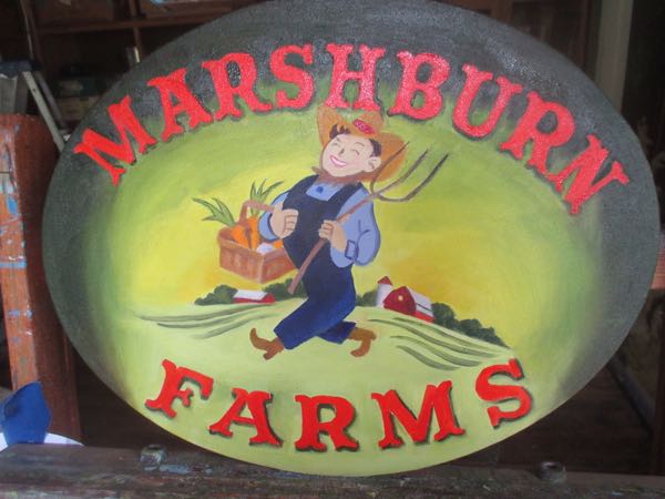
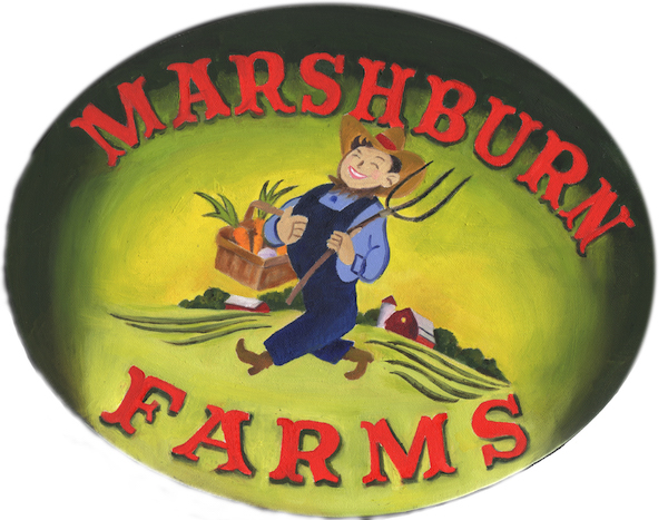
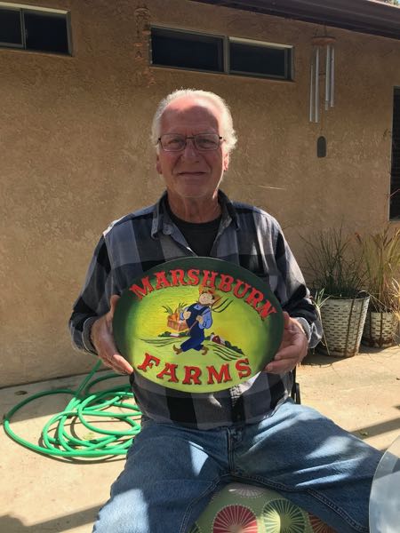
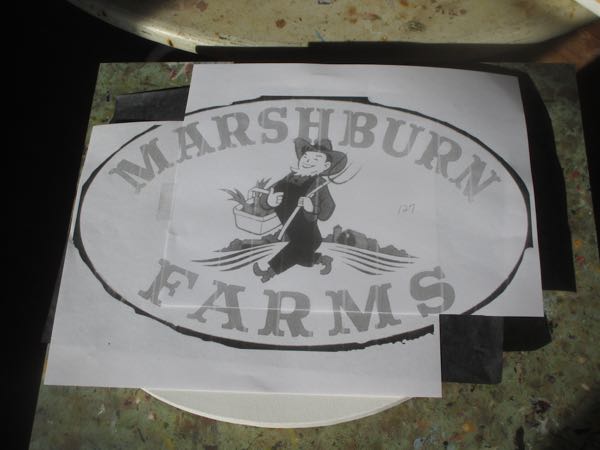 It is the first time I’ve used graphite paper to transfer and trace onto canvas so I wasn’t sure it would work.
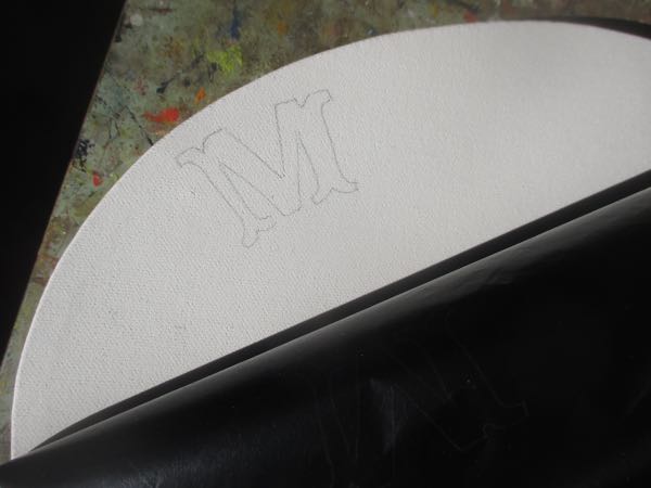 It did, so I finished with the lettering.