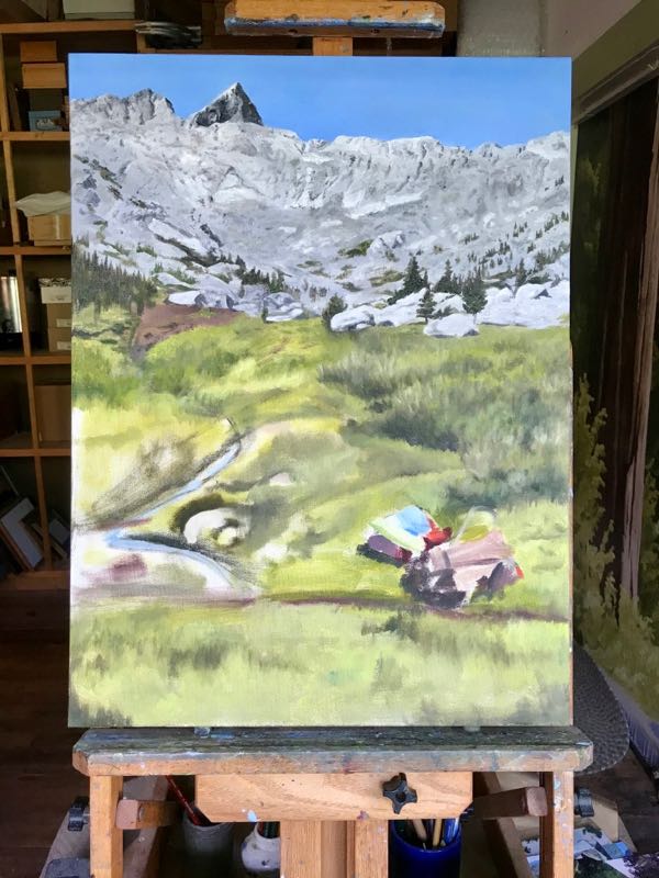
A blog reader became a friend and then a customer. He asked me to paint this photo of Lost Canyon for his wife and himself.
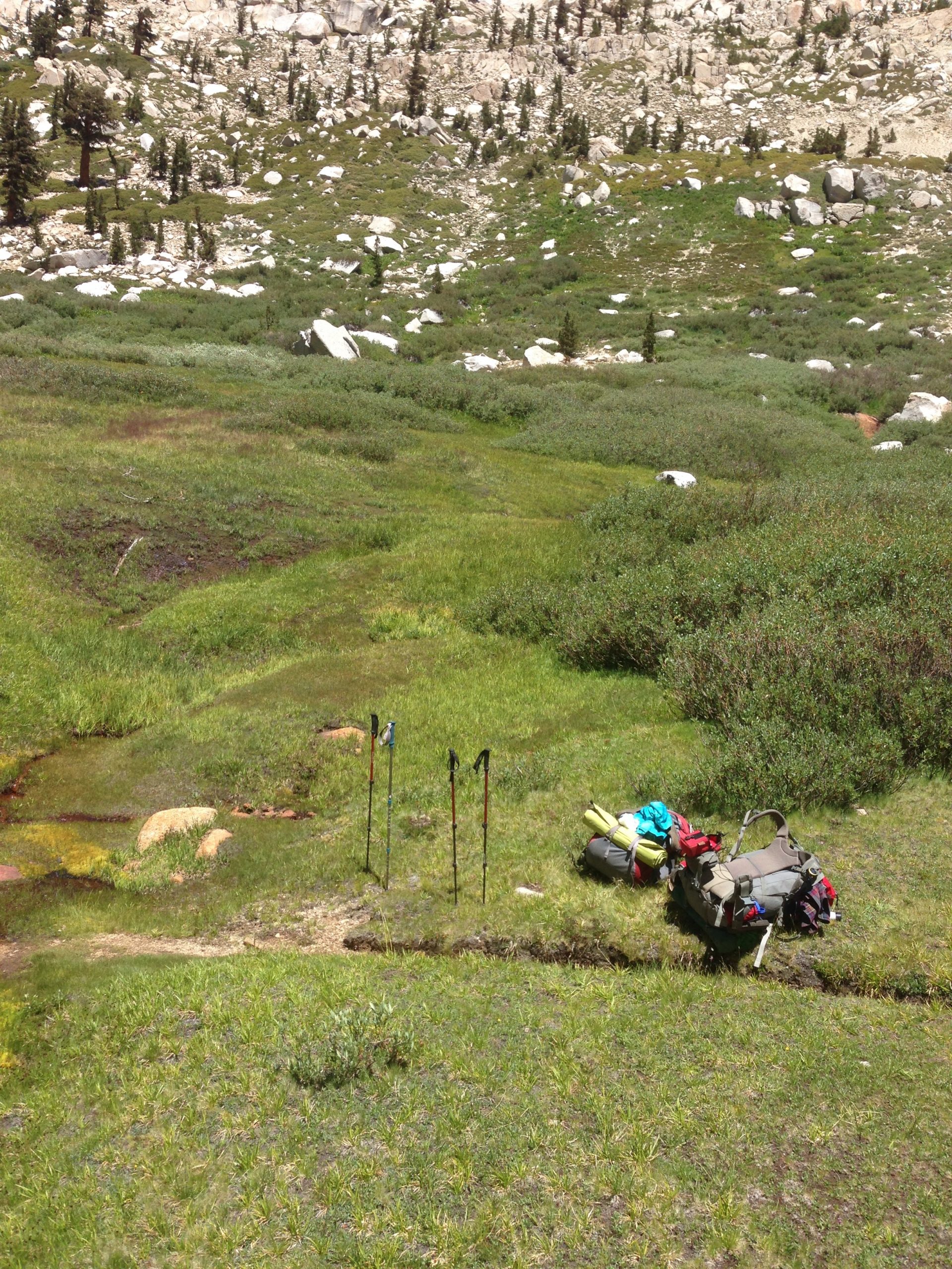
I started the painting. Scary, eh? Good thing he knows that I can paint.
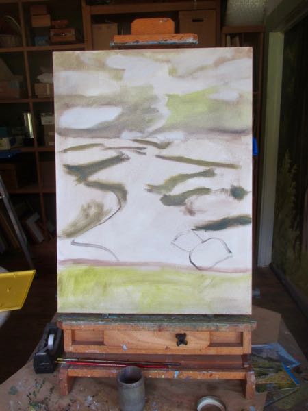
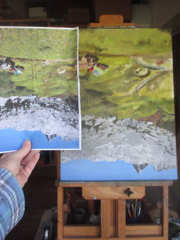
Then I thought, “Just wait a minute here – if this is Lost Canyon, I want to see the backside of Sawtooth!” So, I put together Plan B and showed my Friend/Customer.
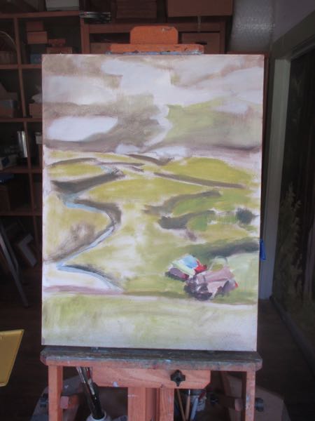
He said yes, so I kept painting, this time adding in Sawtooth.
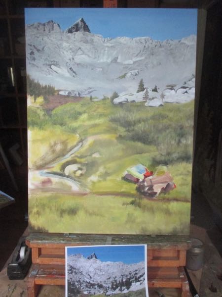
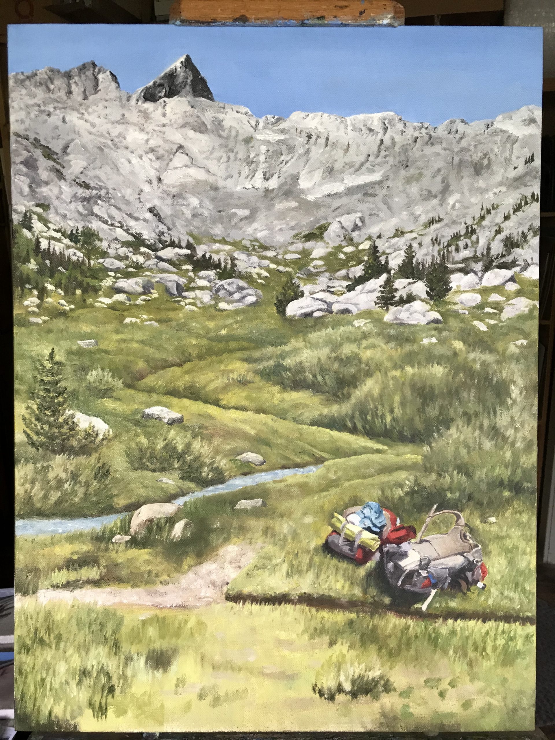
Then I thought the plan for the stream doesn’t look right, and the trail doesn’t look right either. Yes, it follows the original photo, but we’ve been to Lost Canyon, and we can do better.
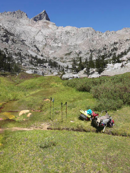
So, I put together Plan C with the help of the internet and photoshop. These are fantastic tools for an artist who accepts commissions of subjects she knows for people who communicate well.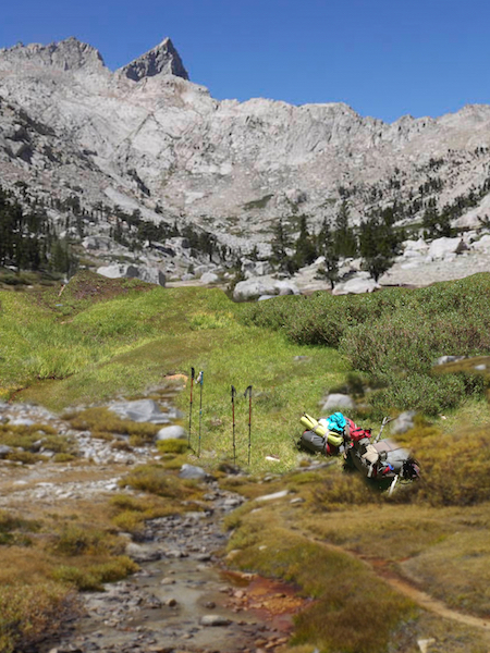
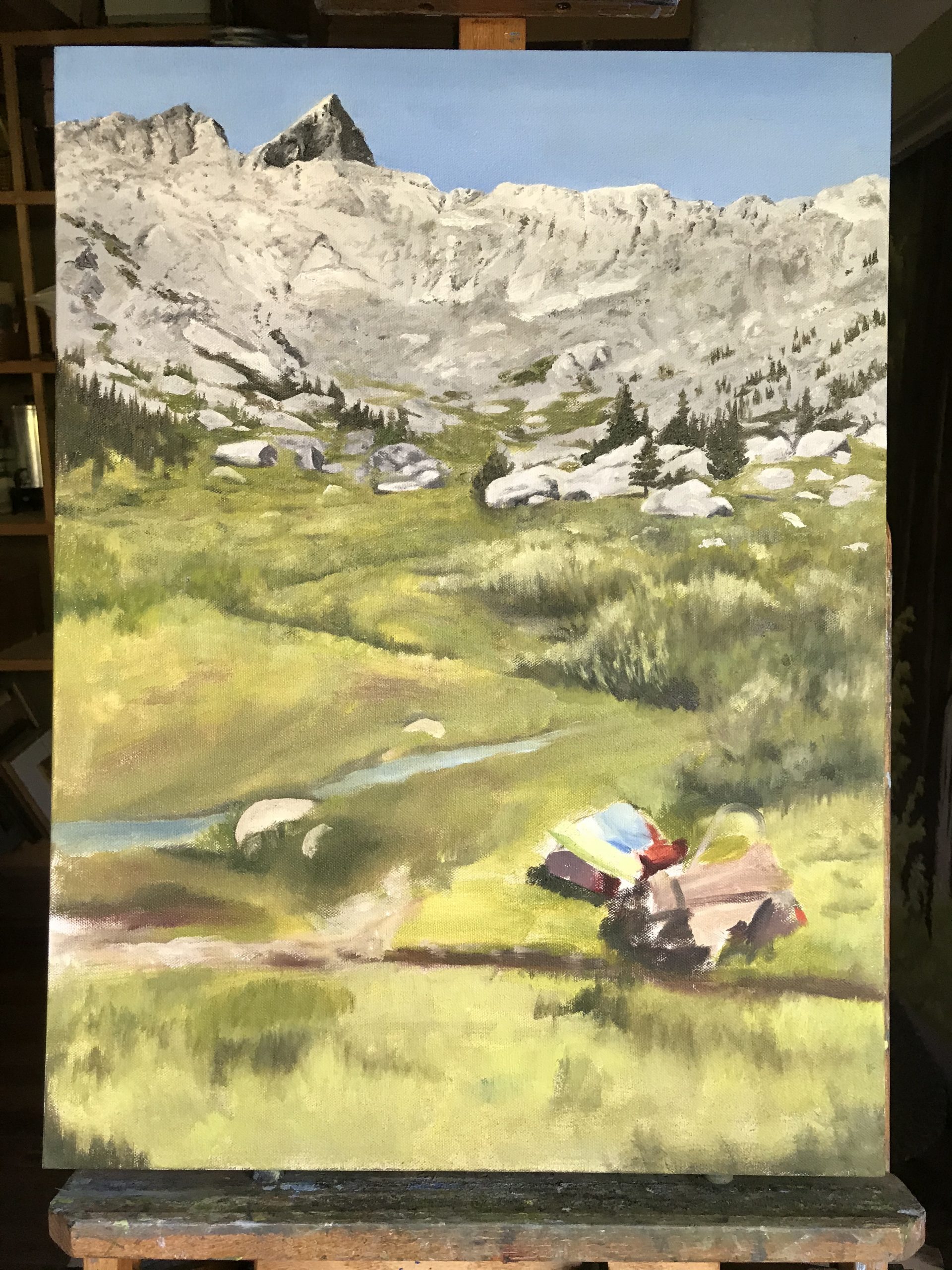
Now I await the decision of Friend/Customer and Wife. Will they agree with this change? It is probably unusual for an artist to tell the customer how to do things on a commissioned piece. Of course I will defer to his opinion – he has commissioned the piece and I will not be finished until he is happy with it.
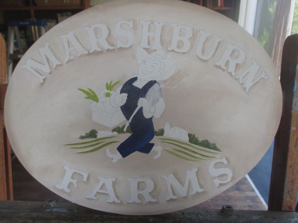
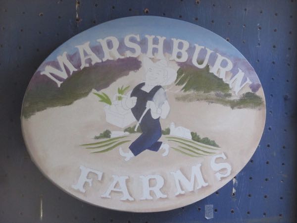
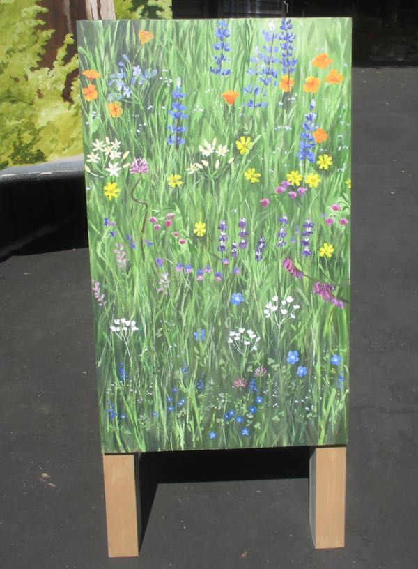 In case you are wondering, yes, I can name all the flowers. They are all foothill flowers, not in my wildflower book Wildflowers of Mineral King: Common Names.
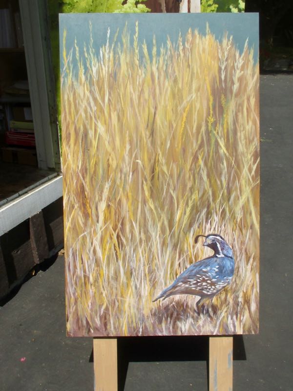 Other than getting the quail as close to reality as possible, this side was just lots of scribbling in brownish yellows and yellowish browns.
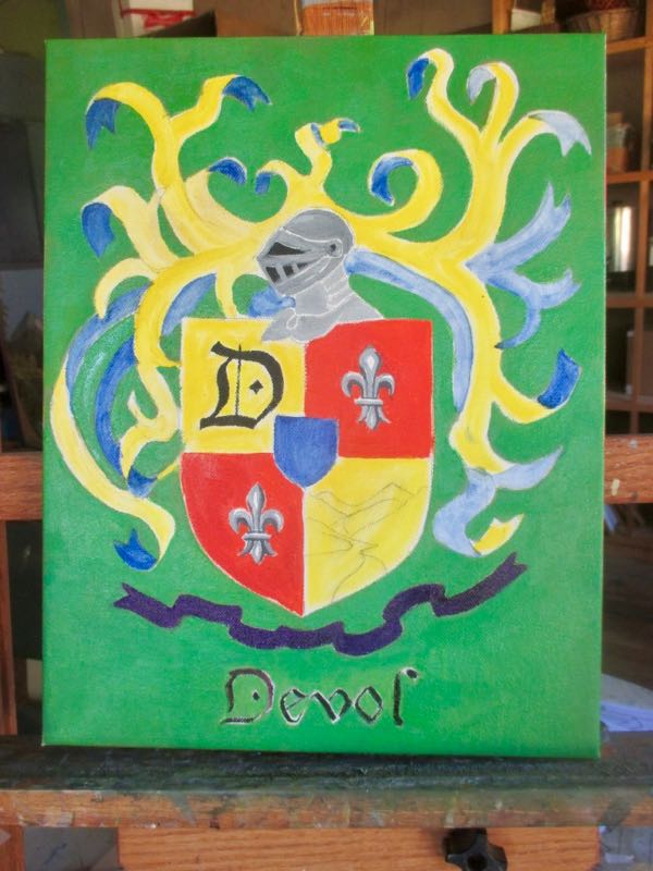
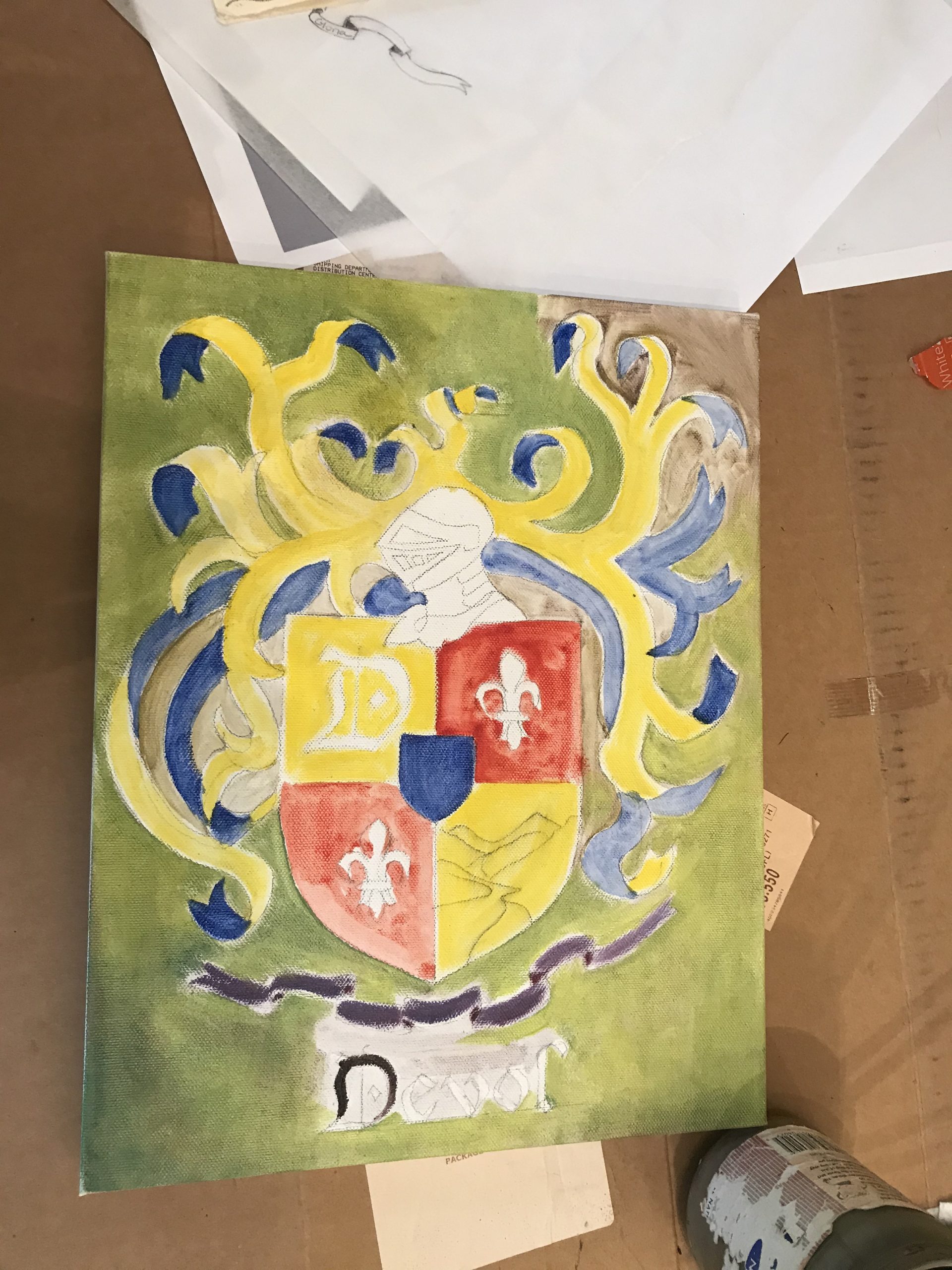
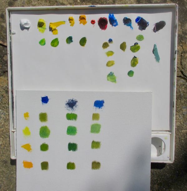 My friend said, and I agree, “More Kelly than lime”. Photoshop Junior used Kelly green, but I wasn’t very careful with mixing in the first pass over the canvas.
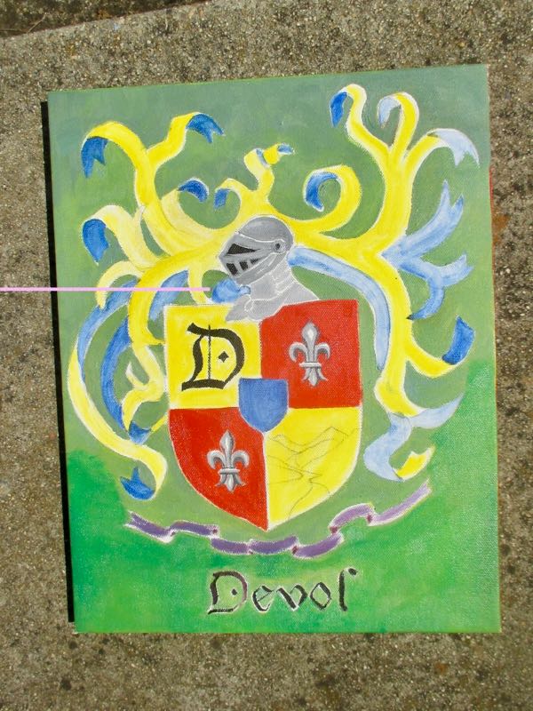 Better, but too wet to continue.
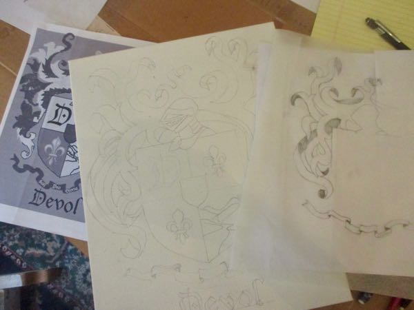
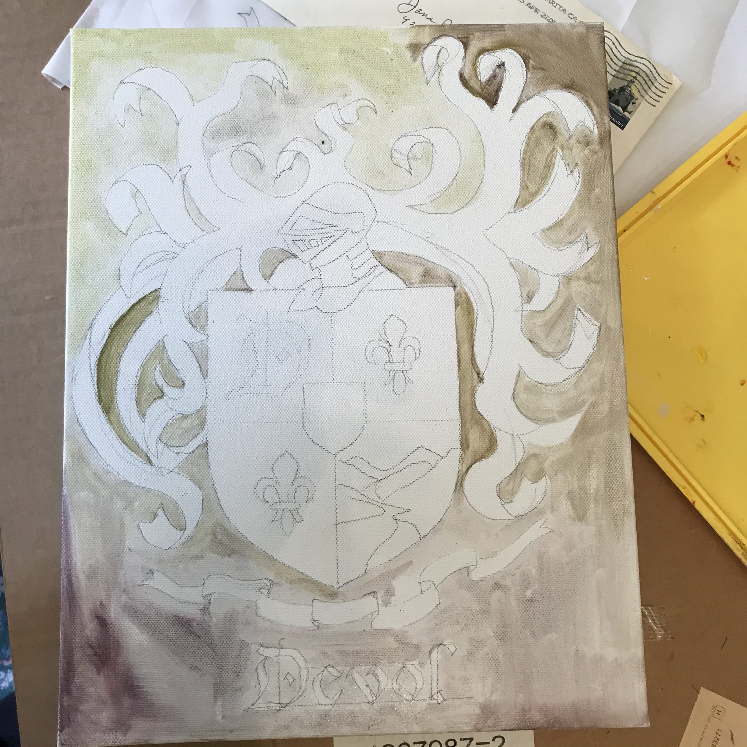


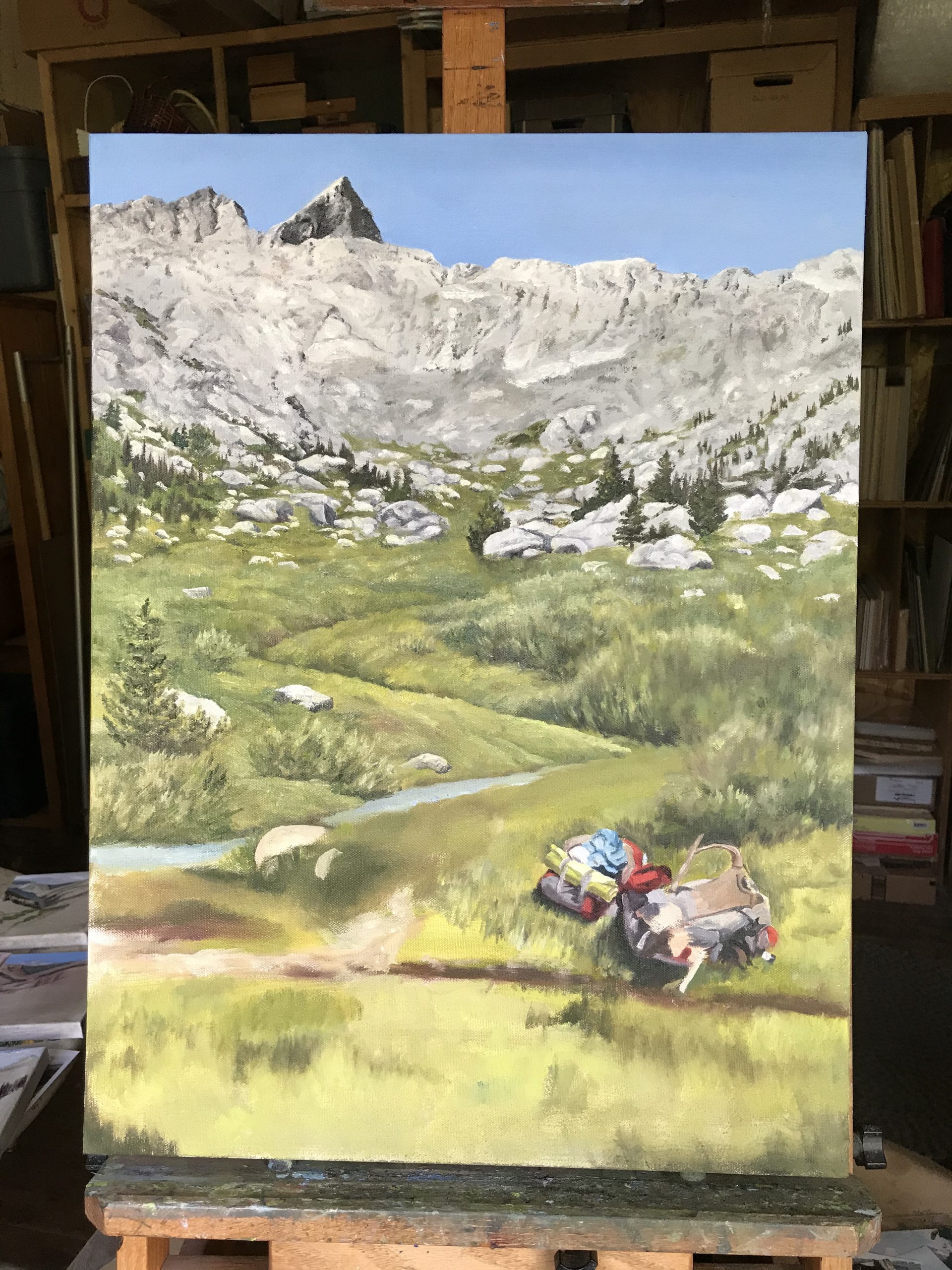
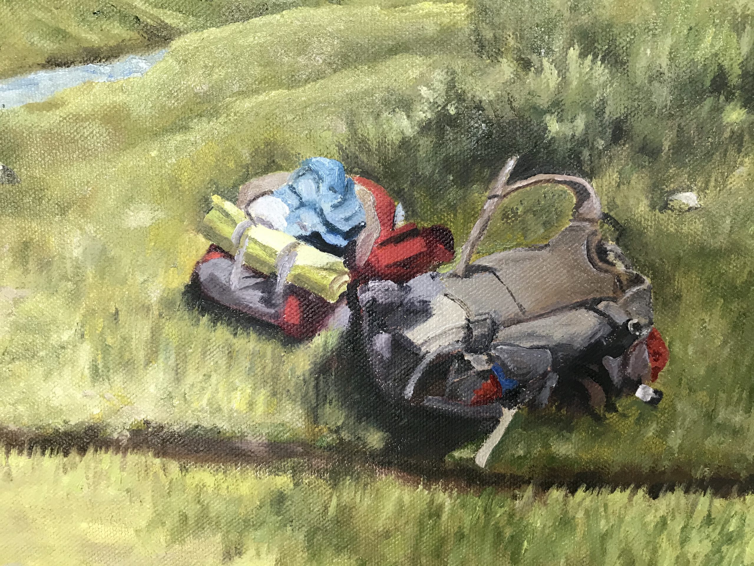
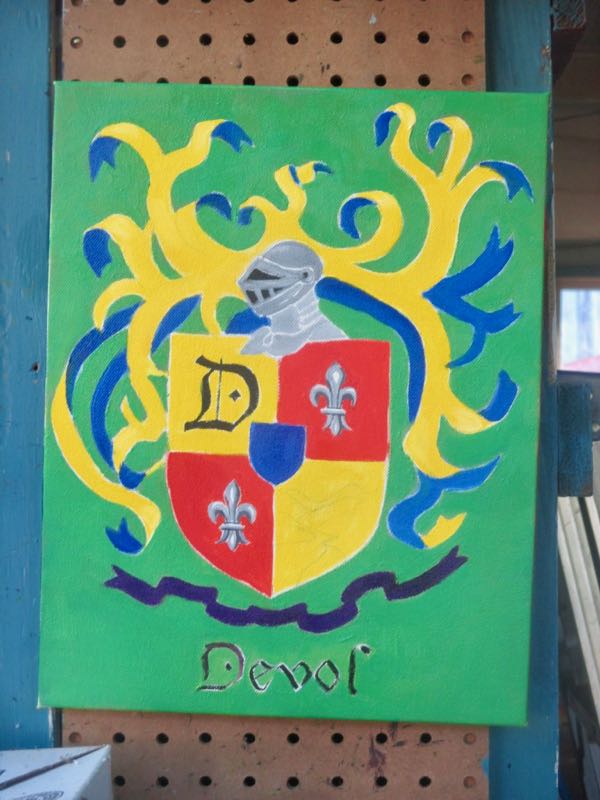
 Then, I moved to the backpacks, because regardless of the customers’ decision, they would remain in the same position.
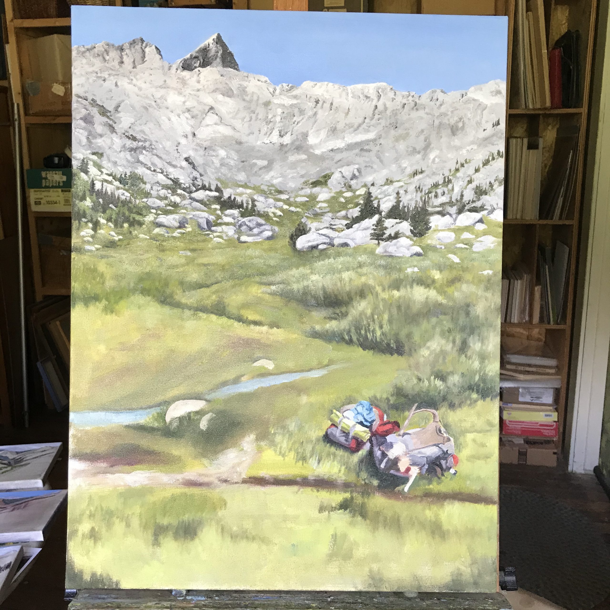
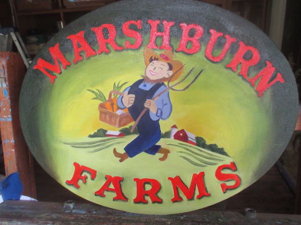
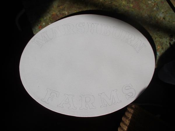
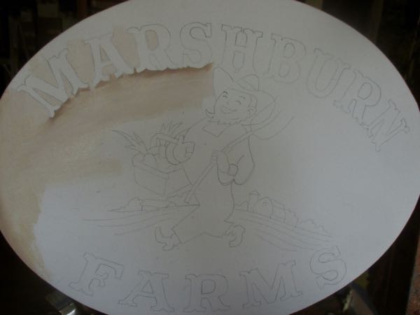
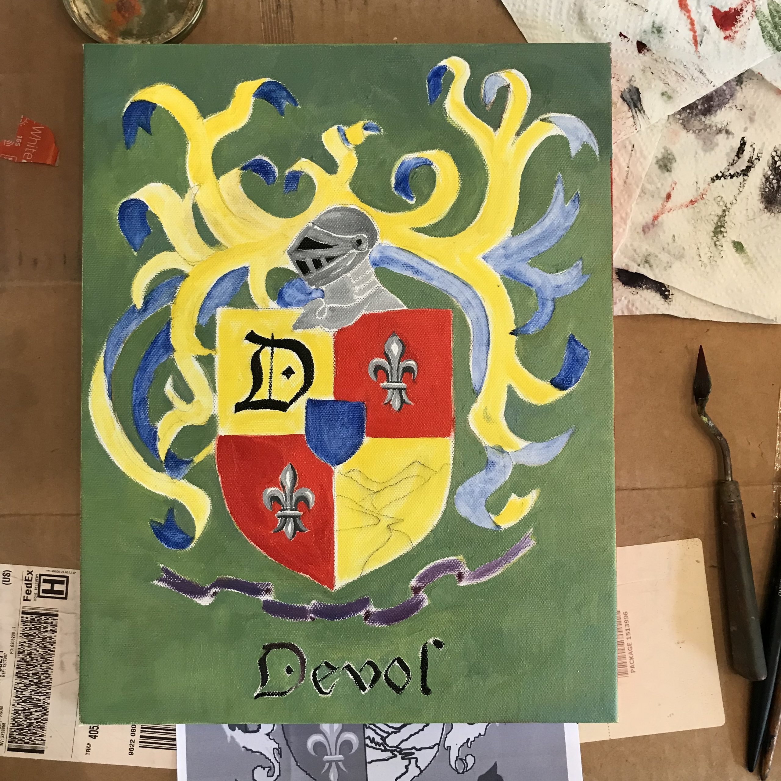
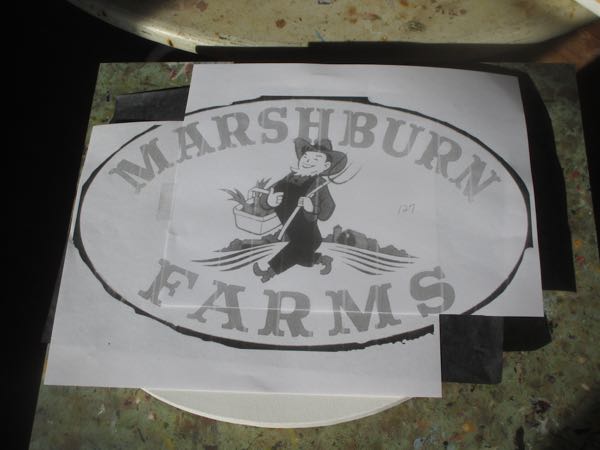 It is the first time I’ve used graphite paper to transfer and trace onto canvas so I wasn’t sure it would work.
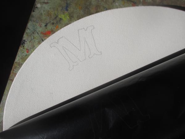 It did, so I finished with the lettering.