More Iris Oil Paintings

In thinking about painting Dutch iris, I got curious about the previous oil paintings of my favorite flower.

So, let’s have a look. A couple of these might be Japanese iris instead of Dutch. And the colors always photograph a bit bluer than the beautiful blue violet of real life flowers and paintings.

I like this last one best, but think my current two are better. 

YEA! GROWTH AND PROGRESS!

Maybe. Taste is an individual matter, or in Latin de gustibus non est disbutandem. My dad liked saying that, and it made me smile, so I learned it too. I think it translates as “is it useless to argue about matters of taste”.


Iris Oil Paintings in 3 Layers

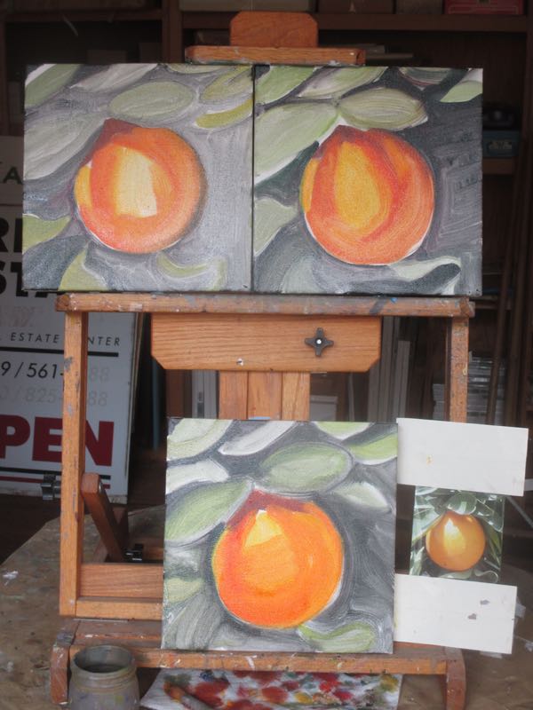
Layer #1 on these iris oil paintings is rough but recognizable. If I painted with a palette knife, using thick paint and finishing it all in one pass (“alla prima”), then the finished version of these would be similar to this. 

Sorry to disappoint . . . that’s not my style, although it might be fun to try.

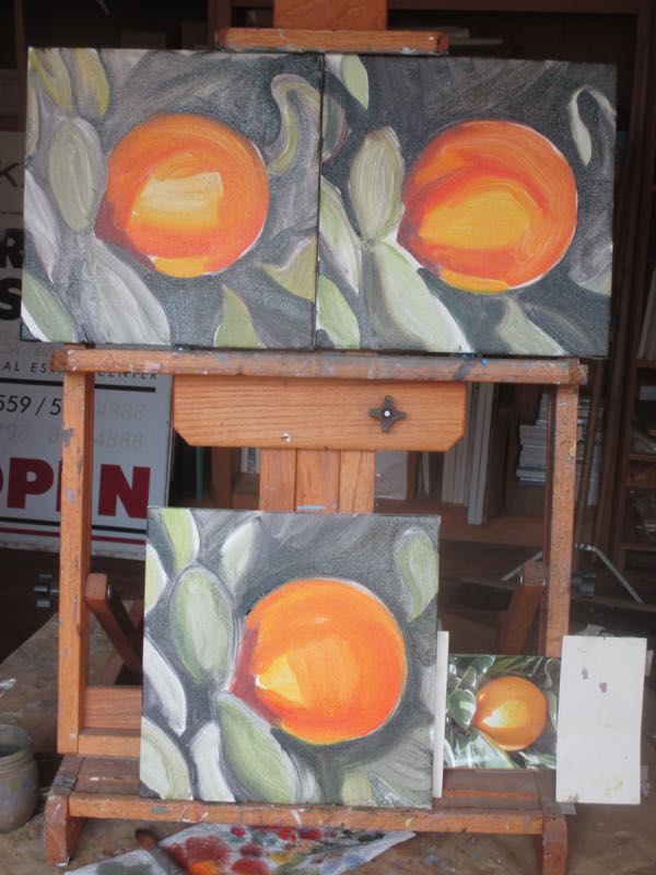
Layer #2 is better.

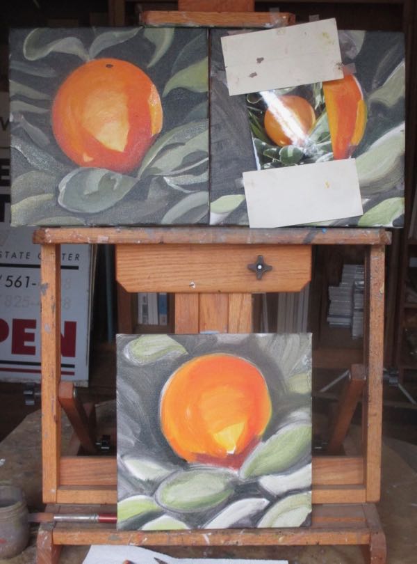
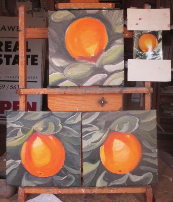
And layer #3 brings them to completion. I love that contrast of light against dark, those crisp edges, that precise detail. And the colors are better in person than on screen here.

Why two paintings that are so similar to one another?

Because Dutch iris are my favorite flower, because it is makes sense to paint multiples, because I am 57 and I can do whatever I want.

Fall down laughing. . .

. . . if I had more sense, I’d be painting multiples of poppies, because those are more popular than Dutch Iris.

Oh yeah?


More Oil Paintings in Progress

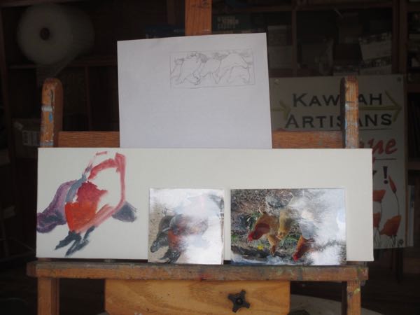
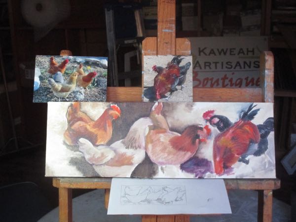
Lest you think I only paint eggs these days, here is a look at other oil paintings in progress. The way I keep myself glued to the easel is by audio books – The Glass Castle by Jeannette Walls was captivating and pushed me through many paintings last week.

Poppies, always need poppy paintings. And I love Dutch iris but haven’t painted any for several years. The lake painting? It’s been in this state for several months. I had another painting of this view for several years before it sold, so I’m not sure that this is a subject that is in demand. 

Those lanterns are definitely too hard for me. So, I dab away, adding one layer at a time, working from back to front and dark to light, wondering if I am learning anything or just reinforcing bad habits. That ignorance is one of the set-backs of being self-taught and working alone.

Decision time. First, the lake. If it took several years for a buyer, why am I painting this again?

Forget it. Bye-bye lake, hello Farewell Gap.

And more Farewell Gap – summer’s coming, and the Silver City Store will want paintings to sell. Here are 2 in progress.

One more layer ought to do the trick on the poppy. Seventeen more attempts on the blue and white plate under the egg might do the trick.

Special delivery!

Artists’ Words

Once of the most dreaded tasks of an artist is having to write a biography. However, this is a piece of cake compared to an “Artist’s Statement”. I have no idea what this actually is, in spite of having read about them numerous times and having tried to wade through such things as written by other artists.

Look at the type of Artspeak that fills up Artists’ Statements.

I’m constructing a framework which functions as a kind of syntactical grid of shifting equivalences.

Or try to digest this one:

Imagine the possibility that painting might take root and find a place to press forward into fertile new terrain.

In reading a blog by artist Lori Woodward recently, I came across this sentence with which I agree completely. I have had this thought this many times:

Representational works need no explanation – they either resonate with the viewer’s life experience, or they don’t.

Here is a piece of art that I hope just speaks for itself:

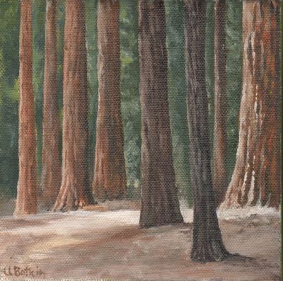
Sunny Sequoias IXXX, 8×10, oil on wrapped canvas, $125

And here is the link to Lori’s post: Lori Woodward


Painting at Home

Happy Birthday, Ruthie! (Or is it on the 25th? Will I ask this question the rest of our lives?)

Isn’t “Painting at Home” a weird title for someone with a home-based studio?

My painting studio is cold and dark on a rainy day. Sometimes I paint there anyway, using an Ott light and a propane heater. It isn’t ideal, but it is what I have. I can color-correct things when the sun shows up. I am not and never will complain about the gift of precipitation!

Last Thursday and Friday I just couldn’t make myself want to be in the studio. There was a fire in the wood stove in the living room (that’s the way we heat our house), Michael was in the house listening to something interesting on the radio, and Samson was also in the house, behaving himself for a change.

So, I decided to paint in the house on the dining table. Suddenly, Samson was no longer content to sleep in my chair in the living room.

Why yes, yes indeedy I do have a couple of original Vermeer paintings in my dining area. How very observant you must be!

It wasn’t ideal, but it worked. On the 2nd day of painting in the house, I rotated everything around to the other end of the table. It wasn’t ideal either, but it certainly beat being alone in the relative dark and cold of the painting workshop.

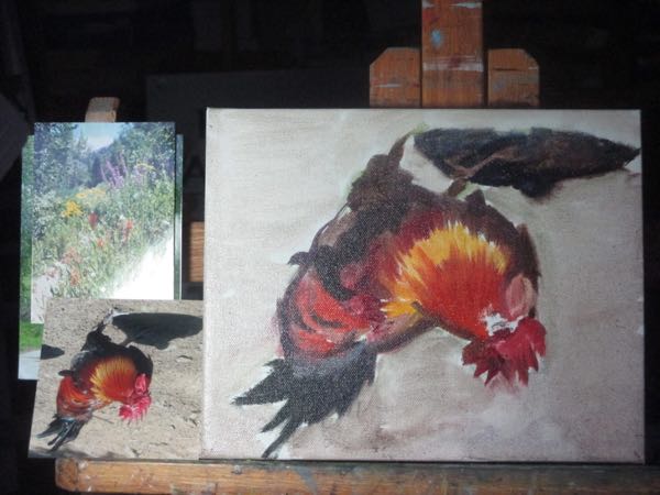
By working upside down, I can get my shapes a bit more accurate. It is the photo and canvas that are upside down, not me. Never have figured out how to paint while standing on my head.

This last painting is my current Little-Bit-Too-Hard-For-Me piece. I have a theory that if I am always working on something a little bit too hard that maybe my painting will improve. It is the same idea as lifting weights that are almost too heavy to build muscle. (This is not real advice about physical activity. . . I was a PE disaster and know nothing.)

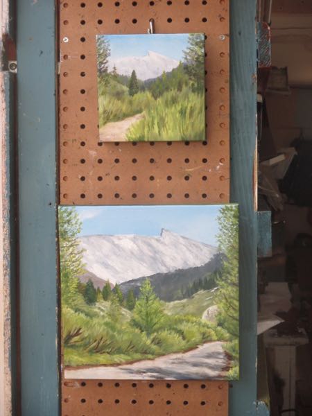
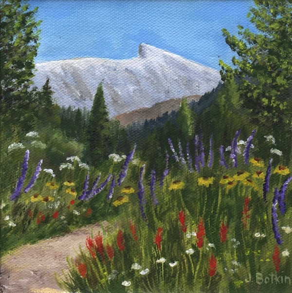
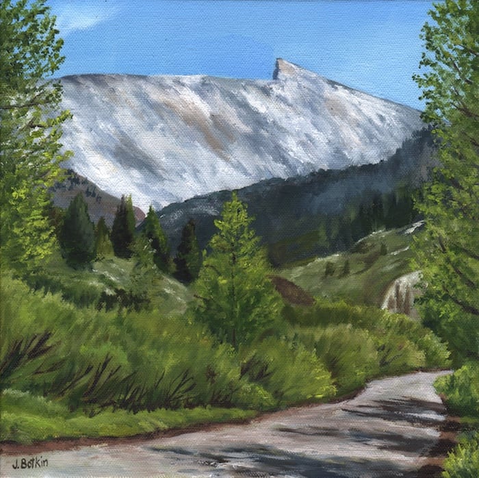
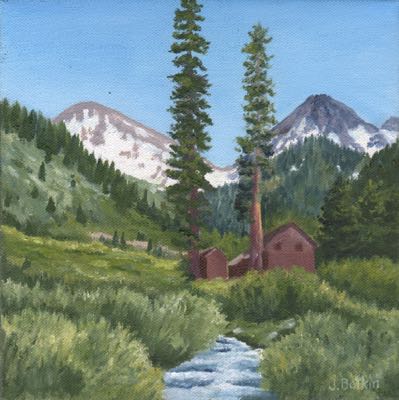
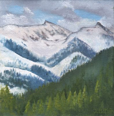
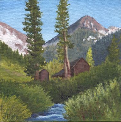
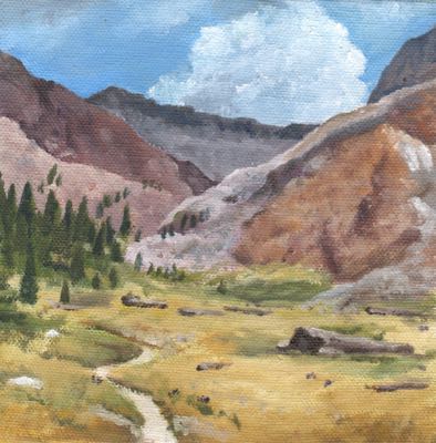
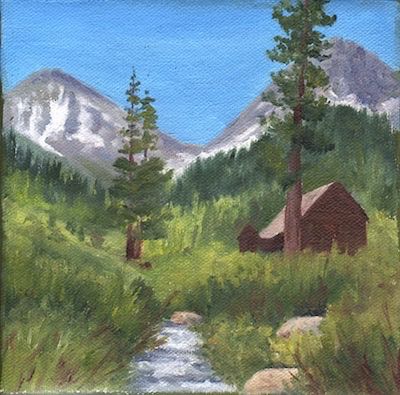
The other paintings are of Mineral King, because I always need to have that subject matter in my inventory.

On the Easels and On the Needles

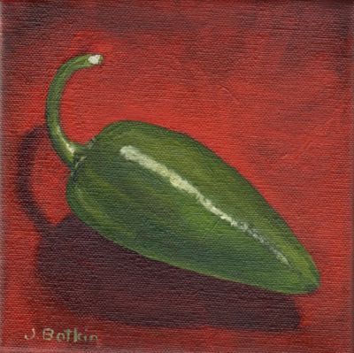
This jalapeno is a commissioned oil painting. I’m happy with the colors and will be tightening up the detail next.
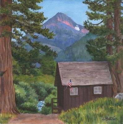
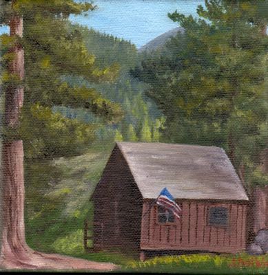
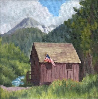
The Honeymoon Cabin is a very popular subject. This is from an early evening photo with heightened colors. The size is 8×8″ and will be $100.
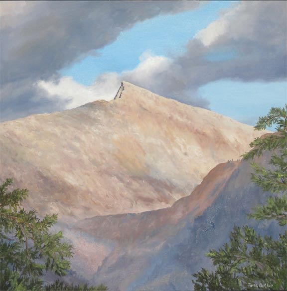
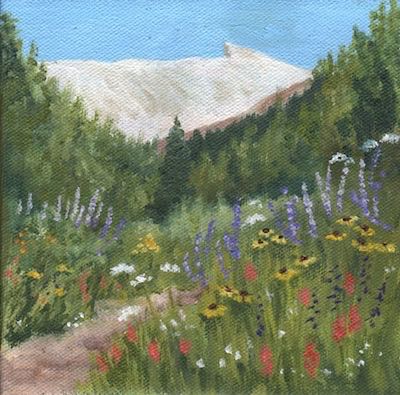
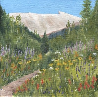
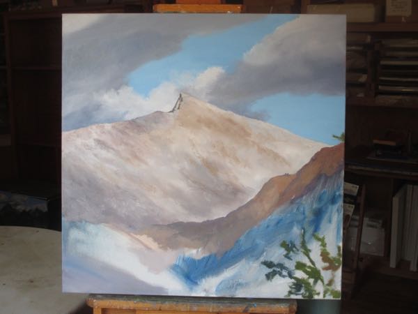
Sawtooth is another very popular Mineral King subject. This is 10×10″ and will be $150.

And in case you were wondering if all I do is work, please be reassured that I always find time to knit. A friend is waiting for a new pair of lungs, and there will be a fund raising dinner with silent auction and pick-a-prize items. I made these 2 infinity scarves for the event, and the blue/red/brown one already sold! No worries, I have just finished a brown/teal and have a second one on the needles, which I might be tempted to keep. Kind of tempted to keep the aqua one, but my friend needs to pay for her lung transplant infinitely more than I need another scarf.

Oh wait – you need to see what an infinity scarf looks like, not just all the colors.

Forget it – this one is mine! (Okay, make a large enough contribution to my friend’s lung account and I will send it to you, but it better be a HUGE check – email if you’d like further instructions.)


Did You Miss Samson?

Samson is still around and participating fully in everything.

So far he has wrecked 3 pairs of tights and a cable knitting needle.

I began this painting of a jalapeno pepper, and he immediately began batting the pepper around the workshop. I encouraged him to bite it, hoping it might cure him of this nasty habit, but no, he only chased it all around the room.

Finished Oil Paintings

Did you think I had forgotten my promise to show you recently finished oil paintings?

Nope.

First, the commissioned piece. It isn’t totally finished, but I never show you the sides of the canvas anyway.

It is Oak Grove Bridge XX, which means #20, but is probably the 25th time I’ve painted it because sometimes my record keeping is not so good.

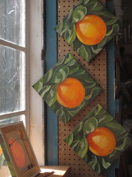
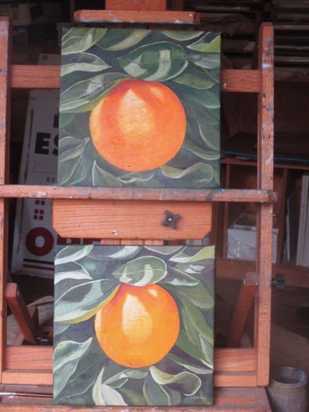
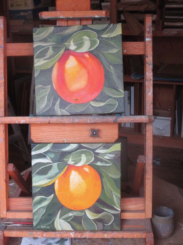
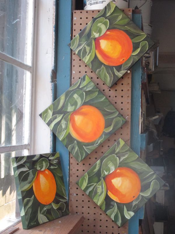
Now, the P Fruits:

6×18″, P Fruits, oil on canvas, wrapped edges, ready to hang, $150 plus the obnoxious 8% California sales tax.

And a Sequoia Gigantea, with the same information as above, except it is a Giant Sequoia tree.

Repainting Mineral King and Prudence

Happy Birthday, Gordon!!

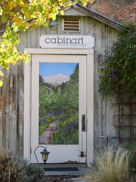
The big Mineral King mural in Exeter has faded.

Yellow fades the quickest, so gray becomes purple, tan becomes gray which then fades to lavender, and green becomes blue.

The mural colors were like this when I finished it after 52 days of painting in 2009.

Now the colors look this way:

It is time to refresh the greens and grays, and when it stops raining, I will do that. The sky and the insets are fine, as are the farthest snow-covered peaks. (Maybe – ever heard of “purple mountain majesty”?)

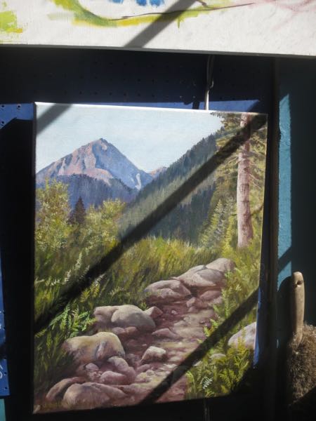
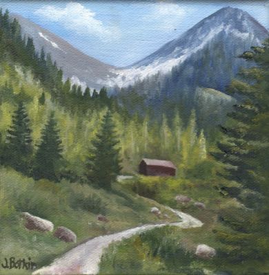
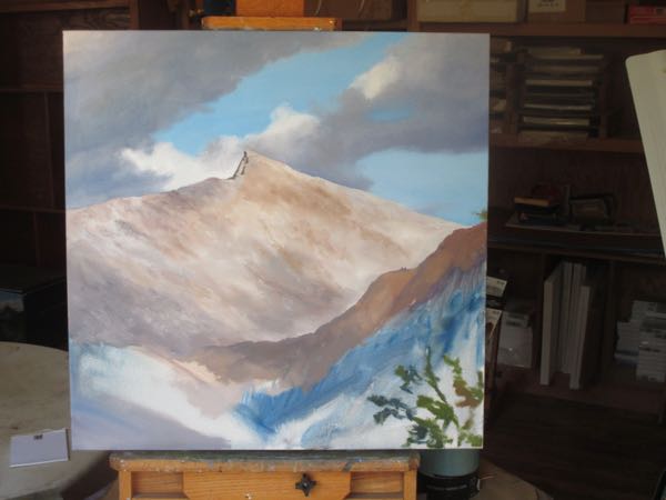
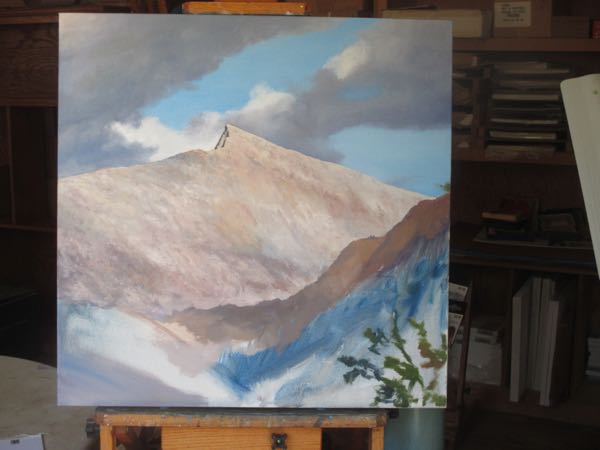
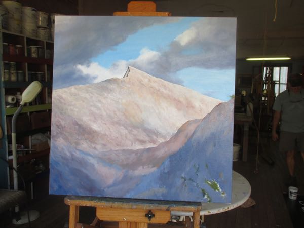
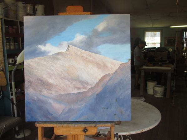
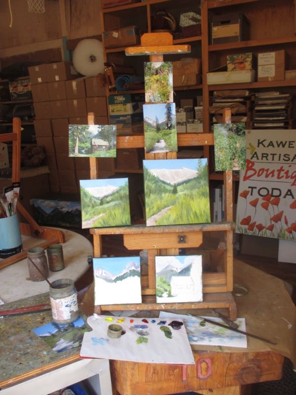
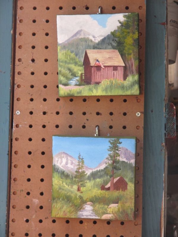
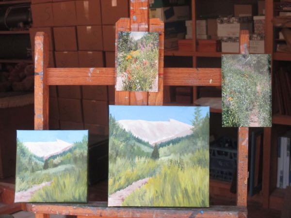
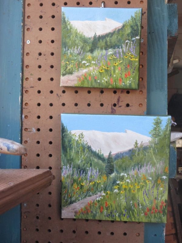
Meanwhile, I am preparing to repaint Mineral King by painting Mineral King in oil. Painting a mural is very attention-getting, and the process will bring attention to Mineral King. It is prudent to have paintings ready for eager customers; if I had been born in the 1600s, perhaps my name would have been Prudence.

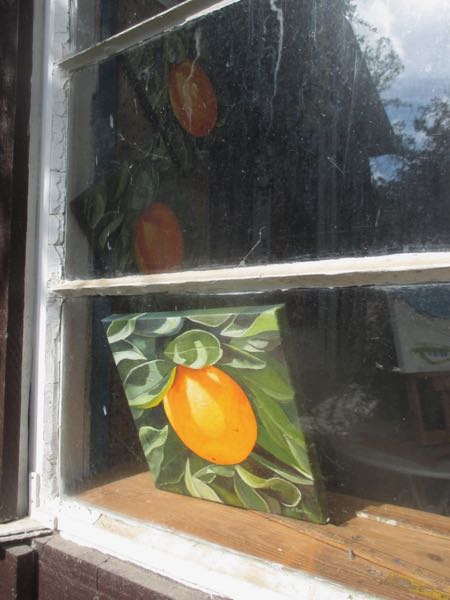
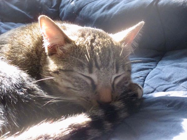
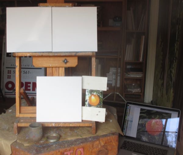
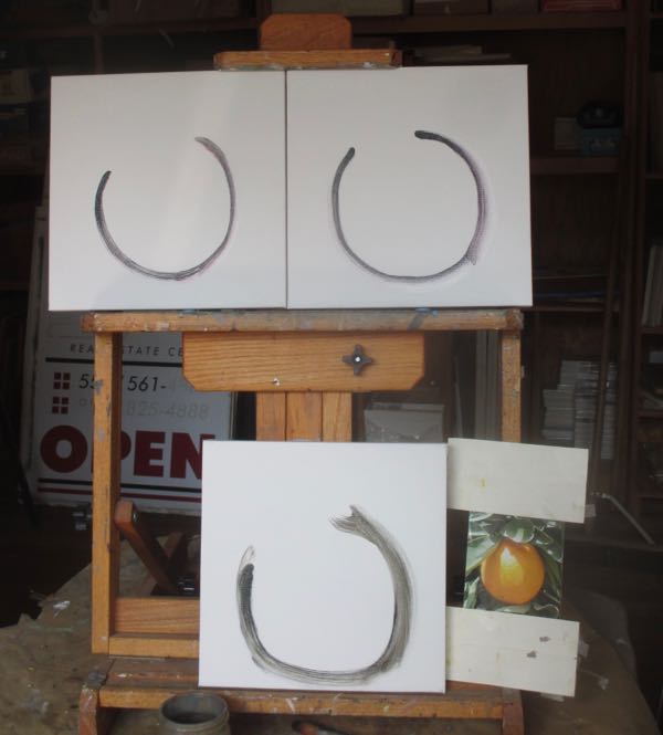
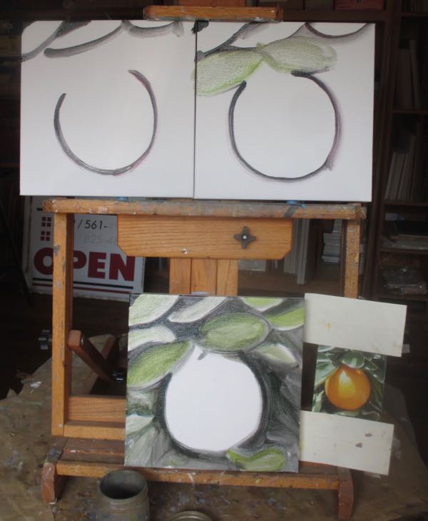
It was prudence that caused me to photograph these through the window rather than going into the painting workshop, which doubles as the Bengal-beast’s safe place. I didn’t want to awaken the sleeping Samson by going into his territory.